10,000 search results
(0.019 seconds)
- Betina Script by ParaType,
$30.00 The type family was designed at ParaType (ParaGraph) in 1992 by Alexander Tarbeev. Based on the handwriting of the German graphic artist Betina Kuntzsch. For use in advertising and display typography. Additional Latin letters (for the whole family) and Greek letters (for the normal style) were added by Gennady Fridman in 2006-2009.
 - Creighton Pro by Red Rooster Collection,
$60.00 Steve Jackaman and Ashley Muir. It was our initial intention to develop a suitable lowercase for Les Usherwood's 'Elston' typeface, based on a few characters from an old German typeface called Hermes Grotesque (Woellmer, Berlin). However, the new design quickly took on a life of its own, and we decided to call it ‘Creighton’. Originally released as a four font family, we have now added eight more weights and made the entire family into 'Pro' versions for good measure.
 - Hopferian by 2D Typo,
$28.00 This font has been developed based on the engraving by the German artist Daniel Hopfer (1470-1536) listing the Latin ABC. While creating the font I tried to preserve the archaism and certain imperfection characteristic for the prototype to accentuate its charm. Fanciful convolution on the serif make it a bit fairy-tale like and cheerful. The font is also available with decorated dots as in the original version. All the letters in the font are capital.
 - Wallgain by Keristyper Studio,
$14.00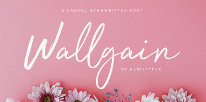 Introducing Wallgain A rustic, dapper handwritten font with a personal touch. With quick dry strokes and a signature style. Wallgain Handwriting Font multilingual support: Afrikaans, Albanian, Catalan, Danish, Dutch, English, Estonian, French, Finnish, German, Icelandic, Indonesian, Italian, Malay, Norwegian, Portuguese, Spanish, Swedish, Zulu, and many more. What’s Included : Standard & Multilingual glyphs Ligature Works on PC & Mac Simple installations Accessible in Adobe Illustrator, Adobe Photoshop, Adobe InDesign, and even work on Microsoft Word. Hope you enjoy our font!
 - ITC Whiskey by ITC,
$29.99Jochen Schuss, the Biedenkopf, Germany, designer who was most recently responsible for ITC Vino Bianco, has created in ITC Whiskey a condensed display face that's both angular and soft at the same time. While the letterforms of Whiskey are clearly roman, there's a slight reminiscence of blackletter in the face's narrow proportions, its dark weight, and its persistent internal angle - not quite the 45 degrees common in a classic German textura, but a gentler angle of 25 or 30 degrees. And the counters are all rounded, as are the ends of all the strokes, giving Whiskey a comfortable friendliness despite its severe structure. The character set includes an alternate z" and an "ft" ligature." - Bohemio by Wiescher Design,
$39.50 Bohemio was designed in memory of Gunter Böhmer, an artist famous for his many book covers of the 1950s in Germany. The cover I took as an inspiration for this font is that of a book called Stiller (by Max Frisch). Bohemio sounds similar to "Böhmer" (which means the one from Bohemia) and it is also an alliteration to artisty. I thought "Bohemio" to be a nice name for this very strong, almost expressionist design. Yours very artsy craftsy Gert Wiescher
 - ITC Jambalaya by ITC,
$29.99The talented designer of the well-known Formata typeface, Bernd Möllenstädt was born on February 22, 1943 in Germany. He has lived in Westfalia, Berlin and Munich, Germany, and now permanently resides in Munich. From his earliest years he was interested in typography, first studying as a typesetter (1961-64) and then a student of graphic design (1964-1967). In 1967 Möllenstädt joined the Berthold typefoundry and his career as one of the leading type personalities began. One year after joining Berthold, he became the head of the type design department. For 22 years he worked as the head of that department, under the leadership of Günter Gerhard Lange. Upon Lange’s retirement in 1990, Möllenstädt ascended to the type directorship of Berthold where he was responsible for type design and font mastering. Möllenstädt designed two typeface for the Berthold Exklusiv Collection, Formata (1988) and Signata (1994). Under license from Berthold, Adobe marketed Formata as part of the Adobe Type Library. Formata is now one of the most successful sans serifs in the world, used both in American and European magazines, as well as newsletters in the Far East (Gulf New Kuwait). Formata also was chosen as the corporate typeface of Postbank, Allianz, VW Skoda, Infratest Burke, etc. In addition to his work for Berthold, Möllenstädt has lectured at local Munich schools on typography and graphic design, and designed corporate type identities and diverse logos for major corporations, including Allianz, Commerzbank, Mauser Officer and Hoepfner. Möllenstädt continues his association with Berthold as a designer. He most recently completed small caps and fractions for Formata. He also has substantially contributed to Berthold's Euro symbol program (e.g. adding the Euro symbol design-specific to the most popular families). Möllenstädt currently is working on a new Berthold Exklusiv design. - Fox by profonts,
$41.99 Fox was originally designed by W. Rebhuhn for the former German Genzsch & Heyse foundry. In reminiscence of the good old times, Ralph M. Unger redrew and digitally remastered this font in 2007. His work is based on artwork taken from old font catalogues. Fox is a very lively script, quite typical for the 50s
 - Klute by Alias Collection,
$60.00 Klute references stylised forms of writing; historic Germanic, blackletter letterforms and graffiti and tagging. Its references are based on a personal idea of lettering - the action of writing is more personal and human than the craft of calligraphy or the mechanics of typing. These references suggest the idea of saying something particular and personal.
 - Matinee Idol NF by Nick's Fonts,
$10.00This typeface is patterned after lettering on a 1931 poster for a German Spa by Fritz Loehr. Informal and idiosyncratic, it will lend its own peculiar charm to any project it graces. Both versions of this font contain the Unicode 1252 (Latin) and Unicode 1250 (Central European) character sets, with localization for Romanian and Moldovan. - Megaphone by Red Rooster Collection,
$60.00 It was our initial intention to develop a suitable lowercase for Les Usherwood's Elston typeface, based on a few characters from an old German typeface called Hermes Grotesque (Woellmer, Berlin). The new design became Creighton. Then, for good measure we decided to experiment with a 'crisper version' of this design; the result is 'Megaphone'.
 - Ongunkan Radloff Viking by Runic World Tamgacı,
$100.00 Vasili Vasilyevich Radlof or Wilhelm Radloff (Russian: Василий Васильевич Радлов; German: Wilhelm Radloff; 17 January 1837 - 12 May 1918) was a German-born Russian orientalist and founder of Turcology. Radloff is a Russian Turkologist of German origin, who researches the Turkish world from different aspects, opens a new era in the history of Turkology by bringing them to light, and has devoted 60 years of his 81-year long life to these studies. In his work known as Radloff Atlas, it was published with a runic font that he developed specifically for the Old Turkish Runic Alphabet. I made the Turkish Runic Font using Radloff's Atlas. I developed this viking font based on this font and adapted it to Viking writing. I will adapt other runic versions when I have the opportunity.
 - Queshia Script by Keristyper Studio,
$14.00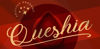 Introducing Queshia font is a beautiful script specially made to look so natural. Created with an authentic, handwritten feel. It looks stunning on wedding invitations, thank you cards, quotes, greeting cards, logos, business cards, and every other design which needs a handwritten touch. Multilingual support: Afrikaans, Albanian, Catalan, Danish, Dutch, English, Estonian, French, Finnish, German, Icelandic, Indonesian, Italian, Malay, Norwegian, Portuguese, Spanish, Swedish, Zulu, and many more. What’s Included : Standard & Multilingual glyphs Ligature Works on PC & Mac Simple installations Accessible in Adobe Illustrator, Adobe Photoshop, Adobe InDesign, and even work on Microsoft Word. Hope you enjoy our font!
 - Handikraf by Keristyper Studio,
$9.00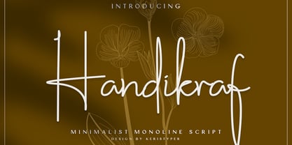 Handikraf Signature Script Font is charming and elegant Typeface. Created with an authentic, handwritten feel. It looks stunning on wedding invitations, thank you cards, quotes, greeting cards, logos, business cards, and every other design which needs a handwritten touch. Handikraf Signature Script Font multilingual support: Afrikaans, Albanian, Catalan, Danish, Dutch, English, Estonian, French, Finnish, German, Icelandic, Indonesian, Italian, Malay, Norwegian, Portuguese, Spanish, Swedish, Zulu, and many more. What’s Included : Web Fonts Standard & Multilingual glyphs Ligature Works on PC & Mac Simple installations Accessible in Adobe Illustrator, Adobe Photoshop, Adobe InDesign, and even work on Microsoft Word. Hope you enjoy our font!
 - Linotype Venezia by Linotype,
$29.99Linotype Venezia Initiale is part of the Take Type Library, selected from the contestants of Linotype’s International Digital Type Design Contests of 1994 and 1997. Designed by German artist Robert Kolben, the font is based on the classic forms of Roman writing in the 1st and 2nd centuries found chiseled on countless buildings and monuments. Linotype Venezia Initiale is a timeless, elegant font particularly well-suited to headlines or as initials in combination with other fonts, working especiall well with sans serif alphabets. - Chalk And Cheese NF by Nick's Fonts,
$10.00The name comes from a British expression about two things that couldn't be more different, and it suits this offering to a tee. The uppercase of this typeface is based on 1930s lettering by French poster artist Charles Loupot, and the lowercase is based on 1910s lettering by German plakatmeister Ludwig Hohlwein. Oddly, the two seem to play together well. Both versions of the font include the 1252 Latin and 1250 CE character sets (with localization for Romanian and Moldovan). - Gilbertino by Keristyper Studio,
$14.00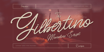 Gilbertino is casual script font With a clean stroke, super slanted, and fun character. This font is great for vintage designs, logos, labels, badges, posters, and more. Multilingual support: Afrikaans, Albanian, Catalan, Danish, Dutch, English, Estonian, French, Finnish, German, Icelandic, Indonesian, Italian, Malay, Norwegian, Portuguese, Spanish, Swedish, Zulu, and many more. What’s Included : Standard & Multilingual glyphs Ligature Works on PC & Mac Simple installations Accessible in Adobe Illustrator, Adobe Photoshop, Adobe InDesign, and even work on Microsoft Word. Hope you enjoy our font!
 - Pragmatik by Christopher Stahl,
$24.90 Pragmatik is a carefully crafted Square Sans by Christopher Stahl, awarded with a Commendation at the Art Director's Club Germany Junior Competition 2011 and selected as Font of the Week 42.2011 by Typolution.de. The design is influenced by the heritage of German industrial typesets like DIN, yet the use of forms and proportions feels modern and fresh. The family consists of three weights with matching italics, thus making a total of six fonts. The high x-Height and the sturdy design provide a good legibility in body text, while in larger sizes the exciting details and alternates create headlines full of atmosphere. Features: - 350 glyphs supporting central and western European languages as of DIN 16518 - over 500 manually adjusted kerning classes and pairs - available in Open Type with a host of Open Type features, such as: - proportional lining, lining table and proportional oldstyle number figures - 7 default and 16 discretionary ligatures that especially cater the needs of the German and English language - a variety of stylistic alternate figures like a stencil like i and j or an old-style Eszett.
 - Holofernes NF by Nick's Fonts,
$10.00The raw emotional energy of German Expressionism is evident in this font, based on Judith Type, designed by C. H. Kleukens in 1923. This version takes its name from the Biblical character who lost his head to the original font’s namesake. Both versions of the font include 1252 Latin, 1250 CE (with localization for Romanian and Moldovan). - Engel Stabenschrift NF by Nick's Fonts,
$10.00This elegant unicase uncial face is based on a work by German type designer Ernst Engel from 1927.This typeface masterfully combines Art Deco sensibilities with medieval letterforms, and is suitable for both text and headline use. Both versions of the font include 1252 Latin and 1250 CE (with localization for Romanian and Moldovan) character sets. - Kalligraphia by Linotype,
$40.99Otto Weisert was a German type founder who ran his own foundry in Stuttgart during the early years of the 20th Century. In 1902, he created Kalligraphia, a cursive Art Nouveau display script face. Kalligraphia has a unique stroke contrast model; the tops and bottoms of its letterforms are thicker than the verticals on its sides. - Restaglick by Mokatype Studio,
$22.00Hello Introducing, Restaglick - Ligatures Connected Serif is an elegant and unique font that uses ligatures to link letters smoothly. Perfect for adding a unique twist to word-mark logos, monograms, or pull quotes. Restaglick has 28 ligatures as well making it super fantastic. Ligature can be turned off if required for standard writing needs. Any question? Just ask! Language Support: Danish, English, Finnish, French, German, Italian, Luxembourgish, Norwegian Portuguese, Spanish, Swedish, Swiss, German and More + Standard glyphs + Web Font + International Accent + Works on PC and Mac + Simple installations accessible in Adobe Illustrator, Adobe Photoshop, Adobe InDesign, and even works on Microsoft Word. PUA Encoded Characters: Fully accessible without additional design software. Fonts include multilingual support. + Image used: All photographs/pictures/vectors used in the preview are not included, they are intended for illustration only. Thank you - Bremer Presse by Schraube,
$29.00 As most successful German private press, «Bremer Presse» has strongly influenced German book art. It was founded 1911 in Bremen to print and produce books in perfection. The role model of the press’ typeface was the english Doves Press. Willy Wiegand drew three versions of the «Bremer Presse» antiqua font, starting with the regular weight in 16 pt and adding later the regular weights in 11 and 12 pt. The revival of this beautiful font is based on the 12 pt weight. During the design process, the focus was laid on finding the elegance and strength of original prints. As it was designed to print books, the typeface is optimally used for texts. And with the revival’s new weights «medium» and «bold» and OpenType features like ligatures or old style figures, you can design sophisticatedly typographical compositions.
 - FF Bauer Grotesk Paneuropean by FontFont,
$40.99FF Bauer Grotesk is a revival of the metal type Friedrich Bauer Grotesk, released between 1933 and 1934 by the foundry Trennert & Sohn in Hamburg Altona, Germany. The geometric construction of the typeface, infused with the art deco zeitgeist of that era, is closely related to such famous German designs as Futura, Erbar, Kabel and Super Grotesk that debuted a few years earlier. However, FF Bauer Grotesk stands out for being less dogmatic with the geometry, lending the design a warmer, more homogenous feeling. The oval “O” is a good example of that, as well as characteristic shapes like the capital M or the unconventionally differing endings of “c” and “s” which make for a less constructed look. The design was started by Thomas Ackermann, and he collaborated with Felix Bonge to evolve his original ideas into this fresh, modern geometric typeface family. FF Bauer Grotesk contains 6 weights with accompanying italics, and a wide range of OpenType typographic features including small caps, figure styles, fractions and contextual alternates. NEW: the new FF Bauer Grotesk W1G versions features a pan-European character set for international communications. The W1G character set supports almost all the popular languages/writing systems in western, eastern, and central Europe based on the Latin alphabet including Vietnamese, and also several based on Cyrillic and Greek alphabets. - Wouldkat by Joachim Frank,
$11.00 Inspired by an old house font of an anthroposophical hospital in Germany, this font was created: coarse, irregular, with corners and edges. In nature there are no right angles, no symmetries, no evenness: and so is this font. Tis is not a fine font, Like a woodcut this font roars: Look at me, I am here! Ideal for posters, leaflets, posters, billboards. Designed by Joachim Frank (Germany) in 2021
 - Linotype Funny Bones by Linotype,
$29.00Linotype Funny Bones is part of the Take Type Library, chosen from the contestants of the International Digital Type Design Contests of 1994 and 1997. The font was designed by the German artist Ingo Preuss and is available in two weights, one and two. Linotype Funny Bones one consists of two different alphabets containing only capital letters and offers a variety of interesting combinations. Weight two and one set of capitals of weight one are somewhat light and delicate, while the other set of capitals of weight one are of a strongly constructed nature, which makes for a good contrast. The carefully constructed details of the font detract from its legibility, but Linotype Funny Bones is perfect for short texts and headlines in point sizes larger than 12. - Conium by MKGD,
$13.00 I designed Conium to be a sister font to Nightshade. It was meant to have the appearance of the hemlock plant without being too derivative; it’s thin drooping stems conjure images of Hamlet’s mad Ophilia clutching sickly weeds while thinking them to be flowers. It also projects the appearance of an ice cold, wrought iron, cemetery gate. The sort that one might pass on a damp overcast day. A fitting compliment to an Edward Gorey illustration from top, right down to the frigid ground from which it sprang. Conium has a glyph count of 388 and supports the following languages Afrikaans, Albanian, Asu, Basque, Bemba, Bena, Bosnian, Catalan, Chiga, Colognian, Cornish, Croatian, Czech, Danish, Embu, English, Esperanto, Estonian, Faroese, Filipino, Finnish, French, Friulian, Galician, German, Gusii, Hungarian, Icelandic, Indonesian, Irish, Italian, Kabuverdianu, Kalaallisut, Kalenjin, Kamba, Kikuyu, Kinyarwanda, Latvian, Lithuanian, Low German, Lower Sorbian, Luo, Luxembourgish, Luyia, Machame, Makhuwa-Meetto, Makonde, Malagasy, Malay, Maltese, Manx, Meru, Morisyen, North Ndebele, Norwegian Bokmål, Norwegian Nynorsk, Nyankole, Oromo, Polish, Portuguese, Romanian, Romansh, Rombo, Rundi, Rwa, Samburu, Sango, Sangu, Scottish Gaelic, Sena, Shambala, Shona, Slovak, Slovenian, Soga, Somali, Spanish, Swahili, Swedish, Swiss German, Taita, Teso, Turkmen, Upper Sorbian, Vunjo, Walser, Zulu
 - Bullmars by LetterStock,
$21.00 **Bullmars Font** This pair was inspired by playful poster design that i saw on some coffee shop, It was crafted by hand specially to add natural handmade feeling in its brand identity than i make it clean with pentool. **Opentype features** Bullmars Font is very good looking in logo, labels, product packaging, invitations, advertising and others. This fonts works with folowing languages: Afrikaans, Albanian, Asu, Basque, Bemba, Bena, Chiga, Cornish, Danish, English, Estonian, Filipino, Finnish, French, Friulian, Galician, German, Gusii, Indonesian, Irish, Italian, Kabuverdianu, Kalenjin, Kinyarwanda, Low German, Luo, Luxembourgish, Luyia, Machame, Makhuwa-Meetto, Makonde, Malagasy, Malay, Manx, Morisyen, North Ndebele, Norwegian Bokmål, Norwegian Nynorsk, Nyankole, Oromo, Portuguese, Romansh, Rombo, Rundi, Rwa, Samburu, Sango, Sangu, Scottish Gaelic, Sena, Shambala, Shona, Soga, Somali, Spanish, Swahili, Swedish, Swiss German, Taita, Teso, Vunjo, Zulu Thank you for using this font. LS
 - Rocketlers by LetterStock,
$23.00 **Rocketlers Font** This pair was inspired by the retro motorbike poster design that i saw on some coffee shop, It was crafted by hand specially to add natural handmade feeling in its brand identity than i make it clean with pentool. **Opentype features** Rocketler Font is very good looking in logo, labels, product packaging, invitations, advertising and others. This fonts works with following languages: Afrikaans, Albanian, Asu, Basque, Bemba, Bena, Chiga, Cornish, Danish, English, Estonian, Filipino, Finnish, French, Friulian, Galician, German, Gusii, Indonesian, Irish, Italian, Kabuverdianu, Kalenjin, Kinyarwanda, Low German, Luo, Luxembourgish, Luyia, Machame, Makhuwa-Meetto, Makonde, Malagasy, Malay, Manx, Morisyen, North Ndebele, Norwegian Bokmål, Norwegian Nynorsk, Nyankole, Oromo, Portuguese, Romansh, Rombo, Rundi, Rwa, Samburu, Sango, Sangu, Scottish Gaelic, Sena, Shambala, Shona, Soga, Somali, Spanish, Swahili, Swedish, Swiss German, Taita, Teso, Vunjo, Zulu Thank you for using this font. LS
 - Lotter by Kaer,
$19.00 Lotter blackletter with Drop caps One fine day I found a vintage book, it called “A treatise by the Dominican friar-writer Marcus von Weida on the Brotherhood of the Holy Rosary”. It was printed in 1515 by Melchior Lotter in Leipzig. The text was illustrated by hand-colored engravings on religious and liturgical themes and beautiful initials I like. Lotter was the last name of a family of German printers, intimately connected with the Reformation. An innovation by the elder Lotter was his use of Roman types for Latin, reserving the Gothic types for German. I'm happy to present to you my new font family. Lotter font family has Drop cap and Regular styles. It's all you need to precisely imitate medieval style text. Use Drop cap style as a decorative element at the beginning of a paragraph or section, other part of the paragraph should be in Regular style. You’ll get: * Drop cap & Regular styles * Uppercase and lowercase * Multilingual support * Numbers * Symbols * Punctuation * Ligatures Please feel free to request any help you need: kaer.pro@gmail.com Best, Roman.
 - Bing by Pelavin Fonts,
$20.00 The sinuous, organic forms of Bing first came into being on a poster for a Smithsonian Institution exhibit on Siegfried Bing, a German art dealer in Paris who figured prominently in the development of Art Nouveau towards the end of the nineteenth century. Inspired by the natural forms of Antonio Gaudi, and the Paris Metro stations of Hector Guimard, Bing can be used effectively in the modernist style of Art Nouveau and is equally at home in the 1960s psychedelic rejuvenation of that genre.
 - Spiralis by Lorenzo Vecchiotti,
$17.00 Spiralis is a font that wants to maximize the spiral by including at least one in each letter of the alphabet. It is a font that lends itself to being used for headlines or otherwise in large sizes in order to be best appreciated. It is based on the golden spiral, Archimedes' spiral, the golden rectangle and the square from which the construction grids are derived. 2 styles 179 glyphs for each style 6 ligatures Italian, english, french, spanish, german, danish https://www.behance.net/gallery/147197043/Spiralis
 - Raldo RE by URW Type Foundry,
$49.99 Quite unusual, Musenberg started his Raldo design with the italic. However, he managed to preserve the temperament and vividness of the italic in the roman without questioning the stability of the individual characters. Raldo is a modern Sans Serif family already quite popular in Germany. The German IGEPA group chose Raldo as corporate typeface family. Now, Marc Musenberg redesigned and extended his Raldo typeface family. The new Raldo RE Pro comprises 10 styles, 5 roman and 5 corresponding italics. All fonts now include the complete Latin character set plus fractions, different sets of figures and fractions as well as small caps and small caps figures for Raldo RE Pro Text, Regular, Semibold and Bold. Raldo RE Pro has been chosen to be part of the URW++ SelecType.
 - Mira by HiH,
$10.00 Mira is a playful, decorative Art Nouveau font, released by Roos & Jung Foundry in Offenbach AM, Germany about 1902. The exaggerated serifs and the sharp contrast between the thick and thin strokes gives the page a whimsical “salt and pepper” look that is very distinctive. Mira uses our new encoding. The Euro symbol has been moved to position 128 and the Zcaron/zcaron have been added at positions 142/158 respectively. Otherwise, MIRA has our usual idiosyncratic glyph selection, with the German ch/ck instead of braces, Western European accented letters, lower case “o” and “u” with Hungarian umlaut and our usual Hand-in-Hand symbol. In addition, black-letter-style upper case “H” and “T” characters are included. Download the PDF Type Specimen for locations.
 - Alte Schwabacher by URW Type Foundry,
$35.00 Schwabacher was the predominantly used typeface in Germany from about 1470 until about 1530. It has round character forms other than Textura or Fraktur.
 - Challenger by Linotype,
$29.99German-born, veteran graphic designer and calligrapher Mandred Kloppert, has designed everything from book covers and packaging to logos and fonts. In fact, in 1977, one of his poster designs was voted best poster of the year. Challenger, his first digital typeface draws on his more than 40 years of experience as a freelance graphic designer and calligrapher. Challenger is a versatile font and is particularly effective in contexts in which the purpose is to put across a message very directly and assertively, while retaining a dignified style - in advertisement texts, on packaging, invitations and greetings cards and the like. It is dynamic without being overbearing, individual without being quirky. - Monocto by Lafonts,
$29.00 Monocto is an upright italic, clearly evidenced by the lowercase letters a, e, f, g, i, k, l, v, w, x, y and several capitals. On one hand, the design is inspired by an historical German running hand written with a pen angle of 45°, and on the other, by rational, utilitarian monospace types, similar to those designed for the mechanical typewriter during the Industrial Revolution. As the writing tool touches the paper, a double-square with broken corners is produced, which then, according to ductus, transforms itself into letter components that are either 90°-verticals or 45°-diagonals. The systematic geometry of Monocto offers unexpected design possibilites.
 - Futura BT by Bitstream,
$39.99 Futura is the fully developed prototype of the twentieth century Geometric Sanserif. The form is ancient, Greek capitals being inscribed by the Cretans twenty-five hundred years ago at the time of Pythagoras in the Gortyn Code, by the Imperial Romans, notably in the tomb of the Scipios, by classical revival architects in eighteenth century London, which formed the basis for Caslon’s first sanserif typeface in 1817. Some aspects of the Geometric sanserif survived in the flood of Gothics that followed, particularly in the work of Vincent Figgins. In 1927, stimulated by the Bauhaus experiments in geometric form and the Ludwig & Mayer typeface Erbar, Paul Renner sketched a set of Bauhaus forms; working from these, the professional letter design office at Bauer reinvented the sanserif based on strokes of even weight, perfect circles and isosceles triangles and brought the Universal Alphabet and Erbar to their definitive typographic form. Futura became the most popular sanserif of the middle years of the twentieth century. Ironically, given its generic past, Futura is the only typeface to have been granted registration under copyright as an original work of art, and, further irony, given the key part played by the Bauer letter design office, the full copyright belongs to Renner and his heirs. This decision in a Frankfurt court implies that a further small group of older typefaces may also be covered by copyright in Germany, particularly those designed for Stempel by Hermann Zapf. This situation appears to be limited to this small group of faces in this one country, although protection of designers’ rights in newer typefaces is now possible in France and Germany through legislation deriving from the 1973 Vienna Treaty for the protection of typefaces. Mergenthaler’s Spartan is a close copy of Futura; Ludlow’s Tempo is less close. Functional yet friendly, logical yet not overintellectual, German yet anti-Nazi... with hindsight the choice of Futura as Volkswagen’s ad font since the 1960s looks inevitable.
 - Blackduck by Eurotypo,
$60.00 “Blackduck” font is a typical Gothic, usually named “Blackletter” . This typeface was born with the name of “Textur” and developed from Carolingian cursive. It was used in the middle age as sacred script, became increasingly narrower, his vertical lines were emphasized and his strokes very compacted to save space. Along the time the early German print typefaces derived in others styles that were more readable such as Schwabacher and Fraktur, very popular in Germany and sometimes associated to the identity of the country. The font "Blackduck" was inspired mixing carefully the last two “Blackletters”. We try to joine some characteristics of both to reach good legibility without loosing the strong impact and powerfulness of the shapes. Some minuscules like the “o” “c” “e” “d” are rounded on both sides, while both strokes join in an angle at the top and at the bottom. Some other lower cases are formed by an angular and rounded stroke. This font contains a full set of OpenType features; swashes, stylistics alternates, old style figures (Arabic numeral were carefully shape integrated), ligatures and some extras ornaments were added to help in your design. "Blackduck" includes diacritic signs for Central European languages.
 - Enzian by Polygraph,
$65.00 Enzian is the fruit of a yearlong German Chancellor Fellowship sponsored by the Alexander von Humboldt Foundation. Our hope was simple: to make something useful and beautiful out of something that most people consider to be neither. We were fascinated by the complex persona of Blackletter in Germany and drawn to its emotive ornament and its sensual, non-geometry. Two areas in particular, the long-standing rivalry and widely-believed inferiority that Blackletter had with Roman type and Blackletter’s relevance in contemporary culture, became the foundation of the project. The result is Enzian: an invigorated, original Blackletter of uncommon depth and hopefully, a bit of charm. It is warm and expressive, feminine and contemporary, while staying true to its hand-written, calligraphic roots. Enzian is a multi-language, workhorse typeface that can create hierarchy (with unconventional italic and small caps), and has numerals that fit the family. It is a display face that isn't afraid of handling longer text; one that is equally comfortable in headlines and in poetry. We are delighted to announce that Enzian has been awarded a Certificate of Excellence in Type Design by the Type Director’s Club.