10,000 search results
(0.019 seconds)
- Brocken by RMU,
$35.00 Good ideas never will die. Based on the concepts of former Leipzig student Volker Küster in the mid-1960s, I redrew and digitized the basics and extended them into a complete multilingual caps-only poster font which I named “Brocken”. Its letter-forms strongly remind me of the mighty rocks covering the highest peak, Brocken, in Northern Germany.
 - Buchfraktur by RMU,
$25.00 The late-19th and early-20th century standard blackletter family in Germany, in three weights. To get access to all ligatures, it is recommended to activate both Standard and Discretionary Ligatures. You find the round s on the # key, and by typing the combination N-o-period and activating the OT feature Ordinals you get the numero sign.
 - Dining Car JNL by Jeff Levine,
$29.00 A 1929 German travel poster espoused the benefits of using a sleeping car with the caption “Wer Schlafwagen reist spart Zeit und Geld” (which translates to “Whoever travels in a sleeping car saves time and money”). Pictured on the poster is a passing train with the name "Mitropa" lettered on the side of a railway car in a bold, stylized font with thin slab serifs. "Mitropa" was an acronym of “Mitteleuropa” (German for Central Europe), and was used by a catering company than ran the sleeping and dining cars of numerous German railways for a good portion of the 20th Century. The lettering was modified and redrawn as Dining Car JNL, which is available in both regular and oblique versions.
 - Liebfraumilch by Yanone,
$25.00 Liebfraumilch is a vivid handwriting script that relies on the OpenType features Contextual Alternates, Discretionary Ligatures and Stylistic Alternates, which are available only in OpenType-aware applications such as the Adobe Creative Suite or Quark Xpress. Liebfraumilch or Liebfrau(en)milch is a style of semi-sweet white German wine which may be produced in the regions Rheinhessen, Palatinate, Rheingau and Nahe. The name is a German word literally meaning "Beloved lady's milk". The original German spelling of the word is Liebfrauenmilch, given to the wine produced from the vineyards of the Liebfrauenkirche or Church of Our Lady in the Rhineland-Palatinate city of Worms since the 18th century. The spelling Liebfraumilch is more common on labels of exported wine. (Wikipedia)
 - Eva Antiqua SG by Spiece Graphics,
$39.00 Based on the 1922 Klingspor model by German designer Rudolf Koch, this hand-drawn quill roman has an informal and curiously delicate appearance. The typeface was known in Germany as Koch Antiqua and in the rest of Europe as Locarno. Eve, as it was called in the United States, continues to enjoy great popularity in advertising and book publishing circles. This deluxe version includes display light, display heavy, and display black as well as the hard-to-find display light and heavy (Koch Kursiv) italics. Eva-Paramount, which is based on Morris Benton's 1928 ATF Paramount, has also been included. It contains a set of alternates characters that are in keeping with the light and heavy display letter styles. Eva-Antiqua is also available in the OpenType Std format. Alternates are now merged together into each style as stylistic alternates or as swashes. These advanced features currently work in Adobe Creative Suite InDesign, Creative Suite Illustrator, and Quark XPress 7. Check for OpenType advanced feature support in other applications as it gradually becomes available with upgrades.
 - Cranach by profonts,
$41.99 This picturesque, beautiful German Blackletter typeface was originally released by Benjamin Becker Succ, Frankfurt am Main, then named ?K�nstlergotisch?. Ralph M. Unger redesigned, digitally remastered and completed the font based on old catalogues/specimen. In honor of the famous Cranach family, German artists in medieval times, we renamed the font after them. The shadowed version was added for even more eye-catching purposes, e.g. in headlines.
 - Zapf Renaissance Antiqua by Linotype,
$29.99The Zapf Renaissance Antiqua type family was designed by Hermann Zapf for the German Scangraphic Dr. Böger GmbH in Hamburg, from 1984–1986. The typefaces were engineered for use in digital CRT phototypesetting. This version was based on Scangraphic SH version (For Display use) and not on the SB version (for text use). - DIN 1451 by Linotype,
$40.99 DIN stands for Deutsche Industrienorm, German Industrial Standard. In 1936, the German Standard Committee settled upon DIN 1451 as the standard font for the areas of technology, traffic, administration, and business. The committee chose a sans serif font because of its legibility and easy-to-write forms. This font was not seen in advertisements and other artistically oriented uses, and there were disagreements about its aesthetic qualities. Nevertheless, this font was seen everywhere on German towns and traffic signs and hence made its way into advertisements because of its ease of recognition.
 - Koch Schrift by Ingo,
$42.00 A heavy blackletter; Rudolf Koch’s first type from 1909. On an old page full of type specimen from the 1930s, the type is described as ”Schwabacher (used by the Deutsche Reichsbahn [German Imperial Railway]).“ As a matter of fact, it is the first print of the Offenbach script master Rudolf Koch, who came out with this typeface in 1909. At that time, it was given the name ”Neudeutsch“ (New German). Later, it became very popular under the name Koch-Schrift, and was at times the official typeface of the Deutsche Reichsbahn (German Imperial Railway).
 - Buddha by Solotype,
$19.95There are many Oriental-themed fonts, most without lowercase. This one originated in the German foundry of Schelter & Giesecke shortly before 1900. Use this font and an hour later you'll want to use it again. - Lustig by Juraj Chrastina,
$39.00 In german lustig means funny. Furthermore Mr. Lustig is a character in one of Karel Čapek's miraculous fairy tales. In addition it's also a lively hand-lettered font equipped with playful interlocking ligatures. Have fun!
 - P22 Typewriter by IHOF,
$24.95 This font is not overly distressed, nor is it overly clean. It is a typewriter font. It is perfect when you want a document to look like it was made on a typewriter. This font is primarily based on the typewriter used for a typographic conference document from 1966 in Mainz Germany. The model and age of the typewriter used is not known. Additional characters were sourced from other vintage typewriters and others were designed to complete the full character set.
 - Brecksville by OzType.,
$15.00 Brecksville is a condensed grotesk typeface that takes inspiration from early German designs of the mid-19th century. It was designed as part of my current research into grotesk typefaces and different letterforms, as part of my dissertation research, “Perfected Letters: German Grotesk in the Nineteenth Century”, which focuses on the role of German design in typography. The Brecksville font family provides a wide range of weights, ranging from light to bold for both its rounded display style and more rugged sharp style. Both its styles feature the same horizontal proportions and metrics so they can freely be combined with no spacing issues. Brecksville's visually punchy condensed style and sharp edges, allows it to stand out on the screen – at almost any size. Its black composition also brings out the details needed in magazine and tabloid headlines, while maintaining readability throughout. The rounded display version is ideal for posters and other uses where you want something eye catching but not too hard on the eyes.
 - PF DIN Stencil by Parachute,
$39.00 DIN Stencil on Behance. DIN Stencil: Specimen Manual PDF. Despite the fact that over the years several designers have manually created stencil lettering based on DIN for various projects, there has never been a professional digital stencil version of a DIN-based typeface. After the successful introduction of DIN Monospace a few months earlier, PF DIN Stencil now completes Parachute’s extensive library of DIN superfamilies. It was based on its original counterpart DIN Text Pro and was particularly designed to address contemporary projects, by incorporating elements and weights which are akin to industries such as fashion, music, video, architecture, sports and communications. Traditionally, stencils have been used extensively for military equipment, goods packaging, transportation, shop signs, seed sacks and prison uniforms. In the old days, stencilled markings of ownership were printed on personal possessions, while stencilled signatures on shirts were typical of 19th century stencilling. Two companies dominated the market in the mid-twentieth century: the Marsh Stencil Machine Company in the United States and the Sächsische Metall Schablonen Fabrik in Germany. Ever since the late 1930s, it was the German Sächsische Metall Schablonen Fabrik which used heavily the new DIN 1451 standard font (introduced in 1936), attempting to overthrow the reign of the Didot-style modern roman which was at the time the most common stencil letter in Germany. These letters were manufactured mainly as individual zinc stencils which could be ordered in sizes between 10 and 100mm. The DIN Stencil family manages to preserve several traditional stencil features, but introduces additional modernities which enhance its pleasing characteristics and make it an ideal choice for a large number of contemporary projects. Furthermore, the spacing attributes of the glyphs were redefined and legibility was improved by revising the shape of the letterforms. The DIN Stencil family consists of 8 diverse weights from the elegant Hairline to the muscular Black. Currently, it supports Latin, Eastern European, Turkish and Baltic.
 - North Shore by Bruised Goods,
$18.00 NORTH SHORE – The ultimate Hawaiian surf spot typeface, both groovy and mid century inspired. Designed by Lauren Kilbane (on the other coast!) in sunny South Florida, USA. USE THIS FONT FOR: ads, album covers, apparel, cards, flyers, invitations, logos, menus, merchandise, packaging, signage, web, and more. 204 Glyphs Total: Uppercase ONLY, Numbers, Symbols, Punctuation, Emojis, & Language Support. Language Support: Danish, English, French, German, Irish, Italian, Portuguese, Spanish, Swedish, & Swiss German.
 - Aquatic by Twinletter,
$12.00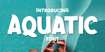 What’s Included : Standard glyphs Ligature Works on PC & Mac Simple installations Accessible in Adobe Illustrator, Adobe Photoshop, Adobe InDesign, even work on Microsoft Word. PUA Encoded Characters – Fully accessible without additional design software. Fonts include multilingual support for; Afrikaans, Albanian, Croatian, Czech, Danish, Dutch, English, Estonian, Finnish, French, German, Hungarian, Italian, Norwegian, Polish, Portuguese, Slovak, Slovenian, Spanish, Swedish
 - Rolam by Twinletter,
$12.00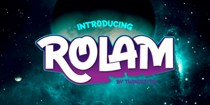 What’s Included : Standard glyphs Ligature Works on PC & Mac Simple installations Accessible in Adobe Illustrator, Adobe Photoshop, Adobe InDesign, even work on Microsoft Word. PUA Encoded Characters – Fully accessible without additional design software. Fonts include multilingual support for; Afrikaans, Albanian, Croatian, Czech, Danish, Dutch, English, Estonian, Finnish, French, German, Hungarian, Italian, Norwegian, Polish, Portuguese, Slovak, Slovenian, Spanish, Swedish
 - Cristal Bendilar by Gian Studio,
$18.00 About Product Cristal Bendilar, Display Typography with Variable Weight and Width. Cristal Bendilar is an elegant modern variable font. It's basically Sans with a touch of serif to each letter. A Simplicity yet very legible with various widths and weights that you can explore, combine, create and help you design things. Font Styles on OTF files or even more if you use Single File Variables, you can shift weight and width in the sweetest places in Cristal Bendilar. What you get: Language Support: English, French, German, Indonesia, Ireland, Italy, Low German, Norwegian, Portuguese, Swedish, Swiss German. Thank You.
 - Liturgisch - Personal use only

- Mavericks Original by Bruised Goods,
$18.00 MAVERICKS ORIGINAL – A smooth and sturdy, handcrafted font, inspired by California surf culture and all things midcentury modern. Designed by Lauren Kilbane (on the other coast!) in sunny South Florida, USA. Use this font for: ads, album covers, apparel, cards, flyers, invitations, logos, menus, merchandise, packaging, signage, web, and more. 257 Glyphs Total: Uppercase, Lowercase, Numbers, Symbols, Punctuation, & Language Support. Language Support: Danish, English, French, German, Irish, Italian, Portuguese, Spanish, Swedish, & Swiss German.
 - Blauhaus by Hanoded,
$15.00 Yes, you're right. Blauhaus should have been 'Blaues Haus', as that is the proper way of saying Blue House in German. But hey, Blauhaus sounds much better and in writing, it is quite similar to Bauhaus. Blauhaus is a stylish, rounded sans serif font, modeled after some early 20th century German typefaces. It is easy on the eye and it will certainly give your work a sophisticated punch. Comes with a classy collection of diacritics.
 - ITC Bauhaus by ITC,
$40.99 ITC Bauhaus was designed by Edward Benguiat and Victor Caruso in 1975. They based it on a prototype face drawn by Herbert Bayer in 1925 while he was teaching at the Bauhaus School in Dessau, Germany. ITC Bauhaus has simple geometric shapes and monotone stroke weights. The rounded, open forms and quirky geometric gyrations of ITC Bauhaus will make contemporary graphic designs look both fun and stylish.
 - Feuerfeste - Unknown license

- Black Grotesk by ParaType,
$30.00 Designed at ParaType in 1997 by Tagir Safayev. Based on Gasetny Chorny (“Newspaper Black”), of Ossip Lehmann foundry, St.-Petersburg, 1874, and Kompakte Grotesk of Haas. An old-fashioned German sans serif “Grotesque”. For use in advertising and display typography.
 - Sattler by astype,
$25.00 Joseph Kaspar Sattler, one of the great German art nouveau artists created these nice initials in 1897 for the famous royal monumental book project Die Nibelunge for the Reichsdruckerei Berlin. Only 200 exclusive signed masterpieces were printed in four years from 1900 till 1904. Joseph Sattler was the art director, typographer and designer in one person. The Reichsdruckerei showed samples of the unfinished work in 1900 at the world exhibition in Paris to advertise the high craftsmanship of the German presses. Style Initials A uses the OpenType features Superscript and Scientific Inferiors to change the fill layer. You can combine up to three different color inks.
 - Guenter by ParaType,
$25.00 Guenter type got its name after Guenter Gnauck — the calligrapher from Eastern Germany whose works brought an inspiration and initial incitement for the design. But in contradiction to the calligraphic nature of the inspiration source Guenter has a specific construction that is built solely with straight stems. Like KvadratZ family Guenter belongs to so called 'in-one-touch' series. The first version in one basic style was developed by Zakhar Yaschin in 2001. In 2009 the font was redesigned with addition of 3 new styles and released by ParaType as a family.
 - RMU Initials by RMU,
$20.00 Four fonts entirely of decorative initials of which the uppercase basic letters of RMU Initials One are occupied by Walthari initials, the lowercase ones by Eckmann initials, both released first by Rudhard’sche Gießerei, Offenbach, Germany, about 1900. RMU Initials Two consists of Jubilaeumsinitialen in the uppercases and Augsburger Initialen in the lowercases. RMU Initials Three comes with floral ornaments, whereby the lowercase initials can be colorized by yourself due to non-joining elements. RMU Initials Four consists of hand drawn initials by Rudolf Koch and letters of a former Klingspor font called Queen.
 - Frakto by Linotype,
$29.99Frakto is a two-weight family of calligraphic Fraktur-style typefaces designed by Julius de Goede. One of the main categories of Blackletter typefaces, Fraktur was developed around 1517, and was used throughout Germany and Northern Europe well into the 20th century. With Frakto, Julius de Goede has re-applied the written element of the script back into the Fraktur style, rejuvenating and reinvigorating it for 21st century display use. Frakto is the perfect fit for certificates and newsletter headlines. We recommended using it in point sizes from 12-pt on up. - ITC Dinitials by ITC,
$29.99ITC Dinitials is the work of German designer Helga Joergensen. When I started drawing the first of them, I was very much inspired by dinosaurs, but during the work my fantasy guided me more and more and then became rather fabulous creatures." ITC Dinitials is a capital letter alphabet available in both black on white and white on black weights." - ITC Kokoa by ITC,
$29.99ITC Kokoa is the work of German graphic designer Jochen Schuss. Schuss found the seeds of inspiration on a trip to Ghana and expanded and experimented with the idea on the computer. It includes an array of symbols and borders to complement its stylized letters. ITC Kokoa retains a touch of its African roots but is overall a modern, funky font. - Gayeng by Twinletter,
$12.00 What’s Included : File font Web Fonts Standard glyphs Ligature Works on PC & Mac Simple installations Accessible in Adobe Illustrator, Adobe Photoshop, Adobe InDesign, even work on Microsoft Word. PUA Encoded Characters – Fully accessible without additional design software. Fonts include multilingual support for; Afrikaans, Albanian, Croatian, Czech, Danish, Dutch, English, Estonian, Finnish, French, German, Hungarian, Italian, Norwegian, Polish, Portuguese, Slovak, Slovenian, Spanish, Swedish
 - P22 St G Schrift by IHOF,
$39.95 P22 ST.G Shrift is a font series based on the type designs of Stefan George with an italic version designed by Colin Kahn. Stefan George (1868-1933) was a German poet who led the revolt against realism in German literature. All of his works were privately published and the typefaces that were used reflected his neo-classic and anti-industrial (progessive) aesthetics; oftentimes consisting of his own hand lettering designs. The original font was cast in 1907 by a small foundry in Germany and was used primarily for the works of George as well as other books including a monumental edition of Dante's Divine Comedy. The ST.G Shrift Fonts contained in this set are derived from 3 known variations of the original roman typeface, St.G., found in various books published in Berlin in the early 20th century. ST.G Shrift One contains the most idiosyncratic characters, while ST.G Shrift Two uses more familiar characters as well as a redesign of characters including the t and the k to be more in keeping with modern san-serif designs. The OpenType version of the roman contains both one and two and expands on them by including central European characters, small caps, and small caps titling figures. The Small Caps titling figures are derived from the first version of the typeface. Below is a features list (accessible through the type palette in Adobe programs) and their functions: ST.G Shrift Opentype Features: Small Caps: Changes Lowercase to Small Caps Titling Figures: Changes Uppercase to Titling Caps, and Small Caps to Small Caps Titling Figures Contextual Alternates: Changes Character Set to match ST.G One and changes Small Caps to Titling Small Caps Ornaments: Changes < > and ? (greater, less and bullet) to ornaments ST.G Shrift Italic is an art nouveau version of the roman. The OpenType version includes central European characters, small caps, titling caps, titling small caps and ornaments.
 - TV Nord by Elsner+Flake,
$39.00The typeface family TV Nord is based on the corporate typeface NDR Sans which was developed by Elsner+Flake for the Norddeutsche Rundfunk (www.ndr.de) between 1999 and 2001. This new design came into being as part of a complete overhaul of the visual image of the NDR. This became necessary because the NDR, founded in 1954, incorporated the stations of the East German states Mecklenburg-Vorpommern (1992) and Brandenburg (1997) after the re-unification of Germany. The Hamburg advertising agency DMCGroup developed a new and unified image for the NDR which is in existence to this day. The typeface TV Nord relates to the design of the Trade Gothic and similar American sans serif typefaces of the early part of the last century. Its development concerns itself as much with good legibility for print, as it does for the reproduction on TV screens, which among others, is achieved through its high x-height. The logotype for the NDR as well was developed from the capitals of the NDR Sans. In 2014, the TV Nord was revised stylistically and expanded to incorporate all European-Latin languages. As part of this effort, further complementary cuts were added. - Eurobrush by profonts,
$41.99 Eurobrush Pro is a new handwriting script designed by German type designer Ralph M. Unger. He produced not only the standard Western character complement, but added all of the Eastern European Latin glyphs and, on top of that, even the complete Cyrillic characters. Born and grown up in Th�ringen, former East Germany, Unger has a fair knowledge of Polish and also Russian (Cyrillic). Eurobrush Pro is a very beautiful, casual, informal and modern handwriting in `brush-style of a contemporary type designer. Even though a digitized handwriting, it keeps a very natural and pleasant look, at the same time being generous and well-readable. The individual characters combine quite easily and perfectly with no need for extra variants (although Unger included a number of ligatures). Eurobrush Pro is well-suited for plenty of applications, e.g. personal correspondence, invitations, greeting cards, headlines etc. Eurobrush Pro is supplied in the complete Latin character set (West + East) including ligatures, plus Cyrillic.
 - Feuerfeste Outline - Unknown license

- Vafthrudnir by Scriptorium,
$18.00Vafthrudnir is an original font design which draws on the tradition of Germanic uncial and early gothic calligraphy. It is designed to be extra bold and somewhat rough-hewn, for use in title design, and features variant versions of many of the characters. - Getman by Dima Pole,
$25.00 Getman is a light Gothic typeface. It made all the rules and traditions of classic Gothic typeface, but it has lightweight shapes, making it easy to read and understood. Getman is based on the works of type masters 1910s. This font has all 104 European alphabets, all Slavic alphabets, OpenType features (ligatures, oldstyle numerals, fistorical forms, localized forms, fractions, ordinals and others). Getman has an historic beauty of the medieval Germanic national script. Glory to the Germans!
 - Typex by Device,
$39.00 Based on the lettering used on Alan Turing’s famous code-breaking machine at Bletchley Park, the “Bombe”, and the subsequent British answer to the German Enigma machine, the Typex. Research done at Bletchley Park on their restored and antique machines provided the inspiration. The unusual shapes for the capitals have all been retained - the square O, the monospaced characters and other eccentricities that make it unique. This reference material was then extended to the numerals (which did not exist in the original) and a full international character complement. The initial design of the bombe was produced in 1939 at the UK Government Code and Cypher School (GC&CS) at Bletchley Park by Alan Turing, with an important refinement devised in 1940 by Gordon Welchman. It was based on a device that had been designed in 1938 in Poland at the Biuro Szyfrów (Cipher Bureau) by cryptologist Marian Rejewski, and known as the "cryptologic bomb" (Polish: bomba kryptologiczna). The Bombe was used to break the German Enigma code on a daily basis, and was a vital part of the Allied war effort. The British “Typex" (alternatively, Type X or TypeX) machines were an adaptation of the commercial German Enigma with a number of enhancements that greatly increased its security. It was used from 1937 until the mid-1950s, when other more modern military encryption systems came into use.
 - Wilhelm Klingspor Gotisch by Linotype,
$40.99Wilhelm Klingspor Gotisch appeared in 1925 with the Klingspor font foundry in Offenbach, Germany. Designer Rudolf Koch based his work on the Gothic forms of the 14th century and his broken letter font is often seen in advertisements. However, the ornamental letters do not match today’s legibility standards and Wilhelm Klingspor Gotisch is therefore recommended for use in headlines and short texts with a point size of 12 or larger. - Hot Cup Cake by Olivetype,
$18.00 Hot Cup Cake is a relaxed, fashionable and delicate script font. It looks beautiful on a variety of designs requiring a personalized style, such as wedding invitations, thank you cards, weddings, greeting cards, logos and so on. Hot Cup Cake font contains is supporting 66 languages, which includes: Afrikaans Albanian Catalan Danish Dutch English Estonian Finnish French German Italian Norwegian Portuguese Spanish Swedish Zulu.


