6,962 search results (0.019 seconds)
  1. SF Piezolectric - Unknown license
  2. Jasper BRK - Unknown license
  3. bald - Unknown license
  4. Transistor - Unknown license
  5. Ellipsoideogram - Unknown license
  6. Sucaba - Unknown license
  7. Independant - Unknown license
  8. Futurex Slab - Unknown license
  9. Kiloton - Unknown license
  10. SF Archery Black Outline - Unknown license
  11. Rosango - Unknown license
  12. Blue Highway D Type - Unknown license
  13. Quark Outline - 100% free
  14. FAXADA - Unknown license
  15. Synthetic BRK - 100% free
  16. SF Quartzite Outline - Unknown license
  17. Sujeta - Unknown license
  18. Orthotopes Oblique - Personal use only
  19. twenty four - Unknown license
  20. !Y2KBUG - Unknown license
  21. GrekoDeco - Unknown license
  22. ArtificeSSK - Unknown license
  23. RoboKoz - Unknown license
  24. M+ 2c - Unknown license
  25. Refrigeration - Unknown license
  26. Chlorix - Unknown license
  27. Lady Ice - Condensed - Unknown license
  28. Kaput Black - Personal use only
  29. Geoplace SC - Personal use only
  30. Kaput Black Black - Personal use only
  31. Campeno by Craft Supply Co, $20.00
    Geometric Precision Let’s step into the world of Campeno, a Geometric Sans Serif font that embodies precision and order. This font is the epitome of geometric perfection, making it an ideal choice for various editorial applications. Editorial Excellence Campeno’s geometric form is what sets it apart and makes it a top choice for editorial needs. Whether you’re working on magazines, long-form text, or other editorial projects, its geometric precision enhances readability and offers editorial excellence. Versatile Typography What makes Campeno even more exceptional is its versatility. It seamlessly adapts to diverse design contexts, ensuring that it can be used for a wide range of projects, from magazines to websites and beyond. Engaging Readability Beyond its geometric aesthetics, Campeno excels in providing engaging readability. It guides the reader through the content, focusing on the message while maintaining a visually appealing design. In Conclusion In summary, Campeno – Geometric Sans Serif is the font that brings precision and clarity to your editorial projects. Its geometric form ensures that your content is not only engaging but also visually appealing, catering to a broad readership while maintaining a high standard of clarity. Whether you’re working on magazines, websites, or other editorial endeavors, Campeno stands out as a font that combines aesthetics with functionality, offering editorial excellence for your projects.
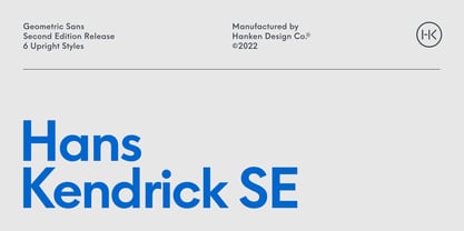
  32. Hans Kendrick SE by Hanken Design Co., $30.00
    Hans Kendrick SE is geometric sans typeface inspired by Avenir and Futura. It is the second edition of the Hans Kendrick typeface improving on its geometric consistency, weight distribution, and overall rendering quality.
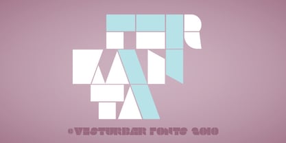
  33. Ferkanta by Vesturbær, $20.00
    Geometric design for massive posters!
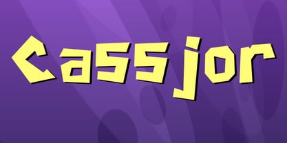
  34. Cassjor by Wooden Type Fonts, $15.00
    An avant garde design, geometric.
  35. K haus 105 by Talbot Type, $19.50
    K-haus 105 is inspired by the work of graphic designer and typographer, Herbert Bayer, during his time at the Bauhaus around 100 years ago — work that kick-started graphic design as we know it, to this day. It owes something to the simple geometry of Bayer’s hand-drawn, ‘universal typeface’, updated and expanded to deliver a clean, balanced, geometric sans for today. Also available as K-haus 205 , featuring a few, more 'daring' characters here and there, chiefly in the lower case set. Both variations include an extended character set, featuring accented characters for Central European languages.
  36. K haus 205 by Talbot Type, $19.50
    K-haus 205 is inspired by the work of graphic designer and typographer, Herbert Bayer, during his time at the Bauhaus around 100 years ago — work that kick-started graphic design as we know it, to this day. It owes something to the simple geometry of Bayer’s hand-drawn, ‘universal typeface’, updated and expanded to deliver a clean, balanced, geometric sans for today. Also available as K-haus 105 , featuring a few different characters here and there, chiefly in the lower case set. Both variations include an extended character set, featuring accented characters for Central European languages.
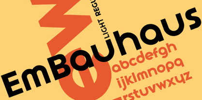
  37. EmBauhaus by Emboss, $25.00
    EmBauhaus is a display typeface, geometric in style, inspired by the face named after the world changing Bauhaus School. To aid readability I rethought the original typeface and closed all of the voids cut out of the strokes. We also modified the upper case to make it a more traditional design. An example of this is the upper case L, where a 90 degree angle was added.  This typeface was designed to be used judiciously in a layout, to draw focus to words and headlines, using stark angles, radii and geometry to create visual rhythm and gestalt.
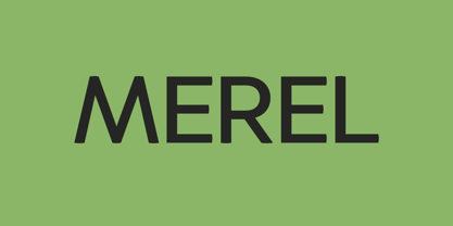
  38. Merel by Inhouse Type, $33.78
    Merel is a modern geometric typeface with humanist attributes. Geometry and logic are at the heart of this 6 weight font family. Humanist touches give it a number of distinctive characteristics, as well as aid legibility. Despite being rational and function driven in its nature, Merel has a soft and gentle touch. It was designed to tackle both print and onscreen challenges of the modern environment. Details include reduced x-height, mild stroke contrast and vertically sheared terminals with cushioned finish across the typeface. Merel features a number of alternative characters, manually edited kerning and Opentype features.
  39. Malmo Sans Pro by Martin Lexelius Core, $33.00
    Malmö Sans was born from the preconception that geometry is neutral, and neutral fonts have a wide application window. No ornaments, no quirks – just clean. Design process: establishing the main proportions, grids and library of geometric shapes. However, people are not math, people are not built from grids. We are irregular, not always logical, and, foremost, we are human. So: humanisation – define parts and areas, and make the needed adjustments to shapes and forms, although being mathematically correct. Basically, changing it into something that pleases the eye. Much effort has been made to achieve equal parts minimalism, aesthetics and legibility.
  40. FS Meridian Variable by Fontsmith, $199.99
    Timeless imperfection FS Meridian is a rhythmic geometric grotesque which takes inspiration from the precise yet imperfect nature of time. There are 24 hours in a day. 60 minutes in an hour. 60 seconds in a minute. Well, almost. The Earth’s orbit isn’t a perfect circle – and nor is the Earth itself. Each day varies a few dozen seconds and up to 16 minutes each year. Look closer and time is more flexible than we think. Geometry with a twist From a geometric base, FS Meridian’s rounded forms veer and extend, creating unexpected humanistic shapes – while the straight terminals remain reliably rigid. This combination of forms gives this grotesque sans serif a pleasingly dynamic rhythm, every time it’s read. Added quirks The unconventional character of rigid terminals and ink traps are balanced with emphasized extended forms to develop visual differentiation. Designed by Kristina Jandová, the complete family has been carefully crafted with distinguishing marks. Take a look at the cap ‘Q’ which comes with three alternative options. Deliciously loopy FS Meridian has a wide geometric, mono-liner appearance with humanistic elements. Quirky individual touches like the loopy expressive pound sign help the typeface to stand out. Available in five weights, FS Meridian is both timeless and timely, a distinctive font for all screens and surfaces.
Looking for more fonts? Check out our New, Sans, Script, Handwriting fonts or Categories
abstract fontscontact usprivacy policyweb font generator
Processing