8,611 search results
(0.016 seconds)
- Jaggers by Victory Type,
$20.00 - ITC Fenice by ITC,
$29.99
- Angekia by Cocodesign,
$12.00
- Wedney by Cocodesign,
$12.00
- Switzal by Four Lines Std,
$15.00
- Holier Than Thou by Comicraft,
$19.00
- Aesthetic Notes by Letterhend,
$19.00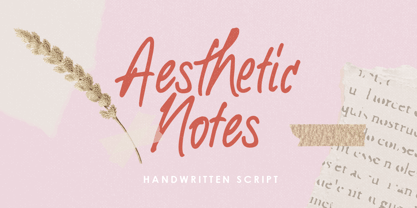
- Night Mares by Ake,
$12.00
- Big Wave by Vozzy,
$10.00
- Shaman by ITC,
$29.99
- Clinica Pro by Mint Type,
$-
- Nido by Latinotype,
$19.00
- Romantina Script by Jorsecreative,
$20.00
- Perfect Delight 1992 by Four Lines Std,
$15.00
- Doll by FaceType,
$30.00
- Balaghat by Dharma Type,
$19.99
- Vida Bandida by Vozzy,
$20.00
- Tacky Font by Ingrimayne Type,
$14.95
- Pricedown - Unknown license

- Earwig Factory - Unknown license

- Telegrafico - Unknown license

- Kenyan Coffee - Unknown license

- Prime Minister of Canada - Unknown license

- Pupcat - Unknown license

- Steelfish - Unknown license

- Karma Future - Unknown license

- Vectroid - Unknown license

- Overload Burn - Unknown license

- Urkelian - Unknown license

- Velvenda Megablack - 100% free

- Typodermic - Unknown license

- Minya Nouvelle - Unknown license

- Kredit - Unknown license

- Deluxe Ducks - Unknown license

- Birdland Aeroplane - Unknown license

- Neurochrome - Unknown license

- Radios in Motion Hard - Unknown license

- First Blind 2 - Unknown license

- Hurry Up - Unknown license

- Rina - Unknown license


