8,331 search results
(0.038 seconds)
- UniLeaf - 100% free

- Bastardilla - Personal use only

- Andrew Ward - 100% free

- Creation - Unknown license

- VampyrishABC-Oblique - 100% free

- Linear Beam - Personal use only

- RhumbaScript - 100% free

- Wendelin - Unknown license

- Stride - Unknown license

- Blue July - Personal use only

- SF Technodelight - Unknown license

- LT Stopwatch - 100% free

- FEAR Logo - Personal use only

- Getboreg Slab - Personal use only

- Fear Logo Fires Trial - Personal use only

- Bassen by SRS Type,
$25.00 Bassen is a contemporary neo-grotesque typefaces that offers 10 uprights and matching italics. This typeface harmoniously combines classic respect with modern inspiration. Bassen is polite, neutral, highly legible, and aesthetically pleasing. Its low cap height makes it particularly versatile for mobile and website applications. Bassen seamlessly blends with any project, providing natural elegance, harmony, and perfect balance.
 - Sabon Paneuropean by Linotype,
$45.99Jan Tschichold designed Sabon in 1964, and it was produced jointly by three foundries: D. Stempel AG, Linotype and Monotype. This was in response to a request from German master printers to make a font family that was the same design for the three metal type technologies of the time: foundry type for hand composition, linecasting, and single-type machine composition. Tschichold turned to the sixteenth century for inspiration, and the story has a complicated family thread that connects his Sabon design to the Garamond lineage. Jakob Sabon, who the type is named for, was a student of the great French punchcutter Claude Garamond. He completed a set of his teacher's punches after Garamond's death in 1561. Sabon became owner of a German foundry when he married the granddaughter of the Frankfurt printer, Christian Egenolff. Sabon died in 1580, and his widow married Konrad Berner, who took over the foundry. Tschichold loosely based his design on types from the 1592 specimen sheet issued by the Egenolff-Berner foundry: a 14-point roman attributed to Claude Garamond, and an italic attributed to Robert Granjon. Sabon was the typeface name chosen for this twentieth century revival and joint venture in production; this name avoided confusion with other fonts connected with the names of Garamond and Granjon. Classic, elegant, and extremely legible, Sabon is one of the most beautiful Garamond variations. Always a good choice for book typography, the Sabon family is also particularly good for text and headlines in magazines, advertisements, documentation, business reports, corporate design, multimedia, and correspondence. Sabon combines well with: Sans serif fonts such as Frutiger, Syntax. Slab serif fonts such as PMN Caecilia, Clairvaux. Fun fonts such as Grafilone, Animalia, Araby Rafique. See also the new revised version Sabon Next from the Platinum Collection." - Oliver Quin by Gittype,
$20.00 Oliver Quin, a beautiful and stylish low italic script handwriting font. Oliver Quin offers a harmonious pen movement for a diversity of design projects, including logos and branding, wedding designs, social media posts, advertisements, poster, watermark photography, and more.
 - Aragon Condensed by Canada Type,
$24.95The condensed version of Hans van Maanen's Aragon is a headline star. The elements that made Aragon a popular "Dutch Garamond" text repeat here, with the slight stress shifts and tapering stems optimized for headline use. Aragon Condensed also comes in bold and italic variations. All three fonts contain extended language support, superiors and inferiors, and class-based kerning. - Garalda by TypeTogether,
$49.00 Type designer Xavier Dupré’s Garalda is a charming 21st century family that renews a legacy of finesse. As paragraphs on a page, Garalda’s overall impression is of a workaday personality, committed to the main purpose of the job: easy long-form reading. But setting it in display sizes proves something different: This reinvented Garamond is anything but basic. The Garalda story begins with the serendipitous finding of a book typeset in a rare Garalde, called Tory-Garamond, with which Dupré was not immediately familiar. This Garamond was used in bibliophile books in the decades surrounding 1920, but after that it became déclassé for an unknown reason. Dupré found the italic styles especially charming and discovered the family was probably the mythical Ollière Garamond cut from 1914. He obtained low resolution scans of the typeface and used them, rather than high resolution scans, as the basis for his new type family. This allowed Dupré the mental freedom to experiment and remix as he saw fit, culminating in a contemporary family with heritage. As seen in the simplistic rectangular serifs, Garalda is a humanist slab serif, but with a mix of angles and curves to give the classic shapes a fresh, unorthodox feeling. While almost invisible in paragraph text, these produce a graphic effect in display work. The set of ligatures in the roman and italics lend themselves to unique display use, such as creating lovely logotypes. In the italics, some swashes inspired by different historic Garamonds are included, sometimes breaking their curves to be more captivating. Just look at how the italic ‘*-s’ ligatures create ‘s’ with a cursive formation rather than merely a flowing slant. And how the roman ‘g’ link swings as wide as a trainer’s whip. These are all balanced by squared serifs in the roman to keep an overall mechanised regularity. The Garalda family comes in eight styles, includes some of the original arrows and ornaments, and speaks multiple languages for all typesetting needs, from pamphlets to fine book printing. The complete Garalda family, along with our entire catalogue, has been optimised for today’s varied screen uses.
 - Roble by Latinotype,
$26.00 Roble is a Slab Serif Font, from a mix between Andes and Sanchez, following a harmony with both fonts one sans and one serif with a fresh and dynamic result. Roble is a family of 16 display fonts 8 weights plus italics.
 - Nike Combat Stencil - Unknown license

- Dark Future - Personal use only

- WANT SOME CANDY - Personal use only

- london 2012 - Personal use only

- Moeflon - Unknown license

- Stilla - Unknown license

- Mathmos Original - Unknown license

- Newslab by Latinotype,
$26.00 Newslab is a slab serif font – designed by Daniel Hernández – which is the result of the combination of three different typefaces: Andes, Sánchez and Roble. Harmony among every feature of the typefaces makes Newslab a neutral but imposing font. The Newslab font family consists of 16 variants and 8 weights, with italics. Well-suited for editorial projects, logotypes, posters, etc. Regular and italic variants are available for free.
 - Boscribe by Monotype,
$29.99Bo Berndal's handwriting was terrible in his younger days, and he could not even read his own notes. When he started out as an apprentice in a printing shop, he started to copy Garamond italic and formed his own style of writing. Later he was inspired by both Alfred Fairbanks and his reform-writing and by Paul Standard in the U.S.A and created the Boscribe font. - Barbra by Nurrontype,
$17.00 Barbra is a display font family with unique letterforms and harmonization. It's bold, brutalist, gorgeus and emotional. While I developed Barbra, my mom passed away. It's broken my heart. So I tried to represent my mixed feeling in Barbra with the expressive curve in each letterform. Up and down, right to the left. The uppercase will make your headline stand out, fresh, and organic, even when you use it for your next logo project. While the lowercase is designed to make a harmonization when you put in words or sentences. FEATURES — Total glyph set: 246 — 4 Families (Regular, Italic, SemiCondensed Regular, Semicondensed Italic) — OpenType Features: — Lowercase — Uppercase — Ligatures — Numbers — Symbols — Diacritics — Stylistic Alternates
 - Roble Alt by Latinotype,
$26.00 Roble Alt is a variation of Roble. It is a Slab Serif Font, from a mix between Andes and Sanchez, following an harmony with both fonts one sans and one serif with a fresh and dynamic result. Roble Alt is a family of 16 display fonts 8 weights plus italics.
 - Aksara by Lafontype,
$28.00 Aksara is a sans serif font with a geometric touch. Aksara is not purely geometric, proportions have been designed so that all characters can look harmonious and have better readability. Aksara comes with five types of weights including Italic style, bringing a total of ten styles and has been supported in various languages.
 - Sabon by Linotype,
$45.99 In the early 1960s, the German Master Printers’ Association requested that a new typeface be designed and produced in identical form on both Linotype and Monotype machines so that text and technical composition would match. Walter Cunz at Stempel responded by commissioning Jan Tschichold to design a new version of Claude Garamond’s serene and classical Roman. Its bold, and particularly its italic styles are limited by the requirements of Linotype casting machines, forcing the character widths of a given letter to match between styles, giving the italic its characteristic narrow f. The family’s name is taken from Jacques Sabon, who introduced Garamond’s Romans to Frankfurt. Sabon has long been a favorite of typographers for setting book text, due to its smooth texture, and in large part because Tschichold’s book typography remains world famous.
 - Trump Mediaeval Office by Linotype,
$50.99The Trump Mediaeval Office family is designed after the model of the original serif family produced by Georg Trump in 1954. Trump released this typeface through the C.E. Weber type foundry in Stuttgart, and Linotype quickly cut the face for mechanical composition. Thereafter it became popular around the world. One of the most prolific German type designers of the 20th century, Trump created numerous typefaces in several different styles, but Trump Mediaeval is often regarded as his best work. Trump Mediaeval is an old style serif typeface, with new inherent quality that could only have come about after centuries of variation on this theme. It bears some resemblance to the classic Garamond typefaces, yet its characteristic letters set it apart in a positive way. Akira Kobayashi, Linotype’s Type Director, released his own revived design, Trump Mediaeval Office, in 2006. Trump Mediaeval Office has two weights, each with an italic companion. Unlike the original design, Kobayashi has harmonized the varying letterforms across the two weights, allowing Regular and Bold text to stand side by side harmoniously. Trump Mediaeval’s numbers now match across weights as well, optimizing their legibility in sizes large and small. Decades ago, Trump Mediaeval was a popular choice for setting book texts, because of its robust serifs. These are exactly what make the face a good choice for office application today; on lower-resolution printers, these serifs will still remain a strong feature on the letterform, increasing legibility along the line of text. - Augereau by Abrams Legacy,
$52.00Named for Antoine Augereau, teacher of Claude Garamond, this much admired rendition of the classic Garamond typeface was created by George Abrams and released in 1997. - Lieur by inkstypia,
$3.00 Lieur is a minimalist, geometric, sans serif font suitable for logos, label designs, or even just plain body text. It comes with 2 styles, Normal and Italic, and includes Light, Regular, Medium, Bold, and Black weights to give you great possibility to harmonize the look and feel of your text.
 - Bettrish by Bluestudio,
$6.00 Bettrish is made to resemble scratchy quick hand writing, so it looks like a natural style like your own scribbles. Bettrish offers beautiful typographic harmony for a variety of design projects, including logos & branding, wedding designs, social media posts, advertisements, product designs, magazines and more. What's included? -Bettrish Regular (OTF) -Bettrish Italic (OTF) -Ligatures -Multilingual support
 - Sovage by Mainelli,
$17.00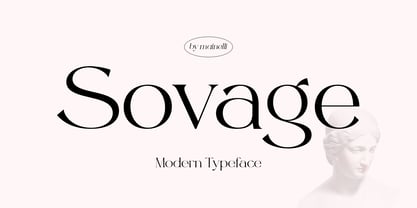 Sovage is a modern minimalist font style and clean feel. To help your creative work, Sovage comes with a regular version and an italic version and is perfect for mixing and matching your creative works harmoniously such as for magazine pictures, for wedding invitations, for branding, poster design, and many others. Sovage Features: Multilanguange PUA Encoded Alternates Ligatures.
 - Cendra by Locomotype,
$23.00 Introducing Cendra, a cutting-edge typeface meticulously crafted to seamlessly blend functionality and personality into a harmonious masterpiece. Elevate your design projects with Cendra, boasting an impressive range of 8 weights, from the delicate Thin to the commanding Black. Embrace the synergy of upright and matching italics versions, ensuring your designs exude a dynamic and cohesive aesthetic.


