10,000 search results
(0.022 seconds)
- DINk - 100% free
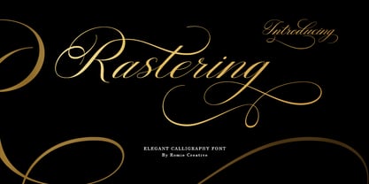
- Rastering by Romie Creative,
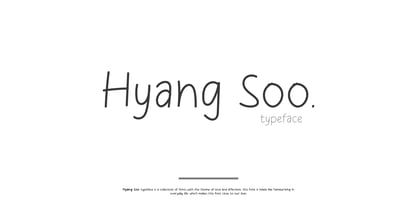
$19.00 - Hyang Soo by Phoenix Group,
$9.00 - FS Split Sans by Fontsmith,
$80.00Quirky and irregular FS Split is no ordinary typeface. Its irregular proportions make it unique, with round letters appearing wide, and straight letters narrow. Other quirks include its eclectic crossbars – the uppercase ‘A’ has an unusually low bar, while the bar on ‘G’ is particularly long. The uppercase has many interesting features in fact, including large counters, closed terminals on certain letters like ‘J’, and a cap-height that lines up with ascenders. The lowercase also holds surprises – the dots on ‘i’ and ‘j’ are unusually large, and some characters, such as ‘g’, feature double-storey counters. An extreme but stylish italic The italic versions of FS Split Sans and Serif are particularly striking. While similar in style to their upright, Roman versions, they take on a larger-than-usual 18-degree angle, making the forward-slant more dramatic. Although the main purpose of any italic is to help words and phrases stand out, this unique execution helps to make the italic variants of FS Split stylish fonts in their own right – they would work brilliantly on magazine covers, in titles and headlines, pull quotes, and even used commercially in logos and corporate branding. Serif and sans: a split personality FS Split Sans and Serif have their differences but also their similarities, contrasting and complementing each other perfectly. This ‘love hate’ relationship inspired the name of the typeface family, and means the two variants provide a versatile, typographic palette for use in graphics and branding. While its proportions are similar to the sans, the serif has a bigger contrast between its weights of bold, regular and light, bracketed serifs, and different styles of terminals, some being straight and others ball-shaped. FS Split Sans has more subtlety and simplicity, with a smaller weight contrast, less flamboyant terminals, and more consistent counter sizes. The two variants are distinct yet alike, so can be used successfully either in isolation or together. - FS Split Serif by Fontsmith,
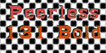
$80.00Quirky and irregular FS Split is no ordinary typeface. Its irregular proportions make it unique, with round letters appearing wide, and straight letters narrow. Other quirks include its eclectic crossbars – the uppercase ‘A’ has an unusually low bar, while the bar on ‘G’ is particularly long. The uppercase has many interesting features in fact, including large counters, closed terminals on certain letters like ‘J’, and a cap-height that lines up with ascenders. The lowercase also holds surprises – the dots on ‘i’ and ‘j’ are unusually large, and some characters, such as ‘g’, feature double-storey counters. An extreme but stylish italic The italic versions of FS Split Sans and Serif are particularly striking. While similar in style to their upright, Roman versions, they take on a larger-than-usual 18-degree angle, making the forward-slant more dramatic. Although the main purpose of any italic is to help words and phrases stand out, this unique execution helps to make the italic variants of FS Split stylish fonts in their own right – they would work brilliantly on magazine covers, in titles and headlines, pull quotes, and even used commercially in logos and corporate branding. Serif and sans: a split personality FS Split Sans and Serif have their differences but also their similarities, contrasting and complementing each other perfectly. This ‘love hate’ relationship inspired the name of the typeface family, and means the two variants provide a versatile, typographic palette for use in graphics and branding. While its proportions are similar to the sans, the serif has a bigger contrast between its weights of bold, regular and light, bracketed serifs, and different styles of terminals, some being straight and others ball-shaped. FS Split Sans has more subtlety and simplicity, with a smaller weight contrast, less flamboyant terminals, and more consistent counter sizes. The two variants are distinct yet alike, so can be used successfully either in isolation or together. - Peerless 131 Bold by Wooden Type Fonts,
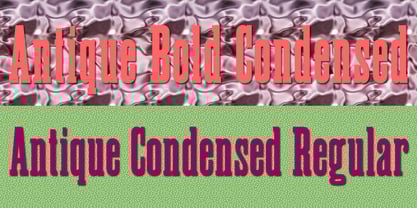
$15.00 - Antique Condensed by Wooden Type Fonts,
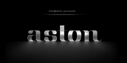
$15.00 - Aston by Fontfabric,
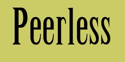
$40.00 - Peerless by Wooden Type Fonts,
$15.00 - Antique Sans by Wooden Type Fonts,
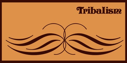
$15.00A modified remake of one of the popular wooden type fonts of the 19th century. An extra bold sans serif suitable for display. - Tribalism by Intellecta Design,
$19.90 - Miltorn by Letterhend,
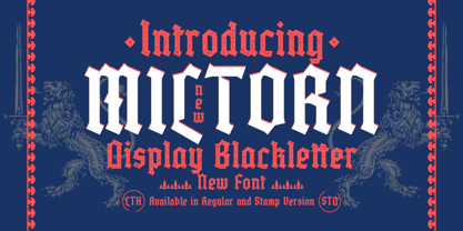
$14.00Introducing, Mictorn - A display blackletter typeface in 2 style regular & stamp. It comes with ornament bonus. This type of font perfectly made to be applied especially in logo, and the other various formal forms such as Logo, Clothing, Fashion, Headline, or any type of advertising purpose. Features : Uppercase & lowercase Numbers and punctuation Alternates & Ligatures Multilingual PUA encoded - 2 Mass J1808 by Kosinsky,
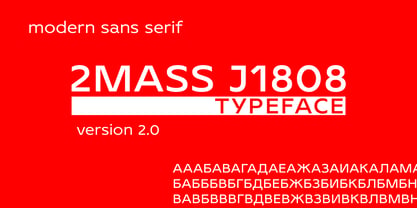
$30.002Mass J1808 is an experimental modern sans serif typeface. Open geometric shapes combined with futuristic style and wide letters make the text he typed quite attractive. Perfect for creating modern branding, logos, website design and many other ideas. Supports extended Latin, Cyrillic and OpenType functions. The font was developed in 2018-2020. Type designer Igor Kosinsky. - Garagum by Belli Creative,
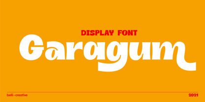
$19.00Garagum is a display font harmonizing traditional and modern vibes. It has beautifully crafted nine swashes. It’s fun, interesting and perfectly fits different kinds of design works, such as posters, book or album covers, digital spaces, or any other mediums that you want. It supports various Latin-based languages and comes with powerful open type and true type features. - Heist by Nyalaapi,
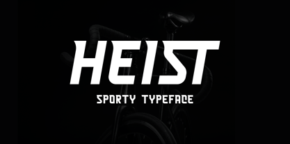
$15.00Heist is a sporty font, comes with two styles that make perfect for your design. Ideal for branding project, logos, quotes and every other design which need strong feel. Features - 4 Ligatures - Multilingual support Open type features can be accessed using Open Type programs such as Adobe Illustrator CS/CC, Adobe Photoshop CS/CC, Adobe Indesign & CorelDraw X6-X7. - Oration by RagamKata,
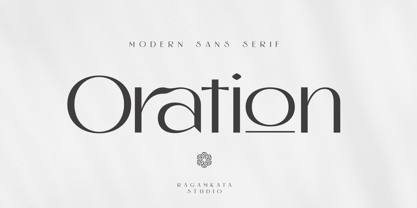
$16.00Orient is a elegant and feminine sans serif with a touch of modern look and feel. This type of font perfectly made to be applied especially in logo, headline, signage and the other various formal forms such as invitations, labels, logos, magazines, books, greeting / wedding cards, packaging, fashion, make up, stationery, novels, labels or any type of advertising purpose. - Ex Libris by Fenotype,
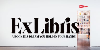
$25.00Ex Libris is a high contrasted Flared Serif font family in two weights. Ex Libris is a display type and it’s at its best in headlines, branding, packaging or as a logotype. Try adding some extra flair with Swash, Stylistic or Titling Alternates or wield any of Ex Libris’s 33 Discretionary Ligatures when typing in caps. - Chuck by Parkinson,
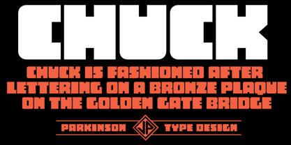
$20.00Chuck. Designed in 2004 by Jim Parkinson. Originally released as a Type 1 font, Chuck was refreshed (version2) and re-released as simple Open Type in 2012. The models for this massive Deco typeface appear on a bronze plaque on the South Tower of the Golden Gate Bridge. The plaque commemorates the builders of the bridge. - Campaign by Solotype,
$19.95We saw a zigzag type like this made in the 1860s. We copied the idea, but added stars to make it patriotic. As with many highly specialized fonts, you won't want to use this every day but certainly, like other "stars and stripes" types, it implies something about the message even before one reads the words. - Beaumont by Studio Buchanan,
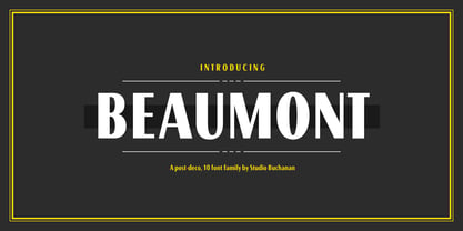
$12.00Beaumont is a modern take on classic 1920's type, playing with stroke contrast and art deco forms. The result is a 10 font family, providing options for setting readable body copy or high impact display headings. With full multilingual character support, stylistic alternates and a range of open type features, Beaumont is perfect for a variety of situations. - Corpo Serif by Borutta Group,
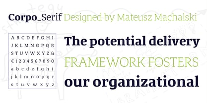
$19.00Corpo Serif is REFRESHED version of my old font Korpo Serif. Corpo Serif, designed by Mateusz Machalski, is a serif type family with a friendly feel. This type comprises 12 variants with 6 weights. The high contrast and high x height is perfect for headlines and display uses. Corpo Serif is a great complement for Corpo Sans. - Sporting Event JNL by Jeff Levine,
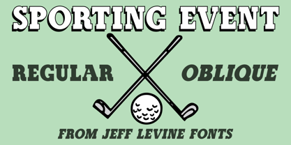
$29.00A British boxing film from 1953 called “The Square Ring” had its titles and credits hand lettered in a slab serif type style commonly referred to as “Egyptian”. Other familiar type fonts which share this influence are Karnak, Stymie and Beton. Sporting Event JNL was modeled from the film’s titles and is available in both regular and oblique versions. - Woodbranch JNL by Jeff Levine,
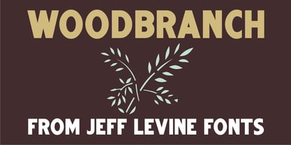
$29.00Woodbranch JNL is a solid version of the 2013 font release Woodlawn JNL. The design was originally based on examples of an outline (open face) wood type. This interpretation takes on newer, stronger characteristics as a bold typeface when the "inner letters" of the original alphabet were removed, yet the imperfection of the wood type pieces are still maintained. - MPI French Clarendon by mpressInteractive,
$5.00French Clarendon was an extremely popular wood type font. Characters are heavy and condensed with bracketed serifs, which measure approximately 1/4 to 1/3 the height of the letter. Dozens of decorative wood type designs have been created based on French Clarendon. It was marketed as a wood letter by William H. Page & Company in 1865. - Linotype Auferstehung by Linotype,
$29.99Linotype Auferstehung is part of the Take Type Library, selected from contestants of Linotype’s International Digital Type Design Contests of 1994 and 1997. German designer Johannes Plass was influenced by historic broken letter faces, particularly Caslon Gotisch, although the rounded corners give the font a handwritten look. Linotype Auferstehung is particularly good for headlines in larger point sizes. - Hipsterious by Letterhend,
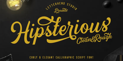
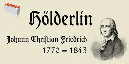
$15.00Hipsterious is casual and fun script that stands out from the crowd. Consist of two types, a regular and rough. Perfect to be used especially for logo type, signature, photography, quotes, apparel design, and any design needs. As usual, the font comes with many opentype features such as ligatures, stylistic set alternate, etc and also support multilingual. - Hoelderlin by RMU,
$25.00In 1938 the Frankfurt-based foundry Ludwig & Mayer released Eugen Weiss’ beautiful fraktur ‚Hoelderlin‘. Carefully redrawn and redesigned, this digitized version is intended to add another gem to the enthusiasts’ treasure drove of blackletter types. The font contains the historical long s which can be reached by the OpenType feature historical forms or by typing the integral sign [ ∫ ]. - AI Wood by Alphabets,
$17.95These six faces are interpreted from examples shown in Rob Roy Kelly's "American Wood Types" They are not merely scanned copies, but have been redrawn from scratch with various optical adjustments. Kelly points out that the true glory of the American Wood Types are the negative spaces, which are, in their dynamic active forms, the antithesis of the anemic flimsy letters produced by type foundries in the 19th century. The Alphabets Wood Types are designed with digital manipulation in mind. Stretch, curve and distort at will! These designs were released prior to similar revivals from Adobe. Each font has two full alphabets (one full height, one smaller) and numerals. However, certain points and accents will not be found. - LTC Kaatskill by Lanston Type Co.,
$24.95LTC Kaatskill was made specifically for use in an edition of Rip Van Winkle for the Limited Editions Club. "I feel that Kaatskill owes nothing in its design to any existing face, and the type therefore is as truly an American type as anything so hidebound by tradition as type can be."- F. Goudy This face was one of the first digital typefaces released by the Lanston Type Co. Ltd. Jim Rimmer took painstaking measures in his faithful revival. Goudy had never designed a specific Italic to accompany this face. The Italic completed by Rimmer is a variation on Deepdene Italic. The font set was re-mastered in 2006 by Colin Kahn. - FS Lucas by Fontsmith,
$80.00Pure and not-so-simple Maybe it’s the air of purity, openness and transparency that they transmit, but geometric typefaces are more popular than ever among leading brands. Based on near-perfect circles, triangles and squares, geometric letterforms look uncomplicated, even though making them readable is anything but – something the designers of the first wave of geometric fonts discovered nearly a century ago. Many of the world’s most recognisable brands in technology, retail, travel, food, manufacturing and other industries continue to be drawn to the straightforward, honest character that geometric fonts convey. Fontsmith set out in 2015 to develop a typeface in the same tradition, but optimised for the demands of modern brands – online and offline usage, readability and accessibility. And, of course, with the all-important Fontsmith x-factor built in. FS Lucas is the bold and deceptively simple result. Handle with care The letterforms of FS Lucas are round and generous, along the lines of Trajan Column lettering stripped of its serifs. But beware their thorns. Their designer, Stuart de Rozario, who also crafted the award-winning FS Millbank, wanted a contrast between spiky and soft, giving sharp apexes to the more angular letterforms, such as A, M, N, v, w and z. Among his inspirations were the colourful, geometric compositions of Frank Stella, the 1920s art deco poster designs of AM Cassandre, and the triangular cosmic element symbol, which led him to tackle the capital A first, instead of the usual H. The proportions and angles of the triangular form would set the template for many of the other characters. It was this form, and the light-scattering effects of triangular prisms, that lit the path to a name for the typeface: Lucas is derived from lux, the Latin word for light. Recommended reading Early geometric typefaces were accused of putting mathematical integrity before readability. FS Lucas achieves the trick of appearing geometric, while taking the edge off elements that make reading difficult. Perfectly circlular shapes don’t read well. The way around that is to slightly thicken the vertical strokes, and pull out the curves at the corners to compensate; the O and o of FS Lucas are optical illusions. Pointed apexes aren’t as sharp as they look; the flattened tips are an essential design feature. And distinctive details such as the open terminals of the c, e, f, g, j, r and s, and the x-height bar on the i and j, aid legibility, especially on-screen. These and many other features, the product of sketching the letterforms in the first instance by hand rather than mapping them out mechanically by computer, give FS Lucas the built-in humanity and character that make it a better, easier read all-round. Marks of distinction Unlike some of its more buttoned-up geometric bedfellows, FS Lucas can’t contain its natural personality and quirks: the flick of the foot of the l, for example, and the flattish tail on the g and j. The unusual bar on the J improves character recognition, and the G is circular, without a straight stem. There’s a touch of Fontsmith about the t, too, with the curve across the left cross section in the lighter weights, and the ampersand is one of a kind. There’s a lot to like about Lucas. With its 9 weights, perfect proportions and soft but spiky take on the classic geometric font, it’s a typeface that could light up any brand. - FS Lucas Paneureopean by Fontsmith,
$90.00Pure and not-so-simple Maybe it’s the air of purity, openness and transparency that they transmit, but geometric typefaces are more popular than ever among leading brands. Based on near-perfect circles, triangles and squares, geometric letterforms look uncomplicated, even though making them readable is anything but – something the designers of the first wave of geometric fonts discovered nearly a century ago. Many of the world’s most recognisable brands in technology, retail, travel, food, manufacturing and other industries continue to be drawn to the straightforward, honest character that geometric fonts convey. Fontsmith set out in 2015 to develop a typeface in the same tradition, but optimised for the demands of modern brands – online and offline usage, readability and accessibility. And, of course, with the all-important Fontsmith x-factor built in. FS Lucas is the bold and deceptively simple result. Handle with care The letterforms of FS Lucas are round and generous, along the lines of Trajan Column lettering stripped of its serifs. But beware their thorns. Their designer, Stuart de Rozario, who also crafted the award-winning FS Millbank, wanted a contrast between spiky and soft, giving sharp apexes to the more angular letterforms, such as A, M, N, v, w and z. Among his inspirations were the colourful, geometric compositions of Frank Stella, the 1920s art deco poster designs of AM Cassandre, and the triangular cosmic element symbol, which led him to tackle the capital A first, instead of the usual H. The proportions and angles of the triangular form would set the template for many of the other characters. It was this form, and the light-scattering effects of triangular prisms, that lit the path to a name for the typeface: Lucas is derived from lux, the Latin word for light. Recommended reading Early geometric typefaces were accused of putting mathematical integrity before readability. FS Lucas achieves the trick of appearing geometric, while taking the edge off elements that make reading difficult. Perfectly circlular shapes don’t read well. The way around that is to slightly thicken the vertical strokes, and pull out the curves at the corners to compensate; the O and o of FS Lucas are optical illusions. Pointed apexes aren’t as sharp as they look; the flattened tips are an essential design feature. And distinctive details such as the open terminals of the c, e, f, g, j, r and s, and the x-height bar on the i and j, aid legibility, especially on-screen. These and many other features, the product of sketching the letterforms in the first instance by hand rather than mapping them out mechanically by computer, give FS Lucas the built-in humanity and character that make it a better, easier read all-round. Marks of distinction Unlike some of its more buttoned-up geometric bedfellows, FS Lucas can’t contain its natural personality and quirks: the flick of the foot of the l, for example, and the flattish tail on the g and j. The unusual bar on the J improves character recognition, and the G is circular, without a straight stem. There’s a touch of Fontsmith about the t, too, with the curve across the left cross section in the lighter weights, and the ampersand is one of a kind. There’s a lot to like about Lucas. With its 9 weights, perfect proportions and soft but spiky take on the classic geometric font, it’s a typeface that could light up any brand. - SF Gushing Meadow - Unknown license
- SF Diego Sans - Unknown license
- SF Wonder Comic - Unknown license
- SF Piezolectric Inline - Unknown license
- SF Chaerilidae Outline - Unknown license
- SF RetroSplice Condensed - Unknown license
- SF Arch Rival - Unknown license
- SF RetroSplice Shaded - Unknown license
- SF Comic Script - Unknown license

