10,000 search results
(0.039 seconds)
- Mikratos by Just Font You,
$19.00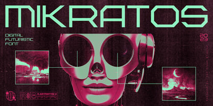 Mikratos is a digital futuristic font inspired by the interfaces in sci-fi movies and retro games visual. Developed to be the solid time-jumper between vintage retro-futurism and also the futuristic nowadays trend in the graphic design and visual industry. Perfectly fit for logo, branding, gaming, esport design, poster, music video, album artwork, cover, book, packaging, merchandise, apparel, fashion, and many more.
 - Exodar by Rometheme,
$15.00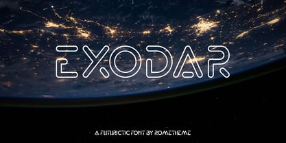 Exodar is a modern futuristic typeface with elegance in every single letter. This font looks modern, sci-fi, futuristic, future, readable, stylish, catchy and easy to use. Exodar is the best choice for your professional design projects, including: logos, poster design, t-shirts, headlines, flyers, cd cover albums, quotes, business cards, branding, magazines, social media, advertisements, product design, or anything that need a modern or futuristic look.
 - Galaxy Freedom by HIRO.std,
$18.00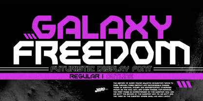 Galaxy Freedom is a futuristic display font. This font describes about futurism, space, sci-fi, modern, simple, cyberpunk, clean and easy to use. FEATURES - Uppercase letters - Numbering and Punctuations - PUA Encoded Characters - Multilingual Support - Works on PC or Mac USE Galaxy Freedom works great in movie title, game title, headline, logotype, labels, magazine, packaging, apparel, and any projects that need futuristic taste. Enjoy using! Thanks. HIRO.std
 - Recepts NF by Nick's Fonts,
$10.00Here’s a futuristic face with a neo-retro twist, based on the logotype for the 1990s tank-warfare videogame for the Mac, Spectre. Whether you're going back to the future or resurrecting a blast from the past, this face will get you there in style. Both versions of this font include the complete Unicode Latin 1252, Central European 1250 and Turkish 1254 character sets. - Khonsong by Jipatype,
$27.00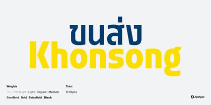 ขอแนะนำฟอนต์ Khonsong ฟอนต์แบบ semi-condensed sans serif ซึ่งผสมผสานความทันสมัยและอนาคตเข้าด้วยกันอย่างกลมกลืน ด้วยรูปลักษณ์ที่โฉบเฉี่ยวและร่วมสมัย ความกว้างแบบ semi-condensed ทำให้มีความสมดุลที่สมบูรณ์แบบระหว่างการประหยัดพื้นที่และความสามารถในการอ่าน ทำให้เป็นตัวเลือกที่เหมาะสำหรับการใช้งานที่หลากหลาย ตั้งแต่สื่อออนไลน์ไปจนถึงสื่อสิ่งพิมพ์ Introducing "Khonsong," a semi-condensed sans serif font that embodies a harmonious blend of modernity and futurism. With its sleek and contemporary appearance, Its semi-condensed proportions strike a perfect balance between space-saving efficiency and legibility, making it an ideal choice for various applications, from online media to print media.
 - Slatterine by Greater Albion Typefounders,
$11.95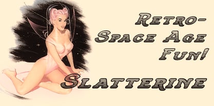 Slatterine is a retro-futuristic family, inspired by the second streamline era of the 1950s It's ideal for any design work that needs to suggest bygone visions of the future, or to have a retro-space-age effect. Slatterine's horizontally shaded glyphs give a strong sense of motion, whether coupled with the regular form's sharply leaning oblique angle, the perpendicular form, or the reverse leaning 'Lefty'.
 - Clarisone by Prestige Artsy Studio,
$25.00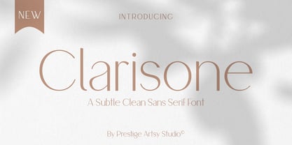 Clarisone is a delicate yet classy modern sans serif font. Designed specifically for clean projects in mind — perfect for creating word mark logos, monograms, quotes, product packaging, invitations, magazines and more... The simplicity of Clarisone introduces a professional, and modern touch to any of your future projects. With its high class clean smooth curves — Clarisone is the perfect font to have in your design arsenal.
 - LED BOARD REVERSED - Unknown license

- Megabeat by Invasi Studio,
$17.00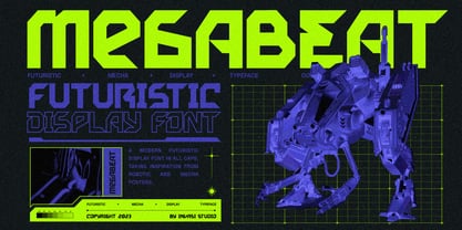 Megabeat Font is a new and exciting typeface that is inspired by the robotic and mecha poster movies of the past. The font references the science-fiction visual of the retro-futurism mindset, making it perfect for any project that requires a futuristic and technologically advanced design. This font is perfect for creating sci-fi movie posters, serials, technology-based branding, posters, logos, vintage illustrations, packaging, snacks, event and festival materials, album and cover artwork, books, toys, games, arcades, cards, automotive designs, and many more. The font features bold and chunky letterforms with sharp angles and mechanical elements, giving it a futuristic and robotic feel. The font is easy to read and legible, making it perfect for headlines, titles, and other design elements that need to be easily understood. The font is perfect for any project that requires a futuristic and technologically advanced design that is inspired by the iconic visual of retro-futurism.
 - PF Eef by Parachute,
$35.00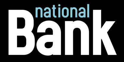 First conceived as the upper-and lowercase “e” for the logotype of independent publishers Elemental Editions, the letterforms were so well received that they were extended to an entire typeface and formed the basis for a bespoke font – Eef. The type design draws inspiration from the basic elements, the periodic table, functionalist vintage lettering and influences from other classic geometric typefaces with condensed cuts such as Futura and Trade Gothic. The extended set is now developed into a family consisting of three weights – Regular, Medium and Bold. While developing Eef it has been crucial to maintain the integrity of the geometrical shape in each glyph as much as possible, but also add subtle optical adjustments to make the forms more balanced and harmonic. Due to its detailed balance of simplicity, aesthetics and playfulness Eef works perfectly well in a corporate context as it does in editorial use or poster design. Eef feels most comfortable with text ranging from display to medium size.
 - Laborat by Monotype,
$50.99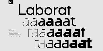 Typeface Laborat™, designed by Kristína Jandová, is a Grotesk typeface that combines the geometry of a circle and a square. The visual message of geometry is applied to stylistic sets and modified by special characters, including abstract forms or symbols, that turn the typeface into a visual “graphic” language. The basic character of the typeface lies in the default set based on the circle-like shapes of letters. The stylistic sets 01 to 03 are characterized by different geometrical modifications of the growing character and the idea “from circle to square” applied on the letters a, f, g, l, r, t, u, y. By using these different alterations of consistent letterforms, it offers a playful space for everyone. The first inspiration of the typeface origins in Paul Renner’s Futura sketches, that were a celebration of geometrical playfulness of modernism meeting constructivism. It is modified into a new contemporary “wave” of typography as a graphical method. Laborat comes in six weights, from Hairline to Heavy.
 - Meta Link by Logofonts,
$10.00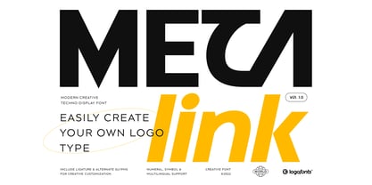 Meta Link is Sans Serif inspired by future techno and sport great for product logo, poster, headline, card logo, web, magazine, packaging, stationery and much more. Easily creates your own logo types with font. Meta Link have 4 weight fonts with italic style also has an Open Type feature to access a large selection of unique alternative letters and many ligatures to make it easier for you to create. Meta Link can be accessed perfectly on design applications such as Adobe Illustrator, Adobe Photoshop, Corel Draw, Affinity Designer but does not rule out the possibility that it can also be accessed using web-based applications such as kittl, canva, artboard studio and others.
 - Legere by B2302,
$35.00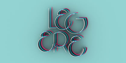 Legere is a slim, light and decorative font, based on the idea to work as close as possible on the geometric forms of the circle, the triangle and the square. As a natural conclusion the number of angles is limited. Legere comes in these weights: THIN, LIGHT, REGULAR and a very special DECO version. Legere might be used as a headline font, for posters or cover layout, it might also be transformed into that fashion label logotype you are working on. Have fun!
 - Abdo Rajab by Abdo Fonts,
$29.50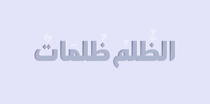 Abdo Rajab is the second version of the font FS Rajab which was designed by the type designer Abdulsamiea Rajab Salem for Future Soft company fonts. It is a leading company in Arabization field and producing the Arabic and Islamic programs beside the children programs. This font appeared between 1998 and 2000. In this version there were a lot of adjustments to keep the font in its spirit and uniformity between the various characters. Also added some new characters, which gave him another beautiful addition to be used in both title and text designs. Three weights (Regular, light and bold) have been created. Then the font was converted to OpenType to support Arabic, Persian and Urdu to be compatible with the various operation systems and modern software. The combination of modern Kufi and Naskh styles and varying between straight and curved parts made it a beautiful typeface appropriate to the titles and text, and able to meet the desire of the user in the design of ads and modern designs of various types of audio and visual.
 - Abdo Salem by Abdo Fonts,
$29.50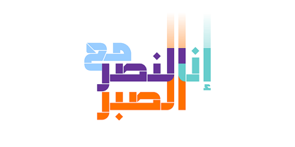 Abdo Salem is the second version of the font FS_Salem which was designed by the type designer Abdulsamie Rajab Salem for Future Soft company fonts. It is a leading company in Arabization field and producing the Arabic and Islamic programs beside the children programs. This font appeared between 1998 and 2000. In this version there were a lot of adjustments to keep the font in its spirit and uniformity between the various characters. Also added some new characters, which gave him another beautiful addition to be used in both title and text designs. Three weights (Light, bold and black) have been created. Then the font was converted to OpenType to support Arabic, Persian and Urdu to be compatible with the various operation systems and modern software. The combination of modern Kufi and Naskh styles and varying between straight and curved parts made it a beautiful typeface appropriate to the titles and text, and able to meet the desire of the user in the design of ads and modern designs of various types of audio and visual.
 - Scion by Type Innovations,
$39.00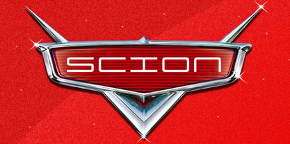 ‘Scion’ is an original design by Alex Kaczun. The inspiration for the typeface came from the Toyota SCION logo, which bears its name. In Alex’s own words, "I loved the simplicity, proportions and hi-tech look of the logo and decided to create an entire new design series based on its unique look". The fonts come in five flavors: thin, light, regular, bold and black. All the font weights were designed systematically on tabular widths so that the user can make adjustments to overall type color without changing the line length. In addition, Alex Kaczun has provided us with several alternate glyph substitions to further enhance the overall appeal of this contemporary new design. The large Pro font character set, which supports most Central European and many Eastern European languages, makes this typeface series ideally suited for display copy as well as text composition. In the near future, Alex plans to include a narrow, compressed and ultra expanded, along with true-drawn italic variations to further expand the possibilities of this great new display series.
 - Xenu by Typodermic,
$11.95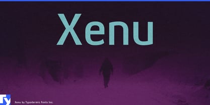 Introducing Xenu—the technical typeface of the future, designed for those who demand precision and efficiency in their communication. Inspired by industrial classics like DIN, Xenu exudes a cold, business-like demeanor that will immediately convey a sense of technical prowess and sophistication. Crafted with a unique blend of traditional scientific letterforms and contemporary aesthetics, Xenu’s impassive letterforms are a perfect representation of the future of industrial design. Its sleek lines and rigid structure make it a perfect choice for any project that requires a technical edge. Whether you’re designing a user manual, technical guide, or an engineering report, Xenu’s four weights and italics will instill your message with mechanical confidence and technological elegance. Its technical look and feel are perfect for businesses that want to project a cutting-edge image and convey a sense of precision. So why settle for a mediocre typeface when you can have Xenu—the ultimate expression of technical perfection? Choose Xenu and experience the future of technical communication. Most Latin-based European writing systems are supported, including the following languages. Afaan Oromo, Afar, Afrikaans, Albanian, Alsatian, Aromanian, Aymara, Bashkir (Latin), Basque, Belarusian (Latin), Bemba, Bikol, Bosnian, Breton, Cape Verdean, Creole, Catalan, Cebuano, Chamorro, Chavacano, Chichewa, Crimean Tatar (Latin), Croatian, Czech, Danish, Dawan, Dholuo, Dutch, English, Estonian, Faroese, Fijian, Filipino, Finnish, French, Frisian, Friulian, Gagauz (Latin), Galician, Ganda, Genoese, German, Greenlandic, Guadeloupean Creole, Haitian Creole, Hawaiian, Hiligaynon, Hungarian, Icelandic, Ilocano, Indonesian, Irish, Italian, Jamaican, Kaqchikel, Karakalpak (Latin), Kashubian, Kikongo, Kinyarwanda, Kirundi, Kurdish (Latin), Latvian, Lithuanian, Lombard, Low Saxon, Luxembourgish, Maasai, Makhuwa, Malay, Maltese, Māori, Moldovan, Montenegrin, Ndebele, Neapolitan, Norwegian, Novial, Occitan, Ossetian (Latin), Papiamento, Piedmontese, Polish, Portuguese, Quechua, Rarotongan, Romanian, Romansh, Sami, Sango, Saramaccan, Sardinian, Scottish Gaelic, Serbian (Latin), Shona, Sicilian, Silesian, Slovak, Slovenian, Somali, Sorbian, Sotho, Spanish, Swahili, Swazi, Swedish, Tagalog, Tahitian, Tetum, Tongan, Tshiluba, Tsonga, Tswana, Tumbuka, Turkish, Turkmen (Latin), Tuvaluan, Uzbek (Latin), Venetian, Vepsian, Võro, Walloon, Waray-Waray, Wayuu, Welsh, Wolof, Xhosa, Yapese, Zapotec Zulu and Zuni.
 - Guile by Bunny Dojo,
$10.00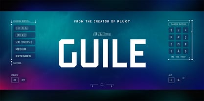 A timeless and mighty sans-serif, Guile's chiseled forms make the font ideal for reaching into history, while its minimalism and balance are fit for propelling into the future. Guile voraciously absorbs and enhances the style of its surroundings. In sports, it's a true team player, from the jerseys to the on-air presentation. In film, it's a blockbuster star, from the title treatment to the billing block.
 - Isagi Blue by Lurinzu Studios,
$10.25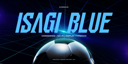 A techy, sci-fi condensed typeface that is inspired by the mixture of futuristic and athletic vibes into one out of this world headline typeface. This headline font best fits in large scale design when you want to immediately capture the attention of the viewers. This also fits with school-related, athletics, sports, future and science themed designs. *This font includes letters, numbers, multi-language, and all essential marks needed.
 - Fomalhaut by Device,
$39.00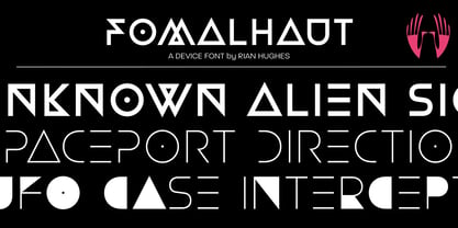 A modern, geometric sans serif display font with a hint of the future and the alien. The familiar letter-shapes are reimagined, with key stokes being placed in unusual positions without impacting the readability. The 'Solid' variants have certain counters filled in, creating a bold and unusual rhythm that is very effective in shorter settings. The different versions can be mixed for effect, while letterspacing adds a sharp, clean sophistication.
 - Summer Dear Font Duo by Lucky Type,
$12.00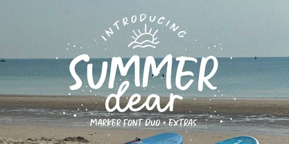 Let me introduce the latest beautiful combination of handwritten font Summer Dier Font Duo + Extras. The Summer Dier Font typeface is designed to make your next great project look more natural and stand out. The Summer Dier Font includes several Opentype Ligatures included to make the typeface look more natural and lastly, it has over 30 handcrafted additions to help your future designs look prettier. Thank you very much for viewing.
 - CYRON by Tadiar,
$27.00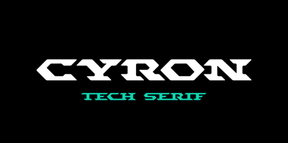 CYRON Tech Serif is unique serif font combines hi-tech cyberpunk and futuristic atmosphere and classic serif's style. There are Uppercase and Lowercase letters done the way they ideally connect with each other. Multilingual support (Latin extended). It is designed for header and text both. Use it in your projects in such areas as robots & androids, cyberpunk, hi-tech, future, virtual reality, space, army, games and many others.
 - Cuanky by Kereatype,
$14.00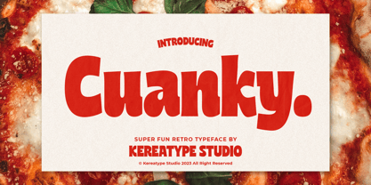 Cuanky is a super fun, retro-style sans serif font with subtle serifs. It possesses a recognizable flair and evokes a sense of warm nostalgia. Available in both regular and italic styles, Cuanky also features a playful hint of the future. Cuanky is perfect for headlines or food-related designs, such as pizza, burgers, and restaurant themes. Additionally, it's well-suited for creating eye-catching posters with a cool aesthetic.
 - Delphium by Further Type,
$10.00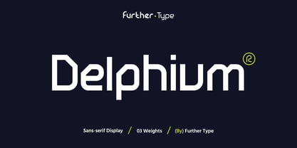 Inspired by a vision of the future that's been left in the past, Delphium is a continuation of the cutting edge design language of the 90s, most notably led by the typographic work of The Designers Republic. Designed to embody the pulsing rhythm of electronic music at the turn of the century, Delphium is a bold, highly legible display font that lends itself to impactful contemporary visual communications.
 - Banco by ITC,
$29.00Banco was the first typeface work of French designer Roger Excoffon and was released in 1952. The strong forms look as though they were rolled out of sheet metal and feature upright, tapering strokes. The slight slant, the varying heights of stroke ends, and the relationships between line and curve give Banco font its sense of liveliness and dynamism. Excoffon did not design a matching lower case alphabet for his capitals, but this was accomplished later by Phill Grimshaw, who also designed the light weight. He deliberately 'underdesigned' the lower case forms, producing a more reserved alphabet based on the design ideas of the original. - Poligon by Halbfett,
$30.00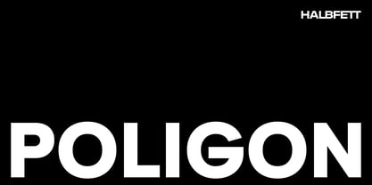 Poligon is a large family of geometric sans serif fonts. It is inspired by classic typefaces from the geometric-sans genre, like Futura and Avant Garde Gothic, whose shapes were constructed from circles and straight lines. Every character has been crafted to give it a distinct and individual feel. The family is an excellent choice for both corporate design and editorial design projects because of its range of weights, as well as its legibility in text. The typeface family ships in two different formats. Depending on your preference, you can install the typeface as two Variable Fonts or use the family’s eight static OpenType font files instead. Those weights run from Thin to Black. While the static-format fonts offer a good intermediary-step selection, users who install the Variable Fonts have vastly greater control over the stroke width in their upright and italic texts. The weight axes in Poligon’s Variable Fonts allow users to differentiate between almost 1,000 possible font weights. That enables you to fine-tune your text’s exact appearance on-screen or in print. But even the static fonts satisfy the need for flexibility, creating harmonious variations of texture and emphasis. Despite their rigid geometry, the fonts have a playful air to them. That playfulness and uniqueness can be dialed up by applying stylistic alternates via the fonts’ four Stylistic Sets. The first of these replaces “G”, “M”, and “&” with alternate, more outgoing shapes. Stylistic Set 2 has an alternate “ß”; Stylistic Set 3 has a “Q” with a longer tail and another “G”. Stylistic Set 3 has alternates for “A”, “K“, “Q”, “R”, “S”, “Y”, and “Z”.
 - Full Sans by Bülent Yüksel,
$19.00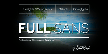 Full Sans is a geometric sans in the tradition of Futura, Avant Garde and the like. It has a modern streak which is the result of a harmonization of width and height especially in the lowercase letters to support legibility. Full Sans is the younger brother of original Full Neue, Full Slab and Full Tools. Ideally suited for advertising and packaging, editorial and publishing, logo, branding and creative industries, poster and billboards, small text, wayfinding and signage as well as web and screen design. Full Sans provides advanced typographical support for Latin-based languages. An extended character set, supporting Central, Western and Eastern European languages, rounds up the family. The designation “Full Sans LC 50 Book” forms the central point. The first figure of the number describes the stroke thickness: 10 Thin to 90 Bold. Full Sans LC comes 5 weights and italics also Full Sans SC comes 5 weights and italics total 20 types. The family contains a set of 485 characters. Case-Sensitive Forms, Classes and Features, Small Caps from Letter Cases, Fractions, Superior, Inferior, Denominator, Numerator, Old Style Figures just one touch easy In all graphic programs. Full Sans is the perfect font for web use. You can enjoy using it. UPDATE: 08 March 2019 - Fixed extension of glyhps "y" and "g". - "LineGap" error has been fixed. - Fixed bug in "onum", "pnum", "tnum" and "tnum" software in OpenType feature.
 - CA Postal by Cape Arcona Type Foundry,
$39.00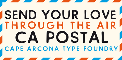 CA Postal is a cute and clever little stamp-font. It was originally intended for a record-cover only, but when the artist wanted all lyrics printed in the booklet, it was time for a font. The initial inspiration was a moveable-stamp printing-set, which had a nice Futura-like style, being very pleasant to read, especially in small sizes. But of course it’s the loose and irregular outlines that give the font its special charms. CA Postal features two sets of characters and the "Contextual Alternates" feature will make sure that never two identical characters will stand next to each other, so that the stamp-look becomes even more authentic.
 - Understory by Hanoded,
$15.00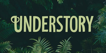 Lately I feel reluctant to watch the news: The Amazon Forest is burning, Australian forests are burning, palm oil controversy… It really brings tears to my eyes to see all this destruction around me. It is like people hate nature with a vengeance - I cannot explain it otherwise. I made this font to take my mind off things. It was loosely based on Futura, a font I really like. Understory was completely made by hand. It comes with some cute upper case swashes and a whole bunch of diacritics. The good thing is: no trees were cut down or burned to make this font; in fact, I donated a nice amount of $ to help save the rainforests!
 - Moucha by Vibrant Types,
$41.00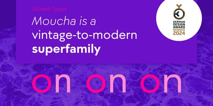 Moucha is a geometric superfamily that received the German Design Award 2024 for its multitude of variants. Find a vintage and a modern variant and play with all the proportions in between. The variable font is your typographic toolbox with the perfect sans-serif match for your favorite serif. It supports 619 Latin, Cyrillic and Greek languages. How it works: All variants share the same round characters while rectangle-based characters vary in width. Do you want a dynamic classic look with a narrow ‘n’ and uppercase proportions like you know from prototypes like Futura®? Or do you prefer a homogenous contemporary look? Use Moucha X for the exact middle or bubble up your own variant!
 - MARIAMNE by Type Innovations,
$39.00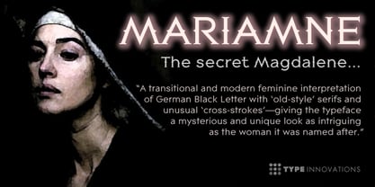 MARIAMNE is an original design by Alex Kaczun. It is an elegant, modern and traditional interpretation based on and modeled after his successful "Contax Pro" and "New Age Gothic" typeface series. As such, it has generous proportions with clean, crisp lines—ideally suited for easy reading and long lines of copy. Alex felt that the skeleton for "Contax" was perfectly suited to transform the design into a modern version of 'old-style', somewhat reminiscent of German Black Letter. Numerous modifications where made to the body proportions, stems and shapes. True 'old-style' serifs and unusual 'cross-strokes' where added for a touch of distinction. The 'cross-strokes' where added at exactly visual mid-point on the overall heights. This gives the typeface a romantic, female-like quality to the overall design. Strong, yet delicate. Visually stimulating in appearance and function. The result is a truly unique transitional and modern design. Unlike other typefaces, MARIAMNE incorporates uniform stems throughout the capitals, lower case and figures. This gives the design a uniform appearance in overall color and strength. There is a perfect visual balance between inter-letter spacing, stem weights and proportions. The accents are equally large, bold and command attention. This font includes a large 'Pro' character set, which supports most Central European and many Eastern European languages. As a result, the design is ideally suited for display copy as well as text composition. In the near future, Alex plans to expand the typeface series to include a light and heavy weight, along with true italics.
 - Catenary by Active Depth,
$6.00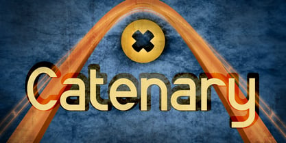 The Catenary typeface was designed with the goal of creating an extremely-readable sans-serif font that could weather the future. Inspired by the beauty of the catenary curve, it's a blend of the transitional and the geometric that allows it to be readable while keeping its forms precise and consistent. Every character in its set is unique, leaving no confusion between similar letter forms. Sixes and nines can be distinguished even when they're upside down or sideways. The number one, the lowercase-L, and the uppercase-I can never be confused with one another, even without context. Throw b, d, g, p, and q into a jumble and the challenge of distinguishing the characters can easily be overcome. The Catenary family consists of eight fonts, six of which, the standard light/italic, regular/italic, and bold/italic, work as both excellent text fonts and exceptional display fonts. The two bonus fonts, a stencil and a guerrilla grunge style, make for great additional display font choices. The Catenary family is extremely versatile and ready for your toughest design work.
 - Metroblack #2 by Linotype,
$29.00American graphic designer William Addison Dwiggins' (W.A.D. for short) first typefaces were the Metro family, designed from 1927 onward. The project grew out of Dwiggins' dissatisfaction with the new European sans serif typefaces of the day, such as Futura, Erbar, and Kabel, a feeling he expressed in his seminal book Layout in Advertising. Urged by Mergenthaler Linotype to create a solution for the problem, Dwiggins began a professional relationship that would span over the next few decades. The first Metro family typeface to be released was Metroblack, brought to market by Linotype in 1929 (Metroblack #2™ the only one of the two versions that Mergenthaler Linotype eventually put into production which is available in digital form). With more of a humanist quality than the geometric styles popular in Europe at the time, Dwiggins drew what he believed to be the ideal sans serif for headlines and advertising copy. Metroblack has a warmer character than the Modernists' achievements, and the type is full of mannered curves and angled terminals (Metroblack also has an astoundingly beautiful Q). The weights of the Metro family, Metromedium #2™ and Metrolite #2™, were each designed by Mergenthaler Linotype's design office under Dwiggins' supervision. In 2012 Toshi Omagari reworked the Metro family as "Metro Nova" with many weights into a modern type family that even contains the alternate characters from the origin Metro family from Dwiggins. Despite having been created more than three-quarters of a century ago, the Metro family types have aged well, and remain a popular sans serif family. Although spec'd less often than other bestsellers, like Futura, Metro continues to find many diverse uses. The typeface has appeared throughout Europe and the North America for decades in newspapers and magazines, and can even help create a great brand image when used in logos and corporate identity. Dwiggins ranks among the most influential graphic designers and typeface designers of the 20th Century. He has several other quality fonts in the Linotype portfolio, including the serif text faces Electra™ and New Caledonia™, as well as Caravan™, a font of typographic ornaments. - Claremont by Red Rooster Collection,
$45.00Claremont is a serif font family designed by Les Usherwood (Typsettra). Usherwood originally created four weights – a light, extra bold, light italic, and extra bold italic. Paul Hickson (P&P Hickson) and Steve Jackaman (ITF) digitized the family and created eight new weights, and it was released exclusively for the Red Rooster Collection in 1993. Claremont shares similarities to Bookman Old Style, but also shares properties with slab serif Egyptian-style typefaces. Like all Usherwood typefaces, the family was engineered with great care for maximum legibility and aesthetics. ©1993. International TypeFounders, Inc. - !Futurelic, created by !Exclamachine, encapsulates a forward-thinking vision through its type design, making it a standout choice for projects that require a blend of modernity and science fiction. T...
- Embossanova by Emboss,
$29.00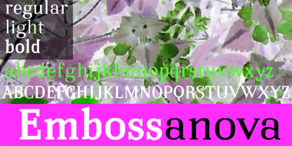 Embossanova was initially sketched to be a monospaced typeface but quickly took on a life of its own. It developed serifs and numerous arcs and stroke weights. I wanted it to retain a pre computer/unmathematical feel so there is a slight variation on curved characters and their relationship to the X height.
 - Soprani Variable by insigne,
$129.99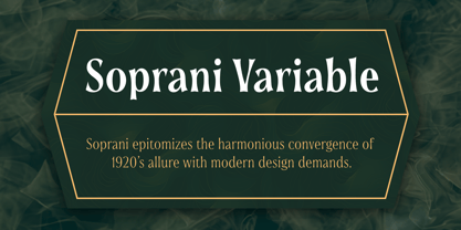 "Step into a world where the 1920s meet the future with Soprani—a typeface that seamlessly blends vintage charm and modern sophistication. Drawing inspiration from a distinctive plaque unearthed in New Zealand, Soprani showcases serifs that flare and shimmer, capturing the essence of art nouveau and arts & crafts in a contemporary light. Dive into its rich OpenType features, granting designers unparalleled flexibility to bring their visions to life. Its condensed yet elegant letterforms are the perfect fit for everything from artful table books and stylish menus to dynamic media showcases in TV and film. Spanning from the graceful subtlety of its thin variant to the undeniable boldness of the black, Soprani is diverse and dynamic. Soprani isn't just a typeface—it's a revolution in design. Production assistance by Lucas Azevedo and ikern.
 - Megatrans by Craft Supply Co,
$15.00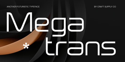 Introducing Megatrans: A font from the future, where innovation and design meet. With its sleek lines and visionary style, Megatrans embodies a sense of futuristic aesthetics. Transform your projects with Megatrans' cutting-edge presence, adding a touch of tomorrow to your creative endeavors. This typeface is ideal for greeting card, packaging, brand identity, poster, or any purpose to make your design project look eye catching and trendy. Feel free to play with this typeface!
 - Reisar by Konstantine Studio,
$17.00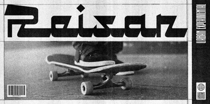 Reisar is inspired by the vintage sign of motels, automotive logos, and badges, mixed up with urban modern cross-culture of contemporary visuals and brutalism. It makes Reisar born with a fresh vibe combined with the past and future for your visual graphic design needs. Perfectly fit for your logo, branding, clothing, apparel, merchandise, music project, album artwork, cover, book, music video, serial title, movie title, poster, animation, stickers, event, festival, magazine, and many more.
 - Nowduke by Just Font You,
$19.00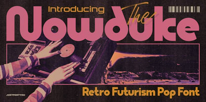 Nowduke is a bold vintage font. Inspired by the rise of the Retro-Futurism trend in the digital industry nowadays. The undeniable invasion in every industry makes it a big trigger I can say, to bring this pop font to rise in this universe. Perfectly fit for logo, branding, gaming, esport design, poster, music video, album artwork, retro concept, advertising, digital content, stream overlay, cover, book, packaging, merchandise, apparel, fashion, and many more.
