10,000 search results
(0.031 seconds)
- TT Neoris by TypeType,
$39.00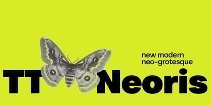 The future of Neo-Grotesques is now! Introducing TT Neoris—a new ambitious font from TypeType. TT Neoris is an ideal sans with: 21 font styles: 10 upright, 10 italics, and 1 variable font; 1832 characters; 41 OpenType features; 14 stylistic sets with Soft character and Upright cursive in Latin and Cyrillic character sets; 230+ languages support; Special condensed italics designed to create a 'highlighting' effect when used in specific text segments.
 - Saxo by Eurotypo,
$35.00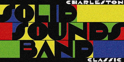 The Saxo family is based on the typefaces of the twenties and thirties, where through the Art Deco and Futurism were built the foundations of the modern movement. Designed from basic geometric shapes (triangle, circle and square). This font transmits his solid character and modern spirit, through 470 glyphs, including Opentype features like ligatures, stylistic alternates and borders based on the geometry of the typeface. All Saxo fonts come with CE languages support.
 - HiFi by Pelavin Fonts,
$25.00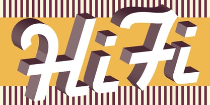 HiFi is a geometric script whose genesis lies in drive-in movie theaters, vintage auto emblems and radio dials. It embraces the stylistic tenets of retro futurism and proposes that the evolution of design styles, rather than being linear, is a circular process, continually revisiting and reshaping itself. It evokes the 40s & 50s and pre-transistor electronics when you turned your radio on and waited patiently for the tubes to warm up.
 - Monograph by Pelavin Fonts,
$25.00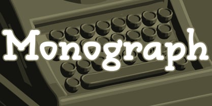 Monograph conjures ancient typewriters, telephone switchboards, vintage office machines past visions of the future. As though it were drawn with the rounded nib a of a Speedball "B" style pen, the soft curves and rounded serifs speak of a gentler less complicated time. It is nuanced with traces of the Arts and Crafts movement at the turn of the 20th Century which stressed craftsmanship and preserving and emphasizing the qualities of construction and materials.
 - Baligo by Sarid Ezra,
$13.00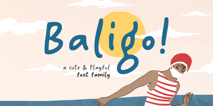 Hello, this is Baligo, playful font family! Baligo is a quotable font that have 3 weight style. Comes with light, regular and bold this font will make your project more bright and cheerful. This playful font is very suitable for quotes, branding, children books, and more. Baligo also support multi language!
 - Maryam by Outras Fontes,
$24.00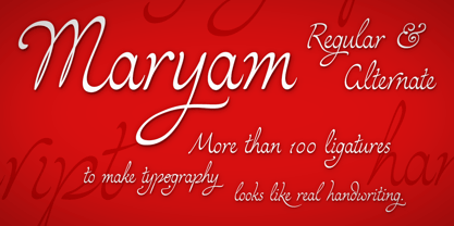 Maryam is an Outras Fontes type family designed by Ricardo Esteves Gomes. With moderate contrast, these fonts have elegant and very legible forms even in small x-height sizes. There are more then 70 ligatures in each font, providing a lot of letterform variations that make this type family looks like a real handwriting on a page. It is currently available in two versions (Regular and Alternate) that you can combine with each other as you wish.
 - Koo Koo Puff by astroluxtype,
$20.00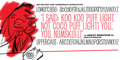 Does the world really need one more vernacular pop culture typeface? We here, at astroluxtype shout a resounding yes! Sure, at myfonts.com, you can find the apex of fine font design that will have your mind and eyes burst with joy at the level of sophistication and craftsmanship they exhibit- Koo Koo Puff Light Condensed and Regular Condensed are not one of those fonts. But if kooky goofy is your thing, we're selling it at the astroluxtype booth. Koo Koo Puff Regular Condensed is the companion font to Koo Koo Puff Light Condensed. Both fonts includes an upper and lowercase glyph set. Regular Condensed has a different upper and lowercase “O” from the original Koo Koo Puff Light Condensed. Spacing metrics are looser, as well. The font is not a match for Light Condensed, it is a separate font. Both are headline display faces, for optimum usage it is recommended to be set at 48 points or larger in size. Look to astroluxtype’s Sugarbang ! as the first in a series of fonts inspired by vintage product packaging, Koo Koo Puff is the second release in the Cerealboxx series. The third font is in the fridge getting cool now, watch for it in the future. Rave on you design genius.
 - Hargloves Sans by Heypentype,
$20.00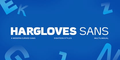 Hargloves sans remixes between grotesque proportions and 80’ industrial inspired-typefaces. Yes, it is a major improvement from original Hargloves fonts with completely different projections. Hargloves Sans intended primarily for text, editorial or long-form text. This new design emphasized on reader joy experience when reading text without losing typeface characters. Hargloves Sans support almost all Latin script language, roughly around 356 latin language according to hyperglot analytics. This language coverage is heypentype priority to serve all possible Latin script language all over the world. The premise is simple, because it is text typeface it should cover all Latin script languages whether its popular language or not. Hargloves Sans have a higher x-height compared to Hargloves. Higher x-height will give a seamless, undistracted reading. The open counter on nearly squared proportions is Hargloves Sans main character. There’s a lot of feature coming for this typeface in the future.
 - Jt Modernism by Jolicia Type,
$23.00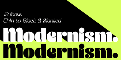 JT Modernism is a cutting-edge font that seamlessly blends a funky aesthetic with a modern twist. Boasting a total of 18 weights, ranging from the delicately Thin to the boldly commanding Black, this font offers a versatile spectrum of options to suit any design project. The unique charm of JT Modernism lies in its slanted design for each weight, adding a dynamic and energetic flair to your typographic creations. The slant is carefully crafted to enhance the overall visual impact of the font, making it stand out in the contemporary design landscape. Whether you're designing a sleek corporate identity, a vibrant poster, or an edgy website, JT Modernism provides the flexibility and range to meet your every need. It's not just a font; it's a statement, an embodiment of the spirit of the contemporary design renaissance. Welcome to the future of typography – welcome to JT Modernism.
 - BENTO - 100% free

- Metromedium #2 by Linotype,
$29.00American graphic designer William Addison Dwiggins' (W.A.D. for short) first typefaces were the Metro family, designed from 1927 onward. The project grew out of Dwiggins' dissatisfaction with the new European sans serif typefaces of the day, such as Futura, Erbar, and Kabel, a feeling he expressed in his seminal book Layout in Advertising. Urged by Mergenthaler Linotype to create a solution for the problem, Dwiggins began a professional relationship that would span over the next few decades. The first Metro family typeface to be released was Metroblack, brought to market by Linotype in 1929 (Metroblack #2™ the only one of the two versions that Mergenthaler Linotype eventually put into production which is available in digital form). With more of a humanist quality than the geometric styles popular in Europe at the time, Dwiggins drew what he believed to be the ideal sans serif for headlines and advertising copy. Metroblack has a warmer character than the Modernists' achievements, and the type is full of mannered curves and angled terminals (Metroblack also has an astoundingly beautiful Q). The other weights of the Metro family, Metromedium #2™ and Metrolite #2™, were designed by Mergenthaler Linotype's design office under Dwiggins' supervision. Despite having been created more than three-quarters of a century ago, the Metro family types have aged well, and remain a popular sans serif family. Although spec'd less often than other bestsellers, like Futura, Metro continues to find many diverse uses. The typeface has appeared throughout Europe and the North America for decades in newspapers and magazines, and can even help create a great brand image when used in logos and corporate identity. Dwiggins ranks among the most influential graphic designers and typeface designers of the 20th Century. He has several other quality fonts in the Linotype Originals, including the serif text faces Electra™ and New Caledonia™, as well as Caravan™, a font of typographic ornaments." - Neue School by Daniel Brokstad,
$29.00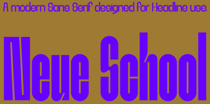 Neue School is a modern sans serif font with extra tight tracking & deep ink traps. Designed to maximize the available space, make impactful headlines. Inspired by old school narrow poster fonts, presented in a “neue”-way. The font consists of 8 weights, across 2 widths, plus italics. Symbols are fixed weight throughout, as a contrast to the font weights. There are 2 additional OpenType stylistic sets. Stylistic Set 1 adds more rounded edges to specific characters for a softer look. Stylistic Set 2 makes lowercase ascenders and symbol height equal to capital height, making it ideal for stacking type more easily with all same height.
 - Montesori by Variable Type Foundry,
$19.99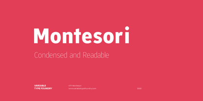 Montesori is inspired by the economic forms and large x-height with a condensed style and a humanistic-grotesque typeface forms. It is a perfect option for editorial projects, branding, logos and packaging. Montesori comes in a variety of nine weights (Fine, Extra Light, Ultra Light, Light, Regular, Semi Bold, Bold, Ultra Bold and Black) with its two styles (round and italic) classified in two forms, Basic and Alternative. In addition, its case-sensitive shapes, ordinals, scientific inferiors, denominators, superscripts, subscripts, numerators, fractions... make it ideal for posters or infographics.
 - Silica by Stone Type Foundry,
$49.00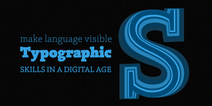 This slab serif is a general purpose type in six weights. The lighter weights are useful for short passages of text. The heavier weights are a versatile tool for setting headlines. Available weights are Extra Light, Light, Regular, Semibold, Bold, Black. Silica was designed to withstand condensation using horizontal scaling without compromising the weighting scheme of the design.
 - Drummer by Harvester Type,
$20.00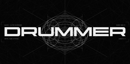 Drummer is a large futuristic font family inspired by the Expansion TV series, old science fiction book covers and Honda Prelude and Porsche logos. The family contains a large number of styles and a lot of language support. 54 styles, 6 in width (Ultra Condensed, Condensed, Normal, Expanded, Extra Expanded, Ultra Expanded) and 9 in weight (Thin, Extra Light, Light, Regular, Medium, Semi Bold, Bold, ExtraBold, Black). The font also has a variable version. 573 glyphs, including 40 alternate characters. A lot of work has been done on the font. The fillets on the symbols have been well worked out and tested for a better visual and practical experience. The font combines the monospacing of many characters combined with kerning, which makes it very convenient for many purposes, such as vertical typography. The font is good in all sizes, both small and large, which makes it possible to use it anywhere. Branding, logos, titles, posters, texts, covers, merch, prints, web, titles, banners, games and design in games and much more. In the near future, it is planned to add another axis of variability - the slant. Consequently, the family itself will increase. It is also planned to add a small case (capital). If you want to say something about the font or get a font in other formats, then write to the mail: bunineugene@gmail.com .
 - Litore by Enfeeltype,
$22.00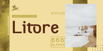 This font represents the wonders of the sea, with an engraved design that brings waves to mind when reading. Litore is a clean and elegant font with clear strokes and a modern style. Life is just one big journey, and the path you choose has a great impact on your future and overall happiness. So if you're looking for inspiration on what represents beauty in life and love, Litore is the perfect font to spend some time with.
 - Aberfoyle by Mysterylab,
$19.00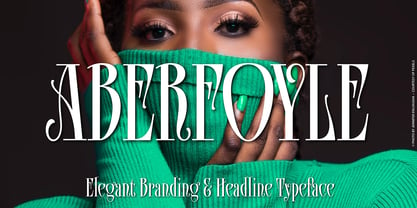 Aberfoyle is an elegant and ornate modern condensed serif. It’s a great choice for unique branding and banners of anything from gourmet food packaging, to high-end accessories and cosmetics, to winter holiday headline vibes. With its old-world flair, it features a wealth of eye-catching details and a whimsical variety in its approach to letter width and shape. Aberfoyle straddles two worlds, referencing historical embellishment traditions, but squarely looking forward into the future of typographic design.
 - Ravelion by Typehand Studio,
$18.00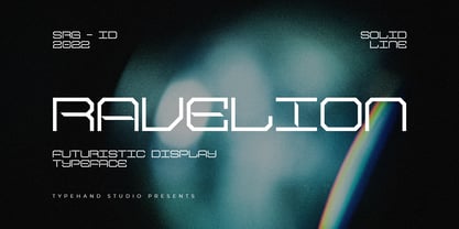 Ravelion is a sans serif all caps display font. Available in reguler and line style. Ravelion is made for futuristic font display. Ravelion is a funky, future-forward typeface set up perfectly any sci-fi space thriller. If you're a fan of futuristic fonts, this one is for you! Ideal for contemporary, sci-fi and space designs, you can also apply this on adventure, branding, or music themes. Try different styles and experiment with kerning for best results.
 - Pentagram by Fauzistudio,
$12.00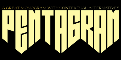 Pentagram is a typeable three-letter Pentagon monogram font. You can type Monogram a pentagram with a mapped border on the numbers 0-9. With the support of alternative contextual features It works automatically so all you can do is just type. If you liked this feel free to show your appreciation by giving this project a simple like, I will be making a font with a similar feature in the future. Hope you enjoy. Intuisi Creative
 - Atompunk by Konstantine Studio,
$10.00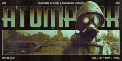 Inspired by the first wave of the industrial revolution back in the 60s. The glory of steam and steel machines in manufacturing technology. Atompunk was referenced from the science-fiction visual of the retro-futurism mindset—the imagination of nuclear-based technology for every human need. Perfectly fit for sci-fi movies, serials, technology-based branding, poster, logo, vintage illustration, packaging, snack, event, festival, album artwork, cover artwork, books, toys, games, arcades, cards, automotive, and many more.
 - Lemon Milk Pro by Marsnev,
$16.99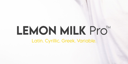 Wait no more. Meet Lemon Milk Pro™, your new go-to typeface. After a long journey, the widely known Lemon Milk has now became pro fonts. It finally has lowercases, covering extended Latin, Cyrillic, and Greek. Moreover, developed from the original version in 2014, it is now future proof: more opentype features + variable fonts. With such styles, this famous geometric typeface with sharp edges is perfect for every display! Lemon Milk Pro: Beyond a typeface, it's a culture.
 - Novaria Vista by Sipanji21,
$20.00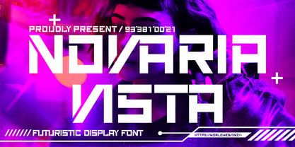 "Novaria Vista" is a futuristic display font. Fonts with a futuristic theme often embrace technological and forward-looking aesthetics. They are commonly used in various design projects that aim to convey modernity, innovation, and a vision of the future. With "Novaria Vista," you can create designs that exude a sense of advancement and a futuristic touch. This font is suitable for projects related to technology, science fiction, space exploration, and other themes where a futuristic style is desired.
 - Argonautica by URW Type Foundry,
$39.99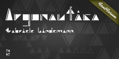 Argonautica is based on a relict of the future that was left on earth by time-travelling extra-terrestrials. In 1947, an UFO crashed in the New Mexico desert. There were unknown glyphs found on the spaceship which couldn�t be deciphered to date. Based on one of the unknown glyphs, Gabriele Lindemann developed a complete alphabet readable for human beings. Argonautica is particularly suited for colored typography and can be read much better with growing distance.
 - FF Bauer Grotesk by FontFont,
$50.99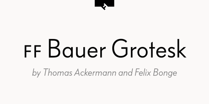 FF Bauer Grotesk is a revival of the metal type Friedrich Bauer Grotesk, released between 1933 and 1934 by the foundry Trennert & Sohn in Hamburg Altona, Germany. The geometric construction of the typeface, infused with the art déco zeitgeist of that era, is closely related to such famous German designs as Futura, Erbar, Kabel and Super Grotesk that debuted a few years earlier. However, Bauer Grotesk stands out for not being so dogmatic with the geometry, lending the design a warmer, more homogenous feeling. The oval “O” is a good example of that, as well as characteristic shapes like the capital M or the unconventionally differing endings of “c” and “s” which make for a less constructed look. Watch the FF Bauer Grotesk introduction video on Vimeo
 - #NAME? by OtherwhereCollective,
$29.00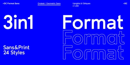 -OC Format Sans is the third incarnation of this geometric grotesk sans serif which fuses the style of Futura with the rhythm and proportions of Akzidenz. It comes in two styles, standard and a new Print family where crisp sharp edges have been made blunt in reference to the ink spread that occurs when printing on uncoated paper stock. It can give digital media a softer more approachable analog aesthetic. Typical of both grotesk and geometric styles the design has an even weight with minimal stroke contrast and the slanted form is an oblique rather than a true italic. The default double-story �a� and �g� give an academic touch, the single story versions of Set 1 are more friendly and approachable while Set 2 changes the look into something more scientific. Made with tireless attention to detail and kerning it's perfect for logotypes and extensive text, supports multiple languages and comes with a plethora of OpenType features including standard and discretionary ligatures, social icons, symbols, and multiple figure styles including roman numerals.
 - Newspoint by Elsner+Flake,
$35.00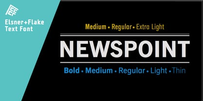 The design of the Newspoint typeface is based on the tradition of the American sans serif faces of the last century. This form expression was greatly influenced by the News Gothic type which was created by Morris Fuller Benton in 1908, and has, once again, become very popular. When the development of sans serif types such as Futura and Kabel by Renner and Koch began in 1925, the design of American sans serif types receded somewhat into the background. In the 1950’s, however, they experienced a renaissance which continues to this day. Thanks to its clean design and the relatively large x-height, the Newspoint is well suited for informative texts in newspapers, magazines, and brochures. In packaging design, as well, the Newspoint can display its strength in small print. Newspoint was developed as a customer-specific variation of the News Gothic. In contrast to the News Gothic, however, the face appears to be softer and more appealing thanks to the changed interpunctions. If so desired, the alternative characters give the typeface expanded individuality and a richness of design options.
 - Castle by Linotype,
$29.99This family, which includes faces in light, book, bold, and ultra weights, more stroke contrast than is typical of sans serifs, making it very legible in text. Because of its large x-height, it is recommended for used in point sizes ranging from 12 point upward. Of course, it functions well in display sizes, too. The contrast between the four weights makes this family optimal for use in hierarchical advertising systems, and corporate identity uses. - Trakya Sans by Bülent Yüksel,
$19.00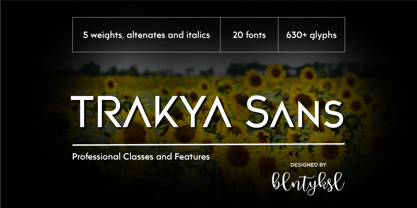 Thrace (/θreɪs/; Greek: Θράκη, Thráki; Bulgarian: Тракия, Trakiya; Turkish: Trakya) is a geographical and historical region in Southeast Europe, now split among Bulgaria, Greece, and Turkey, which is bounded by the Balkan Mountains to the north, the Aegean Sea to the south, and the Black Sea to the east. It comprises southeastern Bulgaria (Northern Thrace), northeastern Greece (Western Thrace), and the European part of Turkey (East Thrace). Trakya Sans is a modern sans serif with a geometric touch. Futura, Avant Garde and the like. It has a modern streak which is the result of a harmonization of width and height especially in the lowercase letters to support legibility. Ideally suited for advertising and packaging, editorial and publishing, logos, branding and creative industries, posters and billboards, small text, way-finding and signage as well as web and screen design. Trakya Sans provides advanced typographical support for Latin-based languages. An extended character set, supporting Central, Western and Eastern European languages, rounds up the family. The designation “Trakya Sans 500 Regular” forms the central point. The first figure of the number describes the stroke thickness: 100 Thin to 900 Bold. "Trakya Sans" comes in 5 weights with matching italics plus "Trakya Sans Alt", also 5 weights and italics so a total of 20 styles. The family contains a set of 630+ characters. Case-Sensitive Forms, Classes and Features, Small Caps from Letter Cases, Fractions, Superior, Inferior, Denominator, Numerator, Old Style Figures just with one easy touch in all graphic programs. Trakya Sans is the perfect font for web use. You can enjoy using it.
 - Okojo Pro by Wordshape,
$20.00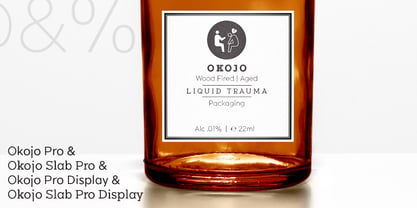 The Okojo Pro Complete family is a reworking of Wordshape’s immensely popular Okojo family of typefaces. It includes Okojo Pro, a semi-geometric sans serif, Okojo Slab Pro, a semi-geometric slab serif, Okojo Pro Display, a round-cornered sans serif variation, and Okojo Slab Pro Display, a round-cornered slab serif. The entire Okojo Pro family looks great at small or large sizes. The Okojo Pro family is designed for readability in long texts while simultaneously functioning as effective display type. Features of Okojo Pro Display: - all lowercase characters have an enlarged x-height, creating less optical dazzle than typefaces like Futura, Neutra or Avant Garde - more humanist numerals and punctuation for enhanced readability - complete Western, Central and Eastern European characters sets - radically improved spacing guaranteeing beautiful results in print and on screen for the Czech, English, Hungarian, Croatian, Esperanto, Maltese, Romanian, Turkish, Albanian, French, Portuguese, Spanish, Basque, Bulgarian, Finnish, Swedish, Norwegian languages The Okojo Pro Display family is influenced by the type designs of Paul Renner and Herb Lubalin, but smoothed over with more than a bit of Americana. Both work well on-screen as webfonts and in print as book type. Each is hinted with accuracy and kerned with precision.The lighter weights are slightly slimmer than the regular and bold weights to give the typeface more of a vertical feel, inviting readers' to rapidly read typeset text with a maximum of contrast and a minimum of optical distortion. Okojo: it’s a little bit country and a little bit rock’n’roll.
 - Manual by TypeUnion,
$39.00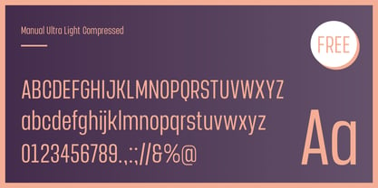 Manual is an 80 font super family formed of 10 weights in 4 different widths. The font is styled with a slight retro feel to give it a unique appearance. Manual is a blue-collar font that works hard for you and your design ideas. The higher x-height enhances the readability for smaller, more informative text sizes whereas the black weights create beautiful, impactful headlines to fit a variety of spaces. The support of the expansive weights and widths will give your design a truly unique feel.
 - GHEA Granshan by Edik Ghabuzyan,
$40.00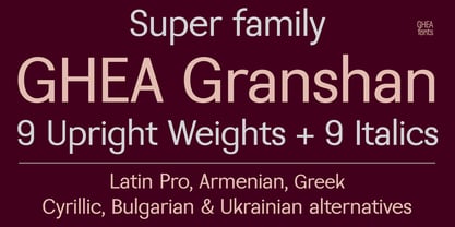 GHEA Granshan is a super font family. It has 9 upright weights and their Italics. It supports Latin Pro, Armenian, Greek, Cyrillic, Bulgarian & Ukrainian alternatives alphabet systems. The weights from Regular to Bold and their Italics can be used as text fonts. The weights thinner than Regular and thicker than Bold can be used as Display fonts. It is an easily readable fond and the eyes don't get tired while reading. GHEA Granshan has a slight contrast style and at the same time is quite bright and clear.
 - Quarca by insigne,
$24.75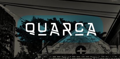 Quarca's masculine power runs strong across the page with bold self-assurance and a raw energy that courses through its thick veins. Don't think the continuous, smooth geometry of this semi-modular face is captively chained to the grid, though. Quarca has been cautiously optimized to engage the reader's eye. Achieving an attractive balance to its sturdy design, the open forms of this "rounded square" geometric sans -together with a tall x-height- make the font legible even when using the compact widths. This high-impact typeface definitely doesn't sacrifice versatility for style. These compact widths, with their raw heart and strength, are perfect for callouts, while the extended widths provide you with the platform for a punchy and extremely efficient headline. The font has a thinner weight and transcends to an intense bold. The face's geometric or technological construction also tends to make it right at home on the web. The family consists of 36 fonts -six weights plus italics. Where Quarca truly stands out, though, is its wide number of OpenType typographic choices and optional glyphs, allowing you to design your piece with a personal, one-of-a-kind variant touch. These variations consist of Experimental Capitals, Angled Capital Terminals, and "Future Stencil". In all, you can find more than one hundred of these alternate glyphs. Quarca is well-suited for anything you are able to throw at it. Devised for today's multi-disciplined designer, this clear and infinitely versatile family provides tremendous value to your toolbox.
 - Black Eye Nue - Unknown license

- Livemono by Letterhend,
$17.00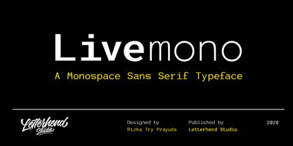 Livemono is a new monospaced sans serif. It looks clean and and very suitable for coding style. The typeface is versatile to blend in your design- with 6 weight, ranging from bold, light, medium, regular, semibold, and thin. Perfect anywhere you need a right finas touches for branding, publishing, titles, book, magazine , and use on UI/UX design. Features: Variable Font uppercase & lowercase numbers and punctuation multilingual 6 weight PUA encoded
 - Oliviar Sans by Adam Fathony,
$10.00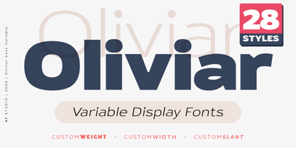 Oliviar Sans Variable is a modern sans serif with Grotesque touch. It's my experimental to study the new trends for the future fonts that is Variable Fonts. Inspired by a Geometrical fonts and also Humanist Sans serif. Created with 8 Masters that export to the traditional OTF to 28 Styles!. On the Applications that support variable fonts such as Adobe Illustrator & Photoshop, you can get more than only 28, you can customize the Weight, Width and Slant. Weight created from Thin (100) to Bold (900), Width created from Standard (100) to Expanded (900) and Slant based on degree angle from 1˚ to 10˚. There is a new slider icons for accessing this features Check on Last Display Image. Another advantage on the Variable fonts are you just need 1 files to install to your computer and it will install all the styles available. All of the Fonts are support for Multilanguage, Carefully Crafted.
 - XPCrazy - Unknown license

- Bulletto by Zetafonts,
$39.00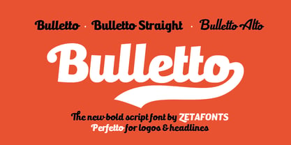 Bulletto is a bold display script font. Made for logos and headlines, it features a slight slant, connecting letterforms and a big x-height. OpenType features include ligatures, swashes, alternate finals and a full set of uppercase alternates. The complete family features Bulletto Regular and its upright version Bulletto Straight with their light companions. Plus Bulletto Alto, an italic version with taller ascenders and descenders for a more calligraphic look.
 - Boundar by Huruforia,
$8.00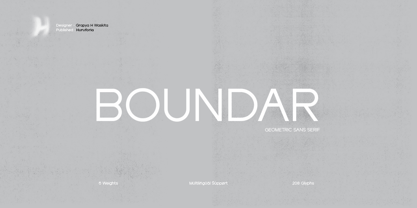 Boundar is a sans serif font with a Geometric style, this font consists of 6 Weights and 208 Glyph. Boundar is taken from the Indonesian word "Bundar" which means circle because in this font there are so many circle elements in the manufacturing process. And I (Grapya) as the designer in this font hope, Boundar Typeface can be useful for you. If there is an error or anything that is less pleasing, you can contact us via our email, we will be happy to receive a review from you so that my team and I can be better in the future. and please note that every font that we upload in front of your monitor screen must have been tested by the curator of MyFonts. Thank You, Grapya & Suratoria Team
 - Asparocus by Prestigetype Studio,
$16.00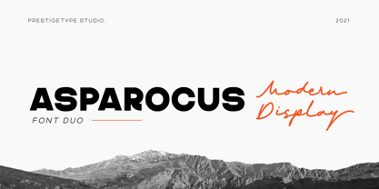 Asparocus is a modern and clean font duo that includes all caps sans serif and script font style. Sans serif style comes in 16 weights with italics + variable fonts. Designed with a modern minimalist mind, Asparocus is suited for display, advertising, web design, headline, branding, logo, text, business card, and many editorial design purposes. What you will get: All caps sans serif and script font style Numbers and punctuation Multilingual Ligatures Alternates Opentype features Future Updates Available We highly recommend using a program that supports OpenType features and Glyphs panels like many Adobe apps and Corel Draw so you can see and access all Glyph variations. We hope you enjoy our font - please do let us know by emailing us at info@prestigetype.com or prestigetypestudio@gmail.com if you need something!
 - Blog by BA Graphics,
$45.00Blog has a new distinctive look and comes in four weights light, regular, medium and bold. It can be seen as quite elegant in the light weights while looking masculine in the heavy weight. Its unique look lends to so many different applications. Blog works well for both headline and text.


