10,000 search results (0.024 seconds)
  1. QuillCapitals - Unknown license
  2. Apollyon™ - Unknown license
  3. Biergärten - Personal use only
  4. Chipperfield_and_Bailey - Unknown license
  5. Uberhölme Italic - Personal use only
  6. KleinsBrokenGotik - 100% free
  7. HerzogVonGraf - 100% free
  8. PerryGothic - Unknown license
  9. Gothic Texture Quadrata - Unknown license
  10. Meyne Textur - 100% free
  11. Uberhölme Lazar Italic - Personal use only
  12. SchmalfetteGotisch - 100% free
  13. Manticore - Unknown license
  14. Morris Roman Alternate - Personal use only
  15. Freak Show - Unknown license
  16. BigElla - 100% free
  17. Worn Manuscript - Unknown license
  18. Sebaldus-Gotisch - Personal use only
  19. BrokenWoodtypes - Unknown license
  20. Ganz Grobe Gotisch - Personal use only

  21. Durwent - Unknown license
  22. JSL Blackletter - Unknown license
  23. TypographerFraktur Contour - Personal use only
  24. 1492_Quadrata_lim - Unknown license
  25. GF Gesetz - Unknown license
  26. Theodoric - Unknown license
  27. Helldorado - Unknown license
  28. Uberhölme Lazar Condensed - Personal use only
  29. Uberhölme Condensed - Personal use only
  30. Deutschische - Unknown license
  31. Wellsley - Unknown license
  32. Trocadero - Personal use only
  33. MKBrokenTypes - 100% free
  34. Durango Western Eroded - Personal use only

  35. Helmswald Post - Personal use only
  36. Kerberos Fang - Personal use only
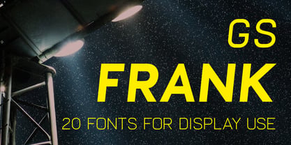
  37. GS Frank by Great Scott, $8.00
    GS Frank is an uppercase display typeface inspired by the classics DIN, Eurostile and a dash of Futura. Perfect for prints, t-shirts, posters and such. Supports Basic, Western European, Central European and South Eastern European latin characters.
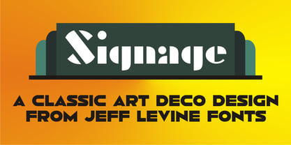
  38. Signage JNL by Jeff Levine, $29.00
    Signage JNL shows the heavy influence of the perennial favorite Futura Black with a couple of minor changes here and there. The design was inspired by a set of British brass stencils for sale in an online auction.
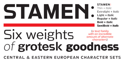
  39. Stamen by Wordshape, $20.00
    Stamen is the answer to a big question: What would happen if one tried to create a typeface that was ‘out of time’? If a type designer was to turn off the internet and put away the type specimens and just try to explore limbic, phantom history, what might that look like? No slavish explorations of the past. No gropings toward the future. No exhaustive core sample of the contemporary. Instead, using what one remembers of history and our collective vision of the future (usually a future imagined from the past) and channeling that into something that is, hopefully, new… The Bentons meet Frutiger for a Manhattan on a space station while Matthew Carter sways to the sweet sounds of the chorale that occasionally played through the halls of Stephenson Blake. This smear of implicit history expressed without explicit reference—this is Stamen: a family of 12 typefaces with a ton of alternate characters. The bold weight was designed for the LP “I Thought the Future Would Be Cooler” ( http://ittfwbc.com/ ) by the band YACHT in response to their request for a typeface that was ‘lost in time’, and refers to neither strict historical models nor purely futuristic forms. I built a small family out from there. It works well in text, but just as well for display setting. I think you’ll enjoy using it.
Looking for more fonts? Check out our New, Sans, Script, Handwriting fonts or Categories
abstract fontscontact usprivacy policyweb font generator
Processing