10,000 search results (0.035 seconds)
  1. Hoedown - Personal use only
  2. Estilographica - Personal use only
  3. Puppeteer - Personal use only
  4. CBGBFont - Unknown license
  5. Wild West Shadow - Unknown license
  6. Cheap Stealer - Personal use only
  7. Burris - Unknown license
  8. Dearest Open - Unknown license
  9. Belwe Gotisch - Personal use only
  10. Dearest Friend - Unknown license
  11. JFRingmaster - 100% free
  12. Monky Business - Unknown license
  13. Ghosttown BC - Personal use only
  14. Fiddums Family - Unknown license
  15. Poseidon - Unknown license
  16. The·Fire - Personal use only
  17. Mellogothic - Personal use only
  18. Steelplate Textura - Personal use only
  19. Ardenwood Demo - Unknown license
  20. Pillbox Opaque - Unknown license
  21. Rediviva - Unknown license
  22. Screw DSG - Unknown license
  23. StageCoach - Unknown license
  24. Dearest Friend lite - Unknown license
  25. Göt - Unknown license
  26. Bill Hicks - Unknown license
  27. KaiserzeitGotisch - Personal use only
  28. Medici Text - Personal use only
  29. Parigee Initials Simple - Unknown license
  30. CantzleyAD1600 - 100% free
  31. Gothic Flames - Personal use only
  32. MCF bad manners ww - 100% free
  33. 1790 Royal Printing by GLC, $38.00
    From 1702 to 1811 the French "Royal", then "Imperial", Printers, neglected Garamond and Fournier's designs and used only the font called "Romain du Roy", carved (1693 to 1723) by Philippe Grandjean by order of the king Louis XIV. 1790 Royal Printing was inspired by various variants of Romain du Roy that were in use during this period. Our sources were mainly official and legal documents printed in the late royal period, and in the beginning of the French revolution. There was no bold style. The 1790 Royal Printing Caps fonts contain small caps, plus titling caps for headlines as 1790 Royal Printing capitals are intended to be used preferably for text.
  34. Juvelo - 100% free
  35. Miragem by Vanarchiv, $55.00
    This serif typeface was designed to be simple and neutral on text sizes, there descender proportions are short and the x-height is large. The lowercase italics contain different structure from roman characters, but the most differentiation detail is the fact the ascender and descender strokes don’t contain serifs. Italics characters are slightly more narrow and condensed than roman letterforms.
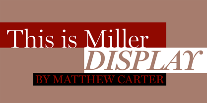
  36. Miller Display by Carter & Cone Type Inc., $35.00
    Miller, designed by Matthew Carter, is a “Scotch Roman,” a class of sturdy, general purpose types of Scottish origin, widely used in the US in the last century, but neglected since & overdue for revival. Miller is faithful to the Scotch style though not to any one historical example — and authentic in having both roman & italic small caps, a feature of the originals.
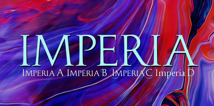
  37. Imperia by Wiescher Design, $49.50
    Imperia is derived from my Classic font Imperium – the Roman Original from the Trajan column. I pushed Imperia a lot further, adding two versions of swings. To make the family more usable I threw in my own version of lowercase letters for free; Roman did not have lowercase letters of that kind! The other three cuts – A, B, and C –have classic smallcaps.
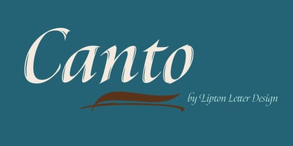
  38. Canto by Lipton Letter Design, $29.00
    Inspired by Edward M. Catich’s seminal thesis on the origins of the Roman inscriptional style, such as that found on Trajan’s column, Richard Lipton’s Canto traces the path from an expressive, preparatory Brush (with Brush Open to preserve gestural details at smaller sizes), through informal Pen, to the formal Roman. Classical capitals are accompanied by Lipton’s own calligraphic lowercase, small caps, and swashes.
  39. Victorian Orchid by Dharma Type, $19.99
    Victorian Orchid is a gorgeous vintage flower. Victorian Orchid is a beautiful, organic serif font family available for both text and display. Its bizarre serifs for A and other diagonal letterforms came from decorative types and letterings in old Victorian era. These unusual serifs support and enhance the horizontal flow of the eyes and vertical alignments. Very eye-catching lowercase g also came from the Victorian era and this is one of the most dramatic letterform of this font. Lowercase such like n and d also have horizontal serifs which designed in the same theory. Victorian Orchid is somewhat organic, humanistic and soft-impression font like Transitional Serif as typified by Times New Roman. But at the same time, this font has horizontal serif and vertical stressed letterform like Modern Serif. They make this font sharp, handsome and neat. In addition, Victorian Orchid has low contrast and the serifs are not too flat and not too coved. By them, Victorian Orchid create strong and casual impression like Slab Serif fonts. Victorian Orchid family consist of 5 weights from Light to Bold including about 500 glyphs, international accented letters, some OpenType features. Italics are "True" italics which designed very carefully to match Romans.
Looking for more fonts? Check out our New, Sans, Script, Handwriting fonts or Categories
abstract fontscontact usprivacy policyweb font generator
Processing