10,000 search results
(0.017 seconds)
- Slowglass by Adam Jagosz,
$29.00 Slowglass is a geometric semi-serif accompanied by geohumanist italics. Softly rounded edges lend it a friendly tone. The typeface includes two categories of stylistic alternates, available as font features as well as complementary font subfamilies. Text forms for increased legibility (Slowglass Text) and uncial-inspired unicase variants (Slowglass Alt). At over 1500 glyphs per weight, the fonts support 80+ Latin-based languages (incl. Vietnamese), 14 Cyrillic-based languages and polytonic Greek. OpenType features: Six sets of figures: proportional / tabular × oldstyle / lining / petite (ss20) Superscript and subscript figures Fractions, numerators, denominators Optional slashed zero Case-sensitive forms Glyph composition/decomposition (support for Navajo and Greek) Localization (Dutch, Marshallese, Bulgarian) Stylistic Sets: ss01 Roman: Two-story a, loopy α / Italic: Loopy α ss02 Roman: Simple g / Italic: Simple k ss03 Unicase r ss04 Alt f t г п т γ ss05 Descending η χ ss06 Unicase β ζ θ ξ ss07 Alt в г д ж з к п т ю ss08 Latinized ς, cursive и й ss09 Round Δ Λ Д д Л л Љ љ ss10 Full-stem a q ss11 Seriffed I ss12 Unicase A ss13 Unicase E Ω ss14 Descending F T Г П ss15 Descending G P Q Y ss16 Unicase M N И H Y ss17 Extending Φ Ψ ss20 Petite figures
 - Analisa by Gatype,
$12.00 Analisa is a special modern style font. Crafted with pinpoint accuracy with beautiful curves. with alternate characters and bonds that make your work very special. Analisa is perfect for use in watercolor designs or bold handwriting styles, such as blog headers, branding, t-shirts, Great for branding designs, logos, greeting cards, title packaging, weddings, social media, product design, stationery , advertising, clothing, book covers, business cards, greeting cards, branding, merchandise, handmade invitations and quotes, and more. Immediately use our fonts to make your work more amazing. Feature analisa of OpenType style alternatives, International binders and support for most Western Languages included. To enable the OpenType Stylistic alternative, you need a program that supports OpenType features such as Adobe Illustrator CS, Adobe Indesign & CorelDraw X6-X7, Microsoft Word 2010 or later versions. How to access all alternative characters using Adobe Illustrator: https://www.youtube.com/watch?v=XzwjMkbB-wQ Analisa are coded with PUA Unicode, which allows full access to all additional characters without having to design special software. Mac users can use Font Book , and Windows users can use Character Map to view and copy any additional characters to paste into your favorite text editor/application. How to access all alternative characters, using the Windows Character Map with Photoshop: https://www.youtube.com/watch?v=Go9vacoYmBw If you need help or have any questions, let me know. I'm happy to help. Thanks & Happy Designing.
 - Snowdrop by Supfonts,
$17.00 Thanks for checking out Snowdrop Script! A fabulously fun yet elegant script font with tons of energy, allowing you to create beautiful hand-made typography in an instant. With extra bouncy curves & alternates, Snowdrop Script is guaranteed to make your text stand out - perfect for wedding invitations, printed quotes, cards, product packaging, headers and whatever your imagination holds. By the way, you can make your own design IN ANY language What's really awesome is that Snowdrop Script comes with a complete set of lowercase alternates, which allows you to create even more authentic custom-feel text. Another great feature is the bonus ornaments font, which allows you to add some really unique and elegant finishing touches to your script text. Here's what you get in the download: 1. Snowdrop Script - A handwritten script font containing upper & lowercase characters, numerals and a large range of punctuation. Fully support of all Latin and Cyrillic languages 2. Snowdrop Swirls - The set of small letters with swirls at the beginning and end of the letter. You can use A-Z and A-z to get to them 3. Snowdrop Alt - The set of small letters with special endings + a set of letters with special curls for the middle of words Fonts are provided in TTF / OTF / WOFF formats. You do not need a special design program. Font easy and convenient to use.
 - Technomat by Storm Type Foundry,
$10.00Technomat takes inspiration from matrix or thermal dot printers. Minimalistic construction and soft edges makes it legible from 3 point size. - Amsterdam Old Style by Red Rooster Collection,
$45.00 An original design, loosely based on a typeface from an old wood type specimen book from the turn-of-the-century.
 - Le Havre Titling by insigne,
$24.00 Throughout time, history’s architects have incorporated some of the finest illustrations of type into their great works--cuneiform on Mesopotamian ziggurats; Greek etched into the temples of the gods; inscriptions marking the monuments of mighty Rome. From these Roman inscriptions specifically, we take our capital letters of today; and while we've lost the need for serifs over time, our current characters maintain the classical foundations, even after being distilled to their simplistic forms. Here’s where we have the basis for Le Havre Titling. This updated face is a carefully optimized version of Le Havre that uses purely capital lettering. Originally inspired by the golden period of the passenger ship and the French port that bid a rich bon voyage to so many famed, luxurious ocean liners of the Roaring Twenties and Thirties, the typeface includes an exciting array of ligatures that brings it into the present day and gives designers a tremendous amount of versatility in their work. With its seven weights, Titling looks equally at home on the side of a building as it does in a finely crafted invitation. With over five hundred glyphs, Le Havre Titling offers a multiplicity of options for your projects. Combine ligatures, play around with two sets of art deco forms, use original caps, and more; every one of these is obtainable with the OpenType functionality. The new design also shares five weights with the original Le Havre, allowing you to maximize your potential through its interchangeability. Titling’s Thin weights are delicate but not too fragile, and its geometric forms give each individual composition you create an exquisite and beautiful sense of emotion. Without a doubt, this fresh, fashionable take on the classical forms offers your reader refined, yet unanticipated approach as he or she travels through your text.
 - AwanZaman by TypeTogether,
$93.00 AwanZaman has a three-phase story, beginning with Dr Mamoun Sakkal’s two Arabic styles and culminating with Juliet Shen’s Latin extension. AwanZaman started as simply Awan, a commission for a modern, clean, monoline typeface for writing headlines and story titles in a forward-thinking Kuwaiti newspaper. Awan was based on the geometric forms of Kufic script, while in phase two, a second typeface (Zaman) was designed to add enough calligraphic Naskh details to make it easy to read in demanding newspaper settings. Together these two phases give the typeface a warm, familiar, and progressive look, as well as an explanatory two-part name — AwanZaman. Since most editorials use typical Naskh headline fonts with an exaggerated baseline, Awan’s rational forms immediately distinguish it as a modern and progressive voice in the crowded field of Arabic editorial typefaces. As the companion Arabic typeface, Zaman has the same basic proportions and forms as Awan, but with many cursive, energetic, and playful details. And since modern monoline fonts are increasingly being used to set extended texts, more features were borrowed from Naskh calligraphy to expand the typeface’s use from headlines into text setting. When using the AwanZaman Arabic family, Awan (geometric Kufic forms) is the starting point. To add the sweeping, energetic personality of Zaman (calligraphic Naskh forms), simply activate an alternate character through the option of 20 stylistic sets available in any OpenType-savvy software. The two typefaces function as one file — the AwanZaman Arabic family — allowing users to combine features from both designs to transform the appearance of text from geometric and formal to playful and informal. The third phase of AwanZaman’s development introduced a companion Latin typeface designed by Juliet Shen to fulfil the persistent need in the Arabic fonts market for modern and geometric bilingual type families. Due to the Arabic’s monolinear strokes, AwanZaman Latin was destined to be a sans serif with a tall x-height, larger counters, and corresponding stem thickness to harmonise with the Arabic’s overall text colour and page presence. But it needed much more. One of AwanZaman’s chief assets is making the two languages look on a par when typeset side by side. Arabic and English readers will have a different sense of what that entails, but this type family defers to the Arabic — graceful and artistic with a good mix of straight stems and curved forms. Latin in general doesn’t aesthetically flow the way Arabic does, yet the tone of the Latin needed to mirror both the Arabic’s more squarish curves and formal personality of Awan and the undulating and more playful shapes of Zaman without looking outlandish. That need was met by creating some novel Latin characters, which are accessed through four stylistic sets the same way as AwanZaman Arabic. The alternates are not just clever in the way they look and how they echo the Arabic aesthetic, but also in harmonising the disparate languages and serving designers well when needing a balanced, bilingual text face with a warm and lively voice. AwanZaman is a clever, seven-weight powerhouse that makes extensive use of OpenType’s stylistic sets (20 in the Arabic and four in the Latin) so writers and designers can make the most of everything from a single glyph in display sizes down to dense text in paragraphs. As AwanZaman Arabic has no italic, neither does the Latin; contextual distinction normally handled by italics is achieved by exploiting the family’s seven weights. AwanZaman’s intricate OpenType programming supports Persian and Urdu, with features such as the returning tail of Barri Yeh treated properly. From its inception in geometry to its melding of two worlds with novel forms, AwanZaman is a personal labor by designers Dr Mamoun Sakkal and Juliet Shen, and embodies the TypeTogether ideals of serving the global community with innovative and stylish typeface solutions. The complete AwanZaman Arabic and Latin families, along with our entire catalogue, have been optimised for today’s varied screen uses.
 - Hayfork JNL by Jeff Levine,
$29.00 Hayfork JNL is based on a vintage wood type sanserif typeface from the 1880's. A font of similar design is Eckhardt Poster Display, which was modeled from a 1920's sign painter's handbook; no doubt getting its inspiration from this wood type's design.
 - Lost Forever - Unknown license

- Gothic No.13 by Bitstream,
$29.99A dark, condensed, nineteenth century sanserif made popular by Linotype, the capitals deriving from Barnhart Brothers and Spindler, the lowercase from Farmer. - Ordin by Robert Corseanschi,
$24.99 Ordin is inspired by today's technology with a unique and clean look which stands out from the other fonts from its category.
 - Class Project JNL by Jeff Levine,
$29.00Another in the series of stencil fonts from Jeff Levine, Class Project JNL was inspired by a lettering guide from the 1940s. - Vintage Designs JNL by Jeff Levine,
$29.00Vintage Designs JNL is another collection of images re-drawn from illustrations found in catalogs and sign painters' idea books from decades past. - Montreal Architect Px by Letradora,
$15.00 Inspired from blueprints of old Montreal buildings, this font is a hand lettered, all caps face with influences from the arts & crafts movement.
 - Stereobytes by Stereo Type Haus,
$10.00 54 audio dingbats scoured from pages of vintage aural enthusiasts magazines and fontified just for you… from tubes to amps, turntables, headphones and more.
 - Exotica by Studio K,
$45.00 Old World elegance meets Levantine luxury in this stylish new font from Studio K. It takes its inspiration from the numerals on antique clocks and pocket watches – specifically the curlicue on the figure ‘2’ – from which the entire font has been extrapolated. The font also includes alternate swash capitals.
 - Rotham Industria by Greater Albion Typefounders,
$18.00 Rotham Industrial. Stylised lettering for industrial flavoured projects. Imagine, if you will letters shaped from metal tube, or perhaps from a solid rod, or perhaps made from brass handrails? You get the idea. A stylised and fun typeface for those occasions where you want to suggest an engineering influence.
 - Meduza Collection FJ by Frncojonastype,
$30.00 fj Meduza is a new typographical system designed by Franco Jonas Hernández, born as an exploring process from the classic model from —modern or didones style— typhography from XIX century. fj Meduza also explores the posibilities of Optical Adjustments —from 8 or 10 to 72 pts— offering a version to compose preferent reduced sizes —newspapers— and another version to titles with long-standing. Ideally for Branding, Headlines and especially complex editiorial contexts.
 - Vtg Stencil France No3 by astype,
$28.00 The Vtg Stencil fonts from astype are based on real world stencils from several countries. All styles offering an extended Latin character set. » pdf specimen «
 - Handegypt by MADType,
$21.00 Handegypt resulted from playfully hand-rendering Egyptian style fonts from memory. Its playful nature is ideally suited for whimsical designs and anything aimed at children.
 - Stampede by FontMesa,
$25.00Stampede was created from a small sample of letters found on an old document dating back to 1902 from the Chicago, Indiana & Eastern Railway Co. - Vtg Stencil France No5 by astype,
$28.00 The Vtg Stencil fonts from astype are based on real world stencils from several countries. All styles offering an extended Latin character set. » pdf specimen «
 - Cardboard Cutouts JNL by Jeff Levine,
$29.00Cardboard Cutouts JNL is a blocky sans serif font re-drawn from some old "kiddie" stencils from the 1950s or 1960s acquired by Jeff Levine. - That Stuff JNL by Jeff Levine,
$29.00That Stuff JNL is a collection of twenty-six images ranging from a stop sign to a peace sign... from a daisy to some 35 mm slides... from smiley and unhappy faces to a rubber stamp and a prize ribbon... A little bit of this and that for the creative designer. - Rennie Mackintosh Hillhouse by CRMFontCo,
$20.00Derived from the world famous Rennie Mackintosh Font, the Hillhouse version gives a 3D look to the genius of Charles Rennie Mackintosh. The "Hillhouse" name comes from one of Mackintosh's most famous architectural works - the Hill House in Helensburgh, Scotland. This stunning conceptual design can be visited from April to October. - Imagine strolling through a bustling vintage marketplace on a sunny afternoon; each step takes you past stalls bursting with vinyl records, hand-painted signs, and rustic wooden crates. As you meande...
- Oh, let me take you on a little journey through the cosmos of typography, where the star of our expedition is none other than the Voyager Grotesque! Dreamt up and meticulously crafted by the talented...
- Militta Reguler by Four Lines Std,
$12.00 Personalize your designs and make them stand out from the crowd with our collection of handwritten fonts! From quirky to elegant, we’ve got something for everyone!
 - TT Jenevers by TypeType,
$35.00 TT Jenevers useful links: Specimen | Graphic presentation | Customization options Please note! If you need OTF versions of the fonts, just email us at commercial@typetype.org About TT Jenevers: TT Jenevers is a modern serif with Dutch flavor. The font family features the characteristic details peculiar to Dutch serifs—these are the asymmetrical shape of serifs and an irregular slant of ovals. For example, in the letter “o” there is no slant, but it is present in p-q. In TT Jenevers, both lowercase and uppercase characters are of a large size, which makes it a rather display typeface. At the same time, the big half-ellipse of the lowercase characters does not allow the letters to stick, which allows the implementation of TT Jenevers in text arrays. The italics of the TT Jenevers are slightly narrower as compared to upright faces—this is done to ensure a greater density of the text array. The italics of the TT Jenevers are slightly narrower as compared to upright faces—this is done to ensure a greater density of the text array. TT Jenevers font family consists of 12 fonts (6 upright and 6 true Italics), each of which has more than 830 characters. The typefaces include small capitals for Cyrillic and Latin alphabets, 33 ligatures, standard and old-style figures, stylistic alternates, arrows, hands, and card suits. We have prepared two dissimilar stylistic sets, which allow changing the nature of TT Jenevers to a more hand-written one, or adding a futuristic touch to the typeface. FOLLOW US: Instagram | Facebook | Website TT Jenevers OpenType features: ordn, case, c2sc, smcp, frac, sups, sinf, numr, dnom, onum, tnum, pnum, lnum, liga, dlig, salt, ss01, ss02, zero. TT Jenevers language support: Acehnese, Afar, Albanian, Alsatian, Aragonese, Arumanian, Asu, Aymara, Azerbaijani, Banjar, Basque, Belarusian (cyr), Belarusian (lat), Bemba, Bena, Betawi, Bislama, Boholano, Bosnian (cyr), Bosnian (lat), Breton, Bulgarian (cyr), Cebuano, Chamorro, Chichewa, Chiga, Colognian, Cornish, Corsican, Cree, Croatian, Czech, Danish, Dutch, Embu, English, Erzya, Esperanto, Estonian, Faroese, Fijian, Filipino, Finnish, French, Frisian, Friulian, Gaelic, Gagauz (lat), Galician, Ganda, German, Gusii, Haitian Creole, Hawaiian, Hiri Motu, Hungarian, Icelandic, Ilocano, Indonesian, Innu-aimun, Interlingua, Irish, Italian, Javanese, Jola-Fonyi, Judaeo-Spanish, Judaeo-Spanish, Kalenjin, Karachay-Balkar (lat), Karaim (lat), Karakalpak (lat), Kashubian, Kazakh (lat), Khasi, Khvarshi, Kinyarwanda, Kirundi, Komi-Permyak, Komi-Zyrian, Kongo, Kumyk, Kurdish (lat), Ladin, Latvian, Laz, Leonese, Lithuanian, Luba-Kasai, Luganda, Luo, Luxembourgish, Luyia, Macedonian, Machame, Makhuwa-Meetto, Makonde, Malay, Maltese, Manx, Maori, Mauritian Creole, Minangkabau, Moldavian (lat), Montenegrin (lat), Mordvin-moksha, Morisyen, Nahuatl, Nauruan, Ndebele, Nias, Nogai, Norwegian, Nyankole, Occitan, Oromo, Palauan, Polish, Portuguese, Quechua, Rheto-Romance, Rohingya, Romanian, Romansh, Rombo, Rundi, Russian, Rusyn, Rwa, Salar, Samburu, Samoan, Sango, Sangu, Sasak, Scots, Sena, Serbian (cyr), Serbian (lat), Seychellois Creole, Shambala, Shona, Silesian, Slovak, Slovenian, Soga, Somali, Sorbian, Sotho, Spanish, Sundanese, Swahili, Swazi, Swedish, Swiss German, Tagalog, Tahitian, Taita, Talysh (lat), Tatar, Teso, Tetum, Tok Pisin, Tongan, Tsakhur (Azerbaijan), Tsonga, Tswana, Turkish, Turkmen (lat), Udmurt, Ukrainian, Uyghur, Vastese, Vepsian, Volapük, Võro, Vunjo, Welsh, Wolof, Xhosa, Zaza, Zulu.
 - Monsters Attack! - Unknown license

- Acadian by Scriptorium,
$12.00A lovely decorative Victorian period font taken directly from samples printed on an old press right from the metal type in the collection of typophile Steve Saxe. - Letterpress Pieces JNL by Jeff Levine,
$29.00 From cartoons to ad helpers to embellishments and ornaments, Letterpress Pieces JNL is another collection of vintage imagery from the pre-computer era of printing and advertising.
 - Party Invite JNL by Jeff Levine,
$29.00 Party Invite JNL is a thin, condensed Art Deco sans based on lettering from a letterpress holiday stock cut (the predecessor to clip art) from the 1940s.
 - Zerno by Pepper Type,
$25.00 Zerno is a glyphic typeface with geometric roots. Its symmetrical flared serifs are reminiscent of stone carving techniques. With weights ranging from Thin to Black, it is versatile enough to be used in any environment - from screen to literal stone carving, as well as from posters to body copy that stands out.
 - Kartoon Kutz NF by Nick's Fonts,
$10.00These charming little cartoon figures, known in the trade as "midgets", added a little extra oomph to everything from business cards to matchbook covers from the 1920s to the 1950s. Each font contains 52 different cuts, ready and waiting to spice up your layouts, and each carefully hand drawn from authentic historical sources. - The DIST Inking Bold font is a robust and captivating typeface that effortlessly captures the essence of hand-drawn creativity with the precision and clarity of digital design. Designed to emulate th...
- Southern Colonialist by Intellecta Design,
$19.90Southern colonialist is a new slab typeface from Intellecta, based on ancient advertisements from the Wild West of America Good for titling and display usage; in many styles. - Breeze by Linotype,
$29.99Breeze is a fun font from Frank Marciuliano where the letters are formed like the sails from the boat. He may have been inspired from the sailboats which he sees on the walks along the shore on the Hudson River. There are two forms available. Left and right define the direction of the blowing wind. - Lycaner by Otto Maurer,
$19.00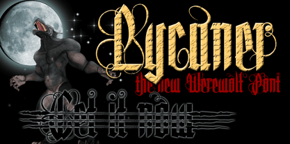 Derived from Freiheit.
 - Lansbury - 100% free


