5,118 search results
(0.02 seconds)
- Dimelike by Balpirick,
$15.00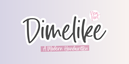 Dimelike is a Modern Handwritten Font. Dimelike feels equally charming and elegant. It looks stunning on wedding invitations, thank you cards, quotes, greeting cards, logos, business cards and every other design which needs a customized touch. - also multilingual support Enjoy the font, feel free to comment or feedback, send me PM or email. Thank you!
 - Bleakfall by Allouse Studio,
$16.00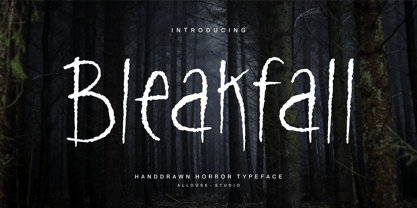 Proudly Present, Bleakfall a Handdrawn Horror Typeface. Bleakfall is perfect for any titles, logo, product packaging, branding project, megazine, social media, wedding, or just used to express words above the background. Bleakfall also come with Multi-Lingual Support. Enjoy the font, feel free to comment or feedback, send me PM or email. Thank You!
 - History Valentine by Skinny Type,
$15.00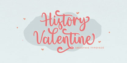 Proudly Present, History Valentine Font. History Valentine is a Modern Handwritten Font. History Valentine is perfect for product packaging, branding project, megaazine, social media, wedding, or just used to express words above the background. History Valentine also multilingual support. Enjoy the font, feel free to comment or feedback, send me PM or email. Thank you!
 - Sheilablue by Allouse Studio,
$16.00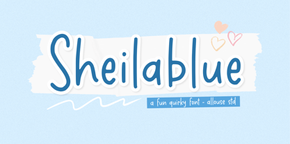 Proudly Presenting, Sheilablue A Fun Quirky Font Sheilablue is perfect for any titles, logo, product packaging, branding project, megazine, social media, wedding, or just used to express words above the background. Sheilablue also come with Multi-Lingual Support. Enjoy the font, feel free to comment or feedback, send me PM or email. Thank You!
 - Gloomie Sunday by Balpirick,
$15.00 Gloomie Sunday is a Handwritten Font. Whether you’re using it for crafts, digital design, presentations, or making greeting cards, this font has the potential to become your favorite go-to font, no matter the occasion! This font only has allcaps letters. - also multilingual support Enjoy the font! Feel free to comment or feedback! Thank you!
 - The Gloves by Aestherica Studio,
$12.00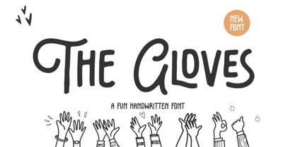 Introducing the new Fun Handwritten Font by Aestherica Studio. Proudly Present, The Gloves The Gloves is perfect for product packaging, branding project, megazine, social media, wedding, or just used to express words above the background. The Gloves also multilingual support. Enjoy the font, feel free to comment or feedback, send me PM or email.
 - Mango Mingle by Balpirick,
$15.00 Mango Mingle is a Handdrawn Font. Whether you’re using it for crafts, digital design, presentations, or making greeting cards, this font has the potential to become your favorite go-to font, no matter the occasion! This font only has allcaps letters. - also multilingual support Enjoy the font! Feel free to comment or feedback! Thank you!
 - Glathope by Allouse Studio,
$16.00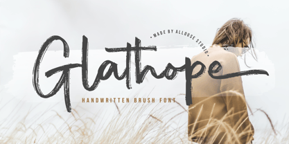 Proudly Presenting, Glathope is A Handwritten Brush Font Glathope is perfect for any titles, logo, product packaging, branding project, megazine, social media, wedding, or just used to express words above the background. Glathope also come with Multi-Lingual Support. Enjoy the font, feel free to comment or feedback, send me PM or email. Thank You!
 - Honey Bread by Balpirick,
$14.00 Honey Bread is a Handbrushed Font. Whether you’re using it for crafts, digital design, presentations, or making greeting cards, this font has the potential to become your favorite go-to font, no matter the occasion! This font only has allcaps letters. - also multilingual support Enjoy the font! Feel free to comment or feedback! Thank you!
 - Sahhira Wishess by Rotterlab Studio,
$12.00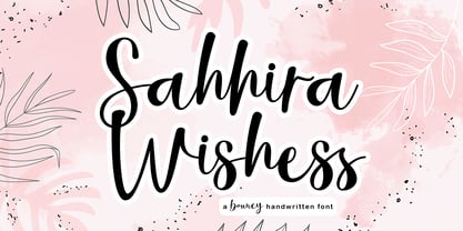 Proudly Present, Sahhira Wishess Font. Sahhira Wishess is a Modern Handwritten Font. Sahhira Wishess is perfect for product packaging, branding project, megaazine, social media, wedding, or just used to express words above the background. Sahhira Wishess also multilingual support. Enjoy the font, feel free to comment or feedback, send me PM or email. Thank you!
 - Highfilm by Allouse Studio,
$16.00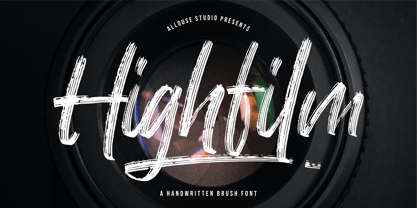 Proudly Present, Highfilm a Handwritten Brush Font Highfilm is perfect for any titles, logo, product packaging, branding project, megazine, social media, wedding, or just used to express words above the background. Highfilm also come with Multi-Lingual Support. Enjoy the font, feel free to comment or feedback, send me PM or email. Thank You!
 - Rhapsoline by Allouse Studio,
$16.00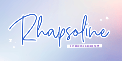 Proudly Presenting, Rhapsoline A Monoline Script Font. Rhapsoline is perfect for any titles, logo, product packaging, branding project, megazine, social media, wedding, or just used to express words above the background. Rhapsoline also come with Multi-Lingual Support. Enjoy the font, feel free to comment or feedback, send me PM or email. Thank you!
 - Adelliatte by Allouse Studio,
$16.00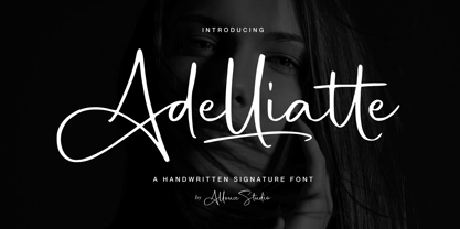 Proudly Presenting, Adelliatte A Handwritten Signature Font. Adelliatte is perfect for any titles, logo, product packaging, branding project, megazine, social media, wedding, or just used to express words above the background. Adelliatte also come with Multi-Lingual Support. Enjoy the font, feel free to comment or feedback, send me PM or email. Thank You!
 - Talklessy by Allouse Studio,
$16.00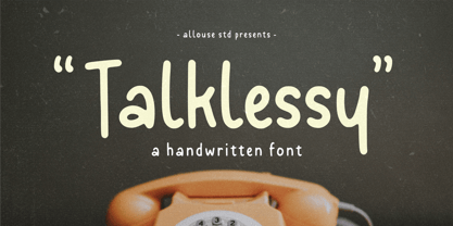 Proudly Presenting, Talklessy A Quirky Handwritten Font. Talklessy is perfect for any titles, logo, product packaging, branding project, megazine, social media, wedding, or just used to express words above the background. Talklessy also come with Multi-Lingual Support. Enjoy the font, feel free to comment or feedback, send me PM or email. Thank You!
 - Secretsoul by Balpirick,
$15.00 Secretsoul is a Monoline Handwritten Font. Secretsoul Monoline is a thin lettered, refined script font that emanates sophistication and elegance. Its stylish alternates and ligatures make this font the perfect match for any project. Secretsoul also multilingual support. Enjoy the font, feel free to comment or feedback, send me PM or email. Thank you!
 - Chocobelly by Allouse Studio,
$16.00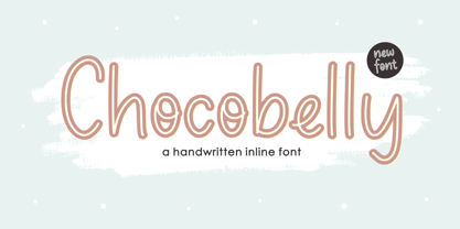 Proudly Presenting, Chocobelly A Handwritten Inline Font. Chocobelly is perfect for any titles, logo, product packaging, branding project, megazine, social media, wedding, or just used to express words above the background. Chocobelly also come with Multi-Lingual Support. Enjoy the font, feel free to comment or feedback, send me PM or email. Thank You!
 - Baltiholm by Allouse Studio,
$16.00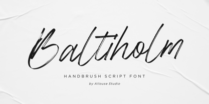 Proudly Presenting, Baltiholm A Handbrush Script Font. Baltiholm is perfect for any titles, logo, product packaging, branding project, megazine, social media, wedding, or just used to express words above the background. Baltiholm also come with Multi-Lingual Support. Enjoy the font, feel free to comment or feedback, send me PM or email. Thank You!
 - Vandal Lineros by Sipanji21,
$17.00 Vandal Linerous sounds like a cool graffiti typeface. Graffiti fonts often have a unique and artistic style that can add an edgy and urban feel to various design projects. If you have any specific questions or if there's anything specific you'd like to know or discuss about graffiti fonts or design, feel free to ask!
 - Jolystmas by Allouse Studio,
$16.00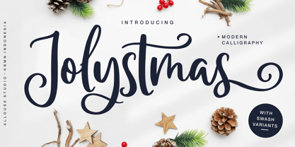 Proudly Presenting, Jolystmas a Modern Calligraphy Font. Jolystmas is perfect for any titles, logo, product packaging, branding project, megazine, social media, wedding, or just used to express words above the background. Jolystmas also come with Multi-Lingual Support. Enjoy the font, feel free to comment or feedback, send me PM or email. Thank You!
 - Boomsplash by Allouse Studio,
$16.00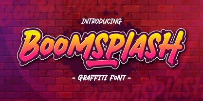 Proudly Presenting, Boomsplash a Tagging Graffiti Font. Boomsplash is perfect for any titles, logo, product packaging, branding project, megazine, social media, wedding, or just used to express words above the background. Boomsplash also come with Multi-Lingual Support. Enjoy the font, feel free to comment or feedback, send me PM or email. Thank you!
 - Tiranti Solid by ITC,
$39.00Tiranti Solid is based on the original textured Tiranti created by English designer Tony Forster. This typeface lends itself more easily for use in digital formats while still maintaining the free-flowing calligraphy of the earlier design. Tiranti Solid consists of initial swash capitals complemented by a more reserved lowercase with many alternate letters. - Frantic Pace JNL by Jeff Levine,
$29.00 Frantic Pace JNL is based on hand lettering found on the lid of a late 1950s or early 1960s edition of the Print Craft alphabet printing set once manufactured by the Superior Marking Equipment Company of Chicago. The free-form spurred serif lettering is fun and casual; giving the impression of movement or action.
 - Fachristar by Allouse Studio,
$16.00 Proudly Presenting, Fachristar A Fun All - Caps Font. Fachristar is perfect for any titles, logo, product packaging, branding project, megazine, social media, wedding, or just used to express words above the background. Fachristar also come with Multi-Lingual Support. Enjoy the font, feel free to comment or feedback, send me PM or email. Thank You!
 - Onlychalk by Allouse Studio,
$16.00 Proudly Presenting, Onlychalk A Handmade Chalk Font Onlychalk is perfect for any titles, logo, product packaging, branding project, megazine, social media, wedding, or just used to express words above the background. Onlychalk also come with Multi-Lingual Support. Enjoy the font, feel free to comment or feedback, send me PM or email. Thank You!
 - Gabyrose by Allouse Studio,
$16.00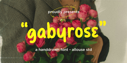 Proudly Presenting, Gabyrose A Monoline Hand drawn Font. Gabyrose is perfect for any titles, logo, product packaging, branding project, megazine, social media, wedding, or just used to express words above the background. Gabyrose also come with Multi-Lingual Support. Enjoy the font, feel free to comment or feedback, send me PM or email. Thank You!
 - Heartcraft by Allouse Studio,
$16.00 Proudly Present, Heartcraft a Handwritten Signature Font. Heartcraft is perfect for any titles, logo, product packaging, branding project, megazine, social media, wedding, or just used to express words above the background. Heartcraft also come with Multi-Lingual Support. Enjoy the font, feel free to comment or feedback, send me PM or email. Thank You!
 - Shinymotion by Allouse Studio,
$16.00 Proudly Presenting, Shinymotion A Monoline Script Font. Shinymotion is perfect for any titles, logo, product packaging, branding project, megazine, social media, wedding, or just used to express words above the background. Shinymotion also come with Multi-Lingual Support. Enjoy the font, feel free to comment or feedback, send me PM or email. Thank You!
 - Lemonmint by Allouse Studio,
$16.00 Proudly Presenting, Lemonmint A Cute Handwriten Script Font. Lemonmint is perfect for any titles, logo, product packaging, branding project, megazine, social media, wedding, or just used to express words above the background. Lemonmint also come with Multi-Lingual Support. Enjoy the font, feel free to comment or feedback, send me PM or email. Thank You!
 - Montageway by Allouse Studio,
$16.00 Proudly Presenting, Montageway A Bold Brush Script Font. Montageway is perfect for any titles, logo, product packaging, branding project, megazine, social media, wedding, or just used to express words above the background. Montageway also come with Multi-Lingual Support. Enjoy the font, feel free to comment or feedback, send me PM or email. Thank You!
 - Dupliciter by JAF 34,
$9.90 DUPLICITER is an experimental display sans serif font which has two typefaces for comfortable and experimental use. DUPLICITER is a (latest) part of new school in type design that could be called like mind-free and geometric direction in the world. Sans serif, condensed, sharp edges, geometric, experimental, these are the main attributes of DUPLICITER.
 - Pierce Jackson by Balpirick,
$15.00 Pierce Jackson is a Handbrushed Font. Whether you’re using it for crafts, digital design, presentations, or making greeting cards, this font has the potential to become your favorite go-to font, no matter the occasion! This font only has allcaps letters. - also multilingual support Enjoy the font! Feel free to comment or feedback! Thank you!
 - Ninetys Starfox by Allouse Studio,
$16.00 Proudly Presenting, Ninety Starfox A Playful DIsplay Font. Ninety Starfox is perfect for any titles, logo, product packaging, branding project, megazine, social media, wedding, or just used to express words above the background. Ninety Starfox also come with Multi-Lingual Support. Enjoy the font, feel free to comment or feedback, send me PM or email.
 - Franksthone by Allouse Studio,
$16.00 Proudly Presenting, Franksthone A Handwritten Brush Font Franksthone is perfect for any titles, logo, product packaging, branding project, megazine, social media, wedding, or just used to express words above the background. Franksthone also come with Multi-Lingual Support. Enjoy the font, feel free to comment or feedback, send me PM or email. Thank You!
 - Bemsod Decker by madeDeduk,
$14.00 Introducing Bemsod Decker is a casual handwritten font and will be perfect for book, title branding, product packaging, invitation, quotes, label, poster, logo etc. Feature Uppercase & Lowercase Number & Symbol International Glyphs Multilingual support Alternative Ligature Feel free to drop us a message any time and follow my shop for upcoming updates Hope you enjoy it.
 - Fontfoliae by studiocharlie,
$24.00 Leaves from the most common trees with botanical names. See the attached pdf for the legenda.
 - Exquisite Corpse - 100% free

- Lausanne - Personal use only

- Shit Happens - Personal use only

- Shrapnel - Personal use only

- KG Dancing on the Rooftop - Personal use only


