723 search results
(0.018 seconds)
- Anisette Std Petite by Typofonderie,
$59.00 Geometric font inspired by shop signs in 4 styles Anisette has sprouted as a way to test some ideas of designs. It has started with a simple line construction (not outlines as usual) that can be easily expanded and condensed in its width in Illustrator. Subsequently, this principle of multiple widths and extreme weights permitted to Jean François Porchez to have a better understanding with the limitations associated with the use of MultipleMaster to create intermediate font weights. Anisette built around the idea of two widths capitals can be described as a geometric sanserif typeface influenced by the 30s and the Art Deco movement. Its design relies on multiple sources, from Banjo through Cassandre posters, but especially lettering of Paul Iribe. In France, at that time, the Art Deco spirit is mainly capitals. Gérard Blanchard has pointed to Jean Francois that Art Nouveau typefaces designed by Bellery-Desfontaines was featured before the Banjo with this principle of two widths capitals. The complementarity between the two typefaces are these wide capitals mixed with narrow capitals for the Anisette while the Anisette Petite – in its latest version proposes capitals on a square proportions, intermediate between the two others sets. Of course, the Anisette Petite fonts also includes lowercases too. Anisette Petite, a geometric font inspired by shop signs in 4 styles So, when Jean François Porchez has decided to create lowercases the story became more complicated. His stylistic references couldn’t be restricted anymore to the French Art-déco period but to the shop signs present in our cities throughout the twentieth century. These signs, lettering pieces aren’t the typical foundry typefaces. Simply because the influences of these painted letters are different, not directly connected to foundry roots which generally follow typography history. The outcome is a palette of slightly strange shapes, without strictly not following geometrical, mechanical and historical principles such as those that typically appear in typefaces marketed by foundries. As an example, the Anisette Petite r starts with a small and visible sort of apex that no other similar glyphs such as n or m feature, but present at the end of the l and y. The famous g loop is actually inspired by Chancery scripts, which has nothing to do with the lettering. The goal is of course to mix forms without direct reports, in order to properly celebrate this lettering spirit. This is why the e almost finishes horizontally as the Rotis – and the top a which must logically follow this principle and is drawn more round-curly. This weird choice seemed so odd to its designer that he shared his doubts and asked for advise to Jeremy Tankard who immediately was reassuring: “Oddly, your new top a is fine, it brings roundness to the typeface, when the previous pushes towards Anisette Petite to unwanted austerity.” The Anisette Petite, since its early days, is a mixture of non-consistent but charming shapes. Anisette, an Art Déco typeface Anisette Petite Club des directeurs artistiques, 46e palmarès Bukva:raz 2001
 - Guthen Bloots by Azetype,
$16.00 NEW UPDATED! OKTOBER 16, 2023 (Guthen Bloots Monoline) Presenting Guthen Bloots! A Smooth Marker Font with stylish alternates. This font is made with the perfect combination of each character. Mix and match to get a unique combination of letters. It looks original and can be used for all your project needs. Each glyph has its own uniqueness and when meeting with others will provide dynamic and pleasing connections. This font can be used at any time and in any project. So, Guthen Bloots can't wait to give its touch to all your design projects such as quotes, poster design, personal branding, promotional materials, logotype, product packaging, etc. Guthen Bloots multilingual support: Afrikaans, Albanian, Catalan, Danish, Dutch, English, Estonian, French, Finnish, German, Icelandic, Indonesian, Italian, Malay, Norwegian, Portuguese, Spanish, Swedish, Zulu, and more. Check Other Fonts: Greatest Richmond - an authentic brush font with 3 alternates and 36 swashes Blastone - a brush font with 2 versions, alternates, and extra Ever Looser - a wild brush font with a distinct texture Alingtone Font Duo - a display font with 2 versions, alternates, and extra Bones Stone - a bold script font with more than 9 alternates and extra Journey Signature - an authentic script font crafted carefully Stylish Classy - a fashionable handwritten script font Authentic Photography - a stunning handwritten font WHAT'S INCLUDED? 1. Guthen Bloots Basic • The first version comes with uppercase, lowercase, ligatures, numeral, punctuation, symbols, and Huge Latin Multilingual Support (Afrikaans, Albanian, Catalan, Danish, Dutch, English, French, German, Icelandic, Indonesian, Italian, Malay, Norwegian, Portuguese, Spanish, Swedish, Zulu, Azeri, Croatian, Czech, Esperanto, Filipino, West Frisian, Hungaria, Irish, Latvian, Lithuanian, Polish, Romanian, Serbian, Bosnian, Slovak, Slovenian, Turkish, Dutch (Netherlands), Estonian, Finnish (Suomi), Francais, Bokmal (Norsk), Welsh (Cymraeg), Somalia, Belarusian (Latin), Moldovan, and Many More). 2. Guthen Bloots Alt1 • The second version comes with Uppercase and Lowercase. 3. Guthen Bloots Alt2 • The third version comes with Uppercase and Lowercase. 4. Guthen Bloots Slant • The Italic version comes with uppercase, lowercase, ligatures, numeral, punctuation, symbols, and Huge Latin Multilingual Support (Afrikaans, Albanian, Catalan, Danish, Dutch, English, French, German, Icelandic, Indonesian, Italian, Malay, Norwegian, Portuguese, Spanisch, Swedish, Zulu, Azeri, Croatian, Czech, Esperanto, Filipino, West Frisian, Hungaria, Irish, Latvian, Lithuanian, Polish, Romanian, Serbian, Bosnian, Slovak, Slovenian, Turkish, Dutch (Netherlands), Estonian, Finnish (Suomi), Francais, Bokmal (Norsk), Welsh (Cymraeg), Somalia, Belarusian (Latin), Moldovan, and Many More). Also Included All Alternates. 5. Guthen Bloots Swash • This version comes with 52 underline swashes. Just type A-Z and a-z to feature all. 6. Guthen Bloots Monoline • The first version comes with uppercase, lowercase, ligatures, numeral, punctuation, symbols, and Huge Latin Multilingual Support (Afrikaans, Albanian, Catalan, Danish, Dutch, English, French, German, Icelandic, Indonesian, Italian, Malay, Norwegian, Portuguese, Spanish, Swedish, Zulu, Azeri, Croatian, Czech, Esperanto, Filipino, West Frisian, Hungaria, Irish, Latvian, Lithuanian, Polish, Romanian, Serbian, Bosnian, Slovak, Slovenian, Turkish, Dutch (Netherlands), Estonian, Finnish (Suomi), Francais, Bokmal (Norsk), Welsh (Cymraeg), Somalia, Belarusian (Latin), Moldovan, and Many More). Enjoy the Font! Azetype Studio www.azetypestudios.com
 - FranklinGothicHandLight by Wiescher Design,
$39.50 FranklinGothicHandLight is part of a series of hand-drawn fonts from way back in time – before computers changed the way we worked. When I was in advertising – before computers – a very time consuming part of my daily work was sketching headlines. I used to be able to sketch headlines in Franklin Gothic, Times, Futura, Helvetica and several scripts. We had a kind of huge inverted camera – which we called Lucy. We projected the alphabet onto a sheet of transparent paper, outlined the letters with a fineliner and then filled them in. It was very tedious work, but the resulting headline had its own charm and we had a permanent race going on who was best and fastest. I won most of the time! They used to call me the fastest "Magic Marker" this side of the Atlantic. Great days, just like today! Your sentimental type designer from the past Gert Wiescher
 - FranklinGothicHandDemi by Wiescher Design,
$39.50 FranklinGothicHandDemi is part of a series of hand-drawn fonts from way back in time – before computers changed the way we worked. When I was in advertising – before computers – a very time consuming part of my daily work was sketching headlines. I used to be able to sketch headlines in Franklin Gothic, Times, Futura, Helvetica and several scripts. We had a kind of huge inverted camera – which we called Lucy. We projected the alphabet onto a sheet of transparent paper, outlined the letters with a fineliner and then filled them in. It was very tedious work, but the resulting headline had its own charm and we had a permanent race going on who was best and fastest. I won most of the time! They used to call me the fastest "Magic Marker" this side of the Atlantic. Great days, just like today! Your sentimental type designer from the past Gert Wiescher
 - Turntable Stencil JNL by Jeff Levine,
$29.00 A disc jockey-only promotional sleeve for a 1964 [45 rpm] release of “Close to Me” and “Let Them Talk” by Dan Penn featured the song titles printed in a stencil typeface on the record sleeve. Closely resembling a stencil version of Franklin Gothic but with its own unique characteristics, this design has been reinterpreted as Turntable Stencil JNL and is available in both regular and oblique versions. For trivia buffs, Dan Penn is a singer-songwriter-record producer, often collaborating with Dewey Lindon “Spooner” Oldham; both closely associated with the late Rick Hall’s Fame recording studios in Muscle Shoals, Alabama. In 1964, Hall started the Fame record label, and for a time it was distributed by Vee-Jay Records of Chicago, the first major Black-owned record label in the United States. Penn’s release was only the second for the new label; Fame 6402.
 - Ardoise Std by Typofonderie,
$59.00 A straightforward sanserif in 20 fonts, 4 widths Ardoise met the needs of publications. By extension, it met the needs of a newpapers typeface featuring a low contrast, straightforward forms, as Franklin Gothic. The verticals metrics and proportions of Ardoise are calibrated to match perfectly others Typofonderie families. Four widths to answer all situations Ardoise, inspired by the needs of today’s fine newspapers offers simple and tense shapes designed to renew and revitalize. Ardoise could be considered as an homage to Antique Olive, but quite indirectly and as an organic result of the designer’s longstanding admiration of the work of Roger Excoffon. Ardoise shares a purity and dynamics with Excoffon’s designs giving it a unique elegance and excellent readability. Its sturdiness means it is virtually immune it to distortion. In addition, a few alternates glyphs (a, c, g) can be used to alter the overall tone of a text setting.
 - Slivowitz by Hanoded,
$15.00 First off, Slivowitz is written with a v (SlivoVitz), rather than a w, but I liked it better with a w. Slivowitz is a plum brandy from Eastern Europe. My father used to be an international truck driver and he often had to go to Eastern Europe. He took all kinds of ‘western’ goods with him to give away (plastic bags, beer, cigarettes - remember, Eastern Europe at the time was still communist!). He always came back with bottles of Slivowitz. I never tasted it, as I was too young, but I liked the name and I decided to name this font after a fond memory! Slivowitz is an easy-going handwritten script font - it looks good on fashion items, book covers and fancy magazines, but greeting cards will look just as great. Comes with a bunch of ligatures, alternates and a whole lotta diacritics!
 - BoomBox - Unknown license

- Ah, Rusty Sign by GemFonts, the brainchild of Graham Meade, is a font that walks the fine line between elegantly aged and outright rebellion against the sleek, clean fonts that populate our digital s...
- Waldorfschrift by Joachim Frank,
$23.00 The Waldorfschrift family was created in digital form in the years 1993-1994 by Joachim Frank, inspired by the naturally organic letters from the anthroposophical movement of the 20th century of Rudolf Steiner . In nature there are no right angles, straight lines or complete uniformity, but instead round corners, varying thicknesses and all kinds of variability. This is what the anthroposophical movement created in their buildings, their art, in their music – and also in their lettering. And this Font is like the plants in nature: it grows upwards, branches out, letters hugs to some letters, with others they keeps more distance, some letters proudly stretch their belly, others crouch in the corner - a completely natural font. Take a look at the brand of Weleda (the natural cosmetics company), Demeter (one of the biggest organic foods companies), Filderklinik (a great anthroposophical hospital in Germany) and you will see these great companies work with different but organic letter styles. More recently, Joachim revisited the Waldorf fonts with modern type design software and added extra characters such as the euro sign, and extra weights to make the fonts useable for a wide variety of design tasks. Dez 21: A big update: All fonts have been digitized again and given a complete character set, new kerning, minor bugs removed.
 - Tea Biscuit by Fenotype,
$39.00 Tea Biscuit is a classy upright script family with its roots in the past. It’s inspired by hand lettering of the 1950s, but finished with a modern, smooth appearance. The Tea Biscuit Family contains four weights, each of which contains more than 1200 glyphs, to fulfill the tasks of modern design challenges while retaining a customised look. Tea Biscuit is equipped with plenty of features to achieve a custom-designed look. When the Standard Ligatures function is on, the font automatically chooses different letterforms on the fly, depending on which characters appear first. For a bit of extra flavour, turn on Swash, Stylistic or Titling Alternates in any OpenType-savvy program for even more extra swirls and swashes. The Tea Biscuit family comes with a set of matching Ornaments to support your designs. In addition, Small Caps are included within the fonts: a complete set of frisky block letters that can be used on their own or to support the Script font. Enjoy!
 - Allumi Std by Typofonderie,
$59.00 Technology in mind in 12 fonts Allumi is a different font. Different from anything Jean François Porchez has designed in the past. Allumi is a sleek typeface designed with technology in mind. It’s a perfect font family for any communication concerning design, robotics, or functionality. Pushed to its extreme limits, the Allumi shapes are neither perfectly round or geometrically square. It’s a human design with a high tech touch. Allumi can be described as the Eurostyle (designed by Aldo Novarese in 1964) of the new century, mixed with Frutiger. Allumi is a serious typeface because of the unique design and sturdy form. The pure shapes can create a global presence today with an eye on the world of tomorrow. Two widths The Allumi family has been built around two series of widths, standard and extended. Italics have been carefully designed as slanted roman with all necessary optical and human corrections to create a perfect and neat italic. I Love Typography 2009
 - FranklinGothicHandCond by Wiescher Design,
$39.50 FranklinGothicHandCond is another part of a series of hand-drawn fonts from way back in time – before computers changed the way we worked in advertising. When I was in advertising – before computers – a very time consuming part of my daily work was sketching headlines. I used to be able to sketch headlines in Franklin Gothic, Times, Futura, Helvetica and several scripts. We had a kind of huge inverted camera – which we called Lucy. We projected the alphabet onto a sheet of transparent paper, outlined the letters with a fineliner and then filled them in. It was very tedious work, but the resulting headline had its own charm and we had a permanent race going on who was best and fastest. I won most of the time! They used to call me the fastest "Magic Marker" this side of the Atlantic. Great days, just like today! Your sentimental type designer from the past, Gert Wiescher.
 - Zilvertype Pro by Canada Type,
$29.95 Right on the heels of the tremendous popularity wave that made Hollandse Mediaeval the most used Dutch typeface during the Great War years, Sjoerd H. de Roos was asked to design a 15 point type for De Zilverdistel, Jean François van Royen’s publishing company. So between 1914 and 1916, de Roos and van Royen collaborated on the typeface eventually known as Zilvertype, and which both parties viewed as an improved version of Hollandse Mediaeveal. Like Hollandse Mediaeval, Zilvertype was based on the Jenson model, but it is simpler, with more traditional metrics, lighter and more classic in color. This Pro digital version of Zilvertype comes expanded in all directions. It contains a roman, a bold and an italic. Each font contains over 685 glyphs, including small caps, eight different sets of figures, plenty of ligatures, some Dutch ornaments, and extended language support covering most Latin languages. Zilvertype Initials is also there to round out this distinctively Dutch text family and make it ideal for immersive text design.
 - Caslon Classico by Linotype,
$29.99The Englishman William Caslon (1672-1766) first cut his typeface Caslon in 1725. His major influences were the Dutch designers Christoffel van Dijcks and Dirck Voskens. The Caslon font was long known as the script of kings, although on the other side of the political spectrum, the Americans used it as well for their Declaration of Independence. The characteristics of the earlier Renaissance typefaces are only barely detectable. The serifs are finer and the axis of the curvature is almost or completely vertical. The overall impression which Caslon makes is serious, elegant and linear. Next to Baskerville, Caslon is known as the embodiment of the English Baroque-Antiqua and has gone through numerous new interpretations, meaning that every Caslon is slightly different. Caslon Classico appeared in 1993 and was designed by Franco Luin, the designer of various interpretations of classic typefaces. Luin kept his design true to the original and Caslon Classico consists of two cuts with corresponding italic and small caps characters. - FranklinGothicHandBold by Wiescher Design,
$39.50 FranklinGothicHandBold is another part of a series of hand-drawn fonts from way back in time – before computers changed the way we worked in advertising. When I was in advertising – before computers – a very time consuming part of my daily work was sketching headlines. I used to be able to sketch headlines in Franklin Gothic, Times, Futura, Helvetica and several scripts. We had a kind of huge inverted camera – which we called Lucy. We projected the alphabet onto a sheet of transparent paper, outlined the letters with a fineliner and then filled them in. It was very tedious work, but the resulting headline had its own charm and we had a permanent race going on who was best and fastest. I won most of the time! They used to call me the fastest "Magic Marker" this side of the Atlantic. Great days, just like today! Your sentimental type designer from the past Gert Wiescher
 - Maiola by TypeTogether,
$49.00 Being inspired by early Czech type design, Maiola is clearly a contemporary typeface, that is mindful of its historical heritage, implementing old-style features and calligraphic reminiscence, more frankly so in the Italic. Nevertheless, through its personality, it attempts to create a welcoming tension on the page, without shouting too loudly at the reader. It handles its expressive tendencies with care and in doing so increases its usability, with legibility being of great importance. Subtle irregularities of the letterforms enhance furthermore the dynamic spirit and liveliness of the typeface. With the advent of Opentype, allowing for bigger character-sets and better language support, as a natural consequence, Maiola Multiscript covers Latin A, Cyrillic and Greek. Although basically independent from each other, they are, however, designed in the same spirit as the Latin, and harmonize well in multilingual text settings. The update to this beautiful font family includes the addition of over 240 glyphs featuring new ornaments, stylistic alternates, ligatures, superior letters, fractions and more. Furthermore, several glyphs were significantly improved and the kerning was fine tuned for better performance. Originally released in 2005, Maiola was an immediate success. It won the renowned TDC competition in 2004 where it was also recognized as a “judge’s choice”, was part of the touring exhibition e-a-t, and was selected in the Creative Review design competition in 2005.
 - Prepare yourself to delve into the whimsically wicked world of EvilGenius BB, a font that could only spring from the vibrant minds at Blambot Fonts. This is a font that puts on a cape, laughs maniaca...
- Franklin Cascaes is a font that notably embodies a captivating blend of cultural heritage and artistic expression. Named after Franklin Cascaes (1908-1983), a celebrated Brazilian folklorist, artist,...
- Ah, Bebas Neue by Dharma Type, the slender, tall glass of water of the typeface world. Picture this - if fonts were people, Bebas Neue would be that incredibly cool, unfailingly stylish friend who kn...
- Close your eyes. Wait, don’t—then you won’t be able to read this. Imagine, in a world where letters not only talk but strut down the catwalk with unmatched elegance, there lives a font: Ordinatum Med...
- Sure thing! Imagine if the fonts in your computer decided to throw a costume party. Amongst the sea of letters dressed in their serif and sans-serif finery, one font stands out for its audacity and f...
- FHA Broken Gothic by Fontry West,
$15.00 More than a century ago, Frank H. Atkinson presented this hand lettered style as Broken Poster. It was one of a hundred styles he demonstrated in his manual on sign painting. Even before his book was published (and certainly after), Broken Poster was a favorite with sign painters and letterers. It has graced show cards and movie posters, signs and windows displays, and advertisements of all varieties. We presented the our first digital revival of this classic in 2000. It is long overdue for an upgrade. Broken Gothic expands the basic Broken Poster to four weights, two specialty formats and some cool layed effects. The language base includes Greek, Cyrillic, Latin A, and some of Latin B and Latin Extended. There are also some nice alternates and ligatures. All weights are quite suited to posters, headlines, display copy, web headers, etc. At first glance, Broken Gothic may seem to have limited uses. Give it a chance and it will surprise you. Broken shouts out that there is a sale, a giant monster or the end of the world. Broken Gothic is comfortable in a wide range of themes and applications from zombie movie titles to salsa jar labels. While I can't recommend it for text, Broken is great for headers, banners, signs, titles, product presentation and other display applications. When you need a rough customer, Broken Gothic fills the bill.
 - If you're looking for something that oozes charm, character, and a touch of whimsy, then the Jack Fancy font is a delightful choice that could add a unique flair to your designs. Imagine the playful ...
- Shameless by Positype,
$79.00 I will spare you the long-winded description this time and all of the motivations and witty innuendoes. Quite frankly, I forgot about creating this typeface and it sat on my hard drive for almost a year. Luckily, my daughter Isobel saw the initial drawings one day and ask me about those pretty letters and I remembered… yep, that happened. That said, time made this a better typeface… with fresh eyes and time, much was redrawn, retooled and expanded to something I truly enjoy playing with. Shameless makes extensive use of Contextual alternates to create a proper ebb and flow from letter to letter. Interestingly, there are only a handful of ligatures… instead many special combinations are accounted for solely by relying on Contextual Alts. Mix in Stylistic Alts, Swashes, responsive Titling Alts, numerous Style Sets, etc and you can have a lot of fun. I created 2 versions. A ‘Standard’ version that has 2200+ characters and a ‘Deluxe’ version that has 2400+ characters and an interesting caveat… I plan on expanding the Deluxe version any time I have an idea to add to the typeface… and as such, buyers will receive all of those updates at no charge (with updates going directly to the distributors). You get what you pay for… no insane discounts. Oh, and if you are wondering… Shameless is based on my handwriting using Kuretake Zig CocoIro pens. I love these pens.
 - The font Swanky and Moo Moo is a playful and whimsical typeface created by Kimberly Geswein, a notable figure in the world of typography known for her diverse and expressive fonts. This particular fo...
- Fountain Pen Frenzy is an enchanting typeface crafted by the creative minds at Redruth's Basement Software, designed to capture the elegance and spontaneity of handwriting with a traditional fountain...
- Le Monde Courrier Std by Typofonderie,
$59.00 A rounded slab in 4 styles In our age, since the arrival of microcomputing, the majority of professional letters have been composed in quality typefaces. Typewriters & the typestyles they used have become antiques. A letter set in Times or Helvetica & printed with a laser printer at 600 dpi or more are of such quality that one can no longer distinguish it with a document produced by offset printing. But letters composed in this way appear overly institutional when a bit of informality is needed. Le Monde Courrier, designed by Jean François Porchez, attempts to re-establish a style halfway between writing and printing. Informal neo-tech style This rounded slab serif returns the informal character of “typewritten” fonts to letters and suit well all bad conditions, from inkjet printed memos to webfonts use. With a unique typographic colour, it integrate itself with the rest of the Le Monde family with effective contrast. The verticals metrics and proportions of Le Monde Courrier are calibrated to match perfectly others Typofonderie families. Bukva:raz 2001 Type Directors Club .44 1998 European Design Awards 1998
 - DF Dejavu Pro by Dutchfonts,
$39.00 This font is an orphanage where all the beautiful details of classical grotesque typefaces from the early twentieth century are gathered, and thus living together, are forming a ‘new’, happy family. The aim was to collect my favorite characters in one font. The start was an eclectic collection orientated on British types from the Caslon Doric No. 4, the Monotype Grotesque, the Gill, the Franklin Gothic up to the Transport. In this amalgamation I avoided the narrow apertures in the ‘e’, ‘c’ and in the numerals ‘5’, ‘6’ and ‘9’ and enlarged the x-height dramatically. To the classical slanted form of the italics I added real italic forms for ‘a’, ‘e’ and ‘g’ in order to obtain a more distinguished italic style. DF-Dejavu Pro supports all Latin-based languages (Western, Central-European, Eastern-European, Baltic and Turkish) and includes small capitals, ligatures, inferior & superior numerals and letters, fractions, various numeral styles: proportional lining, tabular lining, proportional old-style, tabular old-style and last but not least a slashed zero.
 - Steel Grrrder Script by ULGA Type,
$9.00 Steel Grrrder is an industrial-style joining script with a stencil effect, available in six weights ranging from Light to Black. Great for all kinds of display purposes including posters, film titles, book covers, magazines, advertising, signage, packaging, logos and tanks, this is a script with a sharp personality and a steely presence. However, if you’re searching for a “nice” script - sorry, bud - you’re looking in the wrong place. Steel Grrrder Script doesn’t entice the reader with voluptuous curves, flowing swashes or frisky letterforms, instead its sharp chiselled features compel the reader to pay attention. Characters muscle their way along like robotic bulldogs in steel-toe cap boots. Steel Grrrder Script is a veritable slab fest, best categorised as a constructivist joining script. Forged from carbon steel and wrapped in a layer of Graphene, this is a robust display typeface family able to withstand even the most demanding typographical situations. The Steel Grrrrder extended family also includes a six-weight sans-serif with corresponding italics and two display fonts, Groove & Nutjob - all designed to work with each other.
 - News Gothic No. 2 by Linotype,
$40.99News Gothic No. 2 is an enhanced version of News Gothic produced by the D. Stempel AG type foundry in 1984. It added more weights to the News Gothic family than were available in other versions, increasing its use in contemporary design and communication. The lighter weights of the original News Gothic were designed by Morris Fuller Benton in 1908 for American Typefounders (ATF). News Gothic typeface is quite similar to Benton's other sans serifs from the early twentieth century, including Franklin Gothic and Lightline Gothic. The bold weights were added to the News Gothic scheme in 1958. The capital letters in News Gothic No. 2, just like those found in News Gothic, have a similar visual width to each other. The lowercase is compact and powerful. These design attributes contributed to Benton's strong handle on the sans serif genre, and for years his types have been popular for newspaper headlines and many other uses. Still a popular presence on the font charts, News Gothic has proven its ability to get the job done right. - Inbadge by Blankids,
$30.00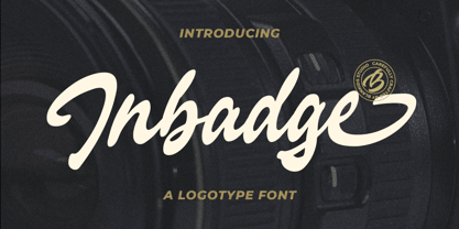 Hello, Are you looking for a modern trandy script font? Do you want of creating Something that stand out and inspire creativity, imagination, and endless fun? Wait no more, we will give you the best choice. Inbadge a Branding Logotype Font Inbadge a Branding Logotype Font, Inspiring from brush lettering style typography. This font is perfect for a design that makes it more attractive and playful. made with a very good level of aesthetics making this font suitable for book cover, poster, packging, merchandise, logotype and much more. Inbadge font includes Multilingual Support, among others : Afrikaans, Albanian, Asu, Basque, Bemba, Bena, Breton, Catalan, Chiga, Cornish, Danish, Dutch, English, Estonian, Faroese, Filipino, Finnish, French, Friulian, Galician, German, Gusii, Indonesian, Irish, Italian, Kabuverdianu, Kalenjin, Kinyarwanda, Luo, Luxembourgish, Luyia, Machame, Makhuwa, Meetto, Makonde, Malagasy, Manx, Morisyen, North Ndebele, Norwegian Bokmål, Norwegian Nynorsk, Nyankole, Oromo, Portuguese, Quechua, Romansh, Rombo, Rundi, Rwa, Samburu, Sango, Sangu, Scottish Gaelic, Sena, Shambala, Shona, Soga, Somali, Spanish, Swahili, Swedish, Swiss German, Taita, Teso, Uzbek (Latin), Volapük, Vunjo, Zulu FEATURES : Uppercase Lowercase Number Punctuation Multilingual PUA Encode Opentype
 - Eurotypo BKL by Eurotypo,
$28.00 Eurotypo BKL is a family of fonts inspired in on one of the most beautiful British Typography ever done. This version of Baskerville tries to reflect the taste of his fine style, compatible with the bluntness of the digital present. As many other designers and foundries, our intention has been to represent the atmosphere of Baskerville's style, than simply relive the shapes of its letters. Actually, capitals fits almost to a square proportions, lowercases are more open, ascenders and descenders are shorter, offering more space for enlarge the "x" high. The beauty of his letterforms can enrich headlines; this font can also be used as body text for its good legibility and accurate kerning. John Baskerville (1706-1775) was born 1706 in Wolverley, England. He was a great typographer and printer who published a remarkable edition of Virgil in 1757. His typefaces were greatly admired by Benjamin Franklin; He also has improved and developed many innovations in printing, paper and ink production. Baskerville’s typefaces are regarded as transitional types that represents the link between Old Roman Style and Modern Roman typography.
 - Gorgonzola Gothic by The Ampersand Forest,
$20.00 Gorgonzola Gothic is a geometrically-inspired gothic sans serif family that's robust and versatile. Inspired by the geometric quirkiness of IxD (also by The Ampersand Forest), Gorgonzola Gothic expands into a thirty-style family that works for everything from branding to text. It further mitigates IxD's quirkiness by offering two options in the round and shouldered lowercase glyphs. The standard letterforms, like IxD, have notched joins, giving them an assertive, almost futuristic look. The alternates of those letterforms (housed in Stylistic Set 01, and available as immediate hoverable glyph options in the Adobe Suite) are more conventional (as are the SS01 ampersand, Q, S, a, and s). In this way, Gorgonzola Gothic offers the best of both worlds: a flavorful, slightly futuristic family (in the same world as geometric classics like Eurostile) and a workhorse gothic sans (like the Benton classics Franklin Gothic, News Gothic, etc.). Its three widths: Skinny, Slim, and Standard, give it a wide range of applications, from display to body. Gorgonzola Gothic makes a statement with strength and sureness.
 - Picture this: "Teen Spirit" by Steven J. Lundeen is not just a font; it's the embodiment of youth rebellion, a visual shout that echoes through the halls of high school, sticking it to the man with e...
- Apolline Std by Typofonderie,
$59.00 A Venetian serif in 6 styles The Apolline typeface family was created by Jean François Porchez as a means to study the transition from Renaissance writing into the first printing types. Rather than sticking to the method commonly used these days for the creation of revivals of Jenson or Bembo types, it seemed more interesting to try and get in the same mindset as those exceptional designers during this pivotal period in the history of typography. Thus Apolline is an exploration of the design methods used by people like Nicolas Jenson and his contemporaries for adapting handwriting with its multiple occurrences (a, a, a, b, b, b…) into single, unique signs (a, b…). Initially Jean François made drawings modelled after his own calligraphy. They were done at a very small size on tracing paper (2 cm high for the capitals) to preserve the irregularity of human handwriting. Besides emphasising the horizontal parts of the letter forms, the serifs were designed asymmetrically to reinforce the rhythm of the writing. The final drawings were produced at a large size (10 cm high for the capitals) to allow for subtle optimisation of specific details. The very narrow and fluid Apolline italic Influenced by various concepts for an ideal italic by Van Krimpen, Gill, etc. Apolline italic was designed at 8° degrees. Although the structure of the letterforms were informed by chancery scripts, the italic has full serifs like the roman. Very narrow and fluid, its unique design creates a good contrast when used in combination with its upright counterparts. Thanks to the presence of the serifs similar to roman typefaces it sets very neatly in large sizes. The next step was digitising the drawings with Ikarus (the pre-Bézier-curves era) to create the final roman and italic fonts. Two years later, when the family was expanded to six series the same method was used, this time with Fontographer. This was necessary for correcting a few problems caused by the conversion to Bézier outlines, and to add intermediate weights. Before the advent of feature-rich OpenType, quality type families consisted of several separate fonts for each weight to provide users with various sets of numerals, an extended ligature set and alternates, ornaments, and so on. Introducing Apolline Morisawa Awards 1993
 - 1514 Paris Verand by GLC,
$20.00 This set of initial decorated letters was inspired by a font in use in the beginning of 1500s in Paris. Exactly, we have used the set that Barthélémy Verand employed for the printing of Triumphus translatez de langage Tuscan en François, (from “Triumph” of Petrarque) in the year 1514. Some letters, lacked, have been reconstructed to propose a complete alphabet. It appears that the printer used some letters to replace others, as V, turned over to make a A, or D to make a Q. The original font’s letters were drawn in white on a black background only, but it was tempting to propose a negative version in black on white. It is used as variously as web-site titles, posters and flyers design, publishing texts looking like ancient ones, or greeting cards, all various sorts of presentations, as a very decorative, elegant and luxurious additional font. This font supports strong enlargements remaining very smart and fine. It’s original medieval hight is about one inch equivalent to about four lines of characters. This font may be used with all blackletter fonts, but works particularly well with 1543 Humane Jenson, 1557 Italic and 1742 Civilite, without any anachronism.
 - Sabon Next by Linotype,
$57.99 The design of Sabon® Next by Jean François Porchez, a revival of a revival, was a double challenge: to try to discern Jan Tschichold´s own schema for the original Sabon, and to interpret the complexity of a design originally made in two versions for different typecasting systems. The first was designed for use on Linotype and Monotype machines, and the second for Stempel hand composition. Because the Stempel version does not have the constraints necessary for types intended for machine composition, it seems closer to a pure interpretation of its Garamond ancestor. Naturally Porchez based Sabon Next on this second version and also referred to original Garamond models, carefully improving the proportions of the existing digital Sabon while matching its alignments. The new family is large and versatile - with Roman and italic in 6 weights from regular to black. Most weights also have small caps, Old style Figures, alternates (swashes, ligatures, etc); and there is one ornament font with many lovely fleurons. The standard versions include revised lining figures that are intentionally designed to be a little smaller than capitals. Featured in: Best Fonts for Resumes, Best Fonts for Websites, Best Fonts for PowerPoints
 - Gather around, typography enthusiasts and history buffs, for a tale of a font that summons the spirit of centuries past with a modern twist. Plakat-Fraktur, created by the talented Dieter Steffmann, ...
- Haarlemmer by Monotype,
$29.00 Haarlemmer is a recreation of a never-produced Jan Van Krimpen typeface that goes one step beyond authentic: it shows how he wanted it to be designed in the first place. The original, drawn in the late 1930s, was created for the Dutch Society for the Art of Printing and Books and was to be used to set a new edition of the Bible, using Monotype typesetting. Hence the problem: fonts for metal typesetting machines like the Linotype and Monotype had to be created within a crude system of predetermined character width values. Every letter had to fit within and have its spacing determined by a grid of only 18 units. Often, the italic characters had to share the same widths as those in the roman design. Van Krimpen believed this severely impaired the design process. The invasion of Holland in World War II halted all work on the Bible project, and the original Haarlemmer never went into production. Flash forward about sixty years. Frank E. Blokland, of The Dutch Type Library, wanted to revive the original Haarlemmer, but this time as Van Krimpen would have intended. Blokland reinterpreted the original drawings and created a typeface that matched, as much as possible, Van Krimpen's initial concept. While Van Krimpen's hand could no longer be on the tiller, a thorough study of his work made up for his absence. The result is an exceptional text family of three weights, with complementary italic designs and a full suite of small caps and old style figures. Van Krimpen would be proud.
