10,000 search results
(0.068 seconds)
- Miya Mine by Arunatype,
$15.00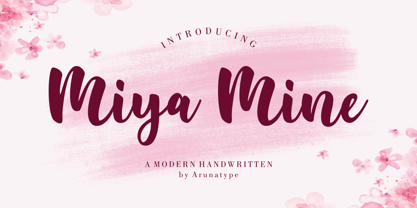
- Breakable by Gassstype,
$23.00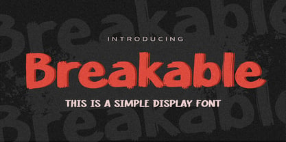
- Hegarown by Rvandtype,
$12.00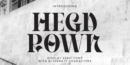
- Kimetsu by Canden Meutuah,
$20.00
- Alpen Jack by HandletterYean,
$14.00
- CNN - Unknown license

- Drinking - Unknown license

- Nevins Hand - Unknown license

- Sujeta - Unknown license

- Wittenbach Demo - Unknown license

- Autor by Latinotype,
$29.00
- Mogand by Soerat Company,
$19.99
- Dona by Harbor Type,
$30.00
- Strateen by IbraCreative,
$17.00
- Days - 100% free

- Adamant BG - 100% free

- Franklin Cascaes - Unknown license

- MY TURTLE - Personal use only

- SF Automaton Extended - Unknown license

- Cubiculo Gallery) - Personal use only

- SF Comic Script - Unknown license

- SF Chaerilidae Shaded - Unknown license

- We2000 - Unknown license

- HVD Rowdy - 100% free

- SF Automaton - Unknown license

- SF Minced Meat - Unknown license

- Cubiculo Gallery) - Personal use only

- SF Diego Sans - Unknown license

- Solange - Unknown license

- SF Intermosaic B - Unknown license

- Behrensschrift - Unknown license

- SF Piezolectric SFX - Unknown license

- SF Wonder Comic - Unknown license

- SF Speakeasy Outline - Unknown license

- SF Proverbial Gothic - Unknown license

- Sevenet 7 Cyr - Unknown license

- SF Wonder Comic - Unknown license

- SF Arch Rival - Unknown license

- Never Let Go - Personal use only

- SF Speakeasy Shaded - Unknown license


