1,044 search results
(0.014 seconds)
- Third Floor MS by Redcollegiya,
$10.00
- Morning Glory NF by Nick's Fonts,
$10.00 - Flores del Sol by Roland Hüse Design,
$25.00
- Flora Dora NF by Nick's Fonts,
$10.00 - P22 Flora Mambo by P22 Type Foundry,
$24.95
- Art Deco Flowery Initials by Celebrity Fontz,
$19.99 - TNA Bound for Glory - Unknown license

- Four More Years - Unknown license

- KR Katlings Four - Unknown license

- NT Louis Douze by Novo Typo,
$26.00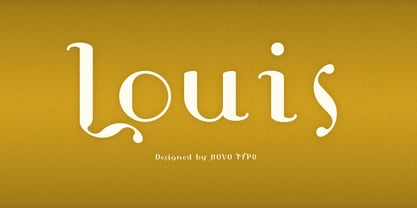
- Gear Four Graffiti by Sipanji21,
$13.00
- Display Digits Four by Gerald Gallo,
$20.00
- Gothic Initials Four by Gerald Gallo,
$20.00
- Two By Four by Fonthead Design,
$19.00 - Wood Font Four by Intellecta Design,
$22.90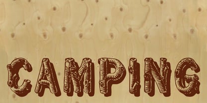
- AZ Fast Fury by Artist of Design,
$15.00
- F2F Frontpage Four by Linotype,
$29.99 - Quilt Patterns Four by Gerald Gallo,
$20.00
- Slab Four Rounded by Wooden Type Fonts,
$15.00
- Black Ornaments Four by Intellecta Design,
$17.90
- FF Dirty Four by FontFont,
$41.99
- British Block Flourish, 10th c. - Unknown license

- Seven Monkey Fury BB - Personal use only

- MFC Franklin Corners Four by Monogram Fonts Co.,
$19.95
- Headline Helpers Four SG by Spiece Graphics,
$39.00
- Display Dots Four Sans by Gerald Gallo,
$20.00
- Display Dots Four Serif by Gerald Gallo,
$20.00
- Slab Four Rounded Ext by Wooden Type Fonts,
$15.00
- Slab Four Rounded Bold by Wooden Type Fonts,
$15.00
- Slab Four Rounded Super by Wooden Type Fonts,
$15.00
- KG Flavor And Frames Four by Kimberly Geswein,
$5.00
- Many Weatz - Personal use only

- Freebooter Script - Alts - Unknown license

- Eutemia Ornaments - 100% free

- Whirl Cyrillic - Unknown license

- Hand of God - 100% free

- FT Ornamental - Unknown license

- Manualito-Flo - Personal use only

- ringey - Unknown license

- Bienville by Scriptorium,
$18.00


