10,000 search results
(0.041 seconds)
- TT Trailers by TypeType,
$39.00 Meet the new TT Trailers! The first version of TT Trailers was conceived as a font suitable for the film industry. The font harmoniously looks in posters, it is ideally suited for setting titles. However, the font has gained wide popularity among designers, and now you can find TT Trailers on the covers of magazines, on restaurant signs and on the main pages of websites. TT Trailers useful links: Specimen | Graphic presentation | Customization options Since 2019 when we released the first version, the TypeType studio team has released dozens of fonts, constantly improving our skills. In 2022, we decided to look at TT Trailers again, improving and expanding the font. In the new TT Trailers, we expanded the character set, corrected the contours, and improved the technical content. We have added extended Latin and Cyrillic characters, new symbols, and additional sets of numbers. The number of glyphs in one style has increased from 1081 to 1242. The inclined styles were long-awaited. The italics in TT Trailers are as eccentric as the upright fonts. The 15-degree tilt looks absolutely harmonious, complementing the character of the font family. We added italics to the variable font, so the new font changes along two axes at once, weight and slant. From the technical point of view, TT Trailers has become more modern and correct, and the number of OpenType features has increased from 29 to 42. We have added new alternative versions of glyphs and created a large number of localized features. The font retained all the qualities thanks to which designers fell in love with it, but became even more convenient. TT Trailers in the new version is suitable for titles and posters, for websites and printed materials. The font will embellish in restaurant and cafe signs and look beautiful in posters. There are 19 styles in TT Trailers: 9 upright, 9 italic and 1 variable font.
 - Hamlet by Canada Type,
$24.95Based on a specimen of an obscure and uncredited old face called Kitterland, Hamlet is one of those curiosities hardly ever noticed in the world of modern fonts, the kind that infuses a variety of historic Blackletter and calligraphy traits in an otherwise Roman alphabet. Such typefaces, what few of them exist, are almost always classified by typophiles as traditional decorative Roman alphabets. We beg to differ. We think such hybrids are fascinating enough to deserve a classification of their own. And we think today's aspiring letterers and type designers would benefit from paying special attention to this kind of hybrid alphabet, not only because it has much more hand than machine in it, but also because it is a prime example of how to succeed in mixing different lettering techniques into one self-contained and distinctly functional alphabet. As in any efficient mixture of lettering methods, Hamlet ended up with characters that are uniquely its own, such as the cupped A, M, V, W and Y, the very luscious and inviting curves on the arms of E, F, L and T, both single- and double-story forms of the a, and the humblest, friendliest g and y ever. A dozen alternate characters are sprinkled throughout the character set, so check out the map for a few pleasant surprises. We also made the Handtooled and Headstone styles because we thought these friendly forms were just crying out for such treatments. The Handtooled version turned out quite lovely, if we may say so ourselves, perhaps even better than the main font. The Headstone version is available as a free bonus to those who purchase the complete Hamlet package. All Hamlet styles come with lining figures as well as old style ones. Hamlet comes in all popular font formats. The OpenType fonts contain push-button swapping alternates and figures, which come in handy in software programs that support this kind of thing. - Selfie Neue Rounded by Lián Types,
$29.00 INTRODUCTION When I started the first Selfie back in 2014 I was aware that I was designing something innovative at some point, because at that time there were not too many, (if any) fonts which rescued so many calligraphy features being at the same time a monolinear sans. I took inspiration from the galerías’ neon signs of my home city, Buenos Aires, and incorporated the logic and ductus of the spencerian style. The result was a very versatile font with many ligatures, swashes and a friendly look. But… I wasn’t cognizant of how successful the font would become! Selfie is maybe the font of my library that I see the most when I finally go out, (type-designers tend to be their entire lives glued to a screen), when I travel, and also the font that I mostly get emails about, asking for little tweaks, new capitals, new swashes. Selfie was used by several renowned clients, became part of many ‘top fonts of the year’ lists and was published in many magazines and books about type-design. These recognitions were, at the same time, cuddles for me and my Selfie and functioned as a driving force in 2020 to start this project which I called Selfie Neue. THE FONT "Selfie for everything" Selfie Neue, because it’s totally new: All its glyphs were re-drawn, all the proportions changed for better, and the old and somehow naive forms of the first Selfie were redesigned. Selfie Neue is now a family of many members (you can choose between a Rounded or a Sharp look), from Thin to Black, and from Short to Tall (because I noticed the feel of the font changed notoriously when altering its proportions). It also includes swashy Caps, which will serve as a perfect match for the lowercase and some incredibly cute icons/dingbats (designed by the talented Melissa Cronenbold) which, as you see in the posters, make the font even more attractive and easy to use. You'll find tons of alternates per glyph. It's impossible to get tired with Selfie! Like it happened with the old Selfie, Selfie Neue Rounded was thought for a really wide range of uses. Magazines, Book-covers, digital media, restaurants, logos, clothing, etc. Hey! The font is also a VF (Variable Font)! So you can have fun with its two axes: x-height and weight, in applications that support them. Let me take a New Selfie! TECHNICAL If you plan to print Selfie Neue VF (Rounded or Sharp), please remember to convert it to outlines first. The majority of the posters above have the "contextual" alternates activated, and this makes the capitals a little smaller. I'd recommend deactivating it if you plan to use Selfie for just one word. Use the font always with the "fi" feature activated so everything ligatures properly. The slant of the font is 24,7 degrees, so if you plan to have its stems vertical, you may use Selfie with that rotation in mind. THANKS FOR READING
 - Tenez by Plau,
$30.00 Big News! Tenez has been selected for the Tipos Latinos Biennial 2016 and Typographica’s Favorite Typefaces of 2015! Tenez is a Grand Slam display didone typeface from Plau. We designed it for a branding project, further developing the resulting logotype into a typeface we felt could solve many designers’ needs. Its origins are rooted in pointed nib calligraphy which can be seen in contemporary Didot and Bodoni inspired typefaces. But Tenez’s shapes are organic (these modern typefaces were originally cut by hand after all) – in fact that was the challenge we set from the start: to make a typeface as organic in construction as possible. This echoes some of late 19th century typefaces and advertising, yet we thought of it for contemporary uses. One of the several unique features of Tenez is its unusual Thin weight, in which the contrast between thin strokes and the black area left by the serifs makes for a typewriter-like personality. The italics provide a perfect counterpoint to the roman weights. Tenez was unapologetically conceived as a display typeface meant to be used large as in magazine openings, drop caps or everywhere there’s a need for elegant impact. The family includes support for almost all Latin languages available, figure sets for almost every conceivable occasion (tables, text, you name it), alternates for the quirky beautiful R (sometimes simpler is better, but not always!) and Q (with a nice big tail for that article opener). Tenez pairs really well with our no-frills sans-serif Motiva Sans and our cute vertical connected script Primot.
 - Wood Sans by TypoGraphicDesign,
$19.00 The typeface Wood Sans is designed from 2021 for the font foundry Typo Graphic Design by Manuel Viergutz. The display typeface is a digital version of original wood letters from a german flea market find. 8 font-styles (Clean, Clean Invest, Clean Mix, Rough, Rough Misprint, Rough Alt, Rough Dark & Icons) with 450 glyphs (Adobe Latin 2) incl. 100+ decorative extras like icons, arrows, German Capital Sharp S, dingbats, emojis, symbols, geometric shapes, catchwords, decorative ligatures (type the word #LOVE for ♥︎or #SMILE for ☺ as OpenType-Feature dlig) and stylistic alternates (3 stylistic sets). For use in logos, magazines, posters, advertisement plus as webfont for decorative headlines. The font works best for display size. Have fun with this font & use the DEMO-FONT (with reduced glyph-set) FOR FREE! ■ Font Name: Wood Sans ■ Font Styles: 8 font-styles (Clean, Clean Invert, Clean Mix, Rough, Rough Misprint, Rough Alt, Rough Dark & Icons) + DEMO (with reduced glyph-set) ■ Font Category: Display for headline size ■ Font Format:.off (for Print) + .woff (for Web) ■ Glyph Set: 450 glyphs (Latin 2 incl. decorative extras like icons) ■ Language Support: 69 languages: Afrikaans, Albanian, Asu, Basque, Bemba, Bena ,Breton ,Catalan ,Chiga ,Cornish ,Danish ,Dutch ,English ,Estonian ,Faroese ,Filipino ,Finnish ,French ,Friulian ,Galician ,German ,Gusii ,Indonesian ,Irish ,Italian ,Kabuverdianu ,Kalenjin ,Kinyarwanda ,Luo ,Luxembourgish ,Luyia ,Machame ,Makhuwa-Meetto ,Makonde ,Malagasy ,Manx ,Morisyen ,North Ndebele ,Norwegian Bokmål ,Norwegian Nynorsk ,Nyankole ,Oromo ,Portuguese ,Quechua ,Romansh ,Rombo ,Rundi ,Rwa ,Samburu ,Sango ,Sangu ,Scottish Gaelic ,Sena ,Shambala ,Shona ,Soga ,Somali ,Spanish ,Swahili ,Swedish ,Swiss German ,Taita ,Teso ,Uzbek (Latin) ,Volapük ,Vunjo ,Welsh ,Western Frisian ,Zulu ■ Design Date: 2021 ■ Type Designer: Manuel Viergutz
 - Cabrito Didone by insigne,
$- A graceful kid if ever you’ve seen one, Cabrito Didone joins the Cabrito family of fonts--a family designed to provide young infants with clear recognition of letter forms. The original letters were released as part of the children’s book about fonts, The Clothes Letters Wear. Now, this latest addition brings a new Didone flavor to the table. But don’t judge the book by its cover. While Didones can be stodgy in the way they deliver a sense of luxury, this stubborn goat of a Didone bucks the stodgy stereotypes with its high-contrast, carefree, flowing fun, taking a more calligraphic direction than most. Cabrito Didone joins structure and handwriting to create a flowing balance of both characteristics. It’s a unique combination of functional and friendly. Its 42 well-designed fonts give you plenty of easy-going, highly readable options to work with as you craft your design. The typeface has unique serifs that give the sense of ink pooling slightly at the points, drawn with a sharp nib. Cabrito Didone supports OpenType features and is packaged with upright obliques, alternates, ligatures, old-fashioned figures, and compact caps. Preview any and all of these features in the interactive PDF manual. The family member font also includes glyphs for 72 languages; over 600 glyphs per font await. Cabrito Didone is an excellent choice for websites as well as flyers and packaging. Like Cabrito, which is currently used by a number of visible brands, Cabrito Didone is also a great option for defining your brand. Grab a taste of the Cabrito Didone flavor--and those of the other Cabrito members: Sans, Semi and Inverto.
 - Kidela by insigne,
$21.99 Kidela is an exuberant and eccentric serif typeface reminiscent of hand painted signage. Kidela features tight kerning and spacing, and some interesting effects can be achieved by adjusting the tracking. The typeface includes 64 discretionary ligatures to extend the natural hand painted look, alternates, oldstyle figures and small caps. Please see the sample brochure to see these ligatures in action. Kidela is an excellent choice when you need a fun and interesting serif.
 - Birani by Attype Studio,
$16.00 Birani is lovely script font with swash on beginning & ending word. This font perfect for valentine & wedding theme design. Combine it with Birani beginning, ending swash & ligatures to make perfect design for yor projects. Birani perfect for valentine promotion, wedding invitation, branding, logo, invitation, stationery, social media post, product packaging, merchandise, blog design, game titles, cute style design, Book/Cover Title and more. What's Included : - Birani Family Font - Ligature - Multilingual Support - Beginning & Ending Swash
 - GL Miraflores by Fontbilisi,
$20.00 GL Miraflores is a nice slab serif font with the name of a Spanish village. It is an elegant vintage resource perfect for decorations, but also works perfectly for plain text, as you can see in the previews. The origin of the inspiration to create it is in the free font 'Molesk' as you can see in the capital letters. Hope it will be really useful for your arts from now on.
 - Hello Bride Script by 50Fox,
$19.00 Redefine elegance with Hello Bride! This lovely font "Hello Bride" comes with classy style of calligraphy. This fonts is one of the most elegant fonts for wedding or engagement ceremony. Especially if it's an luxury ceremony. Hello Bride Font has huge ligatures & alternative characters. This Font is great for logo, printed quotes, badge, insignia, packaging, headline, poster, t-shirt/apparel, greeting card, and wedding invitation, & etc. Thanks for looking and have a wonderful day
 - Airbolt by Zealab Fonts Division,
$9.00 Airbolt is sporty, futuristic, and sharp font. It will make your design looks sporty and also futuristic design. Airbolt is a great fit for retro, futuristic, automotive, and gaming themed designs. Just look how it performs on the preview that I have provided, you will see its capabilities. But it will also work well with other themes. I can’t wait to see what you guys will come up with with using this font!
 - Halena Jordan by Bungletter,
$12.00 Halena Jordan is a beautiful script that's perfect for branding, wedding invitations, and other romantic projects. This love centered look makes it perfect for use in all your design projects be it logos, labels, packaging designs, blog titles, posters, wedding designs, social media posts, Instagram designs, etc. Contains full set: -Uppercase -Lowercase -Alternative -Ligature -Punctuation -Number -Multilingual support. I hope you enjoy this font. If you have any questions, feel free to message me.
 - Overlander by Oakstone Creative,
$6.50 Overland is a strong Art Deco typeface, inspired by the train 'The Overland' that runs in Australia, the font is perfect for headlines, display, branding and much more... even wedding stationary!. It is a bold and dense with an obvious deco inspired background, great for any projects or brands that wear the roaring 20's to 40's on their sleeve. Great for Signage, Wedding stationary, logos, branding materials, business cards, quotes, posters, and more!
 - Fledermaus by Hanoded,
$15.00 Fledermaus (meaning 'Bat' in German) was a cabaret theater from Vienna. The original Jugendstil decor was designed by Josef Hoffman and several posters, advertising performances, were designed by other members of the Vienna Workshop. Fledermaus font was based on a 1907 poster by Bertold Löffler. Since only a few glyphs were available, I designed the missing ones myself. The lower case consists of small caps and the font comes with extensive language support.
 - Yuanita by Putracetol,
$12.00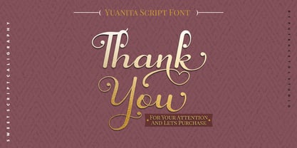 Yuanita is a beautiful modern calligraphy font. A modern script with a handmade calligraphy style. This font is feminime, elegant, messy and modern. Yuanita perfect for wedding event, anniversary, birthday, greeting cards, logotype, branding, wedding invite and card, elegant logo, poster, packaging, stationery, website, and any other projects requiring a handwritten and luxurious touch. Includes OpenType feature with a lot of alternates to help you to make great lettering. This font also supports multiple languages.
 - Knighthood by Letterara,
$12.00 Knighthood is a elegant and masculin font Brush. with extra attention to quick strokes and sharp details, Knighthood contains uppercase, lowercase and ligature. This font can also be used to show elegance in a wedding and christmas. Grotters is ideal for logos, apparel, wedding, book, t-shirts, hoodies, quotes, youtube, quotte, product packaging, website or anything that needs a typographic turbo-boost and you’ll get a unique swash to accompany the font.
 - Diamond Bridge by Sarid Ezra,
$15.00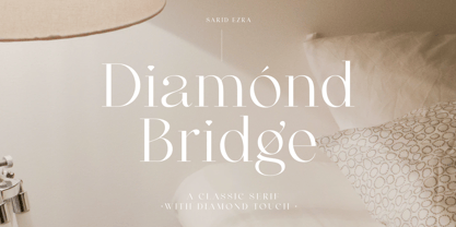 Introducing, Diamond Bridge - a classy serif with diamond touch! Diamond Bridge is an elegant and classy serif with a beautiful details that will make your presentation, logo or your wedding invitations more stunning and classy! You can use this font for several purposes such as a wedding invitations or even your own branding! This fonts support Multi Language and already PUA Encoded! Features Uppercase & Lowercase Number & Symbol Multi language PUA Encoded Thank You!
 - Buttershine Serif by Typestory,
$25.00 Buttershine is a bold, beautiful and versatile duo font (serif and script). It looks beautiful on a variety of designs requiring a personalized style, such as wedding invitations, thank you cards, weddings, greeting cards, logos and so on. What’s Included : Ligature, Alternate & Swashes Works on PC & Mac Simple installations Accessible in the Adobe Illustrator, Adobe Photoshop, Adobe InDesign, even work on Microsoft Word. PUA Encoded Characters – Fully accessible without additional design software.
 - Kanaya by Putracetol,
$14.00 Kanaya is a beautiful modern script font. Kanaya has a very beautiful alternate character, and has modern, elegant and luxurious swashes in each lowercase character. Kanaya is perfect for wedding events, anniversaries, birthday, greeting cards, logotype, branding, wedding invites and cards, elegant logos, posters, packaging, stationery, websites, and many more. Includes OpenType features with a lot of alternates, to help you to make great lettering. This font is also support multi-language.
 - Pentaprism NF by Nick's Fonts,
$10.00In the Dynamic Seventies, "prismatic" typefaces were all the rage, and few were more popular than variants of Paul Renner's Futura and the Herbert Bayer-inspired Bauhaus. This family of fonts features Futura-like forms in the uppercase and Bauhaus-like forms in the lowercase, so you can mix or match to create just the perfect headline. As always, all versions contain the complete Latin 1252, Central European 1250 and Turkish 1254 character sets. - Figgins Standard by Shinntype,
$39.00 To meet the burgeoning demands of commerce, type founders in 1830s London introduced a plethora of new fonts which abandoned the traditional nib-informed model. Most radical were bold, capital-only designs with almost no stroke contrast, stripped bare of serifs. To all intents and purposes these minimal expressions of utility were identical to 20th century functionalism. Recontextualizing one of the original sans fonts, Shinn offers an alternative proposition to the myth of modernism.
 - Spring Butter by Sipanji21,
$18.00 Spring Butter is a modern script with leaves looks in the open type feature. This font is elegant, messy and modern. Spring Butter perfect for wedding event, anniversary, birthday, greeting cards, logotype, branding, wedding invite and card, elegant logo, poster, packaging, stationery, website, and any other projects requiring a handwritten and luxurious touch. Come with open type feature with a lot of alternates and some ligatures also its help you to make great lettering.
 - Magrit by Creativemedialab,
$20.00 Magrit is a bold serif display font, It has many alternates character with nice curve that you can arrange to create a nice logo lettering, or use it as a display face on a poster and add a few alterations to it to make a beautiful eye catching words. Magrit font is best for branding, logo lettering, headlines, product packaging, tshirt design, wedding theme, poster, book cover, wedding invitation, Christmas and many more
 - FF Pastoral by FontFont,
$50.99 A sturdy workhorse with the grace of a gazelle, the FF Pastoral typeface family marries pure craftsmanship with rapturous excesses of form. With his fifteenth release under the FontFont brand, prolific French designer Xavier Dupré has filled a typographic toolbox with plentiful options ranging from a tender, feathery Thin to a robust, healthy Black. At a glance, FF Pastoral appears deceptively simple, particularly in the middle weights. That surface serenity is intentional and allows for easy reading and quick comprehension of short blocks of copy. Upon closer inspection, FF Pastoral is complex and nuanced, carrying a balanced tension in its forms. This plays particularly well in magazine spreads and corporate logos, where uniqueness is a virtue. In creating his latest design, Dupré drew inspiration from a tasteful mix of references, combining diverse elements with a deft hand. While its letter shapes were informed by humanist-geometric hybrid Gill Sans, FF Pastoral’s proportions have been optimized for contemporary typography. Slightly condensed but generously spaced, FF Pastoral features a tall x-height, open counters, and subtle, sprightly italics slanted at just 5°. Proportional oldstyle figures are the default in the family, with tabular and lining numbers and fractions accessible through OpenType features. Elegant details evocative of calligraphy judiciously pepper the FF Pastoral glyph set. The ‘e’ bears an oblique crossbar, while the right leg of the ‘K’ and the ‘R’ are insouciantly curved in both the upright and italic variants. Further flourishes appear throughout the italics, notably in the ‘T’ and the ‘Z’, the gloriously looped tail of the ‘G’, and an extraordinary ampersand. Sharp-eyed fans of Dupré’s work may feel like they’re in familiar territory, and they would be right. An early version of FF Pastoral sprang to life in 2017 as Malis, a family in four weights on the heavier side of the spectrum. Over time, Dupré refined his original design, expanding it with four lighter styles and including true italics for all. The lightest weights are ethereal, with exquisitely delicate strokes drawing the eye in and across a line of type. The most substantial styles are tremendous in their power, allowing text to make a deep impression in print or on screen. Fully fleshed out, FF Pastoral works sublimely in a vast array of text and display settings. Dupré sees his latest FontFont offering as a ‘cultural’ typeface, perfect for the pages of an oversized coffee-table book or business communications where warmth and informality will win the day. Born in Aubenas, France (1977), Xavier Dupré is a gifted user of type as well as an award-winning type designer and lettering artist. After training in graphic design in Paris, Dupré studied calligraphy and typography at the Scriptorium de Toulouse. Since releasing FF Parango in 2001, Dupré has published such FontFont classics as the FF Absara and FF Sanuk superfamilies, FF Megano, FF Tartine, and FF Yoga. A designer of Khmer fonts as well as Latin typefaces, Dupré splits his time between Europe and Asia.
 - Vacaciones - Personal use only

- Unione GX by TOMO Fonts,
$32.00 UnioneGX by TOMO FONTS is the variable version of Unione. A clean and modern sans-serif type family with a geometric touch. It has a single axes (Weight / Wgth) that you can control with a slider on Desktop apps or you can use it for the web, dramatically reducing file size for your web project. It's like magic! but no. If you want to learn more about variable fonts, please click here or if your are interested in web context read here. Geometric and modern Sans-Serif VARIABLE FONT! This means, you control the weight! 1000+ glyphs per font. Latin Plus support, Extended Latin Cyrillic support, Basic & Extended Fractions Circled Numerals & Letters Lots of Stylistic Alternates Interested in Unione 'static' family? Check it here
 - Sackers Gothic by Monotype,
$32.99 Sackers Gothic is part of the larger Sackers series, a collection of fonts drawn from templates for producing engraved stationery and social cards by Gary Sackers, a Charlotte, North Carolina intaglio printer. Many typefaces were made from similar sources, including Monotype’s Engravers series, as well as Jim Spiece’s ITC Blair, and Mark van Bronkhorst’s Sweet Sans. Sackers’ typefaces, which were initially made into photo-set type, were digitized by Compugraphic and released in the late 1980s. Sackers Gothic has since become a popular choice for conveying sincere and plainspoken language on dust jackets, posters, and of course, in stationery. The face pairs well with display faces of a disparate nature, and serves as a ready foil for anything requiring an air of typographic sophistication.
 - Sinkin Sans Narrow by K-Type,
$20.00 Sinkin Sans Narrow is a simple, pleasantly proportioned and easy to read sans-serif, available in all 9 standard web weights, 100 to 900, plus italics, so the face is a comprehensive illustration of the CSS web font numerical scale. Sinkin Sans fonts are designed with tiny, inconspicuous notches that sink into verticals at the intersections of strokes, adding highlights to congested corners. The incisions make right angles appear sharper and improve definition in more intricate characters. Sinkin Sans Narrow inherits the enviable clarity and readability of the luxuriously wide original family. The Narrow typeface, however, is designed to economise on space within busy web pages and has been sensitively condensed for maximum legibility. Each weight of Sinkin Sans Narrow is supplied with a free Italic.
 - Printers in Marks by Proportional Lime,
$19.99 In the early days of printing it was soon recognized that there was a need to identify the printer and publisher behind the printed work. So these industrious people created marks to identify themselves to clients. This font contains over 160 marks dating back to the early years of printing with the likes of Fust, Ratdolt, Manutius, Caxton, and a whole host of others represented. Some of these printers were very influential and altered the course of history, some merely enabled the broader public to access the classics. Some were imprisoned and others helped foment revolutions. But all were riding the new current of this technology of moveable type that helped transform our world through the enabling of easily exchanging information.
 - Guinevere Pro by Canada Type,
$29.95 Guinevere Pro is a typeface designed by Icelandic art director Sigurdur Armannsson. It started in 2001 as simple hand-drawn sketches of a few letters built from modules, then became an experiment with four goals: - Construct an original alphabet from a specific set of predetermined modules. - See how certain letter forms built without said modules would behave within the totality of the module-constructed alphabet. - See if certain letters would actually enforce their own shapes to be drawn a certain way within the totality of the typeface. Likewise, see if the totality of the alphabet demands that individual letters be drawn in a specific way, and if so, how much room for variation would there be? - See how all of the above reacts/changes to implementing the alphabet across different weights. The experiment was finessed and re-worked over many years of technology changes, and Guinevere Pro is the final outcome, ten years later. The Guinevere Pro set is four cross-platform Open Type fonts, with built-in small caps, alternates, ligatures, and support for a wide range of Latin-based languages.
 - ITC Avant Garde Gothic by ITC,
$42.99 ITC Avant Garde Gothic is a font family based on the logo font used in the Avant Garde magazine. Herb Lubalin devised the logo concept and its companion headline typeface, then he and Tom Carnase, a partner in Lubalin’s design firm, worked together to transform the idea into a full-fledged typeface. The condensed fonts were drawn by Ed Benguiat in 1974, and the obliques were designed by André Gürtler, Erich Gschwind and Christian Mengelt in 1977. The original designs include one version for setting headlines and one for text copy. However, in the initial digitization, only the text design was chosen, and the ligatures and alternate characters were not included. The font family consists of 5 weights (4 for condensed), with complementary obliques for widest width fonts. When ITC released the OpenType version of the font, the original 33 alternate characters and ligatures, plus extra characters were included. ITC Avant Garde Gothic® font field guide including best practices, font pairings and alternatives. Featured in: Best Fonts for Logos, Best Fonts for Websites, Best Fonts for PowerPoints
 - DIN Next Rounded by Monotype,
$56.99 The name DIN refers to the Deutsches Institut für Normung (in English, the German Institute for Standardization). The typeface began life as the DIN Institute's standard no. DIN 1451, published in 1931. It contained several models of standard alphabets for mechanically engraved lettering, hand-lettering, lettering stencils and printing types. These were to be used in the areas of signage, traffic signs, wayfinding, lettering on technical drawings and technical documentation. Rooted in earlier designs for Germany's railway companies, the alphabets were based on geometric shapes in order to be easily reproducible using compass and ruler. In post-1945 West Germany, the DIN alphabets were widely used, for instance on most road signs. They became available as fonts that were appreciated by designers for their industrial, somewhat quirky and “non-typographic” look and feel. From the 1990s onwards, more refined versions became available for use in book and magazine typography. DIN Next is a typographically corrected and expanded version of this quintessential 20th-century design. DIN Next Rounded is its softer, friendlier version.
 - Ongunkan Sweden Dalecarlian Run by Runic World Tamgacı,
$50.00 The Dalecarlian runes, or dalrunes, was a late version of the runic script that was in use in the Swedish province of Dalarna until the 20th century.The province has consequently been called the "last stronghold of the Germanic script. When Carl Linnaeus visited Älvdalen in Dalarna in 1734, he made the following note in his diary: The peasants in the community here, apart from using rune staves, still today write their names and ownership marks with runic letters, as is seen on walls, corner stones, bowls, etc. Which one does not know to be still continued anywhere else in Sweden. The Dalecarlian runes were derived from the medieval runes, but the runic letters were combined with Latin ones, and Latin letters would progressively replace the runes. At the end of the 16th century, the Dalecarlian runic inventory was almost exclusively runic, but during the following centuries more and more individual runes were replaced with Latin characters. In its last stage almost every rune had been replaced with a Latin letter, or with special versions that were influenced by Latin characters.
 - LT Chickenhawk - Personal use only

- Volta by Linotype,
$29.99Volta is a robust typeface from the 1950s. A revisit to styles that were en vogue at the turn of the century, Bauer type foundry designers Walter Baum and Konrad Bauer designed this type family in1955. The form of Volta's letters are similar to those in New Transitional Serif typefaces, like Cheltenham and Century. Developed after the Didone (i.e., Bodoni) style types, New Transitional Serifs speak more to the zeitgeist of the late 19th Cntury, and were typographic adaptations to it's newer technologies. Already in the period of mass production, typographers and printers at the dawn of the 20th Century had to cope with larger print runs on cheaper materials. The robust letterforms of New Transitional Serifs were designed to compensate for this, but they were also ingenious little inventions in their own right. Form the beginning, the new, peculiar forms of New Transitional Serif letters were adopted for use by advertisers. Their robustness also allowed them to be used in virtually all sizes. Volta was designed especially with advertising display usage in mind. The x-height of Volta's letters is higher than average for serif faces. It is recommended that Volta be used exclusively for shorter tracks of text, above 12 point. Headlines look dashing set in Volta. Four different font styles are available for the Volta typeface: Regular, Medium, Medium Italic, and Bold." - Express - Unknown license

- Nirvana - Unknown license

- JSL Ancient - Unknown license

- Ol' 54 - Unknown license

- Engravers' Old English BT by Bitstream,
$29.99Designed by Morris Fuller Benton in 1907; an improved version of the familiar nineteenth century blackletter as he had executed it in his Wedding Text.


