3,122 search results
(0.031 seconds)
- Moving Headlines JNL by Jeff Levine,
$29.00 For decades, visitors to Times Square could look up and read the up-to-the-minute news flashes that moved across a giant electric sign on the face of the old New York Times Building (now known simply as One Times Square). According to Wikipedia's article on OneTimes Square: "On November 6, 1928, an electronic news ticker known as the Motograph News Bulletin (colloquially known as the "zipper") was introduced near the base of the building. The zipper originally consisted of 14,800 light bulbs and a chain conveyor system; individual letter elements (a form of movable type) were loaded into frames to spell out news headlines. As the frames moved along the conveyor, the letters themselves triggered electrical contacts which lit the external bulbs (the zipper has since been upgraded to use modern LED technology)." An example of this was seen in the 1933 Warner Bothers film "Picture Snatcher" starring James Cagney. This example inspired Moving Headlines JNL.
 - AT Move Holborn by André Toet Design,
$39.95 HOLBORN Aptly named after ‘High Holborn’, a high-street in London where the Central School of Art & Design was based. A font, just in capitals, based on the original design and the earlier sketches (1976) by André Toet. The strong optical illusion in this alphabet makes it an outstanding typeface. Concept/Art Direction/Design: André Toet © 2017
 - AT Move MMM by André Toet Design,
$75.00 MMM is a sturdy Typeface, the design is based on a old Soap-Powder advertisement. MMM is very useful for headings and/or logotypes. André Toet his 17th Font Caps, Lowercase. With Numbers, Glyphs and the normal Punctuation. Use this Font well, it’s made with the greatest care. Concept/Art Direction: André Toet © 2017 - Design: André Toet / Jasper Terra
 - AT Move Quipo by André Toet Design,
$39.95 QUIPO is a typeface based on my recent survey (Freeflow) on hand drawn logotypes used by American and English pop groups in the 60-70s. We thought it an interesting project and a free flow exercise to design this particular font just in capitals and well... yes it’s rather ‘bulky’. Needless to say it comes with numbers and the normal punctuations ! Concept/Art Direction/Design: André Toet © 2017
 - AT Move Billiard by André Toet Design,
$39.95 BILLIARD was born from the numerous sketches André Toet did for the design of a series of postage stamps in 2011. It’s a capital monospaced and ‘fun’ alphabet, based on the classic billiard play with two white and one red ball. Actually snooker and pool were derived from this rather old sport! In Europe it used to be a sport played by elderly people, practiced in traditional bars, including the smell of beer and the at that time prevalent smell of cigarettes and cigars. These days billiard, snooker and pool are quite popular once again with young people. Hopefully our new font will get the same attention the ‘old sport’ deserves and who knows it might even be used in a sportive way. Concept/Art Direction/Design: André Toet © 2017
 - AT Move Strano by André Toet Design,
$39.95 STRANO Like the name indicates it’s a strange typeface. Just capitals (including punctuation marks and numbers), composed from early sketches for a corporate identity in 2005 by André Toet. The complete font was restyled and translated to a Monospaced version. It’s a quite versatile font: it can be used in a lot of different cases, not only in print but also in architecture and street furniture. Think about lettering on benches, bridges, buildings. Concept/Art Direction/Design: André Toet © 2017
 - AT Move Artu by André Toet Design,
$39.95 Artù ! Strano ma vero, strange but true. A beautiful, intelligent and lively Italian dog and a great friend, unfortunately no longer among us ... but his memory lingers. A typeface designed in Rosennano (Tuscany), its Italian, but executed in Amsterdam. This monospace typeface might prove to be extremely useful for household products like washing powder or any anything like that. Just use it in your designs, let it live! Concept/Art Direction/Design: André Toet © 2017
 - AT Move Tremelo by André Toet Design,
$39.95 TREMELO a typeface based on a logotype (Microtel). We designed it as a complete capital alphabet. The original idea for the logotype font came from the products the firm produced. They provided the parts that go into hearing-aids. We thought the type should have some visual tremor in it. Concept/Art Direction/Design: André Toet © 2017
 - Tipo Movin CDMX by Ixipcalli,
$- La versión propuesta por la SEMOVI (Secretaria de Movilidad) es un estilo más angosto y ortográfico, creadó con la finalidad de aligerar las aplicaciones tipográficas del sistema. Se emplea oficialmente en todas las aplicaciones del sistema de Movilidad Integrada de la Ciudad de México. El creador de la tipografía es Lance Wyman. En esta edición, los tipos minúsculas son una adaptación “no oficial” para el Tipo Movin CDMX, enriqueciendo la tipografía a un estilo visual de altas y bajas, por lo que se prescinde del diseño base como trabajo propio para enfatizar los tipos minúsculas exclusivamente, además de que se han añadido algunos caracteres de acentuación extendiendo su uso a otros lenguajes. Los tipos son una nueva propuesta por Ixipcalli en el presente año 2023. The version proposed by SEMOVI (Secretary of Mobility) is a narrower and more orthographic style, created with the purpose of lightening the typographic applications of the system. It is officially used in all the applications of the Integrated Mobility system of Mexico City. The creator of the typeface is Lance Wyman. In this edition, the lowercase types are an “unofficial” adaptation for the Tipo Movin CDMX, enriching the typography to a visual style of highs and lows, so the base design is dispensed with as my own work to emphasize the lowercase types exclusively, In addition, some accentuation characters have been added, extending their use to other languages. The types are a new proposal by Ixipcalli in the current year 2023.
 - Moving Van JNL by Jeff Levine,
$29.00Moving Van JNL is a classic sign painter's block Roman with angled [instead of rounded] corners and slab serifs. This style of lettering was most popular in the 1920s and 1930s. - AT Move Bloggy by André Toet Design,
$39.95 BLOGGY designed in 2010 by André Toet. In the series of typefaces that were created by our team, BLOGGY stands out as a rough typeface based on a grid. Within this square grid the typeface is enlarged and reduced in size in order to create a dazzling font. A complete ‘extra alphabet’ was added to the font by cutting the letters diagonally. To us typedesign doesn't only mean designing fonts for books but also advertising, posters, film or digital use. We hope that BLOGGY will do the trick ! Concept/Art Direction/Design: André Toet © 2017
 - AT Move Herengracht by André Toet Design,
$39.95 HERENGRACHT (Patricians' Canal or Lord’s Canal) is the first of the three major canals in the city centre of Amsterdam. The canal is named after the heren regeerders who governed the city in the 16th and 17th century. The most fashionable part is called the Golden Bend, with many double wide mansions, inner gardens and coach houses on Keizersgracht. Former bureau of André Toet (SO)Design was situated there for over 32 years, it was about time to name one of our fonts to: HERENGRACHT. Concept/Art Direction/Design: André Toet © 2017
 - Trekbats - Unknown license

- Moi Non Plus by Hanoded,
$15.00 Moi Non Plus is a wonderful, handwritten font. It has a somewhat chaotic look, but is stylish nonetheless. The name was taken from a famous Serge Gainsbourg song called 'Je t'aime - moi non plus', which caused a bit of a scandal when it was released in the '60's, due to its overtly sexual content.
 - HU Mois KR by Heummdesign,
$25.00 HU Mois KR is a calligraphy typeface with a sense of speed and a naturally slanted feel as if writing. It also gave a sense of free rhythm of handwriting. Includes Korean from the existing 'HU Mois' font.
 - the Incredibles - Unknown license

- AT Move Specx Stncl by André Toet Design,
$39.95 SPECX Stencil This is my #11/12 Font a slabserif typeface. In fact it’s a very, very basic and extreme strong typeface! We gave this new Font a special touch by adding an extra family-member: a stencil-version of the SPECX. My inspiration for the SPECX is based on the cover of a 1955 French School-Notebook. Concept/Art Direction/Design: André Toet © 2017
 - BonJovi - Unknown license

- SteelTongs - Unknown license

- Kingthings Whizzbang - 100% free

- LT Novelty - 100% free

- SHARKBOY & lavagirl - Personal use only

- Evil Dead - Unknown license

- Godzilla - Unknown license

- Burton's Nightmare - Unknown license

- SkyFall Done - Personal use only

- Corleone - 100% free

- Solander by Patria Ari,
$15.00 Solander is as sharp display typeface inspired from middle east movies. With small caps, this font suit for movie posters, cinema, fantasy movies, etc.
 - Jedi - Unknown license

- South African by Mans Greback,
$59.00 Movie poster style brush typeface.
 - Silverscreen by TypeArt Foundry,
$45.00 Just like movie poster credits.
 - Tempestua by Sharkshock,
$115.00 Beauty….Style…. Sophistication…. Tempestua is a very chic display font suitable for a variety of purposes. This typeface is defined by wispy thin lines paired alongside broad strokes for maximum contrast. Some of the lowercase letters feature shaved off serifs as well as flattened tops. Elegant curves will keep eyes moving throughout ensuring viewers will be stopped in their tracks. Use Tempestua for a luxury brand logo, magazine, or movie title. This family is equipped with Basic Latin, Extended Latin/ diacritics, kerning, italics, and support for Polish.
 - BlackBeast Typeface by Linkor Digital,
$13.00 BlackBeast Typeface v1 is a dapper handwritten font with a personal charm. With hard strokes and a signature style, Black Beast is perfect for branding projects, labeling, clothing, movie sceen, poster, movie title, album covers, logos, etc.
 - Frontline by TypeArt Foundry,
$45.00 Thrilling titler for grade-B movie poster.
 - Lions Den by Jesse Tilley,
$19.95 A font inspired by 40s movie posters. Enjoy!
 - MoanLisa by JOEBOB graphics,
$9.00 MoanLisa, a font for monster movies. Caps only...
 - Starring by Jesse Tilley,
$19.95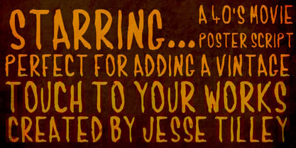 Another font inspired by 40s movie posters. Enjoy!
 - Dreadful by Aiyari,
$14.00 Introducing a new layered typeface called Dreadful. Inspired from classic horror movie and vintage comic. Dreadful typeface best uses for headings, Logo type, quotes, apparel design, invitations, flyer, poster, greeting cards, product packaging, book cover, printed quotes, cover album, movie, etc.
 - Stressed by 4RM Font,
$14.00 Inspired by brutalism and horror movie designs, the Stressed font is made with random pen strokes, giving this font a brutal/unbalanced feel. suitable for use in graphic design, especially with horror themes such as movie posters, and Brutalism graphic design.
 - Candle Wax JNL by Jeff Levine,
$29.00 The design of Candle Wax JNL comes from an original movie poster for the movie "Bell, Book and Candle" starring James Stewart. The oddly erratic letter forms conjure up ideas of spells, witchcraft and other things found lurking on dark moonlit nights.


