10,000 search results
(0.025 seconds)
- Biker Whiskey by Vozzy,
$10.00 Introducing a vintage look label font named "Biker Whiskey". Typeface contains small letters, capital letters (several of them have alternates), numbers and punctuation characters. Biker Whiskey font have two styles - clean and rough. Each of styles have layered effects with texture and shadow, for preview of styles look at screenshot. This font will good viewed on any retro design like poster, t-shirt, label, logo etc.
 - Bite Chalk by Storictype,
$9.00 BiteChalk Still with a chalk concepts, This is good for projects like a menuboards it's specially designed cafe or restaurant ,background photoboots wedding, t-shirt, posters, etc and a touch of vector pack theme dessert, that allows you to mix and match pairs of ornaments to fit your design . Above the description of this font, I hope you're satisfied with what I have created. Thank You
 - 2 Quadro by Apostrof,
$50.00 This big family summarizes and develops the tradition of boldface squared-off 45° shear sanserifs. Known from the middle of 19th century and actively used in different times (1920s, 1970s) is still usable now, thanks to its brutal expression, monumentality and possibility to fully maximize the flatness without loss of readability. This font is especially good for filling letters with photos or to create geometrical “constructivist” compositions.
 - Hungry Chalk by Storictype,
$9.00 HungryChalk Still with a chalk concepts, This is good for projects like a menuboards it's specially designed cafe or restaurant ,background photoboots wedding, t-shirt, posters,etc and a touch of vector pack theme dessert, that allows you to mix and match pairs of ornaments to fit your design . Above the description of this font, I hope you're satisfied with what I have created. Thank You
 - Knocked by Crumphand,
$25.00 Introducing a new Slab Serif fonts "Knocked" Knocked fonts is an inspiration to College fonts, Varsity fonts, Athletic fonts and Retro fonts. this Knocked fonts is pretty good and good for experimenting with your design. comes with 3 styles; Regular, Rough and Stripes.
 - P22 Muschamp Pro by IHOF,
$29.95 Prolific illustrator and veteran typographer Tracy Sabin draws on more than 40 years of multi-disciplinary design experience to bring us Muschamp Pro, a loopy, bouncy, free-form alphabet adaptable for many uses. It embodies the spirit of the massive art nouveau wave that broke out in the late 1950s and ingrained itself in popular culture for about three decades on both sides of the pond. Carefree, playful, rhythmic and versatile, this font evokes plenty of album jackets, children book covers, and cartoon titling from the times that really defined those design expressions and enshrined them as essential pop art. Muschamp Pro comes with plenty of alternates, ligatures of both standard and discretionary varieties, and extended Latin language support, all contained in a glyphset of more than 500 characters. Use this font if you want your design to transmit a message of crafty and joyful activity.
 - SL Borges by Sudtipos,
$29.00A man purposes himself the task of drawing the world. Among the years, he populates a space with images of provinces, reigns, mountains, bays, ships, islands, fishes, rooms, instruments, heavenly bodies, horses and people. A while before he died, he discovers that patient labyrinth of lines traces the image of his own face. J. L. Borges. SL Borges is a homage to the genial Jorge Luis Borges, illustrious Argentinean writer who lived between 1899 and 1986. Sharply depicted by Augusto Costhanzo, SL Borges synthesizes to icons the big themes that obsessed him: the infinite, labyrinths, libraries, identity. But it although traces lines over the more human side of the writer, who loved cats, fervent politics and the taste of Tango. SL Borges abridges a sum of original iconographic illustrations in True Type format, which masterly synthesizes the most important themes of the grand genius of the literature. SL Borges takes part of the "Icons of Icons" Gallery, developed by SinergiaLab for Sudtipos - Abecedarian by The Type Fetish,
$10.00 Chank claims to have the fastest type design, we think we have the youngest. Samuel was merely four years old when he wrote out his first face. We are expecting many more brilliant typefaces from this upcoming designer. Please note that this font has no numbers or punctuation symbols; Samuel just did letters at that time.
 - Hypothesis by Arendxstudio,
$25.00 Hypothesis is a typeface inspired in tattoo letters, chicano culture and calligraffiti. It works well with normal size text, but it works even better for large displays, short words, or even just to incorporate a few or single characters in a design. Suitable for many creative products & tattoo designs, like posters, t-shirt, street wear, logo, signage, headlines, etc.
 - Gumok by Linecreative,
$14.00 Gumok - Ultra Condensend font and Minimalis Character, It's Perfect for logo, name card, magazin layout,headers, or oven large scale artwork What you get dear, you will get : 1. Gumok- A clean San serif font including Upper & Lowercase characters(ALL CAPS), 2. Stylistic alternates Character (9 Character) 3. Supports Multi linguage (Latin Western Europe), Numbers and Punctuation
 - Boston Breton NF by Nick's Fonts,
$10.00This engaging slab serif face made its debut in the 1906 ATF specimen catalog, and wears well over a century later. Its warm lines and a wide stance ensure that your headlines will be noticed. Both versions feature the complete Latin 1252, Central European 1250 and Turskish 1254 character sets, with localization for Lithuanian, Moldovan and Romanian. - Zuider Postduif by Roland Hüse Design,
$25.00 Zuider Postduif was my very first font design 3 years ago and I decided to remake and extend it including the Cyrillic alphabet and some OpenType features. It looks pretty cool as printed text(lyrics, poems) and fits best for decorations, posters, menu carts for restaurants, brochures, newspaper headlines or logos. It’s comfortable to read above 12 px.
 - Hanley Pro by District 62 Studio,
$29.00 The origin story of HANLEY FONT COLLECTION all starts with the Script. We were designing logos and kept feeling like we needed a different kind of script, vintage feeling but not dated, and not too baseball-y or too formal. We couldn’t find exactly what we were looking for, so we decided to create it ourselves. After that we realized what we really wanted was good wood block looking lettering especially with small caps. And the collection just grew from there - a tall slim style, a monoline version of the script and of course a good sans. We topped off the group with a large selection of catchwords and extras with plenty of swirls, swashes and frames. Hanley has just enough irregularity to the edges to impart a human feel, but it’s still clean. Super versatile, all the styles work well together and can look authentically vintage or modern and hand-crafted.
 - Roma by Canada Type,
$29.95 Tom Lincoln's award-winning type design work since the 1960s has been one way or another of expressing his fascination for the Roman majuscules inscribed at the base of the Trajan Column in Rome. This time he has really outdone himself by bringing us Roma, a definitive, contemporary, mature sans serif expression of those majuscules. With Roma, Lincoln is not satisfied with simply creating a proper "Trajan Sans". He goes on to make it a family of four weights, with built-in small caps and oldstyle figures, then he really goes to town with the options he makes available for shading and multi-color settings. Precise renderings of the Roma capitals are provided in different fonts that can function individually or be layered atop each other for two- or three-color treatments. The Roma family comes with extended language support that spans the majority of Latin-based languages. For more information on the design, complete character sets, technological features, and print tests, consult the accompanying PDF.
 - Caravan Script by Jonahfonts,
$20.00 An unconnecting informal yet formal script. Caravan is a rambling font which gives the appearance of going places.
 - Hagada Mesugnan MF by Masterfont,
$59.00 Custom designed letterforms for the Hagada, published by Gad Ulman.
 - Singela by PintassilgoPrints,
$20.00 A lively and good-humored handwritten typeface, with a twist.
 - Nt1972 by Harvester Type,
$20.00 NT1972 is a display font from the future. Font in the era of cyborgs and cyberpunk. This is a sharp, brutal font with futuristic shapes. It combines style and functionality, so the font will look great in your futuristic design in any environment, be it a logo or a merchandize. The angle of inclination in each glyph is 50 degrees, all glyphs also have the same stem sizes to create a good font system. All this is done to get a good futuristic cyberpunk font that will give style to your design, be it a logo, poster, banner, merchandize, title, packaging or product design. In addition to all this, there is support for many languages and alternative characters. In case of any questions, problems or suggestions, please email: bunineugene@gmail.com
 - Fear Factor, as a conceptual font, embodies the essence of thrill, suspense, and the edginess associated with fears, challenges, and the unknown. Imagine a typographic design that captures the heart-...
- Quaylike by Nathatype,
$29.00 Looking for a font that will make your branding stand out? Do you sometimes have an appetite for a bit more wholesome typography? Looking for a fabulous, stylish, and adventure font? We've got what you want. Quaylike-A Handwritten Font This font is more than just another handwritten font. Quaylike is a handwritten font with big, quirky letters. It encapsulates the essence of luxury and elegance. Designed primarily as a captivating handcrafted with retro style. This typeface that is easy on the eyes font that excels at captivating headlines, or large branding text, the font oozes that cute aesthetic that just makes you go “aww!” Our font always includes Multilingual Options to make your branding globally acceptable. Features: Ligatures Stylistic Sets PUA Encoded Numerals and Punctuation Thank you for downloading premium fonts from Natha Studio
 - Pronk Family by wearecolt,
$9.00 Pronk - move forward by leaps and bounds This family includes Clean, Rough and Outline - You're welcome! This is an all caps, tall, bold and round sans serif display font designed for retro-modern designs. This font is perfect for your next logo design or magazine titles. Taking inspiration from many tall fonts and American number plates I created a display font that would be my 'go-to' for a neat tall, bold font. I also wanted something which would take a good amount of treatment like stamp effects and grunge. Pronk works brilliantly as a pegboard font and for neon lettering. Pronk pairs perfectly with Stroom and Gill Sans. I really hope you enjoy this font, please don't hesitate to drop me a message if you have any questions. Features: - Uppercase letters - Numerals
 - Sinder by The Fontry,
$5.00 It's extended. Somewhat. It's got all the characters. There's a plus. It's fully kerned. That's awesome! And it is rubbed down to the nub. Whuh??? That means it's highly distressed, manually eroded on my work bench. Tortured further to open the wounds using my bitmap editor. Tweaked lovingly and built up to even higher standards of distortion in my vector program. The end result is a font called Sinder. I've even included an "ash" effect. Using the bracket or brace left gives you ashes from left to right as you type your text. Finish your text with ash terminals by typing the bracket or brace right. But be careful. This font is a heavy duty downloader. Make sure all your programs are up to the task, especially before you go converting to vectors.
 - Fleur by Lián Types,
$39.00 La vie est une fleur dont l'amour est le miel Fleur is the French for flower and I've chosen this language for a good reason. Over the past 5 years, I've had the opportunity to travel a lot to Paris and I've always tried to catch every moment and detail of this delightful city through the eyes of the designer inside me. Paris is full of surprises, mainly for us, artists. In fact, I believe the city is a museum itself. Every corner of any street has something inspiring. But, there’s something I particularly love and I want to address here: The Palais Garnier. Built between 1861 and 1875, this opera house is a dream made true for many of us, who love somptuosité. Garnier, the architect of this magnificent building, said that the style he proposed was not Grecian nor Roman/baroque, he created something new and called it Napoleonic: Luxurious at its best. Fleur is inspired in this palace which, in fact, has some similar letters inside. Garnier put his name at the ceiling of the Rotonde des Abonnés: Letters are interlacing each other with nicely done art nouveau curves. I thought I could take this idea and achieve something very delicate and imposing at the same time if the font consisted entirely of caps with the logic of a didone and a bit of art-nouveau. This mix of elegance and flamboyance gave birth to Fleur which has a wide range of uses but was mainly intended for perfumes, fashion magazines, storefronts, book covers or logos. Not only you'll find many decorative glyphs, but also a vast amount of unique ligatures will make you really adore this font. Get Fleur and profite de la vie TECHNICAL As suggested above, the font has many open-type coded alternates and a vast amount of unique ligatures. Install the font in applications that support them, like Adobe Illustrator or Photoshop.
 - Gothic Grotesk JNL by Jeff Levine,
$29.00 In a specimen book from Stevens, Shanks & Sons, Ltd. of London (circa1930s) “Royal Gothic” was their version of a classic grotesk sans that had been in use as far back as 1899 when the Keystone Foundry called it “Charter Oak”. The terms "gothic" and "grotesk" were equally applied to early sans serif typefaces – at first not well embraced by printers as being too ugly (grotesque) for use. One familiar characteristic of early grotesk fonts (such as this one) is the numerous variations of character widths and shapes. By combining those two terms into a font name, the digital version of this design is called Gothic Grotesk JNL, and is available in both regular and oblique versions.
 - Roos ST by Canada Type,
$39.95 Roos ST is a special version of the Roos family, engineered specifically for science writing. It is equipped with SciType, a combination of additional characters and OpenType programming included in the fonts to help with typesetting science text. For more information about SciType, please consult the SciType FAQ available in the Gallery section of this page. The Roos design is the Dutch classic made by S. H. de Roos during the years of the second World War, and subsequently used for a special edition of the Dutch Constitution on which Juliana took the oath during her inauguration as the Queen of the Netherlands. This design is widely regarded as de Roos's finest, and has one of the most beautiful italics ever drawn. Aside from the SciType additions, all the Roos ST fonts contain OpenType features for ligatures, ordinals, automatic fractions, and seven kinds of figures. For details about the functionality of Roos ST, please consult its Access Chart PDF available in the Gallery section of this page.
 - Reina Neue by Lián Types,
$29.00 Hey! See Reina Neue in action here! INTRODUCTION When I designed the first Reina¹ circa 2010, I was at the dawn of my career as a type designer. The S{o}TA, short for the Society of Typographic Aficionados, described it as complex display typeface incorporating hairline flourishes to a nicely heavy romantic letterform². And it was like that; that’s what I was pursuing at that time since I was very passionate about ornaments and accolades of Calligraphy. Why? I felt that Typography, in general, needed more of them. These subtle flourishes could breathe life into letters. Maybe, I thought it was the only way I could propose something new into the field of type. However, after some years, I came across a very interesting quote: –Beautiful things don’t ask for attention– Wow! What did this mean? How could something be attractive if it’s not actually showing it. Could this be applied to my work? Sure. I think every type-designer goes through this process (aka crisis) regarding his or her career. At the beginning we love everything. We are kind of blind, we only see the big picture of a project. And that’s not because we are lazy. We actually can’t see the small mistakes nor the subtleties that make something simpler beautiful. We are not able. But, the small subtleties… They are actually everything: With experience, one puts more attention into the details and learns that every single decision in type has to be first meticulously planned. Here I am now, introducing a new Reina, because I felt there was a lot of it that could be improved, also the novelty of Variable Fonts caught my attention and I had to take that to my type library. THE FONT A thing of beauty is a joy forever Now, a decade later, I’m presenting Reina Neue. This font is not just an update of its predecessor: –A thing of beauty is a joy forever– is the first line of the poem ‘Endymion’ by John Keats, and despite the meaning of “beauty” may vary from person to person, and even from time to time (as read in the last paragraph), with Reina I always wanted to bring joy to the eye. In 2010, and now, in 2020. I believe the font is today much better in every aspect. It was entirely re-designed: Its shapes and morphology in general are much more clean and pure. The range of uses for it is now wider: While the old Reina consisted in just one weight, Reina Neue was converted into a big family of many weights, even with italics, smallcaps and layered styles. The idea behind the font, this kind of enveloping atmosphere made out of flourishes, is still here in the new Reina. This time easier to get amazing results due to the big amount of available alternates per glyph and also more loyal from a systemic point of view. However, and as read in the introduction -Beautiful things don’t ask for attention-, if none of the flourishes are activated the font will look very attractive anyway. Reina Neue is ready to be used in book covers, magazines, wedding cards, dazzling posters, storefronts, clothing, perfumes, wine labels and logos of all kind. Like it happened with the previous Reina, I hope this new font satisfies every design project around the world if used, and can be a joy forever. SOME INSTRUCTIONS Before choosing the right style for your project, hear my advice: -Reina Neue Display was meant to be used at big sizes. If you plan to print the font smaller than 72pt, I suggest using Reina Neue, not Display. Otherwise, if the font will be BIG or used on a digital platform, Reina Neue Display should be your choice. For even smaller sizes, use Reina Neue Small. This style was tested and printed in 12pt with nice results. (Note for variable fonts: Print them in outlines) -Reina Italic is not a slanted version of the roman, and this means some flourishes are different between each other. The Italic version has other kind of swirls. More conservative, in general. -All the styles of Reina Capitals have Small Capitals inside. -Reina Capitals Shine should be used/paired ONLY with Reina Capitals Black. The engraved feeling can be achieved if Reina Capitals Black and Reina Capitals Shine are used as layers, with the same word. Variable fonts instructions: -For more playful versions, choose Reina Neue VF, Reina Neue Italic VF or Reina Neue Capitals VF: With them you can adjust between 3 axes: Weight (will change the weight of the font) – Optic Size (will thicken/lighten the thin strokes and open/close the tracking) – Accolades (will modify the weight of the active flourishes). SOME VIDEOS OF REINA NEUE VF https://youtu.be/8cImmT5bpQM https://youtu.be/1icWfPmKAkg https://youtu.be/YC9GkJDL1a8 NOTES 1. The original Reina, from a decade ago: https://www.myfonts.com/fonts/argentina-lian-types/reina/ 2. In 2011, Reina received an honourable mention by S{o}TA. “Great skill is shown in the detailing, and an excellent feel for the correct flow of curves and displacement of stroke weight.” https://www.typesociety.org/catalyst/2011/ Reina was featured in the “Most Popular Fonts of the year” in MyFonts in 2011 https://www.myfonts.com/newsletters/sp/201201.html In 2012, the font was also selected in Tipos Latinos, the most prestigious competition of type in Latinoamerica. https://www.tiposlatinos.com/bienales/quinta-bienal-tl2012/resultados Also, chose as a “Favorite font of the year” in Typographica. https://typographica.org/typeface-reviews/reina/
 - Shameless by Positype,
$79.00 I will spare you the long-winded description this time and all of the motivations and witty innuendoes. Quite frankly, I forgot about creating this typeface and it sat on my hard drive for almost a year. Luckily, my daughter Isobel saw the initial drawings one day and ask me about those pretty letters and I remembered… yep, that happened. That said, time made this a better typeface… with fresh eyes and time, much was redrawn, retooled and expanded to something I truly enjoy playing with. Shameless makes extensive use of Contextual alternates to create a proper ebb and flow from letter to letter. Interestingly, there are only a handful of ligatures… instead many special combinations are accounted for solely by relying on Contextual Alts. Mix in Stylistic Alts, Swashes, responsive Titling Alts, numerous Style Sets, etc and you can have a lot of fun. I created 2 versions. A ‘Standard’ version that has 2200+ characters and a ‘Deluxe’ version that has 2400+ characters and an interesting caveat… I plan on expanding the Deluxe version any time I have an idea to add to the typeface… and as such, buyers will receive all of those updates at no charge (with updates going directly to the distributors). You get what you pay for… no insane discounts. Oh, and if you are wondering… Shameless is based on my handwriting using Kuretake Zig CocoIro pens. I love these pens.
 - mortis - Unknown license

- Rough Letterline by Blankids,
$25.00 Introducing of our new product the name is Rough Letterline Authentic Brush Font. Rough Letterline inspired by brush calligraphy style this font is a fun theme very good for display, tshirt design, craft, quote sign, logotype and etc FEATURES : Uppercase Lowercase Number Punctuation Multilingual PUA Encode Opentype
 - Posterizer KG Rough by Posterizer KG,
$30.00 Posterizer KG Rough is basically a hand-printed texture version of the Egyptian Slab Serif font Posterizer KG that already exists. Posterizer Kg Rough looks good on substrates with a rustic texture like wood, metal, textile, rough paper. It contains all the Latin and Cyrillic glyphs.
 - Romantic Heart by Blankids,
$25.00 Introducing of our new product the name is Romantic Heart Script Font. Romantic Heart inspired by bouncy script style this font is a fun theme very good for display, tshirt design, craft, quote sign, logotype and etc FEATURES : Uppercase Lowercase Number Punctuation Multilingual PUA Encode Opentype
 - Roberta by profonts,
$41.99 Roberta goes back to the old poster fonts of the 1930s. It is an excellent alternative and combination to fonts like Arnold Böcklin or Hobo. Ralph M. Unger redrew and digitized this font in 2003. His work is based on artwork taken from old font catalogs.
 - Dynamic Block by Biroakakarati,
$11.00 This is a block font style really dynamic. The blocks have a good harmony between them, every letter have the same width, this is comfortable when work on poster or on a big text. The rounded final of letter give a dynamic effect than a square final.
 - Bondy Quirky by Blankids,
$23.00 Introducing of our new product the name is Bondy Quirky Playful Font. Bondy Quirky inspired by Quirky Handwritten style this font is a fun theme very good for display, tshirt design, craft, quote sign, logotype and etc FEATURES : Uppercase Lowercase Number Punctuation Multilingual PUA Encode Opentype
 - Beppo Brush by Lindstrom Design,
$20.00 Beppo is a bold upright casual script with a condensed character width and a full palette of ordindals, small caps, and diacritics. Beppo flavors things up with old style figures and quirky, contextual alternate connections. Legible, compact and smothered in typographic cheese - it just smells good!
 - Gorus Duo by Smartfont,
$20.00 Gorus Duo is a modern and futuristic display font family. This is irreproachable font to diversify your headlines, logo, poster, branding visual identity, magazines and etc. Gorus Duo includes 5 fonts. Goes well with Gorus typefamily. The combination of futuristic and geometric elements renders a modern design.
 - Ageoline by Blankids,
$17.00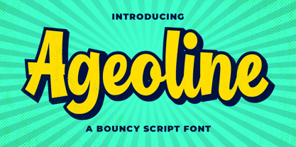 Introducing of our new product the name is Ageoline a Bouncy Script Font. Ageoline inspired by bouncy lettering style this font is a fun theme very good for display, tshirt design, craft, quote sign, logotype and etc FEATURES : Uppercase Lowercase Number Punctuation Multilingual PUA Encode Opentype
 - Comic Hero by Kereatype,
$14.00 Cartoon Display Typeface is playful and strong. This font is perfect for a design that makes it more attractive and playful. made with a very good level of aesthetics making this font suitable for book covers, children's books, comics, posters, packaging, merchandise, logotype, and much more.
 - Prestige 12 Pitch by Bitstream,
$29.99Limited to a single width for all characters and a rough image transferred through a ribbon to the paper, in 1953 Clayton Smith at IBM, Lexington, adapted the classical serifed letterform to this difficult medium to obtain a typewriter face of good readability and interesting texture. - Algeline by Blankids,
$26.00 Introducing of our new product the name is Algeline a Romantic Script Font. Algeline inspired by modern calligraphy style this font is a fun theme very good for display, tshirt design, craft, quote sign, logotype and etc FEATURES : Uppercase Lowercase Number Punctuation Multilingual PUA Encode Opentype
