10,000 search results
(0.024 seconds)
- Simple Pen by Zeenesia Studio,
$10.00 Simple Pen Font Duo, Introducing of our new product the name is Simple Pen, Simple Pen is a Quirky Serif Font. came with two style, Solid and Line who make your design so classy, Simple Pen very good for crafting, kids poster, promotion poster, cartoon, comic etc
 - Early Morning Coffee by Hanoded,
$15.00 Wake up and smell the….. Early Morning Coffee! It's a bit messy, I admit, but it has everything you need to make your designs look good. This caffeine fueled script comes with a whole bunch of alternates (CALT & SALT) and has all the diacritics you need.
 - Hello Nightmare by Blankids,
$21.00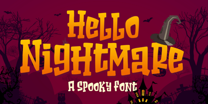 Introducing of our new product the name is Hello Nightmare a Spooky Font inspired by beauty quirky style this font is a fun theme very good for display, T-shirt design, craft, quote sign, logotype and etc FEATURES : Uppercase Lowercase Number Punctuation Multilingual PUA Encode Opentype
 - Kids Touch by Sipanji21,
$15.00 Hello, this is kids touch typeface, it is original and natural kids handwritten font. This article is good for a variety of designs, such as: packaging, advertising, crafting, merchandise, banner posters, titles, book covers, tote bags, and other designs. make your design more natural with Kids Touch.
 - Happy People by Blankids,
$23.00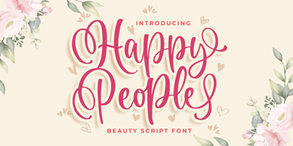 Introducing of our new product the name is Happy People Beauty Script Font. Happy People inspired by bouncy script style this font is a fun theme very good for display, tshirt design, craft, quote sign, logotype and etc. FEATURES : Uppercase Lowercase Number Punctuation Multilingual PUA Encode Opentype
 - Organic Weekend by Bogstav,
$14.00 It is monospaced and organic. Two words that often not goes hand in hand, but in this case it does. You have 6 different versions of each letter to choose from, or just let the Contextual Alternates do the job by automatically cycles as you type.
 - Spiderwild by Calligraplay,
$13.00 Spiderwild is a scratchy, splotchy font especially perfect for spooky layouts, but also good for any quirky project that needs a unique and hand-drawn typeface. Use it for Halloween cards, social media tiles, posters or banners. Spiderwild is multilingual with a total of 424 glyphs.
 - Chunder by Chank,
$49.00Created in Minneapolis in 1996, Chunder is inspired by the hand-painted cursive signage of urban boutiques where a shopkeeper can't afford to hire a very good sign painter. Kinda clunky, kinda flowery. Like beer spilled on a daffodil. "It's not pretty, but it's mine," says Chank. - Urban Rebel by Blankids,
$18.00 Introducing of our new product the name is Urban Rebel Graffiti Font. Urban Rebel inspired by graffiti style with a fun theme very good for graffity poster, Hip Hop music, kids poster, flyer, childrenbook, cartoon, comic etc FEATURES : Uppercase Lowercase Number Punctuation Multilingual PUA Encode Opentype
 - Relix by Intellecta Design,
$11.25 Relix, emulating the old videogame's screen fonts, that's a good font to non-formam small texts, names, logotypes, titles, headers, topics etc., developed from the original Reliant's Intellecta typeface. Big sizes of this font can be used for texts on posters, t-shirts and other surfaces.
 - Bodywerk by PizzaDude.dk,
$20.00 Bodywerk is a futuristic looking font, but worn and torn! The font has got more than 200 ligatures - including double letter and number substitution - along with a huge load of most common letter combinations! You will need to use OpenType supporting applications to use the autoligatures.
 - Loving Kitten by Blankids,
$23.00 Introducing of our new product the name is Loving kitten a Quirky Font. Loving kitten inspired by Quirky Handwritten style this font is a fun theme very good for display, tshirt design, craft, quote sign, logotype and etc FEATURES : Uppercase Lowercase Number Punctuation Multilingual PUA Encode Opentype
 - Belgravia by Scriptorium,
$24.00Belgravia is an Art Nouveau period design based on hand lettering from the 1890s. Like our popular Pantagruel font it has a lot of the elements which would influence later Psychedelic poster lettering in the 1960s. Very nice looking with a good weight for title designs. - Gevher by Hurufatfont,
$23.00 Gevher is a grotesque based font family that the product of a meticulous work that spread over 2 years. It differs from other grotesque fonts with its very soft angular turns to the rounded forms and its daring ink traps. The rigid and stable structure is balanced by deep ink traps and unusual opposite angle at the joints. Thus it has a more humanistic expression. It has 3 widths: Condensed, Narrow and Normal. It consists of 8 main weights and their compatible italics, totally has 48 styles. Therefore, it provides a wide range of usage practices. It offers creative "contextual alternates" for the best reading experience. Ideal for every editorial design, packaging, corporate identity, brand, application, web and desktop usages.
 - Elen Sans by Hurufatfont,
$19.00 The first design of Elensans consisted of 4 styles that are including two weights and their italics which I designed in my student years in 2002. It was designed with a little Art Nouveau style touch with inspired by classical geometric based fonts such as Friz Quadrata and Eras. It was updated with according to the orientations of the day in 2012 and eventually it took its final form with actual touches in 2020. The family has 18 weights, ranging from Thin to Black in normal styles and including their italics. It is ideally suited for advertising and packaging, editorial and publishing, logo, branding and creative industries, poster and billboards, small text, wayfinding and signage as well as web and screen design.
 - M XiangHe Hei SC Pro Variable by Monotype,
$1,049.99The M XiangHe Hei Simplified Chinese typeface merges traditional brush strokes with modern letterforms to carefully balance traditional calligraphy with humanist design. Named for the smooth movements of a flying crane, the M XiangHe Hei typeface is designed to glide across the page, and features strokes that are partly derived from the Kaishu calligraphic style – an everyday script which dates back hundreds of years. Seol Sans features Neue Frutiger for its Latin glyphs, and works harmoniously with Neue Frutiger World and Monotype’s CJK typefaces Tazugane Info (Japanese) and Seol Sans (Korean). M XiangHe Hei is a great choice for global brands using sans serif Latin typefaces looking to maintain their visual identity, and communicate with a consistent tone of voice with Simplified Chinese. - Zt Chablis by Khaiuns,
$14.00 Chablis is a serif font with two different design colors including a cyliric typeface. Chablis comes in 2 styles, and each style has 5 weights, Chablis Basic shape with a harmonious and classic look that makes you feel nostalgic for precious memories from the golden years that have passed, Chablis Slow shape with a sharp look at the bottom corner of small letters but very elegant and classy, very suitable for presenting a new atmosphere of corporate identity design, websites, publications, titles, books, magazines, business cards, logos, product labels, packaging or any kind of purpose advertising. Includes: Numbers & punctuation Classic Numbers Ligature Foreign language support I hope you have fun using zt Chablis Thanks for using this font ~ Khaiuns X zelowtype
 - Reross by Adobe,
$29.00Of all student work produced in Joost Schmidt?s Bauhaus classes, Reinhold Rossig?s (1903?1979) alphabet designs are perhaps closest to his master?s teachings: monolinear, geometric lettering, constructed on grids using compass and ruler. Drafts by Rossig, dated 1929, also demonstrate explorations of letterform width and x-height. Almost ninety years later, Elia Preuss carefully preserves Rossig?s letters and considerations in a proper typeface, by overcoming most of the optical mistakes captured in true geometric letterforms. To carry Rossig?s design further away from Schmidt?s influence, Preuss also lent more characteristic letters found on poster designs by fellow Bauhaus student Hermann Werner Kubsch. Reross is a true Bauhaus-influenced geometric sans, equipped with different historic influences and contemporary features. - Artifex CF by Connary Fagen,
$35.00 Designed for easy reading of long passages, Artifex CF's smoothed-off serifs help the flow of text without unnecessary visual noise. Artifex's even rhythm and mellow tone make it an excellent option for books, magazines, articles, blogs, captions, and longform texts. A near-upright italic adds emphasis and urgency with elegance. Artifex also doubles as a handsome display typeface, scaling gracefully with charming details revealing themselves at large sizes. Artifex CF pairs nicely with bold, clean sans-serifs, such as Greycliff CF and Visby CF. Artifex also has a sibling typeface, Artifex Hand CF, cut from the same cloth, but with subtle flares in place of the serifs. All typefaces from Connary Fagen include free updates, including new features, and free technical support.
 - Alfarn by Adobe,
$29.00Alfarn is based on capital letters that Bauhaus student Alfred Arndt (1898?1976) drew for a poster in 1923, designed to advertise a bakery in Jena, Thuringia. The poster is an example for what we call today ?Bauhaus features?: yellow circle, red square, black bars and an indication of geometric lettering that became so popular in the following years. C�line Hurka carefully analysed Arndt?s lettering and derived two weights in different widths: wide and condensed. She took on the characteristic bars and transformed them into an underlined weight of its own. Hurka also drew perfectly balanced small caps, which make up for a missing lower case. Alfarn captures the spirit of 1920s Bauhaus-influenced posters ? a timeless style quite suitable for contemporary designs. - Black Pearl by FontMesa,
$30.00 Black Pearl is a revival of an ornate calligraphic font possibly created between 1850 and 1870. I spent two years looking for all the letters of this font; once I found them all, I immediately went to work on recreating this old classic. I was not able to find any numbers for the font, so new to this style are numbers, some punctuation and currency symbols. The Truetype and OpenType formats include an extended character set with Central and Eastern European accented letters. Extra characters in this font are left and right pointing hands in place of the less than and greater than keys; a ship’s wheel, located on the asterisk key; and a boat anchor on the bracket keys.
 - Depicto by Michael Rafailyk,
$12.00 A pixelated typeface with asymmetrical serifs intended to depict emojis in coarse mosaic shapes and represented in two styles that perfectly complement each other – Mono (casual font) and Mosaic (color font). The main font feature is a large set of pictograms, which are activated using the Stylistic Set and typed right in a text with a keywords like :smile: :happy: :sad: :pear: :rose: :horse: :bike: :house: and so on. Read more about Depicto font family concept, features, pictograms, color font, emoji skin tone, how to use it, and the applications support: https://michaelrafailyk.com/depicto See the complete list of 600+ pictograms: https://michaelrafailyk.com/typeface/specimen/Depicto.pdf Scripts: Latin, Greek, Cyrillic, Hebrew Languages: 480+ The promo image “Serpant Mosaics” used a photo of Nick Verlice from Pexels
 - Gonte by Dear Alison,
$29.00 If you are like me, you love to doodle in a sketchbook when traveling abroad to capture the indescribable moments that a camera or video would miss. Years ago, on a trip to Spain, I penned out this fanciful handwritten script and just fell in love with it. I came across that old sketchbook recently, and the love affair was renewed. Gonte brings back all of the magic and charm of that trip, and I hope that it will bring a little magic to whatever flights of fancy you might use it for. Double letter Ligatures, Contextual Swashes to start and finish letterforms, and Stylistic Alternates for the lowercase v and w all lend to keeping the carefree hand-penned style.
 - Cervo Neue Condensed by Typoforge Studio,
$29.00 Cervo Neue Condensed is the new perfected and Condensed version of Cervo Neue, containing 18 variants. It differs from the previous version of Cervo with the higher accents over glyphs, enlarged punctuation, old-style numerals and the newly added varieties Semi Bold, Bold, Extra Bold and Black. Additionally, there is the variety of grotesque. Font Cervo is inspired by a “You And Me Monthly” published by National Magazines Publisher RSW „Prasa” that appeared from Mai 1960 till December 1973 in Poland. Recently, Cervo Neue Condensed has started being used as a display text in „Przekrój Magazine” which was published in years 1945–2013 in Krakow (2002–2009 in Warsaw) as a weekly and again from 2016 as a quarterly journal in Warsaw.
 - M XiangHe Hei SC Std Variable by Monotype,
$1,049.99The M XiangHe Hei Simplified Chinese typeface merges traditional brush strokes with modern letterforms to carefully balance traditional calligraphy with humanist design. Named for the smooth movements of a flying crane, the M XiangHe Hei typeface is designed to glide across the page, and features strokes that are partly derived from the Kaishu calligraphic style – an everyday script which dates back hundreds of years. Seol Sans features Neue Frutiger for its Latin glyphs, and works harmoniously with Neue Frutiger World and Monotype’s CJK typefaces Tazugane Info (Japanese) and Seol Sans (Korean). M XiangHe Hei is a great choice for global brands using sans serif Latin typefaces looking to maintain their visual identity, and communicate with a consistent tone of voice with Simplified Chinese. - Zany Route by Putracetol,
$22.00 Zany Route is a delightful and rounded typeface designed to rev up the fun in transportation-themed projects. With its playful and engaging style, it's the perfect addition to any creative project. Whether used on its own or combined with any of its eleven thematic variations, Zany Route is sure to transport your designs to a world of joy and adventure. This font offers eleven distinct variations inspired by transportation, including planes, cars, gears, motorcycles, trucks, and more. It's the ideal choice for designs related to transportation, catering to children and crafters alike. Zany Route is your ticket to logos, children's themes, crafting, invitations, packaging, posters, titles, businesses, greeting cards, stickers, children's books, magazines, and any designs connected to the world of transportation.
 - Bender Script by Dear Alison,
$29.00 Would you hire one of the top hand lettering artists that worked for companies like Max Factor for your designs? Of course you would! Chas Bluemlein passed away many years back, and you couldn't have afforded his services anyway, but his lettering prowess which graced many advertisements, primarily cosmetic ads, has been pulled together from numerous samples to make this font. Bender Script comes with BONUS Swash alternates to mix up the flavor a bit, and exudes passion and confidence! Now you can own not only a piece of his lettering legacy, but you can also put it to work for you! This beauty is a sure fit into any font collection, so what are you waiting for, buy it today!
 - M XiangHe Hei TC Variable by Monotype,
$1,049.99The M XiangHe Hei Traditional Chinese typeface merges traditional brush strokes with modern letterforms to carefully balance traditional calligraphy with humanist design. Named for the smooth movements of a flying crane, the M XiangHe Hei typeface is designed to glide across the page, and features strokes that are partly derived from the Kaishu calligraphic style – an everyday script which dates back hundreds of years. Seol Sans features Neue Frutiger for its Latin glyphs, and works harmoniously with Neue Frutiger World and Monotype’s CJK typefaces Tazugane Info (Japanese) and Seol Sans (Korean). M XiangHe Hei is a great choice for global brands using sans serif Latin typefaces looking to maintain their visual identity, and communicate with a consistent tone of voice with Traditional Chinese.¶ - HWT Showcard Script by Hamilton Wood Type Collection,
$29.95 Described as “An extended script type that lends itself well to fine fashion, ready-to-wear and all quality merchandise” in a marketing blurb pitching Beaufont by the Morgan Sign Machine Company of Chicago for their Line-O-Scribe sign printing system. This advertising script font was originally manufactured exclusively for Morgan Sign under license by the Hamilton Wood Type Manufacturing Company. The source patterns and original artwork for this typeface exist in the archives of the Hamilton Wood Type & Printing Museum, and were used for this fresh digitization of this font. This digital take includes alternate letters as originally designed in the mid-century wood type version, and now includes a full extended latin character set with over 350 characters.
 - M XiangHe Hei SC Pro by Monotype,
$187.99The M XiangHe Hei Simplified Chinese typeface merges traditional brush strokes with modern letterforms to carefully balance traditional calligraphy with humanist design. Named for the smooth movements of a flying crane, the M XiangHe Hei typeface is designed to glide across the page, and features strokes that are partly derived from the Kaishu calligraphic style – an everyday script which dates back hundreds of years. Seol Sans features Neue Frutiger for its Latin glyphs, and works harmoniously with Neue Frutiger World and Monotype’s CJK typefaces Tazugane Info (Japanese) and Seol Sans (Korean). M XiangHe Hei is a great choice for global brands using sans serif Latin typefaces looking to maintain their visual identity, and communicate with a consistent tone of voice with Simplified Chinese. - Preface by Shinntype,
$39.00 Preface vs. Helvetica/Futura/Gill: a different strategy of text color. Whereas the established classes of sans serif typeface achieve a dynamic balance between stroke and space by combining a diversity of letterform with an evenness of fit, Preface switches the emphasis, driving out diagonals to create a dominant harmony of curves and perpendiculars, matched with a greater variety of inter-character space shapes—the result of extra width introduced in the “f” and “t”, and by the openness that accompanies the wide tails of the “ a” and “l”, the long ear of the “r”, and the serif of the “i”. En masse, and in keeping with the present trend in typography, Preface exhibits a coarser texture than the traditional sans serif faces, but one that is nonetheless even and precise. With tabular, oldstyle figures.
 - Geis by Galapagos,
$39.00In 1978 I went to work at Mergenthaler as a letter drawer. Being an inquisitive sort I decided that I should take a stab at this type design 'stuff'. I drew 25 or 30 glyphs before the work found its way to a high shelf in a dark corner of my apartment. Just 23 years later I found the drawings on a different shelf, in a different home, in a different city and decided to finish what I had started. I'm still trying to deal with my predisposition toward procrastination but I've finished the font. The name of the font is the last name of somebody I played softball with before I moved to Beantown. Ronnie Geis was one of the courageous firefighters we lost on September 11th when the WTC collapsed. - Campora by W Type Foundry,
$25.00 This year we attended the Bologna Children’s Book Fair in Italy. In our days off, we went to Piazza Maggiore to see what the city had to offer and luckily for us we saw an incredible store sign saying CAMPORA. We took some pictures of the typed font and later back in the studio we discovered that it was Dynamo. Immediately our minds were blown away by its beauty and thus we decided to design a new font inspired by its sharp and geometric design adding new weights and OpenType features. In the process we realized that both Dynamo and one of our favorite fonts Avant Garde, share a similar structure, so we made a type mashup between these beauties, including the sharpness of Dynamo and the revolutionary ligatures of Avant Garde.
 - Frieze by Fine Fonts,
$29.00 The origin of this font was a frieze in the RAF Chapel in Westminster Abbey which Michael Harvey was commissioned to design and create. It was comprised of the names of the top brass in wartime Bomber Command, namely Dowding, Harris, Newall, Tedder, Portal and Douglas. The Brief was to cut the letters in bronze and gild them. Instead, they were cut in perspex and gilded. To sit comfortably within the long and narrow vertical space available beneath the chapel’s stained glass window, extended letterforms were used with many vertical serifs omitted and with lengthened horizontal serifs. Some twenty years later, the missing upper-case letters were drawn together with the lowercase letters and Frieze, the font, was born. Subsequently, additional weights and styles were added to create a font family of six styles.
 - Shaky Kane by Comicraft,
$39.00 He sees you! He can see everything YOU do! He wears X-Ray Spex! He glows in the dark! Top Pop Cult Comic Artist Shaky Kane pushes at the limits of taste, dragging a scalpel down the veil of your illusions to make you see the world as it really is, as HE sees it. You've wondered at his work in the pages of ELEPHANTMEN! THE BULLETPROOF COFFIN! CAP'N DINOSAUR! THAT'S BECAUSE YOU'RE A ROBOT! MONSTER TRUCK and DEADLINE! You've worn the HATEFUL DEAD t-shirt and drawn blood with the SHAKY KANE FAN CLUB pins. Now Shaky Kane isn't just a disaffected punk rock way of looking at the world, it's a font too. A little Shaky, a little Stirred, best served with a purple eyeball spiked on a cocktail stick.
 - Ring by Ochakov,
$9.00 First of all, Ring font has a little story. It was created as an example for Typography Exhibition in Moscow. And the font was immediately awarded! 10 years later, I decided to continue working on it and improve this font. Ring - really circular typeface. I felt inspired by Bauhaus. I've always wanted to design something similar. Ring is a cool and geometric-styled font. Expertly designed to make your creation look out of this world, this font will look gorgeous on a variety of ideas. This font is ideal for writing web designs, business cards, or pretty much anything else that requires a unique touch. Ring font comes in 8 weights and 16 styles and this is just the beginning. The beginning of a further big font family called Ring!
 - VVDS Suffer by Vintage Voyage Design Supply,
$10.00 Do you hear that sound of Dick Dale's guitar? Here it is! Introducing you a new font family with retro surf rock vibes! Straight outta retro vinyl covers and surf gig posters to your font collection! We're all missed the sun, so grab this family and get some of the summer vibes. No matter what your next design project – a tiki t-shirt collection / summer rock festival or gigs / greeting cards / or a header for your new zine, - you'll get your goals with this family. A lot of alternates will give you a hand written's mood and absolutely unique typographic style. Up to 10 styles for some of them. Open Type Features as Stylistic Alternates, Small Caps and Fractions. Three styles: Clear, Roughen and Scratched. Three widths: Light, Regular and Bold.
 - Kapelka New by ParaType,
$30.00 Kapelka New is a soft and friendly display face based on the principles of writing with a soft pointed brush. Kapelka is suitable for packaging design, children's books headlines and any other domestic and informal purposes. The typeface was designed by Zakhar Yaschin and released by ParaType in 2015. Inspired by the sweetie paper and soft pointed brush writing Zahar Yaschin designed the first version of Kapelka in 2001. It wasn’t on the shelf all these years and even served some time as a corporate identity of “Domashniy” TV channel. But with the benefit of hindsight the author decided to improve, modernize and extend Kapelka. The result was even better than you would expect. The font became even more soft and gentle and also gained some inward nobility due to more evident calligraphic base.
 - Goldenwick by LetterStock,
$25.00 Goldenwick This pair was inspired by lettering at invitation design that i got few weeks ago, it was crafted by hand specially to add natural handmade feeling in its brand identity than i make it clean with pentool. Opentype features Goldenwick font has 207 character set included. This font is very good for design logo, labels, packaging product, invitations, advertising and others, this font will make your design authentic and good looking with modern calligraphy style. If you’re looking for original calligraphy script font for your greeting card and make your design authentic, this item is a great choice to make your design looks great and unique. This fonts works with following languages: Afrikaans, Albanian, Asu, Basque, Bemba, Bena, Chiga, Cornish, Danish, English, Estonian, Filipino, Finnish, French, Friulian, Galician, German, Gusii, Indonesian, Irish, Italian, Kabuverdianu, Kalenjin, Kinyarwanda, Low German, Luo, Luxembourgish, Luyia, Machame, Makhuwa-Meetto, Makonde, Malagasy, Malay, Manx, Morisyen, North Ndebele, Norwegian Bokmål, Norwegian Nynorsk, Nyankole, Oromo, Portuguese, Romansh, Rombo, Rundi, Rwa, Samburu, Sango, Sangu, Scottish Gaelic, Sena, Shambala, Shona, Soga, Somali, Spanish, Swahili, Swedish, Swiss German, Taita, Teso, Vunjo, Zulu Thank you for using this font. LS
 - Classica Pro by URW Type Foundry,
$35.99 Classica Pro by Bernd Möllenstädt A real alternative for letterpress printing A masterpiece It was only after many years, shortly before the end of his life, Bernd Möllenstädt brought out these early drafts of his Classica Light and Light Italic from his drawer, and asked me to produce for him on the computer a Bold and Bold Italic, from which we later wanted to interpolate further cuts like Regular and so on. The boldening of letters with an oblique axis and with hairlines which should not grow to the same extent as the general line widths, is hard to cope with perfectly, even for the smartest computer program, and even more so, when it concerns an as complicated set of data as those conceived by Bernd. The automatically generated result could therefore only be a first step that had to be improved manually later. This was about the stage that we had reached when Bernd died in March 2013, leaving me behind with comprehensive corrections on proofs of this automatically generated Bold. Although I was aware that it would mean a lot of work to complete the project, I did not want to leave it unfinished and decided to finalize and publish the Classica, also in Bernd‘s honor. In the course of the two years that I worked on this font family it somewhat naturally became also my own. New details were added and some of the existing changed. A book typeface requires the supreme and forgives rarely, it represents a true masterpiece. My intention and my ambition were to create a real alternative for letterpress printing, with a font family that contains all the typographic options for an excellent typesetting, and is better readable and has a better appearance than other existing typefaces. Whether this was achieved, the reader may decide. Volker Schnebel, Hamburg, december 2014