10,000 search results
(0.021 seconds)
- TE HAFS2 Tharwat Emara2 by Tharwat Emara,
$49.00 It is known as the Hafs Quraan2 Font for its extensive use in the copying and transmission of books because it helps the writer to write more quickly than any other font since the Islamic times and then Alnaskh Quraan font wrote the "Quran"And the advantages of Alnaskh Quraan font are clarifying the letters and show their beauty and splendor. Naskh Font for writing the Holy Qur’an by Raweya Hafs, for the first time, the possibility of coloring all its letters to learn Tajweed - The possibility of coloring letters, various forms of one letter
 - TE Mona Tharwat Emara by Tharwat Emara,
$35.00 TE Mona Tharwat Emara," a masterpiece of Arabic calligraphy crafted by the renowned Egyptian calligrapher, Tharwat Emara. This exquisite Ruqaa font seamlessly blends tradition with innovation, offering a timeless elegance that captures the essence of Arabic script. Tharwat Emara, a distinguished figure in the world of calligraphy, has lent his artistic prowess to create a font that is not merely a collection of characters but an embodiment of cultural richness. Each stroke of the pen reflects the heritage of Egyptian calligraphy, echoing the historical echoes of an ancient civilization. "TE Mona Tharwat Emara" stands as a testament to Emara's dedication to perfection. The font's graceful curves and meticulously designed letterforms pay homage to the classical Ruqaa style, while subtle contemporary touches infuse it with a modern flair. It is a harmonious blend of tradition and innovation, making it an ideal choice for projects that demand sophistication and cultural resonance. Designed with precision and passion, this font is not just a typographic tool; it's a work of art that brings the beauty of Arabic calligraphy to the forefront. Each character is a brushstroke of inspiration, contributing to a seamless flow that captures the eye and mesmerizes the reader. Whether you are working on a branding project, publication, or artistic endeavor, "TE Mona Tharwat Emara" adds a touch of timeless class. Embrace the elegance of Arabic script with this font, where every detail reflects the expertise of a master calligrapher. As you embark on your creative journey, let "TE Mona Tharwat Emara" be your muse. Elevate your designs, captivate your audience, and embrace the heritage of Arabic calligraphy with this exceptional font. Embrace the legacy, embrace the art – TE Mona Tharwat Emara awaits, a font that transcends time and tradition
 - TE HAFS2 Tharwat Emara by Tharwat Emara,
$39.00 Introducing "Te Hafs tharwat Emara" - An Exquisite Arabic Font for the Holy Quran Unveil the beauty and elegance of Arabic calligraphy with "Te Hafs tharwat Emara," a meticulously crafted font designed specifically for typing the Holy Quran. This magnificent typeface pays homage to the rich cultural heritage of Arabic script while embracing modern design elements, resulting in a captivating blend of tradition and innovation. With its unique and enchanting aesthetic, "Te Hafs tharwat Emara" captures the essence of Islamic art and typography, making it an ideal choice for any project related to the Holy Quran. Whether you're designing Quranic verses, Islamic manuscripts, or educational materials, this font will elevate your work to new heights and leave a lasting impression on your audience. The essence of "Te Hafs tharwat Emara" lies in its harmonious balance of form and function. Every letter has been meticulously crafted to ensure legibility and clarity, even at smaller sizes. The thoughtful spacing and meticulous attention to detail make this font a delight to read, enhancing the overall reading experience of the Holy Quran. One of the standout features of "Te Hafs tharwat Emara" is its ornate and intricate calligraphic strokes. Each character is a masterpiece in itself, reflecting the skill and expertise of traditional Arabic calligraphers. The fluidity of the strokes and the subtle curves create a sense of rhythm and grace, evoking a sense of reverence and spirituality. The versatility of "Te Hafs tharwat Emara" allows it to adapt effortlessly to various design contexts. Whether you're working on printed materials, digital platforms, or even signage, this font will maintain its beauty and legibility, ensuring your message is conveyed with utmost clarity and impact. To further enhance its usability, "Te Hafs tharwat Emara" includes a comprehensive set of Arabic ligatures, diacritical marks, and punctuation, enabling you to accurately represent the intricacies of the Arabic language. These thoughtful additions ensure that your typography remains authentic and faithful to the traditions of Arabic script. When it comes to font selection, readability is of utmost importance. "Te Hafs tharwat Emara" has been meticulously optimized for digital and print environments, ensuring exceptional legibility in both mediums. Each character has been carefully tested and refined to guarantee optimal reading comfort, making this font an excellent choice for long passages of text. Moreover, "Te Hafs tharwat Emara" supports a wide range of OpenType features, granting you creative control over your typography. From alternate character forms to contextual alternates, swashes, and ligatures, this font offers a plethora of options to customize and elevate your design. With such flexibility at your fingertips, your creativity knows no bounds. Beyond its technical prowess, "Te Hafs tharwat Emara" is a font with a story. It symbolizes a rich cultural heritage, embodying the devotion and reverence associated with the Holy Quran. Its elegant curves and intricate details evoke a sense of spirituality, making it a perfect choice for projects aimed at preserving and celebrating Islamic traditions. In conclusion, "Te Hafs tharwat Emara" is more than just a font; it is a celebration of Arabic calligraphy, Islamic art, and the beauty of the Holy Quran. With its exquisite design, unparalleled legibility, and versatile application, this font is an invaluable asset for any project related to Islamic typography. Embrace the artistry of "Te Hafs tharwat Emara" and elevate your designs to new heights of beauty and elegance.
 - TE Warsh Tharwat Emara by Tharwat Emara,
$49.00 Introducing "TE Warsh Tharwat Emara," an exquisite Naskh font designed to elevate your typography to the next level. Our font features intricate calligraphic strokes, elegant curves, and graceful flourishes that bring a touch of sophistication and elegance to your text. Designed with the utmost attention to detail, every character in "TE Warsh Tharwat Emara" is beautifully crafted and easy to read. "TE Warsh Tharwat Emara" is perfect for typesetting the Holy Quran, with its beautifully crafted curves and strokes. The Naskh script is one of the most popular calligraphic styles used in Arabic typography and is known for its clarity, making it perfect for Quranic typesetting. With "TE Warsh Tharwat Emara," you can create stunning, high-quality typography that is perfect for publishing the Quran, as well as other religious texts. In addition to its suitability for Quranic typesetting, "TE Warsh Tharwat Emara" is versatile and can be used in a variety of contexts. Its elegant and sophisticated design makes it perfect for book covers, posters, branding, and web design. "TE Warsh Tharwat Emara" supports a wide range of languages, including Arabic, Persian, Urdu, and many others, making it ideal for multi-lingual projects. "TE Warsh Tharwat Emara" includes a range of special features that take your typography to the next level. The font includes ligatures and alternate characters, which allow you to create more natural and fluid connections between characters. The alternate characters provide a variety of stylistic choices, giving you even more control over the typography. "TE Warsh Tharwat Emara" is compatible with a wide range of platforms and software, including Adobe Creative Suite, Microsoft Office, and many others. This means that you can use "TE Warsh Tharwat Emara" in your favorite design software, without worrying about compatibility issues. "TE Warsh Tharwat Emara" comes with a multi-user perpetual license, which allows you to use it for commercial and personal projects. The perpetual license means that you can use the font indefinitely, without having to worry about renewing your license. We also offer a range of licensing options, including a single-user license, to suit your needs. In conclusion, "TE Warsh Tharwat Emara" is a must-have for designers and typographers who are looking to create stunning, high-quality typography that is perfect for publishing the Holy Quran, as well as other religious texts. With its intricate calligraphic strokes, elegant curves, and graceful flourishes, "TE Warsh Tharwat Emara" will elevate your typography to the next level. It's versatile, easy to use, and comes with a range of special features that make it perfect for all kinds of projects. So, whether you're designing book covers, posters, or websites, don't miss out on "TE Warsh Tharwat Emara." Purchase now and experience the beauty of our Naskh font for yourself.
 - TE HAFS1 Tharwat Emara1 by Tharwat Emara,
$39.00 Introducing "Te Hafs1 tharwat Emara1" - An Exquisite Arabic Font for the Holy Quran Unveil the beauty and elegance of Arabic calligraphy with "Te Hafs1 tharwat Emara1," a meticulously crafted font designed specifically for typing the Holy Quran. This magnificent typeface pays homage to the rich cultural heritage of Arabic script while embracing modern design elements, resulting in a captivating blend of tradition and innovation. With its unique and enchanting aesthetic, "Te Hafs1 tharwat Emara1" captures the essence of Islamic art and typography, making it an ideal choice for any project related to the Holy Quran. Whether you're designing Quranic verses, Islamic manuscripts, or educational materials, this font will elevate your work to new heights and leave a lasting impression on your audience. The essence of "Te Hafs1 tharwat Emara1" lies in its harmonious balance of form and function. Every letter has been meticulously crafted to ensure legibility and clarity, even at smaller sizes. The thoughtful spacing and meticulous attention to detail make this font a delight to read, enhancing the overall reading experience of the Holy Quran. One of the standout features of "Te Hafs1 tharwat Emara1" is its ornate and intricate calligraphic strokes. Each character is a masterpiece in itself, reflecting the skill and expertise of traditional Arabic calligraphers. The fluidity of the strokes and the subtle curves create a sense of rhythm and grace, evoking a sense of reverence and spirituality. The versatility of "Te Hafs1 tharwat Emara1" allows it to adapt effortlessly to various design contexts. Whether you're working on printed materials, digital platforms, or even signage, this font will maintain its beauty and legibility, ensuring your message is conveyed with utmost clarity and impact. To further enhance its usability, "Te Hafs1 tharwat Emara1" includes a comprehensive set of Arabic ligatures, diacritical marks, and punctuation, enabling you to accurately represent the intricacies of the Arabic language. These thoughtful additions ensure that your typography remains authentic and faithful to the traditions of Arabic script. When it comes to font selection, readability is of utmost importance. "Te Hafs1 tharwat Emara1" has been meticulously optimized for digital and print environments, ensuring exceptional legibility in both mediums. Each character has been carefully tested and refined to guarantee optimal reading comfort, making this font an excellent choice for long passages of text. Moreover, "Te Hafs1 tharwat Emara1" supports a wide range of OpenType features, granting you creative control over your typography. From alternate character forms to contextual alternates, swashes, and ligatures, this font offers a plethora of options to customize and elevate your design. With such flexibility at your fingertips, your creativity knows no bounds. Beyond its technical prowess, "Te Hafs1 tharwat Emara1" is a font with a story. It symbolizes a rich cultural heritage, embodying the devotion and reverence associated with the Holy Quran. Its elegant curves and intricate details evoke a sense of spirituality, making it a perfect choice for projects aimed at preserving and celebrating Islamic traditions. In conclusion, "Te Hafs1 tharwat Emara1" is more than just a font; it is a celebration of Arabic calligraphy, Islamic art, and the beauty of the Holy Quran. With its exquisite design, unparalleled legibility, and versatile application, this font is an invaluable asset for any project related to Islamic typography. Embrace the artistry of "Te Hafs1 tharwat Emara1" and elevate your designs to new heights of beauty and elegance.
 - Lovely Amatis Signature - Personal use only

- An Electronic Display LED LCD LED7 Seg 3 by Fortune Fonts Ltd.,
$15.00 * For when you need the most realistic looking electronic display. * See User Manuals Main advantages: - Spacing between characters does not change when entering a decimal point or colon between them. - Custom characters can be produced by selecting any combination of segments to be displayed. Low cost electronic displays have a fixed number of segments that can be turned on or off to represent different symbols. A digital watch would be the most common example. Fonts typically available for depicting electronic displays are often in the artistic style of these common LED or LCD displays. They provide the look-and-feel, but fall short when technical accuracy is required. Failure to represent an accurate and consistent representation of the real thing can be a cringe-worthy experience for the product design and marketing team, or even the hobbyist for that matter. To solve this problem, Fortune Fonts has released a range of fonts that accurately depict the displays typically found on low cost electronic devices: watches, answering machines, car stereos, alarm clocks, microwaves and toys. These fonts come with numbers, letters and symbols predefined. However, they also allow you to create your own segment combinations for the custom symbols you need. When producing manuals, marketing material and user interfaces, accuracy is an all-or-nothing concept. Instructions in the user manual describe how to turn these fonts into realistic displays according to your own design, in the manner of the images above. If you cannot see a license option for your specific application, such a license may be purchased from here. By purchasing &/or using &/or distributing the fonts the buyer user and distributor (including Monotype Imaging Inc. & Monotype Imaging Hong Kong) agree to (1) indemnify & hold harmless the foundry, for any consequential, incidental, punitive or other damages of any kind resulting from the use of the deliverables including, but not limited to, loss of revenues, profits, goodwill, savings, due to; including, but not limited to, failure of the deliverables to perform it’s described function, or the deliverable’s infringement of patents, copyrights, trademarks, design rights, contract claims, trade secrets, or other proprietary rights of the foundry, distributor, buyer or other parties (2) not use the fonts to assist in design of, or be incorporated into, non-software displays
 - An Electronic Display LED LCD LED7 Seg 2 by Fortune Fonts Ltd.,
$15.00 * For when you need the most realistic looking electronic display. * See User Manuals Main advantages: - Spacing between characters does not change when entering a decimal point or colon between them. - Custom characters can be produced by selecting any combination of segments to be displayed. Low cost electronic displays have a fixed number of segments that can be turned on or off to represent different symbols. A digital watch would be the most common example. Fonts typically available for depicting electronic displays are often in the artistic style of these common LED or LCD displays. They provide the look-and-feel, but fall short when technical accuracy is required. Failure to represent an accurate and consistent representation of the real thing can be a cringe-worthy experience for the product design and marketing team, or even the hobbyist for that matter. To solve this problem, Fortune Fonts has released a range of fonts that accurately depict the displays typically found on low cost electronic devices: watches, answering machines, car stereos, alarm clocks, microwaves and toys. These fonts come with numbers, letters and symbols predefined. However, they also allow you to create your own segment combinations for the custom symbols you need. When producing manuals, marketing material and user interfaces, accuracy is an all-or-nothing concept. Instructions in the user manual describe how to turn these fonts into realistic displays according to your own design, in the manner of the images above. If you cannot see a license option for your specific application, such a license may be purchased from here. By purchasing &/or using &/or distributing the fonts the buyer user and distributor (including Monotype Imaging Inc. & Monotype Imaging Hong Kong) agree to (1) indemnify & hold harmless the foundry, for any consequential, incidental, punitive or other damages of any kind resulting from the use of the deliverables including, but not limited to, loss of revenues, profits, goodwill, savings, due to; including, but not limited to, failure of the deliverables to perform it’s described function, or the deliverable’s infringement of patents, copyrights, trademarks, design rights, contract claims, trade secrets, or other proprietary rights of the foundry, distributor, buyer or other parties (2) not use the fonts to assist in design of, or be incorporated into, non-software displays
 - An Electronic Display LED LCD LED7 Seg Platz by Fortune Fonts Ltd.,
$15.00 * For when you need the most realistic looking electronic display. * See User Manuals Main advantages: - Spacing between characters does not change when entering a decimal point or colon between them. - Custom characters can be produced by selecting any combination of segments to be displayed. Low cost electronic displays have a fixed number of segments that can be turned on or off to represent different symbols. A digital watch would be the most common example. Fonts typically available for depicting electronic displays are often in the artistic style of these common LED or LCD displays. They provide the look-and-feel, but fall short when technical accuracy is required. Failure to represent an accurate and consistent representation of the real thing can be a cringe-worthy experience for the product design and marketing team, or even the hobbyist for that matter. To solve this problem, Fortune Fonts has released a range of fonts that accurately depict the displays typically found on low cost electronic devices: watches, answering machines, car stereos, alarm clocks, microwaves and toys. These fonts come with numbers, letters and symbols predefined. However, they also allow you to create your own segment combinations for the custom symbols you need. When producing manuals, marketing material and user interfaces, accuracy is an all-or-nothing concept. Instructions in the user manual describe how to turn these fonts into realistic displays according to your own design, in the manner of the images above. If you cannot see a license option for your specific application, such a license may be purchased from here. By purchasing &/or using &/or distributing the fonts the buyer user and distributor (including Monotype Imaging Inc. & Monotype Imaging Hong Kong) agree to (1) indemnify & hold harmless the foundry, for any consequential, incidental, punitive or other damages of any kind resulting from the use of the deliverables including, but not limited to, loss of revenues, profits, goodwill, savings, due to; including, but not limited to, failure of the deliverables to perform it’s described function, or the deliverable’s infringement of patents, copyrights, trademarks, design rights, contract claims, trade secrets, or other proprietary rights of the foundry, distributor, buyer or other parties (2) not use the fonts to assist in design of, or be incorporated into, non-software displays
 - An Electronic Display LED LCD LED7 Seg dots1 by Fortune Fonts Ltd.,
$15.00 * For when you need the most realistic looking electronic display. * See User Manuals Main advantages: - Spacing between characters does not change when entering a decimal point or colon between them. - Custom characters can be produced by selecting any combination of segments to be displayed. Low cost electronic displays have a fixed number of segments that can be turned on or off to represent different symbols. A digital watch would be the most common example. Fonts typically available for depicting electronic displays are often in the artistic style of these common LED or LCD displays. They provide the look-and-feel, but fall short when technical accuracy is required. Failure to represent an accurate and consistent representation of the real thing can be a cringe-worthy experience for the product design and marketing team, or even the hobbyist for that matter. To solve this problem, Fortune Fonts has released a range of fonts that accurately depict the displays typically found on low cost electronic devices: watches, answering machines, car stereos, alarm clocks, microwaves and toys. These fonts come with numbers, letters and symbols predefined. However, they also allow you to create your own segment combinations for the custom symbols you need. When producing manuals, marketing material and user interfaces, accuracy is an all-or-nothing concept. Instructions in the user manual describe how to turn these fonts into realistic displays according to your own design, in the manner of the images above. If you cannot see a license option for your specific application, such a license may be purchased from here. By purchasing &/or using &/or distributing the fonts the buyer user and distributor (including Monotype Imaging Inc. & Monotype Imaging Hong Kong) agree to (1) indemnify & hold harmless the foundry, for any consequential, incidental, punitive or other damages of any kind resulting from the use of the deliverables including, but not limited to, loss of revenues, profits, goodwill, savings, due to; including, but not limited to, failure of the deliverables to perform it’s described function, or the deliverable’s infringement of patents, copyrights, trademarks, design rights, contract claims, trade secrets, or other proprietary rights of the foundry, distributor, buyer or other parties (2) not use the fonts to assist in design of, or be incorporated into, non-software displays.
 - An Electronic Display LED LCD LED14 Seg 1 by Fortune Fonts Ltd.,
$15.00 * For when you need the most realistic looking electronic display. * See User Manuals Main advantages: - Spacing between characters does not change when entering a decimal point or colon between them. - Custom characters can be produced by selecting any combination of segments to be displayed. Low cost electronic displays have a fixed number of segments that can be turned on or off to represent different symbols. A digital watch would be the most common example. Fonts typically available for depicting electronic displays are often in the artistic style of these common LED or LCD displays. They provide the look-and-feel, but fall short when technical accuracy is required. Failure to represent an accurate and consistent representation of the real thing can be a cringe-worthy experience for the product design and marketing team, or even the hobbyist for that matter. To solve this problem, Fortune Fonts has released a range of fonts that accurately depict the displays typically found on low cost electronic devices: watches, answering machines, car stereos, alarm clocks, microwaves and toys. These fonts come with numbers, letters and symbols predefined. However, they also allow you to create your own segment combinations for the custom symbols you need. When producing manuals, marketing material and user interfaces, accuracy is an all-or-nothing concept. Instructions in the user manual describe how to turn these fonts into realistic displays according to your own design, in the manner of the images above. If you cannot see a license option for your specific application, such a license may be purchased from here. By purchasing &/or using &/or distributing the fonts the buyer user and distributor (including Monotype Imaging Inc. & Monotype Imaging Hong Kong) agree to (1) indemnify & hold harmless the foundry, for any consequential, incidental, punitive or other damages of any kind resulting from the use of the deliverables including, but not limited to, loss of revenues, profits, goodwill, savings, due to; including, but not limited to, failure of the deliverables to perform it’s described function, or the deliverable’s infringement of patents, copyrights, trademarks, design rights, contract claims, trade secrets, or other proprietary rights of the foundry, distributor, buyer or other parties (2) not use the fonts to assist in design of, or be incorporated into, non-software displays
 - Joyvrie by Greater Albion Typefounders,
$15.00 Joyvrie is inspired by the rather characterful lettering to be seen on a local grocer’s blackboard. It’s lettering in the style of beautifully clear, yet individualistic, hand printing. We’re pleased to report that this particular rather splendid grocer, does not succumb to the ‘Grocer’s apostrophe’ either…
 - An Electronic Display LED LCD LED7 Seg dots 2 by Fortune Fonts Ltd.,
$15.00 * For when you need the most realistic looking electronic display. * See User Manuals Main advantages: - Spacing between characters does not change when entering a decimal point or colon between them. - Custom characters can be produced by selecting any combination of segments to be displayed. Low cost electronic displays have a fixed number of segments that can be turned on or off to represent different symbols. A digital watch would be the most common example. Fonts typically available for depicting electronic displays are often in the artistic style of these common LED or LCD displays. They provide the look-and-feel, but fall short when technical accuracy is required. Failure to represent an accurate and consistent representation of the real thing can be a cringe-worthy experience for the product design and marketing team, or even the hobbyist for that matter. To solve this problem, Fortune Fonts has released a range of fonts that accurately depict the displays typically found on low cost electronic devices: watches, answering machines, car stereos, alarm clocks, microwaves and toys. These fonts come with numbers, letters and symbols predefined. However, they also allow you to create your own segment combinations for the custom symbols you need. When producing manuals, marketing material and user interfaces, accuracy is an all-or-nothing concept. Instructions in the user manual describe how to turn these fonts into realistic displays according to your own design, in the manner of the images above. If you cannot see a license option for your specific application, such a license may be purchased from here. By purchasing &/or using &/or distributing the fonts the buyer user and distributor (including Monotype Imaging Inc. & Monotype Imaging Hong Kong) agree to (1) indemnify & hold harmless the foundry, for any consequential, incidental, punitive or other damages of any kind resulting from the use of the deliverables including, but not limited to, loss of revenues, profits, goodwill, savings, due to; including, but not limited to, failure of the deliverables to perform it’s described function, or the deliverable’s infringement of patents, copyrights, trademarks, design rights, contract claims, trade secrets, or other proprietary rights of the foundry, distributor, buyer or other parties (2) not use the fonts to assist in design of, or be incorporated into, non-software displays
 - rusted plastic - Unknown license

- Great Vibes - 100% free

- Korolev Military Stencil by Device,
$39.00 A stencil variant of last year's bestselling Device font family, Korolev . Named after Sergei Korolev, father of Soviet astronautics, and based on signs from the Red Army parade of 1932.
 - Grecian Empire by Elemeno,
$25.00The designer's father, Philip Grecian drew a logo for his business, Grecian Creative Services and asked Alex Grecian to expand on the logo. Alex extrapolated from the existing letters, creating a font to compliment his father's logo. Naming it was the easy part. Grecian Empire has since become one of the most popular fonts offered by Elemeno. The Strikes Back and Engraved styles have limited character sets and are far less versatile than the regular version. - Royante - Personal use only

- Beautiful ES - 100% free

- LIGHT EMITTING DIODES - Personal use only

- Gangfield by Slex Studio,
$18.00 Based on lettering with a sharp pen, Gangfield features a rather solid character and a measured rhythm. This is named after my nephew who has an optimistic and disciplined style. Gangfield is available in upright variants, with regular, italic and bold weights. Gangfield's bright and cheerful energy shines through either in the form of short blocks of text, or enhanced on display sizes with over 1,100 wildcards and swashes that vary in size and complexity. Gangfield includes 134 alternates with various variations plus several variants of ligatures which make it ideal for special dates such as weddings and parties.
 - Grunge - Unknown license

- Alberto by Corradine Fonts,
$14.95 Based on the handwriting of Alberto Corradine, Manuel Corradine's father.
 - Amelline by Yoga Letter,
$13.00 "Amelline" is a modern monoline script font that is very pretty and classy. This font can be used for all your purposes. The embellishments in this font are very easy to use. This font is perfect for spring, summer, holiday, traveling, wedding, invitations, greeting, birthday, mother day, father day, cinco de mayo, logos, branding, banner, poster, print, and others.
 - ND Gestalt by NeueDeutsche,
$9.00 If you watched ND Gestalt glitter in the dark near the Tannhauser gate. You know all these sans serifs will be lost in time, like tears in rain… If you like circles you will like ND Gestalt just as much. The unconventional stem to counter bridge in the lowercase gives this one its rather unique appeal. Fonts like this are unlike any other font – they’re either a benefit or a hazard. Beware!
 - Generous Hospitality by Dear Alison,
$19.00 While there can be similar handwriting styles out there, no two handwritings are exactly the same. I like to think that I have the same handwriting style as my father, but I had never seen him write with lowercase letters, only in all capitals, except when signing his name on something in cursive. I recently came across a letter my father had written long ago to a friend. It was returned to sender, yet he kept it intact. The letter primarily thanked his friend for his hospitality when my father unexpectedly dropped in for a visit while traveling. I was so taken by the handwriting, that I decided to make it into a font, not only to remember my father, but also to forever preserve his handwriting. Generous Hospitality not only taps into the character of the person the letter was written to, it also reflects the personality of my father. If you are looking for a masculine handwriting type style for your designs, I think this font could be a nice fit.
 - Sweet Magolina by Letter Muray,
$15.00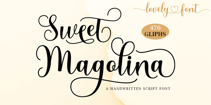 Sweet Magolina Script is a beautiful modern calligraphy typeface. Sweet Magolina is perfect for today’s emerging market design. This font has a stylish, trendy, natural, and soft touch. You can use it for wedding invitations, branding, parties, graduations, birthdays, gatherings, etc.
 - Parler Fraktur by RMU,
$25.00 Friedrich Poppl’s blackletter font, carefully redrawn and redesigned for modern use, named after the Parler master builder family who built the Schwaebisch Gmuend cathedral. This font contains the letter ‚long s‘ which can be reached in two ways. Either you use the OpenType feature ‚historical forms‘, or you type the integral sign + the option key on your keyboard.
 - Mati by Sudtipos,
$19.00 Father's Day, or June 17 of this year, is in the middle of Argentinian winter. And like people do on wintery Sunday mornings, I was bundled up in bed with too many covers, pillows and comforters. Feeling good and not thinking about anything in particular, Father's Day was nowhere in the vicinity of my mind. My eleven year old son, Matías, came into the room with a handmade present for me. Up to this point, my Father's Day gift history was nothing unusual. Books, socks, hand-painted wooden spoons, the kind of thing any father would expect from his pre-teen son. So you can understand when I say I was bracing myself to fake excitement at my son's present. But this Father's Day was special. I didn't have to fake excitement. I was in fact excited beyond my own belief. Matí's handmade present was a complete alphabet drawn on an A4 paper. Grungy, childish, and sweeter than a ton of honey. He'd spent days making it, three-dimensioning the letters, wiggle-shadowing them. Incredible. A common annoyance for graphic designers is explaining to people, even those close to them, what they do for a living. You have to somehow make it understandable that you are a visual communicator, not an artist. Part of the problem is the fact that "graphic designer" and "visual communicator" are just not in the dictionary of standard professions out there. If you're a plumber, you can wrap all the duties of your job with 3.5 words: I'm a plumber. If you're a graphic designer, no wrapper, 3.5 or 300 words, will ever cover it. I've spent many hours throughout the years explaining to my own family and friends what I do for a living, but most of them still come back and ask what it is exactly that I do for dough. When you're a type designer, that problem magnifies itself considerably. When someone asks you what you do for a living, you start looking for the nearest exit, but none of the ones you can find is any good. All the one-line descriptions are vague, and every single one of them queues a long, one-sided conversation that usually ends with someone getting too drunk listening, or too tired of talking. Now imagine being a type designer, with a curious eleven year old son. The kid is curious as to why daddy keeps writing huge letters on the computer screen. Let's go play some ball, dad. As soon as I finish working, son. He looks over my shoulder and sees a big twirly H on the screen. To him it looks like a game, like I'm not working. And I have to explain it to him again. This Father's Day, my son gave me the one present that tells me he finally understands what I do for a living. Perhaps he is even comfortable with it, or curious enough about that he wants to try it out himself. Either way, it was the happiest Father's Day I've ever had, and I'm prouder of my son than of everything else I've done in my life. This is Matí's font. I hope you find it useful.
 - LD Remington Portable by Illustration Ink,
$3.00This font represents the type style created by this very famous classic typewriter. Remington was considered the father of all typewriter companies. - Spring Heart by Yoga Letter,
$14.00 This font is called "Spring Heart" which combines spring and a cozy heart. This font is a very beautiful, unique, and very easy to use calligraphy font. The embellishments on the letters are very easy to use, and besides that, there are instructions on how to use them as well. This font is perfect for spring, wedding, mother day, father day, patrick day, easter, earth day, and other projects.
 - LT Perfume - 100% free

- Digital Readout Upright - Unknown license

- Linotype Go Tekk by Linotype,
$29.00Linotype Go Tekk is a part of the Take Type Library, selected from the contestants of Linotype’s International Digital Type Design Contest. The font was designed by the German artist Critzler and is available in three weights, thin, medium and black. Go Tekk is a cool, constructed with unusual cross strokes, appearing in almost every character at exactly the same height. The capital letters do not end on the baseline, rather drop even farther down than the descenders of the lower case letters, making it necessary to allow for generous line spacing. Linotype Go Tekk is a relatively static font designed exclusively for headlines and displays. - Professor by Three Islands Press,
$39.00 My father is retired from teaching after a distinguished career as a professor at the University of Texas (and other colleges). He's also retired from writing in longhand, ever since I digitized his script several years ago. Professor is a slightly modified version of my ol' dad's cursive hand -- a good, strong, helpful, friendly, personable hand, much like the man. Use Professor for all your casual handwriting needs: my father doesn't mind. Comes in a single, medium-weight style.
 - Nomad by Coniglio Type,
$20.02 NOMAD —Regular is a stand alone font. Nomad -Regular is a clean, interesting revival font. It is a Display font. Nomad, now exclusively in OpenType .oft by Joseph V Coniglio of Coniglio Type. It is a narrow boldfaced font. Its analog source was comprised of an extremely limited die cut, truly generic, craft, peel-and-stick vinyl set of capital letters of ascenders and numbers. It was purchased at a five & dime stores, hardware department from the 1970's. My father owned an original set of characters: Nomad-Regular is nicely expanded to meet the needs of OpenType. The original adhesive labels adhered to the bows of that small boats so fisherman wouldn't get turned away at the Canadian border for not having their vessels tagged and listed with the appropriate license name and numbers, recorded by customs. It was a required serialization of letters and numbers marked on the side of their vessels. On the other hand, most beer and whisky drinking fishers, card players and bait casters would rather not deal with it, but the boat could not cross over the border without them. (Once part of Market LTD from the 1990's, a collection of limited faces, mostly alpha-numeric and some just plain numeric, used primarily in retail and display situations and titling.) Designer: Joseph V Coniglio Author: Coniglio Type
 - Poing by Authentic,
$34.50 Poing is an exceptionally elegant script, I took my fathers Penn font and pimped it to a higher level. It is perfect for invitations and business cards.
 - Fearsome by Hanoded,
$10.00 I watched the movie Red Dragon a while ago and it inspired me to make this rather spooky font. I was going to call it Dolarhyde (after the antagonist), but settled on the more unsettling Fearsome. Fearsome is a handmade script font with a ‘psychopath’ feel to it. Comes with a gruesome amount of diacritics.
 - Euffrat - Personal use only

- Evanescent - Unknown license


