10,000 search results
(0.051 seconds)
- Geskon by Twinletter,
$15.00 Geskon Halloween Font is a mystery font that will help you create a strong design display for horror and scary-themed projects. This font is perfect for you to use for making invitations, banners, and posters, or as a scary title. You can use this font to depict Halloween in an artistic or spooky way while also showing your creative talents. Of course with this font your various design projects will be perfect and amazing, get a beautiful title and start using our font for your special project.
 - Balerno Serif by My Creative Land,
$29.99 Balerno is a modern (yet vintage) multilingual elegant Didone serif enhanced by ligatures, alternates and swashes. Balerno is a very versatile font family - with it's classic forms and modern features it covers a wide range of design projects starting from greeting cards to magazines, wedding invitations to websites etc. The amount of alternates is tremendous, from simple stylistic alternates to swashes, ligatures and their alternates. Languages supported: English, German, French, Italian, Spanish, Swedish, Portuguese, Irish, Norwegian, Luxembourgish, Basque, Breton, Corsican, Faroese, Galician, Icelandic. Free fonts contain basic latin characters set, numbers, punctuation and symbols.
 - Tang by Suomi,
$19.00 The Tang family came to be, when I started studying fonts made for use in very small point sizes, like Bell Gothic. I studied the use of ink traps and went to town with them. Instead of just using them for their purpose: trapping ink to prevent the type getting blotted; I used them as a design feature. With those features Tang works very well in both headline and text use. I use it as a house type, and I've already seen it in a beer and cider labels.
 - Bhoory by Twinletter,
$15.00 Bhoory Halloween Font is a bold font that will help you create powerful text or logos and designs for your Halloween-themed projects. Use it to create invitations, flyers, and posters, or use the font as a headline or just a decoration. You can use this font to depict Halloween in an artistic or spooky way while showing your creative talents. Of course with this font your various design projects will be perfect and amazing, get a beautiful title and start using our font for your special project.
 - Slandic by Vibrant Types,
$42.00 Headlines are transformed into clear-cut messages with the handwriting type family Slandic. Its robust appeal combines the elegance of script typefaces with the lightness of handwritten notes. What makes the Slandic so playful is the synergy between the quite narrow lowercase letters and the wide uppercase letters. Therefore it might rather be an upright chancery italic of a humanist sans. You can see it very clearly in its sharp upward angles and its long-limbed ascenders. Its visual appeal sets a reliable tone. It is precisely balanced with a solid stroke contrast and confidently angular-shaped curves. Slandic perfectly enhances exciting contrasting typography adding a personal note without giving it a comic spin.
 - FS Truman by Fontsmith,
$80.00 Beyond broadcast Like Truman Burbank, the star of The Truman Show, FS Truman was born for TV. You’ll know it from Sky One’s on-screen trails and announcements, but it’s just as at home in other media. Its starting point was the skeleton of a highly legible, space-saving, corporate font with some of FS Dillon’s geometric discipline built in. Its distinctive tone of voice and “ownability” are in its boxy but friendly shapes, and characters with hybrid features. FS Truman’s weights and widths were honed to work at TV screen resolutions. A face for TV it may have been, but this is a font that works on every level, on screen, in print, in headlines, in listings, in longer text, in tight corners and open spaces. The space-saver Compact, condensed but crystal clear, FS Truman comes into its own where a lot needs to be said in not a lot of space. Its letter spacing allows the type room to breathe, even at small sizes, while its fulsome x-height and diminutive descenders pave the way for tighter leading. A natural for headlines and titles over three or four lines. “Hybrid” features With every font, Fontsmith look for crafty new ways to imbue letterforms with a consistent character. The idea with FS Truman was to introduce “hybrid” features. In open letters such as “c” and “s”, for example, the top terminals have straight, vertical cuts while their lower terminals have a more angular, cursive finish. Boxy, spacious forms with unusual curves and angles create not just highly legible and efficient letters but strongly distinctive ones, too.
 - Abscissa - Unknown license

- Moon Dream by Eotype,
$12.00 Moon Dream is a wide sans serif display font that has beautiful curves. Each end is made slightly rounded giving the impression of a comfortable and friendly. Moon dream provides a collection of glyphs with unique shapes. With alternative styles and ligature features, this font is perfect for complementing various projects.
 - Tenez by Plau,
$30.00 Big News! Tenez has been selected for the Tipos Latinos Biennial 2016 and Typographica’s Favorite Typefaces of 2015! Tenez is a Grand Slam display didone typeface from Plau. We designed it for a branding project, further developing the resulting logotype into a typeface we felt could solve many designers’ needs. Its origins are rooted in pointed nib calligraphy which can be seen in contemporary Didot and Bodoni inspired typefaces. But Tenez’s shapes are organic (these modern typefaces were originally cut by hand after all) – in fact that was the challenge we set from the start: to make a typeface as organic in construction as possible. This echoes some of late 19th century typefaces and advertising, yet we thought of it for contemporary uses. One of the several unique features of Tenez is its unusual Thin weight, in which the contrast between thin strokes and the black area left by the serifs makes for a typewriter-like personality. The italics provide a perfect counterpoint to the roman weights. Tenez was unapologetically conceived as a display typeface meant to be used large as in magazine openings, drop caps or everywhere there’s a need for elegant impact. The family includes support for almost all Latin languages available, figure sets for almost every conceivable occasion (tables, text, you name it), alternates for the quirky beautiful R (sometimes simpler is better, but not always!) and Q (with a nice big tail for that article opener). Tenez pairs really well with our no-frills sans-serif Motiva Sans and our cute vertical connected script Primot.
 - Munc by Stone Type Foundry,
$49.00 Munc is the uncial version of Magma. It has been designed with the same stroke weights and cap heights. Characters from the two families can be mixed. Uncial letterforms are ancient, but familiar. Their history remains somewhat mysterious.
 - Receding Hairline NF by Nick's Fonts,
$10.00 Based on L&C Hairline, this family of faces is weighted to achieve stroke consistency in a variety of sizes. Both versions of this font support the Latin 1262, Central European 1250, Turkish 1254 and Baltic 1257 codepages.
 - Ridinger Pro by RMU,
$30.00 Based upon Riedingerschrift, cut by Franz Riedinger for Benj. Krebs Succ. in Frankfurt am Main in 1906, here come Ridinger Std and its extended version, Ridinger Pro. An elegant cursive font which also includes various adorning swash strokes.
 - Ridinger by RMU,
$30.00Based upon Riedingerschrift, cut by Franz Riedinger for Benj. Krebs Succ. in Frankfurt am Main in 1906, here come Ridinger Std and its extended version, Ridinger Pro. An elegant cursive font which also includes various adorning swash strokes. - One-Eighty - Unknown license

- Billowed by Ingrimayne Type,
$9.00 Billowed is a typeface family inspired by a simple shape that tessellates in three different ways: in a single orientation, in two orientations, and in four orientations. The shape resembles a billowing sail, with two concave edges that are adjacent and two convex edges, also adjacent. Forcing letters into this template shape results in some oddly shaped letters, but the result should not be judged by individual letters but by how the words and strings of words appear. Billowed was designed as an alternating-letter font in which two sets of characters alternate. The alternating is done automatically in applications that support the OpenType feature contextual alternatives (calt). To get the ripple pattern not just horizontally but also vertically, lines should alternate between the right and left styles and leading set to the same value as the font size. Billowed is monospaced with tight letter spacing to accentuate the ripple pattern. The family includes outline styles that can be used in a layer above the solid style to add color. Undulate was not designed for any particular use but as a challenge to fit letters into a particular geometric shape. The unusual patterns that result are eye-catching and may be useful for advertising or signage and in other places where one wants attention-grabbing lettering.
 - FF Sanuk Round by FontFont,
$50.99 “The rounded shapes are like Chantilly cream or Italian meringue over a lemon pie,” says designer Xavier Dupré of his FF Sanuk Round typeface. Designed to work alongside the existing members of the FF Sanuk family, this sprightly sans serif offers a more mischievous personality than its counterparts. Angular shapes have been gently softened, to create a playful design that really comes into its own at larger sizes. Set this one on posters and packaging, or anywhere you need to be punchy yet approachable. The FF Sanuk Round family is based on the original FF Sanuk family and offers 5 weights plus from Ultra Light to Black plus italics. It offers OpenType features including stylistic alternates and ligatures.
 - Swift by Linotype,
$30.99 Gerard Unger developed this newspaper font between 1984 and 1987 for Dr.-Ing. Rudolf Hell GmbH, Kiel. He was mainly influenced by William A. Dwiggins (1880-1956), the typographic consultant of Mergenthaler Linotype, who started to develop more legible, alternative fonts for newspaper printing as early as 1930. Swift was named after the fast flying bird. Austere and concise, firm and original, Swift is suited for almost any purpose. Swift has been specially developed to sustain a maximum of quality and readability when used in unfavorable print and display processes, e.g. newspapers, laser printing and low resolution screens. Its robust, yet elegant serifs and its large x-height provide an undeniable distinction to the typeface, making it suitable for corporate ID and advertising purposes as well. Swift 2.0 family was designed in 1995. It's an improved version with technical and aesthetic enhancements and new family members. The Cyrillic version was developed for ParaType in 2003 by Tagir Safayev. Please note that this family includes only basic latin characters; it does not include accented characters required for western and central Europe.
 - Swift 2.0 Cyrillic by ParaType,
$100.00 Gerard Unger developed this newspaper font between 1984 and 1987 for Dr.-Ing. Rudolf Hell GmbH, Kiel. He was mainly influenced by William A. Dwiggins (1880-1956), the typographic consultant of Mergenthaler Linotype, who started to develop more legible, alternative fonts for newspaper printing as early as 1930. Swift was named after the fast flying bird. Austere and concise, firm and original, Swift is suited for almost any purpose. Swift has been specially developed to sustain a maximum of quality and readability when used in unfavorable print and display processes, e.g. newspapers, laser printing and low resolution screens. Its robust, yet elegant serifs and its large x-height provide an undeniable distinction to the typeface, making it suitable for corporate ID and advertising purposes as well. Swift 2.0 family was designed in 1995. It's an improved version with technical and aesthetic enhancements and new family members. The Cyrillic version was developed for ParaType in 2003 by Tagir Safayev. Please note that this family includes only basic latin characters; it does not include accented characters required for western and central Europe.
 - Colville by Canada Type,
$29.95 The Colville fonts began their existence in 2015 as a project-specific typeface, made to be used on a custom-made headstone commemorating Canadian artist Alex Colville (1920-2013) and his wife Rhoda Wright. For that purpose, some initial shapes were modelled after letters Colville himself had used on a Governor General gold medal he designed in the mid-1970s. From there started a year-long project that culminated in a set of four comprehensive fonts ranging in weight from Light to Bold, each containing over 750 glyphs to cover Pan European language support, stylistic alternates, five sets of figures, automatic fractions, and some ornaments rooted in Alex Colville’s art. These fonts exhibit a strong art deco aesthetic that has always been a favourite of architects, metal casters, and sign makers. This is a very humanist geometry alternating from the precisely calculated to the curvy and lithe, subtle contrast, flat stroke stops, and airy proportions that make for a counterspace built for accommodation and comfort. The breadth and timeless humanism of the Colville set makes fit in a variety of applications, from straightforward headlines, titles, and emphasis captions, to branding and packaging.
 - Silent Drama JNL by Jeff Levine,
$29.00 An ad in the April 19, 1919 edition of Motion Picture News for the (now lost) silent drama "Josselyn's Wife" featured some wonderfully stylized Art Nouveau hand lettering. Primarily a condensed character set with rounded serifs, there are a number of letters that take liberties in both width and character shape. Adding to this, [mostly vertical] parallel lines are cut through the characters to create a "striped' type of "double engraved' effect. Silent Drama JNL is available in both regular and oblique versions. **Uppercase
 - Gluten by Andinistas,
$24.67 Gluten is an experimental font family designed by Carlos Fabian Camargo. It includes irregular shadows to communicate craftsmanship. Its multiple upper cases with condensed width and naive lines are notable for their expressive drawing with a high amount of contrast between thick and thin strokes.
 - Intruder Alert - Unknown license

- Niko by Ludwig Type,
$50.00 Niko is a contemporary, humanist sans with a friendly yet clear and distinct personality. It is designed for excellent legibility, particularly for long continuous reading. The wedge-shaped stem heads add liveliness and variety to the carefully crafted letterforms. Niko, a highly versatile type family consisting of 54 styles that are designed to work equally well on paper and on screen. The family includes condensed, as well as extra-condensed variations, for situations where space-saving typography is required.
 - Bulgari by Slex Studio,
$15.00 Bulgari is an organic handwritten font suitable for branding, wedding invitations, promotions, product packaging and other necessities. This font is modern, simple, but still authentic. You'll get a full set of lowercase and uppercase letters, numbers and punctuation, multilingual symbols, lowercase start and end swashes, and ligatures.
 - Mosafin by Yukita Creative,
$12.00 The Mosafin font is a sans-serif typeface that has a modern and elegant design. This font has a very consistent and proportional letterform, and has clean and firm lines, making it easy to read and very suitable for various graphic design purposes. Made with the latest technology and excellent design, the Mosafin font has distinctive characteristics, such as very geometric letter shapes, with sharp angles and clear, thin lines. This font can be used in various media, such as poster designs, logos, business cards, banners, and various other design purposes. This font also has a proportional font size ratio, so it's easy to read at any size
 - Nikaia by Miller Type Foundry,
$- Nikaia started as an experimental typeface (the script weights) and was then expanded to its logical conclusions (italic & regular), producing the fastest look typeface in the world. Nikaia looks clean and sharp at any size, with 5 weights for contrast.
 - ITC Berkeley Old Style by ITC,
$29.99 ITC Berkeley Old Style is based on a typeface designed by Frederic W. Goudy in 1938 called University of California Old Style. It was a private press type for the publishing house of that school. In 1958, about ten years after Goudy's death, Monotype re-issued the type under the name Californian, and it became a very successful face for book typography. Goudy himself said he designed this face to have the greatest legibility possible, and it is indeed free from the exuberances in some of his other faces. Tony Stan redrew the family for ITC for 1983, and it was named ITC Berkeley Old Style, Berkeley being the city where the University of California Press is located. Stan did a careful drawing of eight styles including italics. ITC Berkeley Old Style is a crisply beautiful tribute to a distinguished typeface, and it works well for books, magazines, and advertising display. Featured in: Best Fonts for Tattoos
 - Sticker by DonyaDesign,
$14.00 Special creative products for you, our products will give you an extraordinary experience that will not be forgotten. A popular and professional script font. Modern and elegant, this typeface is made of beautiful creative strokes. This font is perfect for your creative ideas, both formal and informal. It has a modern style with a touch of creative ideas that is very suitable to be applied anywhere that requires creative ideas such as invitation cards, letterheads, website logos, social media, banners, advertisements, brochures, packaging products, leather products, and any product that requires writing. By using this font, all of your products will look luxurious, elegant, and attractive, please try and see the results. This font includes a complete set of beautiful upper and lowercase letters, numbers, a wide variety of punctuation marks, and ligatures. All lowercase letters include a start and end, providing a realistic style. everything you get.
 - Diamante Robusto by César Modesto,
$- Diamante Robusto Font is my new font, where all the letters came out of this strange shape created without intention of being the inspiration for this new font.
 - Another Monday by Hanoded,
$15.00 I started this font on a Monday and I finished it the Monday after, so I guess the name is right! Another Monday started off as a bit of doodling (with a Sharpie pen) on a piece of paper. Before I knew it, I had a complete glyph set and it looked nice. Another Monday is a bit messy, uneven and maybe even a little weird, but it will look good on postcards, packaging and labels.
 - Quan Pro by Typesketchbook,
$60.00 Quan Pro is new redesigned version of Quan(2013) – one of the most popular font families of Typesketchbook foundry. This new family has refreshed structure, corners, and a new shape of glyphs. It is developed in 8 separate weights ranging from Thin to Black, each coming with Rounded and Slim version, which is well suited for a variety of typographic applications such as headlines and small texts. Quan Pro font family supports multiple languages and is available as both webfont and desktop font.
 - Nextir by Ditatype,
$25.00 Nextir is an extraordinary brush sans serif font that commands attention and redefines modern typography. Designed with large letters and a thick weight, its distinctive square letter shapes are the epitome of strength and contemporary style. What sets Nextir apart from the ordinary is its brush detailing. This unique blend of brush strokes and sans serif elements adds a layer of organic texture to the font. The combination of large letters, thick weight, square shapes, and brush detailing creates a font that makes a striking statement with a contemporary edge. When you need a typeface that combines strength with artistic expression, Nextir is the perfect choice to infuse your designs with boldness, modernity, and a touch of handcrafted elegance. You can also enjoy the features here. Features: Multilingual Supports PUA Encoded Numerals and Punctuations Nextir fits in headlines, logos, posters, flyers, branding materials, print media, editorial layouts, and many more designs. Find out more ways to use this font by taking a look at the font preview. Thanks for purchasing our fonts. Hopefully, you have a great time using our font. Feel free to contact us anytime for further information or when you have trouble with the font. Thanks a lot and happy designing.
 - Century Old Style by URW Type Foundry,
$35.99 The Century Old Style font family was modeled on Century Expanded which had been cut in 1900. Similar weights and proportions were maintained but the letter shapes were made more elegant by the introduction of a number of old style characteristics. The Century Old Style font family is a useful text design that offers good legibility and economy.
 - Monotype Century Old Style by Monotype,
$29.99The Century Old Style family was modeled on Century Expanded, which had been cut in 1900. Similar weights and proportions were maintained, but the letter shapes were made more elegant by the introduction of a number of old style characteristics. The Century Old Style family is a useful text design that offers good legibility and economy. - Breda Two by Eurotypo,
$24.00 Breda Two is the condensed version of the Breda family, but it is presented as an independent family of fonts because they can work as a single face in your design. As a Breda font, this style is austere, functional and clear, emerged from straight lines and primary shapes. Breda Two is released in four weights with two italics.
 - Merryas Signature by Letterhend,
$17.00 Merryas Signature is a beautiful signature script based on manual hand writing. The stylistic alternate, ligatures and the tick and thin stroke make this font looks a real hand writing instead of typing a font. This type of font perfectly made to be applied especially in logo, and the other various formal forms such as invitations, labels, logos, magazines, books, greeting / wedding cards, packaging, fashion, make up, stationery, novels, labels or any type of advertising purpose. Features : Uppercase & lowercase Numbers and punctuation Alternates & Ligatures Multilingual PUA encoded
 - Meso America by Intellecta Design,
$9.00Meso America is a native dingbat face inspired in meso-american culture containing funny characters and flowers created starting a geometric forms. - Aron by Artisticandunique,
$12.00 Aron - Sans Serif Font Family - Multilingual supports - 6 Style Aron Sans serif font family, with is geometric structure and 6 styles, helps you create many alternatives in your creative projects. It is also assertive about being a highly readable font with different weights in creating striking and powerful titles. Ideal for books and magazines, editorials, headlines, websites, logos, branding, advertising and more. If you have a question, please contact me. Have a good time.
 - Combine by Andinistas,
$49.00 Combine, designed by Carlos Fabian Camargo G, is powerful and attractive, multi-layered chromatic type family that consists of 12 fonts, typographically grouped in two logics: “Script and Caps”, so that they could be colored separately or in group. Both designed with contrasting optical techniques and combinable at the same time. The unforgettable central idea of Combine was inspired by unique types of speedball letters designed by ancient artists in Canadian posters of shows and fairs in 1930. This is why its Typographical tools work independently or in group, resulting in highly polished designs that need fonts with coupled effusiveness. Their combined resources offer guaranteed distinguishing letters with shadow effects and worn, in order to help enhance their expressiveness. Combine is excellent in any project on paper or screen as it has more than 2100 glyphs and features of OpenType distributed strategically in fonts easy to use. SEE BELOW THE MAIN ADVANTAGES: • Combine Script & Shadow: It offers incredible case sensitive fluency and eloquence drawn with vertical cursive letters with ornamental non-stop excitement and complementation. It also has a variety of significant upward and downward, alternative strokes combined with its vintage ties that also give authenticity to their designs. • Combine Caps 1,2,3 & Shadow1,2: Guarantees you a colorful horizontal area of narrow case with 2 types of shadows, sound and other shade with diagonal stripes. Its geometric uniformity gives a friendly, open and subtle character by Typographic and special resources and visual properties coloring layers separately or in groups. In addition, its 2 layers of skeletal illuminations, adding internal lines and simultaneously contributing to play perfect confrontation and contrast with their geometric ideas and aesthetics for special attention. • Combine Words & Shadow: It can be used to design a perfect tone in each one of the 50 slogans written diagonally, making a brilliant feeling suggestive seductive style. Compatibility and flexibility works by monoline thin cursive strokes ideal for featured items with and without shade. Combine was selected at the Bienal Tipos Latinos 2016
 - Signature Present by Fikryal,
$23.00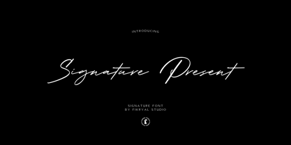 Signature Present – Signature Font is a meticulously crafted typeface that exudes elegance and sophistication. This font is designed to add a touch of personal flair and exclusivity to your projects, making it an ideal choice for various creative endeavors. With its exquisite strokes and graceful curves, Signature Present embodies the art of calligraphy, making it perfect for adding a luxurious and handwritten feel to your designs.


