10,000 search results
(0.052 seconds)
- Stack Braille by Echopraxium,
$5.00 This is a monospace font for the Braille alphabet. The idea came while exploring new ways to display the regular braille glyph ( 3 rows of 2 dots ). The glyph design is inspired by "stackable multiple board" games like the famous Vulcan chess (from Star Trek series) and the Qubic (3D tic-tac-toe). The stack is made from 3 levels, each level is a 3x3 grid with 2 "playable" cells (South-West and North-East). Each cell can be either empty, filled by a white square token or a black square token. The 3D effect is obtained by means of the classic isometric perspective. Lowercase letters use black tokens, while uppercase letters use white tokens. Most special characters (e.g. digits, *$#@, []{}() etc.. ) are also provided for special usages like program source code (see poster 5).
 - Litza by Marianna Orsho,
$35.00 Litza is a layered, condensed, all-caps cross stitch display type family. It is made up of 10 layers that show different stages of stitching and can be stacked, moved around, and coloured separately in order to create interesting effects. The ten layers come in 3 weights; Light, Medium, and Bold. The 3 weights can also be mixed with one another to create a vast range of combinations when stacking the layers. Litza has multilingual support and includes glyphs for a wide range of Latin and Cyrillic languages. The family also contains a set of ornamental borders and over 80 decorative symbols in the shape of various animals and objects. Combining the various Litza layers allows you to create eye-popping, intricate, experimental typographic compositions that are rich in detail - with ease. The condensed, geometrics sans-serif letterforms and playful nature of the Litza layering system give a contemporary feel - while at the same time retaining a nostalgic and tactile quality due to its reference to traditional needlework techniques and patterns. Ideal for use at larger point sizes where the unique, stylish effects can be best expressed - Litza will add a touch of intrigue and work best in headings and emphasised text for poster design, editorial design, packaging design, and motion design.
 - Haboro by insigne,
$- Haboro is a powerful workhorse. It’s a neoclassical font developed for numerous uses, ranging from editorial and corporate to web pages and apps. This new face from insigne Design takes a modern twist on the high-contrast typeface genre known as the Didone. Recognized for their ability to convey clarity, the geometric simplification of the Didone genre adds a level-headed rationality to whichever work it’s applied. Didones are used to lend style and sophistication to a wide number of applications—everything from style or cosmetic labels to annual reports. With its unique take on this classic genre, Haboro—with its slight wedge-shaped serifs and unique terminals—is still defined by elegance, tradition and timelessness. Even more to its versatility, this multi-purpose text face features whimsical terminals, which liven up even the most serious texts. If you desire, you can also opt for the more usual ball terminals by activating OpenType alternates. The Haboro family consists of seven weights from a Thin to a Black along with matching italics. The contrast from the letters’ thick strokes and thin strokes draws the eye to your design, making Haboro a powerful visual tool for communicating your message. The typeface also contains numerous ligatures and alternates. Choose between serif variants such as ball terminals or standard serifs by utilizing OpenType alternates. We recommend using the default contextual alternates and discretionary ligatures in order to benefit from all members of this fantastic font family. In addition, Haboro has a sizable set of option glyphs and numerous other OpenType variables to give your text the unique touches it needs. Haboro has all of the attributes you need to undertake your next project. Use its modified elegance to shape and mold your next design, whether a web site, app, branding package, or magazine. You’ll find there’s no job Haboro can’t take on.
 - Dewhirst Display by Greater Albion Typefounders,
$16.00 There is a particular charm about traditional, hand executed sign writing. There is also something magical about watching an experienced sign writer at work with his sign writer's dagger (don't worry, it's a specially shaped paintbrush), watching the elegant lettering formed by deft brushstrokes. The Dewhirst family of five decorative faces is inspired by an elegant specimen of just such hand painted sign writing seen while I was out and about one day. Use this family of five faces to add a special touch of flair.
 - Quercus 10 by Storm Type Foundry,
$69.00 Quercus is characterised by open, yet a little bit condensed drawing with sufficient spacing so that the neighbouring letters never touch. It has eight interpolated weights with respective italics. Their fine gradation allows to find an exact valeur for any kind of design, especially on the web. Quercus serif styles took inspiration from classicistic typefaces with vertical shadows, ball terminals and thin serifs. The italics have the same width proportion as upright styles. This “modern” attitude is applied to both families and calls for use on the same page, e g in dictionaries and cultural programmes. Serif styles marked by “10” are dedicated to textual point sizes and long reading. The sans-serif principle is rather minimalistic, with subtle shadows and thinned joints between curved shapes and stems. Quercus family comprises of the usual functionality such as Small Caps, Cyrillics, diacritics, ligatures, scientific and aesthetic variants, swashes, and other bells & whistles. It excels in informational and magazine design, corporate identity and branding, but it’s very well suited for book covers, catalogues and posters as well. When choosing a name for this typeface I've been staring out from my studio window, thinking helplessly without any idea in sight. Suddenly I realised that all I can see is a spectacular alley of oaks (Quercus in Latin) surrounding my house. These oaks were planted by the builders of local ponds under the leadership of Jakub Krčín in the fifteenth century.
 - Quercus Whiteline by Storm Type Foundry,
$69.00 Quercus is characterised by open, yet a little bit condensed drawing with sufficient spacing so that the neighbouring letters never touch. It has eight interpolated weights with respective italics. Their fine gradation allows to find an exact valeur for any kind of design, especially on the web. Quercus serif styles took inspiration from classicistic typefaces with vertical shadows, ball terminals and thin serifs. The italics have the same width proportion as upright styles. This “modern” attitude is applied to both families and calls for use on the same page, e g in dictionaries and cultural programmes. Serif styles marked by “10” are dedicated to textual point sizes and long reading. The sans-serif principle is rather minimalistic, with subtle shadows and thinned joints between curved shapes and stems. Quercus family comprises of the usual functionality such as Small Caps, Cyrillics, diacritics, ligatures, scientific and aesthetic variants, swashes, and other bells & whistles. It excels in informational and magazine design, corporate identity and branding, but it’s very well suited for book covers, catalogues and posters as well. When choosing a name for this typeface I've been staring out from my studio window, thinking helplessly without any idea in sight. Suddenly I realised that all I can see is a spectacular alley of oaks (Quercus in Latin) surrounding my house. These oaks were planted by the builders of local ponds under the leadership of Jakub Krčín in the fifteenth century.
 - Quercus Serif by Storm Type Foundry,
$69.00 Quercus is characterised by open, yet a little bit condensed drawing with sufficient spacing so that the neighbouring letters never touch. It has eight interpolated weights with respective italics. Their fine gradation allows to find an exact valeur for any kind of design, especially on the web. Quercus serif styles took inspiration from classicistic typefaces with vertical shadows, ball terminals and thin serifs. The italics have the same width proportion as upright styles. This “modern” attitude is applied to both families and calls for use on the same page, e g in dictionaries and cultural programmes. Serif styles marked by “10” are dedicated to textual point sizes and long reading. The sans-serif principle is rather minimalistic, with subtle shadows and thinned joints between curved shapes and stems. Quercus family comprises of the usual functionality such as Small Caps, Cyrillics, diacritics, ligatures, scientific and aesthetic variants, swashes, and other bells & whistles. It excels in informational and magazine design, corporate identity and branding, but it’s very well suited for book covers, catalogues and posters as well. When choosing a name for this typeface I've been staring out from my studio window, thinking helplessly without any idea in sight. Suddenly I realised that all I can see is a spectacular alley of oaks (Quercus in Latin) surrounding my house. These oaks were planted by the builders of local ponds under the leadership of Jakub Krčín in the fifteenth century.
 - Quercus Sans by Storm Type Foundry,
$69.00 “Quercus” is characterised by open, yet a little bit condensed drawing with sufficient spacing so that the neighbouring letters never touch. It has eight interpolated weights with respective italics. Their fine gradation allows to find an exact valeur for any kind of design, especially on the web. Quercus serif styles took inspiration from classicistic typefaces with vertical shadows, ball terminals and thin serifs. The italics have the same width proportion as upright styles. This “modern” attitude is applied to both families and calls for use on the same page, e g in dictionaries and cultural programmes. Serif styles marked by “10” are dedicated to textual point sizes and long reading. The sans-serif principle is rather minimalistic, with subtle shadows and thinned joints between curved shapes and stems. Quercus family comprises of the usual functionality such as Small Caps, Cyrillics, diacritics, ligatures, scientific and aesthetic variants, swashes, and other bells & whistles. It excels in informational and magazine design, corporate identity and branding, but it’s very well suited for book covers, catalogues and posters as well. When choosing a name for this typeface I've been staring out from my studio window, thinking helplessly without any idea in sight. Suddenly I realised that all I can see is a spectacular alley of oaks (Quercus in Latin) surrounding my house. These oaks were planted by the builders of local ponds under the leadership of Jakub Krčín in the fifteenth century.
 - Aremic by Graptail,
$15.00 Aremic is a bold display font created to be used for bold headings coming in 2 shapes Regular and Rounded including Oblique. This font is inspired by the shape of the letters on sports posters. This type of font perfectly made to be applied especially in logo, headline, signage and the other various formal forms such as invitations, labels, logos, magazines, books, greeting / wedding cards, packaging, fashion, make up, stationery, novels, labels or any type of advertising purpose.
 - Kasia by ROHH,
$40.00 Kasia™ is a unique contemporary sans serif family, full of character and originality. It's soft and rounded shapes give it warm, friendly, playful and dynamic feel. Special ink traps serve as ornamental details in bigger sizes, making Kasia™ a wonderful display font family. In small sizes, Kasia™ is very clean and legible. Its proportions and optimized kerning make it a versatile, friendly and organic text family, that features broad variety of OpenType features. Thanks to its various advantages Kasia™ is a great choice for all kinds of design work, both print and on-screen. It is a great choice for branding, logo design and advertising, as well as all sorts of paragraph text. Kasia™ consists of 20 fonts - 10 weights and their corresponding italics. It has extended language support including cyrillic and true italics, as well as OpenType features, such as small caps, case sensitive forms, ligatures, stylistic alternates, contextual alternates, lining, oldstyle, tabular, small cap and circled figures, slashed zero, fractions, superscript and subscript, ordinals, currencies and symbols.
 - Sella Mella by Crowntype Studio,
$12.00 Sella Mella is a script type family of four fonts. It is inspired by Lovely Fonts and has a soft and welcoming look. Sella Mella can be used for branding, packaging and wherever you need a script font that is easy to read and smooth. Sella Mella has many ties, strokes, and alternative characters that will make your designs unique and beautiful. You can also purchase Sella Mella as a Font Family and adjust the weight of Sella Mella seamlessly between Italic and Bold weights. Note that you need design software that supports the Font Family. Thank You...
 - Jealousy Heart by Bosstypestudio,
$12.00 Jealousy Heart is a script type family of four fonts. It is inspired by Lovely Fonts and has a soft and welcoming look. Jealousy Heart can be used for branding, packaging and wherever you need a script font that is easy to read and smooth. Jealousy Heart has many ties, strokes, and alternative characters that will make your designs unique and beautiful. You can also purchase Jealousy Heart as a Font Family and adjust the weight of Jealousy Heart seamlessly between Italic and Bold weights. Note that you need design software that supports the Font Family. Thank You...
 - Klein by Zetafonts,
$39.00 Klein PDF Specimen Klein is Zetafonts love letter to the grandmother of all geometric sans typefaces, Futura. Starting from a dialogue with Paul Renner’s iconic letterforms and proportions, Francesco Canovaro and Andrea Tartarelli decided to depart from its distinctive modernist shapes with slight humanist touches and grotesque solutions - with some design choices evoking the softness of humanist sans serifs like Gill Sans. The end result is a workhorse superfamily of 54 fonts with full multilingual capabilities and coverage of over two hundred languages using latin, cyrillic and greek alphabets. The original display-oriented family, developed in nine weights with matching italics (from the hairline thin to the sturdy black), has been paired with a text version (with slightly higher x-height, better readability and maximum legibility at small point size) and with a condensed version, to be used for space-saving display solutions in editorial and advertising formats. With a name that is both a nod to its humble functionality and an homage to french nouveau realiste artist Yves Klein, this typeface aims to become your next trusted companion in all your adventures in print, digital and motion design.
 - Realitta Sinta by Zamjump,
$10.00 "Realitta Sinta" is a handwritten font that was created using the Infinite Painter application for sketches. This font is inspired by simplicity which is then attached to each stroke. Realitta sinta is a simple font that includes various features such as ligatures and alternates. Realitta Sinta suitable for various needs such as writing invitations, signatures, promo needs, business card design, Photography logos, casual wear, profession or work and others. Ligature and lowercase alternate swash are differentiators for various purposes or adjust the desired style,
 - Zan Zan by Pitt's Hand,
$20.00 A fun font to create pop and young graphics, with a non-obvious font created starting from a handcrafted line. For an urban, snappy and fresh result.
 - Burin by Monotype,
$29.99The Burin family of typefaces consists of Roman and Sans variations. Burin Roman has very distinct lowercase characters b, c, d, g and y with a quirky use of tapered strokes and hairlines. Burin Sans is a light display face with an extended tail on the lowercase y. - Prose Sans by Ayca Atalay,
$29.00 Prose Sans is a wide sans serif font family that comes in 8 weights. With its slightly tilted axis and relatively high contrast strokes, it is both elegant and strong. The standard and discretionary ligatures help achieve a more tailored look, excellent for branding, logo design, poster design etc.
 - Burin Sans by Monotype,
$29.99The Burin family of typefaces consists of Roman and Sans variations. Burin Roman has very distinct lowercase characters b, c, d, g and y with a quirky use of tapered strokes and hairlines. Burin Sans is a light display face with an extended tail on the lowercase y. - Black Bruno by Subectype,
$18.00 Black Bruno is a supercharged, street-wise brush font bursting with energy. It includes extra attention to quick strokes and sharp details. This font is perfect for challenging jobs, titles, t-shirts, websites, hoodies, clothing, headline, logotype, branding, advertising, event and various print and digital media with energy.
 - Halvan by driemeyerdesign,
$35.00 HALVAN –a striking type with half-serifs The Halvan font family comes in 5 styles from Roman to Bold, Italic and a Small Caps Version. Each version includes old style figures and lining figures. It is a versatile type and can be used in a wide range of circumstances.
 - Bome by Nirmana Visual,
$22.00 Introducing Bume Display psychedelic font, designed to transport you to another dimension with its bold. With its fluid and organic shapes, our psychedelic font is perfect for creating striking headlines, logos, and branding materials that demand attention. The intricate curves and loops in this font create an ethereal and dreamlike quality that perfectly captures the essence of the psychedelic aesthetic.
 - Ulga Grid by ULGA Type,
$19.00 Update November 2022: ULGA Grid now features an oblique variant. It’s also been expanded into a family of different but related designs with the addition of ULGA Grid Solid and ULGA Grid Rounded typeface families. All variants and new designs are monospaced, sharing the same width as the original ULGA Grid font and matching character sets. The character set has also been enlarged and now supports Western Europe, Vietnamese, Central/Eastern Europe, Baltic, Turkish and Romanian. ULGA Grid is a modular, monospaced typeface reminiscent of the old Letraset LCD & Quartz typefaces from the 1970/80s with lots of alternative characters and ornaments to bring a fresh twist to the genre. The idea’s seed germinated while I was going through a phase of binge watching my favourite 1980/90s sci-fi movies (classics such as Terminator, Total Recall and RoboCop). However, perception and reality don’t always align. Thirty years later, when compared to today’s technology, some visual elements look kind of outdated, almost Retro Futuristic. The initial design process started out in Adobe Illustrator when I constructed letters from a few geometric shapes within a square block. Just playing around with different shapes was so engrossing that it wasn’t long before there were enough characters for a basic typeface. The project grew again as I experimented with designs within the shapes and set paragraphs of text in patterns, resulting in over a hundred alternative characters and ornaments, some of which double up as border designs. This typeface may be square but it’s anything but boring. What it lacks in legibility ULGA Grid makes up for in style and the end result is a surprisingly versatile typeface that you'll have fun using for a wide range of display purposes including CD covers, posters, packaging, advertising, brochures and film titles. Ironically, the fixed grid structure frees the characters to create patterns of text not possible with variable widths.
 - Well Done by Letterara,
$16.00 Well Done is a flower calligraphy font with an incredibly luxurious feel. It will add a romantic touch to any crafting project! Get inspired by its unique look! To stay up to date for my latest job, follow me and let’s be friends because there will be many promos.
 - Goosebumps by Comicraft,
$19.00 Here's a font that'll send shivers down your spine, stand your hair up on end and turn your skin into gooseflesh. Hand lettered by rotten old Richard Starkings after we locked him up in the attic one dark, stormy night, these stressed out characters are a real scream!
 - Lasta by Tour De Force,
$25.00 Lasta is small serif font family with simple elegant shapes, refreshing Italics and poetic endings. Containing 2 weights and 2 italics, with lower x-height which brings more air (empty space, white space...) into paragraphs making text more graceful and legible. Thin serifs bring small touch of dynamic into letter forms, just enough to bring specific tone to paragraph. Beside being mainly imagined as fully text family, Lasta is suitable titles or decorative typography as well for, especially the Italics with fancy curvy endings.
 - Yagi by Ably Creative,
$25.00 Yagi is a serif typeface that contrasts with old-fashioned proportions creating a more defined texture than your usual sans-serif, and Yagi is elegant enough for fashion, art, and luxury; yet sincere enough for serious business. And at 2 styles, ready for complex typographic demands. When we started this project, we wanted to try drawing modern serifs with accurately verified shapes and detailed elaboration of each character, making your text look great both on paper and on screen. Yagi creates unique and organic characters, with different sets of styles, you can change the feel of your designs from more organic to more standard. Let your designs fly!
 - Qualion Text by ROHH,
$39.00 Qualion Text™ is a modern geometric sans serif typeface with humanist and calligraphic inspirations. It is a text family designed for excellent legibility. Qualion Text™ is a sibling of Qualion™ & Qualion Round™, geometric family with lots of swashes and ornaments. Letter shapes and proportions has been adjusted to fit paragraph text and small sizes: - typeface is narrower now in order to fit more text in the design space - larger stroke contrast - pronounced ink traps and tapering - elegant true italics made even more calligraphic - adjusted spacing and kerning - adjusted font weights The main purpose of the family is clean and legible paragraph text, however it is very attractive choice for branding, headlines and display use, too. The italic styles as well as thin, bold and black upright styles have very strong character and look great in display sizes. Italics are very fluent, calligraphic, subtle and elegant, from the other side bold and black uprigths are very modern, powerful and unique thanks to the pronounced ink traps. Qualion Text™ family consists of 20 styles - 10 weights with corresponding true italics. Both have extended language support, as well as broad number of OpenType features, such as small caps, case sensitive forms, standard and discretionary ligatures, swashes, stylistic sets, contextual alternates, lining, oldstyle, tabular and small cap figures, slashed zero, fractions, superscript and subscript, ordinals, currencies and symbols.
 - Rodista Brush by Stripes Studio,
$20.00 Rodista Brush is a super casual hand brushed script with detailed brush stroke texture, and a quirky, Can be used for various purposes. such as the title, signature, letterhead, signage, labels, newsletters, posters, logos, correspondence, wedding invitations, badges, etc. Rodista Brush Font international Support for a review of most Western languages included.
 - Choose Time by Stripes Studio,
$20.00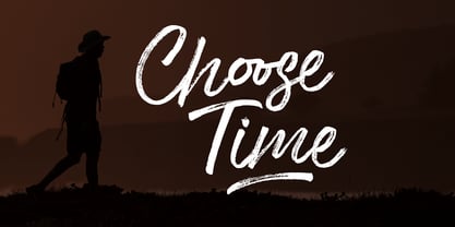 Choose Time is a super casual hand brushed script with detailed brush stroke texture, and a quirky, Can be used for various purposes. such as the title, signature, letterhead, signage, labels, newsletters, posters, logos, correspondence, wedding invitations, badges, etc. Choose Time Font international Support for a review of most Western languages included.
 - Sapiens by Hemphill Type,
$25.99 Sapiens is a prehistoric font family characterised by simplicity & crudeness, as if carved out and assembled by our sapiens ancestors. The family is built with a rough edged style that evolves through various styles and becomes more legible while retaining the raw roots of its origins.
 - Losta Bonita by Creativemedialab,
$20.00 Introducing Losta Bonita A modern, vintage, and retro serif family. Consists of 9 weights from thin to black and variable format. The stylistic alternates allow many different unique shapes that give your lettering idea a well-looking look.
 - Avaline Script by Kimmy Design,
$20.00 Avaline is a super smart script font that was 100% handmade. Inspired by hand lettering doodles, the font family combines a mischievous spirit and cheerful style. Its playful letterforms come in Light, Regular, Bold and Sketch, and it comes with tons of language support and fun alternatives. Packed with OpenType features, Avaline comes together to make a truly authentic hand script family package. Its imperfect hand-drawn style is utilized by contextual alternatives – giving each character 3 subtle variations as well as special styles that appear automatically based on where they appear in a line of text. Stylistic alternatives offer completely different styles for all capital and some lowercase letters. Swashes provide numerous flourish options for ascending & descending letters as well as characters that start or end text lines. Small caps and titling alternatives provide great secondary text options, converting the script letterforms to more proportional small cap ones. Avaline also comes with a massive set of extras, including catchwords, swashes & flourishes, arrows, borders, line breaks, laurels and frames. Together they make for a truly organic script font bundle. Avaline seriously comes with hundreds of alternative options, to see everything you can do with the family and to learn how to access them, please visit http://tinyurl.com/htwhetr
 - HU Flat White by Heummdesign,
$15.00 HU Flat White is a retro vibe headline typeface. It has a full module, but, the inner space created by large strokes' contrast gives a cool feeling. Overall, the extended typeface with a wide width is attractive, and the shape of every alphabets' tip create a retro feel.
 - Wilderness X by Enfeeltype,
$15.00 Wilderness X is a font name that has a very wide wilderness concept. This font has a very large variety of characters, including isolated characters with strong definition and small text. It is also a font which can be used as a random display font. There are also many other options, such as: different stroke thickness and size, change the glyphs and so on A wilder a wilderness, the more rewarding the journey...I love the idea of exploring and staying on the edge, getting dirty and making my path is challenging. Wilderness X is not a bland font but has a bit of badness in it which makes it more interesting and attractive.
 - Franklin Gothic Raw Semi Serif by Wiescher Design,
$19.50 When drawing a new font, there is a time when the final form is found – almost – but the curves are not slick and clean yet, that's what I call the "raw" form. Raw – no sweeteners added! In this family I redefined this moment in type development for the eternally beautiful "Franklin Gothic". I call the design "Franklin Gothic Raw". This packet is the semi-serif addition. There never was a Franklin-Gothic with serifs but actually the font lends itself perfectly to a slab-serif. I started with adding a half serif and eventually add a full slab-serif later on.
 - Decima Mono by TipografiaRamis,
$39.00 Decima Mono – condensed geometric monospaced Sans Serif typeface, released back in 2009 and quite successful ever since (MyFonts Rising Star, February 2009). This new edition is an upgraded version of Decima Mono and Decima Mono X, combining both into one edition. New version supports more Latin languages with an extension to glyph amounts. Also, six more alternate styles have been added to the original six styles.
 - Sassoon Sans by Sassoon-Williams,
$48.00 A more mature font retaining the clarity of the Sassoon typefaces that accentuate word shape, while omitting the exit strokes. A more legible alternative to standard Sans serif typefaces - superb on the screen. Many alternative letters are included in each font. A typeface designed with the computer screen in mind. It retains maximum legibility even in the most unusual layout - ideal for multi media uses and giving unimagined clarity to menus and navigational aids. Avoid eyestrain with a typeface that accentuates word shape as well as the identity of individual letters. Legible in print at tiny point sizes so ideal for captions. Ideal for older pupils, perhaps at Secondary school, or adults, who no longer require ‘exit strokes’ to clump the letters together. Free to download resources: How to access Stylistic Sets of alternative letters in these fonts
 - Syntax Next Paneuropean by Linotype,
$103.99Syntax was designed by Swiss typographer Hans Eduard Meier, and issued in 1968 by the D. Stempel AG type foundry as their last hot metal type family. Meier used an unusual rationale in the design of this sans serif typeface; it has the shapes of humanist letters or oldstyle types (such as Sabon), but with a modified monoline treatment. The original drawings were done in 1954; first by writing the letters with a brush, then redrawing their essential linear forms, and finally adding balanced amounts of weight to the skeletons to produce optically monoline letterforms. Meier wanted to subtly express the rhythmical dynamism of written letters and at the same time produce a legible sans serif typeface. This theme was supported by using a very slight slope in the roman, tall ascenders, terminals at right angles to stroke direction, caps with classical proportions, and the humanist style a and g. The original foundry metal type was digitized in 1989 to make this family of four romans and one italic. Meier completely reworked Syntax in 2000, completing an expanded and improved font family that is available exclusively from Linotype GmbH as Linotype Syntax. In 2009 the typeface family was renamed into a more logical naming of "Syntax Next" to fit better in the Platinum Collection naming." - Luxus Brut Sparkling by phospho,
$25.00 Luxus Brut Sparkling developed from sketches for a bolder version of Luxus Brut that I made for a poster design. Interventions like slightly tightening the (still generous) spacing and amplifying the contrast between thick and thin strokes ended in a complete rework of the original font. All the shapes have been redrawn in respect of their distinctive origin in mid 1900’s signage lettering. It has now even more timeless elegance!
 - Stenographer JNL by Jeff Levine,
$29.00 Sheet music for the song “The Little Thing You Used to Do” (from the 1935 motion picture “Go into your Dance” starring Al Jolson and Ruby Keeler) had its title set in what closely resembled Bank Gothic Condensed. [Bank Gothic was originally designed by Morris Fuller Benton for American Type Founders circa 1930.] This reinterpreted version is now known as Stenographer JNL, and is available in both regular and oblique versions.