10,000 search results (0.102 seconds)
  1. Sesquipedalian - 100% free
  2. Arcade Classic - Unknown license
  3. Continuum Medium - Unknown license
  4. DancingDonuts - Unknown license
  5. Scriptina - Unknown license
  6. Xpressive - Unknown license
  7. Palomino - Unknown license
  8. Rosango - Unknown license
  9. PF Tempesta Five Extended - Unknown license
  10. Bittersweet - 100% free
  11. BM kitchen - Unknown license
  12. Electric Pickle - Unknown license
  13. BM gaia - Unknown license
  14. Surfin'ta Mars - Unknown license
  15. ringey - Unknown license
  16. Talismanica - Unknown license
  17. RitzyNormal - 100% free
  18. Caslon Openface by Bitstream, $29.99
    A small x-height typeface, originating with engravers near the start of the twentieth century, appearing in type in the 1923 ATF specimen.
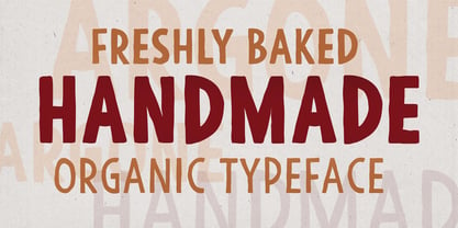
  19. Argone by Graphite, $18.00
    Argone is a handmade, organic, display family and comes in four weights. It also has a version with lower case letters – Argone LC
  20. Happy-Go-Lucky by Jelloween, $-
    The purpose of Happy-Go-Lucky is to bring joy to the world. These cheerful little dingbats will brighten your day right up!
  21. Streamliner by Zang-O-Fonts, $25.00
    Inspired by the typefaces used for company insignia on aircraft in the 1930's and 1940's, Streamliner is light, friendly and open.
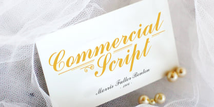
  22. Commercial Script by Bitstream, $29.99
    A bold weight of a moderately flourished script designed for ATF by Morris Fuller Benton in 1908, and an industry standard since then.
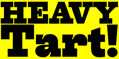
  23. Tart by Suomi, $35.00
    Headline font with extremely tight kerning with more than 1600 kerning pairs. Also with some discretionary ligatures and lining figures. That’s Tart. Sweet.
  24. Antique Condensed by Wooden Type Fonts, $15.00
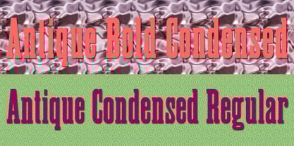
    A revival of one of the popular wooden type fonts of the 19th century, suitable for text or display, medium and bold weights.
  25. PL Brazilia by Monotype, $29.99
    PL Brazilia from Albert Boton is an elegant extended sans serif face in two weights. Usable in headlines on books, journals and posters.
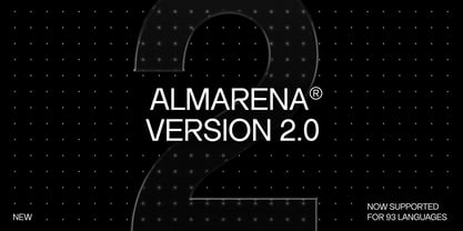
  26. Almarena by Almarena, $29.00
    Almarena® is a family of modern sans serif fonts. It has 2 styles (Classic & Display), 6 font weights and many alternative characters.
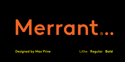
  27. Merrant by Max Prive, $28.00
    Merrant® is a lithe geometric display typeface designed by Max Prive. The Merrant® family has 3 weights – Lithe, Regular, and Bold.
  28. Sketchetik by Hiekka Graphics, $19.00
    Sketchetik is a hand-drawn font in four styles: light, regular, bold and black. It is recommended for use as a display typeface.
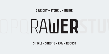
  29. Rawer by Gaslight, $20.00
    Another boring sans?! No way! Rawer - simple, strong, raw, robust sans with stencil and inline weights. And again it’s inspired by soviet typography.
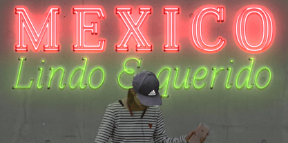
  30. Azote by Thomas Jockin, $30.00
    One line, two lines, three lines. Inspired by the 1968 Mexican Olympics, Azote is a multiline typeface family that adds lines for weight.
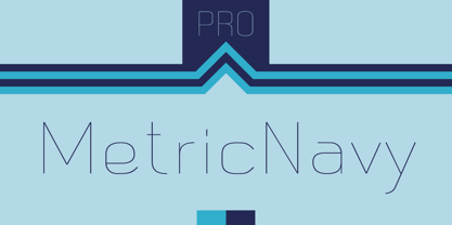
  31. Metric Navy PRO by Sea Types, $19.00
    Metric Navy PRO is a lightweight monoline developed for short texts and loose phrases in versions: thin, light, normal, regular, bold and black.
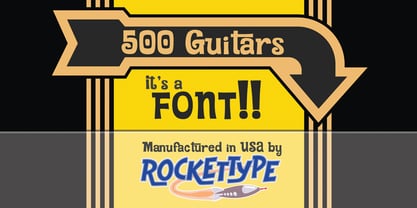
  32. 500 Guitars by Rocket Type, $14.00
    A chunky, whimsical number that strikes just the right chord for modern and retro projects. Loaded with stylistic alternatives, ligatures and Vietnamese support.
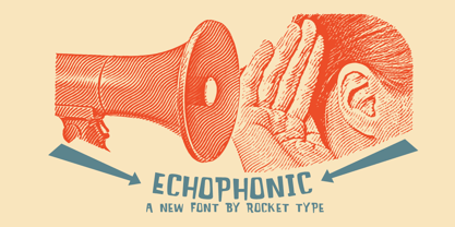
  33. Echophonic by Rocket Type, $14.00
    Try new Echophonic today! It's hi-fidelity sound you can actually see! Another miracle of modern science in several weights by Rocket Type.
  34. Faqro Extended Wide Trial - Personal use only
  35. Faqro Extended Expand Trial - Personal use only
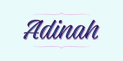
  36. Adinah by Brink, $30.00
    Adinah is a lively brush script with a strong sense of rhythm. Adinah’s expressive letterforms are based on pointed brush calligraphy with a hint of sign painting. This Sign painting influence reveals itself the further you dig into the family styles. Eight combined styles are complimented by a sub family of Six Layered Font options.
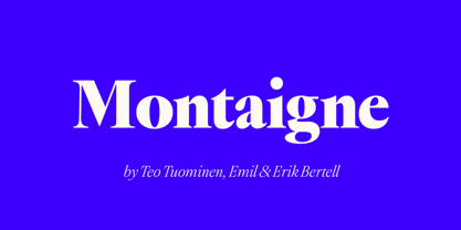
  37. Montaigne by Fenotype, $20.00
    Delve into the world of timelessness with Montaigne. With its blend of classic elements and contemporary design, this serif family offers a comprehensive selection of eight styles and their corresponding italics. Explore Montaigne's OpenType features, including Small Caps, OldStyle numerals, and a delightful array of Swash initials and Discretionary ligatures in the Italic styles.
  38. The "Bright Lights" font by onezero is a vivid, captivating typeface that practically vibrates with energy and charisma. It's a font that doesn't just sit quietly on the page or screen; it demands at...
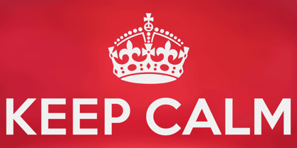
  39. Keep Calm by K-Type, $20.00
    Keep Calm is a family of fonts developed from the now famous World War 2 poster that was designed in 1939 but never issued, then rediscovered in 2000. As well as the original Keep Calm font, the medium weight of the poster, new weights are now available – Keep Calm Book (regular weight), Heavy and Light – and each weight comes with a complimentary italic. Version 2.0 (2017) is a comprehensive update which consists of numerous refinements and improvements across all weights. The family now contains a full complement of Latin Extended-A characters, Welsh diacritics and Irish dotted consonants. The four italics have been optically corrected with revised, ‘true italic’ forms of a and f. The crown motif from the top of the Keep Calm poster is located at the plus minus ± and section § keystrokes (Alt 0177 and Alt 0167 on Windows). The lowercase g follows the Gill/Johnston eyeglass model, but also included is an alternative, single-story g at the Alt G keystroke (Alt 0169 on a Windows keyboard), the normal location of the copyright symbol which has been relocated elsewhere in the fonts. An alternative lowercase t, without the curved wedge cutaway, is provided at the Alt T (dagger) keystroke (Alt 0134 on Windows). When I first saw the Keep Calm and Carry On poster, I wrongly assumed the letters to be Gill Sans. Recent research at the National Archive by Dr. Bex Lewis of Manchester Metropolitan University has revealed that the original poster was hand drawn by the illustrator and painter, Ernest Wallcousins. The Gill Sans influence is apparent, in the R particularly, the M’s perfectly pointed vertex is redolent of Johnston’s Underground, and the most anomalous character, the C, resembles the ‘basic lettering’ of engineers that provided the vernacular sources for the Gotham typeface. Developing the Keep Calm typeface has been an exercise in extrapolation; an intriguing challenge to build a whole, high quality font family based on the twelve available capitals of the Keep Calm poster, and on similar lettering from the other two posters in the original series. This has required the creation of new lowercase letters that are believably 1939; that maintain the influence of Gill and Johnston while also hinting at the functional imperative of a wartime drawing office. Wallcousins’s lettering balanced intuitive human qualities and the pure pleasure of drawing elegant contemporary characters, against an underlying geometry of ruled lines, perfect circles, 45° terminals, and a requirement for no-nonsense clarity.
  40. As of my last update in April 2023, "Safrole" is not widely recognized as a standard or famous font within the vast typography landscape. It’s possible that "Safrole" could be a bespoke or less commo...
Looking for more fonts? Check out our New, Sans, Script, Handwriting fonts or Categories
abstract fontscontact usprivacy policyweb font generator
Processing