1,591 search results
(0.017 seconds)
- Unfortunately, I can't give a detailed, current description of the "Motorcade" font by Ray Larabie, as my latest update was in April 2023 and I might not have the latest details on this specific font...
- The Corporate font, designed by Vic Fieger, is a typographic creation that embodies the essence of modern professionalism and efficiency. This font is distinguished by its clean lines and straightfor...
- As of my last update, ThamesCondensed might not be a widely recognized or established font within notable typographic repositories or among mainstream font databases. However, we can explore the esse...
- Ah, "Dirty Female Feet" is not your everyday font choice! With a name that instantly conjures up vivid, perhaps even whimsical or controversial, imagery, this font stands out in the vast ocean of typ...
- As of my last update, there may not be a widely recognized or popular font specifically named "AB Exp". However, the naming convention suggests it could be a specialized or custom font, perhaps desig...
- The Janda Scrapgirl Dots font, designed by Kimberly Geswein, is a delightfully whimsical and charming typeface that captures the essence of creativity and playfulness. Kimberly Geswein, known for her...
- As of my last update in early 2023, "Knives" is not a widely recognized or standardized font in the vast collection of typefaces used across design and digital platforms. However, let's explore a con...
- As of my last update in early 2023, the font "Detroit Ghetto" may not be widely known or recognized within mainstream typographic resources or among the broader design community. However, the intrigu...
- I'm sorry, but as of my last update in April 2023, there doesn't seem to be any information available on a font specifically named "Ishirkian" by Risket Xero. It's possible that it could be a new or ...
- Foobar Pro by CheapProFonts is a versatile and elegantly designed font that finds its origins in a creative pursuit towards balancing functionality with style. This font family embodies a modern aest...
- "Porn Star Academy" is a font that, as provocative as its name might imply, embodies a blend of playfulness, audacity, and a touch of rebellion. Designed with an intention to stand out and capture at...
- The font Komika Title, created by Apostrophic Labs, is a distinctive and vibrant typeface that falls within the display category due to its unique characteristics and visual appeal. This font is part...
- "Wizards Magic" is a font that seems to encapsulate the enchanting essence of the mystical and magical world, inspired by the rich tapestry of fantasy literature, movies, and folklore that involve wi...
- Gentium, a typeface family created by SIL International, is distinguished by its comprehensive approach to typographic representation. Designed by Victor Gaultney, Gentium (which means "of the nation...
- The GOLFABET font, designed by the font creator known as SpideRaY, is a unique and intriguing typographic creation that merges the timeless allure of the sport of golf with the expressive power of th...
- Pattheda, designed by Azcreative Studio, is an elegantly crafted font that encapsulates a harmonious blend of modern design principles with a touch of playfulness. This font stands out for its unique...
- Ah, Qebab Shadow FFP, the font that seems to have been crafted by a whimsical wizard in a shadowy, cobweb-draped studio, using nothing but a feather from a phoenix, some pixelated ink, and a healthy ...
- DIVERGENT, a unique font crafted by the designer known as SpideRaY, embodies a standout style that clearly sets it apart from the plethora of typefaces available. This distinctive font captures the e...
- The "Anabel" font, crafted by the type designer Toto, is a distinctive typeface that may catch the attention of both graphic designers and typography enthusiasts alike. While specific information reg...
- "Patched Medium" is a distinctive typeface designed by Måns Grebäck, a renowned typeface and logo designer whose work often combines craftsmanship with visual appeal. The "Patched" aspect of its name...
- Given my artistic inclination and optimistic outlook, it's delightful to delve into describing a font named "Tangled". The name itself conjures images of whimsy and adventure, perhaps inspired by fai...
- Certainly! Picture this: You're strolling through the whimsical alleyways of Typography Town, where the buildings stretch impossibly tall, framing the sky in slivers of blue. Suddenly, you stumble up...
- As of my last update in April 2023, "Bizzy Bee" is not a widely recognized or extensively documented font within the design community or among the commonly used typographic resources. However, let me...
- As of my last update in April 2023, GAU_font_modern does not appear to be a widely recognized or established font within the typographic or graphic design communities. It's possible that GAU_font_mod...
- As of my last update in April 2023, the font named "Commonwealth2" isn't widely recognized in major font catalogs or among standard typeface collections. Therefore, my description here will lean on s...
- Ah, Liturgisch! This font is to typography what a grand, echoing chorus is to a silent chapel: absolutely transformative. Crafted by the talented Dieter Steffmann, a wizard in the world of fonts, Lit...
- Imagine a font that exudes personality, creativity, and a touch of whimsy while maintaining readability and a structured elegance. Thiamine, crafted by the talented Ray Larabie, is a font that embodi...
- The font "Ruban Dismoi Tryout" by Match Software is an intriguing typeface that captures the essence of artistic flair and sophistication. This font stands out for its unique blend of classic eleganc...
- "I Hate Comic Sans" by Utopiafonts reflects a unique chapter in the world of typography that is as much about personal expression as it is about the broader discourse surrounding typeface design and ...
- The "Year 3000 Bold Italic" font by Iconian Fonts is not just a typeface; it's a journey into the future of typography. Crafted by the talented hands at Iconian Fonts, a foundry known for its wide ar...
- **Wicked Queen BB** by Blambot Fonts is a font that embodies a blend of mystical charm and sinister allure, catering to a wide array of artistic and design projects that demand a touch of fantasy and...
- As of my last update in early 2023, the font "Paddington" could either be an emerging typeface with limited exposure, or potentially you're inquiring about a relatively lesser-known or specialized de...
- As of my last update in early 2023, the font named "Irrep" created by Utopiafonts isn't specifically well-documented in mainstream font directories or prominently featured in the typographic resource...
- "Presa ANTIPIXEL.COM.AR" by Antipixel is a distinctive font that embodies a unique blend of contemporary aesthetics and functional versatility. Designed with a creative flair, this font showcases the...
- As of my last update, Rammstein isn't widely recognized as a standard or commercially available typeface in the traditional sense, such as Helvetica or Times New Roman. Instead, Rammstein's associati...
- The unique font "Broken 15" by Misprinted Type, also known as Eduardo Recife, is an evocative and highly characteristic typeface that dives into the artistic realms of the unconventional. Nestled wit...
- The Powderfinger Smudged font, designed by Apostrophic Labs, embodies a unique aesthetic that captures the essence of creativity mixed with a casual, laid-back vibe. This font is part of Apostrophic ...
- As of my last update in April 2023, "Paul6" does not appear to be a widely recognized or documented font within the typographic community or among the standard collections from major type foundries. ...
- As of my last update in April 2023, there isn't a widely recognized or commercially available font specifically known as "Yodle." It's possible that "Yodle" could be a custom or a less-known typeface...
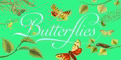
- Auberge Script by Sudtipos,
$79.00