10,000 search results
(0.031 seconds)
- Tall Order JNL by Jeff Levine,
$29.00
- Calling Card JNL by Jeff Levine,
$29.00 - Just Fall Holidays by Outside the Line,
$19.00
- Samaritan Tall Lower by Comicraft,
$49.00
- Down The Wall by Hanoded,
$15.00
- Double Bill JNL by Jeff Levine,
$29.00
- Bill Hiffith Handwritten by Colllab Studio,
$19.00
- Tall Skinny Condensed by Outside the Line,
$19.00
- Tall Scrawl NF by Nick's Fonts,
$10.00 - JI Color Crayons - Unknown license

- Doggone It JNL by Jeff Levine,
$29.00
- HU Crayon Doodles by Heummdesign,
$15.00
- Nylon and Draylon by Barnbrook Fonts,
$30.00
- Crayon En Folie by Hanoded,
$15.00
- All Over Again - Personal use only

- All Star BV - Unknown license

- KR All American - Unknown license

- all used up - Unknown license

- KR All Heart - Unknown license

- All Hooked Up - Unknown license

- All That Jazz - Unknown license

- YOU ALL EVERYBODY - Unknown license

- All Round Gothic by Dharma Type,
$24.99
- All Over Again by Hanoded,
$20.00
- Bal Harbour JNL by Jeff Levine,
$29.00 - Shes All That by Typadelic,
$19.00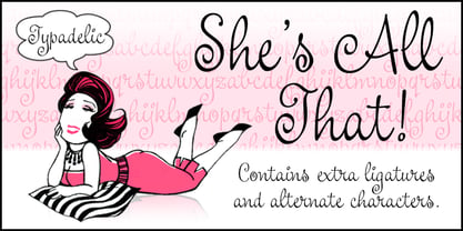
- All Pro JNL by Jeff Levine,
$29.00 - All for you by HOHOHtype,
$28.00
- All Is Quiet by Kitchen Table Type Foundry,
$15.00
- That’s All Folks by Comicraft,
$19.00
- Saiyan Sans - Unknown license

- Christmas Bell - Personal Use - Personal use only

- bell doraemon by OUBYC - Unknown license

- Hall Fetica Decompose Italic - Unknown license

- Hall Fetica Narrow Italic - Unknown license

- Hall Fetica Upper Decompose - Unknown license

- Hall Fetica Upper Italic - Unknown license

- Belle Epoque Stencil JNL by Jeff Levine,
$29.00
- LD Deck The Halls by Illustration Ink,
$3.00 - Tall And Narrow JNL by Jeff Levine,
$29.00


