5,044 search results
(0.108 seconds)
- 210 MGothic by Design210, Korean Fonts,
$300.00
- 210 Gulim by Design210, Korean Fonts,
$300.00 A round was added to a neat straight line to express a soft sensibility. It is a neat and flexible font using a clean and stable type of module.
 - 210 Jamak by Design210, Korean Fonts,
$300.00 It is a font designed in a balanced manner by optimizing the width and spacing of letters to make use of readability. Serif was treated as a curve to emphasize a soft and comfortable feeling. The serifs of the letters gave a distinct impression and gave it a natural look by adding inclination.
 - Arista 2.0 - Personal use only

- SlabFace 2010 - 100% free

- Iso 2.0 - Personal use only

- lelim 200 - Personal use only

- Megaflakes 2010 by Baseline Fonts,
$20.00 Snowflakes and doodles to complement any design on the fly.
 - Freeform 710 by Bitstream,
$29.99 - Palmilla 2.0 by RodrigoTypo,
$25.00 Palmilla 2.0 is a continuation of palmilla which added more glyphs such as Alphabets, Cyrillic was added like Greek, in addition to Alternatives such as Ligatures, more Ligatures were also added in Latin to play more with the title, in total there are six special weights for informal and creative titles.
 - Congratulatory 2.0 by Dmitriy Shchetinskiy,
$19.00 Congratulatory 2.0 font consist of 36 calligraphic greetings letterings for different event. Letterings are original and handwritten. This font makes it possible to use high quality calligraphy in your projects - greeting cards, certificates, invitation cards, letters of commendation etc.
 - Egyptian 710 by Bitstream,
$29.99 - Sys 2.0 by FSD,
$60.27Sys is a condensed font designed to work well at small sizes (i.e. phone books, maps, or the like) but it has enough personality to be used at big sizes, too. The TrueType version, thanks to its incredibly accurate hinting, may be used to replace amazingly well TrueType system fonts in every platforms, in web or other screen applications. After the succcess by the first version designed ten years ago, the version 2.0 has numerous improvements in the design of the glyphs, new Unicode ranges, useful OpenType features and enhanced readability. - Gerucht 2.0 by Rumors Foundry,
$11.00 Gerücht Typeface is a family of digital fonts designed in 2019 by Gabriele Bellanca for Rumors Foundry in three different weights and their corresponding slanted versions. All rights reserved. Gerücht (in English rumor) is the name of the font-family: today the name of a font is part of the graphic design itself, unlike in the past, where it usually consisted of a simple retrospective description (such as in the case of Gothic Condensed No.2) of its characteristics. It's a "one-word advertising slogan", writes Tobias Frere-Jones, which serves to build an idea and a charm to associate with that type of character.
 - Geometric 212 by Bitstream,
$29.99 - Calligraphic 810 by Bitstream,
$29.99 - Shahrazed 2.0 by GrafikarFonts,
$49.00 Shahrazed 2.0 is an arabic and latin typeface. Shahrazed, Arabic glyphs are based on calligraphic writing inspired by Naskh and Maghrabi. (1366 Glyphs) It has more than 400 ligatures which add an aesthetic advantage in the connections of the glyphs. Also, stylistic set and variations that enrich the aesthetic aspect and the composition and layout needs.
 - Displace 2.0 by Serebryakov,
$35.00 Displace 2.0 is a display sans-serif font family. Displace 2.0 is a humanistic sans-serif based on the calligraphic shapes with a pronounced handwriting contrast and open forms typeface. It has a natural thick-thin swelling and shrinking of the strokes as if it were draw calligraphicaly. Displace font family includes five weights with italics: Light, Regular, Medium, Bold and Black. Try it!
 - Impact 2010 by Microsoft Corporation,
$89.00 - Element 120 by Hanoded,
$15.00 Element 120 (Unbinilium) is a hypothetical chemical element in the periodic table. You can forget about that, I just thought it was a cool name for a font. Element 120 is a hand drawn Ultra Bodoni. I drew all the glyphs by hand, then gave them a good grunge makeover and the result is what you see before you. Comes with a periodic table of diacritics as well!
 - Arista 2.0 by Zetafonts,
$29.00 Arista is a soft round font, perfect for 2.0 logos and contemporary headlines. Arista 2.0 is the definitive release of Arista, with extra characters and corrected kerning. It includes a light version, a extrafilled version for 2.0 style fat borders, and an Alternate version with a lot of style changes.
 - Cowboys 2.0 - Personal use only

- Grinched 2.0 - Personal use only

- Kruti Dev 010 - Unknown license

- Sleepy Hollow 2.0 - Unknown license

- W.J. Pearce 213 - Unknown license

- Mighty Zeo 2.0 - Personal use only

- FF Dingbats 2.0 by FontFont,
$51.99 German type designers Johannes Erler and Henning Skibbe created this pi and symbols FontFont in 2009. The family has 12 weights and was one of the first symbol typeface for a new generation.It has one of the largest collections of contemporary symbols and icons for office communication.
 - Walbaum 2010 Pro by Storm Type Foundry,
$54.00 Upon numerous demands of highly esteemed users of our fonts I decided to supplement the Walbaum type family by display and poster cuts. Because I obviously cannot compete with world’s renowned type foundries which already offer a number of renderings of forenamed typeface, I thought proper to decline a bit from the original Walbaum’s design, strictly speaking, from the apprehension we commonly keep about this typeface. Therefore I didn’t set forth the way of modernizing (shame!), but rather the opposite direction: towards an analysis of the original neo-classical intention. I took the 10-point character, magnified it enormously and cut off progressively all the optically thickened bobbles which raised by small-size correction. I ended up at the size of about 120 points, where it became obvious that any further thinning would lead to an undesired manneristic fragility. Resulting 8-member family Walbaum 120 is naturally usable in variety of sizes, as well as cuts marked “10” you can use, say, from 6 to 30 points. I only hope that mister Justus Erich won’t pull me by the ear when we’ll meet on the other side...
 - YD Myungjo 200 by Yoon Design,
$400.00
- A10 STAR Black by Mogtahid,
$90.00 As a former typographer / lino and calligrapher, Abdallah NASRI had recourse to the nature of the idea of an "INTERCHANGEABLE" collection for types who in reality offer a police collar parallel to the complex typeface of the variable. Our fashion is outlined by a simple calculation defined by superimposed geometric circles where we used only its ¼ to fill the need for the angles of each of our letters. Always with the idea of having in the same allocated space, the same letter nested as many times as fat example from Hairline to Ultrabold. It was in this way that I was able to obtain a large number of styles, with a very interesting kerning which prompted me to extend the font to other languages with +1000 characters and +600 glyphs. I have always been treasured by the all in "1". I assure you that I sought to obtain the maximum of Visibility for a use S / Titling TV, WEB Pages and Typography Typo; once the difficult thing was done, I was rewarded by a font that has countless typographic openings for the world of graphics with 10 styles of weights in hand, and again I am happy to have personalized the charm of each letter by new details; I do not regret the time spent on thinking about it so that it is useful and at the same time pleasant as a working tool, finally profitable in all sectors and more multilingual, without forgetting that it is a family of inter change c ' is to say: All the types occupy the same height of the body and it is their fats which differs in the same space width of each of the letters, therefore no interference in spacing. Here, an additional alternative, a participation of a septuagenarian in the service of the love of modern digital typography. • TEST: At 50% screen in a body of 12 pixels, the A10 STAR Alphabet subjected to a test, has a clear Readability / Visibility. • P.S: A10 STAR integrates Diacriticism in all its forms. Texte d'origine : Abdallah NASRI a eu recours en étant ancien typographe/lino et calligraphe à la nature de l'idée d'une collection "INTERCHANGEABLE" pour les types qui en réalité offre un collier de police parallèle à la fonte complexe du variable. Notre mode est esquissé par un calcul simple défini par des ronds géométrique superposés où on a utilisé seulement son ¼ pour garnir le besoin des angles de chacune de nos lettres. Toujours dans l’idée à avoir dans le même espacement alloué, la même lettre imbriquée autant de fois de graisse exemple du Hairline à Ultrabold. C’est de cette manière que j’ai pu obtenir un grand nombre de styles, avec un crénage très intéressant ce qui m’a incité à étendre la police à d’autres langues avec +1000 caractères et +600 glyphes. J’ai toujours été prisé par le tout en « 1 ». Je vous assure que j’ai cherché à obtenir le maximum de Visibilité pour une utilisation S/Titrage TV, Pages WEB et Maquette typo ; une fois le difficile fait, j’ai été récompensé par une police qui possède d’innombrable ouverture typographique pour le monde du Graphisme avec comme atout en main 10 styles de graisses, et encore je suis content pour avoir personnalisé le charme de chaque lettre par des détails nouveaux ; je ne regrette pas le temps passé dessus à réfléchir pour qu’il soit utile et à la fois agréable comme outil de travail, enfin profitable tous secteurs confondus et en plus multilingue, sans oublié que c’est une famille d’inter change c’est-à-dire : Tous les types occupent la même hauteur du corps et c'est leurs graisses qui diffère dans un même espace largeur de chacune des lettres, donc aucune interférence dans l’espacement. Voilà, une alternative supplémentaire, une participation d’un septuagénaire au service de l’amour de la typographie numérique moderne. • TEST : A 50% d'écran dans un corps de 12 pixels, l'Alphabet A10 STAR soumise a un test, présente une nette Lisibilité / Visibilité. • P.S : A10 STAR intégre la Diacritique dans toutes ses formes.
 - MPI No. 510 by mpressInteractive,
$5.00 No. 510 is a friendly, slim gothic face. Strokes have a gentle inward curve at the median with the tops and bottoms of the letters slightly wider and thicker. The design was first introduced by William H. Page & Company around 1887.
 - FM Christmas 2.0 by The Fontmaker,
$20.00 FM Christmas 2.0 consists of 26 hand-lettered Christmas greetings. All the words and phrases are original and handwritten - a high quality calligraphy for your holiday projects. Check our portfolio for the rest of our Christmas collection and more holiday related hand-lettered fonts.
 - 2010 Cancellaresca Recens by GLC,
$38.00 This font was inspired by the Cancellaresca pattern (look at our 1491 Cancellaresca and 1610 Cancellaresca), in particular Spanish one, from Francisco Lucas, who was working in the late 1500s. It is a modern variation, including West European accented characters and a lot of initial and final alternates (not in the Mac TT version for technical reasons).
 - 2010 Outta Space by Morganismi,
$10.00 2010 OuttaSpace is a late space age font with geometric yet organic characters. Ideal for use in posters, cards, invitations etc. 2010 OuttaSpace Icons show you what it's all about in the universe. 2010 OuttaSpace supports West European languages.
 - YD Gothic 200 by Yoon Design,
$400.00
- American Advertise 010 by Intellecta Design,
$13.90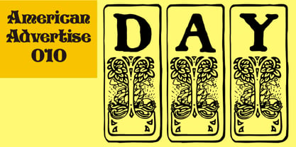
- Swift 2.0 Cyrillic by ParaType,
$100.00 Gerard Unger developed this newspaper font between 1984 and 1987 for Dr.-Ing. Rudolf Hell GmbH, Kiel. He was mainly influenced by William A. Dwiggins (1880-1956), the typographic consultant of Mergenthaler Linotype, who started to develop more legible, alternative fonts for newspaper printing as early as 1930. Swift was named after the fast flying bird. Austere and concise, firm and original, Swift is suited for almost any purpose. Swift has been specially developed to sustain a maximum of quality and readability when used in unfavorable print and display processes, e.g. newspapers, laser printing and low resolution screens. Its robust, yet elegant serifs and its large x-height provide an undeniable distinction to the typeface, making it suitable for corporate ID and advertising purposes as well. Swift 2.0 family was designed in 1995. It's an improved version with technical and aesthetic enhancements and new family members. The Cyrillic version was developed for ParaType in 2003 by Tagir Safayev. Please note that this family includes only basic latin characters; it does not include accented characters required for western and central Europe.
 - 20 db - Personal use only

- 21 Heads - Unknown license


Page 1 of 127Next page