5,854 search results
(1.087 seconds)
- Softmachine by Shinntype,
$39.00
- Standie by Graptail,
$15.00
- Morthern by Graptail,
$19.00
- Frutiger by Linotype,
$42.99
- Artemis JY by JY&A,
$39.00 - Nageka by GSH,
$44.00
- Artartika by Tour De Force,
$25.00
- Harry sunday by Attype Studio,
$15.00
- Lunema by S6 Foundry,
$19.00
- Slenco by Patria Ari,
$20.00
- Anamorphic by TEKNIKE,
$39.00
- Zalcony by HandletterYean,
$16.00
- Kid Knowledge by 38-lineart,
$6.00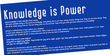
- ALS Story by Art. Lebedev Studio,
$63.00
- Loubotin by Rifa Studio,
$15.00
- Jugendstil Borders NF by Nick's Fonts,
$10.00
- Sudestada by Sudtipos,
$59.00
- Blox by Superfried,
$32.50
- Beauty Switzerland Duo by Lettersiro,
$18.00
- Blacker Spirit by Letterara,
$26.00
- Cocomber by 4RM Font,
$15.00
- Magnificent Serif - Personal use only

- Chicken Butt - Personal use only

- Zombie Food Demo - Personal use only

- Flame on! - Personal use only

- Buffied - Personal use only

- Obscure Actions - Unknown license

- yum - 100% free

- Tschich - 100% free

- Bric-a-Braque - Unknown license

- Baron Kuffner - 100% free

- Gilgongo - Unknown license

- SKULL TS 2 - Personal use only

- Psychotic - Unknown license

- Jokewood - Personal use only

- Korneuburg Slab Regular - Personal use only

- MKAbelRough-random - 100% free

- Wet Pet - Unknown license

- AB Barberian - 100% free

- JFRockOutcrop - Unknown license


