10,000 search results
(0.076 seconds)
- Mustopha by Arterfak Project,
$17.00 Greetings! Introducing Mustopha, the brand new Arabic font, inspired by Latin classic handwriting and Arabic letters called 'hijaiyah'. The letterforms designed by a combination of Carolingian typography which visualizes a humanism feel and the Arabic calligraphy that mostly showing decorative with the long-swash of the letters. Feel the humanism with this font, neat, elegant, and luxurious with an extra set of alternates characters and Arabic symbols as a decoration of your typographic design. Musthopa created to bring back the classic typography (specifically cursive typography) between the many styles of design trends. This beautiful font also designed to be versatile that you can use this font for many themes, not only Islamic or Arabic. Perfect choice for poster, logo, branding, greeting card, wedding, apparel, cosmetic labels, packaging, Book cover, short body text, quotes, and many more! Fonts Featured : Uppercase Lowercase Numbers Symbols Stylistic alternates SS01 - SS05 Ligatures Extras
 - Lectio by Eurotypo,
$14.00 Lectio is a Roman font based on a Venetian Renaissance early typefaces, but with a modern and expressive design. His obvious calligraphic influence favors continuous text reading. The generous internal "eye" gives Lectio an appropriate legibility, its soft and organic modulation avoids fatigue, its robust character is attractive and stimulating in large bodies, especially for use in headlines. Lectio comes in two versions: Lectio and Lectio B. Lectio has seven weight and their corresponding slanted variables (true italics). Lectio B is composed only of Italics in six weight. The ascenders are slightly lower, the descending are more regular and the oblique trace of some letters have a more constant rhythm. Each of these faces has the optimum amount of contrast agains the background and clear and open internal letter shape. These fonts include diacritics for CE languages, Old Style figures, standard and discretional ligatures.
 - TT Espina by TypeType,
$19.00 Addition to the collection of TypeType display fonts! TT Espina useful links: Specimen | Graphic presentation | Customization options TT Espina is a display antiqua with expressive serifs. Inspired by the historical shape of the letter O, which took on a diamond shape due to print quality, the designers created a modern typeface with high contrast between horizontals and verticals. TT Espina is yet another proof that antiquas can be stylish and expressive display fonts suitable for modern projects. TT Espina will look harmoniously in headlines of posters or billboards, in gallery and exhibitions design, in large-format printed materials or on websites. The font is easily distinguishable among other antiquas by its high contrast, expressive and large serifs, closed aperture and diamond-shaped circles. TT Espina’s characters are quite narrow, which adds to the materials designed using the font a special aesthetic. It makes you to look closely into each letter, so the headlines set in TT Espina will definitely be read. A full set of different icons is a nice addition for designers who will work with a new typeface. TT Espina consists of 7 typefaces: 6 romans and 1 variable. Each typeface has 648 glyphs. The font family has 21 OpenType features, including changing the shape of some characters (Q, g, j), the possibility to replace characters with high-set diacritics with characters with low-set diacritics, which is convenient for poster design.
 - Bunday Slab by Buntype,
$22.50 The new Bunday™ Slab Font Family consist of three main states with different moods: the crisp and distinctive slab serif, the cute script styled italic and the matching upright italic. All states of Bunday™ Slab share the same contemporary, clear and open base forms and create a space-saving and pretty homogeneous text colour with good legibility. The font was manually hinted and contains extensive handcrafted kerning tables to ensure perfect appearance in all media. Bunday™ Slab ships with 9 standard, 9 upright italic and 8 italic styles from a considerable thin “Hair” to a pretty fat “Heavy” weight. It supports at least 99 languages and provides OpenType® features for ligatures, alternative glyphs, localised forms and more. Please take a look at the other members of the Bunday superfamily: Bunday™ Clean Bunday™ Slab Further information: Bunday Slab Specimen PDF Feature Summary: 9 weights: Hair, Light, Thin, SemiLight, Regular, SemiBold, Bold, ExtraBold and Heavy 3 Moods: Sans, Upright and Upright Italic Overall width: Narrow or Space-Saving Advanced “f” ligature set* “s” and “c” ligatures* Alternates Characters: a, ç, e, f, g, l, t, y and more* Capital German Esszett* Supports at least 99 Languages * Only available applications with advanced OpenType® support
 - Heavenly Bodies by Aah Yes,
$0.25 All 6 fonts use the characters A - K and a - k to show two planets/stars/moons moving across each other. Nice and simple. There's a different number of points on the stars, or they're different sizes, and some appear to pass left-to-right, and some appear to pass the other way. Just type in ABCDEFGHIJK or abcdefghijk and you'll see. Two fonts have all the characters on the same level, (All-Black and Black+White). The Offset font has the 'sun/moon' with one slightly above the other and in black and white, and Half has them all-black. Partial has them even further separated in 2-tone. NearMiss is a very close shave. Comma, hyphen, and full stop/period give just a single symbol; there's a Space, and that's it.
 - Strokes by Favorite Fonts,
$17.00 The "Strokes" font family presented here has several styles: regular, italic, bold and bold italic. The font supports the alphabet consisting of Latin letters and symbols, Cyrillic, Tatar. The composition of the font "Strokes" includes graphemes from uppercase and lowercase letters, numbers, standard characters. The originality of the font lies in its name. The "Strokes" font is made up of many intersecting lines, forming rounded sans-serif letters, but at the same time smooth and easy to read, which will fit perfectly into your composition. The unusualness and attractiveness of the font makes it noticeable among the texts that surround us everywhere. This property is convenient to use on signs, logos, corporate identity, product packaging. The decorativeness of the font is eye-catching and will add important accents to your work.
 - Egoism by WTFont,
$10.00 Presenting a proud and tall font! The ability to express emotion through typography is one that is very much needed. Thus, the idea of emotional typography to communicate feelings was born. The emotion of Egoism is primarily one that is self serving and personal. While appearing to be deceptively simple, it is designed to have a handmade effect. The center point of the letters has been raised, giving the letters and glyphs a taller appearance. This reflects the feeling of having an inflated Ego. The handmade aspect of this font is what makes it great for giving any design a personal touch. Pair it with a bold Sans Serif font which also has a hand made appearance. Create designs with this Egoism font that enhances your hand made looking pieces!
 - Bake Sans by S6 Foundry,
$15.00 Bake Sans is a captivating contemporary typeface that exudes style and personality. Crafted with modern and distinctive shapes and curves, this font offers the perfect visual consistency for your branding and communication projects. Elevate your designs with Bake Sans and make a lasting impression. Ideal for logos, websites, and marketing materials.
 - Folkloric by Inumocca,
$20.00 FOLKLORIC is A Retro Sans-Serif Style They were particularly common in the 70s, this is a great choice for expressing a summer. The Typeface comes with Stylistic Set and Ligature Combinations Exellent typeface to use for covering your Project, like Branding, Movie Title, Headline Letter, Bookcover or Book Content, Magazine cover, Poster, Quotes Lettering, Logos, and more your project design. - Unique glyphs - Multilingual Characters Support - UPPERCASE - Lowercase - Numeric - Symbol - Punctuation Character - Ligature - Stylistic Set inumocca type
 - Tiara by Tanincreate,
$16.00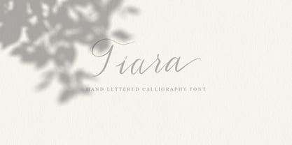 Tiara is a lovely modern calligraphy script typeface with contemporary accents. It is great for wedding invitations, branding, headline, logotype, apparel, packaging, advertising etc. Tiara script comes in uppercase, lowercase, punctuation, symbols & numerals, stylistic set alternate, ligatures, multilingual support . All lowercase letters include beginning and/or ending swashes which gives a realistic hand-lettered style. To use the swashes, a program that supports OpenType features is needed (Adobe Photoshop CS, Adobe Illustrator CC, Adobe Indesign, Corel Draw, ect.)
 - Maybrook JNL by Jeff Levine,
$29.00 One of the type examples found within the pages of “Lettering” by Harry B. Wright (1950) is a bold hand lettered serif typeface with a unique twist – the slab serifs had rounded corners, looking very much like show card lettering of the early 1900s. This design is now available digitally as Maybrook JNL, in both regular and oblique versions.
 - Alphacal JNL by Jeff Levine,
$29.00Alphacal JNL and Alphacal Black JNL are variants of the same lettering style found in Jeff Levine's Juneway JNL font... all based on water-applied decals once made by the Duro Decal Company (now Duro Art Industries) of Chicago, Illinois. Alphacal JNL can be used alone as an outline font (best at 18 pt. and above) or with Alphacal Black JNL as a backfill. Note: Perfect registration is not guaranteed. Some user adjustments may be necessary. - Gonzi by Mans Greback,
$49.00 Gonzi is a geometric sans-serif typeface in 30 styles. Its circular lowercase letters and large, expressive capitals combine to create a modern, clean typesetting with a distinct personality; all the while keeping accessible and legible. Gonzi consists of five weights, each one as narrow, medium and wide: Thin, Light, Regular, Bold, Black Condensed, Medium, Extended Each one of font styles is also provided as Italic, totalling 30 high-quality styles. Also includes a variable font! Only one font file, but the file contains multiple styles. Use the sliders in Illustrator, Photoshop or InDesign to manually set any weight and width. This gives you not only the predefined styles, but instead more than a thousand ways to customize the type to the exact look your project requires. More info about Variable Fonts: https://mansgreback.com/variable-fonts The font is built with advanced OpenType functionality and has a guaranteed top-notch quality, containing stylistic and contextual alternates, ligatures and more features; all to give you full control and customizability. It has extensive lingual support, covering all Latin-based languages, from North Europe to South Africa, from America to South-East Asia. It contains all characters and symbols you'll ever need, including all punctuation and numbers.
 - Cabazon by Parkinson,
$30.00 Cabazon is an informal blackletter inspired by handlettering samples from many sources, and various time periods. Works by Rudolf Koch and Friedrich Heinrichsen are reflected, as well as the work of showcard lettering artists Ross George and Samuel Welo. Medieval manuscript samples were also helpful in developing this style.
 - Katzenjammer by Hanoded,
$15.00 Katzenjammer is a German word meaning 'Cat's Wail' - it is used to describe a hangover. Katzenjammer font is a slightly eroded, squarish typeface, which would be ideal for headlines, packaging, posters and websites. This all caps font comes with different upper and lower case glyphs and a non-eroded set of alternates for the lower case - for those who like their alphabet nice and neat.
 - Bocadillo by Hanoded,
$22.00 A Bocadillo is a sandwich. I guess I was craving one when I had to name this font! Bocadillo is a sweet Brush script. It is all caps, but upper and lower case are different and like to mingle. It is an ideal font for product packaging, posters, book covers, postcards and big ‘I love you’ billboards. Comes with a generous helping of diacritics.
 - Nanumunga by insigne,
$11.95Insigne is pleased to release Nanumunga, inspired by the carefree antics of tropical fish. Designers will find this typeface is useful whenever a relaxed and lighthearted typeface is required. Nanumunga is a versatile face. The font includes small caps and a shadow alternate for titling. Some potential uses are advertising for children's products, tropical destinations, or just whenever you need a slightly different "cartoon" look. - Trail Boss JNL by Jeff Levine,
$29.00 Trail Boss JNL emulates vintage wood type and was inspired by a few visual examples found online. The erratic widths of the letters are part of the intrinsic charm of this kind of lettering.
 - Durable JNL by Jeff Levine,
$29.00 The front page of a late-1940s sales catalog for the [now defunct] Duro Decal Company of Chicago had its company name hand-lettered in a tall, condensed chamfered sans serif type design. Although chamfered lettering had been popular for decades, the way the "R" was shaped gave the letters a bit of an Art Deco influence, and this influence was carried through in the creation of Durable JNL.
 - Kamasunday by Alit Design,
$21.00 Introducing Kamasunday Dynamic Blackletter, a typeface that seamlessly blends the timeless elegance of blackletter script with a modern, dynamic twist. This font is a perfect fusion of tradition and innovation, offering an impressive array of 837 meticulously crafted glyphs, ligatures, and alternates that will elevate your designs to new heights. Key Features: Dynamic Wave Design: Kamasunday Dynamic Blackletter features a captivating wave-like design that adds a sense of movement and energy to your text. Each character flows seamlessly into the next, creating a visually stunning and cohesive text. Modern Elegance: This font embodies the essence of modern elegance, making it perfect for a wide range of design projects, from branding and packaging to invitations and posters. Extensive Glyph Set: With a whopping 837 glyphs at your disposal, you have access to a vast selection of characters, including uppercase and lowercase letters, numerals, punctuation, and a variety of special characters, ensuring your design needs are met with versatility. Ligatures: Kamasunday Dynamic Blackletter includes an extensive set of ligatures, allowing you to achieve a more fluid and natural look in your text. These ligatures create seamless connections between characters for a polished and sophisticated appearance. Alternates: The font offers an abundance of alternate characters and swashes, giving you the creative freedom to experiment and customize your text. These alternates add an extra layer of uniqueness to your designs. Versatile Usage: Whether you're designing a vintage-inspired logo, a Gothic-themed poster, or a contemporary Music event poster, Kamasunday Dynamic Blackletter adapts beautifully to various design contexts. Timeless Appeal: While embracing modernity, this font retains the timeless charm of traditional blackletter script, making it a versatile choice for projects that demand a touch of history and sophistication. Elevate your design projects with Kamasunday Dynamic Blackletter, where the past and present merge into a harmonious typographic masterpiece. This font promises to breathe life into your creative visions, making your designs stand out with its unique style and extensive character set.
 - Gothiks Condensed by Blackletra,
$50.00 This is the condensed version of Gothiks , a 6-weight display sanserif influenced by Texturas. It is ideal for everything big, compact and powerful. This family has an extensive character set — with extensive language support — and many OpenType features like fractions, small capitals and different figure sets. Default figures align with lowercase.
 - Gothiks Compressed by Blackletra,
$50.00 This is the compressed version of Gothiks , a 6-weight display sanserif influenced by Texturas. It is ideal for everything big, compact and powerful. This family has an extensive character set — with extensive language support — and many OpenType features like fractions, small capitals and different figure sets. Default figures align with lowercase.
 - Monogamma by Tolya Doodko,
$45.00 Monogamma is an experimental typeface which explores opportunities for harmonious connection of broad nib writing and the aesthetics of monospaced typefaces. The typeface is primarily designed for headings and typesetting in large sizes. It is not intended for technical usage, therefore its metrics and characters proportions are optimized and the spacing between letters is optically evened out. Thereby, Monogamma has even letter spacing, contrasting styles and is free from the imperfections of monospaced fonts. It is supplied with kerning and OpenType features and comes in three weights, with full character set or capitals only. Supporting Latin and Cyrillic, it covers most European languages. The full character set includes an alternative capital U and zero, punctuation marks for the upper case and a set of arrows.
 - Fabrica by Fenotype,
$40.00 Fábrica is an exquisite display letter with flair. Its delicate curves have been carefully honed; yet its beauty is seemingly effortless. To add to its appeal, Fábrica is equipped with several handy features such as ligatures (there are plenty of them), old style figures and fractions. Its true crown jewel, however, is the finely tuned hairline accents – no longer will a diacritical mark ruin your heading. Find those under a feature called Thin accents. Use Fábrica to turn your communication into statements of divine elegance.
 - Rilke by Pelavin Fonts,
$20.00 Rilke, is the lettering used by Gustav Klimt on the 1st Vienna Secession poster in 1898 and is named for Klimt’s contemporary the poet Rainer Maria Rilke. The Vienna Secession was a group of artists whose motto was "to every age its art and to art its freedom." Their goal was to create a new style not based upon any historical influence. Its subtle curving strokes and the idiosyncratic set of the various characters create an elegant lightness which lends itself well to poetry, inscription
 - Hello Snow Swash by Stefani Letter,
$14.00 Hello Snow is a sweet and snowy display font with a magical feel. Each of its letters is covered in snow, making it the ideal font for any Winter-project! It embodies playfulness and authenticity and is the perfect choice for any children's activity, Christmas, thanksgiving, poster, logo, packaging, or school project. Fall in love with its incredibly adaptable style and use it to create amazing designs! Add this beautiful display font to each of your creative ideas and notice how it makes them stand out!
 - VLNL Agitka by VetteLetters,
$30.00 As a font designer for films Henning Brehm delivers fonts with a whip-sharp eye for precision. His latest Vette Letters release, VLNL Agitka is a Cyrillic-inspired (and including) alphabet with both feet rooted in Soviet Union-era propaganda posters. Its design is constructivist (look Mom, no curves!) geometric and strong. Like Russian vodka. Aside from the Regular, Light, Bold and Black weights, Agitka comes in four Neon styles as well. For a dazzling design effect, layer those neons over a regular weight for a star struck embossed-letter effect. We would also like to point out the usage of VLNL Agitka in the Bourne Ultimatum movie, for which Brehm designed neon signage for a scene at a Russian supermarket. За здоровье – Za Zdarovje!
 - Hannover Modern by Type-Ø-Tones,
$40.00 Hannover Modern belongs to a series of typefaces used at the Estudio Mariscal in Barcelona. José Manuel Urós developed this weight, a vigorous egyptian-style, the embodiment of the Javier Mariscal style.
 - Cora by TypeTogether,
$49.00 Cora is a sans serif with an experimental bent, offering a large x-height, some contrast of stroke weight, and capitals inspired by classical lettering. The large x-height gives it a voice with a little more volume so that those in the back of the room have no trouble hearing. Because the letters seem slightly large, Cora remains clear at smaller point sizes. It is a typeface intended to perform well on screen without losing its attraction in print and the nature of its shapes allows for condensation or expansion without becoming severely distorted. The uppercase exhibits classical proportions found in ancient Roman inscriptions, which provides opportunities for setting titles in all caps. Cora Opentype Pro has a full range of numerals for every use, small caps, the most common open type features and supports many languages that use the latin extended alphabet. It is available in a range of three weights plus Italics. CoraBasic is a reduced version of Cora. It is still an OT-font but without any particular features except of a set of ligatures, class-kerning and language support including CE and Baltic.
 - Artificial Intelligence by Mans Greback,
$59.00 Artificial Intelligence is a computer generated typeface, in a brush handwriting style. As the world's first public and commercially available AI typeface, Artifical Intelligence celebrates the interaction between humanity and technology, in an attempt to blur the lines between hard data and interpretation. Based on 400 of Mans Greback's typefaces, this machine learning is bold and expressive, with a touch of retro while keeping it hip. It is provided in an all-caps uppercase style, Artificial Intelligence Caps, as well as the Regular style with lowercase lettering. The font is built with advanced OpenType functionality and has a guaranteed top-notch quality, containing stylistic and contextual alternates, ligatures and more features; all to give you full control and customizability. It has extensive lingual support, covering all Latin-based languages, from Northern Europe to South Africa, from America to South-East Asia. It contains all characters and symbols you'll ever need, including all punctuation and numbers.
 - Zena by Arabetics,
$39.00 Zena is an Arabetic typeface design with visually connected glyphs, named for designer’s younger daughter, Zena, for her twelfth birthday. Zena follows the guidelines of the Mutamathil Taqlidi type style with one glyph for every basic Arabic Unicode character or letter, as defined in Unicode Standards, and one additional final form glyph for each Arabic letter that can connect with other letters from both sides in traditional cursive Arabic strings. Zena employs variable x-height values. It includes all required Lam-Alif ligatures and selected marks. Tatweel (or Kashida) glyph is a zero width space. Keying it before any glyph will display that glyph isolated form, if desired. Keying Tatweel before Alif Lam Lam Ha will display the Allah ligature. The Zena typeface family includes both Arabic and Arabic-Indic numerals; all required diacritic marks, in addition to Standard English keyboard punctuations and major currency symbols. Zena is available in regular and italic (slated to the left) styles.
 - Transmogrifier by PintassilgoPrints,
$35.00 Inspired on Cuban posters by the talented and prolific graphic artist Eduardo Muñoz Bachs, Transmogrifier was hand painted with a thin brush, using loose, fast strokes. This font is packed with lots of contextual and stylistic alternates that automatically transmogrifies the letters as you write, when using opentype savvy programs. It's also possible to pick the alternates by hand and set the text the way you like better. The choice is yours, and there are really plenty of alternates to choose from and create original handlettered-looking designs. The font also brings a rough set of pictures based in charcoal sketches from Shniedewend & Lee Company, 1888. These were painted with the same thin brush as the letters, making it a natural complement. So let the transmogrification begin!
 - 1863 Gettysburg by GLC,
$38.00 This script font was inspired by a lot of autographs, notes and drafts, written by President Abraham Lincoln, mainly the Gettysburg address, first draft and copies, but also the emancipation proclamation. It is an attempt to offer a typical manual script from this American period, not to propose the exact writing from A. Lincoln himself. This font is a little fat and monotone, maybe Abraham Lincoln used a smooth or rounded pen, but some letters I have consulted were written obviously with a sharp one, so, in the future, I will certainly produce a slim version of this font. It is used as variously as web-site titles, posters and fliers design or greeting cards, all various sorts of presentations, menus, certificates, letters. This font supports enlargement as well as small size, though the original size was about 18 to 24 pts. When printed, it remain perfectly legible from 10 to 12 pts.
 - Featured Item - Personal use only

- Coldfield JNL by Jeff Levine,
$29.00Coldfield JNL is the revival of an old wood type font from Jeff Levine. Clean and easily readable at different point sizes, it is an excellent companion to Twelve Oaks JNL and Ingomar JNL. - Wood Island by WAP Type,
$20.00 Inspired by traditional ethnic feel and visuals. Great for fun and casual thematic visuals, games, logos, branding, products, campaigns, events, seasonal promotions, traditional concepts, explore different sides of your brand using wood island font.
 - Milk Cursive by Okaycat,
$29.50 Milk Cursive is the healthy choice. Fortify your designs & fulfill your daily textual needs with these flowing, bubbly letters. Enjoy the refreshingly natural look of an every-man's calligraphy with a fat & wide style. Milk Cursive is extended, containing West European diacritics & ligatures, making it suitable for multilingual environments & publications. It also contains some icons as extra characters, such as a star, a heart, an arrow, flowers, a butterfly, and manicules (pointing hands). Go ahead and have fun with it!
 - Mini Moniker by AnkaDrozd,
$27.00 Mini Moniker Simple Font Elevate your design simplicity with Mini Moniker, a digital font that embodies the essence of minimalism. Perfectly curated for short phrases and print design, this font brings a clean and understated style to your creative projects. Each letter is a testament to the beauty found in simplicity, making Mini Moniker the ideal choice for those seeking a sleek and modern aesthetic. Enhance your visual language with this versatile font and let your words speak with clarity and elegance.
 - Athaar by MysticalType,
$12.00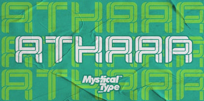 Athaar is a bold, modern sports font with dramatic movements and a strong feel for your latest project that requires a modern sports look. It is perfect for branding projects, logos, wedding designs, social media posts, advertisements, product packaging, product design, labels, photography, watermarks, invitations, stationery, and any project that requires a modern sport style. Athaar comes with uppercase, lowercase letters, numbers, punctuation, and many variations of each character, including OpenType alternatives and general binders to allow you to customize your design.
 - Hilofi Lavoris by Maulana Creative,
$11.00 Hilofi Lavoris is an 80's retro sign painting style font. With bold stroke, italic and fun character with a bit of ligatures. To give you an extra creative work. Hilofi Lavoris font support multilingual more than 100+ language. This font is good for logo design, Social media, Movie Titles, Books Titles, a short text even a long text letter and good for your secondary text font with sans or serif. Make a stunning work with Hilofi Lavoris font. Cheers, MaulanaCreative
