10,000 search results
(0.376 seconds)
- Alma Mater by Studio K,
$45.00 As the Latin tag for one’s college or university, Alma Mater seemed to me to be an appropriate title for a font family reminiscent of the lettering commonly used on college sweaters and sports jerseys. Essentially Alma Mater is an extension of my Oscar Bravo font family, but the lively demand for Oscar Bravo Blank persuaded me to go the whole nine yards and and offer inline, outline and shadow variations on the theme. Pick 'em up and run with 'em!
 - Iwan Stencil by Linotype,
$40.99 Iwan Stencil is a new revival of an old display typeface. Based on type originally designed by Jan Tschichold in 1929, the style was revived by Klaus Sutter in 2008. The letterforms in this peculiar design are very high contrast; all of the thin bits are much thinner than the thick parts. They have a modern, upright axis. All in all, the creation has a bit of a Bodoni-gone-crazy touch. The thin elements are the unique part of the design that binds this face together. They almost naturally fade away in the stencil gaps (or pylons), making you wonder if you are really looking at a stencil face at all. These thins contribute greatly to the typeface's overall serif-style, making the design at least a semi serif typeface, if not a full serif one. The lowercase n, for instance, has no serifs of its own, but many of the other letters have clear ones, or serif-like terminals. A serif stencil face is a peculiar variety, especially in this day and age, but in the past they were much more common, if not the norm, The Iwan Stencil typeface has only one weight. Naturally, this is just for display. Use Iwan Stencil to cut real stencils, or only to create the effect of stenciled type in your design work. Ivan Stencil includes all of the characters that you have come to expect in a font. Just because this design was originally made in 1929 does not mean that is has a 1929 character set. Instead, it includes a 21st century, with extended European language support Jan Tschichold, who we have to thank for today's Iwan Stencil inspiration, was a man of many faces. A trained calligrapher who went on to codify the New Typography, would go on to become a teacher, a classical book designer, and the creator of the Sabon typeface. Like all young designers, he was occasionally in need of money. Before his emigration from Germany in 1933, he took on many kinds of commissions. In the late 1920s, a time full of waves of economic turmoil within Germany and across the world, he began designing a typefaces for different European companies, mostly display things like this. For a time during the mid-1920s, Jan Tschichold went by the name Iwan" "
 - Hylata by Ixipcalli,
$65.00 Hylata is a typeface inspired by the Mexican colonial style of the 50s, especially from the state of Puebla. Its design is very characteristic of the local talavera crafts. The typography presents "blacksmith" type styles, which is ideal to represent the characteristic provincial style of Mexico.
 - Falling Richees by Zamjump,
$21.00 Falling Richees is a handwritten script with authentic dry brush imperfections. Falling Richees has a final letter combination to get the look you want :), besides Falling Richees also has a swash combination, to be placed under the writing you made, this is very easy to use, because this feature I intentionally made as an alternate type of letter lowercase. (see the example in the preview image) No special software is required to access any of the standard or alternative fonts - additional letters are provided in two forms 1. ending swash, 2. line swash :) WHAT IS INCLUDED: Falling Richees.ttf Multi language Ending swash Line swash For people with opentype-capable software: The alternatives can be accessed by turning on the 'Alternative Style' and 'Ligatures' buttons in Photoshop's Character panel, or through any software with a glyph panel, e.g. Adobe Illustrator, Photoshop CC, Inkscape. I hope you have fun using Falling Richees ! Happy creative!
 - Marclane by Ironbird Creative,
$10.00 Marclane is a hand drawn slab serif typeface. This item consist of 4 fonts in various styles which you can play around with it and also come with MARCLANE DINGBAT to make better design. This typefaces is perfect for people looking for vintage aesthetic and organic feel or design needs with a touch of classic western. What Will You Get : Marclane Slab Serif Marclane Dingbat If you have any questions, please contact (ironbirdcreative@gmail.com)
 - Nextir by Ditatype,
$25.00 Nextir is an extraordinary brush sans serif font that commands attention and redefines modern typography. Designed with large letters and a thick weight, its distinctive square letter shapes are the epitome of strength and contemporary style. What sets Nextir apart from the ordinary is its brush detailing. This unique blend of brush strokes and sans serif elements adds a layer of organic texture to the font. The combination of large letters, thick weight, square shapes, and brush detailing creates a font that makes a striking statement with a contemporary edge. When you need a typeface that combines strength with artistic expression, Nextir is the perfect choice to infuse your designs with boldness, modernity, and a touch of handcrafted elegance. You can also enjoy the features here. Features: Multilingual Supports PUA Encoded Numerals and Punctuations Nextir fits in headlines, logos, posters, flyers, branding materials, print media, editorial layouts, and many more designs. Find out more ways to use this font by taking a look at the font preview. Thanks for purchasing our fonts. Hopefully, you have a great time using our font. Feel free to contact us anytime for further information or when you have trouble with the font. Thanks a lot and happy designing.
 - Aztec Club by HIRO.std,
$19.00 Aztec Club is a display decorative typeface. The typeface is presented in two fonts: regular and basic. The typeface describes about stylish, ethnic, different, pride, unique and easy to use. Aztec Club inspired by ethnic, local pride, culture and sub culture around the world. FEATURES - Uppercase and Lowercase letters - Numbering and Punctuations - PUA Encoded Characters - Multilingual Support - Works on PC or Mac - Simple Installation USE Aztec Club typeface works great in logotype, headline, apparel, poster, magazine, décor item and wherever you want to be seen. Enjoy using! Thanks. HIRO.std
 - Bendungan Signature by Chococreator,
$15.00 Bendungan Signature Handwritten is a Beauty and Minimalist font with beautiful ligature, character specials and multilingual support. This is a very versatile font that works well in large and small sizes. Bendungan Signature Handwritten is perfect for branding projects, Logo designs, Clothing Branding, product packaging, magazine headers, or just as a stylish text overlay for any background image. Features: Ligature The A-Z alternative Numbers & Punctuation Accented characters HOW TO ACCESS ALTERNATIVE CHARACTERS Open the glyph panel: In Adobe Photoshop, open Window - glyphs In Adobe Illustrator, open Type - glyphs
 - Winter Break by Supersemarletter,
$10.00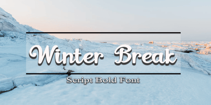 Winter Break is a sweet and flowing handwritten font. It looks stunning on wedding invitations, thank you cards, quotes, greeting cards, logos, business cards and every other design which needs a handwritten touch. Honestly it works perfectly for headlines, logos, posters, packaging, T-shirts and much more. Font Features : • Regular version • Character set A-Z in uppercase and lowercase • Numerals & Punctuation • Accented Characters • Multiple Languages Supported Recommended to use in Adobe Illustrator or Adobe Photoshop with opentype feature. If you have questions, just send me a message and I'm glad to help.
 - Winter Winds by Arendxstudio,
$14.00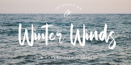 Winter Winds Handwritten Typeface is a font with distinctive handwritten characters, perfect for branding projects, logos, wedding designs, media posts, advertisements, product packaging, product designs, labels, photography, watermarks, invitations, stationery, and any project who need handwritten feel. Features : • Character Set A-Z • Numerals & Punctuations (OpenType Standard) • Accents (Multilingual characters) • Ligature • Alternate There it is! I really hope you enjoy it - comments and likes are always welcome and accepted. More importantly, don't hesitate to send a message if you have a problem or question. Now just read this, go there and make it happen.
 - Matthias by Arendxstudio,
$16.00 Matthias is a brush script font with distinctive handwritten characters perfect for branding projects, logos, wedding designs, media posts, advertisements, product packaging, product designs, labels, photography, watermarks, invitations, stationery, and any project who need handwritten dishes. Features : • Character Set A-Z • Numerals & Punctuations (OpenType Standard) • Accents (Multilingual characters) • Ligature • Swash There it is! I really hope you enjoy it - comments & likes are always welcome and accepted. More importantly, don't hesitate to send a message if you have a problem or question. Now just read this, go there and make it happen :)
 - Qibtiyah by Arendxstudio,
$16.00 Qibtiyah is a brush script font with distinctive handwritten characters perfect for branding projects, logos, wedding designs, media posts, advertisements, product packaging, product designs, labels, photography, watermarks, invitations, stationery, and any project who need handwritten designs. Features : • Character Set A-Z • Numerals & Punctuations (OpenType Standard) • Accents (Multilingual characters) • Ligature • Swash There it is! I really hope you enjoy it - comments & likes are always welcome and accepted. More importantly, don't hesitate to send a message if you have a problem or question. Now just read this, go there and make it happen :)
 - Kasuga Brush by insigne,
$21.99 Kasuga Brush is a contemporary script with eastern influence and authentic brush drawn character. The script offers two variants. One is slightly distressed along the character's edges while the other is painted with a dry brush for interesting texture. Sixty-four optional ligatures add a realistic, hand-drawn effect and ensure that no two letters in a word repeat.
 - Natalisa by Sabrcreative,
$15.00 Introducing Natalisa, a sophisticated sans serif font that brings a perfect balance of elegance and versatility to your design projects. With its clean lines and modern aesthetics, Natalisa is ideal for creating sleek logos, captivating headlines, engaging advertisements, and eye-catching branding materials. Crafted with meticulous attention to detail, Natalisa offers a harmonious blend of uppercase and lowercase letters that seamlessly complement each other. Its refined letterforms lend a timeless appeal, making it suitable for a wide range of applications. Whether you're designing for print or digital platforms, Natalisa will elevate your projects with its sleek and professional look. Not limited to its visual appeal, Natalisa is packed with essential features. The font includes a comprehensive set of numbers and punctuations, ensuring seamless integration into your designs. Its multilingual support allows you to effortlessly communicate your message in various languages, making it a versatile choice for global projects. With PUA encoding, Natalisa provides easy access to special characters and glyphs, expanding your creative possibilities. Additionally, the font offers ligatures that enhance the fluidity and elegance of your typography.
 - Lapidaria by SIAS,
$34.90 Lapidaria is a typeface that may be described as a ‘geometric sans with humanist qualities’. Its mood is smart and sober, its appeal is calm, cool and classical. Though quite well performing even in longer text bodies, a particular strength of Lapidaria lies in display typography. The most peculiar aspect of Lapidaria is its new family concept: for the very first time ever a tricameral alphabet model has been realized as a general-use sans: uppercase, lowercase and middlecase letters blending smoothly into one typographic tone, thus offering entirely new typographic possibilities. – The middlecase (or uncial) sorts being accommodated in the lowercase positions of the Medior fonts. All nine fonts equally offer full character coverage for all Euro-Latin languages – and for Greek. There are a lots of special characters and ligatures. Last but not least, a set of ten ornament characters (in each font) will let you make sparkling designs which will thrill your clients. Each font contains about 500 characters, that makes over 4,500 in total for the complete Lapidaria family package. __________________________________________________________________________________________
 - Evans by Zetafonts,
$39.00 Evans was named after Walker Evans, an american photojournalist whose photographs often featured unassuming subjects – ordinary people, roadside scenes, and the subtle details of the American landscape. His ability to find beauty in simplicity and appreciate the mundane inspired Cosimo Lorenzo Pancini and Andrea Tartarelli to create this typographic family that aims to convey the ideals of journalistic storytelling: simplicity, clarity, and unpretentious honesty. Looking for a soothing, relaxed visual flow in body text, Evans was designed by gently narrowing classical proportions to answer the designers' need of maximizing the arrangement of lengthy text within confined spaces. Combining the vintage appeal of a semi-condensed old-style structure with a very slight transitional slanted axis resulted in text-oriented typeface with visual charm on both printed and digital pages. Subtly reducing the size of majuscules allowed the effect of an increased x-height, balancing space saving with increased readability at same point size. Using soft, semi-calligraphic shapes and keeping a generous letter spacing, the designers embraced a minimalist approach, aiming at a smooth reading experience. For maximum versatility, Evans provides two distinct variations tailored to different purposes: the Regular and the Narrow subfamilies. While both are fine-tuned for body text applications , the second is suited also for display-oriented contexts, where attention-grabbing headlines take center stage. Each subfamily is developed in a range of 8 weights from Extralight to Heavy, and includes over 700 glyphs with full coverage of language using extened latin glyphs. True italics are designed for all weights, providing additional typographic control through the design of Swash Alternates, available through Open Type features that also include Standard and Discretionary Ligatures, Positional Numerals, Case Sensitive Forms and Stylistic Alternates. The family is complemented also by a rich set of Ornaments, available both as special glyphs or in a separate font. With its retro-inspired design and unwavering commitment to form and function, Evans effortlessly extends its versatility from editorial design to digital interfaces and logo creation, inviting users to appreciate the beauty in simplicity, find joy in the ordinary, and embrace a relaxed and unhurried mindset.
 - Lie Detector by PizzaDude.dk,
$15.00A comic font with a twist of crunch! The Lie Detector font deserves headlines and comic lettering, but most of all it deserves long letters. Use Lie Detector next time you want to spice up your letter or invitation, and you'll be surprised by the powers in this font! - Maestrale by Catharsis Fonts,
$25.00 Maestrale is a paradigm-breaking new take on calligraphy, built around a compact, serif-style core and outrageously long, flamboyant extenders. At large sizes, its confident, charismatic lettershapes are ideally suited for branding and decorative uses, whereas longer texts at smaller sizes naturally weave themselves into a flowing texture. The font comprises 1299 glyphs, including many stylistic alternates, ligatures, small capitals, and initial, terminal, and linking forms, and offers extensive OpenType programming to support them. The calligraphic form of Maestrale is complemented by a matching text font (Maestrale Text) with short extenders, available in three cuts (a serif-style Roman, an upright Cursive, and a tilted Italic). Maestrale is all about the lowercase; its capitals are deliberately understated so as not to steal the limelight. In fact, the font works very well when set exclusively in lowercase. Maestrale�s small capitals are fitted into the core space of the lowercase, allowing them to be freely interspersed with lowercase characters. Alternately, an OpenType feature is available to replace a and e in small-caps text with their lowercase equivalents for a fresh unicase look. Since alternates and ligatures play such an important role, Maestrale offers three different modes of use. The most straightforward approach is simply to start typing using Maestrale Pro � the extensive OpenType programming will ensure that collisions between extenders are avoided and attractive ligatures are substituted for common glyph combinations. A more interactive approach is provided by the font Maestrale Manual, which allows the user to manually select alternate forms and ligatures even in typographically unsavvy applications, such as PowerPoint (as long as standard ligatures are supported). Stylistic alternates are simply represented as ligatures of their base forms with one or more instances of the rarely-used by easily-accessed characters "~" (ASCII tilde) and "`" (spacing grave accent); linking forms are built with �_� (underscore), multi-character ligatures with "|" (pipe), and initial and terminal forms with the �less than� and �greater than� characters. For instance, the Maestrale wordmark in the posters above was simply typeset with the string (`ma`est|r_a```l```e)| in Maestrale Manual (The parentheses represent �less than� and �greater than� characters here.) Feel free to type this string into the test line below and see what happens! Make sure Standard Ligatures are enabled. An instruction sheet listing all alternate forms and their accessibility is available from the Gallery tab on this page. The third mode of usage is aimed at professional designers, who make use of sophisticated software with extensive OpenType support. These power users are advised to use the font Maestrale Pro again, where all glyphs are accessible as stylistic alternates. Maestrale Text is a less extravagant but more versatile variation on the design of Maestrale, replacing Maestrale�s swashes with efficiently compact extenders. It is intended to serve as a perfectly matching text companion to Maestrale calligraphy, but constitutes a full-fledged typeface in its own right. It is equally at home at display sizes as it is in pull quotes, titles, and high-impact blocks of text. Maestrale Text comes in three complementary faces: A serif-style Roman, an upright Cursive, and a tilted Italic. Maestrale is the Italian word for �masterful�. It is also the traditional Italian name for the northwesterly mediterranean wind, better known by its French name, Mistral. Acknowledgements: I am grateful to the helpful souls on the Typophile forums for extensive feedback and encouragement on Maestrale, and to the TypeDrawers forum for feedback on Maestrale Text. This font is dedicated to Simone.
 - FDI Tierra Nueva by FDI,
$25.00 Four fonts — found on a map of America, created by the spanish cartographer Diego Gutiérrez and the dutch engraver Hieronymus Cock anno 1562. From the start of the digitization by Sebastian Nagel in 2005, Tierra Nueva has gone a long way. On its journey of exploration it has grown to four members of a family (regular, bold, italic and script) with an overall count of almost 3.700 characters for different languages and purposes, extensively featured with useful typographic options. Over six years after the start of the expedition, it shall be launched. Land ahoy!
 - Shocking Script by Suza Studio,
$11.00 Shocking Script is a calligraphic script font that comes with a lovely alternative character. mix of copper calligraphy in a handlettering style. Designed to convey an elegant style. Shocking Script is attractive because it is smooth, clean, feminine, sensual, glamorous, simple and very legible. Its classic style is very suitable to be applied to all types of formal items such as invitations, labels, menus, logos, fashion, make up, stationery, letterpresses, romantic novels, magazines, books, greeting / wedding cards, packaging, labels. Shocking Script features 395 + glyphs and 182 alternate characters. includes multiple language support. With OpenType features with stylistic alternates, ligatures and swash characters, which allow you to mix and match pairs of letters to suit your design, and also a touch of ornament makes this font look elegant. To activate the OpenType Stylistic alternative, you need a program that supports OpenType features such as Adobe Illustrator CS, Adobe Indesign & CorelDraw X6-X7, Microsoft Word 2010 or a later version. There are additional ways to access swashes, using Character Map (Windows), Nexus Fonts (Windows), Font Books (Mac) or a software program such as PopChar (for Windows and Mac). Thank You.
 - Pina by Ramen,
$9.00 Pina is a typefaced based on Italian signage, incorporating simplified shapes for the letters and unique characters. The barebones S and the perfectly circular O are examples of the type of lettering you'd likely see on awnings. These letters have a thin footprint, and are quite condensed apart from certain letters like O and Q, which gives the font a unique bounce. It includes plenty of alternates, to letters like O, S, Q, R, K, and special ligatures for specific pairs. This font is named after my grandmother from Italy, Josephine, who was a wonderful figure in my life.
 - Whisky Trail by Vozzy,
$10.00 Introducing a vintage look label font named "Whisky Trail". All available characters you can see at the screenshot. This font have 7 styles - Regular, Full, Shadow, Light, Shadow FX, Light FX and Print. This font will good viewed on any retro design like poster, t-shirt, label, logo etc. For using effect layer: Type your text in Regular. Copy that and paste at the same position. Change the style to Light FX or Shadow FX. After that you can choose different colors for Regular font and Shadow or Light effects. For the catchwords type the word with space before and after word (for sample ' with ', or ' with2 ' for alternate view of catchword), 'Discretionary Ligatures' on the 'OpenType' tab must be turned on. Or paste it from 'Glyphs' tab in any place on your text. This in Illustrator. In Photoshop 'Discretionary Ligatures' you can find in the menu Type - OpenType. Thank you!
 - Mina Chic by Resistenza,
$49.00 Mina Chic is fresh, elegant and sexy. She was raised by the french riviera sun, loves watching Nouvelle Vague films and adores french pop divas from the 60´s. She wants to be a star! Mina Chicis a new version of one of our most popular scripts,Mina. We added some expansion on the strokes reminding of a pointed nib pen writing and kept the long connections and smooth swashes to preserve the elegance and simplicity of that classic style. This typeface contains 515 glyphs, swashes, ligatures, alternates, final forms and initial forms and offers a wide range of flexibility with its many Opentype features! Mina Chic Extra has an extra thicker strokes who gives more weight to Mina.
 - Coleface by Roy Cole,
$34.00 Coleface was created by the British typographer Roy Cole, completed shortly before his death in 2012. It comprises six fonts: Coleface 30, 60, 90 and the italics 33, 66, 99. As with his earlier typeface families - Lina, Zeta and Colophon - Coleface is a highly-readable sans serif typeface that offers significant flexibility in terms of its potential uses. Roy Cole studied typographic design under the tutelage of Emil Ruder at the Gewerbeschule in Basel, at a time when typographic history was being made through the creation of a style that epitomized modernity. Consequently the principles of order, simplicity and legibility, fused with experimentation, became a hallmark of his practice, as exemplified in his last font Coleface.
 - Prism by Stereotypes,
$- Prism was mainly inspired by two things, the sketches of Rudolf Koch for Prisma and the proportions of Avant Garde by Herb Lubalin. Even when the proportions and widths stay the same from ExtraLight to Black, you get the opportunity to change the weight and get a complete new look for that typeface by changing the grayscale or color. It is a modern combination for headlines, that want to have a different look.
 - Fluro by Kazer Studio,
$5.00 Fluro typeface is Sans Serif hybrid, designed to look modern & minimal in any setting. It is offered in 5 weight styles - Light, Regular, Semibold, Bold + a bonus "Bold Outline" style.The Typeface also includes special characters, language supports and specialized Kerning. Designed by: KAZER STUDIO
 - Layal by Arabetics,
$39.00 Layal is an Arabetic type design with a calligraphic flavor. It follows the guidelines of the Mutamathil Taqlidi type style with one glyph for every basic Arabic Unicode character or letter, as defined in Unicode Standards version 5.1, and one additional, final-position, glyph for each Arabic letter that is normally connected with other letters from both sides in traditional cursive Arabic strings. Layal employs variable x-height values. It includes all required Lam-Alif ligatures and uses ligature substitutions and selected marks positioning but it does not use any other glyph substitutions or forming. Text strings composed using types of this family are non-cursive with stand-alone isolated glyphs. Tatweel (or Kashida) glyph is a zero width space. Keying it before any glyph will display that glyph isolated form. Keying Tatweel before Alif Lam Lam Ha will display the Allah ligature. Layal family includes both Arabic and Arabic-Indic numerals; all required diacritic marks, Allah ligature, in addition to standard English keyboard punctuations and major currency symbols. Layal is available in normal, bold, black, light, and extra light, each both in regular and italic styles.
 - Reina by Lián Types,
$37.00ATTENTION! See the newest version of Reina here. Reina Neue is now a family of 45 styles and it's also a Variable Font! Have a look. For the traditional version of Reina, you may stay here ;) --- Reina is Sproviero’s didone of the year. We recommend seeing its user’s guide . Inspired in the sweet letters of calligraphy and typography masters of our past; such as Didot, Bodoni and the incredible Herb Lubalin, its aim was to incorporate the decorative accolades from blackletter and copperplate styles of calligraphy into a Modern Roman typeface. Reina reflects sovereignty due to the enveloping atmosphere and the sensation of greatness that can be felt when using it. It has an unique way of standing over paper and screen, being its swashes responsible of an extreme elegance. Similar to what Lian did in his last font Breathe , Reina was designed to be playful yet formal: While none of its alternates are activated it can be useful for short to medium length texts; and when the user chooses to make use of its open-type decorative glyphs, it can be useful for headlines with dazzling results. TECHNICAL Reina is a family with many members. In order to achieve better results when printing, Lian took his time to design the necessary styles: Reina 72 Pro, prepared for display sizes; Reina 36 Pro, for medium sizes; and Reina 12 Pro, the best for text or decorative words in small size. Each of these members have variants inside, which are open-type programmed: The user decides which glyph to alternate, equalizing the amount of decoration wanted. Reina Engraved Pro has the same features than the variants mentioned above. The family also contains variants which were made exclusively for decoration. These are: Reina Words, a set of the most common words used in english, german, italian, french and spanish; Reina Capitals, which consists in a big set of ornamented capitals; and Reina Fleurons, those little friends which always help to embellish our work. - Galliso by Dora Typefoundry,
$18.00 Galliso is a serif font with a classic yet modern style with subtle curves and a beautiful binding, consisting of regular and italic versions with four types. allowing for a very sophisticated and contemporary typographical approach and the unique look of this font also features ligatures and multi-language support. This font is perfectly made to apply especially to logos, and many other formal forms Galliso provides a distinct, creative, and expressive message for branding, advertising, packaging, headlines, magazines, websites and more. Features: All Caps Font with different uppercase and lowercase Number & Symbol Supported Languages Alternates and Ligatures PUA Encoded What is included: Galliso Regular +Outline Galliso Italic+Outline We highly recommend using a program that supports OpenType features and Glyphs panels like Adobe apps and Corel Draw, so you can see and access all Glyph variations. This type of family has become the work of true love, making it as easy and fun as possible.I really hope you enjoy it! Thank you Enjoy the font and go get creative :)
 - Beurre by Wilton Foundry,
$29.00 In thinking about a way to express the character of this script, it occurred to me that the splitting of the main downstrokes in the caps is almost like when knife cuts into butter. Picture a butter knife that slices into butter, slowly wedging the cut wider so that when it is pulled back, the remaining shape would resemble the main downstroke of any capital letter. The lowercase characters have an almost roundhand-like character but with a slightly more formal presence. Available in Postscript, Truetype and Opentype for both Mac and Windows, Beurre is ideal for Menu's, Invitations and pretty much anywhere you need a reasonably strong, but friendly legible script. Enjoy!
 - Alna by Skrr,
$35.00 Alna is an All Caps Display typeface born with a daily calligraphic sketch exploration focused on recurrent diagonal stroke and reverse contrast inspired by Bastarda and 16th century French Caractères de Civilités forebears St Augustine Civilité. The customised retail typeface offers a stable but full of life feeling. Equiped with a bag full of ligatures for reading optimisation, Alna owns whimsical personality and rhythmic shines at large sizes. Technical use: For optimised readibility, Alna uses ligatures features (liga) to replace (by default) sequences of characters with a single ligature glyph. The longest ligature sequence is three letters. Some combinations can induce problems, especially with long words.
 - Alliette by Krafted,
$10.00 Introducing Alliette - A Handwritten Font One of the most elegant,exquisite yet strong font, can be used for loads of different projects, advertisements and promotions. Go ahead and use it on your website, for your social media branding, Pinterest banners, printed invitations, and more! Inspire your audience, clients, or guests with this stylish, handwritten font. What you’ll get: Multilingual & Ligature Support Full sets of Punctuation and Numerals Compatible with: Adobe Suite Microsoft Office KeyNote Pages Software Requirements: The fonts that you’ll receive in the pack are widely supported by most software. In order to get the full functionality of the selection of standard ligatures (custom created letters) in the script font, any software that can read OpenType fonts will work. We hope you enjoy this font and that it makes your branding sparkle! Feel free to reach out to us if you’d like more information or if you have any concerns.
 - Armin Grotesk by W Type Foundry,
$25.00 As a graphic designer, sometimes it’s impossible not to be inspired by the Swiss Style, specifically the work of Armin Hofmann, who is one of its best exponents. Grids and grotesk and neo-grotesk typefaces are a fundamental part of the tools that make this aesthetic possible. A visual language that has caused full admiration since we were students. Therefore, we decided to design Armin as an homage to Hofmann’s work. Technically, we added stylistic sets applied to the letters –G, R, a, g, h, l, m, n, r, t, u, y– to make Armin more eclectic and suitable for the creation of any visual language.
 - NoPain by Ingrimayne Type,
$9.00 The letters of NoPain went to a party and had a bit too much to drink. The four NoPain typefaces, regular and bold of NoPainRight and NoPainLeft, were formed by distorting the letters of the wide-serifed font Valgal.
 - Playka by Ekahermawan,
$19.00 Playka is a playfull display font that comes with unique characters and consists of 4 weights from Light to Bold. Playka includes a lot of alternatives and ligatures characters that are specially designed to make your typography design result looks more unique and attractive. Playka is perfect for many different projects such as logo design, wedding, branding, poster, magazines, labels, merchandise, invitation, presentation, advertising and so much more!
 - Jungle Fever Shaded NF by Nick's Fonts,
$10.00Here’s a different take on my face Jungle Fever, patterned after Neuland Black, originally designed by Rudolph Koch for Gebr. Klingspor in 1923. A “sunrise” shading pattern has been employed to add visual impact and warmth to headlines. Best used in sizes of 48 point and above. All versions of this font include the Unicode 1250 Central European character set in addition to the standard Unicode 1252 Latin set. - Horesport by Mightyfire,
$15.00 Horesport is a bold sport font is a typographic style that exudes strength, dynamism, and a sense of action. Characterized by thick, robust letterforms, this font is designed to make a powerful visual impact, capturing the essence of athleticism and energy. The letters are crafted with strong, confident strokes, creating a bold and assertive appearance. Whether used on jerseys, banners, posters, or digital displays, a bold sport font commands attention and reinforces the spirit of competition. Its high-impact design ensures visibility from a distance, making it ideal for conveying a team's identity or promoting sporting events with flair and vigor. We're proud and honored if Horesport can be the part of your special projects. Thank you :)
 - Railhead by FontMesa,
$25.00Railhead is a revival of an 1870s type style that was originally available from both the Bruce foundry in New York and James Conner's Sons type foundry. The Redux version is the original design but only the uppercase and punctuation were ever created the rest of this font design including numbers, accented characters and lowercase are of my own design. Looking at the original font the inside rails reminded me of a railroad so I created a new version by adding horizontal lines in the lower portion of each letter which resemble railroad ties and Railhead seemed to be the most logical name for this old revival. - Laire Sans by Jolicia Type,
$15.00 Laire sans that we created at the end of 2021, we made visual communication more Friendly, bold with a geometric touch in our sans category called Laire, has a good level of legibility when applied as body text because we really consider the optical in each letter. Laire Sans has 40 Styles of Normal, Condensed, Oblique fonts with Weight from thin to extra Black, has a total of 693 glyps, Cyrillic is also available to meet the needs of several languages. Designed with Opentype features to help make using fonts easier We also include variable fonts to make it easier for users to set their own according to their desired needs
 - Tebel Sans by Ardyanatypes,
$15.00 Tebel Sans is a modern, ultra-bold sans-serif font perfect for all kinds of designs. With nine different thickness variations and two different typefaces (regular and italic), this font is the ideal choice for your designs. Its unique thickness makes your design look like a bold and elegant title. It is also a practical body text, with a large selection of different font families available in Opentype features such as multilingual ligature. Alternative fonts make it even more attractive and valuable for various graphic designs. Tebel Sans has a uniqueness that makes your designs look more powerful and modern. Languages Support :Afrikaans, Albanian, Asturian, Asu, Azerbaijani, Basque, Bemba, Bena, Bosnian, Breton, Catalan, Chiga, Colognian, Cornish, Croatian, Czech, Danish, Dutch, Embu, English, Esperanto, Estonian, Faroese, Filipino, Finnish, French, Friulian, Galician, German, Gusii, Hungarian, Icelandic, Igbo, Indonesian, Irish, Italian, Kabuverdianu, Kalaallisut, Kalenjin, Kamba, Kikuyu, Kinyarwanda, Latvian, Lithuanian, Low German, Lower Sorbian, Luo, Luxembourgish, Luyia, Machame, Makhuwa-Meetto, Makonde, Malagasy, Malay, Maltese, Manx, Meru, Morisyen, North Ndebele, Norwegian Bokmål, Norwegian Nynorsk, Nyankole, Oromo, Polish, Portuguese, Quechua, Romanian, Romansh, Rombo, Rundi, Rwa, Samburu, Sango, Sangu, Scottish Gaelic, Sena, Shambala, Shona, Slovak, Slovenian, Soga, Somali, Spanish, Swahili, Swedish, Swiss German, Taita, Teso, Turkish, Turkmen, Upper Sorbian, Vietnamese, Vunjo, Walser, Welsh, Western Frisian, Yoruba, Zulu