10,000 search results
(0.179 seconds)
- Plastun by Edignwn Type,
$16.00 The font collection is called "Plastun", it is a vintage display font for logotype. These collections contain script and sans serif font. Every font comes with 4 style typefaces (clean, rounded, rough and textured). Plastun gives more extras animal and farm in one pack illustrations. This script font includes some alternates and ligatures. This texture style includes some different stamps for uppercase and lowercase in sans serif. The Plastun matches apply in some designs such as the logo, poster, label, badge, packaging, t-shirt, branding, quotes and more custom design. Plastun features : 4 style typefaces (clean, rounded, rough and textured) Uppercase, lowercase, numeral, symbol, punctuation, ligature and alternate(ss01-ss05) in script font All-caps, numeral, symbol and punctuation in sans serif font Multilingual PUA Encoded Plastun includes : 9 fonts (script, sans serif and dingbat) 12 hand-drawn illustrations in dingbat
 - Urbane Rounded by Device,
$39.00 Urbane Rounded is a curved, friendly version of Urbane, a versatile all-purpose sans-serif family of six weights plus italics. It explores the same idea-space as early geometric modernist sans such as Futura, Erbar, Spartan and Elegant Sans, with a single-story a, a contemporary high x-height and very slightly condensed bowls. Perfect for headlines and running text, it is clear, classic and authoritative. Unusually for a geometric moderne sans, letter-widths are optically balanced, giving an even colour in setting. Includes a full international character set, lining, tabular and old-style numerals.
 - Marista by Zephyris,
$- Marista is a bit of an unusual design, a cursive monospaced font inspired by the classic cursive typewriter fonts used in the 1960s-70s. It is designed to feel 'real', and captures some of the light irregularities in line weight which characterise real typewritten text rather than their computer equivalents. Marista is distinctive but easily readable, even in block text where some monospaced fonts suffer. Marista is best used at small to medium sizes, and at a uniform size throughout a document or design to capture the typewritten feel. The italic is more similar to authentic typewriter cursive fonts. Try it for your next letter or invitation!
 - Tacky Font by Ingrimayne Type,
$14.95 Four letters for this font came from a puzzle in a 1983 Games magazine. After seeing them, I could not resist the temptation to do a complete set of letters made from push pins or tacks, a truly tacky font. Most of the letters on the lower case keys are alternatives--choose the one works best for your purposes.
 - Latin #2 by Monotype,
$29.99Typefaces designated as Latins were popular during the last half of the nineteenth century. One of the styles that continued to be popular into the twentieth century is the bold condensed typeface Latin. Readily identifiable by its triangular serifs and sharp terminals on the strokes of some of the lowercase letters, Latin Condensed makes an interesting display type and its condensed proportions easily solve copyfitting problems. - Awax by Arkilion,
$19.90 This font is the result of many years of research between full and empty. The combination of capital letters is very powerful while remaining in the traditional art of an ancestral Zen style. AWAX is perfect for your titles and logos and can also be used in paragraphs. You have to go very very closely to admire the detail work done while scrupulously respecting legibility and balance.
 - Latin by Monotype,
$29.99Typefaces designated as Latins were popular during the last half of the nineteenth century. One of the styles that continued to be popular into the twentieth century is the bold condensed typeface Latin. Readily identifiable by its triangular serifs and sharp terminals on the strokes of some of the lowercase letters, Latin Condensed makes an interesting display type and its condensed proportions easily solve copyfitting problems. - Flavium by Flanker,
$11.00 Flavium is the reconstruction of the typographic character used in the engravings of the marble street name sign of Rome from about 1970 until the end of the eighties. It is an uniquely uppercase Roman font whose letters are confined within the space between the baseline and the caps line. Its style is severe but elegant, very useful for expressing authority and officialdom with simplicity.
 - Urbane Rough by Device,
$39.00 Urbane Rough is a distressed version of Urbane, giving it an urgency and immediacy reminiscent of photocopied flyers or inky printing. A versatile all-purpose sans-serif family of six weights plus italics, it explores the same idea-space as early geometric modernist sans such as Futura, Erbar, Spartan and Elegant Sans, with a single-story a, a contemporary high x-height and very slightly condensed bowls. Perfect for headlines and running text, it is clear, classic and authoritative. Unusually for a geometric moderne sans, letter-widths are optically balanced, giving an even colour in setting. Includes a full international character set, lining, tabular and old-style numerals.
 - Lorden Holen by Kotak Kuning Studio,
$14.00 Lorden Holen is a lovely bouncy script font with a natural & stylish flow. Perfect for making elegant stylish statements - or adding a touch of class to your designs. This script has a multitude of lovely alternates character in its OpenType features - making the font look a beautiful Lorden Holen is perfect for many different projects such as logos & branding, invitation, stationery, wedding designs, social media posts, advertisements, product packaging, product designs, label, photography, watermark, special events or anything.
 - AM Sans One by URW Type Foundry,
$39.99 When designing AM Sans One, it was a great challenge for me to develop a modern sans serif, which despite the large number of existing fonts in this sector has its own unique character. Starting point for the design concept was the cap O, designed as a rectangle with rounded corners, and not as usual as a circle or oval. The O should form the basis for the whole alphabet. Another feature are the characters with oblique starting and end strokes such as "A, V, W". These have not exactly straight, diagonal lines, but have a slight curvature. Thus, these letters do not look too geometric. Also the cap K deviates slightly from the usual shape which makes AM Sans One different from other already existing fonts. I could well imagine applying this font for areas such as engineering or architecture.
 - Mallorist by Nurf Designs,
$16.00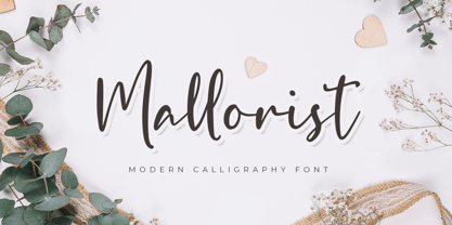 Mallorist is a handwritten font with a modern calligraphy style. This font is great for your next creative project such as logos, printed quotes, invitations, cards, product packaging, headers, logotypes, letters, posters, apparel designs, labels, and etc. Mallorist comes with uppercase, lowercase, numerals, punctuation & multilingual support characters.
 - Adelines by Gassstype,
$28.00 New font Adelinesis a handwritten brush that is 2 Style and written casually and quickly. Letters are made with brushes on Procreate. That is why Adelines has charming, authentic and relaxed characteristic more natural look to your text with a more natural look to your text.
 - Destrod by Tanya Savchenko,
$11.00 Destrod is a modern techno sans serif font. Its futuristic and minimalist style makes it incredibly suitable for all your projects that need a sci-fi touch. Uppercase letters with alternate characters in lower case. Included: Latin base and extended. Cyrillic base and extended. Multilingual support.
 - Artist Colony JNL by Jeff Levine,
$29.00Artist Colony JNL is the third type design inspired by some online examples from an early 20th Century French book of decorative hand lettering. While Arte Critique JNL and French Art Initials JNL embrace the Art Noveau style, Artist Colony JNL leans more toward the emerging Art Deco Movement of the late 1920s and early 1930s. - Movie Producer JNL by Jeff Levine,
$29.00 The Nov. 13, 1915 and Nov. 27, 1915 issues of Moving Picture World carried ads for Jesse L. Lasky Productions in which the titles of the upcoming films were hand lettered in an elegant Art Nouveau spurred serif style. This stylish alphabet is now available digitally as Movie Producer JNL in both regular and oblique versions.
 - P22 Hiromina 03 by IHOF,
$24.95 Hiromina03 is named after the wife of its designer, Hajime Kawakami. The three fonts in the set are based on Hiromi Kawakami's unique hand-lettering style. The distinctly feminine character of Hiromina03 is harmoniously integrated in all three writing systems, Katakana, Hiragana and Latin. The enclosed key charts give instructions for character placement in Katakana and Hiragana.
 - TT Milks by TypeType,
$29.00 TT Milks useful links: Specimen | Graphic presentation | Customization options About TT Milks: The collection of scripts and wonderful decorative typefaces. Initially the idea for TT Milks was to create a collection of fonts to be used for packaging and branding of dairy products. While working on the initial idea, we've tested all possible glyph variations, which resulted in a large decorative designer font family. Thanks to a variety of elements, TT Milks collection has exceeded its initial idea and now offers an unlimited application range. TT Milks type collection includes several subfamilies and consists of 26 typefaces: TT Milks Script subfamily is a satellite to the basic typefaces and features 5 weights. Every typeface of the TT Milks Script subfamily consists of 801 glyphs and supports a lot of OT features: ordn, frac, case, sups, sinf, numr, dnom, tnum, onum, pnum, liga, calt. TT Milks Casual Script consists of two script faces with a different degree of roughness. In TT Milks Casual we've collected 6 typefaces—the unique Black called 900 in three degrees of roughness, and the Bold called 700 featuring three degrees of roughness as well. TT Milks Casual Shadow is a version with broader letter setting and shadow effects. There's a clean shadowed version, three variants of rough typefaces with shadows, and a rough shadowed inline typeface—5 typefaces in total. TT Milks Casual Pie is a special set of typefaces which can be easily combined with each other using different layers. The set of the subfamily includes two basic typefaces—black and inline, and also features a typeface with a clean shadow, a shadowed inline typeface and line typeface. TT Milks Outline completes the collection. It consists of a total of 3 amusing super-display typefaces—outline, outline shadow, and a cow pelt patterned typeface. All typefaces belonging to TT Milks Casual and TT Milks Outline subfamilies contain uppercase letters only, and support tabular numbers and case sensitivity. TT Milks language support: Acehnese, Afar, Albanian, Alsatian, Aragonese, Arumanian, Asu, Aymara, Banjar, Basque, Belarusian (cyr), Bemba, Bena, Betawi, Bislama, Boholano, Bosnian (cyr), Bosnian (lat), Breton, Bulgarian (cyr), Cebuano, Chamorro, Chiga, Colognian, Cornish, Corsican, Cree, Croatian, Czech, Danish, Embu, English, Erzya, Estonian, Faroese, Fijian, Filipino, Finnish, French, Friulian, Gaelic, Gagauz (lat), Galician, German, Gusii, Haitian Creole, Hawaiian, Hiri Motu, Hungarian, Icelandic, Ilocano, Indonesian, Innu-aimun, Interlingua, Irish, Italian, Javanese, Judaeo-Spanish, Judaeo-Spanish, Kalenjin, Karachay-Balkar (lat), Karaim (lat), Karakalpak (lat), Kashubian, Khasi, Khvarshi, Kinyarwanda, Kirundi, Kongo, Kumyk, Kurdish (lat), Ladin, Latvian, Laz, Leonese, Lithuanian, Luganda, Luo, Luxembourgish, Luyia, Macedonian, Machame, Makhuwa-Meetto, Makonde, Malay, Manx, Maori, Mauritian Creole, Minangkabau, Moldavian (lat), Montenegrin (lat), Mordvin-moksha, Morisyen, Nahuatl, Nauruan, Ndebele, Nias, Nogai, Norwegian, Nyankole, Occitan, Oromo, Palauan, Polish, Portuguese, Quechua, Rheto-Romance, Rohingya, Romanian, Romansh, Rombo, Rundi, Russian, Rusyn, Rwa, Salar, Samburu, Samoan, Sango, Sangu, Scots, Sena, Serbian (cyr), Serbian (lat), Seychellois Creole, Shambala, Shona, Slovak, Slovenian, Soga, Somali, Sorbian, Sotho, Spanish, Sundanese, Swahili, Swazi, Swedish, Swiss German, Swiss German, Tagalog, Tahitian, Taita, Tatar, Tetum, Tok Pisin, Tongan, Tsonga, Tswana, Turkish, Turkmen (lat), Ukrainian, Uyghur, Vepsian, Volapük, Võro, Vunjo, Xhosa, Zaza, Zulu.
 - Baldwin by Pen Culture,
$15.00 Introducing Baldwin, a modern retro serif font that seamlessly blends contemporary design with vintage flair. With its clean lines and classic letterforms, Baldwin exudes a timeless elegance that is perfect for a wide range of design projects. Whether you're creating branding materials, editorial layouts, or web designs, this versatile font will add a touch of sophistication to your work. Featuring a distinctive, slightly geometric serif style, Baldwin offers a fresh take on traditional serifs. Its balanced proportions and subtle detailing create a harmonious look that is both refined and approachable. Available in a variety of weights and styles, this font is designed to adapt to any design setting, from headlines to body copy. I really hope you enjoy it – please do let me know what you think, comments & likes are always hugely welcomed and appreciated. More importantly, please don’t hesitate to drop me a message if you have any issues or queries. Thank you
 - HMS Gilbert by Fenotype,
$35.00 HMS Gilbert is a hand drawn collection of fonts designed to play perfectly together. HMS Gilbert contains seven different fonts, five of which also have texturised versions of them. In addition to fonts there is also Catchwords and Ornaments -sets of nice extras that help you to complete your designs with a coherent look. Most of the fonts are equipped with OpenType features such as Swash, Stylistic Alternates and Automatic Ligatures to help you to achieve more custom and “hand made” look.
 - Sleepy Bear by Missy Meyer,
$12.00 I've been learning to read Cyrillic and Greek letters lately, mainly because I've been playing the game GeoGuessr. (If you haven't played it, I highly recommend! It plops you down somewhere in the world in Google Street View, and you have to figure out where you are.) Cyrillic shows up in so many more places than Russia! You can see it in Bulgaria, Mongolia, Serbia, Montenegro, Kyrgyzstan, and more. Because of that, I made sure to include a fun double-uppercase version of those alphabet sets in Sleepy Bear. They're styled the same way as the Latin characters: all uppercase height, with some lowercase-styled letters thrown in at that same height for a fun look for all ages. I've also made two weights of Sleepy Bear: a plump and smooth regular weight, and a lighter weight that's built to stack on top of the regular (though you can use it on its own). Just type out a word in Sleepy Bear, copy it, and then change the copy to Sleepy Bear Light. You'll get a great outline look in seconds! All characters are extensively cleaned up, with smooth curves and rounded ends. Sleepy Bear is great for all print projects, and also cuts out of all materials like a dream. It's a cute and quirky monoline font family that's great for all of your family's designs. Each font contains over 850 glyphs, and includes: - Latin and extended Latin characters to support over 100 languages; - Cyrillic and Greek double-uppercase alphabet sets; - 18 fractions; - Punctuation galore; - 38 double-letter ligatures for variety (including international pairs like KK and II); - And a half-dozen alternates for even more variety!
 - Chellora by Picatype,
$15.00 I am very happy to finally release Chellora Typeface. Chellora is a bevelled, layered font which gives simple effects to letters. The effect allows it to be plated, giving it a smoother and smoother appearance. Chellora comes with 3 different styles: Regular, Shadow, Filled Outline, Chellora is a bold Sans that is perfect for Logos, Signage, Apparel, Headlines, Etc. This typeface is a great addition to any collection because it saves time with post-production effects, this allows you to easily measure effects. To enable the OpenType Stylistic alternates, you need a program that supports OpenType features such as Adobe Illustrator CS, Adobe Indesign & CorelDraw X6-X7, Microsoft Word 2010 or later versions. How to access all alternative characters, using Windows Character Map with Photoshop: https://www.youtube.com/watch?v=Go9vacoYmBw How to access all alternative characters using Adobe Illustrator: https://www.youtube.com/watch?v=XzwjMkbB-wQ Chellora Typeface is coded with PUA Unicode, which allows full access to all the extra characters without having special designing software. Mac users can use Font Book , and Windows users can use Character Map to view and copy any of the extra characters to paste into your favorite text editor/app. Thanks so much for looking and please let me know if you have any questions.
 - Whitechapel BB by Blambot,
$20.00During the investigation of the infamous murders in Whitechapel, police received several letters allegedly from Jack the Ripper. Of the hundreds received, the so-called, “Dear Boss” letter actually included some details of a crime that had yet to be committed. Soon after, the information in this letter would be corroborated at a crime scene. This font was inspired by the handwriting in that letter. It includes dozens of European characters…and just might be the writing of Jack himself! - Morris by HiH,
$10.00 Morris is a four-font family produced by HiH Retrofonts and based on the work of the very English William Morris. William Morris wanted a gothic type drawn from the 14th century blackletter tradition that he admired both stylistically and philosophically. He drew from several sources. His principal inspiration for his lower case was the 1462 Bible by Peter Schoeffer of Mainz; particularly notable for the first appearance of the ‘ear’ on the g. The upper case was Morris’s amalgam of the Italian cursive closed caps popular throughout the 12th through 15th centuries, a modern example of which is Goudy’s Lombardic Capitals. The gothic that Morris designed was first used by his Kelmscott Press for the publication of the Historyes Of Troye in 1892. It was called “Troy Type” and was cut at 18 points by Edward Prince. It was also used for The Tale of Beowulf. The typeface was re-cut in at 12 points and called “Chaucer Type” for use in The Order of Chivalry and The Works of Geoffrey Chaucer. Morris' objective is designing his gothic was not only to preserve the color and presence of his sources, but to create letters that were more readable to the English eye. ATF copied Troy and called it Satanick. Not only was the ATF version popular in the United States; but, interestingly, sold very well in Germany. There was great interest in that country in finding a middle ground between blackletter and roman styles -- one that was comfortable for a wider readership. The Morris design was considered one of the more successful solutions. Our interpretation, which we call Morris Gothic, substantially follows the Petzendorfer model used by other versions we have seen, with the following exceptions: 1) a larger fillet radius on the upper arm of the H, 2) a more typically broadpen stroke in place of the foxtail on the Q, which I do not like, 3) inclusion of the aforementioned ear on the g and 4) a slightly shorter descender on the y. We have included five ornaments, at positions 0135, 0137, 0167, 0172 and 0177. The German ligatures ‘ch’ & ‘ck’ can be accessed using the left and right brace keys (0123 & 0125). Morris Initials One and Morris Initials Two are two of several different styles of decorative initial letters that Morris designed for use with his type. He drew from a variety of 15th century sources, among which were Peter Schoeffer’s 1462 Mainz Bible and the lily-of-the-valley alphabet by Gunther Zainer of Augsburg. Each of the two initial fonts is paired with the Morris Gothic lower case. Morris Ornaments is a collection of both text ornaments and forms from the surrounding page-border decorations.
 - P22 Dwiggins by IHOF,
$24.95 Dwiggins Uncial is based on calligraphy by William Addison Dwiggins that he created for a self-penned short story, which appeared as an insert in the book-arts publication The Dolphin in 1935. This self-described “experimental uncial” lettering features rather unusual treatments of letterforms which combine manuscript calligraphy with modern idiosyncrasies. Dwiggins Extras is a set of decorative extras features 62 stencil and woodblock motifs adapted from abstract and representational Dwiggins designs. Although Dwiggins illustrated a number of books using conventional media, he is best known for his method of illustration that uses a series of hand-cut celluloid stencils or what he called “machine ornaments.” With these stencils Dwiggins (and other designers who use his ornaments) build-up repeated motifs and patterns into abstract designs and/or representational images which have a look that is uniquely Dwiggins’ own. Unlike other illustrators, Dwiggins’ style has not been commonly imitated and therefore his style is as distinctive today as it was 70 years ago.
 - Austin Antique by HiH,
$10.00 “More is better” may have been the motto of Richard Austin of Austin and Son’s Imperial Letter-Foundry on Worship Street at Finsbury Square in London when he designed and cut his Antique typeface. The year it was created is uncertain, but it is known to have appeared in a specimen book produced in 1827. At first glance, the upper case letters of Austin Antique look very much like Figgins Antique. But, upon examination, one will note that the Austin face is much darker. In general, the letters designed and cut by Richard Austin have fatter strokes, larger serifs and smaller counters -- more metal and less daylight. The premise was that the darker the letter, the more attention an ad using the typeface would receive. In old pictures of London and Paris one may see walls crowded with posters and “bills” -- competing for the attention of the passerby. Morris and Updike aside, the early nineteenth century marked the beginning of a commercial as well as industrial revolution. Patterns of commerce were changing. With new methods of marketing came the need for new typefaces to support the new methods. Foundries found the display types were very profitable and competed most energetically and creatively for the trade. There was a lot of trial-and-error. Some ideas faded away. Others, like the Antiques or Egyptians, were refined and developed. From them came the Clarendons that were to prove both popular and long lasting -- because they worked. Their job was to sell goods, not please the aesthetic sensibilities of the critics. They did their job well. Austin Antique has a full Western European character set, plus the following ligatures: ct, st, fi, fl, ff, ffi and ffl. Tabular numbers. Surprisingly readable.
 - St Croce Pro by Storm Type Foundry,
$29.00 Our eye is able to join missing parts of worn letters back into undisturbed shapes. We tend to see things better than they really are. Thanks to this ability we ignore faults of those close to us as we can’t accept the fact that every once in a while we convene with an impaired entity. Typography is merely a man’s invention, hence imperfection and transience, albeit overlooked, are its key features. This typeface is based on worn-out letterings on tombstones in the St. Croce basilica in Florence. For hundreds of years, microscopic particles of marble are being taken away on the soles of visitors: the embossed figures become fossilised white clouds, fragments of inscriptions are nearing the limits of legibility. First missing are thin joins and serifs, then the main strokes finally slowly diminish into nothingness over time. Unlike an archaeologist, for whom even completely featureless stele is valuable, the typographer must capture the proper moment of wear, when the type is not too “new” but also not too much decimated. Such typeface is usable for catalogue jackets, invitations and posters. Calligraphy is a natural human trait. To write is to create characters of reasonable beauty and content, according to the nature of the writer. A natural characteristic of architecture is to create an aesthetic message very similar to the alphabet. A doric column, the gabled roof, the circle of the well plan: these are the basic shapes from which all text typeface is derived.
 - ITC Stepp by ITC,
$29.99When Hal Taylor saw the 1930 logo for the Stetson Shoe Company of Weymouth, Massachusetts, he didn't run out and buy a pair of loafers. Instead, he seized on this striking example of an Art Deco logotype as the basis for a new typeface design. “I was impressed with the delicate and sophisticated letter forms,” Taylor recalls, “particularly the enlarged cap S -- in any other case it would have seemed unbalanced, but in the context of this logo, it worked perfectly.” All the letters in the original all-caps Stetson Shoe logo were rendered with condensed proportions except the O, which was a perfect circle. While the prominent O added visual interest to the logo, Taylor knew that such a character would limit his typeface to display applications. For versatility's sake, he drew his O for ITC Stepp with the same proportions as the rest of the alphabet. Taylor also gave the logotype's inverted S a more traditional design, but kept the original as an alternate character in the OpenType font. Taylor's toughest challenge during the design process was creating a lowercase. “A good type design tells you what it wants to be,” he says, “and after a little while the Stepp caps began to tell me what the lowercase should look like.” Taylor's lowercase is slightly more conventional than the caps. The jaunty g" and almost upside-down "s" add subtle charm, while the capital letters provide the broader gestures of Stepp's personality. Together, they create a versatile and distinctive typeface design. One of Hal Taylor's first jobs was as a photo-lettering typographer in Philadelphia, setting headlines and creating custom lettering. This was followed by a stint doing finished lettering for John Langdon, whose ambigrams appear in Dan Brown's best-selling novel, Angels & Demons. Today, Taylor works as a graphic designer in the publishing industry, but he still finds time to create an occasional hand-lettered book jacket, and draw handsome typeface designs. ITC Stepp is available in four weights, ranging from Light to Ultra Bold. All four weights have companion italics, and the lightest three weights also offer a suite of small caps." - Daylosta by Authentype,
$20.00 Daylosta Authentic Handwritten Font created by AuthenType. This font features a classic and elegant style, perfect for: The concept of font design for the food, drink and cake industry leads to an energetic and creative youth market processing the taste and color of food. Features Standard glyphs uppercase and lowercase letters Numerals, a large range of punctuation and ligatures. Lowercase letters include ending swashes. Works on PC & Mac. Simple installations, accessible in the Adobe Illustrator, Adobe Photoshop, Adobe InDesign, even work on Microsoft Word. PUA Encoded Characters – Fully accessible without additional design software. Fonts include multilingual support for; ä ö ü Ä Ö Ü ß ¿ ¡ ________________________________________________________________________________________________________________________________________________ Image used : All photographs/pictures/logo/vector used in the preview are not included, they are intended for illustration purpose only. Thank you for your purchase! Hope you enjoy with our font! Designers: Ekayasa.
 - Nebora by Product Type,
$15.00 Nebora is a typeface that makes a big statement with clean, basic lines and an emphasis on negative space. This geometric style font is excellent for magazine headlines, product packaging, posters, and more, and is inspired by the magnificent beauty and fresh air of the Arctic. In lowercase, Nebora is charming and charismatic; in capital letters, she is sophisticated and authoritative. The humanist feel adds warmth, while hard lines and sharp edges flow into the smooth rounded curve of the letters. To develop a typography-focused design that really jumps out, try it in 16 weights, including obliques. of course, your various design projects will be perfect and extraordinary if you use this font because this font is equipped with a font family, both for titles and subtitles and sentence text, start using our fonts for your extraordinary projects.
 - Moreli Display by Jinan Studio,
$19.00 Moreli Display is a wonderful typeface designed to bring a spirit of psychedelia to your projects. With mixable uppercase and lowercase glyph, ligatures, alternates, and outlines version, offers unmatched versatility for psychedelic theme design projects, apparel, branding, promotional materials, stickers, quotes, and social media posts. Let your creativity flow and embark on a captivating and transformative visual journey. Features A set of uppercase and lowercase glyphs Number, symbol, and punctuation Multilingual Support Alternates, ligatures, and swashes Outline Version Type j_1 until j_20 to features swash, ligatures will automatically replace the standard letter pairs whenever available, when using any OpenType capable software.
 - JWX Memo by Janworx,
$15.00 Memo, designed by Janet Valdez of Janworx, is a digital version of her own personal penmanship, currently displayed in abundance on sticky notes all over her desk and monitor. Although its basis is in actual handwriting, it's perfectly legible, offering a casual alternative typeface for everyday correspondence or simple things, ranging from event flyers to children's birthday party invitations. Memo performs well at regularly used correspondence sizes, but at a larger size can also be manipulated in graphics software for interesting effects. The letters can be moved randomly from the baseline, overlapped, and then contoured with good results for a casual look.
 - Slurm by Nikola Klimova,
$15.00 Slurm is a hand-drawn fun font that is ideal for use in headlines, descriptions and logotypes used in product design and similar applications. In longer texts it works well as a complementary font for comics and illustrations. Various sizes and weights for individual characters are derived from the hand-drawn font. Each glyph is an original; no shapes are repeated. Ligatures have been created for double letters and the typeface includes diacritics for languages that use Latin letters. The typeface features two basic styles, Regular and Bold, which can be used separately just as well as combined. Each style also includes pictures that can be used for various occasions.
 - Farela by Asenbayu,
$14.00 The Farela font is a serif ligature font that has an attractive elegant appearance. You can use this font in vintage, classic, and retro designs. This font gives a beautiful, classy and luxurious feel to your designs. This font is perfect for projects such as logos, branding, fashion, magazines, labels, posters, album covers and many more. This font features Open Type Format, Kerning, Ligature Style, Alternative Style, Numeral, Symbol and Multilingual Supports. Note: To use the alternate and ligature features, please look in the Glyph Panel / Character Map in your software to be able to access all the glyphs in this font. The ligature style in this font is simply "Standard Ligature", meaning it appears automatically. To set your desired letter binding, you can block letters or add them from the glyph panel. Thank you!
 - Plinc Buffalo by House Industries,
$33.00 Just as its eponymous ancestors graced vast Western vistas, Buffalo fills broad horizontal typographic topography with distinctive dignity. Buffalo’s migration across a visual landscape that straddles two millennia saw it survive the threat of extinction similar to its mammalian ancestors and emerge with rotund relevance. Now fortified with modern character sets and digital flexibility, nothing espouses an artisanal post-western industrial craft renaissance quite like Buffalo. Legendary lettering artist and type designer Ed Benguiat created the original film version of Buffalo for Photo-Lettering Inc. Working under the direction of the current Photo-Lettering partners, Dutch type designer Donald Roos digitized and expanded Buffalo while expertly maintaining the organic nuances found in the original version. Like all good subversives, House Industries hides in plain sight while amplifying the look, feel and style of the world’s most interesting brands, products and people. Based in Delaware, visually influencing the world.
 - Mako by Deltatype,
$39.00 Inspired from block lettering to blockbuster, Mako creates a sense of Sci-Fi, Futuristic, Cyber, Gaming look and feel. Deltatype created a high-quality font that lets you express your imagination with your favorite digital assets. Mako is a large family with 36 fonts included italic and round corner. Mako is designed to use in every size of the artwork, supported more than 30 languages including Thai. With standard Latin-4 glyphs and digital cryptocurrency, multi-currency, old-style figure. With 800 glyphs in fonts, use at your own risk!
 - Cookery by Los Andes,
$29.00 Cookery is a contemporary, friendly and authentic hand-drawn brush pen typeface with irregular baseline. It is well-suited to display use for book covers, logotypes, packaging, restaurant menus, invitation cards and advertising, among other uses. Get the most out of Cookery's 613-character set by activating OpenType features including letters having the capability to automatically adjust between connected and disconnected forms, alternates, swashes, initial/terminal forms, old style figures, etc. All these alternatives provide a wide range of possibilities to give your compositions a natural, playful and unique look.
 - Malegis Serif by Skypia,
$15.00 MALEGIS SERIF is a chic + modern sans serif font. This font is perfect for branding, logos, social media, prints, stickers, shirts, svg files and more! Malegis serif is unique as it can be used for a variety of design styles. It fits in wonderfully for free-spirited, boho designs and also for more classy editorial looks! There are a lot of fun stylistic alternates available to use with this font. These letters are embedded into the font file and easily accessible in programs such as photoshop and illustrator. Thank you! Skypia
 - Wild Mango by KA Designs,
$12.00 Wild Mango is a chic + modern serif font. This font is perfect for branding, logos, social media, prints, stickers, shirts, svg files and more! Wild Mango is unique as it can be used for a variety of design styles. It fits in wonderfully for free-spirited, boho designs and also for more classy editorial looks! There are a lot of fun stylistic alternates available to use with this font. These letters are embedded into the font file and easily accessible in programs such as photoshop and illustrator. Thank you!
 - Meliana Script by Arterfak Project,
$13.00 Meliana is a joyful handwriting font, created with a freestyle hand-lettering and a bit bouncy letterform that gives cute and friendly looks. Inspired by children's style and natural handwriting, Meliana Script is suitable for logo, packaging, quote, apparel, cards, invitation, wedding, branding, poster, and more! Meliana is equipped with lots of alternates, there are ligatures, alternates, and stylistic set 01 - 06 that you can mix and match to get more variation of typographic design! You can combine the font with Meliana Extras, containing the swash and doodles.