10,000 search results
(0.062 seconds)
- MC Karbin by Maulana Creative,
$16.00 Karbin is an All Caps sans Display font with slant style. Round Heavy stroke, fun character with a bit of ligatures and alternates. To give you an extra creative work. Karbin font support multilingual more than 100+ language. This font is good for logo design, Social media, Movie Titles, Books Titles, a short text even a long text letter and good for your secondary text font with script or serif. Make a stunning work with Karbin font. Cheers, Maulana Creative
 - Another Christmas by Maulana Creative,
$12.00 Another Christmas is an annual Christmas font with slanted style clean mono-line stroke, fun character with a bit of ligatures. To give you an extra creative work. Another Christmas font support multilingual more than 100+ language. This font is good for logo design, Social media, Movie Titles, Books Titles, a short text even a long text letter and good for your secondary text font with sans or serif. Make a stunning work with Another Christmas font. Cheers, Maulana Creative
 - Ellisa Snowly by Maulana Creative,
$16.00 Ellisa Snowly is an slanted style script font. With high contrast stroke, fun character with a bit of ligatures and alternates. To give you an extra creative work. Ellisa Snowly font support multilingual more than 100+ language. This font is good for logo design, Social media, Movie Titles, Books Titles, a short text even a long text letter and good for your secondary text font with sans or serif. Make a stunning work with Ellisa Snowly font. Cheers, Maulana Creative
 - Ristella by Mans Greback,
$59.00 Ristella - a logotype script font. This high-quality typeface is created by Måns Grebäck. Its style is bold and has large, attention-grabbing uppercase letters. Ristella contains alternate and stylistic alternates, as well as multiple ligatures. With its hundreds of glyphs it also has support for a wide range of languages. How do you make a swash? Combine an ending and a tail to make a swash. Endings are found in the following symbols: [ ] { } Tails are found in the following symbols: < > § _ ¤ Example: Ristella}> With ligatures activated, write multiple tail symbols to make a longer swash. Example: Tailextender]¤¤¤
 - Ongunkan Wakanda Runic by Runic World Tamgacı,
$50.00 Wakandan is an alphabet designed by Hannah Beachler, and used in the 2018 film Black Panther. It is based on Nsibidi symbols. In the film it is used to transliterate English text in the credits and other on-screen text. Another script used in the film was developed by Oluwaseun Osewa and inspired by Nsibidi, a system of symbols used in southeastern Nigeria between about 400 and 1400 AD. In addition, the symbols of several different ancient languages were also used for the alphabet. Like Old North Arabia, Old Tifinagh. I did not draw for this font, except for a few letters. I transferred the sound values from the ancient writing languages fonts that I had made before to the Wakanda font, so I did not take much time, I finished it in 4-5 hours.
 - Essonnes by James Todd,
$40.00 Made up of sixteen individual weights and spread over three different optical sizes, Essonnes is designed to bring utility back to the Didot genre. It’s a common belief among designers that Didones don’t work for text. This wasn’t true in 1819 and it isn’t true today. Like its forbearers, Essonnes is a truly optical family—not just a study in adjusting contrast. The text and display weights have been designed from the ground up for their intended roles. This means that everything from the height of the uppercase & lowercase letters have been specifically tuned for their intended purpose. Like many typefaces, Essonnes started after falling in love with a piece of history. In this case, it was the eccentric forms of Pierre Didot’s Type and the evolution of the High contrast Didone throughout the 19th century. It was out of curiosity and love for these forms that led to the first draft of what would become Essonnes back in 2011. These unique situations—screens, modern printing methods, the previous 200 years of typographic innovation since the original design, my own life experiences—have led to a typeface that, while based on history, is not stuck in it.
 - RT Austin Plain by Estudio Calderon,
$19.00 Austin Plain is derived from the union between Melts Script and Deftone Stylus, the result is a friendly typeface that mixes old American styles with modern design concepts.
 - Paulette by Rosario Nocera,
$22.99 Paulette is a script typeface, the capital letters are completely unpublished, some of them have a smile-similar ornament (A,F,O,H,Q,B,C,P,G), whereas minuscule letters are inspired to Edwardian font script. The font is very versatile and is very suitable for typographic compositions with large letters and for medium and small ones. It includes a complete series of internationals letters, 342 glyphs and 6 new ligatures. Paulette is an elegant letter and it's available in two versions, regular and eroded.
 - Motoride by Epiclinez,
$17.00 Motoride is an authentic handcrafted lettering that transformed into a font. It was inspired by the world of custom motorcycles. It's vintage style is suitable for every design which needs a timeless typeface, such as logotype, apparel, branding, packaging, advertising, Instagram quotes and more! This font features a wealth of OpenType features including alternate glyphs, ligatures, and swashes. This font is multi-language and also PUA encoded which means you can access all of the alternate glyphs with ease. We hope you will enjoy the font, please feel free to comment if you have any thoughts or feedback.
 - Gangfield by Slex Studio,
$18.00 Based on lettering with a sharp pen, Gangfield features a rather solid character and a measured rhythm. This is named after my nephew who has an optimistic and disciplined style. Gangfield is available in upright variants, with regular, italic and bold weights. Gangfield's bright and cheerful energy shines through either in the form of short blocks of text, or enhanced on display sizes with over 1,100 wildcards and swashes that vary in size and complexity. Gangfield includes 134 alternates with various variations plus several variants of ligatures which make it ideal for special dates such as weddings and parties.
 - Laurels Samantha by Create Big Supply,
$15.00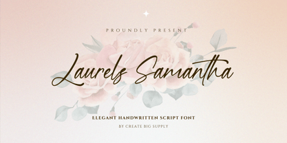 Discover the elegance of Laurel's Samantha, a captivating script handwriting signature font. With its beautiful style, Laurel's Samantha is perfect for adding a touch of sophistication to your projects. Whether you're designing wedding invitations, creating stunning logos, or crafting eye-catching social media posts, this font is sure to make a lasting impression. It features both uppercase and lowercase letters, numbers, and punctuations, providing versatility in your designs. The font is multilingual, enabling you to communicate your message globally. With PUA encoding, accessing ligatures and additional glyphs is effortless. Explore the full character set of Laurel's Samantha and elevate your creative endeavors.
 - Nimbusant Bresslo by DePlictis Types,
$31.00 Nimbussant Bresslo is a contemporary sans and attipic unicase were lowercase alternates with smallcaps creating an unusual look that can be used in posters, logo design and headings or small bold plain texts. This grotesque typeface supports most of the latin based languages and also kyrillic and greek alphabets. For a plus of a modern and young appeal, some of the letters have a very sharp, straight and minimalist body design but you may find also their stylistic alternates to better emulate the look you find more appropiate for your design.
 - Rendering JNL by Jeff Levine,
$29.00 Rendering JNL was inspired by European-style plastic stencils which emulate the block lettering with rounded ends used for years by architectural draftspersons.
 - Straight Fighter by Arterfak Project,
$16.00 Straight Fighter is a stencil font that exudes strength, masculinity, and bravery. Inspired by classic war posters, military style, and the punk scene. With the unique stencil cutting and letter shapes, this font features bold lettering that demands attention. It comes equipped with special characters and multilingual support, making it a versatile choice for a variety of design projects. Straight Fighter is particularly suitable for display, headlines, posters, editorials, patches, logotypes, branding, movies, flyers, and short quotes. If you want to convey a powerful message with your design, Straight Fighter is the perfect choice. Here’s what you’ll get : Uppercase Lowercase Numbers Symbols & punctuation Stylistic alternates Multilingual support. Thank you for your support!
 - Rigidica by Ryan Williamson,
$5.00 Rigidica is a strict geometric type family. Often basic geometry is lost in the stroke contrast of a letter. This type family is an attempt to retain this basic geometry even within the stoke contrast of a letter.
 - Indy Italic by ITC,
$29.00Indy is the work of Chicago-based lettering designer Charles Hughes. The lowercase letters link together to evoke the look of true handwriting and complement a generous and graceful capital alphabet. Indy is a refined handwriting script ideal for anything needing a touch of elegance. - Bohemia by Linotype,
$29.99Argentinean designer Eduardo Manso created the Bohemia type family in 2003. Bohemia's cunning and elegant essence shows off refined letters that evoke the Transitional style typefaces like Baskerville, though most Baskerville-like designs tend not to be as curvaceous as Manso's! True to form, Bohemia shines in smaller text sizes, like 9 point and above, while still maintaining a unique character and spirit. Bohemia is a great alternative to better-known text faces. The critics have been raving. Bohemia came to Linotype via its fourth International Type Design Contest (ITDC) [Link] in 2003, where it received one of the three top awards. Under the name Argot, this typeface received a Certificate of Excellence in Type Design from the Type Directors Club of New York in 2004. Bohemia was also selected for inclusion in the 21st International Biennale of Graphic Design 2004 in Brno, Czech Republic, and was later named one of the most relevant works in the Bienal Letras Latinas 2004 exhibition, which traveled through Buenos Aires, San Paolo, Santiago, and Vera Cruz." - Celebrate The Day Pro by CheapProFonts,
$10.00 The freeflowing and quite feminine style of this script appealed to me, but it needed a bit of taming. Quite a few of the letterforms have been normalized - to better accommodate the diacritics. :) All fonts from CheapProFonts have very extensive language support: They contain some unusual diacritic letters (some of which are contained in the Latin Extended-B Unicode block) supporting: Cornish, Filipino (Tagalog), Guarani, Luxembourgian, Malagasy, Romanian, Ulithian and Welsh. They also contain all glyphs in the Latin Extended-A Unicode block (which among others cover the Central European and Baltic areas) supporting: Afrikaans, Belarusian (Lacinka), Bosnian, Catalan, Chichewa, Croatian, Czech, Dutch, Esperanto, Greenlandic, Hungarian, Kashubian, Kurdish (Kurmanji), Latvian, Lithuanian, Maltese, Maori, Polish, Saami (Inari), Saami (North), Serbian (latin), Slovak(ian), Slovene, Sorbian (Lower), Sorbian (Upper), Turkish and Turkmen. And they of course contain all the usual "western" glyphs supporting: Albanian, Basque, Breton, Chamorro, Danish, Estonian, Faroese, Finnish, French, Frisian, Galican, German, Icelandic, Indonesian, Irish (Gaelic), Italian, Northern Sotho, Norwegian, Occitan, Portuguese, Rhaeto-Romance, Sami (Lule), Sami (South), Scots (Gaelic), Spanish, Swedish, Tswana, Walloon and Yapese.
 - HWT Aetna by Hamilton Wood Type Collection,
$24.95 HWT Aetna is a revival of the sturdy Roman style of wood type most often called simply Aetna. This new digital version by Aaron Bell features four widths all based on the various widths commonly offered by 19th Century wood type manufacturers. In addition, there is a four-layer all-caps version Aetna based on the the famous Wm. Page Chromatic Types, that allows the user the ability to easily create these chromatic streamer and shadow effects. Both the multiple width Aetnas and Streamer component fonts support full Western and Eastern European languages.
 - Devama SRF by Stella Roberts Fonts,
$25.00 Devama SRF was designed by Typodermic's Ray Larabie and provided for Stella Roberts Fonts. Available in Regular, Backlash and Forward, this typeface evokes a retro-80s look while still remaining clean and fresh. The net profits from my font sales help defer medical expenses for my siblings, who both suffer with Cystic Fibrosis and diabetes. Thank you.
 - Relaunch by Fype Co,
$16.00 Relaunch delivers a classy, smart and timeless look. To make it look like handwriting, we created 20 ligatures and 15 alternates, so you can mix and match it to make a better style on your design.
 - Organic Thinker by Bogstav,
$19.00 Monospaced fonts can be so dull...they are often only suitable for something like programming and other places where you need the text lined up perfectly. Well, that is not the case with Organic Thinker! Yes, it is monospaced, but it is also handmade and full of vibrant and organic life! Each letter has 5 slightly different versions, and they automatically changes as you type - makes you forget everything about programming, kerning and other dull things! :) Well...you are more than welcome to use Organic Thinker for your next Turbo Pascal text, actually I'd fancy that! :)
 - Thistle Balloons by Ditatype,
$29.00 Thistle Balloons is the right script font for natural, casual, personal displays because the letters are in forms of real cursive handwritings connected to each other to create togetherness and continuity nuances. This script font has low letter contrasts to show a more casual, friendlier display and a variety of letter heights. Some letters may look higher than the other ones to make them more interesting and dynamic, and such inconsistent letter sizes can enhance the natural, personal nuances to the font itself. Additionally, it is better to apply this font for big text sizes and you may also enjoy the outstanding features available here. Features: Ligatures Multilingual Supports PUA Encoded Numerals and Punctuations Thistle Balloons fits best for various design projects, such as brandings, quotes, invitations, name cards, greeting cards, printed products, merchandise, social media, etc. Find out more ways to use this font by taking a look at the font preview. Thanks for purchasing our fonts. Hopefully, you have a great time using our font. Feel free to contact us anytime for further information or when you have trouble with the font. Thanks a lot and happy designing.
 - Wahed by Khalid Jassim,
$27.00 I used Arabic letters to give the same sound of each letter in the English Alphabet (a, b,c,….)
 - Morl by Typesketchbook,
$55.00 Developed from condensed san serif families of the 90’s to 00’s, Morl brings together the distinctive features of the time but presented in a simpler design. Its potential is increased with Original, Sans, and Rounded options which offer varied moods. Suitable for publications, web and product designs, Morl can fit either headlines or body. It’s also effectively supported in various devices. The family comes in 10 weights, making it available to use for your required tasks in 60 styles.
 - PF DIN Display Pro by Parachute,
$79.00 While DIN Display seems to retain DIN’s basic characteristics, it shines with its sharper corners and contemporary look. Completed in 2002, it was first released and published in Parachute’s award-winning 2003 catalog and immediately was a hit. It has been used successfully in magazines, corporate applications and packaging in fields such as music, fashion, technology, visual arts. The ‘Pro’ series has been enhanced with more weights, multilingual support and opentype features in all different styles. Specifically, this superfamily supports simultaneously Latin, Greek and Cyrillic, while each one of its 15 weights contains 1197 glyphs and 20 opentype features. Additionally, every font in this superfamily has been completed with 270 copyright-free symbols, some of which have been proposed by several international organizations. This is a set of very useful daily symbols for packaging, branding and advertising. Symbols for public areas, environment, transportation, computers, fabric care and urban life.
 - Stingwire BT by Bitstream,
$50.99Bonislawsky pulls off a beauty in these letterforms rendered with barbed wire. In our view, it couldn't have been done better. Now you can contain the animal in you with style. - Grava by Positype,
$35.00 Grava is Neil Summerour’s injection of warmth within the geometric sans font category. Historically, geometric sans families have been based on primal shapes — triangle, circle, square — and the more closely they held to those rigid rules, the more internal inconsistencies they showed. Angles won’t match up correctly, letters will lean, overshoots complicate clean typesetting, and idealized circles become grotesque and unwieldy in some weights. Because of issues like these, geometric sans fonts have a reputation of being cold, austere, even a bit “off”. Grava was made to hold a T-square and triangle in one hand while giving a welcoming handshake with the other. The Grava font family comes in two styles (a normal and a Display), each with 20 weights (Thin to Ultra) and paired with italics. Its design allowed the three scripts of Latin, Cyrillic, and Greek to emerge seamlessly, ensuring Grava will find its home in multilingual publications. Even better, each character in the three scripts is spaced with every other character for a beautifully matched fit, and it’s a buy-one-get-all-three deal since they are all packaged together. The normal style’s large x-height won’t let you down in paragraphs, headings, and any call-out text. And have you seen the angles on those numerals? Pairing Grava’s numerals on a jersey is sure to catch some eyes, just sayin'. Grava Display is purposefully quirky and sharp, and made for poster sizes, book and album covers, and those websites with a well-defined character — somewhere between playfully self-aware and overtly vintage. Flat edges are abandoned to make way for sharp points and conspicuousness, for geometrical attitude and respectful expressiveness. Corporate reports use Grava Display to take on a professional and current look. The optional ligatures (N–T, L–L, G–A, C–O, almost anywhere an ‘A’ is placed, and more) in both the normal and Display styles invoke a midcentury modernist and high art feel. Now that introductions are done, you can let go of Grava’s hand and put it to work for you.
 - Kaobe by Zeenesia Studio,
$17.00 Introducing Kaobe Kaobe is a luxury display font with serif style. It's modern and classic font with a unique and deference look . Perfect if you need a dose of fun in your project. Perfect for editorial projects, Logo design, web font, clothing branding, product packaging, magazine headers, or simply as a stylish text overlay to any background image. We hope you enjoy the font, please feel free to comment if you have any thoughts or feedback. Thanks for purchasing and glad to help you!
 - Magical by Zeenesia Studio,
$17.00 Introducing Marginal Marginal is a elegant display font with serif style. It's modern and classic font with a unique and deference look . Perfect if you need a dose of fun in your project. Perfect for editorial projects, Logo design, web font, clothing branding, product packaging, magazine headers, or simply as a stylish text overlay to any background image. We hope you enjoy the font, please feel free to comment if you have any thoughts or feedback. Thanks for purchasing and glad to help you!
 - Belladio by Mans Greback,
$69.00 Belladio is a beautiful calligraphic script typeface. An urban brush font, the handwriting is designed to help you to design professional graphics in cool, flowing styles; elevating your brand to the next level. It can be imagined on a t-shirt design or as a signature logotype. With its multiple alternates and ligatures, Belladio is sure to give any project a custom and genuine style. Use underscore _ to make a swash. Example: Ama_zing Use multiple underscores for different swashes. Example: Won_______der (Download required.) The font is built with advanced OpenType functionality and has a guaranteed top-notch quality, containing stylistic and contextual alternates, ligatures and more features; all to give you full control and customizability. It has extensive lingual support, covering all Latin-based languages, from North Europe to South Africa, from America to South-East Asia. It contains all characters and symbols you'll ever need, including all punctuation and numbers.
 - Alisal by Monotype,
$29.99 Matthew Carter has been refining his design for Alisal for so long, he says, that when he was asked to complete the design for the Monotype Library, it was almost as if he were doing a historical revival of his own typeface. The illusion even extended to changes in his work process: although he now does all his preliminary and final drawing on screen, the first trial renderings of Alisal were done as pencil renderings. Alisal is best classified as an Italian old style design. Originally created between the late 15th and mid-16th centuries in northern Italy, the true Italian old styles were some of the first roman types. They tend to be the most calligraphic of serifed faces, with the axis of their curved strokes inclined to the left, as if drawn with a flat-tipped pen or brush. These designs offer sturdy, free-flowing and heavily bracketed serifs, short descenders, and a modest contrast in stroke weight. Alisal has nearly all the classic Italian old style character traits, plus a few quirks of its own. It is calligraphic in nature, with more of a pen-drawn quality than faces like Palatino or Goudy Old Style. It is more rough-hewn than either Goudy's Kennerley or Benton's Cloister, and is generally heavier in weight than most of the other Italian old style designs. One place where Alisal makes a clean break with traditional old style designs is in the serifs. While sturdy and clearly reflecting pen-drawn strokes, Alisal's serifs have no bracketing and appear to be straight strokes crossing the main vertical. Like Caslon or Trajanus, Alisal is a handsome design when viewed as a block of copy. Ascenders are tall and elegant, and serve as a counterpoint to the robust strength of the rest of the design. Alisal is available as a small family of roman and bold with a complementary italic for the basic roman weight, providing all that is needed for the majority of text typography. Alisal is not as well-known as some of Carter's other typefaces, but this lovely and long-incubated design was certainly worth the wait.
 - Footloose by BA Graphics,
$45.00 Footloose was a work in progress when its original designer, my friend and colleague Bob Alonso, passed away. Back then just 14 lowercase letters were designed so far. Several years have since gone by, but lately I took on the task of developing Bob’s design into a full-fledged font. The distinctive style of his supplied letterforms provided much inspiration. In blocks of short text there is a dynamic that communicates much verve and vigor, owing in part to gracefully curving lines and high contrast of stroke weight. I guess you could say that this project has been a sort of “passing on of the baton”; and I trust that Bob would have been pleased with the outcome.
 - SK Synonym Grotesk by Shriftovik,
$48.00 SK Synonym Grotesk is a geometric neo-grotesk typeface, which was developed under the influence of Swiss type design and adapt to modern realities. Its sturdy and simple structure is characterized by angular joints that accent details of the letters. The font design uses a strict geometric and stable construction it's combining with organic and lively forms, it creates an unusual attractive aesthetic of the character set. SK Synonym Grotesk consist of a variety of tools for various design needs, including OpenType alternatives and a wide range of styles from Thin to Black. This typeface is multilingual, supports more than 40 languages including Extended Latin and Cyrillic sets and contains more than 450 characters.
 - Banuk by Grontype,
$16.00 Banuk is a brand new techno font designed with slanted line accent, the fonts is rounded edges and little imminent space between fonts. This font is a regular bold font and all caps with different style between uppercase and lowercase. Banuk is perfectly used font in any project such as logo font, flyer header, name card, invitational header, movie poster, poster, website header and much more. Features: Uppercase and lowercase Numeral and punctuation More Alternates and Ligatures Multilingual Support What inside Main Files Banuk .ttf Banuk .otf webfont Thankyou for choosing this font, i hope you enjoy it. Regard, Grontype
 - Helvegen by Ironbird Creative,
$15.00 Helvegen is a Super Sans Serif designed with carefully crafted. Comes with 6 Styles, Regular, Inky, Rough, Rounded, Outline and Stamp. Helvegen is a simple yet refined All-Caps sans serif. Also suitable for Branding, T-shirt, Vintage Design, Logotype, and any project. This font also support multilingual, number and symbol, alternates, and already PUA Encoded. What's inculded? Helvegen Regular Helvegen Inky Helvegen Outline Helvegen Rounded Helvegen Rough Helvegen Stamp Multilingual Support support many different languages. Included AÀÁÂÃÄÅCÇDÐEÈÉÊËIÌÍÎÏNÑOØÒÓÔÕÖUÙÜÚÛWYÝiŸỲŸÆŒßÞþ We hope you enjoy the font, please feel free to comment if you have any thoughts or feedback.
 - Kontext Dot by Elster Fonts,
$20.00 Imagine a font that is easier to read the smaller it is – or the further away the text is. There are already many rasterised fonts, I wanted to take it to the extreme and use as few dots as possible. The result is a typeface that lives up to its name. Each individual circle makes no sense on its own; individual letters are only recognisable in the context of all associated circles, individual letters are most likely to be recognised in the context of whole words. Attached to a building wall, text would be readable from a great distance and become increasingly difficult to decipher the closer you get to the building. Placed on the ground or on a large flat roof, text would only be readable from a higher building, an aeroplane or - depending on the size - in Google Earth. Kontext has old style figures, superscript numerals, case-sensitive questiondown and exclamdown and an alternative ampersand, 390 glyphs at all. Use the same value for font size and line spacing to keep the lines in the grid, or change the line spacing in 10% steps. Change the spacing in 100-unit increments to keep the grid. The numbers in the family- and style-names refer to the (ca.) grey value of the respective background and the font itself. Kontext Dot 00-33 has e.g. a white background (0%) and 33% grey value. Kontext Dot 66-33 has a 66% background and 33% grey value. »Positive« styles (first number smaller than the second number) have kerning, »negative« styles (first number bigger than the second number) can have none.
 - Richie by Monotype,
$29.99 The Richie™ typeface grew out of a lettering experiment inspired by the work of Czech type designer Oldrich Menhart (1897-1962). Menhart’s typefaces were primarily text designs with a strong personal calligraphic influence. Monotype Studio designer, Jim Ford, wondered what a display typeface from Menhart might look like, and began drawing bold script characters with a broad-tipped chisel marker. “It was a familiar but laborious exercise,” explains Ford, “I tried to achieve an authentic – yet controlled – randomness that would serve as the foundation of a typeface.” Ford first drew a large suite of characters using the marker. All the drawings were then carefully adjusted, and scanned. Ford then pieced together a typeface from the best versions of letters, and refined those further. The result is a rugged, somewhat eccentric and playful script built on an obvious hand-drawn foundation. In a world of smooth scripts, the Richie design is heavy, chunky and rough. Its hand-made feel and vigorous rhythm put the power of raw brush lettering into the typographer’s hands. OpenType® fonts of Richie include standard, contextual and discretionary ligatures, in addition to contextual and stylistic alternates, old style, lining and superior figures, plus a large complement of swash characters. The name “Richie”? It grew out of Ford’s original premise for the design. “I wondered what it might it look like if ‘Old Richie’ had designed a heavy display face or script.”
 - Lady Marmalade by DimitriAna,
$16.00 Lady Marmalade is a hand drawn script font, with a sketchy style, that makes it perfect for lettering prints. It is combined with an Extra font that contains 62 decorative elements with ornaments, drawings, catchwords and ampersands. All you have to do is type any uppercase or lowercase letter or number, to find the element you like. The font contains standard and discretionary ligatures and supports Central, Eastern, Western European, Baltic, Turkish and Greek languages.
 - Hangout by PizzaDude.dk,
$20.00 Hangout has got a big mouthful of ligatures - including substitution for double letters and numbers - and on top of that, almost 200 substitutions for the most common letter combinations - almost 250 ligatures in total. Furthermore, Hangout also includes alternate version of lowercase letters! Take that and chew!!!