10,000 search results (0.029 seconds)
  1. Roycroft Initials - Unknown license
  2. Oblata Kurrenta - Unknown license
  3. TrajanusBricks - Unknown license
  4. Lombardic - Unknown license
  5. Truesdell by Monotype, $29.99
    Frederic Goudy drew Truesdell in 1930 and first used it for an article in a quarterly journal for book collectors. Since it was a small family and not promoted, Goudy received few orders for fonts. The original drawings and matrices for the face were lost in the fire that destroyed Goudy's studio in 1939.The only known examples of Truesdell fonts reside in the extensive collection of typographic material at the Rochester Institute of Technology School of Printing. It was proofs from these fonts that served as the basis for Monotype's digital revival of the family. Monotype Truesdell was released in March of 1994, just slightly over fifty-five years after fire destroyed Goudy's original work. Truesdell font field guide including best practices, font pairings and alternatives.
  6. Slantalic - Unknown license
  7. u26fog - Unknown license
  8. u27fog - Unknown license
  9. Discharge Pro by The Type Fetish, $25.00
    Discharge is a bold, heavy, distressed and destroyed sans serif typeface. It was started alongside Universally Corrupt and Insurgent, but it took a couple extra years to finish. It was expanded to include extended Latin, extended Cyrillic and Greek alphabets, so it will work with most languages in Europe and the Americas.
  10. Rail Line JNL by Jeff Levine, $29.00
    Rail Line JNL is a font for the railroad enthusiast for making their own model train car emblems. The logos contained in this font are or may be the property of the various rail companies, their assigns and/or successors. Outside of non-profit hobby use or for historical/educational purpose under the Fair Use rules, any commercial application of these logos must be obtained by written permission by the respective logo owner or owners. Jeff Levine fonts provided Rail Line JNL strictly as a hobby font. We assume no liability for the use, misuse or misrepresentation of any of the logos contained within the font file.
  11. ITC Tiepolo by ITC, $29.99
    ITC Tiepolo font is from the design team at AlphaOmega Typography and named after Italian artist Dominic Tiepolo. The designers describe it as a sans serif with serifs" and it has also been referred to as a calligraphic design. Similar to Asian calligraphy, ITC Tiepolo font has personality yet does not detract from the text."
  12. Fortuita by Typographias, $28.00
    Fortuita is a versatile sans fit for text or display. The name carries some of its history as it was born from logo sketches that fortuitously grew into a type family over eight years. It comes with a tall x-height, rendering it readable at smaller sizes. It has sixteen weights, eight regular ones, and their italics, each with small caps, something you may not see very often with sans serifs. It counts with old-style numbers that can switch to its lining, small caps, or tabular versions through open-type features. The family carries a distinct personality in its design that will lend itself to its subject, all the while without becoming distracting or detracting from it.
  13. Ventoux by Wiescher Design, $39.50
    The highest and windiest mountain of Provençe is the Mont Ventoux. That is where I saw a pretty windy signpost in a very windy typeface that inspired me to design Ventoux. I recently added a Small-Caps style to it and overhauled the font a little bit without destroying its shaky appearance. Your not so windy Gert Wiescher
  14. Lamenta by Dawnland, $13.00
    All that remains from this once so proud and glorious antiqua are steel skeletons. Destroyed. Distorted. Ruins. The main focus and usage of LamentaX are headlines, posters for event graphics and music/media/game packaging. Lamenta X was revised 2012 and now hold a full character set of basic english/latin letters and west european diacritics!
  15. Graveyard Smash by Comicraft, $19.00
    Tombstones tumble as the night shift begins; as bloodsucking bats turn into pale predators and the undead reach through the dirt that covers their coffins to crush and destroy those who dare cross the cemetery path... Finally there emerges a cold cast of creepy characters, a macabre cadre of lurid letters we had to call… GRAVEYARD SMASH.
  16. KING ARTHUR - Personal use only
  17. Caslon Initials - Unknown license
  18. AnglicanText - Personal use only
  19. 1543HumaneJenson - Personal use only
  20. Handwriting1800 - 100% free
  21. Lohengrin - Personal use only
  22. Runic AltNo - Unknown license
  23. Renaiss-Italic - 100% free
  24. 1610_Cancellaresca_lim - Unknown license
  25. Bollatica by Monotype, $29.99
    Bollatica from Philip Bouwsma is a nice interpretation of the scrittura bollatica. It has a floreal historical lettering and can be used for historical documents.
  26. Ancient History by Kaer, $20.00
    Hey guys! I'm happy to introduce you my new Ancient history based font. Recently I made an adventure to the North and visited a rock art attraction. This font based on pictograms I saw. The font may be used for creating ancient prints, logo design, clothing embroidery, product packaging, historical header, etc. What you will get: * Uppercase and lowercase * Multilingual support * Numbers * Symbols * Punctuation
  27. Gravure by Intellecta Design, $14.90
    a historical human figure font
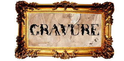
  28. Carta Marina by insigne, $21.99
    Carta Marina is based on the titling found on the famous map drawn by Olaus Magnus in 1539. The map of northern Europe took 12 years to complete, and the total size is a huge 1.7 meters tall by 1.25 meters wide. More information about the map, as well as the high resolution reference document used to create the typeface and illustration set can be found at the James Ford Bell Library, University of Minnesota. The titling is slightly aged, very sturdy and elegant. Carta Marina includes a full set of OpenType alternates for every character in the English alphabet, oldstyle figures, historical forms, small caps and 64 discretionary ligatures. These ligatures are used to alter the appearance of the type so that the printing appears realistic and without any duplicate letters to detract from the antique appearance. The Carta Marina family also includes some of the unique illustrations that gave the map its character. It includes depictions of fanciful sea creatures, land animals and some of the inhabitants of the lands pictured.
  29. chocolat_bleu - Personal use only
  30. EcuyerDAX - Unknown license
  31. Alhambra - Unknown license
  32. Plakat-Fraktur - Unknown license
  33. Florentine SwashCaps - Unknown license
  34. OrnamentalInitial - 100% free
  35. CloisterBlack BT - Unknown license
  36. RunishMK - 100% free
  37. Capitular Moldurada - Unknown license
Looking for more fonts? Check out our New, Sans, Script, Handwriting fonts or Categories
abstract fontscontact usprivacy policyweb font generator
Processing