10,000 search results
(0.102 seconds)
- Gingerbread Initials - Unknown license

- SF Chrome Fenders Condensed - Unknown license

- SF Pale Bottom Extended - Unknown license

- SF Buttacup - Unknown license

- SF Shai Fontai Distressed - Unknown license

- SF Minced Meat Shaded - Unknown license

- OldeChicago - Unknown license

- Bumpy Road - Unknown license

- SF Archery Black SC Outline - Unknown license

- SF Shai Fontai Extended - Unknown license

- SF Intoxicated Blues - Unknown license

- BPbigHead - Unknown license

- SF Square Root - Unknown license

- Roman Nouveau JNL by Jeff Levine,
$29.00 In the 1904 book “Letters & Lettering” by Frank C. Brown is a page of Roman style upper case letters entitled “Modern American Capitals – after Will Brady”. The slab serif, Art-Nouveau-influenced alphabet inspired a digital version. Roman Nouveau JNL, is available in both regular and oblique versions.
 - Burin by Monotype,
$29.99The Burin family of typefaces consists of Roman and Sans variations. Burin Roman has very distinct lowercase characters b, c, d, g and y with a quirky use of tapered strokes and hairlines. Burin Sans is a light display face with an extended tail on the lowercase y. - Burin Sans by Monotype,
$29.99The Burin family of typefaces consists of Roman and Sans variations. Burin Roman has very distinct lowercase characters b, c, d, g and y with a quirky use of tapered strokes and hairlines. Burin Sans is a light display face with an extended tail on the lowercase y. - Econs by Tour De Force,
$20.00 Dangereous can on E, sharp grass on C, strong tree on O, drop of water on N and hand shovel on S = ECONS, set of 52 ecological symbols made after spending one day fishing on the river in my municipality and seeing so miscellaneous garbages in the water.
 - Matahari Sans by Studio Sun,
$36.00 Matahari (English : Sun) is the power source of life. The symbol of power and energy that synergies with other part of daily lives. It is one of the most fundamental thing us humans need, just like communication. And like Matahari itself, words are powerful enough to make a living. Referring to Grotesque Font and influenced by the works of Eric Gill, Matahari Typeface is available in 3 widths and 7 weights, also in Oblique version in each font. The font uses oldstyle and transitional letters (double-story ‘a’ and ‘g’). It has a humanist gesture, the thickness of the font is semi-monolinear where the horizontal and vertical size is almost equal, making the font reach its maximum optical readability even in small sizes. The font anatomy refers to the basic geometric square-sized of the letter ‘M’, while the letters of S/C/G/c/e have uneven curve shape which give the sense of humanist and flexibility. This typeface is ideal for various design needs, from Printing to On-Screen/Digital Reading, from Brand Identity, Posters, Caption, Headline, to Body Text. With the numbers of widths available, the font can be used for all kinds of purposes (Label, Signage, Packaging, Website, etc). Supported well over 75+ languages, including Greek & Cyrillic, Matahari Typeface will give you an excellent way in aesthetic communication and message-delivering.
 - PGF Caprina Pro by PeGGO Fonts,
$24.00 "PGF Caprina Pro" is an audacious and rough geometric sans-serif font inspired by the wild and untamed personality of mountain goats (the word "caprina"‘ in Spanish is related to or resembling ‘goats’)—amazing animals which can skilfully climb up slopes and withstand very cold temperatures. Was originally developed under the Latinotype team supervision and is now upgraded to this Pro version that comes in 20 font styles, with 739 glyphs each, supports now more than 200 Latin-based languages and includes a wider OpenType features range like: Stylistic Alternates ‘set 01’ for b, d, g, p, q, i, j, t, y, &, I, G, M Stylistic Alternates ‘set 02’ for d, g, j 4 Stylistic Alternate from ‘set 01’ to ‘set 04’ for Enclosed Numbers (circles and squares) Stylistic Alternate ‘set 05’ for curved 3 and ‘Zero with dot inside’ Contextual alternates automatically turns ‘zero’ into a ‘slashed zero’ in alphanumeric contexts Contextual alternates automatically turns “Il” into a serif for improve its legibility Case Sensitive when "All Caps" is activated for ß, ¡, ¿, () [] {}, ‹› «», •(bullet), *(asterisk), -(hyphen) Standard Ligatures for fi, fj, fl Discretionary Ligatures for tt, tr, www, LL, TT Lining Numbers Old Style Numbers Tabular Lining Tabular Old Style Numbers Slashed zero on every number figures Numerators and Denominators from 0 to 9 for any Fraction expression Superiors and Inferiors from 0 to 9 for any scientific notation Ordinal forms for ‘a’ and ‘o’ Localized language customization for German, Dutch, Polish, Catalan, Romanian, Moldavian, Turkish, etc. Every OpenType option is also accessible via Character Map allowing users and designers to choose an alternate design for a particular character. “PGF Caprina Pro” is well-suited for high-impact action publishing and advertising as well related with adrenalynic and extreme sport design stuff.
 - ATF Garamond by ATF Collection,
$59.00 The Garamond family tree has many branches. There are probably more different typefaces bearing the name Garamond than the name of any other type designer. Not only did the punchcutter Claude Garamond set a standard for elegance and excellence in type founding in 16th-century Paris, but a successor, Jean Jannon, some eighty years later, cut typefaces inspired by Garamond that later came to bear Garamond’s name. Revivals of both designs have been popular and various over the course of the last 100 years. When ATF Garamond was designed in 1917, it was one of the first revivals of a truly classic typeface. Based on Jannon’s types, which had been preserved in the French Imprimerie Nationale as the “caractères de l’Université,” ATF Garamond brought distinctive elegance and liveliness to text type for books and display type for advertising. It was both the inspiration and the model for many of the later “Garamond” revivals, notably Linotype’s very popular Garamond No. 3. ATF Garamond was released ca. 1918, first in Roman and Italic, drawn by Morris Fuller Benton, the head of the American Type Founders design department. In 1922, Thomas M. Cleland designed a set of swash italics and ornaments for the typeface. The Bold and Bold Italic were released in 1920 and 1923, respectively. The new digital ATF Garamond expands upon this legacy, while bringing back some of the robustness of metal type and letterpress printing that is sometimes lost in digital adaptations. The graceful, almost lacy form of some of the letters is complemented by a solid, sturdy outline that holds up in text even at small sizes. The 18 fonts comprise three optical sizes (Subhead, Text, Micro) and three weights, including a new Medium weight that did not exist in metal. ATF Garamond also includes unusual alternates and swash characters from the original metal typeface. The character of ATF Garamond is lively, reflecting the spirit of the French Renaissance as interpreted in the 1920s. Its Roman has more verve than later old-style faces like Caslon, and its Italic is outright sprightly, yet remarkably readable.
 - Morganhand by Morganismi,
$9.00 Morganhand is a very individual typeface based on the handwriting of Finnish outsider artist Heikki Morgan Hämäläinen. Its economical lines make it very serviceable for numerous uses like cards, notes, prints, comics and so on. Morganhand Outline is based on Morganhand Regular, a handwritten font imitating the writing of Finnish outsider artist Heikki Morgan Hämäläinen. Every drawn line of each glyph is outlined giving a fun expression. The two fonts can be used separately or mixed together. Mightly usable in cards, notes, prints, comics etc. Morganhand Outline supports many European languages. Morganhand supports many European languages. The font works fine with its sister Morganhand Outline which is kind of a modification of it.
 - Saya Satpol by Dumadi,
$20.00 Saya Satpol – Sketched Typeface made with a sketch-themed application that gives a relaxed and cool feel. Saya Satpol is perfect for design, logo, social media, branding, advertising, product design, handwritten quotes, product packaging, headers, posters, merchandise, and other designs. What’s Included : + Saya Satpol + Standard glyphs + All Caps + Multilingual Accent + Works on PC & Mac, Simple installations Accessible in Adobe Illustrator, Adobe Photoshop, Adobe InDesign, even work on Microsoft Word. PUA Encoded Characters – Fully accessible without additional design software. Fonts include multilingual support + Image used: All photographs/pictures/vectors used in the preview are not included, they are intended for illustration purposes only. Thanks
 - Ukasyah by Javatypestd,
$15.00 Ukasyah is a Modern Calligraphy font that will give a beautiful impression to your designs Ukasyah would perfect for photography, watermark, social media posts, quotes, logos & branding, invitation, product designs, label, stationery, wedding designs, product packaging, special events or anything that need handwriting taste. What’s Included : - Web Font - Standard glyphs - Ligature and Stylish Set - Works on PC & Mac - Simple installations - Accessible in Adobe Illustrator, Adobe Photoshop, Adobe InDesign, even work on Microsoft Word. - PUA Encoded Characters – Fully accessible without additional design software. - Fonts include multilingual support Thank you for your purchase! Hope you enjoy our font!
 - Child Happy by MC Creative,
$9.00 Child Happy is a delightful display font. It embodies playfulness and authenticity and is perfect for children themed designs, especially when combined with bright colors. perfect for branding projects, logo, wedding designs, social media posts, advertisements, product packaging, product designs, label, photography, watermark, invitation, stationery and any projects that need handwriting taste. What’s Included : Standard Glyphs Ligature Works on PC & Mac Simple installations Accessible in the Adobe Illustrator, Adobe Photoshop, Adobe InDesign, even work on Microsoft Word. PUA Encoded Characters – Fully accessible without additional design software. Fonts include multilingual support for; ä ö ü Ä Ö Ü ß ¿ ¡
 - Sattinda by MC Creative,
$10.00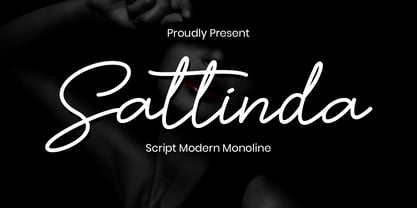 Sattinda is a thin and elegant handwritten font. It features a cute and joyful style that will take your designs to the next level! perfect for branding projects, logo, wedding designs, social media posts, advertisements, product packaging, product designs, label, photography, watermark, invitation, stationery and any projects that need handwriting taste. What’s Included : Standard Glyphs Ligature Works on PC & Mac Simple installations Accessible in the Adobe Illustrator, Adobe Photoshop, Adobe InDesign, even work on Microsoft Word. PUA Encoded Characters – Fully accessible without additional design software. Fonts include multilingual support for; ä ö ü Ä Ö Ü ß ¿ ¡
 - Strange Agent by Dumadi,
$35.00 Strange Agent – Casual Brush is a font that goes well with procreate a relaxed, fun and friendly atmosphere. Strange Agent perfect for designs, logos, social media, brands, content, advertisements, product designs, quotes, product packaging, headers, posters, merchandise, and other designs. What’s Included : + Standard glyphs + Ligature + Web Font + Multilingual Accent + Works on PC & Mac, Simple installations Accessible in Adobe Illustrator, Adobe Photoshop, Adobe InDesign, even work on Microsoft Word. PUA Encoded Characters – Fully accessible without additional design software. Fonts include multilingual support + Image used: All photographs/pictures/vectors used in the preview are not included, they are intended for illustration purposes only. Thanks
 - Herlianty by MJB Letters,
$15.00 Say hi to our newest product called ‘Herlianty‘ which is a natural handwritten font, with an original handwritten look, highlighting the uniqueness of each character and having several ligatures that will add an elegant impression to the design. This font is very perfect for wedding designs, wedding invitations, stationery, logotype, branding, display, fashion design, poster and more. Herlianty includes full set of uppercase and lowercase letters, numeral, punctuations and ligatures. Included in this set: Works on PC & Mac Simple installations Accessible in Adobe Illustrator, Adobe Photoshop, Adobe InDesign, even work on Microsoft Word. PUA Encoded Characters – Fully accessible without additional design software
 - Homeville by Dumadi,
$35.00 Homeville – Elegant Typeface is a font amazing this year. a font that will shake things up in the design world. Distinctive fonts and complemented by alternative styles will enhance your project. Homeville is perfect for design, logos, social media, branding, advertising, product design, handwritten quotes, product packaging, headers, posters, merchandise, and other designs. What’s Included : + Homeville + Standard glyphs + Style Alternate + SWSH + Ligature + Multilingual Accent + Works on PC & Mac, Simple installations Accessible in Adobe Illustrator, Adobe Photoshop, Adobe InDesign, even work on Microsoft Word. PUA Encoded Characters – Fully accessible without additional design software. Fonts include multilingual support + Image used: All photographs/pictures/vectors used in the preview are not included, they are intended for illustration purposes only. Thanks
 - Lovemy by Almarkha Type,
$35.00 Lovemy is a script font with a natural handwritten feel. It has lovely ligatures and alternates that are perfect for any creative design. This handmade font will make your design has a beautiful natural touch for each details. It is perfect for any design project as Invitation, logo, book cover, craft or any design purposes. This font is PUA encoded which means you can access all of the magical glyphs and swashes with ease! It also features a wealth of special features including alternate glyphs and ligatures. Simple installationsAccessible in the Adobe Illustrator, Adobe Photoshop, Adobe InDesign, even work on Microsoft Word. PUA Encoded Characters – Fully accessible without additional design software. Fonts include multilingual support Cheers! Thank You
 - Untrouble by Dumadi,
$20.00 Untrouble – Elegant Futuristic Font is a powerful font that is here to answer design problems. with the presence of this font will maximize the project to the point of perfection. Untrouble is perfect for design, esports, logos, social media, branding, advertising, product design, handwritten quotes, product packaging, headers, posters, merchandise, and other designs. What’s Included : + Standard glyphs + UPERCASE + Web Font + Multilingual Accent + Works on PC & Mac, Simple installations Accessible in Adobe Illustrator, Adobe Photoshop, Adobe InDesign, even work on Microsoft Word. PUA Encoded Characters – Fully accessible without additional design software. Fonts include multilingual support + Image used: All photographs/pictures/vectors used in the preview are not included, they are intended for illustration purposes only. Thanks
 - Magistech by Mokatype Studio,
$20.00 Magistech is a display font inspired by technology and future design. Designed with modern sensibility build based on slab serif with square letterform, consist in any character either uppercase or lowercase. This font is fit for any design like headline, video, or social media, particularly for future or modern nuances design. What's you get : Standard glyphs Ligatures (Opentype features) Web Font International Accent Works on PC & Mac Simple installations Accessible in Adobe Illustrator, Adobe Photoshop, Adobe InDesign, and even work on Microsoft Word. PUA Encoded Characters - Fully accessible without additional design software. Fonts include multilingual support Image used: All photographs/pictures/vectors used in the preview are not included, they are intended for illustration only. Thank You
 - SPIDER-MAN:ECLIPSE - Personal use only

- CrEAtoR cAmpoTYPe SmcP - Personal use only

- STOP SHARK FINNING - Personal use only

- Geogrotesque Stencil by Emtype Foundry,
$69.00 Geogrotesque Stencil is a member of the popular Geogrotesque family, and despite being thought as a display typeface, it goes one step further and tries to solve some of the typical problems with stencils fonts. Geogrotesque Stencil comes with 3 widths of cut (A, B and C). These cuts not only allow a better performance when printing at different sizes, you can also move across versions A, B or C in accordance to the rigidity of the material used. The family consists of 42 styles, 7 weights with 3 versions each plus italics, all of them in Open Type format including ligatures, tabular figures, fractions, numerators, denominators, superiors and inferiors with support for Central and Eastern European languages. For more details see the PDF.
 - Onick by Wordshape,
$- While researching the history of Onitsuka Tiger's branding and graphic design, I came across an odd, yet highly appealing piece of custom lettering on the company's ONICK ski boots from the 1970s. Reminiscent of aspects of the typeface Black-Out by Eli Carrico (released by my type foundry Wordshape), yet vertically compressed with razor-sliced counters and odd stencil element that makes up one of the legs of the "K", the ONICK lettering is a potential source for an intriguing modular font. I immediately thought of Ryoichi Tsunekawa as a potential collaborator to bring this piece of lettering to full-fledged life in the contemporary context. Based in Nagoya, Tsunekawa runs an independent type foundry called Dharma Type, including three specialized foundry sub-labels: Flat-It, devoted to display lettering; Prop-A-Ganda, a series of fonts inspired by and based on retro propaganda posters, movie posters, retail sign lettering & advertisements in the early 20th century; and Holiday Type, a series of decorative and retro scripts for holiday use. The past year has seen a flurry of notice of his work abroad, having been featured in both MyFonts' "Creative Characters" and YouWorkForThem's newsletter. As the work of most Japanese type designers is almost wholly unnoticed abroad, for Tsunekawa to be interviewed by two of the most popular type distribution companies in the world is definitely something beyond the norm. Perhaps it is because he works independently, or perhaps it is due to the charm and friendliness with which his typefaces are infused. Either way, this attention is both welcome and appreciated. Beyond mere charm, Tsunekawa's work is nuanced, detailed, and accessible due to its high level of finish. His fonts stand apart from his contemporaries in Latin typeface design in Japan due to his fascination with pop, vernacular and historical lettering from "non-pure" sources- whereas type designers like Kunihiko Okano and Akira Kobayashi have spent years analyzing the essence of Western letterform construction and unlocking the essence of Latin forms, Tsunekawa views surface and the awkward nature of his sources as being of value, as well. His irreverence for the formal doctrines of history imbue his typeface designs with a rugged inventiveness that would be missed by most- glyphs without source designs are guessed at and approximated, often in a manner wildly divergent from what Western eyes would assume. It is in these moments that I find sheer delight in Tsunekawa’s work and what make me most pleased to invite him aboard Neojaponisme and Onitsuka Tiger’s type development project. His assorted typefaces show an eclecticism in finish and as holistic systems- Tsunekawa's return email to me about the proposed type project showed a digital sketch of how a completed typeface family from the source lettering might look, rendered with an effortlessness and dedication to detail that belies a skilled craftsperson. Further development showed Tsunekawa’s rigor- the typeface in development rapidly featured glyphs ignored by many: a full set of fractions, Eastern European diacritics and accents, superior and inferior numerals, alternate characters, and custom ligatures - all designed with regulated, detailed spacing. ONICK is a typeface Tsunekawa should be proud of- an homage to a moment in history rendered in the absolute best fashion. We are proud to present it to the world! --Ian Lynam
 - Meler by Clevus,
$16.00 Proudly present Meler a modern ligature serif font with a touch of elegant. Meler a modern ligature serif font that draws inspiration from the iconic style of the era. Its regular and edgy lines make it the perfect choice for creating retro-inspired logos, fashion brand, magazine, clothes, lettering, quotes, and other design materials. With Meler, you can effortlessly infuse your work with a touch of nostalgia and capture the essence of the 90s in your designs. Font Features : Lettres, numbers, symbols, and punctuation 33 alternates and ligatures No special software required they may be used even in canva, any basic program /website apps that allows standard fonts That's it folks! Multilingual Support Language Support: Danish, English, Estonian, Filipino, Finnish, French, Friulian, Galician, German, Gusii, Indonesian, Irish, Italian, Luxembourgish, Norwegian Bokmål, Norwegian Nynorsk, Nyankole, Oromo, Portuguese, Romansh, Rombo, Spanish, Swedish, Swiss-German, Uzbek (Latin) Follow My Shop For Upcoming Updates Including Additional Glyphs And Language Support. And Please Message Me If You Want Your Language Included or If There Are Any Features or Glyph Requests, Feel Free to Send me A Message. Kindly check over on Instagram! https://www.instagram.com/clevustudio/ Have a Good Day !
 - Stratosphere SG by Spiece Graphics,
$39.00 Every element in this typeface shouts tall and narrow, slender and provocative. With wispy delicate serifs attached to elevator-style vertical stems, Stratosphere’s only goal seems to be getting to the top in style. And no matter how you describe it - ultra thin or ultra condensed - this typeface is best for short headlines and titles. Use only in large display sizes and use sparingly. Stratosphere Light is also available in the OpenType Std format. Some new characters have been added to this OpenType version. Advanced features currently work in Adobe Creative Suite InDesign, Creative Suite Illustrator, and Quark XPress 7. Check for OpenType advanced feature support in other applications as it gradually becomes available with upgrades.
 - OCR A Tribute by Linotype,
$57.99OCR-A was originally designed in 1968 as a machine-readable alphabet. Its functionality was its most important element, instead of its design. Over the following decades, the typeface has become popular in the design world nevertheless. But typographically pleasing results are often hard to come by, due to the original design’s “non-design design”, as well as its undeveloped character set. In 2006, Miriam Röttgers revised and extended OCR-A, creating OCR A Tribute. OCR A Tribute is a typeface family comprising of two versions: one in which the glyphs have been proportionally-spaced, and another that is monospaced. In the monospaced version, all glyphs have the same width, like the letters in the original OCR-A font do. Both versions of OCR A Tribute contain complete character sets and expert glyphs, as well as lining and old style figures. Now you can rest easy, and finally use this classic design for display purposes and headlines! - TT Norms Pro by TypeType,
$39.00 Introducing TT Norms® Pro, version 3.200! The updated font now supports more languages and boasts a larger character set. These implementations have made the typeface even more advanced and convenient. TT Norms® Pro is a functional geometric sans serif for aesthetic design choices and TypeType studio's bestseller. It has been a massive success since its release, and rightfully so! This stylish, elegant, and versatile font will become the full-fledged core of your collection. TT Norms® Pro is ideally suited for products in any domain: streaming services, banking, clothing brands, or the automotive industry. It's equally convenient to use in both web and printing. Now, the TT Norms® Pro typeface includes the most extensive font package, both in terms of font styles and character sets. The base version of TT Norms® Pro consists of 22 fully redesigned font styles and 4 additional subfamilies. Besides, this font boasts the most comprehensive language support in the TypeType collection. We've added the characters of extended Cyrillic and Latin writing systems to the updated TT Norms® Pro and configured the new languages support. The character set has become more extensive—we've added currency symbols with their minuscule version and minuscule mathematical symbols. The 3.200 version of TT Norms® Pro includes: 44 roman font styles, 44 italics, and 2 variable fonts; 7 roman and 7 italic font styles in TT Norms® Pro Mono; 2 variable fonts: TT Norms® Pro Variable with three parameters of variation (weight, width, and slant) and TT Norms® Pro Mono Variable with weight and slope axes of variation; 1993 characters in each font style, including an extended set of punctuation marks, symbols, and currencies; 5 widths: TT Norms® Pro with classic proportions, monospaced TT Norms® Pro Mono, narrower-proportioned TT Norms® Pro Compact and TT Norms® Pro Condensed, and wider TT Norms® Pro Expanded; 38 OpenType features, including a large number of ligatures, fractions, numerators, and denominators; 17 stylistic sets; - 280+ languages support, counting in new symbols for French, Norwegian, Bulgarian, Uzbek, Abkhaz, and more; Flawless kerning and manual TrueType hinting. TT Norms® Pro has already become the signature font of Intercom, Inc., Sartorius AG, CSN, CBSN, Shieldex, and many other global brands. Customization is available for TT Norms® Pro upon request—we adjust the font to suit your project. Learn more about customization options in the corresponding website section. In addition to the TT Norms® Pro, we've designed the TT Norms® Pro Serif typeface. These fonts complement each other perfectly, making an ideal typeface pair.


