10,000 search results
(0.111 seconds)
- Along Sans Grande by Brenners Template,
$19.00 Along Sans Grande is an ultra condensed sans serif font family developed based on the typeface styles of the Along Sans Geometric Font Family. In the case of the black weight with the largest change in the size of the stem, the size is 180:140:100, respectively. And, the thin weight style has the same proportion of stem size. Some Glyphs that need to support the stem alone remain a size 222 for Black Weight. These interpolation rules are sufficient to complement the rhythm and readability of the whole family. This family is perfect for special titling works, logo designs, and cool showcases.
 - Chattery Teeth - Unknown license

- Nexus Typewriter Pro by Martin Majoor,
$49.00 Nexus (2004) consists of three matching variants – a serif, a sans and a slab – which makes it a highly versatile typeface. Nexus started as an alternative to Seria, a typeface Majoor had designed some 5 years earlier. But soon the design developed into a new typeface, with numerous changes in proportions and in details and with a redrawn italic. Besides the three connected versions (Nexus Serif, Nexus Sans, Nexus Mix) Majoor designed a monospaced version called Nexus Typewriter. The Nexus family is a workhorse typeface system like Scala, with features such as small caps in all weights, four different sorts of numbers and an extensive set of ligatures. All fonts in the Nexus family come in regular, italic, bold and bold italic. Free bonus: there are more than 100 elegant Swash italics and dozens of arrows and other icons. The Nexus family was awarded the First Prize at the Creative Review Type Design Awards 2006.
 - Nexus Mix Pro by Martin Majoor,
$49.00 Nexus (2004) consists of three matching variants – a serif, a sans and a slab – which makes it a highly versatile typeface. Nexus started as an alternative to Seria, a typeface Majoor had designed some 5 years earlier. But soon the design developed into a new typeface, with numerous changes in proportions and in details and with a redrawn italic. Besides the three connected versions (Nexus Serif, Nexus Sans, Nexus Mix) Majoor designed a monospaced version called Nexus Typewriter. The Nexus family is a workhorse typeface system like Scala, with features such as small caps in all weights, four different sorts of numbers and an extensive set of ligatures. All fonts in the Nexus family come in regular, italic, bold and bold italic. Free bonus: there are more than 100 elegant Swash italics and dozens of arrows and other icons. The Nexus family was awarded the First Prize at the Creative Review Type Design Awards 2006.
 - Nexus Sans Pro by Martin Majoor,
$49.00 Nexus (2004) consists of three matching variants – a serif, a sans and a slab – which makes it a highly versatile typeface. Nexus started as an alternative to Seria, a typeface Majoor had designed some 5 years earlier. But soon the design developed into a new typeface, with numerous changes in proportions and in details and with a redrawn italic. Besides the three connected versions (Nexus Serif, Nexus Sans, Nexus Mix) Majoor designed a monospaced version called Nexus Typewriter. The Nexus family is a workhorse typeface system like Scala, with features such as small caps in all weights, four different sorts of numbers and an extensive set of ligatures. All fonts in the Nexus family come in regular, italic, bold and bold italic. Free bonus: there are more than 100 elegant Swash italics and dozens of arrows and other icons. The Nexus family was awarded the First Prize at the Creative Review Type Design Awards 2006.
 - Versus by Latinotype,
$29.00 A unicase typeface inspired by Latin American wrestling. Versus is a type system designed for use with short and block text. The font, based on well-known typefaces found on boxing posters, combines Latin American elements and wrestling; it is this mixture of widths and weights and different styles which helps give your designs a unique flavour and personality. Versus is a unicase sans serif font well-suited for display use; its orthogonal terminals and short ascenders and descenders make it ideal for block of texts. By mixing different weights, you can have a wide range of design options—short text, isolated words, logos, titles, branding design, posters, etc. The Versus family comes in 9 weights—from a lightweight and condensed Extra Light to an expanded and heavy Ultra. Its character set supports over 200 different languages. The font also includes a large number of stylistic alternates and a complete ligature set which give your compositions a strong identity and personality.
 - Musnad Serif by Sultan Fonts,
$19.99 About this font family Musnad Serif Is Old South Arabian typeface for desktop applications ,for websites, and for digital ads. Musnad font family contains two types: Rigular and bold. The font includes a design that supports Latin, Arabic, and Old South Arabian language systems.
 - P22 FLW Terracotta by P22 Type Foundry,
$29.95The lettering and 100 extras for this font set, the third in P22’s Frank Lloyd Wright series, are derived from letterforms and decorative embellishments found in Wright’s early work (1893–1910) and in his book, The House Beautiful (1896–97). Wright based his delicate graphic designs on stylized natural plant forms. Users go this font can adorn their graphics with these beautiful motifs. Terracotta Regular and Terracotta Alt have been remastered and now contain almost 400 characters including support for Western and Central European languages. - JP Alva Expanded by jpFonts,
$19.95 jpAlva is a technical and functional sans-serif that consists of 40 typefaces, divided in 2 font families jpAlva and jpAlva Extended. A universal family of typefaces that fits pretty much any purpose. It illustrates a precise balance of modern geometrics, with a functional yet sparing style that effectively communicates without distraction. A straightforward, unadorned appearance with efficient construction. Simple, clean with a technical note and a wide range of styles it is perfectly suitable for a wide range of applications, from identity systems to editorial design, from signage systems to software applications. Designed with powerful OpenType features (e.g. figure sets, fractions, ligatures, case sensitive forms) and extended language support, it is easy and enjoyable to use.
 - JP Alva by jpFonts,
$19.99 jpAlva is a technical and functional sans-serif that consists of 40 typefaces, divided in 2 font families jpAlva and jpAlva Extended. A universal family of typefaces that fits pretty much any purpose. It illustrates a precise balance of modern geometrics, with a functional yet sparing style that effectively communicates without distraction. A straightforward, unadorned appearance with efficient construction. Simple, clean with a technical note and a wide range of styles it is perfectly suitable for a wide range of applications, from identity systems to editorial design, from signage systems to software applications. Designed with powerful OpenType features (e.g. figure sets, fractions, ligatures, case sensitive forms) and extended language support, it is easy and enjoyable to use.
 - Accia Sans by Mint Type,
$39.00 Accia Sans is a humanist sans-serif typeface with character. Its strong features make an outstanding performance in branding applications, as well as in editorial designs. The font family contains 8 weights from Thin to Extra Bold, with matching true italics. It supports extensive language support including Cyrillic, as well as numerous OpenType features such as small caps, ligatures, several sets of figures, case-sensitive punctuation, ordinals. Accia Sans is a member of Accia Type System. It encompasses five typefaces ranging from sans-serif to expressive serif, giving you the possibility to create sophisticated cohesive designs. Accia Type system consists of Accia Sans, Accia Flare, Accia Piano, Accia Moderato, and Accia Forte.
 - Cocomat Pro by Zetafonts,
$39.00 Cocomat has been designed by Francesco Canovaro and Debora Manetti as a development of the Coco Gothic typeface system created by Cosimo Lorenzo Pancini. It shares with all the other subfamilies in the Coco Gothic system a geometric skeleton with open, more humanistic proportions, a sans serif design with slightly rounded corners and low contrast proportions, without optical compensation on the horizontal lines, resulting in a quasi-inverted contrast look in the boldest weights. What differentiates Cocomat from the other subfamilies in Coco Gothic are some slight design touches in the uppercase letters, with a vertical unbalancing reminiscent of art deco design, notably evident in uppercase "E", "A","F","P" and "R" - while lowercase letters have been given some optical compensation on the stems, like in "n","m", "p" and "q". These design choices, evoking the second and third decade of the last century (Cocomat is also referred as Coco 1920 in the Coco Gothic Family) all give Cocomat a slight vintage feeling, making it a perfect choice every time you need to add a period vibe or an historical flair to your design, like in food or luxury branding. The typeface, first published in 2014, has been completely redesigned by the original authors in 2019 as Cocomat PRO to include eight extra weights (thin, medium, black and heavy in both roman and italic form), extra open type features (including alternate forms, positional numerals), and extra glyphs making Cocomat cover over two hundred languages using latin, cyrillic and greek alphabets.
 - Coulures - Unknown license

- Medieval Pixel VP by VP Type,
$11.00 Medieval Pixel VP is a highly stylized family of three fonts that combine familiar pixelfont forms with unique sharp details - evocative of a fantasy and historical aesthetic, retro video games, and horror movies. All styles include an extensive character set and numerous advanced OpenType features. Over 800 glyphs in each font ensure full support for over 200 languages.
 - P22 Mucha by IHOF,
$24.95 P22 Mucha is inspired by the free-flowing lettering styles of art Nouveau master Alfons Mucha, circa 1900. This font adapts his distinctive style into a new organic type suitable for many occasions. Mucha evokes the essence of Paris and Prague from 100 years ago, yet it is still fresh in its innovative approach to the alphabet.
 - Lansonia by Bosstypestudio,
$12.00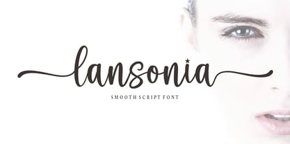 Lansonia is a modern calligraphy font with a dancing baseline and a clean, classic and elegant touch. It can be used for various purposes such as headings, signature, logos, wedding invitations, t-shirt, letterhead, signage, lable, news, posters, badges etc.Hello Bella Script features 300 total glyphs with 100 alternate characters including OpenType Stylistic alternates, ligatures and international language suppor
 - Umberto - Personal use only

- Yoshitoshi - Personal use only

- MuskelBengt - Unknown license

- Module by Sébastien Truchet,
$40.00 Sébastien Truchet designed a modular typographic system during his last year in the School of Fine Arts of Besançon. The system is made of a unique grid and 6 modules which are the components to build several typefaces. The most radical is the "2-2". The last one is the "10-12".This is the "2-3". The goal is to use a grid made of 2 modules in width and three in height. This version is the most pertinent minimalist typeface which keeps plasticity and legibility. There is a character set of capitals tied to the origin of the project
 - Alianza by Corradine Fonts,
$24.95 This is a complex typographic system which includes three different but complementary styles so far: Slab, italic and script, with nine weights each one; plus three sets of ornamental fonts: labels, negative labels and ornaments. The soul of the family is a slab feeling applied judiciously to the italic and script styles to make it coherent with the whole system. Each style has three sets of figures: Proportional lining, tabular lining and old style. You can mix the three styles in a single piece to obtain more expressive results without worring about the uniformity and complementing the design by using the ornamental sets.
 - Dual by North Type,
$- DUAL is a full width sans-serif typeface with an experimental side. Its straight lines and 90 degree angles give it a very geometric feel without hindering its legibility. It’s now available in 6 weights, ranging from 100 to 600. The idea behind DUAL has been brewing for quite some time, and though there has been many “experimental” released in the past, it does have its unique features. For starters, it is a fully usable and legible font in its original state. Also, its 251 alternate glyphs and 10 stylistic sets are, of course, its main attraction making DUAL a very versatile typeface for any user, from the casual designer to the hardcore artist. Finally, it has extensive additional language support for the Americas and parts of Europe. With its 563 glyphs, It’s actually two fonts in one, and thus the name DUAL. Enjoy!
 - HandPrinting - Unknown license

- Enochian Writing by Deniart Systems,
$10.00Based on the magical writing system originated by Dr. John Dee and Edward Kelly in Elizabethan England. - Campeche by Latinotype,
$29.00 Campeche is an expressive yet functional typeface family. Seeking to express its beauty, it twists the conventions of classic typography when necessary. Campeche finds its inspiration in the grotesque typefaces of the late 19th century coupled with a typical Latin American playful sense that gives it a modern freshness. The initial form arises from the idea of expanding Seriguela, evolving along the way, becoming its own system with a unique personality. Campeche is designed for today's requirements. It is available in two styles and three widths, from condensed to extended, with 9 weights each, totaling 54 fonts, in addition to the variable version. Campeche is a comprehensive typographic system that provides versatility for almost any use. It can be used for packaging, editorial, branding... etc. The mix of widths and between the normal and display versions can generate complex graphic parts or systems with different levels of hierarchy, without losing unity.
 - Beba by Eurotypo,
$28.00 Beba is based on geometric structures, where the same formal characteristics are applied to as many letters as possible. It is a sans-serif monoline typeface. It has a modern, clean and minimalist image; ideal to use for advertising, printed or digital graphics and signage system design.
 - Fd Neueral by Fortunes Co,
$- Neueral is a semi-round and geometric sans serif font, with flexibility and modern every glyphs, neutral font variable so it is very functional in making logo designs, article, wayfinding, system fonts, branding, business cards and many others. There are 18 fonts including Latin simple ligatures
 - Cordillera by Latinotype,
$39.00 Clear, simple and multipurpose. We present Cordillera, a new sans serif designed for corporate use, which mixes classic proportions, geometric and neo-grotesque characters. Its alternative characters will allow you to go from expressive titles to neutral texts easily while maintaining the harmony of the system.
 - Blambot Custom - Personal use only

- Vampiress - Personal use only

- Belizarius - Unknown license

- Fizzo - Unknown license

- Nt1972 by Harvester Type,
$20.00 NT1972 is a display font from the future. Font in the era of cyborgs and cyberpunk. This is a sharp, brutal font with futuristic shapes. It combines style and functionality, so the font will look great in your futuristic design in any environment, be it a logo or a merchandize. The angle of inclination in each glyph is 50 degrees, all glyphs also have the same stem sizes to create a good font system. All this is done to get a good futuristic cyberpunk font that will give style to your design, be it a logo, poster, banner, merchandize, title, packaging or product design. In addition to all this, there is support for many languages and alternative characters. In case of any questions, problems or suggestions, please email: bunineugene@gmail.com
 - HWT Tuscan Extended by Hamilton Wood Type Collection,
$24.95 Tuscan wood types cover a fairly wide range of styles, and there is sometimes confusion over what is classified as a Gothic Tuscan and what is considered an Antique Tuscan. HWT American Chromatic and P22 Tuscan Expanded are more precisely faces of the Antique Tuscan variety. Gothic Tuscans are generally absent of the heavy serifs typically associated with their Antique Tuscan brethren (although decorative bifurcation of terminals can imply serifs). Additional internal decoration with spikes along the stems gives some Tuscans their distinctive look, these faces are often described as “Circus Types.” Tuscan Extended is an extremely wide design, with a distinctive slab crossbar running through the center of most characters. Each letter is a complex system in its own right. This typeface is best used very large in short headline work. The style defies falling clearly into either the Antique Tuscan or Gothic Tuscan category. The new HWT version of Tuscan Extended has been meticulously redrawn by Frank Grießhammer. During production, he also incorporated a number of new letterforms, bringing the font to over 300 characters (including a full ASCII character set and Central European accented characters).
 - Tiqqun by Harvester Type,
$20.00 Tiqqun appeared as a font for a monumental, but at the same time futuristic design. During the creation process, many variations for each glyph came to mind. Therefore, it was decided to create an entire system of alternative options. As a result, we have more than 130 alternative characters and as many as two full-fledged alternative sets. The font contains monumentality, brutality, futurism, rigor and uniqueness of some forms. As a result, Tiqqun has become a font system that can cover a large range of your design needs: Prints on clothes, logo, packaging, banner, title, text, poster, merchandising, identity, branding or product design. - 360+ Glyphs - 130+ Alternative Glyphs - Supports 80+ Languages - Special Symbols and Features - 2 Full Alternative Set - OT Features: aalt, case, kern, ordn, salt, sups, ss01-09
 - Masonic Writing by Deniart Systems,
$10.00Based on an ancient secret writing system. NOTE: this font comes with an interpretation guide in pdf format. - Remeslo - Unknown license

- Satero Serif by Linotype,
$29.99 Satero was designed by Prof. Werner Schneider in 2007. Never before have we had so much written material to consume; this is the age of mass-communication. Unfortunately, the decision of which typeface to use is too often made lightly. The typeface is one of the most elementary means of language, and it can play a major role in a text's legibility and the amount of time the reader needs for it. The Satero Type System offers a high degree of legibility due to its dynamic and forms. The individual characters have been based on classical concepts. They are clearly made, and leave all unnecessary elements behind. The type works to create an environment of extreme legibility. Essential parts of the a, c, e, s, and r are to be found at the x-height line, which is the most important area of a line of text in determining legibility. The Satero Type System includes two members whose basic forms are the same. The Sans Serif members are more horizontally differentiated than common grotesques, which aides their legibility. The Serif design employs asymmetrical serifs, avoiding elephant feet" altogether. Their dynamic is progressive. The condensed nature of the seriffed counterparts is optimal for newspaper and magazine applications, where space is at a premium and paper must be saved. All fonts in the Satero Type System include a number of alternate glyphs, as well as ligatures and proportional lining figures; all weights except the Heavy and Heavy Italic fonts are also equipped with small caps, small cap figures, and oldstyle figures as OpenType features. "
 - Metron by Storm Type Foundry,
$52.00 Metron is so far the most ambitious typeface made to order in the Czech Republic. Despite the fact that for a number of years it has not been used for the purpose for which it was designed, every inhabitant of Prague is still well aware of its typical features. Metron Pro was commissioned by the Transport Company of the Capital City of Prague in 1970 to be used in the information system of the Prague Metro. It was first published in the manual of the Metroprojekt company in 1973 and then used to the full, under the author’s supervision, for lines “A” and “C”. Since 1985 Rathouský's system has been disappearing from the Prague Metro; it survives only in the form of metal letters at its stations and at some stations of the Czechoslovak Railways. In 2014 we're mentioning the 90th birthday of Jiří Rathouský. It’s a good opportunity for updating and re-introducing his Metron. Extended was the choice of figures and fractions, new currency signs added, diacritics revised, etc., but above all the newly designed Cyrillics including true SmallCaps. Now we have six weights plus italics, where the tone of the basic style is even closer to the original. Ten years back we've had the feeling that this typeface should again take a part of Prague’s traffic system and today, when revisiting of all the fonts, the feeling turned to certainty. The main feature of this typeface is namely a noticeability a property above all welcomed in rush of platforms.
 - Satero Sans by Linotype,
$29.99 Satero was designed by Prof. Werner Schneider in 2007. Never before have we had so much written material to consume; this is the age of mass-communication. Unfortunately, the decision of which typeface to use is too often made lightly. The typeface is one of the most elementary means of language, and it can play a major role in a text's legibility and the amount of time the reader needs for it. The Satero Type System offers a high degree of legibility due to its dynamic and forms. The individual characters have been based on classical concepts. They are clearly made, and leave all unnecessary elements behind. The type works to create an environment of extreme legibility. Essential parts of the a, c, e, s, and r are to be found at the x-height line, which is the most important area of a line of text in determining legibility. The Satero Type System includes two members whose basic forms are the same. The Sans Serif members are more horizontally differentiated than common grotesques, which aides their legibility. The Serif design employs asymmetrical serifs, avoiding elephant feet" altogether. Their dynamic is progressive. The condensed nature of the seriffed counterparts is optimal for newspaper and magazine applications, where space is at a premium and paper must be saved. All fonts in the Satero Type System include a number of alternate glyphs, as well as ligatures and proportional lining figures; all weights except the Heavy and Heavy Italic fonts are also equipped with small caps, small cap figures, and oldstyle figures as OpenType features. "


