10,000 search results
(0.026 seconds)
- Helzapoppin™ - Unknown license
- Moonlight Shadow - Personal use only
- Setebos - Unknown license
- Jambon - Unknown license
- Sheriff - Unknown license
- Harry Potter and the Dingbats - Unknown license
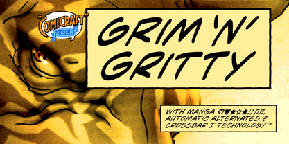
- Grim N Gritty by Comicraft,
$49.00 - Rechtman - Unknown license
- Zaleski - Unknown license
- RabbitEars - Unknown license
- Showboat - Unknown license
- DavidFarewell by Ingrimayne Type,
$9.95 - Tasmin - Unknown license
- Gaiseric Demo - Unknown license
- Bluntz by ITC,
$29.00 - Konanur - Unknown license
- Paris - Unknown license
- Varah - Unknown license
- Pimp - Unknown license
- Daresiel Demo - Unknown license
- Sangkuriang - Unknown license
- Ironworks™ - Unknown license
- Marmyadose™ - Unknown license
- Altenburg™ - Unknown license
- Tasmin Reference - Unknown license
- Mephisto™ - Unknown license
- Tasmin Ref - Unknown license
- Norumbega™ - Unknown license
- Asphodelª - Unknown license
- Harbinger™ - Unknown license
- Terpsichore™ - Unknown license
- Lambada by ITC,
$29.99 - Pointage - Unknown license
- Earthpig Demo - Unknown license
- Def Writer | BASE Cyr - Unknown license
- Raleigh by Bitstream,
$29.99 - Albertino - Personal use only
- Purcell™ - Unknown license
- Yazata™ - Unknown license
- Tuscarora - Unknown license


