10,000 search results
(0.041 seconds)
- Slinces Heart by Nathatype,
$29.00 Slinces Heart is a captivating script font that captures the essence of handwriting with a touch of romance. Each letter in this font is meticulously crafted with fairly high line contrast, adding a dynamic and eye-catching quality to the font. The swinging endings in Slinces Heart add a flourish of creativity and uniqueness. With its smooth and flowing letterforms, this font offers a natural and seamless writing style. For the best legibility you can use this font in the bigger text sizes.
 - Potenciarte by Nasir Udin,
$25.00 Potenciarte is an all-caps display typeface inspired by the facade of old buildings from the era of Nederlandsch-Indie (1900’s) in Surabaya, where Art Deco & Art Nouveau typographic styles were widely used.
 - Crysh Graffiti by Fitrah Type,
$12.00 Crysh Graffiti is the newest typeface with a simple graffiti style. There are three styles of font. Regular, extrude, and line styles Inspired by a simple piece of graffiti. The entire typography has been designed to work on large sizes. This font is good to use on posters, zines, stickers, and t-shirts.
 - Antikka by Okaycat,
$9.50Antikka draws some inspiration from the style of the Art Deco movement of the 1920s and 30s. The vision behind making Antikka was to revitalize the style of this bygone era -- making it funky and relevant to our 21st century times. Antikka is a minimal font, clear and geometric, yet highly stylized. Comfortable in a business setting - or just about anywhere. Antikka arrives as the business casual of fonts - giving it a wide range of use. - Paris by kapitza,
$99.00 Walking around Paris looking for inspiration for our latest people font, we encountered chic Parisians, yummy food markets, and bakeries on virtually every street corner with delicious baguettes and pastries. We were surprised how many people were cycling, motorcycling and rollerblading along the vast boulevards and side streets of Paris. We spotted classic French cars like the 2CV and Citroën CX and watched the world go by in one of the many sidewalk cafes whilst enjoying a 1664 or a café crème. With our latest people font, Paris, we tried to capture this unique Parisian atmosphere and hope we succeeded. All 64 illustrations are based on photographs taken on location over a period of time. The photographs are then hand traced to create high quality, detailed silhouettes.
 - Ebenezer by Typodermic,
$11.95 Welcome to the world of darkness and fear, where shadows dance and nightmares come to life. Introducing Ebenezer, the typeface that will send shivers down your spine and make your message stand out like never before. With Goldburg-inspired letterforms and intricate, eerie details, Ebenezer is the perfect choice for any project that requires a macabre touch. Each character is carefully crafted to evoke a sense of dread and terror, making it the perfect typeface for horror movies, Halloween-themed designs, or any project that requires a dark and ominous feel. But Ebenezer is more than just a typeface. With its OpenType ligatures, common character sequences are automatically substituted with bespoke combos, ensuring that your message has an even more ghastly impact. Each word becomes a work of art, with letters combining and twisting into haunting shapes that will leave your audience speechless. So embrace the darkness and let Ebenezer lead the way. Its spooky, highly detailed design will take your project to the next level, ensuring that your message is unforgettable and truly terrifying. Whether you’re designing a poster, creating a logo, or simply looking to add a touch of macabre elegance to your text, Ebenezer is the perfect choice. Most Latin-based European writing systems are supported, including the following languages. Afaan Oromo, Afar, Afrikaans, Albanian, Alsatian, Aromanian, Aymara, Bashkir (Latin), Basque, Belarusian (Latin), Bemba, Bikol, Bosnian, Breton, Cape Verdean, Creole, Catalan, Cebuano, Chamorro, Chavacano, Chichewa, Crimean Tatar (Latin), Croatian, Czech, Danish, Dawan, Dholuo, Dutch, English, Estonian, Faroese, Fijian, Filipino, Finnish, French, Frisian, Friulian, Gagauz (Latin), Galician, Ganda, Genoese, German, Greenlandic, Guadeloupean Creole, Haitian Creole, Hawaiian, Hiligaynon, Hungarian, Icelandic, Ilocano, Indonesian, Irish, Italian, Jamaican, Kaqchikel, Karakalpak (Latin), Kashubian, Kikongo, Kinyarwanda, Kirundi, Kurdish (Latin), Latvian, Lithuanian, Lombard, Low Saxon, Luxembourgish, Maasai, Makhuwa, Malay, Maltese, Māori, Moldovan, Montenegrin, Ndebele, Neapolitan, Norwegian, Novial, Occitan, Ossetian (Latin), Papiamento, Piedmontese, Polish, Portuguese, Quechua, Rarotongan, Romanian, Romansh, Sami, Sango, Saramaccan, Sardinian, Scottish Gaelic, Serbian (Latin), Shona, Sicilian, Silesian, Slovak, Slovenian, Somali, Sorbian, Sotho, Spanish, Swahili, Swazi, Swedish, Tagalog, Tahitian, Tetum, Tongan, Tshiluba, Tsonga, Tswana, Tumbuka, Turkish, Turkmen (Latin), Tuvaluan, Uzbek (Latin), Venetian, Vepsian, Võro, Walloon, Waray-Waray, Wayuu, Welsh, Wolof, Xhosa, Yapese, Zapotec Zulu and Zuni.
 - Kandidat by Fontroll,
$30.00 Imagine being printer in the early nineteenth century, your stock isn’t the finest, your lead characters are worn out: Voilá Kandidat Rough. But wait, Kandidat isn’t the usual scan-an-old-book,-put-the-glyphs-in-a-font-and-you’re-done-font. Kandidat Rough has a variety of whopping 14 alternates for most characters. Our algorithm changes the letters automatically. All you have to do is turn on Contextual Alternates in your layout app. The algorithm is the best we’ve seen so far, and it’s so good that even same words appear in different forms. And should by coincidence words have the same glyphs, just assign a different Style Set to the first letter, and all other letters in the word will change as well (well, it depends a bit on your software). The mechanism isn’t perfect and maybe we stretched OpenType capabilities a bit over the top, but we yet haven’t seen any better routine for switching letters on the fly. Is it worth to mention that Kandidat Rough not only speaks English, but also German, French, Spanish, Dutch, Danish, Norwegian, Swedish, Croatian, Turkish and most likely some other languages? Maybe. To be sure whether your language is supported, this is the typeset of all letters: ABCDEFGHIJKLMNOPQRSTUVWXYZÀÁÂÃÄÅÆÇÈÉÊËÌÍÎÏÑÒÓÔÕÖØÙÚÛÜÝĆČĐĞ݌ފŸŽ abcdefghijklmnopqrstuvwxyzàáâãäåæçèéêëìíîïñòóôõöøùúûüýÿćčđğıœşšž Apart from that we also included the following punctuation and currency symbols: !"#$%&'()*+,-./:;?@[\]_{|}¡©«®°±¶·»¿×–—‘’‚“”„†•…‹›⁄≠☞ €¢$£¥ This sums up to nearly 3000 glyphs per font, and we have three of them: Regular, Italic and Bold. All neatly kerned. All in all a great repertoire for even the most demanding book or advert jobs with a look of old times. And now imagine you are sick of the rugged print experience Kandidat Rough delivers: go for Kandidat. This is our Scotch-ish ancestor the Rough version was made from. A sturdy, friendly, round, warm friend from the beginning of the nineteenth century. A bit dark, maybe. You will like it. Kandidat has the aforementioned type set plus complete Baltics, Eastern Europe and Cyrillic. Plus a couple of gimmicks like fleurons, stars, circled numbers, arrows, and, and, and… Kandidat Regular additionally has small caps for Latin based scripts (not Cyrillic). The spick and span Kandidat font set also consists of Regular, Italic and Bold cuts. The bold cut is on the very bold side and can nicely be used for headings, whereas Italic is a great companion for Regular. It took us some time and trouble to finish this project, but after all we are very proud of our little feat and hope you will enjoy Kandidat as much as we do. Enjoy!
 - Arabetic Sans Serif by Arabetics,
$32.00 The Arabetic Sans Serif type family follows the guidelines of the Mutamathil type style but also illustrates the effects of adding and removing Latin-like serifs on Arabetic scripts legibility. It has only one glyph for every basic Arabic Unicode character or letter as defined in Unicode Standards version 5.1. Arabetic Sans Serif employs variable x-height values. It includes all required Lam-Alif ligatures and uses ligature substitutions and selected marks positioning but it does not use any other glyph substitutions or forming. Text strings composed using types of this family are non-cursive with stand-alone isolated glyphs. Tatweel (or Kashida) glyph is a zero width space. Keying it before any glyph will display that glyph’s isolated form. Keying it before Alif Lam Lam Ha will display the Allah ligature. Arabetic Sans Serif family includes both Arabic and Arabic-Indic numerals; all required diacritic marks, Allah ligature, in addition to all standard English keyboard punctuations and major currency symbols. Fonts are available in regular, italic, bold, and bold italic styles.
 - Arabetic Serif by Arabetics,
$32.00 The Arabetic Serif type family follows the guidelines of the Mutamathil type style but also illustrates the effects of adding and removing Latin-like serifs on Arabetic scripts legibility. It has only one glyph for every basic Arabic Unicode character or letter as defined in Unicode Standards version 5.1. Arabetic Serif employs variable x-height values. It includes all required Lam-Alif ligatures and uses ligature substitutions and selected marks positioning but it does not use any other glyph substitutions or forming. Text strings composed using types of this family are non-cursive with stand-alone isolated glyphs. Tatweel (or Kashida) glyph is a zero width space. Keying it before any glyph will display that glyph isolated form. Keying it before Alif Lam Lam Ha will display the Allah ligature. Arabetic Serif family includes both Arabic and Arabic-Indic numerals; all required diacritic marks, Allah ligature, in addition to all standard English keyboard punctuations and major currency symbols. Fonts are available in regular, italic, bold, and bold italic styles.
 - Jailbird - Unknown license

- Avatar - Unknown license

- Nadall - Unknown license

- Bruce - Unknown license

- Lou - Unknown license

- Squealer - Unknown license

- mzw teaparty - Unknown license

- Easton by Typemotion,
$15.00 I wanted to combine a classical antiqua with corners and edges. I was convinced this combination would create a new, a fresh design of types. At the beginning I used the forms from "Goudy Old Style", later I modified the sizes, the widths of the letters, the x-height and their forms in general. At the moment the Easton Family consists of 3 styles called Easton Serif, Easton Semiserif and Easton Sans.
 - Christhine by Letterafandi Studio,
$14.00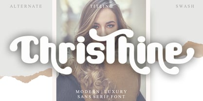 Christhine is a cool and interestingly designed display font. It will elevate a wide range of crafting ideas, from cards, to branding, labels and much more. This font is PUA encoded which means you can access all of the glyphs and swashes with ease!
 - Merlynea by Nissa Nana,
$23.00 merlynea is a delicate, elegant and flowing handwritten font. It has beautiful and well balanced characters and as a result, it matches a wide pool of designs. This font is PUA encoded which means you can access all of the glyphs and swashes with ease!
 - Bullvetti by Nissa Nana,
$25.00 Bullvetti is a delicate, elegant and flowing handwritten font. It has beautiful and well balanced characters and as a result, it matches a wide pool of designs. This font is PUA encoded which means you can access all of the glyphs and swashes with ease!
 - Chlorophyll by Alit Design,
$18.00 Introducing "Chlorophyll" - A Sans Serif Font with a Refreshing Natural Elegance Unveil the beauty of nature in your design projects with "Chlorophyll," a stunning sans serif font that combines modern simplicity with the organic charm of leaf illustrations. This elegant typeface is designed to infuse your creations with a sense of natural harmony, making it perfect for a wide range of applications, from branding to packaging and beyond. Key Features: Sans Serif Sophistication: "Chlorophyll" boasts a clean and versatile sans serif style, making it ideal for both display and body text. Its balanced letterforms exude a sense of modern sophistication, ensuring legibility and impact in all your design endeavors. Leafy Delight: With meticulously crafted leaf illustrations integrated into the font's characters, "Chlorophyll" embodies the spirit of the great outdoors. Each letter and symbol subtly incorporates the elegance of leaves, creating a seamless connection to the natural world. Elegance in Simplicity: "Chlorophyll" captures the essence of natural beauty through its simplicity. This font is a testament to the idea that less is more, allowing your content to shine while adding a touch of eco-friendly charm. Versatile Usage: Whether you're designing a logo for an eco-conscious brand, creating invitations for a garden wedding, or crafting a menu for a farm-to-table restaurant, "Chlorophyll" adapts effortlessly to diverse design projects. It's a versatile tool that can evoke a sense of elegance and sustainability in any context. Extensive Character Set: "Chlorophyll" includes an extensive character set, encompassing uppercase and lowercase letters, numerals, punctuation, and a wide range of special characters. This ensures compatibility with multiple languages and enables you to express your message with clarity and grace. Digital and Print Ready: "Chlorophyll" is delivered in multiple formats, making it ready for both digital and print applications. Its high-quality vectors ensure crisp and sharp rendering in any size or medium. Embrace the allure of nature and elevate your design projects with "Chlorophyll." This sans serif font, inspired by the beauty of leaves and the elegance of simplicity, brings a touch of the natural world to your creative endeavors. Elevate your designs, evoke a sense of harmony, and make a lasting impression with "Chlorophyll" today.
 - Hatmaker by ITC,
$29.99Jean Evans' interest in type design dates back to her third-grade fascination with fancy script writing. Years later, work at a sign-painting school she found in the Yellow Pages® cemented her relationship with letterforms. Evans went on to study with master calligraphers and type designers, including the likes of Donald Jackson, Hermann Zapf and Matthew Carter. Evans' designs have been exhibited and collected around the globe, and her distinctive calligraphic style has been lauded by leading trade organizations, annuals and publications. Hatmaker, one of Evans' more popular typefaces, was originally developed for the Boston-based broadcast design firm of the same name. Inspiration for the design came from Ben Shahn's famous hand-constructed alphabet. Shahn's alphabet, however, was limited to capital letters. Daunted by the idea of designing a lowercase that would measure up to Shahn's capitals, I developed a second set of caps-simple, quirky, yet almost classic-to work as 'lowercase' with the Shahn-like caps," explains Evans. Mixing the two in Hatmaker, creates a lively interplay of light and dark." - ITC Franklin Gothic LT by ITC,
$43.99 Franklin Gothic was designed between 1903 and 1912 by Morris Fuller Benton for the American Type Founders Company. The font serves as the American Grotesk prototype. It was named after Benjamin Franklin. Even today, Franklin Gothic remains one of the most widely used sans serif typefaces. The robust character of the font gives text a modern feel. It is widely used in newspapers and advertising and is frequently seen in posters, placards and other material where space is restricted. Featured in: Best Fonts for Tattoos
 - Coco Gothic Pro by Zetafonts,
$39.00 Inspired by a biography of Coco Chanel and trying to capture the quintessential mood of classical fashion elegance, Cosimo Lorenzo Pancini designed Coco Gothic looking for the effect that the first geometric sans typefaces (like Futura, Kabel or the italian eponyms like Semplicità) had when printed on paper. The crisp modernist shapes acquired in printing charme and warmth through a slight rounding of the corners that is translated digitally in the design of Coco Gothic. This signature touch is enhanced by the inclusion of light humanist touches to the proportions of the letters, resulting in the unique mix that makes Coco Gothic one of our best sellers, with a look that is both contemporary and vintage. After six years from the original project (that has spawned in the meanwhile successful families like Cocogoose and Coco Sharp), we went back to the design to completely redraw and expand the original family, creating with a Pro version that has better on-screen readability, a wider weight range, variable type versions and more language coverage (with Coco Gothic Arabic adding a new script to the latin, greek and Cyrillic of the original). Coco Gothic Pro comes in three subfamilies, each with seven weights with matching italics and featuring an extended character set with open type support for small caps, ligatures, alternates, European languages, Greek and Cyrillic alphabets. The original, body-text optimised Coco Gothic and Coco Gothic Alternate subfamilies have been kept for compatibility with the previous version, while a new Coco Gothic Display subfamily has been developed with a complete redesign aimed at display usage, featuring tighter spacing and optimised letterforms. A distinguishing feature of Coco Gothic Pro is the inclusion of ten alternate historical sets that allow you to use the typeface as a true “typographic time machine”, selecting period letterforms that range from art deco and nouveau, to modernism and to eighties’ minimalism. Equipped with such an array of historical variants, Coco Gothic Pro becomes an encyclopedia of styles from the last century, ready to transform itself and adapt to the mood of your text.
 - Plantin by Monotype,
$29.99 Plantin is a Renaissance Roman as seen through a late–industrial-revolution paradigm. Its forms aim to celebrate fine sixteenth century book typography with the requirements of mechanized typesetting and mass production in mind. How did this anomalous design come about? In 1912 Frank Hinman Pierpont of English Monotype visited the Plantin-Moretus Museum in Antwerp, returning home with “knowledge, hundreds of photographs, and a stack of antique typeset specimens including a few examples of Robert Granjon’s.” Together with Fritz Stelzer of the Monotype Drawing Office, Pierpont took one of these overinked proofs taken from worn type to use as the basis of a new text face for machine composition. Body text set in Plantin produces a dark, rich texture that’s suited to editorial and book work, though it also performs its tasks on screen with ease. Its historical roots lend the message it sets a sense of gravity and authenticity. The family covers four text weights complete with italics, with four condensed headline styles and a caps-only titling cut. Plantin font field guide including best practices, font pairings and alternatives.
 - Trochilida NF by Nick's Fonts,
$10.00This Albert Auspurg offering from 1915 for the German foundry Schelter & Giesecke was originally called Kolibri, or Hummingbird. The design combines formal elegance with a carefree, wide stance, making it a perfect choice for inviting headlines. Both versions of this font include the complete Unicode Latin 1252, Central European 1250 and Turkish 1254 character sets. - LeopardSkin by Scholtz Fonts,
$19.00 LeopardSkin is an exciting, contemporary display font, incorporating the distinctive markings of one of Africa’s most famous “big cats”. Two versions are available: LeopardSkin Aarde, based on the Aarde Black font, is best used in conjunction with Aarde Black or Aarde Outline. LeopardSkin Umkhonto is based on the best-selling Umkhonto font, and may be used in conjunction with the Umkhonto font collection. The popularity of the “animal skin” look in contmporary clothing and soft furnishing design make LeopardSkin a must for artists on the creative edge of contemporary design.
 - Darkstone by Sanchit Sawaria,
$40.00 Darkstone is a hybrid blackletter display font which combines features of the fraktur and old english. The level of detail in the glyph drawings enables the users to exploit the pure form of the letters in big sizes. Darkstone is great for labels, mastheads, branding, advertising, posters, etc.
 - Bundt Cake by Up Up Creative,
$29.00 Introducing Bundt Cake, a sweet, modern mono-line script display font with tons of OpenType features. Bundt Cake comes with more than eleven hundred glyphs! Specific OpenType features include contextual alternates, swash forms, stylistic alternates, initial and final forms, multiple alternate glyphs for each letter (accessed through the glyphs panel), multilingual support (including multiple currency symbols), two ampersands, ninety standard and discretionary ligatures, a bunch of hearts and arrows, and standard numbers, oldstyle figures, and fractions. The OpenType features can be very easily accessed by using OpenType-savvy programs such as Adobe Illustrator and Adobe InDesign. (To access these awesome features in Microsoft Word, you'll need to get comfortable with the advanced tab of Word's font menu. If you need help with this, ask me!) Perfect for: logos, wedding invitations, photo overlays, and more.
 - ITC Outback by ITC,
$29.99ITC Outback was designed by Bob Alonso, a contemporary typeface with a distressed" look. It combines the rustic 1920s look of Rudolph Koch's Neuland with the proportions of a 1960s headline typeface, then roughens the edges 1990s style. The crude, rough ITC Outback is clearly intended as a display typeface but reads surprisingly well even in sizes as small as 18 point." - Elefantasia NF by Nick's Fonts,
$10.00The inspiration for this typeface—originally called Elefanta—enjoyed popularity stateside in the late nineteenth century, an import from the Karl Brendler & Söhne foundry of Vienna. Its graceful yet playful elegance makes it suited for a wide range of projects where projecting warmth is desirable. Both versions contain the complete Latin 1252, Central European 1250 and Turkish 1254 character sets. - Blantic by Zamjump,
$17.00 BLANTIC is a modern and dynamic sans font that contains all caps and alternative fonts. The combination of futuristic and geometric elements creates a modern design. very suitable for use in various logo designs, posters, book covers, films, sports and several other formal designs, very easy to read, try some alternative letters to get the impression of dynamism and harmony between letters. WHAT IS INCLUDED This font contains standard characters, uppercase letters, numbers, punctuation marks. Includes: Uppercase Numbers Punctuation Symbols multilingual support Alternate
 - Radiant Kingdom by Timurtype,
$14.00 Introduced by Timurtype Studio! Radiant Kingdom is a Quotable Handwritten Font This font enhances your words with a font that is not just handwritten but also a charming masterpiece. Each stroke weaves a story of intrigue, making each quote a journey through the art of expression. Quotable and irresistible – let your writing leave an indelible mark. Radiant Kingdom Font also supports multilingualism. Enhance your designs with our original fonts, feel free to comment or provide feedback, Enjoy the fonts 😊 Thank You
 - PR8 Charade - Unknown license

- Freak out, Go bananas - Unknown license

- Brushstrike by Zetafonts,
$39.00 The Brush Strike Family is an exercise in dynamic, gestural brush type design by Francesco Canovaro. The typeface contains no lowercase set, but it doubles the uppercase with a strikethrough alternate set to be used for dynamic logo design and unusual word highlighting. Two weights are available with consistent design: the light weight (Brushstrike Light aka Lightstrike) can work together with the heavier regular weight but can also be used in white on dark background for light effects.
 - Albollón by Salsipuedes,
$16.00 In the last years our society has change a lot. Nowadays cities and countries are no longer static territories with well-drawn borders and a population perfectly defined. Globalization is a fact and the best consequence of it is the mixture of races, ideas and cultures, and this is exactly what this typography aims to show. Albollón is at once a semi-serif and a semi-sans serif typeface; it is a mixture made with the best parts from both sides. This way is how I understand a healthy society and a healthy design too. Albollón is designed to work in all types of text, both long and shorts, big and small ones.
 - Axion STN by Type Innovations,
$39.00 Axion STN is an original design by Alex Kaczun and is a stencil interpretation of his Axion RX-14 font. It is but one of several alternate designs based on his original Axion family of fonts. The wide gap within this stencil treatment works well with and compliments the spacing in the font, creating a tension within this modern grotesque and adding a class of destinction and interest. This display font is not intended for text use. It was designed specifically for display headlines, logotype, branding and similar applications. The entire font has an original look which is strong, dynamic, machine generated and can be widely used in publications and advertising. Axion STN is a futuristic, techno-looking and expressive typeface with an appearance of machined parts with sharp and rounded edges. This attractive display comes in roman with lower case and lining figures. The large Pro font character set supports most Central European and many Eastern European languages.
 - Nat Flight by ParaType,
$30.00 This elegant family of fonts, suitable for both text and display, is narrow in fit and characterized by a unique feature: in the capital B, P, and R, the stroke of the bowl does not quite meet with the stem. The design is noticeably calligraphic with a dynamic and delicate character, especially in the italics. Its subtleties can best be appreciated when set in large point sizes.
 - Rounded, Two. by Siren Fonts,
$10.00 Rounded, two was designed with a simple idea in mind: the basis for the majority of the characters is a perfect circle. That circle is then intersected and cropped to make unique, modern and stylish letterforms. Rounded, two is an improved version of my initial experimentation. The font looks good at all sizes, but particularly for large displays where the elegant simplicity of each character can be appreciated.


