4,382 search results
(0.009 seconds)
- LD Wanted by Illustration Ink,
$3.00Bring an old west flavor to your lettering projects. The block letters of this "Wanted" font are reminiscent of western posters and signs. It's a fun choice for cowboy scrapbook pages and cards. - Christmas Dancing by Fikryal,
$15.00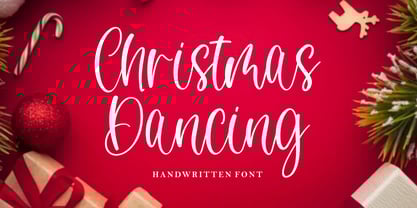 Christmas Dancing is a beautiful handwritten font perfect for crafting, branding, invitation, stationery, wedding designs, social media posts, advertisements, product packaging, product designs, label, photography, watermark, special events or anything. Christmas Dancing with full set of uppercase and lowercase letters, ligatures, multilingual symbols, numerals and punctuation.
 - Cowboy Wanted by Shakira Studio,
$19.00 Introducing "Cowboy Wanted" - The Ultimate Western Retro Serif Font! Saddle up and embrace the wild, wild west with Cowboy Wanted, the font that's taking the design world by storm. This font embodies the perfect blend of old-school ruggedness and contemporary flair, making it the hottest ticket in town for all your Western-inspired design needs. Each character in Cowboy Wanted is meticulously crafted to capture the essence of the Old West, from the sweeping serifs to the rugged lines. Whether you're working on a saloon-inspired logo, a rustic poster, or a themed event invitation, Cowboy Wanted adds that authentic Western touch that's so in demand right now. Don't miss your chance to lasso the trendiest Western retro serif font of the moment. With Cowboy Wanted, you'll be the sheriff of style in your design projects, standing out in the crowded frontier of design. Saddle up and make a bold statement with Cowboy Wanted today! Here's what you get: Cowboy Wanted Regular All Multilingual symbol Opentype features ( ligature, alternate ) Accessible in the Adobe Illustrator, Adobe Photoshop, Adobe InDesign, even work on Microsoft Word. PUA Encoded Characters - Fully accessible without additional design software. Multilingual character supports : (Afrikaans, Albanian, Catalan, Croatian, Czech, Danish, Dutch, English, Estonian, Finnish, French, German, Hungarian, Icelandic, Italian, Lithuanian, Maltese, Norwegian, Polish, Portuguese, Slovenian, Spanish, Swedish, Turkish, Zulu) Follow my shop for upcoming updates, and for more of my work, Thank you!
 - Last Dance by Wing's Art Studio,
$10.00 Last Dance: Redux - The 80s Feel-Good Script Font - Updated! Welcome to Last Dance: Redux, a new and improved version of my popular brush-script font inspired by 80s movie posters, VHS covers and Friday nights at the video store! This hand-drawn script aims to capture the feel-good vibes of movie blockbusters that won our teenage imaginations, while serving as the go-to font for recreating this unique and nostalgic period. The original Last Dance font features a gritty, hand-drawn texture that looks equally at home on an aerobics competition poster or steamy urban thriller - making great titles that look distinctly cinematic. Last Dance: Redux takes that original design and strips it back to it’s bare essentials resulting in a clean, uniform look that improves letter flow and readability. It’s also much lighter on system resources making it the preferred choice when using extensively across print and web projects. Both versions come with upper and lowercase characters along with punctuation, numerals and language support, plus two full sets of alternatives and a selection of underlines. Check out the visuals to see it in action!
 - Dance Routine by Jeff Levine,
$29.00 The hand lettered title on the cover of the 1932 sheet music for “I Wish We Could Dance Forever” was the inspiration for Dance Routine JNL. This bold Art Deco sans serif design is now available in both regular and oblique versions.
 - MT Bleu Feelin Mono by MametosType,
$20.00 MT Bleu Feelin — is a display font with a monospace typographic feel. Please pay attention to Small Caps, Oldstyle Figures, and Alternates. Good for music album covers, posters and magazines. Inspired by the electronic band from Bandung, Bleu House, which has a light and edgy electronic pop experimental music character, the idea emerged to create a font that changes from sound to visual language, namely font. The use of the design for this font is for Display, and while it is issued one regular weight, in the future will develop multiple masters and other experiments. The design concept of the MT Bleu Feelin Mono Regular font is to take a 45 degree diagonal and geometric cut technique. also every corner is rounded which gives a dynamic impression like electronic music. I created this font design because I like visual experiments, and applied it to the character of the font. By using monospaced font characters have an even width. This is a unique feature in that most fonts are 'proportionally' spaced with characters varying in width. While monospace is perfect in certain ways, it is a proportional font that reigns supreme. Proportional fonts are faster to read. however, the MT Bleu Feelin Mono Regular font is intended for display fonts. MT Bleu Feelin Mono Regular supports language settings - Western Europe - Central Europe - Southeastern Europe - South American - Oceania - Esperanto
 - Gill Sans MT Greek by Monotype,
$67.99The successful Gill Sans® was designed by the English artist and type designer Eric Gill and issued by Monotype in 1928 to 1930. The roots of Gill Sans can be traced to the typeface that Gill's teacher, Edward Johnston, designed for the signage of the London Underground Railway in 1918. Gill´s alphabet is more classical in proportion and contains what have become known as his signature flared capital R and eyeglass lowercase g. Gill Sans is a humanist sans serif with some geometric touches in its structures. It also has a distinctly British feel. Legible and modern though sometimes cheerfully idiosyncratic, the lighter weights work for text, and the bolder weights make for compelling display typography. Gill Sans is also available as Value Pack for Macintosh, PC or as Hybrid CD with both platforms. - Gill Sans MT WGL by Monotype,
$92.99The successful Gill Sans® was designed by the English artist and type designer Eric Gill and issued by Monotype in 1928 to 1930. The roots of Gill Sans can be traced to the typeface that Gill's teacher, Edward Johnston, designed for the signage of the London Underground Railway in 1918. Gill´s alphabet is more classical in proportion and contains what have become known as his signature flared capital R and eyeglass lowercase g. Gill Sans is a humanist sans serif with some geometric touches in its structures. It also has a distinctly British feel. Legible and modern though sometimes cheerfully idiosyncratic, the lighter weights work for text, and the bolder weights make for compelling display typography. Gill Sans is also available as Value Pack for Macintosh, PC or as Hybrid CD with both platforms. - Gill Sans MT Cyrillic by Monotype,
$67.99The successful Gill Sans® was designed by the English artist and type designer Eric Gill and issued by Monotype in 1928 to 1930. The roots of Gill Sans can be traced to the typeface that Gill's teacher, Edward Johnston, designed for the signage of the London Underground Railway in 1918. Gill´s alphabet is more classical in proportion and contains what have become known as his signature flared capital R and eyeglass lowercase g. Gill Sans is a humanist sans serif with some geometric touches in its structures. It also has a distinctly British feel. Legible and modern though sometimes cheerfully idiosyncratic, the lighter weights work for text, and the bolder weights make for compelling display typography. Gill Sans is also available as Value Pack for Macintosh, PC or as Hybrid CD with both platforms. - Gill Sans MT Infant by Monotype,
$43.99The successful Gill Sans® was designed by the English artist and type designer Eric Gill and issued by Monotype in 1928 to 1930. The roots of Gill Sans can be traced to the typeface that Gill's teacher, Edward Johnston, designed for the signage of the London Underground Railway in 1918. Gill´s alphabet is more classical in proportion and contains what have become known as his signature flared capital R and eyeglass lowercase g. Gill Sans is a humanist sans serif with some geometric touches in its structures. It also has a distinctly British feel. Legible and modern though sometimes cheerfully idiosyncratic, the lighter weights work for text, and the bolder weights make for compelling display typography. Gill Sans is also available as Value Pack for Macintosh, PC or as Hybrid CD with both platforms. - KR Kick Up Your Heels - Unknown license

- KR Ants - Unknown license

- Foundry Dat by The Foundry,
$50.00 Foundry Dat is created with a common horizontal dash grid structure for accurate layering when characters are superimposed. Foundry Dat’s integrated background aligns vertically and horizontally, when set solid, forming a continuous pattern. Foundry Dat’s companion family Foundry Dit functions as a legible correspondence font, with a ‘typewriter’ feel. Each family contains: light, regular, medium and bold weights. Foundry Dat comes with a series of dashes to extend the background grid. Characters can also be offset to make different patterns – in the process becoming images – a graphic language with total integration of form and function.
 - Mrs Ant by Hipopotam Studio,
$20.00 Hand drawn serif typeface designed for one of our books. It has upper and lowercase characters with up to three alternate glyphs. Build in OpenType Contextual Alternates feature will automatically set alternate glyphs depending on frequency of appearance of the same character (even in web font but only in HTML5 browsers). The script doesn’t throw random glyphs. For example in the word “HIPPOPOTAMUS” you will automatically get three different “P” glyphs and two “O” glyphs. It really works great but of course you can always fine tune it by hand. Mrs Ant has an older brother. Mr Anteater was designed for headers for the same book.
 - Killer Ants by Cool Fonts,
$24.00 There are two versions of Killer Ants, regular and bold. Regular is a very cool cracked up looking font that will be great for all kinds of stuff. Bold is on of the most distressed fonts I've ever seen - there's crap everywhere - adjust your leading (line spacing) so the grunge overlaps and you have one awesome effect. Yes, those dots are actually smashed ants. Killer!
 - Fancy Dan by Solotype,
$19.95We had a dozen or so letters of this of this, picked up at the flea market in Vienna. The rest came from our imagination. - Dan Pro by Fontfabric,
$30.00 Dan Pro is a custom sans font which is applicable for any type of graphic design - web, print, motion graphics, and perfect for t-shirts and other items.
 - Ant Serif by LNP Fonts,
$9.99 Ant Serif is a font that can be used for advertising, logo creation, webfonts and more. The font comes in two styles, Regular and Italic and has all the characters in the Latin Basic, Additional and Extended scripts. The font's design came from my love of Marvel's Ant-Man and the Wasp logo. The typeface used, which was custom, was of interest for me, so I decided to create it as a font. It's not a perfect font, but I have put work to make sure it looked as decent as possible. Hope you'll enjoy it!
 - Dan Panosian by Comicraft,
$29.00 It’s true -- having your own font IS The Secret Of Happiness! At times suave and sophisticated, at other times rough and ready for anything, superstar comics artist Dan Panosian has worked on the likes of CAPTAIN AMERICA, SPAWN, THE FLASH,, SPIDER-MAN, X-THE X-MEN and GREEN LANTERN, as well as the movie, HARRY POTTER AND THE SORCERER'S STONE and games like DUKE NUKEM. He hasn't been seen in comics for some time, but he’s back, baby, working on a series of JOHN TIFFANY bandes desinée, and he’s brought his own font with him, courtesy of that awfully nice John JG Roshell at Comicraft. John Tiffany is one of the best bounty hunters in the world and he has no illusions about the world that employs him. Tiffany relies exclusively on four people: the Reverend Lovejoy, who taught him to love his money; Wan Chao, of the geek underworld who serves as an interface with the outside world; Dorothy, his partner, and Magdalena, the ‘call girl in his life.’ But in Mexico, the hunter has become prey, his head has a price. And if his rivals know his location, it means that John Tiffany was betrayed by one of four people he thought he could trust...and now he can rely on only ONE thing, his secret weapon. His FONT. See the families related to Dan Panosian: Urban Barbarian.
 - Ante Cf by Creative17studio,
$9.00 Introducing Ante Cf Fonts. A font that's modern, clean, and bold like the roman sans serif font. This font comes in many weights up to 18 weights. The contrasts between thick and thin make this font unique. This font is made with modern characteristics which can give a bold impression in each character, making this font suitable for corporate needs for larger business needs. For branding purposes? Sure. This font is also made for the needs of this field, so that your branding seems more modern. And this font is also useful for news editorial purposes. Coupled with serif types and scripts are also very suitable. You can see all the examples of using this font above. Ante cf also supports various languages, so that it can make it easier for all countries to use and language usage.
 - Modern MT for Dior CS by Monotype,
$29.99Cut by Monotype between 1900 and 1902, the Monotype Modern font family was based on Miller & Richards News 23 and 28; slightly condensed news text types of the 1890s. Monotype Modern is a lively typeface, with long, fine hairlines and well rounded letterforms, representing the best of nineteenth century modern face design. A classic text face, and typical of the moderns that were produced in the United Kingdom at that time, being less extreme in its rendering than some of the models of purer form being produced elsewhere. Monotype Modern is an excellent text face for magazines, newspapers and books, the heavier and more condensed versions are useful in headlines and display. - Modern MT for Dior JP by Monotype,
$29.99Cut by Monotype between 1900 and 1902, the Monotype Modern font family was based on Miller & Richards News 23 and 28; slightly condensed news text types of the 1890s. Monotype Modern is a lively typeface, with long, fine hairlines and well rounded letterforms, representing the best of nineteenth century modern face design. A classic text face, and typical of the moderns that were produced in the United Kingdom at that time, being less extreme in its rendering than some of the models of purer form being produced elsewhere. Monotype Modern is an excellent text face for magazines, newspapers and books, the heavier and more condensed versions are useful in headlines and display. - Modern MT for Dior KO by Monotype,
$29.99Cut by Monotype between 1900 and 1902, the Monotype Modern font family was based on Miller & Richards News 23 and 28; slightly condensed news text types of the 1890s. Monotype Modern is a lively typeface, with long, fine hairlines and well rounded letterforms, representing the best of nineteenth century modern face design. A classic text face, and typical of the moderns that were produced in the United Kingdom at that time, being less extreme in its rendering than some of the models of purer form being produced elsewhere. Monotype Modern is an excellent text face for magazines, newspapers and books, the heavier and more condensed versions are useful in headlines and display. - Wanted Poster Caps - Unknown license

- WANT SOME CANDY - Personal use only

- Dance Craze BV - Unknown license

- Dont Walk Run - Unknown license

- pee pants script - Personal use only

- Want You Back - Unknown license

- Dance Number JNL by Jeff Levine,
$29.00 Vintage sheet music for the song "Just Once for All Time" (from the United Artists release "Congress Dances") provided the bold sans that served as the model for Dance Number JNL. This 1932 film was the English language version of the German comedy "Der Kongrefl tanzt" The movie's plot is based around the Congress of Vienna. There, an Austrian commoner is mistakenly thought to be the Tsar of Russia.
 - Fancy Dancing JNL by Jeff Levine,
$29.00 The 1938 movie musical "Carefree" starring Fred Astaire and Ginger Rogers featured the song "Change Partners" by Irving Berlin. A copy of the sheet music for this song had the title hand lettered in a wonderful tri-line design that has been recreated in the digital typeface Fancy Dancing JNL.
 - Dance Time JNL by Jeff Levine,
$29.00 The words “Benny Goodman & His Orchestra” on an appearance poster for the band from 1936 were rendered in a beautiful semi-script style of hand lettering.
 - Barn Dance JNL by Jeff Levine,
$29.00 The hand lettered title on the 1945 sheet music for the song "Louisiana Hayride" is an Art Deco design with a nod to the preceding Art Nouveau era. It is now available as Barn Dance JNL, which is available in both regular and oblique versions.
 - Dance Hall JNL by Jeff Levine,
$29.00 The hand-lettered title of a vintage piece of sheet music is the basis for Dance Hall JNL.
 - Dance Records JNL by Jeff Levine,
$29.00 A record album entitled “Calypso” by the Talbot Brothers had a hand lettered cover with a free form style reminiscent of the early 1960s. This inspired Dance Records JNL, which is available in both regular and oblique versions.
 - Dance Moderne JNL by Jeff Levine,
$29.00 A small book entitled “Portfolio of Alphabet Designs for Artists, Architects, Designers & Craftsmen” [published in 1938 by Irene K. Ames] contained a number of pages displaying hand lettered alphabet examples. One sample in particular stood out for its bold Art Deco look and unusual design. This is now available as Dance Moderne JNL, in both regular and oblique versions.
 - Dance Partner JNL by Jeff Levine,
$29.00 The unusual mix of Art Deco lettering with a smattering of Art Nouveau characters found within Dance Partner JNL comes from a movie poster for the 1935 RKO picture "Roberta" starring Fred Astaire and Ginger Rogers. The musical was based on the hit 1933 stage play that introduced the song "Smoke Gets in Your Eyes". The play itself was based on the Alice Duer Miller novel "Gowns by Roberta".
 - Dancing Marathon JNL by Jeff Levine,
$29.00 The hand lettered title found on the cover of the 1932 sheet music for “Dancing Marathon” inspired the digital revival of this unusual lettering as well as the font’s name. This eccentric Art Deco design (with a slight bit of Art Nouveau mixed in) is a thin, monoline typeface. Dancing Marathon JNL is available in both regular and oblique versions. Dance marathons got their start during the Great Depression as people desperate to earn a few dollars would enter into contests that went on for hours until the last couple remained standing on the dance floor.
 - Dancing Girl JNL by Jeff Levine,
$29.00 The poster for the 1930 film “Show Girl in Hollywood” had the title hand lettered in a squared Art Deco style with some angled cross strokes. This became the basis for Dancing Girl JNL, which is available in both regular and oblique versions.
 - EF Tante Emma by Elsner+Flake,
$35.00


