10,000 search results
(0.033 seconds)
- Nouveau Nights JNL by Jeff Levine,
$29.00 The deep well of creativity that is the era of the hand lettered sheet music title page brings forth Nouveau Nights JNL. Re-drawn from a period example of the 1920s, this titling font perfectly captures the warm "human" look of pen and ink lettering, long before the advent of "perfect" digital type.
 - Csorna by Edcreative,
$15.00 Csorna is a script typeface with a monoline style. Perfect for your next creative project like Logo Type, printed quotes, invitations, cards, product packaging, headers, letterheads, posters, clothing designs, labels and more. The name Costa itself is taken from the name of a city in Hungary and this name already has special permission
 - Impact Wide by Geoffrey Lee,
$21.00Impact wide was developed from the designer's original drawings for the production of 'Impact' metal type, with many detail changes because of the density of the letters. These include the restoration of the bevelled i and j dots of the original. Character maps show some useful alternative characters in both roman and italic. Included are a crossbar numeral 1, mirror quotes and some sorts which were cast in metal but never reproduced in digitized versions of the typeface. There is also a font-specific Euro symbol. (Impact is a trademark of The Type Museum, London). - Pargrid by Linotype,
$29.99Pargrid is a grid-based typographic experiment from the young Swiss designer Michael Parson. In the Pargrid family, which contains three separate weights, Parson has created an intriguing system of small circles-similar to LED's or light bulbs-that live separately on a grid, creating unique letterforms. In small sizes, these circles blend together to create seemingly fluid lines, giving Pargrid's letters a wide, rectangular appearance. In larger sizes, the letterforms transform themselves into objects d'art-virtual and ordered communities populated by various points. Fantastic in both display settings as well as short strings of text, Pargrid may offer the exact look that your next project is looking for. Pargrid and nine other constructed type designs from Parson are included in Take Type 5 collection, from Linotype GmbH." - Simplesky by Timurtype,
$14.00 Introducing by Timur type Proudly Present, Simplesky Simplesky A Handwritten Script Font, which was created with great care and specially created for you ✨ Simplesky is perfect for product packaging, branding project, megazine, social media, wedding, or just used to express words above the background. Simplesky also multilingual support. Embelish your designs with our original fonts. Enjoy the font 😉 Thank you!
 - Rocksoldier by Timurtype,
$14.00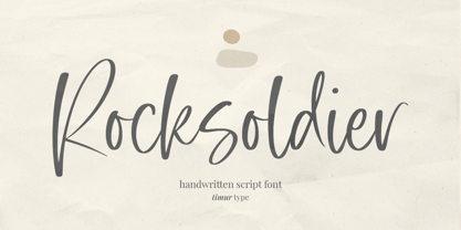 Introducing by Timur type Proudly Present, Rocksoldier ✨ Rocksoldier A Handwritten Script Font, which was created with great care and specially created for you 😊 Rocksoldier is perfect for product packaging, branding project, megazine, social media, wedding, or just used to express words above the background. Simplesky also multilingual support. Embelish your designs with our original fonts. Enjoy the font 😉 Thank you!
 - Sapeca by Just in Type,
$35.00 This project started from an idea to create a fun & informal typeface that would be cool for designers and for the general public. So, Just in Type designed a font with several OpenType features to create different letterings for different occasions, always in a cute way, sometimes even fancy. Have a look at the Sapeca Manual in the Gallery Menu.
 - Warm Thanksgiving by Mvmet,
$15.00 Warm Thanksgiving is a warm and fun font for your thanksgiving day, you can use it for everyday use too for its versatility. Create something with it from regular typing notes, to t-shirts, kids’ book designs, greeting cards, stickers, posters, or anything that needs a casual touch. Fall in love with its incredible style and use it to create lovely designs!
 - UA Squared - Unknown license

- DTCBrodyM37 - Unknown license

- DTCBrodyM33 - Unknown license

- UA Serifed - Unknown license

- Generis Slab by Linotype,
$29.00The idea for the Generis type system came to Erik Faulhaber while he was traveling in the USA. Seeing typefaces mixed together in a business district motivated him to create a new type system with interrelated forms. The first design scheme came about in 1997, following the space saving model of these American Gothics. Faulhaber then examined the demands of legibility and various communications media before finally developing the plan behind this type system. Generis’s design includes two individually designed styles; each of with is available with and without serifs, giving the type system four separate families. Each includes at least four basic weights: Light, Regular, Medium, and Bold. Further weights, small caps, old style figures, and true italics were added to each family where needed. The Generis type system is designed to meet both optical criteria and the highest possible measure of technical precision. Harmony, rhythm, legibility, and formal restraint make up the foreground. Generis combines aesthetic, technical, and economic advantages, which purposefully and efficiently cover the whole range of corporate communication needs. The unified basic form and the individual peculiarity of the styles lead to Generis’ systematic, total-package concept. The clear formal language of the Generis type system resides beneath the information, bringing appropriate typographic expression to high-level corporate identity systems, both in print and on screen. The condensed and aspiring nature of the letterforms allows for the efficient setting of body copy, and the economic use of the page. A range of accented characters allows text to be set in 48 Latin-based languages, offering maximal typographic free range. This previously unknown level of technical and design execution helps create higher quality typography in all areas of corporate communication. Optimal combinations within the type system: Generis Serif or Generis Slab with Generis Sans or Generis Simple. - Generis Serif by Linotype,
$29.00The idea for the Generis type system came to Erik Faulhaber while he was traveling in the USA. Seeing typefaces mixed together in a business district motivated him to create a new type system with interrelated forms. The first design scheme came about in 1997, following the space saving model of these American Gothics. Faulhaber then examined the demands of legibility and various communications media before finally developing the plan behind this type system. Generis’s design includes two individually designed styles; each of with is available with and without serifs, giving the type system four separate families. Each includes at least four basic weights: Light, Regular, Medium, and Bold. Further weights, small caps, old style figures, and true italics were added to each family where needed. The Generis type system is designed to meet both optical criteria and the highest possible measure of technical precision. Harmony, rhythm, legibility, and formal restraint make up the foreground. Generis combines aesthetic, technical, and economic advantages, which purposefully and efficiently cover the whole range of corporate communication needs. The unified basic form and the individual peculiarity of the styles lead to Generis’ systematic, total-package concept. The clear formal language of the Generis type system resides beneath the information, bringing appropriate typographic expression to high-level corporate identity systems, both in print and on screen. The condensed and aspiring nature of the letterforms allows for the efficient setting of body copy, and the economic use of the page. A range of accented characters allows text to be set in 48 Latin-based languages, offering maximal typographic free range. This previously unknown level of technical and design execution helps create higher quality typography in all areas of corporate communication. Optimal combinations within the type system: Generis Serif or Generis Slab with Generis Sans or Generis Simple. - Generis Simple by Linotype,
$39.00The idea for the Generis type system came to Erik Faulhaber while he was traveling in the USA. Seeing typefaces mixed together in a business district motivated him to create a new type system with interrelated forms. The first design scheme came about in 1997, following the space saving model of these American Gothics. Faulhaber then examined the demands of legibility and various communications media before finally developing the plan behind this type system. Generis’s design includes two individually designed styles; each of with is available with and without serifs, giving the type system four separate families. Each includes at least four basic weights: Light, Regular, Medium, and Bold. Further weights, small caps, old style figures, and true italics were added to each family where needed. The Generis type system is designed to meet both optical criteria and the highest possible measure of technical precision. Harmony, rhythm, legibility, and formal restraint make up the foreground. Generis combines aesthetic, technical, and economic advantages, which purposefully and efficiently cover the whole range of corporate communication needs. The unified basic form and the individual peculiarity of the styles lead to Generis’ systematic, total-package concept. The clear formal language of the Generis type system resides beneath the information, bringing appropriate typographic expression to high-level corporate identity systems, both in print and on screen. The condensed and aspiring nature of the letterforms allows for the efficient setting of body copy, and the economic use of the page. A range of accented characters allows text to be set in 48 Latin-based languages, offering maximal typographic free range. This previously unknown level of technical and design execution helps create higher quality typography in all areas of corporate communication. Optimal combinations within the type system: Generis Serif or Generis Slab with Generis Sans or Generis Simple. - Generis Sans by Linotype,
$29.00The idea for the Generis type system came to Erik Faulhaber while he was traveling in the USA. Seeing typefaces mixed together in a business district motivated him to create a new type system with interrelated forms. The first design scheme came about in 1997, following the space saving model of these American Gothics. Faulhaber then examined the demands of legibility and various communications media before finally developing the plan behind this type system. Generis’s design includes two individually designed styles; each of with is available with and without serifs, giving the type system four separate families. Each includes at least four basic weights: Light, Regular, Medium, and Bold. Further weights, small caps, old style figures, and true italics were added to each family where needed. The Generis type system is designed to meet both optical criteria and the highest possible measure of technical precision. Harmony, rhythm, legibility, and formal restraint make up the foreground. Generis combines aesthetic, technical, and economic advantages, which purposefully and efficiently cover the whole range of corporate communication needs. The unified basic form and the individual peculiarity of the styles lead to Generis’ systematic, total-package concept. The clear formal language of the Generis type system resides beneath the information, bringing appropriate typographic expression to high-level corporate identity systems, both in print and on screen. The condensed and aspiring nature of the letterforms allows for the efficient setting of body copy, and the economic use of the page. A range of accented characters allows text to be set in 48 Latin-based languages, offering maximal typographic free range. This previously unknown level of technical and design execution helps create higher quality typography in all areas of corporate communication. Optimal combinations within the type system: Generis Serif or Generis Slab with Generis Sans or Generis Simple. - Cachuelin Letter - Personal use only

- Convalescence - Unknown license

- Scrubble - Unknown license

- Requiem - Personal use only

- Verdy - Personal use only

- Lazov - Unknown license

- Jetmix - Unknown license

- LazovBold - Unknown license

- OLYMPIQUES - Unknown license

- jano - Unknown license

- jey - Personal use only

- bowellberalta - Personal use only

- Gunblade - Unknown license

- Manno - Unknown license

- GEKRAZZE - Unknown license

- Hullunkruunu - Unknown license

- finitimus iungo - Unknown license

- Charlie - Unknown license

- AHDN - Unknown license

- newsiren - Unknown license

- winob - Unknown license

- Impervious - Unknown license

- bubble - Unknown license

- Snowshoe - Unknown license


