10,000 search results
(0.169 seconds)
- MFC Phonograph Monogram by Monogram Fonts Co.,
$19.00 The inspiration source for MFC Phonograph Monogram is a vintage monogram specimen named “Kent” showing only a CBA sample. It was a style I could find no other reference for, but was desperate to recreate this record like styling of monogram. Finally, it all comes to life in MFC Phonograph Monogram. I even threw in a little dog and phonograph icons hidden in the font as decorative icons reminicent of old Victrola records. Phonograph Monogram supports two and three letter monograms, although the two letter style break from the circular record design and creates a zulu style shield design. MFC Phonograph Monogram uses the Ligatures feature, available in most OpenType savvy applications, such as Adobe Illustrator CS (see Fig. 1). The Ligatures feature is typically enabled automatically, but you may need to confirm this in your program if you are not certain. If any second lowercase letter typed does not automatically switch to form the right side of the rounded form, you do not have Ligatures enabled.
 - Giambattista by Wiescher Design,
$39.50 Giambattista is a long-time project of mine finally come to an end. After redesigning all of Giambattista Bodoni's work and then some additional cuts I started a long time ago with this Non-Bodoni Bodoni. The idea came to me while redesigning the original Chancellerosa (chancery). I thought Bodoni just didn't have the right approach to a chancery, this was just not his cup of tea! Maybe that is why he never used the Chancellerosa very much for his own printshop in Parma. So I thought someone has to design a script, that looks like Bodoni could have designed it but is more lively than his. Over the years I have been working on and off on the face and it turned out to become three typefaces which can be freely mixed. Here is my modern version of a script in the style of Giambattista, meant as an hommage, I called it Giambattista. Your modern scribe Gert Wiescher
 - Mafins by Nathatype,
$29.00 Mafins is a combination font of thick display and serif fonts which is simply designed in formal, modern, elegant impressions like other serif fonts. The differences between the thick and thin lines on each character is dramatic and the letters' edges have small hooks for a legibility reason. Due to the great legibility, you can use this font for any text sizes. Make your every design perfect with Mafins font to create the best impressions on your designs. Features: Stylistic Sets Ligatures Multilingual Supports PUA Encoded Numerals and Punctuations Mafins fits for various design projects, such as posters, banners, logos, magazine covers, quotes, name cards, invitations, headings, printed products, merchandise, social media, etc. Find out more ways to use this font by taking a look at the font preview. Thanks for purchasing our fonts. Hopefully, you have a great experience using our font. Feel free to contact us if you require more information when you are dealing with a problem. Thank you. Happy designing.
 - World Madly by Putracetol,
$16.00 World Madly - Display Font is a delightful and quirky typeface designed with an environmental theme in mind. This font exudes a sense of fun and playfulness with its rounded and condensed letterforms, making it a perfect choice for projects related to nature and the Earth. Featuring a remarkable array of ten alternative font versions, each inspired by elements of the Earth and plant life such as tree trunks, leaves, globes, roots, and trees, World Madly is purposefully created for Earth Day-themed designs. It seamlessly integrates into projects with themes centered around nature, green initiatives, and the Earth. This font is an ideal choice for creating designs like Earth Day-themed invitations, birthday invites, party decorations, logos, stickers, clothing, packaging, children's books, magazines, and more. With its crafty and playful style, World Madly lets you express your love for the planet and the environment in your creative projects, adding a touch of eco-consciousness.
 - Linotype Projekt by Linotype,
$29.99Linotype Projekt was created by German type designer Andreas Koch with both a well-defined inspiration and goal. It occurred to me that typefaces like Helvetica and Univers seemed to have a higher quality in hot-metal composition as with modern digital typesetting. They are stronger and livelier. This is in part due to the printing process, which presses the characters onto paper, and in part to the forms of the letters, which differ from the PostScript version of the same typeface. An important aspect of printing is the slight increase in character width resulting from the pressure which also serves as an optical correction to the forms. (True exact squares appear slightly barrel-formed to the eye.) I wanted to revive this peculiarity, not because of a nostalgic feeling, rather just because it is more attractive." The result is Linotype Projekt, a text font which is harmonious, clear and extremely legible. Koch lives in Bielefeld, Germany, and is a freelance book and type designer." - Mundbind NL by Hanoded,
$15.00 I just visited my good friend Jakob Fischer from Pizzadude.dk in Denmark. As always we talked fonts, drank coffee and walked endlessly through Copenhagen, the city where he lives. We thought it would be a fun idea to each create a font from a handmade sign we saw in the city. We only had like 7 glyphs to work with, so the rest was up to our imagination. We also thought it would be nice to give the fonts a similar name. Mundbind means mask in Danish. When you Google translate it, it will give you the wrong translation (it will say 'mouth piece'), so trust me on this one! My font is called Mundbind NL - where the NL stands for Netherlands. Jakob will hopefully call his finished font Mundbind DK - where the DK stands for Denmark. Mundbind NL comes with a monster load of diacritics (including Vietnamese) and two alternate glyphs for the lower case letters that will cycle as you type.
 - Uzurpator by Artcity,
$6.00 Comic book font dedicated for fantasy characters like dragons, elves, angels, trolls, orks etc.
 - HiH Firmin Didot by HiH,
$10.00 Before Bodoni, there was Didot. With the publication by Francois Ambroise Didot of Paris in 1784 of his prospectus for Tasso’s La Gerusalemme Liberata, the rococo typographical style of Fournier de Jeune was replaced with a spartan, neo-classical style that John Baskerville pioneered. The typeface Didot used for this work was of Didot’s own creation and is considered by both G. Dowding and P. Meggs to be the first modern face. Three years later, Bodoni of Parma is using a very similar face. Just as Bodoni’s typeface evolved over time, so did that of the Didot family. The eldest son of Francois Ambroise Didot, Pierre, ran the printing office; and Firmin ran the typefoundry. Pierre used the flattened, wove paper, again pioneered by Baskerville, to permit a more accurate impression and allow the use of more delicate letterforms. Firmin took full advantage of the improved paper by further refining the typeface introduced by his father. The printing of Racine’s Oeuvres in 1801 (seen in our gallery image #2) shows the symbiotic results of their efforts, especially in the marked increase in the sharpness of the serifs when compared to their owns works of only six years earlier. It has been suggested that one reason Bodoni achieved greater popularity than Didot is the thinner hairlines of Didot were more fragile when cast in metal type and thus more expensive for printers to use than Bodoni. This ceased to be a problem with the advent of phototypesetting, opening the door for a renewed interest in the work of the Didot family and especially that of Firmin Didot. Although further refinements in the Didot typeface were to come (notably the lower case ‘g’ shown in 1819), we have chosen 1801 as the nominal basis for our presentation of HiH Firmin Didot. We like the thick-thin circumflex that replaced the evenly-stroked version of 1795, possible only with the flatter wove paper. We like the unusual coat-hanger cedilla. We like the organic, leaf-like tail of the ‘Q.’ We like the strange, little number ‘2’ and the wonderfully assertive ‘4.’ And we like the distinctive and delightful awkwardness of the double-v (w). Please note that we have provided alternative versions of the upper and lower case w that are slightly more conventional than the original designs. Personally, I find the moderns (often called Didones) hard on the eyes in extended blocks of text. That does not stop me from enjoying their cold, crisp clarity. They represent the Age of Reason and the power of man’s intellect, while reflecting also its limitations. In the title pages set by Bodoni, Bulmer and Didot, I see the spare beauty of a winter landscape. That appeals to a New Englander like myself. Another aspect that appeals to me is setting a page in HiH Firmin Didot and watching people try to figure out what typeface it is. It looks a lot like Bodoni, but it isn't!
 - Alterglam by Popskraft,
$18.00 Alterglam is one of my all time favorite fonts, although I didn't think so at first. The font appeared as a modification of my other default font. But over time, the font turned into an independent work. Moreover, the font began to live its own life and constantly demanded attention. So at the same time the Alterglam font is the most thoughtful and polished font in my collection. It is my pleasure to present this wonderful font set for exquisite designs. In the set there are 20 font sizes, which provides a rich typography. If you need a strict, but at the same time artistic font, Alterglam is the font of your choice.
 - Slug by FaceType,
$18.00 Slug is a clean, geometric font, like those that were widely used in the 1970s. To give the user a wide range of possibilities, we made not only a half, a single and a double version, but also provided a bicolor solution: by combining Bicolor A and B you will create astounding multicolored pieces of typography.
 - Luis Serra by Homelessfonts,
$49.00 Homelessfonts is an initiative by the Arrels foundation to support, raise awareness and bring some dignity to the life of homeless people in Barcelona Spain. Each of the fonts was carefully digitized from the handwriting of different homeless people who agreed to participate in this initiative. Please Note: these fonts include only the latin alphabet; no accented characters, no numbers or punctuation. MyFonts is pleased to donate all revenue from the sales of Homelessfonts to the Arrels foundation in support of their mission to provide the homeless people in Barcelona with a path to independence with accommodations, food, social and health care. Luis Serra was born in Alicante. There he grew up and even started a family His life was there. But at the age of 35 he split up with his wife and decided to go to Barcelona in search of a new life. And it wasn’t easy for him. He had to turn his hand to all kinds of jobs and didn’t manage to find the stability he needed. Luis is a shy, retiring person who takes great pleasure in the little things in life such as walking in the mountains or celebrating the victories of his football team, Barça. After four years living in Barcelona, Luis found himself in a position he’d never imagined. “The street’s much worse now, there’s more trouble, there’s more tension,” says Luís. In the street he had to learn, as he always had, to move fast, to find a place to sleep and something to eat. Luís is one of those people who don’t let circumstances mould him, but adapts to them and always tries to do his best.
 - Momento by IbraCreative,
$17.00 Momento – A Stylish Script Monoline Font Momento, a stylish script monoline font, effortlessly marries elegance with modernity in a seamless dance of curves and lines. The graceful strokes of each letter exude a sense of sophistication, making it an ideal choice for projects that demand a touch of refined aesthetics. The monoline design maintains a consistent thickness throughout, adding a contemporary flair to the timeless script style. With its fluid connections and balanced spacing, Momento captures a harmonious rhythm, allowing the script to flow effortlessly like a well-choreographed dance. Whether employed in invitations, branding, or other design ventures, Momento stands as a testament to the perfect fusion of style and versatility, offering a script font that is not only visually pleasing but also a timeless representation of modern elegance. Momento is perfect for branding projects, logo, wedding designs, social media posts, advertisements, product packaging, product designs, label, photography, watermark, invitation, stationery, game, fashion and any projects. Fonts include multilingual support for; Afrikaans, Albanian, Czech, Danish, Dutch, English, Estonian, Finnish, French, German, Hungarian, Italian, Latvian, Lithuanian, Norwegian, Polish, Portuguese, Slovak, Slovenian, Spanish, Swedish.
 - Cross Stitch Carefree by Gerald Gallo,
$20.00 Cross Stitch Carefree is based on upper case characters 10 stitches tall and contains the characters A-Z and period. Several characters extend above the capital line or below the base line.
 - Haegtor by Typemotion,
$25.00 «HAEGTOR» combines a kind of lettering with a calligraphic touch. Beside the upper and lower case latin basic letters there are numerals designed, lining and also medieval, alternate letters, west european diacritics, ligatures, additional characters, lines and symbols, mathematic symbols, open type features...
 - Belinday by Stringlabs Creative Studio,
$25.00 Belinday is a Monoline Script Font with Retro Vintage Style. This font is perfect for fashion brand, apparel, shoes company, wedding invitation, business card, logo brand, clothing, and also business brand name like barber shop or taylor. Thanks.
 - Solastion by GlyphStyle,
$18.00 Solastion is a signature style font that looks both bold and sheer. An elegant looking font and lots of unique characters like natural hand strokes. – Font feature Uppercase, Lowercase, Numerals & Punctuations, Stylistic Alt, Stylistic Set, Swash Ligature, Multilanguage
 - Wasabi by Positype,
$20.00 Remastered in 2019. Wasabi is the re-imagining of my very first release, Iru. Like Iru, Wasabi was heavily influenced by the monument lettering style, Vermarco. The simple, geometric forms allowed for small lettering sizes to be sandblasted cleanly and has been a monument lettering workhorse for decades… the only issue centered around the lack of a lowercase or any other letters beyond the 26 uppercase glyphs and the numerals. Wasabi solves this with the same simple, efficient line reminiscent of the old Vermarco while bringing it into the 21st century. Visual and optical incongruities of the original uppercase were replaced with new interpretations for the capital letters, a new lowercase and small caps were produced and the original single weight alphabet was replaced with six new weights. Wasabi has several ‘lighter’ weights primarily because the thin lines and simple transitions produce very elegant relationships… and I wanted to make sure those relationships could be explored regardless of the scale of letter. Stylistic Alternates show up through the upper, lowercase and small cap glyphs that attempt to simplify these shapes even more when the opportunity arises. Wasabi is as much a utilitarian typeface as it is a headline face. This realization led to the decision to produce a companion Condensed version shortly after the initial regular weights were developed and tested; so, try them all!
 - Ferguson by Arterfak Project,
$14.00 Ferguson is a geometric slab serif which made with a mono-line concept and versatile style. Inspired by old western and magazine designs. Ferguson has a straight and consistent line to give neat looks. Ferguson is made for editorial and formal purposes. but still flexible to use it in other typographic projects. This font family has 6 weights and 2 widths that gives you many options on your designs projects. - Regular versions: Comes from Light, Normal, Medium, Bold, Black, and Ultra Black. Very recommended for editorial use such as body text, sub-headline, and tagline. The bolder weights are goods for headline too. Strong and geometric! Suitable for sports themes, social movement, masculine and logotypes. - Condensed versions: Available in Light, Normal and Bold. Great choice for a headline, and display. This condensed designed a bit minimalist than regular version to keep the readability. Also, there is Bold Shadow style to complete the vintage movement which happening now. Suitable for a poster, magazines, and clothing project. Ferguson font family has up to 28 accents: Afrikaans, Albanian, Catalan, Croatian, Czech, Danish, Dutch, English, Estonian, Finnish, French, German, Hungarian, Icelandic, Italian, Latvian, Lithuanian, Maltese, Norwegian, Polish, Portuguese, Romanian, Slovak, Spanish, Swedish, Turkish, Zulu. Fonts featured : - Uppercase - Lowercase - Numerals - Some symbols - Diacritics Thank you. Hope you like it and enjoy!
 - Wasabi Condensed by Positype,
$20.00 Remastered in 2019. Wasabi is the re-imagining of my very first release, Iru. Like Iru, Wasabi was heavily influenced by the monument lettering style, Vermarco. The simple, geometric forms allowed for small lettering sizes to be sandblasted cleanly and has been a monument lettering workhorse for decades… the only issue centered around the lack of a lowercase or any other letters beyond the 26 uppercase glyphs and the numerals. Wasabi solves this with the same simple, efficient line reminiscent of the old Vermarco while bringing it into the 21st century. Visual and optical incongruities of the original uppercase were replaced with new interpretations for the capital letters, a new lowercase and small caps were produced and the original single weight alphabet was replaced with six new weights. Wasabi has several ‘lighter’ weights primarily because the thin lines and simple transitions produce very elegant relationships… and I wanted to make sure those relationships could be explored regardless of the scale of letter. Stylistic Alternates show up through the upper, lowercase and small cap glyphs that attempt to simplify these shapes even more when the opportunity arises. Wasabi is as much a utilitarian typeface as it is a headline face. This realization led to the decision to produce a companion Condensed version shortly after the initial regular weights were developed and tested; so, try them all!
 - Hella Bertta Script by Letterfreshstudio,
$15.00 Hella Bertta Script A new fresh an modern hand lettered font with decorative characters and a dancing baseline. So beautiful on invitation like handicraft, greeting cards, branding materials, business cards, quotes, posters, and more design concepts. Features : Ligatures Stylistic sets Basic Latin A-Z and a-z Numbers International Symbols included Punctuation Ligature
 - Morning by Monotype,
$15.99 Morning’s spirited, bouncy cursive letterforms feel like a painter’s signature; it’s a familiar style but with something of a twinkle in its eye. The style of Morning looks to imitate wet brush and ink lettering, and dances between seriousness and play. You’ll find a mix of letter connections here, and some ligatures, too.
 - Courtney by Latinotype,
$29.00 Courtney is a display font, unicase, with thick and irregular strokes. It contains a varied set of ligatures that makes Courtney a very dynamic font, ideal for short texts, magazines, logos, etc. It also possesses a large amount of connectors like for example: and, the, by, among other, designed to complement the font.
 - Ramadesh by Typotheticals,
$5.00Lightly playful, this font had a lot of influences in its design. I liked the look of this style in three fonts and decided to create my own version. This is it. Included is a version called Italic, but it is not a true Italic, just a variation in some lower case letters. - Rankensteen by Ingrimayne Type,
$9.00 Many blackletter and calligraphic typefaces are elegant and can be used for items like invitations and liturgical or religious texts. Rankensteen is probably not one of them. It is crude and bizarre and with a somewhat menacing appearance. It seems more appropriate for a letter from a pirate than for a formal invitation.
 - Alisha Arthur by Letterfreshstudio,
$13.00 Alisha Arthur! A new fresh an modern hand lettered font with decorative characters and a dancing baseline. So beautiful on invitation like handicraft, greeting cards, branding materials, business cards, quotes, posters, and more design concepts. Features : Ligatures Stylistic sets Basic Latin A-Z and a-z Numbers International Symbols included Punctuation Ligature
 - Bat Liar by Sipanji21,
$16.00 Bat Liar is a spectacular decorative font with a Sharpness style and like a wings of bat for your design look awesome. It will elevate a wide range of design projects to the highest level, be it branding, headings, Movie Tittle, designs, invitations, signatures, logotype, wall art illustration, apparel, labels, and much more!
 - Beauty angel Script by Letterfreshstudio,
$13.00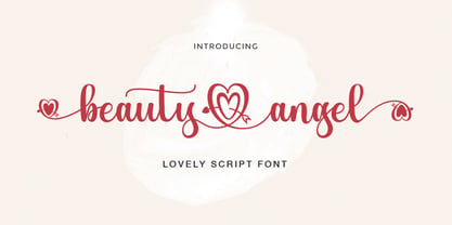 Beauty Angel ! A new fresh an modern hand lettered font with decorative characters and a dancing baseline. So beautiful on invitation like handicraft, greeting cards, branding materials, business cards, quotes, posters, and more design concepts. Features : Ligatures Stylistic sets Basic Latin A-Z and a-z Numbers International Symbols included Punctuation Ligature
 - Bubble Point by Howcolour,
$32.00 Bubble point is a form and shape focussed display font where hand made qualities mix with ballpoint pen and outlines of merged bubbles. If you would like to design a project with a unique look and feel, Bubble Point will help you to project a grim fun and wisdom lurk beneath the meaning.
 - August by Alias Collection,
$60.00 Almost a straightened italic typeface, August explores the idea of taking italic and script letterforms out of context and creating a typeface with a mix of references that does not look like too soft and feminine, but has a sharpness and angularity in some of its characters that jars against this softness.
 - Petit Four by Hanoded,
$15.00 A "Petit Four" is a small, bite-sized, French pastry. The font before you is a bite-sized Hanoded original. It is hand made, fun to use and comes with a lot of calories. Like its namesake, use Petit Four sparingly and it will be the cherry on top of your design.
 - Antypica by Anfound Type,
$33.00 Antypica is a soft and friendly slab-serif font that draws inspiration from typewriter styles. This font is designed to be easily legible in both small and large sizes, making it a great option for various applications. Its simple yet timeless design with a modern twist makes it perfect for use in a wide range of design projects. This includes package design, ad campaigns, brand identities, movie titles, poster art, booklets, and even classified documents. With an impressive 790 glyph count, Antypica supports Basic Latin and Latin Extended-A. OpenType features further enhance typography by providing Small Caps and Small Numbers, Lining Figures, Oldstyle Figures, Superscripts, and Subscripts, Fractions, Tabular Lining Figures, Tabular Oldstyle Figures, Ligatures, and Contextual Alternates to prevent some unwanted letter pair collisions. Additionally, Stylistic Sets offer Stylistic Alternate Lowercase a, Alternate Cap T, Alternate Dollar Sign, and Slanted Hyphen to add calligraphic quality to text blocks, while the Special Set offers unique glyphs like Bitcoin and Interrobang. Antypica is highly versatile and can be used in many design applications. Small Caps and Small Numbers can be used creatively to create more visually engaging typography, and the optimized underline effect can be used to enhance the design. To access the Special Set in OpenType features, select it from the OpenType menu. To add special additional marks, type following in your text field. • For the Exclam-Comma mark, type ” ,! ” (comma+exclam) • For the Question-Comma mark, type ” ,? ” (comma+question) • For the Bitcoin mark, simply type " bitcoin " (not case sensitive). • For the alternate (Cap Height) Registered mark, type " registered " (not case sensitive). • For the Published mark, type " published " (not case sensitive). The font also has a small caps version of the Published Mark. • For the Numero mark, type " N° " (N + degree) (case sensitive). • For the Interrobang, type " bang " (not case sensitive). • For Price marking, type ” ,– ” (comma + one of these: hyphen, en dash, em dash). • For Dot(s) Pattern glyph, type " dots " (not case sensitive). • For Line(s) Pattern glyph, type " lines " (not case sensitive).
 - Brushwork by Celebrity Fontz,
$24.99 Brushwork is a free-flowing brush font that combines a modern aesthetic with a very unique style. Some have suggested that Brushwork looks like a cross between Roman and Japanese characters but most agree it evokes total freedom of expression. Includes a full set of accented characters to accommodate most of the Romance languages.
 - Bupkis by Hanoded,
$15.00 Bupkis literally means ‘goat’s dropping’ in Yiddish, but it is used to say ‘nothing, zero, zilch’. Bupkis is a very nice handmade font. A little formal, a little uneven, a little unusual. Use for it whatever you like, but product packaging, cards and book covers do come to mind. Comes with a lot of diacritics.
 - Rainfall by Arkalandara,
$130.00 Nightmare font is a simple attempt to convey the essence of a handwritten font with strong lines. In a real handwritten font, you would find more variation in line thickness, curves, and other design elements that contribute to the overall style. Creating a visual representation of a handwritten font using lines can be a bit challenging in plain text, but I'll provide a simple ASCII representation that may give you an idea of a strong handwritten style. Keep in mind that this is a very basic representation, and actual fonts would have much more detail and nuances.
 - FarCry - Personal use only

- The Rio Lobo - Unknown license

- Admiration Pains - Personal use only

- GIANTS ITALIC PERSONAL USE - Personal use only

- Dust Serif - Personal use only

- Hotel Coral Essex - Personal use only


