10,000 search results
(0.038 seconds)
- Farfa by Eurotypo,
$44.00 The Farfa fonts were designed for institutional use, commissioned by the City of Fara in Sabina, Italy. This project started from the study of the manuscripts found in the Abbey of Farfa, penned in a variant of the lower case of “Carolingian” typical style of that area. The Capital, ligatures and Small Caps, however, are based on the uncial writing that often appears in those codes and manuscripts. Farfa Abbey is a territorial abbey in northern Lazio, central Italy. It is one of the most famous abbeys of Europe. It belongs to the Benedictine Order and is located about 60 km from Rome, in the commune of Fara Sabina The origin of the Abbey is still unknown. Archaeological discoveries seem to prove that the first monastic establishment was built on the ruins of a pagan temple. The Vandals destroyed the first monastery in the fifth century. Only a few documents from the sixth-century prove the early presence of the monastic community. It had the heritage of Charlemagne (S VIII), the Lombard chiefs, and later the Carolingians, succeeded in withdrawing Farfa from obedience to the Bishops of Rieti, and in securing many immunities and privileges for the monastery. Farfa was at this period the most important monastery in Italy both from the point of view of worldly possession and ecclesiastical dignity.
 - Posh by Lián Types,
$49.00 I've always been in love with fat didones. That’s the reason of Posh. In search of something unique, I started this family back in 2013 with the aim of creating the fattest yet readable bodonian typeface in the market: It was a challenge, because roman fonts need generous counters (or what some call white spaces) and taking them to the extreme of inexistence attempted against the construction of many glyphs. Ears, dots, terminals and serifs always need some extra space so I had to find the exact point of boldness to make characters which have those attributes work well in the middle of those which haven't. (1) After a while, I felt I was again ‘in my element’: Big contrasted letters, sexy and elegant curves, and that Lubalinesque feeling that characterise my fonts. (2) Words written with Posh are a explosion of elegance and sensuality due to the fact that its didone attributes were exaggerated. Since it’s full of alternate glyphs, one can change and choose them until a nice block of ‘‘black’’ is achieved. (3) To accompany the regular style, I designed Posh Inline, a font with the same quantity of glyphs than the regular one; an all caps style called Posh Capitals, and also a really playful Italic version. I hope you find this one delicious like I do! This font is dedicated to all who understand letters are not just meant to be read, but also to be appreciated in group and individually. Enjoy it. NOTES (1) In example, it can be easy to design a fat letter ‘n’ with almost no counter, but really tough to make a satisfactory letter ‘s’ with serifs to match that ‘n’. (2) Also, it wasn't my first attempt in fat didones. Take a look at my font Reina, made in 2012. (3) Posters above show many words with ball terminals that seem to dance above and below the words in order to fill those “undesired” blank spaces.
 - Tiddly Winks NF by Nick's Fonts,
$10.00This dotty delight, with its exceptional x-height, is based on handlettering presented in one of Hal Martin’s many Idea Books for Signmen, Artists and Displaymen, published in the 1930s. The ball terminals on several letters in the original alphabet have been enlarged to punctuate the page with dancing dots, suggesting the game which gives this typeface its name. Both versions of the font include 1252 Latin, 1250 CE (with localization for Romanian and Moldovan). - Barcore by Barkar Designs,
$12.00 This font was designed to create unique typography in graphic design. It consists of one style and only capital letters. It is deliberately complicated by the addition of styles and lines that are not traditional for the latin or cyrillic alphabet, which adds zest, makes you look closely. The uniqueness of this font also lies in the fact that it is made in a geometric style using only square angles or perfect rounding in glyphs. This font will add futurism to your project, the unusual font always looks stylish and memorable. I am sure that the font will come in handy for those who want to add something new, modern and unique to their work.
 - Poliphili by Flanker,
$19.99 Hypnerotomachia Poliphili, which can be translated in English as “Dreaming Love Fighting of Poliphilus”, is a romance about a mysterious arcane allegory in which the main protagonist, Poliphilo, pursues his love, Polia, through a dreamlike landscape. In the end, he is reconciled with her by the “Fountain of Venus”. The author of the book is anonymous, however, an acrostic formed by the first, elaborately decorated letter in each chapter in the original Italian reads “POLIAM FRATER FRANCISCVS COLVMNA PERAMAVIT”, which means “Brother Francesco Colonna has dearly loved Polia”. Despite this clue, the book has also been attributed to many other authors. The identity of the illustrator is less certain than that of the author. It was first published in Venice, in December 1499, by Aldo Manutio. This first edition presents an elegant and unique page layout, with refined woodcut illustrations in an Early Renaissance style and a refined Roman font, cut by Francesco da Bologna, which is a revised version of the type used in 1496 for the De Aetna of Pietro Bembo. The print quality is very high for the time, but nevertheless it presents many inconsistencies and imperfections due to the non-ideal inking and adherence of the matrix to the paper. For that reason numerous samples of the original have been used to create every single glyph which will result in an appropriate reconstruction and not a mere and humble reproduction. Some letters like \J, \U and \W were extrapolated, because they are not part of the original alphabet of the period. Some letters like \Q, \X, \Y, \Z and \h have been updated to more modern variants, but the original shape is accessible by Stylistic Alternates Opentype Feature, which also changes the shape of the \V and the \v. The original numerals \zero, \one, \tree, \four and \six have been accompanied by reconstructions of the missing numbers and extended by modern figures. Finally, swashed lower cases and original scribal abbreviations were also included. The font has joined by a matching Italic variant, closely inspired from Aldo Manuzio's 1501 "Vergilius", the first book printed entirely in Italic type by Francesco da Bologna.
 - Suhainora by Picatype,
$12.00 Suhainora Script is a hand drawn calligraphy font, organic, dynamic and energetic style. It can used for various purposes. such as the title, signature, logo, correspondence, wedding invitations, letterhead, signage, labels, newsletters, posters, badges, etc. To enable the OpenType Stylistic alternates, you need a program that supports OpenType features such as Adobe Illustrator CS, Adobe Indesign & CorelDraw X6-X7, Microsoft Word 2010 or later versions. How to access all alternative characters, using Windows Character Map with Photoshop: https://www.youtube.com/watch?v=Go9vacoYmBw How to access all alternative characters using Adobe Illustrator: https://www.youtube.com/watch?v=XzwjMkbB-wQ Suhainora Script is coded with PUA Unicode, which allows full access to all the extra characters without having special designing software. Mac users can use Font Book , and Windows users can use Character Map to view and copy any of the extra characters to paste into your favourite text editor/app. Thanks so much for looking and please let me know if you have any questions.
 - Redynand Script by Strong,
$21.00 Redynand Script is a soft and sweet Bold typeface, with characters dancing along the baseline. It has a casual and elegant touch. Can be used for various purposes such as logos, wedding invitations, headings, t-shirts, letterheads, signage, labels, news, posters, badges etc. OpenType features with alternative styles, ligatures, and multiple language support. To enable the OpenType Stylistic alternative, you need a program that supports OpenType features such as Adobe Illustrator CS, Adobe Indesign & CorelDraw X6-X7, Microsoft Word 2010 or later. How to access all alternative characters, using the Windows Character Map with Photoshop: https://www.youtube.com/watch?v=Go9vacoYmBw How to access all alternative characters using Adobe Illustrator: http://youtu.be/iptSFA7feQ0 There are additional ways to access alternatives/swashes, using the Character Map (Windows), Nexus Font (Windows), Font Book (Mac) or a software program such as PopChar (for Windows and Mac). Need help? If you need help or advice, please contact me by email. Thank you!
 - Anitasha by Great Studio,
$14.00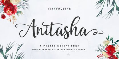 Anitasha is a modern pretty script font, organic, dynamic and energetic style. Can be used for various purposes such as the titles, signature, logos, correspondence, wedding invitations, letterhead, signage, labels, newsletters, posters, badges, etc. To enable the OpenType Stylistic alternates, you need a program that supports OpenType features such as Adobe Illustrator CS, Adobe Indesign & CorelDraw X6-X7, Microsoft Word 2010 or later versions. How to access all alternative characters, using Windows Character Map with Photoshop: https://www.youtube.com/watch?v=Go9vacoYmBw How to access all alternative characters using Adobe Illustrator: https://www.youtube.com/watch?v=XzwjMkbB-wQ Anitasha is coded with PUA Unicode, which allows full access to all the extra characters without having special designing software. Mac users can use Font Book and Windows users can use Character Map to view and copy any of the extra characters to paste into your favorite text editor/app. Thanks so much for looking and please let me know if you have any questions.
 - Mousse Script by Sudtipos,
$79.00 Mousse Script is based on Glenmoy, a 1932 Stephenson Blake typeface. Glenmoy a prime example of what display typography was in pre-WWII American ad art. It graced the pages of magazines, sold numerous products and services, then simply died out when the typographic trends shifted towards the more personalized, stylized and handwritten types of calligraphy. The current trend in typography is a revivalism that brings all of the distinctive display typography of the 20th century, without chronological discrimination, back in the name of ‘retro’. Who are we to deny the masses what they want? Mousse Script doesn’t just bring Glenmoy back from the ashes of the 20th century. It expands upon the limited metal character set nearly twice over and takes advantage of the latest type technologies. This makes Mousse Script a striking typeface, both functionally and visually. A simple, attractive display font on the surface, Mousse Script is unique in its bold upright calligraphy, something rarely found these days. The OpenType version of Mousse Script combines both the regular and alternate character sets into a single, cross-platform package that takes advantage of the extended typographic features of the OpenType format.
 - Tisk by Gittype,
$20.00 Tisk is a superb blackletter font. The Blackletter typeface (also sometimes referred to as Gothic, Fraktur or Old English) was used in the Guthenburg Bible, one of the first books printed in Europe. This style of typeface is recognizable by its dramatic thin and thick strokes, and in some fonts, the elaborate swirls on the serifs. Use this font for any crafting project that requires a personalized look!
 - Gundrada ML by HiH,
$12.00 Gundrada ML was inspired by the lettering on the tomb of Gundrada de Warenne. She was buried at Southover Church at Lewes, Sussex, in the south of England in 1085. The Latin inscription on her tomb, STIRPS GUNDRADA DUCUM, meaning “Gundrada, descendant of the Duke” may have led to the speculation that she was the daughter of William, Duke of Normandy and bastard son of Robert the Devil of Normandy and Arletta, daughter of a tanner in Falaise. In 1066 William defeated Harold at the Battle of Hastings and was crowned William I of England. More commonly known as William the Conquerer, he commissioned a string of forts around the kingdom and charged trusted Norman Barons to control the contentious Anglo-Saxon population. William de Warenne, husband of Gundrada, was one of these Barons. There has also been the suggestion that Gundrada may have been the daughter of William’s wife, Matilda of Flanders, by a previous marriage. According to the Dictionary of National Biography (Oxford University Press, Oxford, England 1921-22), both of these contentions are in dispute. Searching the past of a thousand years ago is like wandering in a heavy fog: facts are only dimly in view. Regardless, I know that I found these letterforms immediately engaging in their simplicity. Unadorned and unsophisticated, they have a direct honesty that rests well in the company of humanistic sans serifs like Franklin Gothic or Gill Sans, appealing to a contemporary sensibility. The lettering on the tomb is in upper case only. Although Gundrada does not sound Norman French to me, her husband certainly and her father probably were Norman French. Nonetheless, the man that carved her tombstone was probably Anglo-Saxon, like most of the people. For that reason, we are quite comfortable with a fairly generic lower case from an Anglo-Saxon document of the time. The time was a time of transition, of contending language influences. This font reflects some of that tension. Features 1. Multi-Lingual Font with 389 glyphs and 698 Kerning Pairs. 2. OpenType GSUB layout features: onum, dlig, liga, salt & hist. 3. Tabular Figures and Alternate Old-Style Figures. 4. Alternate Ruled Caps (line above and below, matching to brackets). 5. Central Europe, Western Europe, Turkish and Baltic Code Pages. 6. Additional accents for Cornish and Old Gaelic. 7. Stylistic alternates A, E, y and #. 8. Ligatures ST, Th, fi and fl. 9. Historic alternate longs. The zip package includes two versions of the font at no extra charge. There is an OTF version which is in Open PS (Post Script Type 1) format and a TTF version which is in Open TT (True Type)format. Use whichever works best for your applications.
 - Monceau by URW Type Foundry,
$19.99 As a successor of Didots famous font, which marked the beginning of modern typography, the Monceau has inherited the spirit, elegance and sophistication of french style, although in a revamped design, typical for the first years of the 21st century. Liberated from its serifs and with soft and round small letters the Monceau approaches ornamental typography and thus perfectly lends itself to being enlarged: it’s a font that loves to be closely looked at. Its name, lent from the famous parc Monceau in Paris, evokes and reinvents in a modern graphical way all of the Parisian chic at the end of 18th and the beginning of the19th century (the time Didot was born), the French Revolution and Empire, the architecture of this business quarter and notably the arabesques of the monumental gates still present in our times.
 - Fluire by Lián Types,
$37.00 MAS AMOR POR FAVOR (1) (more love, please) Fluire means -to flow- in Italian and that’s what this font is all about. The story began when a friend of mine asked for a tattoo with the word -Fluir- (to flow in Spanish). She didn't want a tattoo full of swashes and swirls, like I'm used to doing, but something more fluent, soft and minimal. My very first attempts were more related to copperplate calligraphy but I wasn't even close: I discovered that I needed to forget a little bit about the classic contrast and speed of the engrosser's nib and started playing with a tiny flat metal nib. Letters started to flow, and I immediately thought of turning them into a font. Inspired by the tattoo I created and by other tattoos I saw, I started the journey of what would be a very fun process. The result is a very cute, almost monoline font with a wide range of uses. USES If not used for a tattoo (my first ‘target’), the font delivers amazing results in combination with Fluire Caps: These two need each other, they go together, they talk. I designed Fluire Caps Down and Fluire Caps Up so it’s easier to manage their colors. Also there’s Fluire Caps Down Lines, which has a decorative thin line to add yet another dimension. Use the fonts in magazines, book covers, posters, greeting cards, weddings, lettered walls, storefronts! TIPS Since the font is Open-Type programmed, I strongly recommend using it in applications that support that feature. Also, the font looks way better when -contextual alternates- are activated, but it’s your choice :) Try Fluire, and keep flowing. NOTES (1) The phrase alludes to maybe the most tattooed phrase in Latin America.
 - Steamfunk by MKGD,
$13.00 The font Steamfunk is based on Steampunk. A form of science fiction that couples Victorian era style with futuristic devices operated by early industrial age technology. Each Steamfunk letter is constructed in two symbolic parts. A thick stroke, for the machine’s outer shell, and a second, wire-like, stroke for that machine's delicate inner workings. The result is a look that is Steampunk in appearance, without it being exclusively so. Steamfunk has a glyph count of 398 and supports the following languages; Afrikaans, Albanian, Asu, Basque, Bemba, Bena, Bosnian, Catalan, Chiga, Colognian, Cornish, Croatian, Czech, Danish, Embu, English, Esperanto, Estonian, Faroese, Filipino, Finnish, French, Friulian, Galician, German, Gusii, Hungarian, Icelandic, Indonesian, Irish, Italian, Kabuverdianu, Kalaallisut, Kalenjin, Kamba, Kikuyu, Kinyarwanda, Latvian, Lithuanian, Low German, Lower Sorbian, Luo, Luxembourgish, Luyia, Machame, Makhuwa-Meetto, Makonde, Malagasy, Malay, Maltese, Manx, Meru, Morisyen, North Ndebele, Norwegian Bokmål, Norwegian Nynorsk, Nyankole, Oromo, Polish, Portuguese, Romanian, Romansh, Rombo, Rundi, Rwa, Samburu, Sango, Sangu, Scottish Gaelic, Sena, Shambala, Shona, Slovak, Slovenian, Soga, Somali, Spanish, Swahili, Swedish, Swiss German, Taita, Teso, Turkmen, Upper Sorbian, Vunjo, Walser, Zulu.
 - Futurex Slab - Unknown license

- Futurex Metal-gear Bold - Unknown license

- ZenoPotion AOE by Astigmatic,
$19.95ZenoPotion is a geometric styled typeface influenced by alien stories and nostalgia. It carries a techno look with a regular lined top and dipped thick bottom throughout, highly readble, though not best for large bodies of text. Use the alien technology, let ZenoPotion be the type for your designs and stories. From the far reaches of space, another lifeform sent a message, now you can use their typestyle to convey your own! - Dalek Pinpoint by K-Type,
$20.00 DALEK PINPOINT is a clean and precise version of K-Type’s distressed DALEK typeface, a small caps face with overtones of Greek, Phoenician and Runic alphabets, based on Dalek comic book lettering from the 1960s. The package includes Regular and Bold weights, plus an Italic and Bold Italic which are optically corrected obliques. The fonts contain a full complement of Latin Extended-A characters, and now include Greek capitals and small caps.
 - Praho Pro Stencil by Picador,
$29.00 Praho Pro is a part of Warsaw Types – a project based on Warsaw’s local typographic heritage. The project, presented at the Museum of Praga, is a collaboration of 12 young Polish typographers. Praho Pro Stencil is a multilingual family inspired by the unique, historical character of Praga district of Poland's capital - Warsaw. High contrast, thin serifs, sharp terminals and large x-height are key features for distinctive headlines. Now available as a stencil version!
 - Solpera by Storm Type Foundry,
$32.00This type face fills one of the gaps between the world of Roman alphabets and that of linear alphabets. The first to be designed was the set of upper-case letters. The expression of these characters cannot conceal that they were originally intended only for the sculptor's use, as a type face for three-dimensional inscriptions. Their width proportions reflect a dialogue between the contemporary feeling and the legacy of classical Roman inscriptions. The type face was later complemented with a set of lower-case letters and elaborated into further designs. Its clear, concise letter forms end with small serifs which not only make the type face more refined, but above all anchor the individual letter signs visually to the horizontal of the text line. The austere construction of the majority of the letters is balanced by the more exuberant, humanizing forms of the most frequently used letters "a"; "e". (The three variants of the lower-case "e" enable to create rhythmically differentiated texts.) The letters in which a straight stroke is connected with an arch are designed in two ways. That means that the letters "n", "h","m" and the group of letters "b","d","p","q" are conceived in a different way. Thus an interesting tension is created in the structure of the text, which, however, does not endanger legibility. The economizing, slightly narrowed design of this type face predetermines its use for the setting of usual texts. In larger sizes, however, it produces a rather serious, even solemn, impression. - Movatif by Typodermic,
$11.95 Introducing Movatif, the typeface that effortlessly combines the best of 20th Century sans-serif typefaces into one irresistible mash-up. With seven different weights to choose from, this font has the versatility to make any design stand out. But Movatif isn’t just any ordinary font—it’s packed with OpenType features that will leave your audience in awe. By simply pairing certain letters together, you can create a captivating visual effect that will absolutely freak folks out. Take the letters M and A, for example—they snap together in a way that is both cool and slightly fascinating. But what really sets Movatif apart is the way familiar pieces interact in unexpected ways. With every letter, your design takes on a personalized style that captures the dreary 1970s malaise in a fashionable way. So if you want to create something truly unique, give Movatif a try. With its versatile weights and captivating features, it’s the typeface that will take your design to the next level. Most Latin-based European writing systems are supported, including the following languages. Afaan Oromo, Afar, Afrikaans, Albanian, Alsatian, Aromanian, Aymara, Bashkir (Latin), Basque, Belarusian (Latin), Bemba, Bikol, Bosnian, Breton, Cape Verdean, Creole, Catalan, Cebuano, Chamorro, Chavacano, Chichewa, Crimean Tatar (Latin), Croatian, Czech, Danish, Dawan, Dholuo, Dutch, English, Estonian, Faroese, Fijian, Filipino, Finnish, French, Frisian, Friulian, Gagauz (Latin), Galician, Ganda, Genoese, German, Greenlandic, Guadeloupean Creole, Haitian Creole, Hawaiian, Hiligaynon, Hungarian, Icelandic, Ilocano, Indonesian, Irish, Italian, Jamaican, Kaqchikel, Karakalpak (Latin), Kashubian, Kikongo, Kinyarwanda, Kirundi, Kurdish (Latin), Latvian, Lithuanian, Lombard, Low Saxon, Luxembourgish, Maasai, Makhuwa, Malay, Maltese, Māori, Moldovan, Montenegrin, Ndebele, Neapolitan, Norwegian, Novial, Occitan, Ossetian (Latin), Papiamento, Piedmontese, Polish, Portuguese, Quechua, Rarotongan, Romanian, Romansh, Sami, Sango, Saramaccan, Sardinian, Scottish Gaelic, Serbian (Latin), Shona, Sicilian, Silesian, Slovak, Slovenian, Somali, Sorbian, Sotho, Spanish, Swahili, Swazi, Swedish, Tagalog, Tahitian, Tetum, Tongan, Tshiluba, Tsonga, Tswana, Tumbuka, Turkish, Turkmen (Latin), Tuvaluan, Uzbek (Latin), Venetian, Vepsian, Võro, Walloon, Waray-Waray, Wayuu, Welsh, Wolof, Xhosa, Yapese, Zapotec Zulu and Zuni.
 - Trakya Slab by Bülent Yüksel,
$19.00 Thrace (/θreɪs/; Greek: Θράκη, Thráki; Bulgarian: Тракия, Trakiya; Turkish: Trakya) is a geographical and historical region in Southeast Europe, now split among Bulgaria, Greece, and Turkey, which is bounded by the Balkan Mountains to the north, the Aegean Sea to the south, and the Black Sea to the east. It comprises southeastern Bulgaria (Northern Thrace), northeastern Greece (Western Thrace), and the European part of Turkey (East Thrace). Trakya Slab is a modern slab serif with a geometric touch. It has a modern streak which is the result of a harmonization of width and height especially in the lowercase letters to support legibility. Ideally suited for advertising and packaging, editorial and publishing, logos, branding and creative industries, posters and billboards, small text, way-finding and signage as well as web and screen design. Trakya Slab provides advanced typographical support for Latin-based languages. An extended character set, supporting Central, Western and Eastern European languages, rounds up the family. The designation “Trakya Slab 500 Regular” forms the central point. The first figure of the number describes the stroke thickness: 100 Thin to 900 Bold. "Trakya Slab" comes with 5 weights and italics; "Trakya Slab Alt" also comes with 5 weights and matching italics, giving a total of 20 styles. The family contains a set of 630+ characters. Case-Sensitive Forms, Classes and Features, Small Caps from Letter Cases, Fractions, Superior, Inferior, Denominator, Numerator, Old Style Figures just with one touch, easy to access in all graphic programs. Trakya Slab is the perfect font for web use. Enjoy using it.
 - Exotile by Sylvain Zimmer,
$15.99 Hexagons are all over the place in nature : from honeycombs to snowflakes and the tiling patterns seen on fruits. That form guided me in the creation of this new font. So Exotile is a font inspired by nature. This typeface is ideal for display purposes. It comes in 3 different weights and support for different languages.
 - Nodhe by Wontenart,
$18.00 Fonts with special characters in lowercase vowels: a, i, u, e, o Make sentences more colourful. This font is neutral for use in any product. Especially for happy things, or life motivational words. or contemporary like the teenage years, discover the beauty of harmony in your work with this font. The right choice of fonts, makes a great product.
 - Srostky by Nikita Kanarev,
$25.00 The Srostky font is willful and stubborn. It is rude, but it is as natural as a country boy. The characters of this font were inspired by an image of the Russian countryside. The letters look as if they were felled with an ax. It is named after the village in Altai region. This font is suitable for short sayings and titles.
 - Nawin Latin by Letterjuice,
$66.00 Nawin is an informal Arabic typeface inspired by handwriting. The idea behind this design is to create a type family attractive and ownable for children but at the same time a design that keeps excellent letter recognition for reading. Handwriting has been a great source of inspiration in this particular typeface. By emulating the movements of the pen, we have obtained letter shapes that express spontaneity. A bright group of letters create a lively and beautiful paragraph of text. To get closer to handwriting and the variety of letter shapes that we draw while writing, this typeface offers a large number of alternative characters, which differ slightly from the default ones. Because we have programed the «Contextual Alternate» feature in the fonts, these alternate characters appear automatically as you set a text on your computer. For instance, in the Arabic variability on vertical proportions between letters Alef and initial Lam, create movement in text and avoid the cold mechanical feel of repetition. In the case of the Latin a part from having an entire alternate basic alphabet, there are also different letterforms for characters with diacritics, this way variability becomes even greater. Nawin is quirky and elegant at the same time. Letter recognition is relevant when reading continuous text. For this reason, in the Arabic, we have added another contextual alternate feature with alternate characters that help to avoid confusion when letters with similar or the same shape repeat inside one word. This is the case of medial «beh and Yeh» repeated three times continuously in the same word. The alternate characters change in shape and length, facilitating distinction to the reader. Since this typeface is inspired by handwriting and the free movement of the hand while writing, we considered ligatures a good asset for this design. The Arabic has a wide range of ligatures that enhance movement and fluidity in text making look text alive, while the Latin achieves this same effect via contextual alternates.
 - Nawin Arabic Ltn by Letterjuice,
$107.00 Nawin is an informal Arabic typeface inspired by handwriting. The idea behind this design is to create a type family attractive and ownable for children but at the same time a design that keeps excellent letter recognition for reading. Handwriting has been a great source of inspiration in this particular typeface. By emulating the movements of the pen, we have obtained letter shapes that express spontaneity. A bright group of letters create a lively and beautiful paragraph of text. To get closer to handwriting and the variety of letter shapes that we draw while writing, this typeface offers a large number of alternative characters, which differ slightly from the default ones. Because we have programed the «Contextual Alternate» feature in the fonts, these alternate characters appear automatically as you set a text on your computer. For instance, in the Arabic variability on vertical proportions between letters Alef and initial Lam, create movement in text and avoid the cold mechanical feel of repetition. In the case of the Latin a part from having an entire alternate basic alphabet, there are also different letterforms for characters with diacritics, this way variability becomes even greater. Nawin is quirky and elegant at the same time. Letter recognition is relevant when reading continuous text. For this reason, in the Arabic, we have added another contextual alternate feature with alternate characters that help to avoid confusion when letters with similar or the same shape repeat inside one word. This is the case of medial «beh and Yeh» repeated three times continuously in the same word. The alternate characters change in shape and length, facilitating distinction to the reader. Since this typeface is inspired by handwriting and the free movement of the hand while writing, we considered ligatures a good asset for this design. The Arabic has a wide range of ligatures that enhance movement and fluidity in text making look text alive, while the Latin achieves this same effect via contextual alternates.
 - Bielik by Hotniedog Studio,
$10.00 Bielik was created for a comic book that I’m working on. Main goal was to achieve random character of texts, so I made three glyphs for every letter, even for diacritics. Firstly I was drawing using brush pen with ink, so thickness of letters was really various. I decided to implement this style into a font. So that is how Bielik came into the world. This is good choice for comic books, children books, display designs and much more. Bielik is a polish word for Haliaeetus albicilla.
 - Five Star Final by Solotype,
$19.95Introduced by the American Type Founders Co. at the time of the Spanish American War and advertised as suitable for "War Scare Headlines"! Used by many papers for years after because the narrow type was suitable for narrow single column heads. - Tasman by Re-Type,
$30.00 Originally published by OurType, Dan Milne’s Tasman has found a new home at Retype. Milne first conceived Tasman as a typeface for newspapers. This influenced the proportions and look of the face considerably: the goal was to keep the personality as warm and playful as possible without losing the credible tone required to deliver all kinds of news. A sturdy, warm type family that is neither mechanical nor fragile. It borrows its name from Abel Janszoon Tasman (1603–1659), a Dutch seafarer, explorer, and merchant who mapped parts of Australia in 1642, including Van Diemen’s Land (now known as Tasmania). Tasman’s primary purpose is an unbiased presentation of information; it strives for neutrality over elegance. Its characters are sturdy and unambiguous, sporting strong serifs, punctuation, and diacritics, as well as generously sized small caps and hybrid figures. Rationalized letterforms give the face enough robustness to withstand the stress of screen applications and laser printing. The figures’ three-quarter x-height makes them considerably larger than traditional oldstyle numerals, yet they still integrate with the lowercase much better than lining figures do. Although initially intended for newspapers, Tasman’s somewhat corporate, objective appearance also makes it an excellent candidate for digital and print magazines, websites, annual reports, and corporate identities. Tasman is a suite of feature-rich OpenType fonts fully equipped to tackle complex, professional typography. The character set includes small caps, fractions, case-sensitive forms, bullets, arrows, special quotes, and nine sets of numerals. Besides standard Latin, its extensive character set supports Central European, Baltic, and Turkish languages.
 - Vogan by Heinzel Std,
$9.00 Vogan Typeface is a versatile font that comes in both regular and outline versions, both of which are in all capital letters. The regular version of the Vogan typeface features solid, bold characters that are perfect for making a statement. The letters are clean and well-defined, making them highly readable and suitable for a variety of design projects. Whether used for headings, logos, headlines, magazines, posters, or other creative applications, the regular version of Vogan Typeface commands attention with its bold and impactful appearance. In contrast, the outline version of Vogan Typeface provides a different aesthetic. The characters in this version are defined by their outer contours, creating a stylish and modern look. The outline font maintains the overall shape of the letters while allowing the background to show through the center, adding a touch of sophistication and creativity to any design. This version is particularly popular for design projects where a contemporary and edgy vibe is desired.
 - Cityscape by Scriptorium,
$12.00The characters in this font fit together in hundreds of combinations to form different city skylines. - Maya Month Glyphs by Deniart Systems,
$15.00 Contains the 19 months of the Maya solar year (in outline and silhouette mode) as well as the 19 Maya numerals. NOTE: this font comes with an interpretation guide in pdf format.
 - Voynich - Personal use only

- Gattela by Skinny Type,
$14.00 Gattela Script is modern lovely calligraphy script, with characters dance along the baseline & elegant touch. Can be used for various purposes.such as logos, wedding invitation, heading, t-shirt, letterhead, signage, lable, news, posters, badges etc.OpenType features with stylistic alternates, ligatures and multiple language support.To enable the OpenType Stylistic alternates, you need a program that supports OpenType features such as Adobe Illustrator CS, Adobe Indesign & CorelDraw X6-X7, Microsoft Word 2010 or later versions. How to access all alternative characters, using Windows Character Map with Photoshop: https://www.youtube.com/watch?v=Go9vacoYmBw How to access all alternative characters using Adobe Illustrator: http://youtu.be/iptSFA7feQ0 There are additional ways to access alternates/swashes, using Character Map (Windows), Nexus Font (Windows), Font Book (Mac) or a software program such as PopChar (for Windows and Mac). Thank you!
 - Adela by IM Studio,
$12.00 Adela Script is modern calligraphy. Bold, elegant & fun vintage script font. Can be used for various purposes such as logos, wedding invitations, t-shirts, letterhead, signage, news, posters, badges etc. Adela Script features glyphs and alternate characters, ligatures, swashes, and multiple language support. To enable the OpenType Stylistic alternative, you need a program that supports OpenType features such as Adobe Illustrator CS, Adobe Indesign & CorelDraw X6-X7. How to get access to alternative glyphs from open type fonts: http://youtu.be/iptSFA7feQ0 There are additional ways to access alternatives/swashes, using the Character Map (Windows), Nexus Font (Windows), Font Book (Mac) or a software program such as PopChar (for Windows and Mac). How to access all alternative characters, using Windows Character Map with Photoshop: https://www.youtube.com/watch?v=Go9vacoYmBw
 - Irrlicht by Aarhaus,
$30.00 Irrlicht is based on C. H. Kleukens’ 1923 typeface Judith Type . Whilst Dunkle Irrlicht is a fairly faithful rendition and extension of Kleukens’ typeface, the Licht style was initially added as a stand-alone stencil version; yet, the two styles work perfectly together – for different nuances, for emphasis or simply stacked/layered. Irrlicht is equipped with upper- and lowercase ligatures, contextual and stylistic alternates, fractions, superior and inferior figures, extended language support and a few extra goodies. Additional information – How Irrlicht came to life Christian Heinrich Kleukens cut his Judith Type in 1923, at the peak of German expressionism, exclusively for publications with the Ernst-Ludwig-Press, such as a limited series of biblical prints – the first being the Book of Judith , hence the original’s name. I stumbled upon this typeface a couple of years ago in a nice little 1930 booklet of the Gutenberg-Gesellschaft and was struck by its forceful darkness on paper and its seemingly simple, crude letterforms. The lack of a long-ſ in the final version of Judith Type – quite unusual for a German typeface of that time – adds to this feel of crudeness and spontaneity*. Judith Type seemed to me like a semi-blackletter cousin of Rudolf Koch’s typeface Neuland (cast in the same year). Besides its apparent affinity with expressionism, it reflects a lot of that deeply spiritual craftsmanship of the era – much like Neuland. A few months later, when I was working on a stencil project and looking for a typeface that could be cut into thin wooden plates easily, I remembered those dark, sharp letters that seemed to be lacking any curves at all. After enlarging a few letters and tracing them by hand, the whole set was redrawn digitally, using only straight lines. As for spacing, the goal was to keep the letters tight but to avoid touching characters – without ironing out all the original’s tension and rhythm. Deliberate kerning, subtle contextual alternates and ligatures help to deal with critical glyph combinations. Two additional versions were developed: a stencil version with open counters and, in reference to a popular style of the 1920s and inspired by dry, cracked wood, an inline version. These two additional styles were later merged into one font – Lichte** Irrlicht was born. — AARHAUS * Consequently, the original typeface’s German eszett is simply a ligature of the “round s” and standard z . In some of his publications, Kleukens dispenses with using eszett altogether and sets double s instead. Irrlicht , however, does feature a more common eszett (ß); the original, among other more faithful letter forms, can be accessed via the stylistic sets feature ** licht – literally bright – being the German term for inline typefaces – not to be confused with leicht ( light )
 - ATF Franklin Gothic by ATF Collection,
$59.00 ATF Franklin Gothic® A new take on an old favorite Franklin Gothic has been the quintessential American sans for more than a century. Designed by Morris Fuller Benton and released in 1905 by American Type Founders, Franklin Gothic quickly stood out in the crowded field of sans-serif types, gaining an enduring popularity. Benton’s original design was a display face in a single weight. It had a bold, direct solidity, yet conveyed plenty of character. A modern typeface in the tradition of 19th-century grotesques, Franklin Gothic was drawn with a distinctive contrast in stroke weight, giving it a unique personality among the more mono-linear appearance of later geometric and neo-grotesque sans-serif types. Franklin Gothic has been interpreted into a series of weights before, most notably with ITC Franklin Gothic. But as the original type was just a bold display face (later accompanied by a few similarly bold widths and italics), how Benton’s design is expanded to multiple weights and styles as a digital type family can vary significantly. Benton designed several gothic faces that harmonize with one another, including Franklin Gothic, News Gothic, and Monotone Gothic, that can serve as models for new interpretations of his work. With ATF Franklin Gothic, Mark van Bronkhorst looked to Benton’s Monotone Gothic—originally a single typeface in a regular weight, and similar to Franklin Gothic in its forms—as the basis for lighter styles. ATF Franklin Gothic may appear familiar given its heritage, but is a new design offering a fresh take on Benton’s work. The text weights are wider and more open than some previous Franklin Gothic interpretations, and as a result are quite legible as text, at very small sizes, and on screen. ATF Franklin Gothic maintains the warmth and the spirit of a Benton classic while offering a suite of fonts tuned precisely for contemporary appeal and utility. The 18-font family offers nine weights with true italics, a Latin-extended character set, and a suite of OpenType features. Download the PDF specimen for ATF Franklin Gothic.
 - Bhelt by Fateh.Lab,
$10.00 BHELT is a strong and elegant display typeface. Inspired by the style of design that is currently popular, and this is the answer to all the needs of every idea that you will pour in this modern era, with a thick and solid style in each letter as if this font has a soul in it. Its weight is superior in posters, social media, headlines, titles, large format print - and wherever you want to be noticed.
 - Boldine by Fateh.Lab,
$8.00 Boldine is a strong and elegant typeface display. Inspired by the style of design that is currently popular, and this is the answer to all the needs of every idea that you will pour in this modern era, with a thick and solid style in each letter as if this font has a soul in it. Its weight is superior in posters, social media, headlines, titles, large format print - and wherever you want to be noticed.


