10,000 search results
(0.038 seconds)
- PR Swirlies 01 Frames by PR Fonts,
$10.15 This font is a collection of simple calligraphic ornaments suitable for invitations, gift tags, and anything that can benifit from a "spoonful of sugar" visually. The frames font uses the same calligraphic elements as PR-Swirlies-01, but has them combines in ways which form an elliptical cartouche. Many of the elements can be used in a modular way to create frames of varying length.
 - Horse Drawn Carriage JNL by Jeff Levine,
$29.00 Picture if you will, a balmy autumn evening in Manhattan during the 1930s and a well-dressed couple out on the town. They hail one of the hansom cabs located near Central Park and climb in for an old-fashioned romantic ride around the green. Such are the type of images the stylized Art Deco hand-lettering comprising Horse Drawn Carriage JNL evokes. The inspiration for this font was the title card for a 1935 Bette Davis feature entitled "The Girl from 10th Avenue".
 - Ebony by TypeTogether,
$35.00 Some typefaces need time to ripen; Burian and Scaglione made the first sketches for Ebony back in 2008, but it took a few years of maturing in a drawer to be developed into a multi-functional type family. While keeping in tune with TypeTogether’s focus on complex typographic structures needed for magazine, newspapers and books —whether printed or digital—, Ebony goes far beyond editorial use and promises great performance in branding and advertising. The range of dark weights with taut and powerful curves can boost any headline, while the lighter styles create an approachable and clean feel in blocks of continuous text. Ebony does not fall short on aiding legibility either; letterforms have a distinct direction of ductus and features like the top serif on ‘l’ help making them clearly distinguishable from each other. It is a type family that cleverly seeks a balance between the openness and legibility of humanist sans serifs and the striking and more regularised character of grotesques. The letter-shapes feature generous counters and open terminals with crisp angles, and daringly grow both in colour and width as the fonts get bolder. Infused with this strength, Ebony also shows a quirky side in some of her shapes; the vertical fractions, the at-symbol, the old-style numbers, … The predominantly slanted style of the italics is broken up in some letterforms, such as ‘a e f l’, that are more in line with a classic cursive appearance. This, together with a forceful italic angle, ensure a change in texture within a block of text, despite sharing the same letter weight and width with the uprights. With 18 styles, tending towards the heavier part of the weight-spectrum, this face has a powerful quality!
 - M Young HK by Monotype HK,
$523.99 M Young is a humanistic script design characterised by its modern, lively and youngster-like style. M Young incorporates features of the writings of felt-tip writing pen, its entry and finial points of strokes are rounded, parallel without flare. Contrast is low and the text is visible and eye-catching. It is best suited for casual and lively text, illustrations, set upright (non-slanted), non-condensed.
 - M Young PRC by Monotype HK,
$523.99 M Young is a humanistic script design characterised by its modern, lively and youngster-like style. M Young incorporates features of the writings of felt-tip writing pen, its entry and finial points of strokes are rounded, parallel without flare. Contrast is low and the text is visible and eye-catching. It is best suited for casual and lively text, illustrations, set upright (non-slanted), non-condensed.
 - Mylazy by Twinletter,
$13.00 Introducing Mylazy Font – the quintessential display typeface that embodies the authentic art of handwriting! Crafted to infuse your projects with a genuine handwritten touch, Mylazy offers a creative solution for diverse design needs. Explore Mylazy now to redefine your creative endeavors! What’s Included : File font All glyphs Iso Latin 1 Alternate, Ligature Simple installations PUA Encoded Characters – Fully accessible without additional design software. Fonts include Multilingual support
 - BARONK by Twinletter,
$13.00 Introducing BARONK Font – a captivating display typeface that embodies the essence of authentic handwriting! Elevate your projects with the artistic touch of BARONK, a perfect blend of style and individuality. Explore BARONK now and witness your creations come to life! What’s Included : File font All glyphs Iso Latin 1 Alternate, Ligature Simple installations PUA Encoded Characters – Fully accessible without additional design software. Fonts include Multilingual support
 - Xerym by Twinletter,
$13.00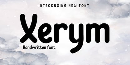 Introducing Xerym Font – a captivating display typeface that embodies the essence of authentic handwriting! Elevate your projects with the artistic touch of Xerym, a perfect blend of style and individuality. Explore Xerym now and witness your creations come to life! What’s Included : File font All glyphs Iso Latin 1 Alternate, Ligature Simple installations PUA Encoded Characters – Fully accessible without additional design software. Fonts include Multilingual support
 - Miranda Pro by Tim Rolands,
$29.00 An elegant display face influenced by Aldine oldstyle letterforms, Miranda Pro brings the early successful Tim Rolands font Miranda into the OpenType era. Miranda Pro now includes numerous extended ligatures, alternate forms, small capitals and support for a wider range of languages. Use it as a companion display for classic text fonts or on its own as a refined but stylish messenger for all sorts of projects.
 - Disclosure by Device,
$39.00 Disclosure is suggestive of low-grade digital output, screen displays, fax machines, or high-speed data transfer. It is missing vertical sections, perhaps due to a faulty print head or signal degradation. It is intentionally monospaced — each letter has the same width, like a typewriter — and unkerned. Suitable for uses where an unfussy urgency and drama is required. Developed from the 112 Hours numbers-only font, Throughput.
 - Intrinseca by AVP,
$29.00 With only a suggestion of the serifs remaining, Intrinseca is modelled on traditional serif letterforms but with low-contrast stroke widths and a generous x-height. The family has a clean appearance and excellent readability. Six weights plus italics, small caps and extended language support make Intrinseca ideal for magazines, books and web – wherever distinctive headings and a variety of text options are required.
 - AFJUCK by Twinletter,
$13.00 Introducing AFJUCK Font – a captivating display typeface that effortlessly captures the essence of authentic handwriting! Elevate your projects with the artistic touch of AFJUCK, a perfect blend of style and individuality. Explore AFJUCK now to see your creations spring to life! What’s Included : File font All glyphs Iso Latin 1 Alternate, Ligature Simple installations PUA Encoded Characters – Fully accessible without additional design software. Fonts include Multilingual support
 - Sign Template JNL by Jeff Levine,
$29.00 Sign Template JNL is based on one of the many plastic lettering guides manufactured by the now-defunct Wright-Regan Instrument Company (also known as WRICO). Aside from their engineering and drafting templates and tools, WRICO had a line of "Sign-Maker" sets which featured various styles of lettering, special ink pens and metal alignment guides to assure clean, crisp lettering with little effort.
 - Woodstock by Linotype,
$29.99Woodstock is a round, heavy, lovable serif display typeface. Just as music brought many together in the spirit of love during the 1960s and the Woodstock music festival, this face brings a smile to the eye of the beholder. Many traces of the hand can be seen in the curves and the joins of Woodstock's forms. Try using Woodstock in headlines, logos, or greeting cards, in point sizes from 12 on upward. - Battlefly by Dicubit,
$9.00 Battlefly is a boxy typeface/font designed with carefully handcrafted. This perfectly made to be applied in logo or branding, stationery, books, packaging, fashion, magazines, t-shirt, novels, labels and many advertising purposes. Features: Uppercase Lowercase Number Punctuation Symbol Multilingual All the pictures used in the preview are not included. They are intended only for illustration purpose.
 - Breda Two by Eurotypo,
$24.00 Breda Two is the condensed version of the Breda family, but it is presented as an independent family of fonts because they can work as a single face in your design. As a Breda font, this style is austere, functional and clear, emerged from straight lines and primary shapes. Breda Two is released in four weights with two italics.
 - Humanista by KaiserType,
$30.00 "Humanista" is the name of a multilingual chancery script font by Bertram Kaiser. The idea in this long-term project was to blend the boundaries between analogue calligraphic handwriting and designing a font digitally, while using all technical possibilities of modern type design. All glyphs were originally written with a broadnib and then carefully vectorized, creating a human charme inside the font. In this design you will find influences from great calligraphy masters like Hermann Zapf or Werner Schneider. The pro version comes along with a big variety of alternate glyphs, initial and terminal forms, swash capitals and ligatures, which gives you the possibility of designing individual text layouts. Inside the font you will also find a set of italic roman capitals plus fitting numerals and interpunction, which can be treated like a font itself. You can activate them through the Open-Type menue (stylistic-set 4) or set manually via the glyphs window (ADOBE applications). When using the feature "swashletters" make sure to also activate the feature "contextual alternates" to get an appealing textdesign with alternating swashletters. This font can be used for display sizes as well as for smaller textsizes like on Invitationcards or in magazines.
 - Autobats by Canada Type,
$24.95 Autobats is a set of over 100 different car and truck icons, minimal silhouettes that can be adapted to whatever context your design flings at them. The mystery of why this font has been so popular was solved when one of our customers said, “I always use this thing, because the name starts with A, so it’s one of the first fonts I see in my slap-a-logo collection”. To see all the icons available, a glyph palette would be come in handy while using the font. Honk if you like convenience. Beep beep!
 - Lavire by Nathatype,
$29.00 Elevate your design projects with the distinctive and captivating Lavire. Lavire is an uppercase display serif font that is effortlessly made in a truly unique typographic masterpiece. Each uppercase letter in Lavire is a work of art in itself. The serifs, which are typically known for their traditional elegance, take on a modern and imaginative twist with Lavire's addition of artistic lines and flairs. The artistic lines and flairs in this font are carefully crafted to enhance the overall composition of each letter. They bring a sense of motion and dynamism to the font, making it particularly well-suited for projects that seek to convey a sense of movement or elegance. Lavire fits in headlines, logos, posters, flyers, branding materials, print media, editorial layouts, and many more designs. Find out more ways to use this font by taking a look at the font preview.
 - EraMax Radial by Our House Graphics,
$16.00 EraMax Radial is a geometric sans serif meant to be set BIG, for big statements. It's the perfect face for signage, packaging posters, branding and so on and on, where a strong voice is needed. It has a modern look that will work in a retro setting. Or, should that be a vintage look that will work in a modern setting. This is the first of what is to be a series to typefaces inspired by the original hand painted signage found in the TH&B train station in Hamilton Ontario. This classic Art Deco, Or, more precisely, Art Moderne building designed by the New York architectural firm of Fellheimer and Wagner and completed in 1933. The original lettering included about 75% of the uppercase letters only, so the balance of the uppercase and the lowercase plus all the other glyphs were extrapolated from the look and feel of the existing uppercase letters. Figures are based on the numerals on the station clock, with adjustments made to harmonised with the letters.
 - KG Primary Penmanship by Kimberly Geswein,
$5.00 I come from a family of educators- my mom, husband, stepmom, brother-in-law, and sister are all currently teaching and I have taught in the past. This font was created after speaking to several elementary school teachers who were struggling to find just the right font to use on worksheets and projects in their classroom. They liked many features of other fonts, but needed small things altered in order to make a "perfect fit" for their class. Hand-drawn by me, this font hopefully addresses several of those issues. As penmanship styles vary across the globe, I am sure this font will not work in every classroom. But hopefully this style will work for many teachers to give their early readers a highly legible, neat, accurate font. It is best used with kerning turned on to allow for accurate letter spacing.
 - Blossomy by kapitza,
$99.00 Blossomy is a pictographic font consisting of 72 plant and flower illustrations, designed by kapitza. The font explores the beauty of shapes and structures in nature. The illustrations are based on photographs which have been traced by hand and are the result of a long term interest in the organic and erratic lines of naturally growing plants. The idea for Blossomy originated several years ago via a series of paintings exploring forms and structures in nature. The outlines for those paintings were traced in Illustrator and then transferred onto canvas. The outcome was so simple and beautiful that the designers decided to keep working on new illustrations and combine them in a font. Blossomy can be used as individual illustrations or to create patterns. The font covers a wide variety of flora and fauna, including pot flowers, a bonsai trees, leaves, blooms and grasses, and gives creatives a wide variety of shapes to get inspired by and use in their work.
 - Soft Hits - Unknown license

- Bilground by Prioritype,
$17.00 Introducing Bilground - Handwritten Fonts Beautiful handwritten fonts with strong characters are now here to accompany your design projects. You can apply it to wedding designs, logos, quotes, social media posts, video content display etc. See some of the previews above for reference. Features: • Uppercase • Lowercase • Numeral • Punctuation • Multilingual • PUA Encoded • Opentype Features Thanks.
 - 1431 Humane Niccoli by GLC,
$38.00 Niccolo Niccoli (1364-1437) was a wealthy bibliophile and an acclaimed scribe, in Florence (Italy). He was one of the most important Italian calligrapher in this early time of rediscovering Roman script. Of rare accomplishment was his adaptation of the so called Italian humanistic minuscule script. We were inspired from his late work to create this present Font. We have added a lot of accented and other characters (U/V, I/J...) who was not existing in the original and replacing "long s" by a small "s" for a modern use. The OTF encoding was used for intelligent alternates, permitting to use different forms of the same lower case or capital in a single word, reproducing easily the charming variety of a real manual scripture.
 - Quo Vadis Quasimodo - Personal use only

- Blanc by Latinotype,
$26.00 Blanc is a functional humanist sans typeface with a marked personality and great style that make it ideal for use in headlines. Blanc is an ode to neutrality: a geometric face characterised by low contrast between thick and thin strokes with calligraphic features that emphasise specific glyphs. Blanc comes with 8 weights and an inline version that make it well-suited for headings and subheadings, corporate designs, advertising, publishing, etc.
 - Dulcet by Dawnland,
$33.00 Dulcet is a hand lettered, rough binding script with high ascenders & low-descenders. It is both elegant and grungy and will work wonders on your invitations or love letters, make beautiful posters, frightening t-shirt designs or logotypes. It is equipped with OpenType features such as common ligatures, double letter ligatures, contextual and stylistic alternates for a varied and hand drawn look. Access alternates by using the glyph panel in Illustrator and InDesign. Dulcet comes with several initial & terminal swashes that can be added to the beginning and/or end of any lowercase letter as well as different swashes for the upper case letters. For initials/beginnings, write _ (underscore) + digit 0 to 9 For terminals/endings, write digit 0 to 9 + _ (underscore) For start swashes, - (hyphen) + digit 0 to 9. Enjoy!
 - Ascetic 2D by 2D Typo,
$28.00 This decorative font is based on Cyrillic Vyaz of XV-XVI centuries. This type of letters were used as display faces in sacred texts. In Vyaz, the letters are characteristically fitted to each other so the letter sequences look as one solid ornamental frieze. The font is rich in discretionary ligatures which help to accentuate the style of Vyaz. In addition to letters and standard characters there is a number of monograms and Christian symbols. These and other features are available in OTF format.
 - Futura Headline EF Pro by Elsner+Flake,
$103.00 The design of Futura seems to be timeless. This typeface family which had been developed in 1926 by Paul Renner for the Bauer Type Foundry in the style of constructivism and as part of the Bauhaus movement, experienced, however, in the course of the past 90 years, repeated time-appropriate revivals which guaranteed its on-going popularity. The version of the Futura EF Pro contains the original character constructions which Dennis Megaw described as the “first designs of Futura” in 1938 in “20th century sans serif types, Typography no. 7” (See: Dr. Christopher Burke: Paul Renner, Princeton Architectural Press, New York 1998). What makes it exceptional is the extension into three weights: “Text”, “Headline” and “Index” which came about as part of a degree dissertation at the Hochschule für Bildende Künste (HFBK) in Hamburg. In this context, the accompanying documentation “Die Kritik der reinen Futura” (“The Critique of the Pure Futura”) by Katharina Strauer was published by the Materialverlag, Hamburg, in 2003. Some copies are still available at Elsner+Flake.
 - Futura Text EF Pro by Elsner+Flake,
$103.00 The design of Futura seems to be timeless. This typeface family which had been developed in 1926 by Paul Renner for the Bauer Type Foundry in the style of constructivism and as part of the Bauhaus movement, experienced, however, in the course of the past 90 years, repeated time-appropriate revivals which guaranteed its on-going popularity. The version of the Futura EF Pro contains the original character constructions which Dennis Megaw described as the “first designs of Futura” in 1938 in “20th century sans serif types, Typography no. 7” (See: Dr. Christopher Burke: Paul Renner, Princeton Architectural Press, New York 1998). What makes it exceptional is the extension into three weights: “Text”, “Headline” and “Index” which came about as part of a degree dissertation at the Hochschule für Bildende Künste (HFBK) in Hamburg. In this context, the accompanying documentation “Die Kritik der reinen Futura” (“The Critique of the Pure Futura”) by Katharina Strauer was published by the Materialverlag, Hamburg, in 2003. Some copies are still available at Elsner+Flake.
 - Chellora by Picatype,
$15.00 I am very happy to finally release Chellora Typeface. Chellora is a bevelled, layered font which gives simple effects to letters. The effect allows it to be plated, giving it a smoother and smoother appearance. Chellora comes with 3 different styles: Regular, Shadow, Filled Outline, Chellora is a bold Sans that is perfect for Logos, Signage, Apparel, Headlines, Etc. This typeface is a great addition to any collection because it saves time with post-production effects, this allows you to easily measure effects. To enable the OpenType Stylistic alternates, you need a program that supports OpenType features such as Adobe Illustrator CS, Adobe Indesign & CorelDraw X6-X7, Microsoft Word 2010 or later versions. How to access all alternative characters, using Windows Character Map with Photoshop: https://www.youtube.com/watch?v=Go9vacoYmBw How to access all alternative characters using Adobe Illustrator: https://www.youtube.com/watch?v=XzwjMkbB-wQ Chellora Typeface is coded with PUA Unicode, which allows full access to all the extra characters without having special designing software. Mac users can use Font Book , and Windows users can use Character Map to view and copy any of the extra characters to paste into your favorite text editor/app. Thanks so much for looking and please let me know if you have any questions.
 - Kesora Faux by Twinletter,
$15.00 KESORA is a Japanese-style font that we carefully crafted to give your composition the proper look. This font is really versatile, so you may use it for a wide range of projects. Your project will always appear special to your audience if it has the proper composition, beautiful appearance, and unique shape. Logotypes, food banners, branding, brochure, posters, movie titles, book titles, quotes, and more may all benefit from this font. Of course, using this font in your various design projects will make them excellent and outstanding; many viewers are drawn to the striking and unusual graphic display. Start utilizing this typeface in your projects to make them stand out.
 - Ladronn by Comicraft,
$39.00 Comicraft first created this font, based on the unique European lettering style of Ladronn, for the Marvel X-book CABLE in 1998. It was later upgraded for THE INHUMANS mini-series, and modified again for the HIP FLASK mini-series in 2002. In 2018, we Remastered it for the new LOST IN SPACE series from Legendary, with improved spacing and kerning, an additional Bold weight, and our patented Crossbar I Technology to automatically place the crossbar I in the right spots.
 - Swiss Folk Ornaments by Gerald Gallo,
$20.00 Swiss Folk Ornaments were inspired by old Swiss embroidery designs. Swiss Folk Ornaments - Critters & Things is composed of critters (animals) and other things, hearts, pitchers, and a basket. In the character set all critters face to the left. In the shift+character set, under each respective key, all critters face to the right. There are a total of 72 ornaments in this font. Swiss Folk Ornaments - Floral is composed of floral designs. There are a total of 56 ornaments in this font. Swiss Folk Ornaments - Geometric is composed of symmetrical geometric designs. There are a total of 42 ornaments in this font.
 - Training Film JNL by Jeff Levine,
$29.00 The title card “Airplane Hydraulic Brakes” in the beginning of a WWII armed services training film had the words "hydraulic brakes" hand lettered in an Art Deco slab serif style. This served as the model for Training Film JNL, which is available in both regular and oblique versions.
 - Otis Condensed by Australian Type Foundry,
$30.00The name Otis arose from an incident in a shopping mall in which, realising my shoelace was undone while on an escalator, I bent down to tie it, became aware of the approaching end, panicked, fell over, and in the process happened to notice the escalator's brand name. - Mullen Hand by Canada Type,
$24.95 Mullen Hand is the fresh digitization and expansion of a Jerry Mullen metal typeface called Repro, originally published by ATF in 1953. The connectivity of certain letters in the original type was limited by metal technology, but this new digital version is updated to resolve those issues with. Two- and three-letter ligatures take care of the r, s, x and z connections. These ligatures are programmed in the 'liga' feature of the OpenType version, so they automatically activate in programs that support advanced typography. Casual, tall, and elegantly friendly, Mullen Hand's even strokes and confident connections embody the spirit of contentedness and reassurance sought by today's appeal designer. It accommodates a variety of applications, from posters and signs, to book and music covers and product packaging. Mullen Hand comes in all popular formats. The TrueType and PostScript versions come with 2 fonts, one of them containing the ligatures and some alternates. The OpenType version combines both fonts into one, and includes programmed features for localization, alternation and intelligent substitution. Language support includes Western, Central and Eastern European character sets, as well as Baltic, Esperanto, Maltese, Turkish, and Celtic/Welsh languages.
 - Rottis Amesty by Create Big Supply,
$15.00 Experience the authentic charm of Rottis Amesty, a captivating Signature Handwriting Script Font that mirrors the natural flow of handwritten text with the subtle nuances of a ballpoint pen. With its unique ballpoint effects, Rottis Amesty adds a touch of elegance to your projects, making it perfect for signatures, logos, and various design endeavors. This font features both uppercase and lowercase letters, numbers, and punctuations, providing versatility for your creative expressions. Its multilingual support ensures seamless communication across different languages, while the PUA encoding allows easy access to special characters and ligatures. Download Rottis Amesty Signature Handwriting Script Font now and infuse your designs with personalized handwritten style.
 - Linden by Journey's End,
$12.00I hope that you enjoy the "Linden" font. The basis for this new font is my Leaf font. As much as I love the Leaf font, however, I felt (and still feel) the desire to have a larger font, for three reasons: 1. I enjoy customizing my internet browser to show different fonts. The original "Leaf" font was a bit too small for that. The new "Linden" font is perfect for this function. 2. Some of the fonts that I use in writing e-mails look their best at sizes 24 or 36. That’s fine for me, but unless I want to go to the trouble each time of changing the size, then the recipients oft my e-mails get wolloped with an enormous-sized font. When I use "Linden" for my e-mails, it’s automatically a perfect size at 12 or 14, solving this problem. 3. I also enjoy customizing the font in which I read my e-mails. Unfortunately, there are only a few which are legible in the tiny size in which this is configured. Again, "Linden" is configured to be large enough automatically so that it can easily be read by anyone. I am pleased to offer a pleasant font for use in any or all of the scenarios; I love fun solutions and hope that you will enjoy the "Linden" font. (Just a tip: when printing out documents using the "Linden" font, I love it best in font size 11!)

