7,460 search results
(0.028 seconds)
- Futura Black Art Deco by URW Type Foundry,
$39.99 - H74 Black Label Whiskey by Hydro74,
$25.00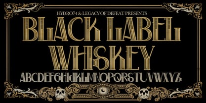
- Well Said Black NF by Nick's Fonts,
$10.00 This commanding typeface is based on Welling Black, a Fotostar offering from the 1970s. Equally well suited for headlines and subheads. Both versions support the Latin 1252, Central European 1250, Turkish 1254 and Baltic 1257 codepages.
 - Display Black Serif Rough by Gerald Gallo,
$20.00 Display Black Serif Rough is a rough version of my font Display Black Serif . It is a display font not intended for text use. It was designed specifically for display, headline, logotype, branding, and similar applications. Display Black Serif Rough has an uppercase alphabet located under the character + shift keys and a complete set of alternate uppercase characters located under the character set keys. It also has numbers and punctuation.
 - LHF Black Rose Script by Letterhead Fonts,
$59.00 Nearly 2 years in the making, LHF Black Rose Script is the perfect blend of hand-lettering and modern technology. This beautiful script is loaded with features, such as automatic ligatures, discretionary ligatures, bonus ending characters, swashes, and several alternates (302 glyphs to be exact). You receive 3 versatile fonts to match different moods: Regular, Block Shadow (placed under Regular), and an expertly-crafted Inked version which has been distressed to look like freshly inked lettering. One look at your designs and your clients will fall in love with Black Rose Script. And with so many carefully designed alternates to use, they'll probably think you hand-lettered it yourself!
 - View Slant Black ExtExp - Personal use only

- BIG Slant Black UltExp - Personal use only

- Secret Operation JNL by Jeff Levine,
$29.00 The movie poster for the 1952 bank heist drama “Kansas City Confidential” had its title hand lettered in a condensed serif stencil design. This inspired Secret Operation JNL, which is available in both regular and oblique versions.
 - KG Corner Of The Sky by Kimberly Geswein,
$5.00 A fatter, more kid-friendly version of KG Lego House, this font is designed specifically for elementary teachers who requested a neat, legible font with a thicker outline.
 - Hall Fetica Upper Decompose It - Unknown license

- Ekorre PERSONAL USE ONLY Black - Personal use only

- SF Archery Black SC Shaded - Unknown license

- SF Archery Black SC Outline - Unknown license

- SF Archery Black SC Shaded - Unknown license

- SF Archery Black SC Outline - Unknown license

- Schuss Sans CG Poster Black by typic schuss,
$33.00 Schuss Sans CG Poster 1 upright OTF Font Latin extended, Cyrillic and Greek. Specially developed for headline poster display sizes. A Sans Black Headline-Font in addition to the Schuss superfamily. The heights are optimized for big sizes, different to the text fonts of the Superfamily Schuss. The character set is slightly different to the non poster styles too. No italic, no additional figures, no tabular figures, no small Caps. But with maximum manual kerning. Ligatures: fi, fl, ff, ffi, ffl. No special OpenType features.
 - MD-Type Rounded by MD-Type,
$25.00 MD-Type Rounded is a modern, stylish font family. The family consists of five fonts (Regular, Bold, Light, Block, Black) which are formed by all capital letters. The strong and accented letters were rounded on the corners and therefore softened. The font family supports Turkish language as well.
 - Calps Sans by Typesketchbook,
$55.00 Calps Sans is a variant of the original Calps typeface. Import to be more corporate, Calps Sans family use flat corners instead of rounded corners (Calps). “Calps Sans” is a prominent, eye-catching and unique typeface. It comes with 9 weights and Slim version in order to suit for a multifunctional usage, especially for cooperative work, such as website, magazine, editorial, publishing , as well as packaging.
 - Goudy Heavyface by Bitstream,
$29.99This face was designed in 1925 as the Monotype answer to the very popular Cooper Black. Goudy is also quite similar in appearance to Ludlow Black and Pabst Extra Bold, both of which were also done in response to Cooper Black. - SONY's Logo - Unknown license

- Qbicle 2 BRK - Unknown license

- Mamba by W Type Foundry,
$19.50 Mamba is inspired by Cooper Black.
 - Robur by Canada Type,
$24.95 It shouldn't be a surprise to anyone that these letter shapes are familiar. They have the unmistakable color and weight of Cooper Black, Oswald Cooper's most famous typeface from 1921. What should be a surprise is that these letters are actually from George Auriol's Robur Noir (or Robur Black), published in France circa 1909 by the Peignot foundry as a bolder, solid counterpart to its popular Auriol typeface (1901). This face precedes Cooper Black by a dozen of years and a whole Great War. Cooper Black has always been a bit of a strange typographical apparition to anyone who tried to explain its original purpose, instant popularity in the 1920s, and major revival in the late 1960s. BB&S and Oswald Cooper PR aside, it is quite evident that the majority of Cooper Black's forms did not evolve from Cooper Old Style, as its originators claimed. And the claim that it collected various Art Nouveau elements is of course too ambiguous to be questioned. But when compared with Robur Noir, the "elements" in question can hardly be debated. The chronology of this "machine age" ad face in metal is amusing and stands as somewhat of a general index of post-Great War global industrial competition: - 1901: Peignot releases Auriol, based on the handwriting of George Auriol (the "quintessential Art Nouveau designer," according to Steven Heller and Louise Fili), and it becomes very popular. - 1909-1912: Peignot releases the Robur family of faces. The eight styles released are Robur Noir and its italic, a condensed version called Robur Noir Allongée (Elongated) and its italic, an outline version called Clair De Lune and its condensed/elongated, a lined/striped version called Robur Tigre, and its condensed/elongated counterpart. - 1914 to 1918: World War One uses up economies on both sides of the Atlantic, claims Georges Peignot with a bullet to the forehead, and non-war industry stalls for 4 years. - 1921: BB&S releases Cooper Black with a lot of hype to hungry publishing, manufacturing and advertising industries. - 1924: Robert Middleton releases Ludlow Black. - 1924: The Stevens Shanks foundry, the British successor to the Figgins legacy, releases its own exact copies of Robur Noir and Robur Noir Allongée, alongside a lined version called Royal Lining. - 1925: Oswald Cooper releases his Cooper Black Condensed, with similar math to Robur Noir Allongée (20% reduction in width and vectical stroke). - 1925: Monotype releases Frederick Goudy's Goudy Heavy, an "answer to Cooper Black". Type historians gravely note it as the "teacher steals from his student" scandal. Goudy Heavy Condensed follows a few years later. - 1928: Linotype releases Chauncey Griffith's Pabst Extra Bold. The condensed counterpart is released in 1931. When type production technologies changed and it was time to retool the old faces for the Typositor age, Cooper Black was a frontrunning candidate, while Robur Noir was all but erased from history. This was mostly due to its commercial revival by flourishing and media-driven music and advertising industries. By the late 1960s variations and spinoffs of Cooper Black were in every typesetting catalog. In the early- to mid-1970s, VGC, wanting to capitalize on the Art Nouveau onslaught, published an uncredited exact copy of Robur Black under the name Skylark. But that also went with the dust of history and PR when digital tech came around, and Cooper Black was once again a prime retooling candidate. The "old fellows stole all of our best ideas" indeed. So almost a hundred years after its initial fizz, Robur is here in digital form, to reclaim its rightful position as the inspiration for, and the best alternative to, Cooper Black. Given that its forms date back to the turn of the century, a time when foundry output had a closer relationship to calligraphic and humanist craft, its shapes are truer to brush strokes and much more idiosyncratic than Cooper Black in their totality's construct. Robur and Robur Italic come in all popular font formats. Language support includes Western, Central and Eastern European character sets, as well as Baltic, Esperanto, Maltese, Turkish, and Celtic/Welsh languages. A range of complementary f-ligatures and a few alternates letters are included within the fonts.
 - Longbranch by Solotype,
$19.95A modern cutting designed to give the appearance of an old wood type. The letters were cut as linoleum blocks about 2 inches high, then duplicated as copper electrotypes. Used for some Ringling Bros. circus work. - Squareroque - Unknown license

- UNITED BRK - Unknown license

- Binary X BRK - Unknown license

- Noyh Geometric by Typesketchbook,
$55.00 Noyh Geometric is altered modified from the form of the original “Noyh(2015)” typeface. We added sharp corners in apex, including the structure of typeface. Import to be more Corporate, the font family has flat terminals that harmonize with sharp corners. With all of these features , “Noyh Geometric” is a prominent, eye-catching and unique typeface. It comes with 9 weights and italic type in order to suit for a multifunctional usage, especially for cooperative work, such as website, magazine, editorial, publishing , as well as packaging.
 - Bou College - Personal use only

- Noyh Geometric Slim by Typesketchbook,
$55.00 Noyh Geometric Slim is altered modified from the form of the original “Noyh”(2015) typeface. We added sharp corners in apex, including the structure of typeface. Import to be more Corporate, the font family has flat terminals that harmonize with sharp corners. With all of these features , “Noyh Geometric Slim” is a prominent, eye-catching and unique typeface. It comes with 9 weights and italic type in order to suit for a multifunctional usage, especially for cooperative work, such as website, magazine, editorial, publishing , as well as packaging.
 - Rohyt Geometric by Typesketchbook,
$55.00 Rohyt Geometric is an altered modified from the form of the original Rohyt typeface. Designed to be more Corporate, the font family has flat terminals that harmonizes with sharp corners. With all of these features, “Rohyt Geometric” is a prominent, eye-catching and unique typeface. It comes with 8 weights with slim option in order to suit for a multifunctional usage, especially for cooperative work, such as website, magazine, editorial, publishing, as well as packaging.
 - Kimberley - Unknown license

- Bandwidth BRK - Unknown license

- Freshman - 100% free

- Quan Geometric by Typesketchbook,
$55.00 Quan Geometric is an altered modified from the form of the original Quan Pro typeface. Designed to be more Corporate, the font family has flat terminals that harmonizes with sharp corners. With all of these features, “Kelpt Sans” is a prominent, eye-catching and unique typeface. It comes with 8 weights with slim option in order to suit for a multifunctional usage, especially for cooperative work, such as website, magazine, editorial, publishing, as well as packaging.
 - Kelpt Sans by Typesketchbook,
$55.00 Kelpt Sans is an altered modified from the form of the original Kelpt typeface. Designed to be more Corporate, the font family has flat terminals that harmonizes with sharp corners. With all of these features, “Kelpt Sans” is a prominent, eye-catching and unique typeface. It comes with 9 weights with 2 Hight options in order to suit for a multifunctional usage, especially for cooperative work, such as website, magazine, editorial, publishing, as well as packaging.
 - Model Railroad JNL by Jeff Levine,
$29.00 The block style lettering with rounded corners found on a package for model railroad kit parts was the inspiration for Model Railroad JNL.
 - Warrior by CastleType,
$59.00 Warrior is a chunky typeface design inspired by a Russian Egyptian-style block alphabet (original designer unknown). Now available in seven weights (Hairline, Extra Light, Light, Medium, Regular, Bold, Black) in addition to three decorative styles: Shaded (3-dimensional), Inline, and Open. With its blocky letters and stable slab serifs, Warrior will add a bold, masculine look to your design. All members of the Warrior family support most European languages including modern Greek, and, of course, languages that use the Cyrillic alphabet.
 - HL2MP - Unknown license

- Loftie by Gerald Gallo,
$20.00 Loftie is an all caps, condensed sans serif font with beveled corner characters. The font is ideal for headlines, titles, branding, small blocks of text.


