9,624 search results
(0.022 seconds)
- Contest by Mecanorma Collection,
$45.00 - Fonde SS by Sensatype Studio,
$15.00 fonde is a elegant chic font for brand, logo and quotes design. Based on our experience as a graphic designer who works for a lot of companies, we often are requested to design a logo in a unique style but with an elegant shape. So, we try to brainstorming and create this font to make the idea is going out. This is perfect for BRANDING and LOGO DESIGN. You will get classy, elegant, and certainly unique logos with this font. fonde is also included full set of: uppercase and lowercase letters multilingual characters numerals punctuation Wish you enjoy our font. :)
 - Context MF by Masterfont,
$59.00 High contrast type for logo's, headlines and signage
 - Context Regular by Wilton Foundry,
$19.00 Context Regular is a condensed inline font with a stencil inline glyph - this makes for a smoother visual join of the stems. Context is also mono-case with the most interesting case selected for a pleasing end result. Applications are numerous: Display, Branding, Advertising, Logos, Publications, etc.
 - Foundry Context by The Foundry,
$90.00 Foundry Context is a sans serif family designed to be universal in many contexts – hence the name. A ‘no-nonsense’ typeface, reminiscent of 19th century sans serif faces, Foundry Context has very round, pure letterforms, crafted without being over refined, and having minimal stroke contrast in the neo-grotesque style. A hint of personality has emerged from the very drawing of the proportions, strokes, and terminals, yet Foundry Context is still neutral enough to compete in the grotesk arena, and at the same time has something new to say.
 - Connection - Unknown license

- Connect by Identikal Collection,
$23.00 - Conteza by Mevstory Studio,
$10.00 Introducing Conteza Font: Redefining Modern Blackletter Elegance Unleash the power of typography with "Conteza," a remarkable font that seamlessly blends the timeless essence of blackletter style with a captivating contemporary twist. This font is a true masterpiece, meticulously designed to elevate your designs, projects, and artworks to new heights of sophistication and creativity.
 - Contender by Viaction Type.Co,
$17.00 Font Contender with a stamp effect gives a vintage feel and is suitable for adding a vintage feel to your design. There are 2 regular and oblique styles, complete with multilingual characters and stalistic alternatives. It is suitable for quotes, clothing designs, vintage logos, labels, posters, packaging designs and other designs. File Include (Font Family) : - Contender - Contender Slant Features : - Uppercase. - Lowercase. - Multilingual. - Punctuation & Symbol. - Stylistic Set. Thank you for buying. I hope you enjoy and thank you.
 - Consent by Sarid Ezra,
$15.00 Consent is an editorial serif font with unique lowercase. With special features, Consent will make your project more stand out and elegant. This font suitable for brand or title of the magazine. You also can use this font for logo, branding, and also versatile for any project! No need a complicated step for using the features. Just type in lowercase, uppercase, or both! You can also access the additional features from opentype ligatures. Just type equal + number (1-4) for the magic. Example =3. Try it in the type sample below!
 - Contenu by Hackberry Font Foundry,
$24.95 Because Contenu is designed for text use, it is spaced for body copy in the 9-12 point range. That is far too much spacing for heads, subheads, and the like. So I made the display version of Contenu Book to use for headers. In the process of tightening the spacing at the very large sizes, I also made some minor modifications to the glyph shapes to make this version a little more elegant. Contenu Opentype has two Opentype families for print design. Contenu Book has five fonts: Regular, Italic, Bold, Bold Italic, and Display. Contenu has Medium, Medium Italic, Black, and Black Italic. The name is French for content and this is what the family is designed for: text, body copy, and book layout. If it has a style, it is a modern take on oldstyle serif font using Jenson as a mask. There are no plans for display versions of the bolder weights or the italics. If you want them, use Contenu Medium, Book Bold, Contenu Black, or any of the four italics and tighten the tracking.
 - Pantext by Jonahfonts,
$25.00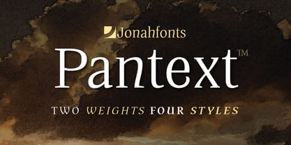 An unusual serif font with a slightly unconventional atmosfere.
 - Concepts by Pointlab,
$10.00 Concepts Font Family is a handmade vintage script, sans serif and sans serif bold. Inspired by classic western culture, custom culture motorbikes and combine with vintage touches. There are so many perfect fonts to integrate into your design, especially in vintage designs. With the beauty of this font package, this font is great for logos, badges, clothes, posters, and more. This font comes with opentype and truetype features and also many alternative styles to enhance your design.Features Basic Latin A-Z and a-z Numbers Symbols Stylistic Set Ligature PUA Encode Multilanguage Support To enable the OpenType Stylistic alternates, you need a program that supports OpenType features such as Adobe Illustrator CS, Adobe Indesign & CorelDraw X6-X7.There are additional ways to access alternates, using Character Map (Windows), Nexus Font (Windows), Font Book (Mac) or a software program such as PopChar (for Windows and Mac).If you have any question, don't hesitate to contact me by email.
 - Convection by Microsoft Corporation,
$49.00 - Conneqt by Roman Melikhov,
$15.00 Conneqt is a font for design of minimalist logos. The font is suitable for creating wordmarks, titles, taglines. Use alternates to emphasize separate letters in your text. All alternate options of the characters are included in each font. You can use alternates in most major image editors, just find menu item Glyphs (Alternates) there. For any questions about the font please contact: arbuzzu@gmail.com
 - Kontext Dot by Elster Fonts,
$20.00 Imagine a font that is easier to read the smaller it is – or the further away the text is. There are already many rasterised fonts, I wanted to take it to the extreme and use as few dots as possible. The result is a typeface that lives up to its name. Each individual circle makes no sense on its own; individual letters are only recognisable in the context of all associated circles, individual letters are most likely to be recognised in the context of whole words. Attached to a building wall, text would be readable from a great distance and become increasingly difficult to decipher the closer you get to the building. Placed on the ground or on a large flat roof, text would only be readable from a higher building, an aeroplane or - depending on the size - in Google Earth. Kontext has old style figures, superscript numerals, case-sensitive questiondown and exclamdown and an alternative ampersand, 390 glyphs at all. Use the same value for font size and line spacing to keep the lines in the grid, or change the line spacing in 10% steps. Change the spacing in 100-unit increments to keep the grid. The numbers in the family- and style-names refer to the (ca.) grey value of the respective background and the font itself. Kontext Dot 00-33 has e.g. a white background (0%) and 33% grey value. Kontext Dot 66-33 has a 66% background and 33% grey value. »Positive« styles (first number smaller than the second number) have kerning, »negative« styles (first number bigger than the second number) can have none.
 - Content Creator by Dumadi,
$20.00 Content Creator – Playful Typeface is a comic themed font that can be used for your design needs. as the title suggests, this font is specifically for content creators to improve the quality of the designs and projects you are working on. Content Creator is perfect for design, logos, social media, brands, advertising, product design, handwritten quotes, product packaging, headers, posters, merchandise, and other designs. What’s Included : + Standard glyphs + Ligature + Web Font + Multilingual Accent + Works on PC & Mac, Simple installations Accessible in Adobe Illustrator, Adobe Photoshop, Adobe InDesign, even work on Microsoft Word. PUA Encoded Characters – Fully accessible without additional design software. Fonts include multilingual support + Image used: All photographs/pictures/vectors used in the preview are not included, they are intended for illustration purposes only. Thanks
 - Automobile Contest by Asd Studio,
$15.00 Introducing the new font Automobile Contest - Handbrush, the new version of Qillsey Einstein Font, a type of script that has a natural scratch texture. I made by using a brush pen that makes the impression seem natural. My font is complete with two StylisticSet which will make the writing more beautiful and charming. This typeface is suitable for use in a variety of design fields, such as event advertisements, product promotions, book titles, activity titles, logos, adventure, and others. This font can when paired with serif font types will make your design project more beautiful and perfect. I highly recommend using a program that supports OpenType featuresand Glyphs panels such as Adobe Illustrator, Adobe Photoshop CC, Adobe InDesign, or CorelDraw, so you can see and access all Glyph variations. This font is encoded with Unicode PUA, which allows full access toall additional characters without having special design software. Mac users can use Font Book, and Windows users can use Character Map to view and copy one of the extra characters to paste into your favorite text editor / application. I hope you enjoy the font, thank you.
 - Kontext H by Elster Fonts,
$20.00 Imagine a font that is easier to read the smaller it is – or the further away the text is. There are already many line screen fonts, I wanted to take it to the extreme and use as few lines as possible, while keeping the grid of the fonts metrics. The result is a typeface that lives up to its name. Each individual line makes no sense on its own; individual letters are only recognisable in the context of all associated lines, individual letters are most likely to be recognised in the context of whole words. Attached to a building wall, text would be readable from a great distance and become increasingly difficult to decipher the closer you get to the building. Placed on the ground or on a large flat roof, text would only be readable from an aeroplane or - depending on the size - in Google Earth. Kontext has old style figures, superscript numerals, case-sensitive questiondown and exclamdown and an alternative ampersand, 390 glyphs at all. Use the same value for font size and line spacing to keep the lines in the grid, or change the line spacing in 10% steps. Change the spacing in 100-unit or 25-percent increments increments to keep the grid. The »H« in the font name stands for horizontal (lines). The numbers in the font name refer to the brightness of the background and letters themselves, with the first number describing the background and the second the letters. Starting with »00« (white) to »200« (dark) See also my Family Kontext Dot
 - Kontext V by Elster Fonts,
$20.00 Imagine a font that is easier to read the smaller it is – or the further away the text is. There are already many line screen fonts, I wanted to take it to the extreme and use as few lines as possible, while keeping the grid of the fonts metrics. The result is a typeface that lives up to its name. Each individual line makes no sense on its own; individual letters are only recognisable in the context of all associated lines, individual letters are most likely to be recognised in the context of whole words. Attached to a building wall, text would be readable from a great distance and become increasingly difficult to decipher the closer you get to the building. Placed on the ground or on a large flat roof, text would only be readable from an aeroplane or - depending on the size - in Google Earth. Kontext has old style figures, superscript numerals, case-sensitive questiondown and exclamdown and an alternative ampersand, 390 glyphs at all. Use the same value for font size and line spacing to keep the lines in the grid, or change the line spacing in 10% steps. Change the spacing in 50-unit or 25-percent increments to keep the grid. The »V« in the font name stands for vertical (lines). The numbers in the font name refer to the brightness of the background and letters themselves, with the first number describing the background and the second the letters. Starting with »00« (white) to »200« (dark) See also my family Kontext Dot
 - Cortex by Cubo Fonts,
$29.00 Cortex was designed for Shanghai Word Expo 2010 / A.A.D.I Pavilion corporate identity: signage, corporate communication, graphic design (a 120 pages monography), promotional items, etc. It was inspired by the pavilion "slanted" architectural concept, and had to fit the famous chinese "YOUYUAN" typeface as well. This is a both very clear and dynamic typeface.
 - Contax by Type Innovations,
$39.00 In the advertising industry, I was often asked to supply the art directors with ideas for a san serif type design that was not the standard Helvetica or Univers. They wanted a fresh new approach, something with generous proportion, like Avant Garde perhaps, but not as uniform in proportions. A font that would lend itself well to wide and long columns of text with lots of leading. So, I rolled up my sleeves and designed a font that meet all their criteria. Contax is the new 'Univers' for the 21st century.
 - Covington Cond - Unknown license

- Covington Cond - Unknown license

- Covington Cond - Unknown license

- Avondale Cond - Unknown license

- Plasmatica Cond - Unknown license

- Avondale Cond - Unknown license

- Plasmatica Cond - Unknown license

- Covington Cond - Unknown license

- Bonding by Arendxstudio,
$15.00 Bonding Font that has a distinctive character that is very thick and elegant to use Bonding is a relaxed and flowing Handwritten Font. Incredibly versatile, this font fits a wide pool of designs, elevating them to the highest levels. Add this font to your favorite creative ideas and notice how it makes them come alive! Features : • Character Set A-Z • Numerals & Punctuations (OpenType Standard) • Accents (Multilingual characters) • Ligature Multilingual Support : Afrikaans, Albanian, Asu, Basque, Bemba, Bena, Catalan, Chiga, Cornish, Danish, English, Estonian, Faroese, Filipino, Finnish, French, Friulian, Galician, German, Gusii, Icelandic, Indonesian, Irish, Italian, Kabuverdianu, Kalenjin, Kinyarwanda, Low German, Luo, Luxembourgish, Luyia, Machame, Makhuwa-Meetto, Makonde, Malagasy, Malay, Manx, Morisyen, North Ndebele, Norwegian Bokmål, Norwegian Nynorsk, Nyankole, Oromo, Portuguese, Romansh, Rombo, Rundi, Rwa, Samburu, Sango, Sangu, Scottish Gaelic, Sena, Shambala, Shona, Soga, Somali, Spanish, Swahili, Swedish, Swiss German, Taita, Teso, Vunjo, Zulu There it is! I really hope you enjoy it
 - Sond by Eurotypo,
$34.00 Sond is a casual, modern and hand brushed font. I've designed Sond carefully with the intention to preserve in its glyphs the original tell-tale dry brush imperfections and a bouncy baseline for a more personalized effect even more authentic. As an exclusively Open Type release, with 519 glyphs and ornaments, it has special alternatives for all letters with lots of possibility an infinity of combinations. There are plenty of options to allow you to create something unique and special: standard ligatures, swashes and stylistics alternates for each letter, beginning and ending letters. This lovely fonts have already an extended character set to support Central and Eastern as well as Western European languages. Sond is a good choice for greeting cards, posters, labels, t-shirt design, logos, and more.
 - Mond by URW Type Foundry,
$39.99
- Cord by Roland Hüse Design,
$20.00 Cord (Zsinór in Hungarian) was originally a commissioned work for a tablecloth pattern with a thread like frame decoration that is actually consist of letters. The lettershapes were being created based on Rovas characters, which were reinterpreted without decreasing legibility. Therefore, the Rovas alphabet was designed in the first place followed by its matching Latin company. The full character set contains: Western, Central and South Eastern European Latin characters basic symbols and punctuation Rovas alphabet Rovas number symbols and punctuation Display font, best fit in larger sizes for souvenirs, folk art theme, embroidery, ribbon like decorative texts and signages. Good luck and Happy Creating! Roland
 - Bond by 4RM Font,
$10.00 Its very simple form is the hallmark of this font, the bond font is a simple styled font but still has an aesthetic value, this font is suitable for use in simple themed designs.
 - Condo by Bogusky 2,
$20.00Novelty condensed serif font - Kondes by Tour De Force,
$25.00 Kondes is our "101 Dalmatians" – it's 101th release in our catalog! And it is the 1st one that belongs to variable typefaces. Kondes (which is made up word as mixture of "condensed" and "kondezovan" on Serbian) is simple, compact, straight-in-your-face sans serif family with 9 weights and 9 Italics. It was designed with purpose to serve and to be use in any project, from editorial to website. For example, Black weight could be used effectively as poster type, in big sizes while Regular fits perfectly as main webfont. Stem joining is done with generous ink trap that divides and opens letter contours, so letter breaths in smaller sizes. Contains extended Latin character set. Enjoy!
 - Neo Contact by URW Type Foundry,
$35.00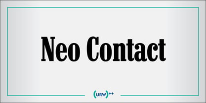
- Contenu EBook by Hackberry Font Foundry,
$19.95 Because ebooks will not normally accept .otf fonts, and they don't support Opentype features, this font family was designed to be used for the ebook conversions of print books. It uses old style figures. The italics are slanted a bit more. And Heavy is a little bolder than the bold in Contenu Book.
 - Neo Contact by Linotype,
$40.99Neo Contact is the typeface used on the packaging of Marlboro cigarettes (Marlboro “Reds,” the main line of the brand). The typeface is bold and condensed, designed in the Egyptienne style. Egyptienne types were first designed in the 1800s, as type founders - especially in the westward-expanding United States - began to dream up newer, bolder styles of letters for advertising usage. During the 1800s, it became increasingly important for businesses to set themselves, and their products, apart from competitors. This desire has remained with corporations, as well as with advertisers and designers, into the 21st century. In addition to cigarette packaging, Neo Contact (as part of Marlboro’s branding efforts) can be seen on numerous items, including Ferrari’s F1 racers, and at Formula 1 race tracks. The letters in Neo Contact are filled with personality. Their forms display two distinct weights of line, and the serifs are made up of tiny, strict slabs. Ball terminals round out the design. Neo Contact is a complete font, with a complete western character set. Typefaces in the Egyptienne style preceded the development and distribution of larger, crazier wood typefaces, but also share many similarities with these descendents. More traditional, text faces in the Egyptienne manner are also available from Linotype GmbH (e.g., Adrian Frutiger’s Egyptienne F). On the opposite end of the spectrum, we offer interesting, personality-filled wood display types, like Ponderosa as well.


Page 1 of 241Next page