10,000 search results
(0.056 seconds)
- Wieynck Gotisch by RMU,
$25.00 Wieynck Gotisch, a 1920s font family created by Heinrich Wieynck, was completely redrawn and redesigned for modern usage. Use this remarkable and eye-catching fonts in an appropriate context. This font contains a bunch of useful ligatures, and by typing 'N', 'o' and period plus activating the OT feature Ordinals you get an oldstyle numbersign. The round ‚s‘ lies on the #-key.
 - Gilmore Fahrenheit by Red Rooster Collection,
$45.00 Gilmore Fahrenheit is a glyphic, sans serif typeface that was inspired from early designs by the renowned English typographer Eric Gill. It was designed in 1992 by A. Pat Hickson (P&P Hickson) and Steve Jackaman (ITF) exclusively for the Red Rooster Collection. It was designed with true small caps, has an italicized geometric look, and possesses legibility reminiscent of Swiss typefaces.
 - Corvetta by Ditatype,
$29.00 Corvetta is a bold handwritten font, carefully handcrafted to become a true favorite. Its casual charm makes it appear wonderfully down-to-earth, readable and, ultimately, incredibly versatile. Corvetta will look outstanding in any context, whether it’s being used on busy backgrounds or as a standalone headline! Featured : Accents (Multilingual characters) PUA encoded Numerals and Punctuation (OpenType Standard) Full Support Dita Type
 - Oh Hex JNL by Jeff Levine,
$29.00 An Art Deco “thick and thin” novelty type design based on the hexagon shape was found within the pages of “La Lettre Dans le Decor & La Publicite Modernes” - a 1930s-era French alphabet collection. The title somewhat translates to “The Letter in Modern Decor and Advertising”). Named Oh Hex JNL, it is now available in both regular and oblique versions.
 - Stgotic by Latinotype,
$10.00 Stgotic, designed in 2006, was the first digital font designed by Daniel Hernández. It is a blackletter typeface designed for low resolution screen devices. Stgotic was designed to be seen at 8 pts (and multiples of 8). In the year 2006, it was recognized as the best screen font by the TipoGráfica magazine in the context of the Bienal de Letras Latinas.
 - Atlantic Doodles by Atlantic Fonts,
$26.00 Like another popular “doodle”, Atlantic Doodles can really liven things up. Give your scrapbooking, invitations, gift tags and other creative endeavors the attention they deserve with this versatile collection of 52 hand-drawn swashes, flourishes, spots, and decorations. Designed to coordinate with your favorite Atlantic Fonts. Atlantic Doodles shown with Catbird, Suntea, Rowboat, Mountain Goat, Merci, Once, Trailmap, Farmstand and Steamboat.
 - American Pi NF by Nick's Fonts,
$10.00 Here's a handy collection of 72 type adornments gleaned from American Type Foundry catalogs from 1913 to 1934, featuring little treasures from some of the early twentieth century's most respected designers, including Will Bradley, Frederic Goudy and George Trenholm. Among the goodies are fleurons, pilcrows, guidons, bishops fingers, mortised initial frames and several other useful elements to dress up your documents.
 - Allison Tessa by madeDeduk,
$15.00 Allison Tessa is gorgeous signature font and sans serif font with three variation regular, rough and stamp, as well as swashes. Allison Tessa perfect for poster design, book covers, merchandise, fashion campaigns, newsletters, branding, advertising, magazines, greeting cards, album covers, and quote designs and more. If you need anything else or you require an upgraded license please contact dedukvic@gmail.com
 - Greatest Holiday by Abo Daniel,
$15.00 GREATEST HOLIDAY - the pencil font - is amazing natural font. It made based on real handwriting. It can be used for cafe or coffee shop menu lists on board, branding, photography, invitations, watermarks, advertisements, product designs, labels, product packaging, book content, quotes and more. It came with number & punctuation, multilingual support, and PUA encode Hope you like this product. Regards Abo Daniel
 - Luxgard Steel by Tadiar,
$23.00 Luxgard Steel is an unique vintage color gradient vector SVG font created for such areas as Media & Entertainment, Food & Drinks, Clothes, Music, Games & Applications, etc. with Multilingual support. Well use in vintage labels, headers & titles, Posters, Street Signs and other Outdoor, Package Design. Luxgard Steel is derivative from Luxgard Layered font (it is also cool and flexible): https://www.myfonts.com/collections/luxgard-font-tadiar
 - Parity Sans by Shinntype,
$19.00 The Parity concept takes the minimalist unicase alphabet and expands it in another dimension, that of the megafamily encompassing a variety of weights, optical sizes and styles (roman/italic, serif/sans, proportional/monowidth)—of benefit whether fine tuning a single, quite specific font for the task at hand, or harmoniously combining several in the hierarchy of a multi-formatted page layout.
 - Sandy Pillow by Nathatype,
$29.00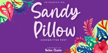 Sandy Pillow is a beautiful handwritten font. It brings an attractive typeface. Made for any professional projects. The font is suitable for any project like logo, t-shirt printing, wedding invitations, and greeting cards to social media quotes, branding, and more! Outstanding in a wide range of contexts. Featured : - Standard Ligatures - Stylistic Sets - Multilingual Support - PUA Encoded - Numerals and Punctuation
 - Courage Union by Invasi Studio,
$16.00 Inspired by vintage sportswear. The Courage Union font is designed in slab serif style with a vintage athletic feel. There are six varieties: regular, rough, halftone, outline, outline rough, and outline halftone. Ensuring carefully crafted styles result from the use of this font. This font can be used for anything from logos to social media content to cheering for your favorite sports team.
 - Sintyabelinda by Zeenesia Studio,
$16.00 Sintyabelinda - Sintysbelinda is Signature Font, suitable for any projects such as logos, branding projects, homeware designs, product packaging, mugs, quotes, posters, shopping bags, t-shirts, book covers, name card, invitation cards, greeting cards, label, photography, watermark, special events, and more. stylistic set alternate and swash make this font so classy, this is a font worthy of your collection. Thank you.
 - Just Note by Java Pep,
$15.00 Introducing the newest font and doodle that called Just Note and Note Doodle. Just Note font is inspired by the sticky notes that we always use to note everything. This font is made with the natural concept of handwriting for more stunning and outstanding we add 50+ of the doodle (Note Doodle) design to complete it so you can mix and match.
 - Bucanera Soft by Corradine Fonts,
$24.95 Bucanera Soft is a clean modern blackletter designed especially considering its readability. Due to its soft edges, Bucanera Soft leaves the traditional look of aggressive and hard blackletters and allows to find a more friendly appearance in a wide range of applications. Bucanera Soft was selected as a winner in the 3rd Communication Arts Magazine Typography Contest in Typeface Design category, 2013 issue.
 - Faithful Colony by Creativemedialab,
$20.00 Faithful Colony is a modern, elegant, classic typeface with a timeless look. It comes with seven weights ranging from thin to black, matching italics, and a variable format. Faithful Colony is perfect for fashion-related concepts, Luxury and Elegant design, Classy or high-end branding, logo, and many more. Try to combine the regular and italic styles for a modern and elegant look.
 - Maas by Mike Zuidgeest,
$15.00 Introducing Maas, a new font collection designed by the passionate designer Mike Zuidgeest in Rotterdam. Each letter of the font was created in Illustrator and handcrafted to perfection. The font is named after the river de Maas, and it's perfect for advertising and branding. As the designer, I'm thrilled with the result and can't wait for you to try it out!
 - Death Ray by AquaType,
$- A typeface to be reckoned with. It's sharp lines and unruly angles are perfect for concert posters, blackmail, and wedding invitations. Keep punk alive and support your local electro goth band by using Death Ray. Available in only uppercase because all messages that merit Death Ray's use must command that sort of attention. And who said type shouldn't be expressive.
 - Masserini by Studio Sun,
$16.00 Masserini is inspired by the 20's art deco era of colorful posters, fonts, and typography with a vintage flair. With its strong geometric shapes and letters, like a style of sans serif that was used in signs and posters during that time period. This collection consists of a variety of widths, weights, and variants to suit your creative needs.
 - Cerita Cinta by Aminmario Studio,
$20.00 Introducing Cerita Cinta Font Cerita Cinta is a casual handwriting font. Its charm makes it appear wonderfully, readable, and, ultimately, incredibly versatile. Comes in Regular and Italic styles. Equipped with beginning and ending tail. This font will look outstanding in any context, whether it’s being used on busy backgrounds or as a standalone headline! Thank you for the purchase. Happy creating design :)
 - BARBARA PERSONAL USE - Personal use only

- TT Knickerbockers by TypeType,
$29.00 TT Knickerbockers useful links: Specimen PDF | Graphic presentation | Customization options About TT Knickerbockers: TT Knickerbockers is a contrasting pair of fonts that continues our project series dedicated to different cities. The new project is dedicated to New York with its multiculturalism, historicity, creativity, energy, and to its inhabitants. TT Knickerbockers Grotesk symbolizes the monumentality of New York expressed in both its traditional historic architecture and skyscrapers. Energy, constant movement and the round-the-clock life of New York—all this is reflected in our TT Knickerbockers Script. TT Knickerbockers Grotesk is a narrow contrast sans-serif with characteristic elements sending us back to the 19th century. There’s also a reference to antiqua fonts to be noticed in the font: where in traditional antiqua there would be serifs, TT Knickerbockers Grotesk features a straight stroke ending, and traditional drops (finals, tails and ears) are substituted with rounded strokes. In TT Knickerbockers Grotesk you will find unusual characters, stylistic alternatives and ligatures. The following OpenType features are implemented: ordn, case, frac, sups, sinf, numr, dnom, onum, tnum, pnum, liga, dlig, salt, ss01. TT Knickerbockers Script is a bright and at the same time a little restrained brushpen script with a slight touch of aristocracy. TT Knickerbockers Script consists of 967 characters and also contains a huge number of contextual alternatives and ligatures. For all lowercase and uppercase letters of basic Latin and Cyrillic alphabets we have drawn 236 swashes which, depending on the context, can appear both at the beginning and at the end of a letter. Do not forget to enable OpenType support and enjoy all the opportunities that the typeface provides and its built-in features: ordn, frac, case, sups, sinf, numr, dnom, onum, tnum, pnum, calt, swsh, liga. FOLLOW US: Instagram | Facebook | Website TT Knickerbockers language support: Acehnese, Afar, Albanian, Alsatian, Aragonese, Arumanian, Asu, Aymara, Banjar, Basque, Belarusian (cyr), Bemba, Bena, Betawi, Bislama, Boholano, Bosnian (cyr), Bosnian (lat), Breton, Bulgarian (cyr), Cebuano, Chamorro, Chiga, Colognian, Cornish, Corsican, Cree, Croatian, Czech, Danish, Embu, English, Erzya, Estonian, Faroese, Fijian, Filipino, Finnish, French, Friulian, Gaelic, Gagauz (lat), Galician, German, Gusii, Haitian Creole, Hawaiian, Hiri Motu, Hungarian, Icelandic, Ilocano, Indonesian, Innu-aimun, Interlingua, Irish, Italian, Javanese, Judaeo-Spanish, Judaeo-Spanish, Kalenjin, Karachay-Balkar (lat), Karaim (lat), Karakalpak (lat), Kashubian, Khasi, Khvarshi, Kinyarwanda, Kirundi, Kongo, Kumyk, Kurdish (lat), Ladin, Latvian, Laz, Leonese, Lithuanian, Luganda, Luo, Luxembourgish, Luyia, Macedonian, Machame, Makhuwa-Meetto, Makonde, Malay, Manx, Maori, Mauritian Creole, Minangkabau, Moldavian (lat), Montenegrin (lat), Mordvin-moksha, Morisyen, Nahuatl, Nauruan, Ndebele, Nias, Nogai, Norwegian, Nyankole, Occitan, Oromo, Palauan, Polish, Portuguese, Quechua, Rheto-Romance, Rohingya, Romanian, Romansh, Rombo, Rundi, Russian, Rusyn, Rwa, Salar, Samburu, Samoan, Sango, Sangu, Scots, Sena, Serbian (cyr), Serbian (lat), Seychellois Creole, Shambala, Shona, Slovak, Slovenian, Soga, Somali, Sorbian, Sotho, Spanish, Sundanese, Swahili, Swazi, Swedish, Swiss German, Swiss German, Tagalog, Tahitian, Taita, Tatar, Tetum, Tok Pisin, Tongan, Tsonga, Tswana, Turkish, Turkmen (lat), Ukrainian, Uyghur, Vepsian, Volapük, Võro, Vunjo, Xhosa, Zaza, Zulu.
 - CAL Bodoni Terracina by California Type Foundry,
$47.00 Bodoni Terracina is a legible, fun-formal script face, with lots of curls. Sometimes script faces are hard to read. Sometimes being formal means that there’s no personality and there’s no fun. Enter Terracina: one of the masterpieces of font design. Some of the most personable italics ever carved. Includes powerful new features for: • Dates • Pricings • Addresses Not is only Terracina formal but fun, it’s also fun to use! In a program like Adobe Indesign or Illustrator, just highlight a word and see lots of fun options. Bodoni himself etched these symbols, and his fun-loving personality shines through. As a semi-script, it can go together with many script fonts, but it is more readable. When you need something equal parts elegant and whimsical, Terracina strikes a perfect balance to let the fun shine through, such as for holiday designs or fairytales. Terracina is a subheads font, but Bodoni also used it for paragraphs. So Terracina works well doing subhead paragraphs, especially when contrasting with the mood of the first font. And because of the swash variety, it works well for setting German and other European languages. CAL Bodoni Terracina is a member of our Origins Series. Origin Fonts are designed to be true to the original designer's intentions and fonts. Our Bodoni origin fonts ARE Bodoni fonts, not imitations or interpretations. They were drawn by Bodoni, our team just expanded it for modern use. For Terracina, Bodoni's original weight is the "Quasi-Lite" option, all other weights have been meticulously matched by the CAL Origins Team.
 - Iso 2.0 - Personal use only

- Sweet Steeffie - Personal use only

- Giotto Handwriting - Personal use only

- Novel Mono Pro by Atlas Font Foundry,
$50.00 Novel Mono Pro is the monospaced typeface family within the largely extended award winning Novel Collection, also containing Novel Pro, Novel Sans Pro, Novel Sans Condensed Pro, Novel Sans Rounded Pro and Novel Sans Office Pro. Novel Mono Pro has a carefully attuned character design and a well balanced weight contrast. It combines the feeling of a modern humanist with the technical appearance of a typewriter. Many similarities with the other typeface families within the Novel Collection enable designers to combine the families and reach highest quality in typography. Novel Mono Pro [948 glyphs] comes in 12 styles and contains small caps for the uprights and the italics, ligatures, lining figures, hanging figures, small caps figures, positive and negative circled figures for upper and lower case, superior and inferior figures, fractions, extensive language support, arrows for uppercase and lowercase and many more OpenType™ features.
 - Museum Ornaments by T4 Foundry,
$7.00Museum Borders and Ornaments is part of a typographical treasure, the Norstedts type collection in Sweden. Type designer Torbjörn Olsson has painstakingly translated the original 34 Ornament matrices in the collection to Open Type. Among them are several of Granjon's arabesques, as well as symbols from both Swedish and Danish typefoundries. The signs were cut in the 16th, 17th and 18th centuries. The old Swedish name for these "type trademarks" were "rössjor". Museum Borders and Ornaments is an OpenType creation, for both PC and Mac. Swedish type foundry T4 premiere new fonts every month. Museum Borders and Ornaments is our tenth introduction. Museum Borders and Ornaments is part of the growing Museum type family. Museum also includes Museum Tertia Cursive, an exquisite 1700's typeface with modern additions, and Museum Fournier, a set of Rococo capitals designed by Pierre Simon Fournier le Jeune circa 1760. - Elpy by Wordshape,
$25.00 Elpy is a friendly rounded sans serif workhorse family inspired by all things music! Spanning 22 Condensed and Regular weights with true italics, Elpy will fit right in with your record collection and your font collection! The Elpy family includes language support for Western and Eastern European languages, Greek and Cyrillic. Ian Lynam dreamt up Elpy one day when he visited a record pressing plant outside Tokyo, watching vinyl pellets being melted down and a fresh batch of 7-inch records get pressed. Despite the smell, a seed was planted that would be extruded into Elpy's rounded forms half a year later... Elpy Light and Regular function as highly readable text typefaces, while the bolder and lighter weights are perfect for display work. Elpy's rounded terminals make the family perfect for screen-based work, as well as for print conditions of any resolution—from offset to Risograph.
 - Chypre by insigne,
$- 21st century innovation demands a 21st century style. It’s the age of virtual assistants. It’s machine learning and AI. It’s blockchain and cryptocurrencies. Shape the feel of these modern concepts with the mechanically-inspired forms of Chypre. Chypre’s subtle technological feel is perfect for our culture’s evolving electronic media applications. At its source, the carefully adjusted character designs and the balanced weight contrast convey to the modern reader an understanding of cutting edge concepts through a pleasing human feel. Unlike many other tech-driven fonts out there, this next-gen cyborg is a great option for text settings as well as headlines. The new face is composed of six styles, including numerous alternates which dramatically alter the appearance. There are also extra letter shapes, numerous figure options, and extensive language support. Designed to fit where you need a high-tech feel, Chypre is a modern font for a modern age.
 - Bun Chalk by Storictype,
$12.00 Introducing BunChalk Typeface Here is new product, It's called Bun Chalk. BunChalk inspired by many lettering on menuboard chalk cafe and bistro, and it's specially designed for the resto who use chalk concept,menuboard Chalk up your brand with our one-of-a-kind chalk concept! Leave your mark and get noticed with custom branded chalk that makes a statement. Whether you're a hip cafe, a stylish boutique, or a savvy startup, our branding chalk is the perfect way to spread the word about your business. Write inspirational quotes, menu specials, sales announcements, or just your logo all over your windows and sidewalks. Made from handmade quality chalk texture that goes on clean and texture typeface, it's ideal for businesses who want to grab attention and stand out from the crowd. Let potential customers know you're there with playful, eye-catching branded chalk that gets your name seen.
 - Brutal Milk No 1 by Casloop Studio,
$9.00 Introducing Brutal Milk Font Collection where prominence, trustworthiness, and sophistication converge. Brutal Milk is a captivating grotesque typeface that seamlessly blends the robust aesthetics of brutalism with the sleek sophistication of Swiss Design and the nostalgia of Y2K. This collection featuring three distinctive variants – Brutal Milk No1, Brutal Milk No2, and Brutal Milk No3 – offers a unique typographic journey for extraordinary design. Let's break down what we present in this work - Brutal Milk No.1 | Modern Elegance with a Brutal Twist Aims for body text with the perfect balance of elegance and modernity. Brutal Milk No.1 is meticulously crafted for optimal readability, making it an ideal choice for a wide range of applications. - Brutal Milk No.2 | Softened Brutalism for Approachable Headers Aims for display/header text with a gentle and approachable impression. Brutal Milk No.2 is crafted to add a touch of warmth to your designs, making it perfect for conveying a friendly and inviting tone. - Brutal Milk No.3 | Rigid Rebellion for Prominent Headers Make a bold statement with headers that exude firmness. Brutal Milk No.3 is designed to capture attention with its rigid impression, injecting a sense of prominence and confidence into a visual identity. The Features The Brutal Milk Font Collection comes loaded with features such as case-sensitive forms, discretionary ligatures, ordinals, fractions, denominators, numerators, superscripts, and scientific inferiors – ensuring flexibility in design needs. Language Support From Western and Central European languages to South Eastern European, South American, Oceanian, and even Esperanto, Brutal Milk Collections caters to a diverse range of linguistic needs. Brutal Milk stands as a testament to versatility and innovation. Whether you're crafting a sleek logo, establishing a brand identity, adorning decor, creating impactful posters, delivering compelling presentations, designing dynamic websites, refining UI/UX experiences, or engaging in graphic design endeavour. The impressions it imparts—modern, minimal, youthful, funky, groovy, trendy, hip, fly, and undeniably cool—speak volumes about its adaptability to contemporary design trends. Redefine the boundaries of creativity and immerse yourself in the dynamic world of Brutal.
 - Brutal Milk No 2 by Casloop Studio,
$9.00 Introducing Brutal Milk Font Collection where prominence, trustworthiness, and sophistication converge. Brutal Milk is a captivating grotesque typeface that seamlessly blends the robust aesthetics of brutalism with the sleek sophistication of Swiss Design and the nostalgia of Y2K. This collection featuring three distinctive variants – Brutal Milk No1, Brutal Milk No2, and Brutal Milk No3 – offers a unique typographic journey for extraordinary design. Let's break down what we present in this work - Brutal Milk No.1 | Modern Elegance with a Brutal Twist Aims for body text with the perfect balance of elegance and modernity. Brutal Milk No.1 is meticulously crafted for optimal readability, making it an ideal choice for a wide range of applications. - Brutal Milk No.2 | Softened Brutalism for Approachable Headers Aims for display/header text with a gentle and approachable impression. Brutal Milk No.2 is crafted to add a touch of warmth to your designs, making it perfect for conveying a friendly and inviting tone. - Brutal Milk No.3 | Rigid Rebellion for Prominent Headers Make a bold statement with headers that exude firmness. Brutal Milk No.3 is designed to capture attention with its rigid impression, injecting a sense of prominence and confidence into a visual identity. The Features The Brutal Milk Font Collection comes loaded with features such as case-sensitive forms, discretionary ligatures, ordinals, fractions, denominators, numerators, superscripts, and scientific inferiors – ensuring flexibility in design needs. Language Support From Western and Central European languages to South Eastern European, South American, Oceanian, and even Esperanto, Brutal Milk Collections caters to a diverse range of linguistic needs. Brutal Milk stands as a testament to versatility and innovation. Whether you're crafting a sleek logo, establishing a brand identity, adorning decor, creating impactful posters, delivering compelling presentations, designing dynamic websites, refining UI/UX experiences, or engaging in graphic design endeavour. The impressions it imparts—modern, minimal, youthful, funky, groovy, trendy, hip, fly, and undeniably cool—speak volumes about its adaptability to contemporary design trends. Redefine the boundaries of creativity and immerse yourself in the dynamic world of Brutal.
 - Offroad by Grype,
$16.00 Geometric typefaces can harken back and visually tie themselves to so many genres, from constructivist posters, to techno club flyers, to raw industrial era power. The Offroad family finds its origin of inspiration in the O’Neal MX logo for their motocross division, represented in its truest form in the MX styles of this family, and expanded to a type megafamily. Offroad grabs hold of that unique pseudo-unicase style and runs with it to create a range of widths and weights that are perfect for historical through modern use. It embodies the hardcore motocross rigidity from the limited inspiration of the original logotype and expands to include a full and expansive glyphset, and a comprehensive range of widths and weights, creating a straightforward, uncompromising collection of typefaces that lend a solid foundation and a broad range of expression for designers. Here's what's included with the Offroad Collection bundle: 382 glyphs per style - including Capitals, Lowercase (Unicase Style), Numerals, Punctuation and an extensive character set that covers multilingual support of latin based languages. (see the 6th graphic for a preview of the characters included) 45 fonts in 6 width subfamilies: Extra Condensed, Condensed, Standard, Expanded, & Wide. 5 weights per subfamily with obliques: Light, Book, Regular, Bold, & Black. Fonts are provided in TTF & OTF formats. The TTF format is the standard go to for most users, although the OTF and TTF function exactly the same. Here's why the Offroad Collection is for you: You're in need of a geometric pseudo-unicase family with a big range of weights and widths You're a die-hard motocross fan, and want to design anything within that genre You're a club flyer designer, and need a kick-ass techno style font family You're totally into constructivist design, and want to create designs within that genre You just like to collect quality fonts to add to your design arsenal
 - Sunblock Pro by Grype,
$19.00 Clean and geometric deco sans typefaces have been used in a range of scientific publications, corporate logotypes, and beauty products over the years. However, a typeface of this style has yet to have an expansive range of widths and weights to become a design workhorse, until now. The Sunblock family finds its origin of inspiration in the Coppertone sunscreen company logo, and from there expands to type megafamily. Sunblock celebrates the rounded geometric forms of deco and bauhaus lettering through a compressed lens, transcending its brand inspired origin to give birth to a font family that pulls on modern and historical styles. It inherited its soothing tone from the limited character logotype that inspired it, and goes on to include a lowercase, small caps, and a comprehensive range of widths and weights, creating a straightforward, uncompromising collection of typefaces that lend a solid foundation and a broad range of expression for designers. Here's what's included with the Sunblock Collection bundle: 643 glyphs per style - including Capitals, Lowercase, Numerals, Punctuation and an extensive character set that covers multilingual support of latin based languages. (see the 7th graphic for a preview of the characters included) 21 fonts in 5 width subfamilies: Ultra Condensed, Extra Condensed, Condensed, Semi Condensed, & Standard. 5 weights per subfamily (except Ultra Condensed): Thin, Light, Regular, Bold, & Black. Fonts are provided in both TTF & OTF formats. The TTF format is the standard go to for most users, although the OTF and TTF function exactly the same. Here's why the Sunblock Collection is for you: You're in need of a deco geometric font family with a big range of weights and widths You're love that Coppertone letter styling, and want to design anything within that genre You're looking for an alternative to Chalet Comprime with a more versatile range of styles You're looking to start up your own derivative Sunscreen product line You just like to collect quality fonts to add to your design arsenal
 - AdamGorry-Lights - Personal use only

- AdamGorry-Inline - Personal use only

- Selfie by Lián Types,
$37.00 ATTENTION CUSTOMERS :) There's a new Selfie available, have a look here; Selfie Neue is better done and more complete in every aspect. However, you can stay here if you still prefer the classic version. -But first, let me take a Selfie!- said that girl of the song and almost all of you at least once this year. While some terms and actions get trendy, some font styles do it too. It wouldn't be crazy to combine these worlds, in fact it happens often. Selfie is a connected sans serif based in vintage signage scripts seen in Galerías of Buenos Aires. These places are, in general, very small shopping centres which pedestrians sometimes use as shortcuts to get to other parts of the city. Their dark corridors take you back in time, and all of a sudden you are surrounded by cassettes, piercings, and old fashioned cloth. For some reason, all these shops use monolined geometric scripts. Surely, neon strings are easier to manipulate when letterforms have simple shapes. My very first aim with Selfie was to make a font that would serve as a company to those self-shot pictures that have become so popular nowadays. However, the font turned into something more interesting: I realised it had enough potential to stand-alone. Selfie proves that geometry itself can be really attractive. In this font, elegance is not achieved with the already-known contrast between thicks and thins of calligraphy, but with the purity of form. Its curves were based in perfectly shaped circles which made the font easy to be used at different angles (some posters show it at a 24.7º angle) without having problems/deformities. In addition to its nice performance when used over photographs, the font can be a good option for packaging and wedding invitations. TIPS Adding some lights/shadows between letters will for sure catch the eye of the viewer: Words will look as if they were made with tape/strings; so trendy nowadays. Try using Selfie at a 24.7º angle so that the slanted strokes become perfectly vertical. Having the decorative ligatures feature (dlig) activated is a good option to see letters dance. TECHNICAL It is absolutely recommended to use this font with the standard ligatures feature (liga) activated. It makes letters ligate perfectly and also improves the space between words.
 - The DorovarFLF-Carolus font, crafted by Altsys Metamorphosis, is a tribute to the elegance and historical depth of early manuscript and inscription lettering, harmoniously blending tradition with the...


