10,000 search results
(0.037 seconds)
- Arial Nova by Monotype,
$45.99The Arial® Nova family takes Arial back to its roots. Character spacing has been adjusted and a number of subtle modifications were made to the design to return the shapes and proportions to those of the original 1982 design created for IBM's then new high-speed laser printers. Although these first Arial fonts, called "Sonora Sans" by IBM, were low-resolution bitmaps, it was apparent that the design could also be an important high-resolution digital typeface, and Arial was redrawn for Monotype's imagesetters in the late 1980s. In the process Arial evolved from its original design loosing some of its earlier personality. The restored Arial Nova family is made up of three weights of roman design of standard proportions and three weights of condensed - all with complementary italic designs. The Arial Nova family is also compatible with the fonts that Microsoft® provides in the Windows® 10 operating system. - 1529 Champ Fleury Initials by GLC,
$42.00 In 1529, Geofroy Tory, French scholar, engraver, printer, publisher and poet, was publishing the well known so called Champ Fleury, printed by Gilles de Gourmond, in Paris. It is a fully illustrated handbook where the author explains how to draw Roman characters. The font used for the text - a Humane/Jenson type - was not a very beautiful one, but rough and ready, and the book is well known for its capital letters designs. We are offering here the two complete historical type sets and more -- we have entirely redrawn the lacked letters: J, U and W, Eth, Lslash, Thorn and Oslash in the two initial forms. The text font, 1529 Champ Fleury Regular is now containing all characters for West European (including Celtic), Baltic, East and Central European and Turkish language, and the Initial set 1529 Champ Fleury Init is containing two complete alphabets, with a very great effort to be as close as possible to the original pictures.
 - Sinkwitz Gotisch by preussTYPE,
$29.00 Sinkwitz Gotisch is a new release of the font of the same name originally designed by Paul Sinkwitz in 1942. The Sinkwitz Gotisch was 1942 by Schriftguss AG Dresden font cast first cast and later supplied by the East German firm VEB Typoart. Paul Sinkwitz (1899-1981) has created them. This font displays not the characteristics of a chunky Gothic, which have influenced the image of national socialism. Paul Sinkwitz was a painter, graphic artist, wood engraver, was interested in religious topics, which he had presented in numerous graphics. But also his interpretation of his Gothic font is modern, without having the font this is ugly. In addition to the GOTISCH he created Roman Uppercase letters, which perfectly harmonize with the lowercase letters. This extra font is called BASTARD. The digital version of Sinkwitz is a beneficial addition to a Gothic with calligraphic character and should be in any historically interested graphic design.
 - Aragon by Canada Type,
$24.95 Re-introducing the classic mid-1500s Garamond forms for the twenty-first century is never an easy task. But Hans van Maanen makes a fine attempt at just that by remodeling the traditional shapes through a modern lens with stunning results. Aragon is a workhorse family that performs very well in a variety of text sizes, from footnotes and legal copy to lengthy body sets. Its combination of wedge serifs with uniquely tapered stems offers a sturdy Dutch touch that improves legibility altogether, while at the same time the slight stress shift to the top half of the characters makes the immersive reading experience very open and comfortable. The Aragon family comes in a standard two-weight set with corresponding italics, a roman small caps font with its own italics, and very attractive initials for display uses. All fonts come in the usual popular formats, and include a glyph repertoire that covers Western, Central and Eastern European languages, as well as Turkish and Welsh/Celtic.
 - Allumi Std by Typofonderie,
$59.00 Technology in mind in 12 fonts Allumi is a different font. Different from anything Jean François Porchez has designed in the past. Allumi is a sleek typeface designed with technology in mind. It’s a perfect font family for any communication concerning design, robotics, or functionality. Pushed to its extreme limits, the Allumi shapes are neither perfectly round or geometrically square. It’s a human design with a high tech touch. Allumi can be described as the Eurostyle (designed by Aldo Novarese in 1964) of the new century, mixed with Frutiger. Allumi is a serious typeface because of the unique design and sturdy form. The pure shapes can create a global presence today with an eye on the world of tomorrow. Two widths The Allumi family has been built around two series of widths, standard and extended. Italics have been carefully designed as slanted roman with all necessary optical and human corrections to create a perfect and neat italic. I Love Typography 2009
 - Axion RX-14 by Type Innovations,
$39.00 Axion RX-14 is an original design by Alex Kaczun. It is but one of several alternate designs based on his original Axion family of fonts. Alternate design elements, specifically on capitals like 'A' , 'V' and terminals of 'C' and 'G', along with contrasting sharp and rounded corners, create a tension within this modern grotesque and add a class of destinction and interest. This display font is not intended for text use. It was designed specifically for display headlines, logotype, branding and similar applications. The entire font has an original look which is strong, dynamic, machine generated and can be widely used in publications and advertising. Axion RX-14 is a futuristic, techno-looking and expressive typeface with an apperance of machined parts with sharp and rounded edges. This attractive display comes in roman with lower case and lining figures. The large Pro font character set supports most Central European and many Eastern European languages.
 - Nima by Naghi Naghachian,
$64.00 I dedicate this font family to Nima Yooshij (1896-1960), the great poet and innovator of Persian poetry. Nima is a new creation of Naghi Naghashian. Nima design fulfills the following needs: A. Explicitly crafted for use in electronic media fulfills the demands of electronic communication. B. Suitability for multiple applications. Gives the widest potential acceptability. C. Extreme legibility not only in small sizes, but also when the type is filtered or skewed, e.g., in Photoshop or Illustrator. Nima's simplified forms may be artificial obliqued in InDesign or Illustrator, without any loss in quality for the effected text. D. An attractive typographic image. Nima was developed for multiple languages and writing conventions. Nima supports Arabic, Persian and Urdu. It also includes proportional and tabular numerals for the supported languages. E. The highest degree of calligraphic grace and the clarity of geometric typography. This typeface offers a fine balance between calligraphic tradition and the Roman aesthetic common in Latin typography.
 - Hadriano by Monotype,
$29.99When traveling in Paris, American designer Frederic W. Goudy did a rubbing of a second century marble inscription he found in the Louvre. After ruminating on these letterforms for several years, he drew a titling typeface in 1918, all around the letters P, R, and E. He called the new face Hadriano" as that name was in the original inscription. Robert Wiebking cut the matrices, and the Continental Typefounders Association released the font. Goudy designed a lowercase at the request of Monotype in 1930, though he didn't really like the idea of adding lowercase to an inscriptional letterform. The lowercase looks much like some of Goudy's other Roman faces. Compugraphic added more weights in the late 1970s, and made the shapes more cohesive. Hadriano has nicely cupped serifs and sturdy, generous body shapes. Distinctive individual letters include the cap A and Q, and the lowercase e, g, and z. Hadriano™ is an excellent choice for impressive headings and vigorous display lines." - Mynaruse Flare by insigne,
$39.99 Mynaruse Flare is a new version of the Mynaruse superfamily. This version eliminates the elongated serifs of the original, and instead stems end with a flare. You will find that the thinner weights are delicate and beautiful, while the heavier weights provide impact and strength. Mynaruse is inspired by the elegant and regal Roman inscriptional types. The face shines in environments that require elegance and splendor. The eight weights of Mynaruse flare range from a subtle, delicate thin to a heavy and powerful Black weight. Mynaruse Flare includes many useful OpenType features, including a set of swash alternates, alternate titling forms, ligatures and miscellaneous alternates. OpenType-capable applications such as Quark or the Adobe suite can take full advantage of the automatically replacing ligatures and alternates. This family also includes the glyphs to support a wide range of languages. This is a titling font that is ideal for logotypes, posters or other high-end luxury applications.
 - Calligraphica by Monotype,
$49.00Calligraphica was designed because there are very few inline fonts, and even fewer inline calligraphic fonts. The original forms were written with a split pen in a single stroke. The minuscules have a rougher look and the capitals have a smoother shape to imitate hand written calligraphy with more formal, decorative initial caps. The Calligraphica family contains 6 fonts: Calligraphica Regular and Italic are the regular upright roman true italic version of the font. The ascenders on this font are a bit higher than the capital letters--this is standard for most fonts. Calligraphica LX Regular and Italic are similar to the first 2 fonts except their ascenders are longer and reach high above the capital letters--giving these fonts a taller appearance. Calligraphica SX Regular and Italic are similar to the first 2 fonts except their ascenders are shorter and are the same height as the capital letters--giving these fonts a shorter appearance. - Dez Now Sans by Dezcom,
$28.00 Dez Now Sans is a humanistic typeface family that was begun in 2005 by Chris Lozos of Dezcom. Since then, it has been nurtured, revised, and expanded to include 12 weights in both upright roman and true italics totaling 24 variations. This allows the user to choose the weights which best work for type-size, output device, and reproduction process. There is often a difference of opinion on what the best weight to use for normal text when setting type. The truth is, there is more than one answer. When you consider the size, weight, leading and set width—along with paper and ink specifications, you may find the need for several. The subject matter of the text with the specifics of the target audience, also increase the demand for expanding choices. Dez Now Sans was designed with several potential text weights to address any circumstance. Dez Now Sans gives you a full and varied toolbox of fonts to choose from.
 - Beatrix Antiqua by Zetafonts,
$39.00 Beatrix Antiqua is a humanist sans-serif typeface designed by Francesco Canovaro. Beatrix Antiqua is part of the Beatrix Family that takes its inspiration from the classic Roman monumental capital model: its capitals are directly derived from the stone carvings in Florence Santa Croce Cathedral - where the serifs are often removed while keeping the variable width strokes. So, even if it’s basically a sans-serif, Beatrix keeps a subtle swelling at the terminals suggesting a glyphic serif - in the same vein as Herman Zapf classic Optima typeface. In the lowercase design, Beatrix references early humanist typefaces, keeping small calligraphic details (as the prolongation of the e nose) that are especially visible in the italics. While Beatrix Antiqua, the companion typeface to Florentia , slightly exaggerates its antique stylistical features, Florentia tries to mix those influence with a more robust & digital age ready design, featuring bigger X-height and an extended character set that covers over forty languages using the latin alphabet, as well as Greek and Russian Cyrillic.
 - 1565 Venetian by GLC,
$20.00 This set of initial decorated letters is an entirely original creation, drawn inspired by Italian renaissance engraver Vespasiano Amphiareo's paterns published in Venice circa 1568. It contains two roman alphabets : the first of large Initials, the second of small caps. Both containing thorn, eth, L & l slash, O & o slash. It can be used as variously as web-site titles, posters and flyers design, publishing texts looking like ancient ones, or greeting cards, all various sorts of presentations, as a very decorative, elegant and luxurious additional font... This font is conceived for enlargements remaining very smart and fine. The original height of the initials is at least about one inch equivalent to about four lines of characters, small caps may have the same height than the caps of the font used with, but cover two lines is better. This font may be used with all GLC blackletter fonts, but preferably with "1543 Humane Jenson", "1557 Italic", "1742 Civilite", "1776 Independence" without any fear for doing anachronism.
 - Hebrewish by JAB,
$18.00I decided to create Hebrewish because the only Hebrew Latino font I have ever seen didn't really live-up to my expectations. Each Roman letter and Arabic numeral in this font is based directly on one or more of the Hebrew characters. Originally I was tempted to create an upper case only - since there is no lower case in Hebrew that I know of. But, as this would have limited it's usefulness, I changed my mind and added a lower case also. Nevertheless, those who want to create very Hebrew looking text, need only use the upper case. I've also added some typical Judaic symbols for the artistic minded, e.g. David's star *, the Menorah ^(Jewish candelabrum) and brackets{ } based on this, as well as brackets [] which, used together, produce a 'Ten commandments' stone-tablet symbol(use this [~] for another version). In short, you can either have some fun with this font or use it for serious work - the choice is yours. - Di Barros by Di Barros,
$5.00 I'm Roberto Teixeira, a Brazilian graphic designer. After looking for a form quite different from the existing types, created in 2019, Di Barros Fonts Family is composed by Di Barros Regular...for while. This,form covers the following, according to the Windows character map: Basic Latin, Latin Supplement 1, Extended Latin A, Extended Latin B, Additional Latin, Cyrillic, Greek, Greek Extended, Armenian and several other special types, such as currency symbols, numbers, fractions, Roman numerals, arrows, symbol of electricity, hearts and vector images, of own authorship and more. Di Barros, with a good length, serves several languages. I think Di Barros applies to fine environments, such as jewelry stores, fashion stores, cultural events and others, where a beautiful and non-aggressive look is required. But there is no better application than the one chosen for its inspiration and creativity. Di Barros Fonts Family was made for you. Thank you for using it.
 - Roijer by PeGGO Fonts,
$39.00 “Röijer” was born from a branding exercise done with “high care”, graphically developed thanks to the valuable help of designers Marcela Aguilera & Pedro Gonzalez, each letterform and every type design process was worked as a typographic jewel, as a strong bond between classical and fresh concepts (with a Lombardic and Art Nouveau touch). Röijer puts a dual capital model in your hands; a classic Roman and a fresh contemporary alternative, on each letter: the first located in a lowercase box looks formal and sober, while the uppercase box shows a glamorous and more daring look, ideal to being use at specific moments only. Röijer combine elegance and audacity in a very magistral way. It has 2 variants with 541 glyphs each one; a normal and a volumetric one, all with an ornaments set and a decorative objects set. Ideas that be useful not only for branding design but also for titling, headline composition, label design, fashion and luxury stuff.
 - Gotto by Attype Studio,
$18.00 Gotto, the playful Sans-serif font with an italic twist and multilingual support. Perfect for logos that want to stand out from the crowd. Let Gotto bring some fun and personality to your next design project! Features : - Gotto Family Font - Multilingual support, US Roman, Latin 1 Support --- This Font Support Language: Afrikaans, Albanian,Asu, Basque, Bemba, Bena, Breton, Catalan, Chiga, Cornish, Danish, Dutch, English, Estonian, Faroese, Filipino, Finnish, French, Friulian, Galician, German, Gusii, Indonesian, Irish, Italian, Kabuverdianu, Kalenjin, Kinyarwanda, Luo, Luxembourgish, Luyia, Machame, Makhuwa-Meetto, Makonde, Malagasy, ManxMorisyen, North Ndebele, Norwegian Bokmål, Norwegian Nynorsk, Nyankole, Oromo, Portuguese, Quechua, Romansh, Rombo, Rundi, Rwa, Samburu, Sango, Sangu, Scottish Gaelic, Sena, Shambala, Shona, Soga, Somali, Spanish, Swahili, Swedish, Swiss German, Taita, Teso, Uzbek (Latin), Volapük, Vunjo, Zulu, Thank you for purchasing premium fonts from Attype Studio. Follow and explore our work on Pinterest & Instagram. If you have any question, don’t hesitate to contact us. Hope you enjoy with our font! Attype Studio
 - Scala Sans Pro by Martin Majoor,
$49.00 The award-winning Scala family (1990-1993) is a worldwide bestseller and has established itself as a ‘classic’ among digital fonts. It was one of the first serious digital text fonts to support small caps, ligatures and different set of numbers. In fact Scala and Scala Sans (1990-1993) are two workhorse-like typefaces sharing a common form principle: the skeletons of both Scala and Scala Sans are identical, therefore they can be combined perfectly. Where many of the modern sans serifs (like Helvetica and Univers) have rather ‘closed’ letter shapes, the same elements in Scala Sans are much more ‘open’. This greatly improves legibility, especially in the smaller point sizes. The italic of Scala Sans is not a slanted version of the roman, but rather a ‘real’ italic. Another part of Scala is very popular among its users: Scala Hands, containing more than one hundred decorative hands and pointers, is included in the Scala fonts and is a free bonus.
 - Axion STN by Type Innovations,
$39.00 Axion STN is an original design by Alex Kaczun and is a stencil interpretation of his Axion RX-14 font. It is but one of several alternate designs based on his original Axion family of fonts. The wide gap within this stencil treatment works well with and compliments the spacing in the font, creating a tension within this modern grotesque and adding a class of destinction and interest. This display font is not intended for text use. It was designed specifically for display headlines, logotype, branding and similar applications. The entire font has an original look which is strong, dynamic, machine generated and can be widely used in publications and advertising. Axion STN is a futuristic, techno-looking and expressive typeface with an appearance of machined parts with sharp and rounded edges. This attractive display comes in roman with lower case and lining figures. The large Pro font character set supports most Central European and many Eastern European languages.
 - Bodoni Classic Cyrillic by Wiescher Design,
$55.00 One day shortly after Christmas 2004, the art-director of Vogue Moscow called me. Would I maybe make a Cyrillic version of my Bodoni Classic Text typeface? Well, since I had been thinking about doing it since a long time, this was the perfect reason to finally do it. It was not an easy venture, since I do not have the faintest idea of Russian but, together with those nice people in Russia and a fellow helpful type designer in Kiev, I managed. I did an enormous amount of kerning, thanks to the help of the Moscow Vogue office. Here the fonts are now for all of you: five text cuts, plus one standard roman cut that has no Cyrillic letters but an extra set of medieval numbers. At Vogue they are happy with the fonts, even though I did not quite adhere to Bodoni's originals in this case. Nastarowje (or whatever you say in Russia), Gert Wiescher
 - Orchidea Pro by Mint Type,
$40.00 Orchidea Pro is a typeface balancing on the verge of sans and serif. Called a stressed sans or a serifless serif, it does not feature any serifs, but resembles a serif typeface by build, and features unilateral nibs that speed up the reading and create a particular distinction in the form. Such solution results in a contemporary-looking yet elegant type, virtually unique in texture, that exists in the same stylistic space as flared serif families. Orchidea Pro will fit particularly well for use in magazines of any theme, as well as in branding for beauty-related products. The typeface comes in 8 weights + corresponding real italics, each supporting numerous Latin-based languages as well as major Cyrillic languages. It is packed with OpenType features like ligatures, small caps, 5 sets of digits, 4 stylistic sets in romans and 1 in italics, superiors and inferiors, fractions, ordinals, respective punctuation varieties including all-cap punctuation, as well as language-specific alternates.
 - Infusion by Andinistas,
$39.00 Infusion is a type family designed by CFCG & Fabio Godoy for andinistas.net. The creative process of Infusion evolved throughout a myriad of experiments supported by my font gluten This is why its expressivity comes from the addition and subtraction of its parts by mixing and combining, resulting in a great variety and new versatility of uppercase, lowercase, multiple and different numbers to be applied at the beginning, middle or end of the word. Infusion is used to write sentences in craft contexts that require organic graphic design, with meticulous imperfect look. Infusion offers typographic solutions out of the limits, or out of borders that divide the mechanics of the drawn by hand. Infusion has 6 decorative and legible fonts to write casual messages with organic, friendly and natural personality. Infusion “Script, Mix, Roman, Shadow, Extras, Dingbats” contain unconventional visually appealing ideas to work independently or in group in the design of logos, packaging, presentations, headlines or editorials.
 - As of my last update in early 2023, the font PharmaCare might not be widely recognized like Helvetica or Times New Roman, but it carves its unique aesthetic, potentially specialized for the healthcar...
- The Slant font by Altsys Metamorphosis is a unique typeface that embodies a dynamic and forward-moving aesthetic, embodying the essence of motion through its distinctive slanted characters. Altsys, a...
- SF Eccentric Opus - Unknown license

- Fonitek - Unknown license

- Quibel - Unknown license

- Neustyle - 100% free

- Metrolite by Jonahfonts,
$39.00 A slab font in 6 styles.
 - Charbonne by TypeArt Foundry,
$45.00 Decorative type in style of 1930s.
 - Cortinado by Intellecta Design,
$22.90 Cortinado is a mixed font style.
 - Dream Lover by TypeArt Foundry,
$45.00 Casual script styled after 1950s signage.
 - LHF Bell Boy by Letterhead Fonts,
$33.00 Authentic 30s style art deco typeface.
 - Steelyard by TypeArt Foundry,
$45.00 Inline styled after retro Luggage Label.
 - MindCrime AOE by Astigmatic,
$19.95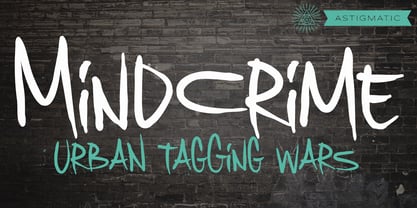 An offbeat graffiti tag-style font.
 - Mondrongo by Intellecta Design,
$22.90a grunge and comic style font - Eucaliptus by TypeArt Foundry,
$45.00Decorative type in style of 1930s. - Getrok by Prioritype,
$19.00 Typeface inspired by the wild style of street graffiti artists. There are two styles, namely regular and extrude. Great for poster design, product packaging, merchandise and so on. Features: Uppercase, Lowercase, Numeral, Punctuation & Multilingual. Thanks.
 - Assinatura by Letterara,
$12.00 Assinatura comes from Portuguese which means signature. Assinatura is a hand drawn script with a natural style. This signature script moves with ease across any design, and adds a large dose of confidence and style.
 - Karacho by alphabeet.at,
$20.00 Karacho is a ‘fat style’ geometric display typeface with two counter-styles, a stylistic set of lowercase letters, and multilayer options: the font design is separated in three layers for building individually colored font variants.


