10,000 search results
(0.315 seconds)
- Funny Business JNL by Jeff Levine,
$29.00 The hand lettered title on the sheet music for "Gee, But I'd Like to Make You Happy" (from the 1930 MGM motion picture "Good News") presented a conundrum. Some of the lettering was a classic Art Deco "thick and thin" design while the others resembled comic book title lettering. Leaning toward the comic book style, the conflicting letters were revised and the finished result became Funny Business JNL; available in both regular and oblique versions.
 - Monteci by Pista Mova,
$14.00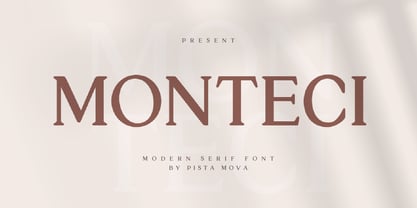 Monteci is a modern display serif font. Minimalist and classic typefaces are suitable for logos, quotes, branding, or editorial designs. Monteci has a unique character by combining geometric shapes with organic curved details. This is a unique typeface for your personality. This font is PUA encoded which means you can access all of the amazing glyphs and ligatures with ease! Feel free to contact us if you have any questions :) Thank you!
 - Calisto by Monotype,
$29.99The appeal of Calisto as a text face lies in its very even color on the page, while its robust construction means that it can work equally well at display sizes. The slightly calligraphic treatment of letter shapes and the classical proportions give Calisto a clean elegance on the page. The Calisto font is a graceful and interesting addition to the typographer's repertoire and will prove particularly useful for book, magazine and advertising work. - Stovepipe Stencil JNL by Jeff Levine,
$29.00 Stovepipe Stencil JNL was not directly designed from a vintage source, but it does draw its influences from classic sans serif lettering of the past. Even its name borrows (somewhat gratuitously) from the "stovepipe" lettering so popular with sign painters. True stovepipe letters tend to be squarer with rounded corners, but the name has also been loosely associated with some tall, condensed type styles. The typeface is available in both regular and oblique versions.
 - Bardi by ParaType,
$30.00 An original typeface designed for ParaType in 2004 by Armenian designer Manvel Shmavonyan. Based on the lettering created in 1970s by outstanding Armenian type designer Henrik Mnatsakanyan (1923-2001) of the same name. In Armenian 'Bardi' means 'Poplar'. Extra compressed decorative stenciled typeface. Its letterforms resemble many Neo-Classicism extra compressed faces and magazine lettering of the 1950s-60s. For use in advertising and display typography especially in magazine headlines and logos.
 - Pigeon Wing by PizzaDude.dk,
$20.00 Crayon fonts are fantastic! I've always thought it looked so cool with fonts that simulate writing with crayons...but the fonts has always been limited in letters! But that’s where my Pigeon Wing font stands out! Using the smart techniques of the OpenType thing called “Stylistic alternates”, you get 8 different versions of each letter! Yes EIGHT different versions that cycle as you write! That means words with the same letter appearing several times, cycles through the different versions! Besides that, the font is loaded with multi language support! What’s not to like! :)
 - Steinwald by Kitchen Table Type Foundry,
$15.00 Steinwald font was named after a mountain range slash nature park in southern Germany. I have to admit that I have never been there, but this font was just screaming for a good German name and I settled on Steinewald (which, in German, means Stone Forest). Steinwald was made by hand and cleaned up by computer. It looks quite neat, but its edges are a bit rough, giving it ‘ye olde handmade look’! Use it for your posters, your product packaging and your supermarket signs. Comes with extensive language support.
 - New Alphabet by The Foundry,
$50.00 New Alphabet was created as a four weight family in close collaboration with Wim Crouwel. His response in the late 1960s to the first device for electronic typesetting was a radical experiment designed to follow the underlying dot-matrix system. With his strong interest in grids, Crouwel worked within the constraints of existing electronic technology, to produce characters that worked with the mechanical means that conveyed them. His original New Alphabet experiments have now been further developed by The Foundry into a typeface family that also includes the dot version.
 - Gacko by Beary,
$10.00 Are you looking for a display serif type with fun Ligature? You came to the right Font. Gacko is a display serif type with fun Ligature look attractive and natural. Masterfully designed to become a true favorite, this font has the potential to bring each of your creative ideas to the highest level! Every single letters have been carefully crafted to make your text looks beautiful. Gacko is PUA encoded, which means you could access all of the glyphs! Every letter has a unique and beautiful touch, which will make your design come alive! Thanks
 - Caslon 540 by URW Type Foundry,
$89.99 William Caslon (1692-1766) laid the foundation for English typefounding, when he cut his first roman face in London in 1722. He modeled his designs on late seventeenth-century Dutch types; thus his typefaces are classified as Old Styles. The original Caslon punches have been preserved, enabling a perfect recutting of his faces. Notice the hollow in the apex of A and the two full serifs or beaks in the C. The italic capitals are irregular in their inclination. The Caslon font family is distinctive for use in subheadings or continuous text.
 - Seashore Pro by Sudtipos,
$59.00 A feminine, graceful script whose thicker horizontals create a wave-like rhythm — hence the name. Seashore is loosely based on an "eccentric" (left-leaning) penmanship style of the late 19th century. Used mainly by professional "engrossers" in certificates and tributes, or by society ladies in their stationery and invitations, it sent a message of true refinement, as the style would have been only been mastered after the more common business, Spencerian, and standard ornamental styles. In fact, unusual script styles were in such demand that type foundries of the era exploded with metal-type knockoffs of increasing fanciness. Seashore includes a wide variety of swash capitals, alternate endings, and contextual ligatures, over 900 glyphs in all. Seashore is best used in short display settings — in names and addresses on formal invitations, in menus and food packaging, or fashion and beauty contexts.
 - Pagnol by Typorium,
$15.00 The Pagnol typeface has been designed with a principle developed by A. M. Cassandre in 1937, when the great French designer created the Peignot typeface following paleographic studies on the evolution of letterforms. Researches in the history of writing have proved that the lowercase "a" is at its origin nothing but the "A" shape transformed through centuries by scribes until the invention of printing. A large number of lowercases meanwhile kept their original shapes. If the scribes’ hand didn’t find the necessity to simplify them, it is only because these letters could be easily written. Integrating the classical shapes of capitals to the lowercases has already been used, keeping the lowercases which are only a deformation of capitals. Nevertheless, the respect of readability imposes to keep ascendants and descendants from traditional lowercases which serve as optical focus points in a text and make reading easier. The particularity of Pagnol is to use rounded shapes on top and bottom of pointed capital letters to make them fit with corresponding lowercases (Aa, Mm, Nn, Vv, Ww, Zz). Lowercases proportions are wide, to be in tune with classic lowercase shapes in order to optimize readability. Five weights in roman and italic have been designed to offer a wide palette of typographic possibilities in all sizes and all paper and screen supports.
 - Malaguena Stencil JNL by Jeff Levine,
$29.00 Malaguena Stencil JNL was derived from hand lettering found on an Art Deco-era piece of vintage sheet music for this familiar tune. According to Wikipedia: “Malagueña is the feminine form of the Spanish language adjective malagueño/ malagueña, ‘pertaining to Málaga’, a Spanish port city.” Additionally: "Malagueña", is a song by Cuban composer Ernesto Lecuona; written in 1928 it was originally the sixth movement of Lecuona's Suite Andalucia, to which he added lyrics in Spanish. The song has since become a popular, jazz, marching band, and drum corps standard and has been provided with lyrics in several languages.
 - Eloquence by Monotype,
$31.99 Eloquence has a modern aesthetic with a strong classical influence – this is the “Renaissance Remixed”. While being inspired by the first printed texts of the Renaissance period, this typeface has contemporary features such as a high x-height, open bowls and counters, along with razor-sharp serifs and terminals. It has been designed specifically for creating a pleasant reading experience. With a comprehensive character set, Eloquence can comfortably handle printed documents such as novels, magazines, annual reports, along with their equivalent online/digital formats. This 14-font family also has a few tricks up its sleeve by means of some neat, complementing discretionary ligatures and alternates that will prove to be useful embellishments to your typography. Small Caps are included too, along with corresponding diacritics meeting the Latin Extended specification. You can view more details, design examples, and a specimen PDF at eloquence-font.com Key Features: • 14 font family – 7 weights in Roman and Italic • Small Caps, Alternates, Ligatures, with Proportional, Old Style, Small Cap, Fractions, Numerators, Denominators, Superior, and Inferior Figures • Full European character set (Latin Extended) • 900+ glyphs per font.
 - Underwood1913 - Personal use only

- PackardClipperNF - 100% free

- Tasmin Reference - Unknown license

- Harrington - Unknown license

- Kingthings Versalis - 100% free

- Opal - Unknown license

- TrixieExtra - Unknown license

- 50's Headline DSG - Unknown license

- Ionic No 5 by Monotype,
$51.99 Ionic No5 is a refresh of a classic Linotype Clarendon-style serif, another restored classic from the Monotype library, much like the recent updates to Walbaum and Helvetica Now. The original typeface was designed to be printed and read at small sizes, popular with newspapers in the 20th Century at its birth. The restoration and refinement of this typeface has bestowed a greater sense of clarity and directness, smartly stylish, and an utterly captivating appeal. Because these styles were so popular for books and newspapers for so long we associate them with being editorial or bookish, not dull, but thoughtful. Designers today can use that association to their advantage as a visual shortcut to convey similar meaning and tone. More attention was given on modernising the typeface with precious use and the introduction of sharp edges & finishes. The thinnest weights can give a dancing typewriter aesthetic, being low stroke contrast. The heavy weights have an unquestionable presence on the page. Overall, the typeface has a richness and almost illustrative quality about it. The true depth of Ionic No.5 could enable each weight to be a poster by itself. Ionic N°5™ font field guide including best practices, font pairings and alternatives.
 - Dip Pen JNL by Jeff Levine,
$29.00 Answer Songs have been around for [probably] just as long as there have been songs. 1917's "If I Catch the Guy Who Wrote Poor Butterfly" was the answer to the 1916 hit "Poor Butterfly" [by Raymond Hubbell and John Golden], which in turn was inspired by the Puccini opera "Madame Butterfly". "Poor Butterfly" was so popular that this "answer" tune had as part of its lyrics "That melody haunts me in my sleep; it seems to creep." Nonetheless, the sheet music for William Jerome and Arthur Green's comic lament had the title hand lettered with an oval nib lettering pen and is now availably as a digital type face called Dip Pen JNL.
 - P22 Komusubi by IHOF,
$24.95 Komusubi is a new font family from Hajime Kawakami. It features Latin as well as Katakana and Hiragana. This lively display font comes in regular and bold for all three alphabets. In Japanese, Komusubi means to tie up a string or ribbon lightly. The Nipponian lyrical atmosphere of the word "Komusubi" reflects the casual tone of the font itself. There is also a "Komusubi" rank of the Japanese SUMO.
 - Christmas Picture by Reyrey Blue Std,
$18.00 Introducing, Christmas Picture Typeface. A classical and fun serif italic version. It's created specially for the Christmas Spirit. Christmas Picture is a great design choice this Xmas season for inspirational quote designs, logo designs, simple and classy Logos, web font, branding, product packaging, and much more. This font is PUA-encoded, which means you can easily access all of the glyphs! Features : All Uppercase and Lowercase Number & Symbol Supported Languages Stylistic Alternate PUA Encoded Hope you enjoy our font!
 - Osnova Pro by AndrijType,
$55.00 The common Slavic word Osnova means basis in English and βάση in Greek. This universal but still distinctive typeface can make a good ground for any design project. Osnova has six weights from Thin to Heavy with Italic, Small Caps, Old Style & Tabular Figures, some ligatures, alternatives and letter variations. It supports Central European, Greek and Cyrillic codepages, and will be suited for both display and text use. Look how people use it: http://use.type.org.ua/tagged/osnova
 - Arlo Sans by S6 Foundry,
$20.00 Arlo is a geometric sans serif typefac containing purposeful subtle design touches, details, and deviations from conformity. The width of the counters and comfortable, breathable apertures means that Arlo Sans has excellent legibility and contrast throughout weights and sizes. Mastered for optimal readability, Arlo Sans is a versatile typefamily, designed with robust, reliable forms; it contains its contemporary personality. The family includes over 20 stylistic glyphic alternatives making it stunningly versatile with its modern details and classic styles.
 - Vector by Reserves,
$39.99 Vector is inspired by the 1979 Atari Asteroids video game UI screen font, yet it has been completely reworked to achieve a more balanced and refined visual aesthetic, loosely adhering to the original source. Letterform widths, angles, metrics and kerning are thorougly tweaked throughout in an effort to recreate a modern classic anew and extend it's functionality. Stylistically, Vector accurately reflects it's name, exuding a uniform sense of flatness and rectangular geometry defined by it's retro-modernist origins.
 - Citrus Gothic by Adam Ladd,
$25.00 Citrus Gothic is a hand drawn, sans featuring solid, texture, inline, rough, shadow, and italic styles. It’s design leans on the classic, condensed gothic appearance but adds flair with the irregular details and curled terminals. An all-caps typeface that is functional and unique, making it great for branding, packaging, headlines, and other display uses. The uppercase and lowercase are each individually drawn so switch between them as you typeset for a more authentic, hand drawn appearance.
 - Hotel Suite JNL by Jeff Levine,
$29.00 This is a digital reinterpretation of Walter Huxley's 1935 evergreen "Huxley Vertical", which was originally cast for American Type Founders. A timeless classic which has been in use since the Art Deco era, this version is known as Hotel Suite JNL. As in the original metal type, alternates for A,K,M,R,W and Y are available and can be found on their respective lower case keys. Hotel Suite JNL is available in both regular and oblique versions.
 - Foundry Sterling by The Foundry,
$90.00 Foundry Sterling is a functional and eloquent typeface family that has its origins in the desire to create a modern sans design with a quintessentially English flavour. The letterforms have been designed with particular attention to classical proportion and purity of form, resulting in the creation of a functional yet graceful typeface with elegant beauty. Foundry Sterling is an eminently versatile font with a carefully chosen weight range equally applicable to identity, editorial and signage use.
 - Brown Pro by Shinntype,
$39.00 At text size, Brown is a classic grotesque, distinguished by its semi-condensed proportions—especially in the capitals, which harmonize well with the lining figures—and an exceptional clarity in certain high-resolution media, such as offset printing, achieved by micro-detailing. At display size, the detailing provides the otherwise austere forms of the neo-grotesque with a subtle wealth of visual interest.
 - Ciao Mamma by Comics Font Store,
$19.00 CIAO MAMMA is a vintage-style font, inspired by old almanacs and classic comics. It is ideal for auteur comics as well as commercial products. It is made with a marker, has contrast-free letters and regular spacing helping its legibility and clarity. The font is elegant and graceful and is reminiscent of the history of comics, evoking great, timeless comic strips.
 - Sacred Letter by 38-lineart,
$14.00 Sacred letter is a font that follows the rules of calligraphy writing, but the difference is there is a natural emphasis on handwriting. The Thick and thin are not smooth to describe the flow of natural ink. The pure calligraphy tends to the classic style with nuances of the grandeur of the past. This font is more open and appears as-is. The flexibility of the style makes it can survive in the classic style and modern style. Sacred Letter is a flowing and classic handwritten font, described by an elegant touch, perfect for your dearest projects. Fall in love with its incredibly distinct and timeless style and use it to create spectacular designs! This font is PUA encoded which means you can access all of the glyphs and swashes with ease! It features a varying baseline, smooth lines, gorgeous glyphs and stunning alternates.
 - Richard Starkings by Comicraft,
$39.00 A NEW HOPE! You begged with us..! You pleaded with us..! But we decided to release the official Richard Starkings font anyway! Huh? WHAT? You heard that line before? Where? Hmm... on this very site...? Well, yes, the Hedge Backwards font is all fine and dandy and does resemble the lettering legerdemain of comic book lettering robot, Richard Starkings... but has it been tweaked over the years to better suit the writing stylings of ELEPHANTMEN creator and writer, Richard Starkings? Has it been refurbished and digitally remastered by ELEPHANTMEN designer and Comicraft Secret Weapon, John JG Roshell? Hmm? No? Well then... here it is, retooled, reimagined and reStarkingsed...ah, what the hell, we started from scratch! This ain't no Greedo Shoots First -- you won't have to keep your pasty '70s VHS recordings of previous Richard Starkings Fonts inside a concrete bunker. Because any other font that claimed to be the official Richard Starkings font would have been called The Official Richard Starkings Font, would it not?
 - ITC Greengate by ITC,
$29.99ITC Greengate is the result of a time-traveling, intercontinental collaboration--one between 21st century South African designer Richard Every, and early 20th century Scottish artist Jessie Marion King. Jessie Marion King (1875-1949) began her professional career as a book designer and illustrator, but over time her creativity found its outlet in many forms, including posters, jewelry, ceramics, wallpaper, fabrics, murals, interior design and costumes. After eventually settling in Kirkcudbright, Scotland, she founded Green Gate Close, a center for women artists. Although her style is reminiscent of the Art Nouveau artist, Aubrey Beardsley, King's aesthetic was an offshoot of the “Glasgow Style,” a Scottish hybrid of the Arts and Crafts movement and Art Nouveau. Often, her illustrations included hand lettering. It was just this kind of lettering that gave Richard Every his inspiration for ITC Greengate. When he saw some children's book illustrations that King created in 1898, he knew on the spot he had to complete the hand lettering as a typographic font. He began working on the typeface in 1996, but it took six years to be released as an ITC typeface. Every simplified and harmonized King's letterforms slightly and, most importantly, added a suite of lowercase characters. The result is a somewhat earthy Art Nouveau design, with a character quite distinct from typical digital revivals. Every's career has been as diverse as King's. He was born in Durban, South Africa and studied graphic design at ML Sultan Technikon in Durban. He's been an art director, freelance designer, the owner and manager of a nightclub and co-manager of a South African band. “Through it all,” he says, “typography has always been one of my passions.” - Dragmatis Whiplash by Alcode,
$23.00 Dragmatis Whiplash is a classic font, I built it with my relaxed hands. designing a classic font but having a modern element in it, which makes it particularly suitable for wedding media, book covers, greeting cards, logos, branding, business cards and certificates, in fact for any design work that requires a clasik, formal or luxurious. Includes multilingual support Try Dragmatis Whiplash, enjoy the richness of OpenType features and let her fun and elegant excitement make you happy and enhance your creativity! You can use this font very easily. Do not forget to see, buy, like and share my other great products, klick here.
 - Polin Sans by Borutta Group,
$39.00 For several years I have been thinking about the design of a type family that explores, on the one hand, the modernist aesthetic that we know, from the Alphabet "a.r." designed by Władysław Strzemiński, and on the other, to the multiscript pre-war Warsaw. This is how the idea of creating the Polin Sans typeface was born. After researching on geometric variants of the Cyrillic alphabet, I was inspired by the text "Towards an open layout: A letter to Volodya Yefimov". I was intrigued by the fact that circular forms, which we are mostly familiar with in the Bulgarian Cyrillic, can be implemented in the classical version, without disrupting the reading process. At the same time, while working on typoteka.pl, I was fascinated by the Hebrew typeface jaffa, published by the Idźkowski & Sk-a foundry, which at some points looks like the Hebrew equivalent of the Alphabet "a.r.". Ben Nathan from Israel joined the project and was responsible for creating his native script. The idea of creating a multiscript family expanded to include Greek and Vietnamese. As a result, Polin Sans is a historical journey through the nooks and crannies of Polish modernism, which was created by people with diverse cultural backgrounds. The Polin Sans family was designed by Mateusz Machalski and Ben Nathan with the support of Michał Gorczyca and Małgorzata Bartosik.
 - Fragment Pro Inline by (v) design,
$49.00 Fragment Pro Inline is a part of a larger OpenType font family (see also Fragment Pro). It is an elegant, soft and decorative typeface built on classical proportions. Its outlines have been carefuly crafted with a high attention to detail, so it could be used even at very large sizes. Fragment is a layered typeface – you can either use the standalone version of Fragment Inline or combine its two layers (Lit and Shadow) to achieve various color effects. It is not recommended to use “inline” layers separately. Instead, choose the separately sold Fragment Pro, which has been significantly optimized for standalone use. Fragment has been conceived to be used as a display typeface in publications, titles, logotypes etc., but it is surprisingly legible even in smaller print sizes. Thanks to its strictly onefold oulines, Fragment can be also used as a stencil typeface. Fragment supports many OpenType features and offers great multilingual support for most of the Latin-based languages. Feel free to download the detailed PDF Specimen.


