10,000 search results
(0.011 seconds)
- Office Work JNL by Jeff Levine,
$29.00 The 1965 film “Mirage” had its titles and credits hand lettered in a simple, thin sans serif with rounded corners and an overall square design. This is now available digitally as Office Work JNL, in both regular and oblique versions.
 - MR FUGLESANG CLEAN - Unknown license

- CLAW 2 BRK - 100% free

- CLAW 1 BRK - Unknown license

- Tokyo Honey Chan - Unknown license

- Weekend Plans JNL by Jeff Levine,
$29.00 A piece of vintage British sheet music from 1941 entitled “That Lovely Week-End” featured the song’s name in a bold Art Deco sans serif with rounded edges. This lettering design is now the digital type face Weekend Plans JNL, which is available in both regular and oblique versions.
 - Welcome Santa Claus by Andrey Font Design,
$10.00 Welcome Santa Claus is a beautiful handwritten font. Its natural and unique style makes it incredibly fitting to a large pool of designs. The only limit is your imagination! This font is PUA encoded which means you can access all of the glyphs and swashes with ease!
 - Clean and Glam by Pixel Colours,
$22.00 Clean and Glam is a sweet handwritten font duo that has a sassy modern style to create the most beautiful design projects. ❤️ Includes a light monoline script font that is so chic and clean, and it combines perfectly with the uppercase sans to create amazing text combinations. Works great for Logos & branding, product packaging, product design, labelling, wedding design, social media posts, advertisement, editorial design, etc. Includes: Clean and Glam: A light modern script font. Includes numerals, uppercase and lowercase characters, punctuation and some cute hearts. Clean and Glam Sans: A modern uppercase sans font that is the perfect match of the script, great for descriptions, taglines, ingredients, etc. Includes numerals, uppercase and lowercase characters, punctuation and more cute hearts. Language support
 - Gmuender Elan Pro by RMU,
$35.00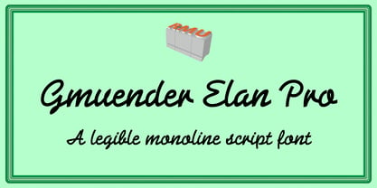 A legible multi-purpose, multilingual monoline-script of great clarity.
 - FF Magda Clean by FontFont,
$62.99 Swiss type designer Cornel Windlin created this display and slab FontFont in 1995. The family has 9 weights, ranging from Thin to Black and is ideally suited for advertising and packaging, editorial and publishing, logo, branding and creative industries as well as poster and billboards. FF Magda provides advanced typographical support with features such as ligatures, alternate characters, case-sensitive forms, and stylistic alternates. It comes with tabular lining and tabular oldstyle figures. This FontFont is a member of the FF Magda super family, which also includes FF Magda Clean and FF Magda Clean Mono.
 - Clean Deco JNL by Jeff Levine,
$29.00 Normally, a short paragraph or two on this page tells the backstory to a font design. In this particular case, that story has been lost to time. Whatever the original source – whether a vintage bit of typography or an original idea – the beginnings of this font lay unfinished for quite a while as it was perceived to duplicate another previous release. However, after recently checking a sample of the design against other Jeff Levine Fonts, it’s reasonably certain this type face may have similar characteristics, but can stand on its own merit. That said, Clean Deco JNL is available in both regular and oblique versions.
 - Bunuelo Clean Pro by Buntype,
$39.00 A contemporary, clear and minimalistic font with a friendly and smooth appearance. Bunuelo™ Clean is based on a squarish form, all edges are slightly rounded and spurs are completely absent. In addition, the endings of terminals follow the curvature. This gives the glyphs a very smooth, friendly and a little bit bubbly look - especially in the bolder styles because the smoothing increases with the weight. Together with the minimalistic and clear letterforms, Bunuelo™ Clean has become a very distinct, strong character. Bunuelo™ Clean ships with 8 upright and 7 real italic styles from an unusually thin Hair to a pretty fat Heavy weight. It provides a bunch of professional typographic features like stylistic alternates, ligatures, Small Capitals, 9 sets of figures, slashed zeros, support for at least 58 languages and much more. Each professional style contains up to than 870 Characters. BunueloClean Specimen PDF
 - Hannah and Clay by loryn ipsum,
$14.00 HANNAH & CLAY | handwritten serif font After the love that MILK & CLAY received, I thought I would make a serif version for all you serif typeface lovers out there. It is the handwritten version of one of my favourite fonts 'hannah hannah'. I absolutely love how this turned out and the unpolished warm feeling this font has. It feels very high-end, but still approachable, inviting and grounded because of its soft edges and human feel. I hope you love it as much as I do xx
 - Travel Plans JNL by Jeff Levine,
$29.00 A 1930s travel poster from American Airlines had the airline’s name in a classic thick-and-thin Art Deco design of hand lettering. With the addition of angular spurs, some of the characters become semi-serif in nature. This type style is now available as Travel Plans JNL, in both regular and oblique versions.
 - Clay Handwriting Pro by SoftMaker,
$7.99 Digitized handwriting fonts are a perfect way to give documents the “very special touch”. Invitations look simply better when handwritten than when printed in bland Arial or Times New Roman. Short handwritten notes look authentic and appealing. There are numerous occasions where handwritten text makes a better impression. Clay Handwriting Pro is a beautiful typeface that mimics true handwriting closely. Use Clay Handwriting Pro to create stunningly beautiful designs easily. This typeface comes with alternative characters for sophisticated typography – all easily accessible as OpenType features. A “random” feature even allows for automated random switching between variations of the same character, resulting in type that looks authentically handwritten.
 - Write Off Oultine - Unknown license

- Off Yer Trolley by Hanoded,
$10.00 I really like the UK and I quite enjoy the British slang. Off Yer Trolley is one such expression. It means ‘behaving in an unusual way or doing something silly’. It just popped in my head when I was looking for a name for this rather silly font. Off Yer Trolley is a handmade cartoon or kids font. As the name implies, this font certainly behaves in an unusual way and you can use it for something silly as well!
 - Brush Off JNL by Jeff Levine,
$29.00 Brush Off JNL is based on the hand-lettered title from the cover of the 1955 sheet music of "Love is A Many Splendored Thing". The unique, artistic and somewhat eccentric letter shapes are both reminiscent of show card lettering and calligraphy. The design is available in both regular and oblique versions.
 - Off Duty JNL by Jeff Levine,
$29.00 The free form hand lettering from the titles and credits of the 1964 French film comedy “Le Gendarme de Saint-Tropez” [“The Policeman from Saint-Tropez”] was the basis for Off Duty JNL – which is available in both regular and oblique versions.
 - Squared Off JNL by Jeff Levine,
$29.00 In an 1896 specimen catalog for American Type Founders there is a design called Geometric Gothic. The lettering style looks as if it’s ahead of its time; foreseeing the 1980s. With its squared characters, some pointed overhangs and modified character shapes, this type design is now available as Squared Off JNL, in both regular and oblique versions.
 - Neuzeit Office Soft Rounded by Linotype,
$29.99 Every year, more and more text is read directly on a computer screen in office applications, or from freshly printed sheets from a copier or laser printer. Clear, legible text faces are more imperative to office communication than ever before. Yet every worker desires a small bit of personality in the corporate world. Most office environments are only equipped with a few basic fonts that are truly optimized for use in text, with laser printers, and on screen. The Linotype Office Alliance fonts guarantee data clarity. All of the font weights within the individual family have the same character measurements; individual letters or words may have their styles changed without line wrap being affected! All numbers, mathematical signs, and currency symbols are tabular; they share the same set character width, ensuring that nothing stands in the way of clear graph, chart, and table design. In addition to being extremely open and legible, the characters in this collection's fonts also share the same capital letter height and the same x-height. The production and reading of financial reports is duly streamlined with the Linotype Office Alliance fonts. The Neuzeit Office family is designed after the model of the original sans serif family Neuzeit S, which was produced by D. Stempel AG and the Linotype Design Studio in 1966. Neuzeit S itself was a redesign of D. Stempel AG's DIN Neuzeit, created by Wilhelm Pischner between 1928 and 1939. Intended to represent its own time, DIN Neuzeit must have struck a harmonious chord. DIN Neuzeit is a constructed, geometric sans serif. It was born during the 1920s, a time of design experimentation and standardization, whose ethos has been made famous by the Bauhaus and De Stijl movements in art, architecture, and design. Upon its redesign as Neuzeit S in the 1960s, other developments in sans serif letter design were taken into account. Neuzeit S looks less geometric, and more gothic, or industrial. Separating it from typefaces like Futura, it has a double-storey a, instead of a less legible, single-storey variant. Unlike more popular grotesque sans serifs like Helvetica, Neuzeit S and especially the redesigned Neuzeit Office contain more open, legible letterforms. Neuzeit Office preserves the characteristic number forms that have been associated with its design for years. After four decades, Neuzeit has been retooled once again, and it is more a child of its age than ever before. Akira Kobayashi, Linotype's Type Director, created the revised and updated Neuzeit Office in 2006. His greatest change was to retool the design to make its performance in text far more optimal. Additionally, he created companion oblique to help emphasize text. The other three families in the Office Alliance system include Metro Office, Times Europa Office and Trump Mediaeval Office.Some weights of the Neuzeit Office are availabla as soft rounded versions. "
 - More Office Stamps JNL by Jeff Levine,
$29.00More Office Stamps JNL is the companion font to Office Stamps JNL, and collects another twenty-six designs based on vintage 'stock' rubber stamps used in hundreds of offices for decades. - Novel Sans Office Pro by Atlas Font Foundry,
$50.00 Novel Sans Office Pro is the humanist grotesque typeface family optimized for office environments within the largely extended award winning Novel Collection, also containing Novel Pro, Novel Sans Pro, Novel Sans Condensed Pro, Novel Mono Pro and Novel Sans Rounded Pro. Novel Sans Office Pro has a carefully attuned character design and a well balanced weight contrast. Classic proportions and the almost upright italic makes Novel Sans Office Pro being a modern humanist with the calligraphic warmth of a real italic. Many similarities with the other typeface families within the Novel Collection enable designers to combine the families and reach highest quality in typography. Novel Sans Office Pro [1020 glyphs] comes in 6 weights and contains small caps, an extra set of alternate glyphs, many ligatures, lining figures [proportionally spaced and monospaced], hanging figures [proportionally spaced and monospaced], small caps figures [proportionally spaced and monospaced], positive and negative circled figures for upper and lower case, superior and inferior figures, fractions, extensive language support, arrows for uppercase and lowercase and many more OpenType™ features.
 - Ame Chan Pop Maru by Norio Kanisawa,
$40.00 I make this font imaging rounded candy, this theme is cute and round but you can use scenes less often. Because the circle is interrupted in places such as voiced points and parts of kanji(chinese characters), it may be fun to look for it. It corresponds to Hiragana · Katakana · Alphabet · Numerals · Symbols · Kanji(chinese characters). You can also write vertically. You can use it easily, because it contains JIS first · second level, and IBM extended Kanji(about 6700chinese characters). This font is bold, recommended to use it for headlines and prominent places. It might be good for shop pop etc. Because it is soft, pop and cheerful impression, I recommend it for contents for children. About the name, I like Osaka, and I thought "This font's name that is loved by everyone", and since the sound is also cute, I attached the word "Amechan". I heard they called candy as "Amechan" in Osaka, and some madam in Osaka always have candy, and give it to people. I think this font gives happy feeling to you and people look it, like madam in Osaka gives "Amechan". <「あめちゃんポップ まる」紹介文> ころころ丸っこい飴玉をイメージして、「丸くてかわいいけどシーンをあまり選ばずに使えるフォント」をテーマに作りました。 濁点や漢字の一部など、所々に丸がまぎれてますので、探してみるのも楽しいかもしれません。 ひらがな・カタカナ・アルファベット・数字・記号類・漢字に対応。縦書きもできます。 漢字はJIS第一水準・第二水準・IBM拡張漢字(約6700文字)に対応しているので、使いやすいかと思います。 太めのフォントなので、見出しや目立つ場所に使うのがオススメです。お店のポップなどにもいいかもしれません。 柔らかくポップで元気な印象なので、子供向けのコンテンツにもオススメします。 名称については、大阪が好きなのと「皆に愛されるような名前を」と思って、響きも可愛いので「あめちゃん」という単語を名前につけました。 大阪では飴のことを「あめちゃん」と言うらしく、大阪のおばちゃんの中にはいつも飴を持っている方もいるそうで、色んな人にその飴をあげるそうです。 大阪のおばちゃんが「あめちゃん」をくれる時みたいに、使ったり見てくださる方の心があったかくなるようなフォントになればいいなぁ、と思います。 <スタイルカテゴリー> ファンシー、装飾
 - FF Magda Clean Mono by FontFont,
$62.99Swiss type designer Cornel Windlin created this display and slab FontFont in 1995. The family has 9 weights, ranging from Thin to Black and is ideally suited for advertising and packaging, editorial and publishing, logo, branding and creative industries as well as poster and billboards. FF Magda provides advanced typographical support with features such as ligatures, alternate characters, case-sensitive forms, and stylistic alternates. It comes with tabular lining and tabular oldstyle figures. This FontFont is a member of the FF Magda super family, which also includes FF Magda Clean and FF Magda Clean Mono. - Rospi Clean and Retro by Typoforge Studio,
$20.00 Rospi Clean and Retro Family is two-element font inspired by the weekly "Tygodnik Ilustrowany” from the 1933.
 - WATERCOLORS CLEAN PERSONAL USE - Personal use only

- Piss off the Professor - Unknown license

- KR Off To Work! - Unknown license

- Off Kilter R BRK - Unknown license

- Off Kilter L BRK - Unknown license

- KG Shake It Off by Kimberly Geswein,
$5.00 Hand-drawn by my 10-year-old daughter, this font comes in 4 whimsical styles- chunky, 3D, regular, and outline.
 - Off The Wall JNL by Jeff Levine,
$29.00Off the Wall JNL is a unique typeface that combines graffiti-style lettering with a brick wall background. special keystroke features give you a complete "wall of text": { (left bracket) places a smaller closed end cap on the left side of the text. } (right bracket) places a medium closed end cap on the right side of the text. [ (left brace) places a regular closed end cap on the left side of the text. ] (right brace places a regular closed end cap on the right side of the text. | (vertical bar key) adds a space between words. \ (backslash) adds a larger space between words. - CA Moskow has a plan by Cape Arcona Type Foundry,
$20.00 Inspired by an old Russian book about Moscow’s plan to take over the world, this font was designed to give digital prints the taste of hand lettering. It’s vivid outlines and slight differences in boldness between characters give it an accurate and realistic imperfect letterpress look. It works amazingly well as a text font in small sizes and shows it’s crippled outlines only at larger sizes. »CA Moskow has a plan« has got an extensive character-set including Russian Cyrillic, the Russian Rubel and the Turkish Lira sign. Although it includes kerning, for a full simulation of letterpress print and cold-war feeling we recommend to turn it off.
 - FF You Can Read Me by FontFont,
$41.99 British type designer Phil Baines created this display FontFont in 1995. The font is ideally suited for festive occasions, editorial and publishing, logo, branding and creative industries as well as poster and billboards. FF You Can Read Me provides advanced typographical support with features such as ligatures and alternate characters. It comes with tabular oldstyle figures.
 - You Can Make Your Own Font - 100% free

- Funkadelity by PizzaDude.dk,
$18.00 Funkadelity is a funky breed between 60ies poster typography and 80ies grafitti. Maybe even inspired a bit by comic book lettering! Funkadelity wants to burn off the dance floor and show off the fancy dance moves - at the same time, it want to show off the smooth and clean lines of the letters. Originally handdrawn, but I digitally remastered every single letter, leaving the curves smooth and clean!
 - FarHat-Acordes b y # - Unknown license

- Goddess by Device,
$39.00 Decadent, baroque and refined. Sinuous curves, ornate swashes and alternates that can be customized to suit your burlesque ball, bodice-ripping romance novel or high-fashion label. The “Swash” version includes swash capitals that can be toggled on or off using the ‘swash’ option in Adobe apps. The “Title” version includes drop-caps that connect with an underline that runs under the regular characters. These again can be toggled on and off using the ‘swash’ option. Also includes optional stylistic alternates and ligatures.
 - E - Unknown license


