10,000 search results
(0.038 seconds)
- CAL Bodoni Terracina by California Type Foundry,
$47.00 Bodoni Terracina is a legible, fun-formal script face, with lots of curls. Sometimes script faces are hard to read. Sometimes being formal means that there’s no personality and there’s no fun. Enter Terracina: one of the masterpieces of font design. Some of the most personable italics ever carved. Includes powerful new features for: • Dates • Pricings • Addresses Not is only Terracina formal but fun, it’s also fun to use! In a program like Adobe Indesign or Illustrator, just highlight a word and see lots of fun options. Bodoni himself etched these symbols, and his fun-loving personality shines through. As a semi-script, it can go together with many script fonts, but it is more readable. When you need something equal parts elegant and whimsical, Terracina strikes a perfect balance to let the fun shine through, such as for holiday designs or fairytales. Terracina is a subheads font, but Bodoni also used it for paragraphs. So Terracina works well doing subhead paragraphs, especially when contrasting with the mood of the first font. And because of the swash variety, it works well for setting German and other European languages. CAL Bodoni Terracina is a member of our Origins Series. Origin Fonts are designed to be true to the original designer's intentions and fonts. Our Bodoni origin fonts ARE Bodoni fonts, not imitations or interpretations. They were drawn by Bodoni, our team just expanded it for modern use. For Terracina, Bodoni's original weight is the "Quasi-Lite" option, all other weights have been meticulously matched by the CAL Origins Team.
 - Macklin by Monotype,
$50.99 Designed by Malou Verlomme of the Monotype Studio, Macklin is a superfamily, which brings together several attention-grabbing styles. Macklin is an elegant, high contrast typeface that demands its own attention and has been designed purposely to enable brands to appeal more emotionally to modern consumers. Macklin comprises four sub-families —Sans, Slab, Text and Display— as well as a variable. The full superfamily includes 54 fonts with 9 weights ranging from hairline to black. The concept for Macklin began with research on historical material from Britain and Europe in the beginning of the 19th century, specifically the work of Vincent Figgins. This was a period of intense social change--the beginning of the industrial revolution. A time when manufacturers and advertisers were suddenly replacing traditional handwriting or calligraphy models and demanding bold, attention-grabbing typography. Typographers experimented with innovative new styles, like fat faces and Italians, and developed many styles that brands and designers continue to use today, such as slabs, serifs, and sans serifs. Verlomme pays respect to Figgins’s work with Macklin, but pushes the family to a more contemporary place. Each sub family has been designed from the same skeleton, giving designers a broad palette for visual representation and the ability to create with contrast without worrying about awkward pairings. With Macklin, Verlomme shows us it’s possible to create a superfamily that allows for complete visual expression without compromising fluidity. Macklin™ font field guide including best practices, font pairings and alternatives. Featured in: Best Fonts for Websites
 - California Sans by BA Graphics,
$45.00 California Sans designed as a beautiful easy reading text face also works great in Headlines. It also has a matching drawn Italic which makes a great combination for all your needs. Even as a stand alone Italic font it works in so many designs.
 - Cullens Shoes by Aboutype,
$24.99Decorative three-dimensional display font with cap and lowercase. Originally designed for a shoe company. Works with colors, gradients and filters. Cullens Shoes was designed for all media and works best at 30 point and above. Cullens Shoes requires subjective display kerning and compensation. - Crossroads by Solotype,
$19.95This was a patented design, so we know who designed it and when. August Will was a type cutter who sold his work to a number of foundries. We worked over this design to open up the space between the strokes to accompdate smaller sizes. - Digby by Atlantic Fonts,
$26.00 Digby is friendly, honest and active. Digby family includes twelve hand-drawn fonts. They work well together, in fact Digby Line Thin fits nicely over Digby Regular. All have a generous set of double letter ligatures and are designed to work great as all-caps.
 - Sign Brush by Jonahfonts,
$30.00 A casual, unconnected script face. A brush script designed after my younger days as a sign painter, suitable for work requiring immediate attention most often seen on packaging and supermarkets. Works equally well for captions, invitations, cards, posters, ads, greeting cards & book jackets among others.
 - Antihistory by Typodermic,
$11.95 Step back in time with Antihistory, the ultimate vintage typeface. Unlike other aged fonts that mimic designs from the early 1900s, Antihistory is inspired by typography from the late twentieth century and beyond. With its distressed look and feel, this typeface is perfect for adding an authentic, retro touch to your designs. Whether you’re working on a vintage-inspired logo, poster, or website, Antihistory will transport your audience to a future bygone era. Available in Regular and Italic styles, Antihistory is incredibly versatile. Use the Regular style for bold headlines and eye-catching titles, while the Italic style adds a touch of elegance and sophistication to your designs. Plus, with its unique look and feel, Antihistory is sure to make your work stand out from the crowd. So, why settle for boring, modern fonts when you can add a touch of alternate universe history to your designs with Antihistory? Get your hands on this one-of-a-kind typeface today and start creating stunning gonzo-vintage designs that will leave a lasting impression. Most Latin-based European, Greek, and some Cyrillic-based writing systems are supported, including the following languages. Afaan Oromo, Afar, Afrikaans, Albanian, Alsatian, Aromanian, Aymara, Bashkir (Latin), Basque, Belarusian (Latin), Bemba, Bikol, Bosnian, Breton, Bulgarian, Cape Verdean, Creole, Catalan, Cebuano, Chamorro, Chavacano, Chichewa, Crimean Tatar (Latin), Croatian, Czech, Danish, Dawan, Dholuo, Dutch, English, Estonian, Faroese, Fijian, Filipino, Finnish, French, Frisian, Friulian, Gagauz (Latin), Galician, Ganda, Genoese, German, Greek, Greenlandic, Guadeloupean Creole, Haitian Creole, Hawaiian, Hiligaynon, Hungarian, Icelandic, Ilocano, Indonesian, Irish, Italian, Jamaican, Kaqchikel, Karakalpak (Latin), Kashubian, Kikongo, Kinyarwanda, Kirundi, Komi-Permyak, Kurdish (Latin), Latvian, Lithuanian, Lombard, Low Saxon, Luxembourgish, Maasai, Macedonian, Makhuwa, Malay, Maltese, Māori, Moldovan, Montenegrin, Ndebele, Neapolitan, Norwegian, Novial, Occitan, Ossetian, Ossetian (Latin), Papiamento, Piedmontese, Polish, Portuguese, Quechua, Rarotongan, Romanian, Romansh, Russian, Sami, Sango, Saramaccan, Sardinian, Scottish Gaelic, Serbian, Serbian (Latin), Shona, Sicilian, Silesian, Slovak, Slovenian, Somali, Sorbian, Sotho, Spanish, Swahili, Swazi, Swedish, Tagalog, Tahitian, Tetum, Tongan, Tshiluba, Tsonga, Tswana, Tumbuka, Turkish, Turkmen (Latin), Tuvaluan, Uzbek (Latin), Ukrainian, Venetian, Vepsian, Võro, Walloon, Waray-Waray, Wayuu, Welsh, Wolof, Xhosa, Yapese, Zapotec Zulu and Zuni.
 - Osande TXT by XdCreative,
$29.00 About Osande-TXT Neo-Grotesques Sans Osande TXT was created and inspired by Osande Pro (by. faldykudo), which carries a modern sans style with a touch of neo-grotesques / neo-gothic These include a large x-height, simpler forms and more static, low contrast, and often a condensed width. Osande TXT comes with enhancements characters and more complete language support, so you will be more flexible to use this font family for your various design, both for body text or displays. Thank you in advance _xdCreative
 - TT Firs Neue by TypeType,
$39.00 TT Firs Neue useful links: Specimen | Graphic presentation | Customization options TT Firs Neue is reborn! We have rethought the font to introduce the next-generation typeface. After analyzing each contour and graphic element, we rebuilt the font, preserving its best features while making any necessary adjustments. We have created a flawless and modern sans serif using the new technical capabilities of the studio. TT Firs Neue is a Scandinavian sans serif that combines expressive graphic elements with the versatility of use. In the latest 2023 edition, the font's display elements have become even more attractive, while the overall font balance has also been improved. This is the result of the visual research we did before working on the update. Here is what has changed. The visual elements of the font are now logically coherent. We got rid of the ones that did not suit the font's concept and kept the most attractive ones. The changes affected letters with diagonal strokes "M, N, И", and figures "2, 3, 6, 9". All round characters' shapes have been standardized for all font styles. In the previous version, all glyphs looked different: more square or oval, depending on the font's weight. We made the shapes consistent for the font to feel more integral. Glyphs containing bowls have also changed. We have worked on the balance, altering the height and shape of the bowls. Like rounded ones, we aspired to make the glyphs more balanced for all font styles. The shapes of the letters "J, M, N, S, W, З, И" and Black font style characters have changed. The individuality of these glyphs was slightly different from the whole set, which became apparent in larger sizes. We have improved the shapes and made them more suitable for the font's style. Letters with diagonal strokes and triangular glyphs, such as "A, V, Y, D". We have brought the characters to a consistent logic in their shapes by refining the angles and weight of diagonals in different font styles. The glyphs' terminals follow the same logic in the new version. We have preserved and perfected the old shapes. Ligatures and stylistic sets have been updated entirely and expanded. We have researched Scandinavian languages and designed ligatures and diacritical sets that would definitely be useful for designers. We have redesigned diacritical marks, figures, and punctuation marks. Now all characters follow the same logic and contribute to a well-balanced impression of the font. The character set in each font style has been increased from 934 to 1719, and the number of OpenType features—from 24 to 40. The new font includes 23 font styles: 11 roman, 11 italic, and 1 variable font. The variable font has also become a significant technological advancement for TT Firs Neue. We retained a warm sentiment towards TT Firs Neue's previous success while redesigning the font and implementing substantial alterations. The 2023 font has been developed according to new technical standards that have become significantly higher in the past 5 years. TT Firs Neue is a font well-suited for a wide range of contexts. It can be used for headings, text fragments, visual merchandising and building decoration, and the web. The font is visually aesthetic on podcast and video covers and is an ideal choice for packaging design and brand identity. TT Firs Neue OpenType features: aalt, ccmp, locl, subs, sinf, sups, numr, dnom, frac, ordn, tnum, onum, lnum, pnum, case, dlig, liga, c2sc, smcp, ss01, ss02, ss03, ss04, ss05, ss06, ss07, ss08, ss09, ss10, ss11, ss12, ss13, ss14, ss15, ss16, ss17, ss18, ss19, ss20, calt. TT Firs Neue language support: English, Albanian, Basque, Catalan, Croatian, Czech, Danish, Dutch, Estonian, Finnish, French, German, Hungarian, Icelandic, Irish, Italian, Latvian, Lithuanian, Luxembourgish, Maltese, Moldavian (lat), Montenegrin (lat), Norwegian, Polish, Portuguese, Romanian, Serbian (lat), Slovak, Slovenian, Spanish, Swedish, Swiss German, Valencian, Azerbaijani, Kazakh (lat), Turkish, Uzbek (lat), Acehnese, Banjar, Betawi, Bislama, Boholano, Cebuano, Chamorro, Fijian, Filipino, Hiri Motu, Ilocano, Indonesian, Javanese, Khasi, Malay, Marshallese, Minangkabau, Nauruan, Nias, Palauan, Rohingya, Salar, Samoan, Sasak, Sundanese, Tagalog, Tahitian, Tetum, Tok Pisin, Tongan, Uyghur, Afar, Asu, Aymara, Bemba, Bena, Chichewa, Chiga, Embu, Gikuyu, Gusii, Jola-Fonyi, Kabuverdianu, Kalenjin, Kamba, Kikuyu, Kinyarwanda, Kirundi, Kongo, Luba-Kasai, Luganda, Luo, Luyia, Machame, Makhuwa-Meetto, Makonde, Malagasy, Mauritian Creole, Meru, Morisyen, Ndebele, Nyankole, Oromo, Rombo, Rundi, Rwa, Samburu, Sango, Sangu, Sena, Seychellois Creole, Shambala, Shona, Soga, Somali, Sotho, Swahili, Swazi, Taita, Teso, Tsonga, Tswana, Vunjo, Wolof, Xhosa, Zulu, Ganda, Maori, Alsatian, Aragonese, Arumanian, Asturian, Belarusian (lat), Bosnian (lat), Breton, Bulgarian (lat), Colognian, Cornish, Corsican, Esperanto, Faroese, Frisian, Friulian, Gaelic, Gagauz (lat), Galician, Interlingua, Judaeo-Spanish, Karaim (lat), Kashubian, Ladin, Leonese, Manx, Occitan, Rheto-Romance, Romansh, Scots, Silesian, Sorbian, Vastese, Volapük, Võro, Walloon, Walser, Welsh, Karakalpak (lat), Kurdish (lat), Talysh (lat), Tsakhur (Azerbaijan), Turkmen (lat), Zaza, Aleut (lat), Cree, Haitian Creole, Hawaiian, Innu-aimun, Lakota, Karachay-Balkar (lat), Karelian, Livvi-Karelian, Ludic, Tatar, Vepsian, Guarani, Nahuatl, Quechua, Russian, Belarusian (cyr), Bosnian (cyr), Bulgarian (cyr), Macedonian, Serbian (cyr), Ukrainian, Kazakh (cyr), Kirghiz, Tadzhik, Turkmen (cyr), Uzbek (cyr), Lezgian, Abazin, Agul, Archi, Avar, Dargwa, Ingush, Kabardian, Kabardino-Cherkess, Karachay-Balkar (cyr), Khvarshi, Kumyk, Lak, Nogai, Rutul, Tabasaran, Tsakhur, Buryat, Komi-Permyak, Komi-Zyrian, Siberian Tatar, Tofalar, Touva, Bashkir, Chechen (cyr), Chuvash, Erzya, Kryashen Tatar, Mordvin-moksha, Tatar Volgaic, Udmurt, Uighur, Rusyn, Montenegrin (cyr), Romani (cyr), Dungan, Karakalpak (cyr), Shughni, Mongolian, Adyghe, Kalmyk.
 - Kate Greenaway's Alphabet by Wiescher Design,
$49.50 Some time ago I bought my smallest book ever: Kate Greenaway’s Alphabet* 57 x 72 mm. I thought it was the sweetest little book I had ever seen. Not knowing about the fame of the designer Kate Greenaway (1846-1901), I put it in some dark drawer and looked at it from time to time. Kate’s books were all outstanding successes in English publishing history; she was an icon of the Victorian era. Some of those books are still being reprinted today. This little gem I had accidentally acquired has become very rare and I have not found any reprints yet. So I thought maybe I could adapt her drawings for use on today’s computers. I ventured to redraw her delicate illustrations, blowing them up 300 percent, being forced to simplify them without losing her touch. It took quite some time! While redrawing them, I discovered that she most certainly drew them in at least three different sessions as well. Then I scanned my drawings and put them in a font. To make the font more usable, I added the ten numerals in Kate’s style; the original does not have those. I hope she would have liked my adaptations. Yours in a very preserving mood, Gert Wiescher. * Kate Greenaway’s Alphabet, edited by George Rutledge & Sons, London and New York, ca. 1885.
 - The New Gothic Textura typeface, designed by Elodie Mandray, is a captivating contemporary adaptation of a historic script that pays homage to the intricate and ornamental style of the medieval textu...
- Kabel DT Condensed by DTP Types,
$49.00Based on custom design work by DTP Types Limited in 1992. - Graphicus DT by DTP Types,
$49.00Based on custom design work by DTP Types Limited in 1992. - Goudy Old Style DT by DTP Types,
$49.00Based on custom design work by DTP Types Limited in 1992. - Convex DT by DTP Types,
$49.00Based on custom design work by DTP Types Limited in 1999. - Garamond DT by DTP Types,
$49.00Based on custom design work by DTP Types Limited in 1992. - Newhouse DT by DTP Types,
$89.00Based on custom design work by DTP Types Limited in 1992. - Pelham DT by DTP Types,
$49.00Based on custom design work by DTP Types Limited in 1992. - Macarena DT by DTP Types,
$49.00Based on custom design work by DTP Types Limited in 1999. - Koberger N24 Schwabacher by Intellecta Design,
$25.90digitization of an incunabel times typeface, an historic work of revival - The Pricedown font, crafted by the talented Ray Larabie, is a striking and dynamically styled typeface that immediately grabs attention. It is famously associated with its resemblance to the logo of ...
- Eight Track program 4 is a distinctive font that carries the groovy and unapologetic essence of the 1970s. Designed by Fontalicious, this font encapsulates the nostalgia of an era known for its bold ...
- ITC Nova Lineta by ITC,
$29.99The ITC Nova Lineta™ design is the first commercial typeface from Slobodan Jelesijevic. As with many typeface designs, it began as simple sketches. “I was working on a packaging design project,” recalls Jelesijevic, “and wanted an informal, slightly cursive design for the type. I could not find anything that matched my need, so I began sketching.” The preliminary design had an elegant yet fresh quality that, once developed, turned out to be perfect for Jelesijevic’s project. After its first use, however, Nova Lineta lay dormant for over a year. Other projects came and went, and new typeface ideas filled Jelesijevic’s notebook. Although Nova Lineta continued to tickle the creative crevices of his mind, no more work was done on the face. Then, in a period between projects, Jelesijevic began to polish the design – and, in the process, created extended and condensed versions to complement the normally-proportioned original. Born in Gornji Milanovac, Serbia in 1951, Jelesijevic graduated with a degree in graphic communication and lettering from the Faculty of Applied Arts in Belgrade. These days, Jelesijevic is sought out not only as a typeface designer, but also as a graphic designer and illustrator. When not working on design projects, he teaches graphic communication at the Faculty of Art in Niš, Serbia. Although it is a casual and inviting design, Nova Lineta has been carefully constructed and refined. As a result, it performs exceptionally well within a wide range of sizes and in a wealth of applications. An ample x-height, open counters and distinctive character shapes also ensure a high level of legibility. And, although at first glance Nova Lineta may appear to be a sans serif design, subtle serifs make their presence known at large sizes. Nova Lineta emanates warmth when used for extensive text, and it has a fresh quality at display sizes. The small family’s range of proportions also provides added flexibility. The result is a friendly yet powerful communication tool in a remarkably modestly-sized package. - Selfie Neue Sharp by Lián Types,
$29.00 INTRODUCTION When I started the first Selfie back in 2014 I was aware that I was designing something innovative at some point, because at that time there were not too many, (if any) fonts which rescued so many calligraphy features being at the same time a monolinear sans. I took inspiration from the galerías’ neon signs of my home city, Buenos Aires, and incorporated the logic and ductus of the spencerian style. The result was a very versatile font with many ligatures, swashes and a friendly look. But… I wasn’t cognizant of how successful the font would become! Selfie is maybe the font of my library that I see the most when I finally go out, (type-designers tend to be their entire lives glued to a screen), when I travel, and also the font that I mostly get emails about, asking for little tweaks, new capitals, new swashes. Selfie was used by several renowned clients, became part of many ‘top fonts of the year’ lists and was published in many magazines and books about type-design. These recognitions were, at the same time, cuddles for me and my Selfie and functioned as a driving force in 2020 to start this project which I called Selfie Neue. THE FONT "Selfie for everything" Selfie Neue, because it’s totally new: All its glyphs were re-drawn, all the proportions changed for better, and the old and somehow naive forms of the first Selfie were redesigned. Selfie Neue is now a family of many members (you can choose between a Rounded or a Sharp look), from Thin to Black, and from Short to Tall (because I noticed the feel of the font changed notoriously when altering its proportions). It also includes swashy Caps, which will serve as a perfect match for the lowercase and some incredibly cute icons/dingbats (designed by the talented Melissa Cronenbold, see also Selfie Neue Rounded for more!) which, as you see in the posters, make the font even more attractive and easy to use. You'll find tons of alternates per glyph. It's impossible to get tired with Selfie! Like it happened with the old Selfie, Selfie Neue Sharp was thought for a really wide range of uses. Magazines, Book-covers, digital media, restaurants, logos, clothing, etc. Hey! The font is also a VF (Variable Font)! So you can have fun with its two axes: x-height and weight, in applications that support them. Let me take a New Sharp Selfie! TECHNICAL If you plan to print Selfie Neue VF (Rounded or Sharp), please remember to convert it to outlines first. The majority of the posters above have the "contextual" alternates activated, and this makes the capitals a little smaller. I'd recommend deactivating it if you plan to use Selfie for just one word. Use the font always with the "fi" feature activated so everything ligatures properly. The slant of the font is 24,7 degrees, so if you plan to have its stems vertical, you may use Selfie with that rotation in mind. THANKS FOR READING
 - Athoor Style by Suamzu Art,
$10.00 Athoor Style fonts are serif fonts that combine signature styles and retro textures, Athoor style fonts are very easy to use in a variety of your design work such as posters, company logos, company brochures, marketing on websites, magazines, book covers, business cards, clothes, resume and all design work, come up with your best ideas for coming up with the best style of this font. Athoor Style fonts comes with 3 kinds of fonts ligature swash alternate fonts. enjoy the best design work.
 - Andreash by Rometheme,
$25.00 Andreash – Sans Serif Font. It has a elegant, classy look and beauty. It’s a great font for fashion, apparel projects, signature, album cover, logo, branding, magazine, social media, & advertisements, but also works great for other projects. Highlight: - Easy instalation - Work on PC or Mac - PUA Encoded Support - Basic Latin A-Z and a-z - Numbers - Symbols - No special software is required, The fonts can be opened and used in Adobe Illustrator, Adobe Photoshop, Adobe InDesign, even work on Microsoft Word.
 - Patrick Oklahoma by Grezline Studio,
$18.00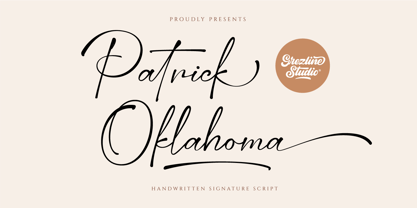 Patrick Oklahoma is a handwritten signature script font. This font has a luxurious and stylish feels that is perfect for fashion-related design. Patrick Oklahoma font is also usable in a wide range of works such as logos, covers, posters, quotes, product packaging, merchandise, social media and much more! Feature : - Alternate Glyphs - Multilingual Language - Works on PC & Mac - Simple installations - Accessible in the Adobe Illustrator, Adobe Photoshop, Adobe InDesign, even works on Microsoft Word. Thank you! Grezline Studio - Akhmad Reza Fauzi
 - Pumpkin Night by Pixesia Studio,
$12.00 Introducing Pumpkin Night - A Halloween Display Font Pumpkin Night is a display font with strong character and fantasy, scream, mystical feel. It will work great with your halloween design project such book/novel or movie title, logos & branding, social media posts, advertisements & product designs, etc. FEATURES - PUA Encoded - Uppercase and Lowercase letters - Numbering and Punctuations - Multilingual Support - Works on PC or Mac - Simple Installation - Support Adobe Illustrator, Adobe Photoshop, Adobe InDesign, also works on Microsoft Word Hope you Like it. Thanks.
 - Pierce Jameson by Grezline Studio,
$20.00 Pierce Jameson is a display font family with vintage aesthetic. This font was created to give your headlines and logotype projects a stylish touch. Pierce Jameson font is also usable in a wide range of works such as logos, covers, posters, quotes, product packaging, merchandise, social media and much more! Combine them to make your creative projects become more authentic! Feature : - Multilingual Language - Works on PC & Mac - Simple installations - Accessible in the Adobe Illustrator, Adobe Photoshop, Adobe InDesign, even works on Microsoft Word.
 - Thequilla by Rometheme,
$25.00 Thequilla is vintage monoline script font. It has vintage, elegant, old school, classy, and cool. It’s a great font for fashion, apparel projects, signature, album cover, logo, branding, magazine, social media, & advertisements, but also works great for other projects. Highlight: - Easy instalation - Work on PC or Mac - PUA Encoded Support - Basic Latin A-Z and a-z - Numbers - Symbols - No special software is required, The fonts can be opened and used in Adobe Illustrator, Adobe Photoshop, Adobe InDesign, even work on Microsoft Word.
 - Oceantide Display by Elyas Beria,
$12.00 Oceantide Display is a whimsical and highly stylized nautical-themed font suitable for display use. The main focus is on standard English capital letters, with a few stylistic alternatives included. Lower case letters, numbers, and some symbols are included but are limited and there are a few limited international letters.
 - Wazoo - Unknown license

- Washington Square NF by Nick's Fonts,
$10.00A titling font, combining caps inspired by the work of lettering artist Samuel Welo, and a lowercase based on the work of Lucian Bernhard. Both versions of this font contain the Unicode 1252 (Latin) and Unicode 1250 (Central European) character sets, with localization for Romanian and Moldovan. - ITC Slimbach by ITC,
$29.99 ITC Slimbach font is the work of California calligrapher and type designer Robert Slimbach. Inspired in part by German fonts and the work of Hermann Zapf, Slimbach created a "contemporary text font with a progressive look", combining clean serif shapes with the warmth of calligraphic forms.
 - Monotype Lightline Gothic by Monotype,
$29.99Monotype Lightline Gothic is a thin sans serif face cut by American Type Founders to work with Franklin Gothic, which had been designed as a bold face. The rather condensed nature of the Monotype Lightline Gothic font has made it popular for advertising display and newspaper work. - Ignatius by ITC,
$29.00Ignatius is the work of British type designer Freda Sack, a traditional roman typeface featuring an open, engraved effect. The stately capitals can be used alone or combined with the complementing lowercase and both should be set closely. Ignatius will give any work a classic look. - Sunmore by Viaction Type.Co,
$17.00 Sunmore is a sans serif font with elegant characters. Sunmore is perfect for your elegant-themed work, suitable also for elegant vintage. This font is available in six font style variants, making it easy to do work on various design themes. Sunmore is equipped with multilingual accents.
 - FS Millbank by Fontsmith,
$80.00 A sign of something better When designer Stuart de Rozario surveyed the fonts used in signage on London’s public transport systems, he reached a dead end. They seemed staid, sterile, lacking in personality, and ill-suited to use by modern brands. He was pointed in another direction entirely. ‘The driving force behind my thoughts was to design something more current and fresh without compromising legibility and clarity. A font with both personality and function, that’s versatile and large and small sizes, and effortless to read, but which also says something new.’ Speed reading Late for a meeting and can’t find your way? Trying to catch a flight? Lost in a hospital? Reading signs is a different business to reading a book or a newspaper. Text on signs needs to be deciphered quickly and effortlessly. So the legibility criteria for signage letterforms are different to those for normal reading, too. Throughout FS Millbank’s uppercase and lowercase alphabets, characters have been given features for extra definition, including: wide ink traps on the A, K, M, V, W, X and Y; a serifed i, accentuated spurs on the a, d, l u; and different x-height shapes on the b, g, p and q. Distinctive forms and generous, open internal shapes all help the quick reading of sign text, and wide, open terminals and counters allow similar letter shapes to be distinguished easily when viewed at different angles. Running down a corridor, maybe... Positive/negative Standard type tends to glow on the kind of dark backgrounds often used for signage, and look heavier than its true weight. To correct the imbalance caused by this optical trick, special weights of the typeface have to be drawn for these ‘negative’, light-on-dark applications. These are lighter than their comparable positive weights to overcome the ‘glow’ effect. After extensive tests of the negative weights, at all sizes, we achieved the right optical balance. Glowing, glowing, gone. Icons This wouldn’t be a signage typeface without its own set of icons, or symbols, to help people find what they’re looking for. So, to sit alongside the positive and negative fonts, we’ve created a comprehensive set of 172 icons, covering a wide range of applications from transport and user interface to information and directional. Designed within the typeface capital height, they sit on the baseline and are spaced centrally.
 - Touch Of Nature - Unknown license


