10,000 search results
(0.03 seconds)
- DejaVu Serif Condensed - Unknown license

- LT Chickenhawk - Personal use only

- FS Silas Slab by Fontsmith,
$80.00 Slab-like sibling Why stop at sans? Rather than leave FS Silas Sans as an only child, the team wanted to extend the family, and create a complete system for brands and editorial. Unsure what the result would be, the team started experimenting with a slab serif version. ‘We didn’t know how it would turn out, but we really liked it and wanted to take it further. A fresh angle ‘We stuck with the angular theme of the sans by drawing angled slab serifs,’ says Phil Garnham, ‘as opposed to the square serifs that slab fonts usually have. That created an inner dynamism in words and sentences on the page, and a very distinctive, crafted character, like a Victorian soul in a contemporary body.’ These crafted touches include details such as the angled ascenders on the ‘i’ and ‘l’, while characters such as the ‘y’, with its abruptly-ending descender, add a mark of distinction. A perfect pair Silas Slab, like its sibling, offers a clear-cut range of five weights, from the elegant Thin to the monumental ExtraBold. Put it together with Silas Sans and you have the full complement, capable of performing the full range of tasks, above the line and below, in headlines, body copy and logotypes, B2B and B2C. Keep them together; they don’t like it when they’re apart.
 - Sada by Arabetics,
$45.00 Sada is a text font designed with hand held devices and ebooks in mind. Glyphs are designed to be larger than usual and very clear with soft visual characteristics and many traditional Arabic calligraphic transitional features incorporated to improve legibility. The word “sada” means “echo” in Arabic. Even though Sada is a cursive style font it offers clearly distinguished and visually unified letter shapes in every position of a word. Sada supports all Arabetic scripts covered by Unicode 6.1, and the latest Arabic Supplement and Extended-A Unicode blocks, including support for Quranic texts. It comes with three weights, regular, bold, and ultra-light. Each weight has normal and left-slanted “italic” styles. The script design of this font family follows the Arabetics Mutamathil Taqlidi style and utilizes varying x-heights. The Mutamathil Taqlidi type style uses one glyph per every basic Arabic Unicode character or letter, as defined by the Unicode Standards, and one additional final form glyph, for each freely-connecting letter in an Arabic text. Sada includes the required Lam-Alif ligatures in addition to all vowel diacritic ligatures. Sada’s soft-vowel diacritic marks (harakat) are only selectively positioned with most of them appearing on similar lower or upper positions to emphasize they are not part of letters. Kashida is zero width glyph.
 - Hand Scribble Sketch Times by TypoGraphicDesign,
$19.00 CHARACTERISTICS A state-of-the-art OpenType-Feature (like Contextual Alternates (calt) and Stylistic Alternates (salt)) of “Hand Scribble Sketch Times” is, that each uppercase and each lowercase letter has automatically alternated two variations to bring humanly-random characteristics of handwriting to life. The character of the rough, ruggend and raw handwritten classic serif typeface is a very unique warmly atmosphere. An pro-version of the font “Hand TIMES”. APPLICATION AREA warmth, love, handmade. For support of human warmth. Of cooking recipes, menus in the restaurant across party flyer, music cover Art to logo (word marks), headings in magazines and websites. TECHNICAL SPECIFICATIONS ? Font Name: Hand Scribble Sketch Times ? Font Weights: Regular, Rough, Invert ? Font Category: Grunge Serif Display for Headline Size ? Font Format: OTF (OpenType Font for Mac + Win) ? Glyph coverage: 601 ? Language Support: Basic Latin/English letters, Central Europe, West European diacritics, Baltic, Romanian, Turkish ? Specials: Alternative letters, Standard & Discretionary Ligatures, extras like symbols, dingbats, Old-style Digits, Lining Figures, accents & €, incl. OpenType-Features like Contextual Alternates (calt), Glyph Composition/Decomposition (ccmp), Discretionary Ligatures (dlig), Kerning (kern), Standard Ligatures (liga), Numerators (onum), Ordinals (ordn), Stylistic Alternates (salt), Stylistic Set 01 (ss01), Stylistic Set 02 (ss02), Stylistic Set 03 (ss03), Slashed Zero (zero), Lining Figures (lnum), Tabular Figures (tnum), Old Style Figures (onum), Proportional Figures (pnum) ? Design Date: 2013 ? Type Designer: Manuel Viergutz
 - ALS SyysScript by Art. Lebedev Studio,
$63.00 Handwriting of a strong Carelian personality revived: It’s autumn time once again, harvesting season, mushroom & berry time – the favourite season of my Karelian aunt Katri. A postcard she sent me more than twenty years ago had inspired me to SyysScript, “Script of Autumn” in Finnish. Katri had a very kind but also energetic personality, and I always thought her handwriting was a mirror of it. By making SyysScript I felt I could revive some of her unforgettable character. My Finnish autumn font has by now become a favourite for many and is branding fine food in both the Eastern and the Western hemisphere – even far beyond the arctic circle. “SyysScript“ is actually a growing family. For enhanced functionality in small sizes I added “SyysScript Eco” a year ago, a style with shortened extensions and simplified letterforms especially suited for packaging. And this autumn, a special one for Finland which is celebrating its 99th birthday, SyysScript grew again: Two long awaited newcomers, “SyysScript FeltTip” and “SyysScript FeltTip Eco” joined the family. They are bolder and softer than the previous styles but keep their positive, lighthearted feel. Use them to make a powerful individual mark on any background. – They are equally well suited for paper, packaging, a screen or even a concrete wall! Language support: Western and Central European, Extended Cyrillic.
 - Sylvie by Anastasia Kuznetsova,
$14.00 SYLVIE is a very stylish font with letters that seem to dance and harmoniously intertwine with each other, creating a unique and elegant typographic design. This font is in my collection, inspired by France. French architecture, vintage fonts, modern forms, fashion and their unique lifestyle have all had an impact on this font. Thanks to the contrasting lines and curves, it will give your design the chic and modernity that you are looking for. It is perfect for logos, branding, posters, social media and all other creative projects. It will also highlight your brand. SYLVIE will definitely add attractiveness to your design! I invite you to familiarize yourself with the preliminary images and hope that you will be imbued with my vision of this creative font, which, I am sure, will be suitable for all the interesting projects you are working on. Font Features: A-Z; a-z character set; 1 language (English); numbers and punctuation marks, symbols. Fonts can be opened and used in any software that can read standard fonts, even in MS Word. No special software is required to get started. It is recommended to use it in Adobe Illustrator or Adobe Photoshop. Made with love and magic ♡ Thank you for reading it, and do not hesitate to send me a message if you have any questions! ~ Anastasia
 - Anna Clara by Trial by Cupcakes,
$29.00 Anna Clara can be dressed up or down, as fancy as you wanna be. On its own, it’s an organic script, with the fine hairlines, thick swells, and slightly undulating baseline found in modern casual calligraphy. Add swashes, and Anna Clara becomes a bit more playful and festive. Each capital letter has a flourished alternate—great for displays or headings, or to add emphasis to a particular section of text. For OpenType-aware software users, Anna Clara also features ten pairs of swashes that can be added to the beginning or end of any lowercase letter, for a custom flourished look. Illustrator and InDesign users can access extra swashes and banners by using the glyph panel. Photoshop users: These characters can be accessed via the “Ornaments” feature in your OpenType panel - try non-numeric punctuation marks and accents for swashes. For banners, type catchwords followed by an asterisk. “Asterisk asterisk” will produce a blank banner that you can use to create your own. Included catchwords are “and”, “at”, “by”, “for”, “from”, “of”, “the”, “to”, “with”, "l'", “le”, “la”, “el”, “et”, and “y”. Roman numerals can be used in the “Ornaments” feature by typing their respective keyboard characters “I”, “II”, “III”, etc. - followed by an asterisk. An ampersand (&) followed by one or two asterisks produces two special “and” characters.
 - Nomad by Coniglio Type,
$20.02 NOMAD —Regular is a stand alone font. Nomad -Regular is a clean, interesting revival font. It is a Display font. Nomad, now exclusively in OpenType .oft by Joseph V Coniglio of Coniglio Type. It is a narrow boldfaced font. Its analog source was comprised of an extremely limited die cut, truly generic, craft, peel-and-stick vinyl set of capital letters of ascenders and numbers. It was purchased at a five & dime stores, hardware department from the 1970's. My father owned an original set of characters: Nomad-Regular is nicely expanded to meet the needs of OpenType. The original adhesive labels adhered to the bows of that small boats so fisherman wouldn't get turned away at the Canadian border for not having their vessels tagged and listed with the appropriate license name and numbers, recorded by customs. It was a required serialization of letters and numbers marked on the side of their vessels. On the other hand, most beer and whisky drinking fishers, card players and bait casters would rather not deal with it, but the boat could not cross over the border without them. (Once part of Market LTD from the 1990's, a collection of limited faces, mostly alpha-numeric and some just plain numeric, used primarily in retail and display situations and titling.) Designer: Joseph V Coniglio Author: Coniglio Type
 - Kufi Mutamathil by Arabetics,
$39.00 Kufi Mutamathil is an Arabetic (extended Arabic) typeface design with heavy Arabic Kufi calligraphy accent, both on a single letter level and in an overall text look and feel. Although Kufi, the earliest Arabic calligraphy style, is often described as “stiff”, it is in fact a very flexible style. The Kufi Mutamathil typeface design underlines this calligraphy style flexibility and openness through visualizing a very legible Mutamathil design with Kufi shapes. The Mutamathil type style utilizes only one isolated glyph per Arabic Unicode character or letter, as defined in Unicode Standards. It is a very light style which does not require any standard glyph substitution or the shaping engine. The Kufi Mutamathil font family employs variable, unrestricted, x-height values. It comes in regular and left-slanted italic styles. Kufi Mutamathil includes all required Lam-Alif ligatures. Soft-vowel diacritic marks, or harakat, are selectively positioned with the majority of them appearing on the same level, over or below, following a letter, to ensure that they would not interfere with individual glyphs appearance. Kashida, or tatweel, (shft-j) is a zero-width character. Keying it before Alif-Lam-Lam-Ha will display the Allah ligature. Kufi Mutamathil includes both Arabic and Arabic-Indic numerals, in addition to all Standard English keyboard punctuations and major currency symbols.
 - Teeshirt by Typodermic,
$11.95 Hey there, so you want to look like a walking throwback to the 1980s? Well, lucky for you, Teeshirt is here to help you achieve that coveted slovenly appearance. If you’re looking for a typeface that screams, “I don’t care” then Teeshirt is your new best friend. It’s designed to mimic vintage t-shirt lettering, so you can rock that “I just rolled out of bed and put on the first thing I found on my floor” look. And if you’re worried about being too uniform with your letters, fear not! Teeshirt has got you covered with letter pair ligatures. Because who wants to look like they put any effort into their appearance, right? And if you’re feeling adventurous and want to shake things up a bit, you can always disable the “standard ligatures” feature in your application. Teeshirt comes in two styles: Regular and Pressed. The bouncy Regular style will make it look like your letters are ready to jump right off your shirt, while the orderly Pressed style will give you that crisp, just-ironed look (although let’s be real, who has time for ironing?). So what are you waiting for? Embrace your inner sloth and give Teeshirt a try. Because who needs effort and a polished appearance when you can look like a hot mess instead? Most Latin-based European writing systems are supported, including the following languages. Afaan Oromo, Afar, Afrikaans, Albanian, Alsatian, Aromanian, Aymara, Bashkir (Latin), Basque, Belarusian (Latin), Bemba, Bikol, Bosnian, Breton, Cape Verdean, Creole, Catalan, Cebuano, Chamorro, Chavacano, Chichewa, Crimean Tatar (Latin), Croatian, Czech, Danish, Dawan, Dholuo, Dutch, English, Estonian, Faroese, Fijian, Filipino, Finnish, French, Frisian, Friulian, Gagauz (Latin), Galician, Ganda, Genoese, German, Greenlandic, Guadeloupean Creole, Haitian Creole, Hawaiian, Hiligaynon, Hungarian, Icelandic, Ilocano, Indonesian, Irish, Italian, Jamaican, Kaqchikel, Karakalpak (Latin), Kashubian, Kikongo, Kinyarwanda, Kirundi, Kurdish (Latin), Latvian, Lithuanian, Lombard, Low Saxon, Luxembourgish, Maasai, Makhuwa, Malay, Maltese, Māori, Moldovan, Montenegrin, Ndebele, Neapolitan, Norwegian, Novial, Occitan, Ossetian (Latin), Papiamento, Piedmontese, Polish, Portuguese, Quechua, Rarotongan, Romanian, Romansh, Sami, Sango, Saramaccan, Sardinian, Scottish Gaelic, Serbian (Latin), Shona, Sicilian, Silesian, Slovak, Slovenian, Somali, Sorbian, Sotho, Spanish, Swahili, Swazi, Swedish, Tagalog, Tahitian, Tetum, Tongan, Tshiluba, Tsonga, Tswana, Tumbuka, Turkish, Turkmen (Latin), Tuvaluan, Uzbek (Latin), Venetian, Vepsian, Võro, Walloon, Waray-Waray, Wayuu, Welsh, Wolof, Xhosa, Yapese, Zapotec Zulu and Zuni.
 - Ace Crikey - Unknown license

- FF Scuba by FontFont,
$62.99 German type designer Felix Braden created this sans FontFont in 2012. The family has 16 weights, ranging from Thin to Black (including italics) and is ideally suited for advertising and packaging, editorial and publishing, logo, branding and creative industries, poster and billboards, wayfinding and signage as well as web and screen design. FF Scuba provides advanced typographical support with features such as ligatures, alternate characters, case-sensitive forms, fractions, super- and subscript characters, and stylistic alternates. It comes with a complete range of figure set options – oldstyle and lining figures, each in tabular and proportional widths.In 2013, FF Scuba received the CommArts award and was also selected as one of Typographica’s favorite typefaces of 2012.
 - The Ahmedians by Zamjump,
$13.00 The Ahmedians is a handwritting gel pen typeface, The Ahmedians is an out-of-this-world addition to your font arsenal, perfect for quote graphics, modern/edgy vinyl cutting projects, or logos & branding. The Ahmedians is best for: - social media graphics or quote graphics - logos + branding with a modern feel - crafting projects with your Cricut or Silhouette - Starstuff has a super smooth edge perfect for vinyl cutting or SVG designs - website design + website accents - clean print design, like magazines + flyers - header elements that need a handwritten touch The Ahmedians : - full upper + lower case characters - numbers + punctuations - Multi Language Support - Standard double letter ligatures ee, ff, ll, oo, rr, ss, tt - PUA-encoding
 - Bergsland Round by Hackberry Font Foundry,
$24.95 This is a version of the Bergsland Fashion stylized sans serif font family that is very high-waisted and sleek with rounded terminals called Bergsland Round. Round is my favorite out of the group as it is looser and friendlier. This four-font set has a Regular and a Black plus the italics. The stroke is only slightly modulated. The letterforms are higher, with a more open aperture, and sprinkled with breaks to add light and sparkle. This an attempt at a readable sans serif for text. It has many OpenType features and 465 characters per font: Caps, lower case, small caps, old style figures, numerators, denominators, accents characters and so on.
 - Cleargothic Pro by SoftMaker,
$15.99 Morris Fuller Benton designed the serifed Clearface typeface for ATF in 1907. He liked the design so much that he also created a flare-serif variation, Clearface Gothic, soon after. It is a great typeface for headlines. SoftMaker created an updated version, Cleargothic Pro, in 2012. SoftMaker’s Cleargothic Pro typeface family contains OpenType layout tables for sophisticated typography. It also comes with a huge character set that covers not only Western European languages, but also includes Central European, Baltic, Croatian, Slovene, Romanian, and Turkish characters. Case-sensitive punctuation signs for all-caps titles are included as well as many fractions, an extensive set of ligatures, and separate sets of tabular and proportional digits.
 - Caros by cretype,
$20.00 Caros Family is a modern sans-serif typeface that is clean, simple and highly readable. Letters in this type family are designed with geometric shapes without any decorative distractions. The spaces between individual letter forms are precisely adjusted to create the perfect typesetting. Caros is a versatile type family of 18 fonts. Caros family consists of 9 weights (Thin, ExtraLight, Light, Regular, Medium, Bold, ExtraBold, Heavy & Black) with their corresponding italics. The Open Type fonts contain complete Latin 1252, Cyrillic, Central European 1250, Turkish 1254 character sets. Each font includes proportional figures, tabular figures, numerators, denominators, superscript, scientific inferiors, subscript, fractions and case features. We highly recommend it for use in books, web pages, screen displays, and so on.
 - Bodiam by Hanoded,
$15.00 Two years ago I went on a camping holiday in England with my wife and (then two) small children. The first stop was a nature campsite near the village of Bodiam in East Sussex. My son wanted to see a real castle, so I figured Bodiam Castle was the 'realest' of them all! He loved it, as the castle had a moat, crenellated walls, a bunch of towers and a guy dressed up as a knight. Bodiam font is a rough didone-ish affair. It is all caps, but you can freely mix upper and lower case. It would be ideal for book covers, posters and maybe even for castles. Comes with a treasure chest of diacritics.
 - Lovely Buttering Script by Lucky Type,
$14.00 Allow me to introduce the Lovely Buttering script, which combines elements of informal, romantic, sweet, beautiful design, and hand-drawn typography design elements. Lovely Buttering script has 1000+ glyphs and 500+ alternative characters, including various language support. You can use this font for your work very easily because there are many features in it. Contains a complete set of upper and lower case letters, punctuation, numbers, and multilingual support. This font also includes several ligatures, alternative stylistic sets for those of you who have software that can work OpenType (Corel Draw / Photoshop / Illustrator / InDesign). Need help? If you need help or advice, please contact me through e-mail. Thank you for your purchase!
 - Aureata by preussTYPE,
$30.00 Whenever I've stayed in Munich my friend Michael Bundscherer and I go on a typographical expedition. When we talk about that, we remember the bygone world of sign painter. On one of the facades of a furniture shop in Munich, you can discover the lettering of the name in golden letters. This one convinced us because of the simple elegance Art Deco. These letters on the facade are in any case the character set, which forms the basis of this document. The missing (especially the lowercase letters and the numbers) were modeled. The "OPEN" called version tries to replicate the 3-D effect. The font is particularly suitable for shorter texts and headlines.
 - Figgins Sans by Shinntype,
$79.00 The first sans serif types were made in London in the early 19th century. They were severely modern, all caps and bold. The Figgins foundry, inventor of the term sans serif, showed a ?ne example in its specimen of 1836. The extra bold weight of Figgins Sans is a close revival of the original, with the addition of a lower case which retains its partly geometric, partly grotesque quality. The family is rounded out with other weights and an italic, and extended into Cyrillic and Greek, all executed in what is assumed to be as authentic a manner as possible, given the hypothetical nature of the exercise. Together with Scotch Modern, comprises The Modern Suite of matched fonts.
 - Pumpkinseed by Three Islands Press,
$19.00 The tale of Pumpkinseed began with a bit of hand-printing I noticed on the dinner menu at a local restaurant. I took a menu home for future reference. Several months later, some similar hand-lettering on another dinner menu caught my eye. I became a sort of connoisseur of hand-done menu lettering. After tweaking and adjusting a few of these menu-inspired (uppercase) characters, I placed them -- along with some other designs -- in an online Type in Progress survey. They won. So I finished the caps, drew out the lower case from scratch, created three weights and oblique styles. The result: Pumpkinseed, a full-featured casual hand-lettering face. Comes in Light, Medium, and Heavy.
 - Plain by Sultan Fonts,
$19.99 Sultan Plain is an active contemporary variable font, complete with a flexible range of cases tailored to responsive layouts The font places itself at the boundary between two eras of contemporary typographic design, Between stillness and movement, between past exclusivity and present diversity, between the finite and the infinite. Although it is like many of the modern Naskh fonts, Sultan Plain has amazing unique energy Which is missing by many of the fonts that we designed since the beginning of the second millennium. The font is clear and legible in small sizes, suitable for printing for large texts, web pages, and other visual uses. The font includes a matching Latin design and support for Arabic, Persian, Kurdish, and Urdu.
 - Casta by Dirtyline Studio,
$39.00 Casta is strong Modern contrasts make this typeface both impressive at display sizes and easily readable in text size, while the sharp shapes of the triangular serifs and the distinctive letter shapes show their strength in logo design and impressive editorial use. Casta come with elegant style, strength and contrasts, with features an extended latin character set of 429 glyphs covering over 28 languages, and includes advanced open type features like standard and discretionary ligatures, positional numerals, stylistic alternates and case sensitive brackets. Mixing versatility and personality, Casta is ready to be like a top model on the design catwalk, making your projects looking classic but contemporary, finely tuned but assertive, and elegant as the best luxury fashion.
 - Esteh by DonyaDesign,
$16.00 Esteh is a modern script font that includes a full set of upper and lower case letters, as well as alternative lowercase letters, swashes, multi-lingual symbols, numbers, punctuation. Esteh is coded with PUA Unicode, which allows full access to all additional characters without having special design software. Mac users can use Font Book, and Windows to attach your favorite text editor / application. To enable OpenType Stylistic Alternates, you need a program that supports OpenType features such as Adobe Illustrator CS, Adobe Indesign & CorelDraw X6-X7, Microsoft Word 2010 or newer. How to access all alternative characters: https://www.youtube.com/watch?v=Go9vacoYmBw https://www.youtube.com/watch?v=XzwjMkbB-wQ https://www.youtube.com/watch?v=x1A_ilsBsGs https://www.youtube.com/watch?v=xFlMwARHusY
 - Accia Forte by Mint Type,
$39.00 Accia Forte is a strong serif typeface with high contrast, large x-height and prominent serifs. Its loud contemporary feel will be ideal for titles as well as posters and web appearance. The font family contains 8 weights from Thin to Extra Bold, with matching true italics. It supports extensive language support including Cyrillic, as well as numerous OpenType features such as small caps, ligatures, several sets of figures, case-sensitive punctuation, ordinals. Accia Forte is a member of Accia Type System. It encompasses five typefaces ranging from sans-serif to expressive serif, giving you the possibility to create sophisticated cohesive designs. Accia Type system consists of Accia Sans, Accia Flare, Accia Piano, Accia Moderato, and Accia Forte.
 - StudioSans by BrightHead Studio,
$20.00 StudioSans — is a modern representative of the class of sans-serif fonts inspired by the traditional Swiss design and typography of the mid 20th century. This is a minimal, clean and open font family with friendly forms. Focuses on functionality, has a high x-height and short ascender and descender elements. This is combined with soft circles and high legibility of characters contributing to comfortable reading. The family contains six weights from ExtraLight to ExtraBold. Each of them has in its arsenal more than 450 glyphs and knows more than 50 languages. Support for OpenType Features focused on the Oldstyle Figures (including signs of currencies and interest), Case-Sensitive Forms, Standarts and Discretionary Ligatures, Slashed Zero and Etc.
 - FF Karbid Display by FontFont,
$58.99 German type designer Verena Gerlach created this display and sans FontFont between 1999 and 2011. The family has 10 weights, ranging from Light to Black (including italics) and is ideally suited for advertising and packaging, editorial and publishing as well as logo, branding and creative industries. FF Karbid Display provides advanced typographical support with features such as ligatures, alternate characters, case-sensitive forms, fractions, super- and subscript characters, and stylistic alternates. It comes with a complete range of figure set options – oldstyle and lining figures, each in tabular and proportional widths. This FontFont is a member of the FF Karbid super family, which also includes FF Karbid, FF Karbid Slab, and FF Karbid Text.
 - Catchphrase by Mix Fonts,
$13.00 Mix Catchphrase is a fun and playful handwritten font that tries its best to be a serious serif (although it fails at being serious, in case you were wondering). With its clean handwriting style and serif details, this font is perfect for adding a quirky, DIY feel to your projects. Use Mix Catchphrase to give your designs a creepy edge, perfect for Halloween or any other ghoulish occasion. With the right styling and color palette, this rough and rugged font is sure to bring personality and character to all of your projects. Add some fun to your designs with Mix Catchphrase. MIX CATCHPHRASE includes the following characters: ABCDEFGHIJKLMNOPQRSTUVWXYZ abcdefghijklmnopqrstuvwxyz 0123456789 !@$#%^&*()`~♥✿•· ÷×+−±≈=≠≥≤[]<>‹›:;'”,.|/?{}<>“”‘’-–—_ …©®™<>«»°¹²³ªº¡¿₱¢€£¥¶§№† ÁÀÂÄÃÅĂĀĄÆĆĈČÇÐĐÉÈÊËĖĒĘĜĤIÍÌÎÏĪĮĴŁŃÑŇ ÓÒÔÖÕØŌŐŒŔŘŚŜŠȘŤȚÚÙÛÜŮŰŪŲẂẀŴÝŶŸŹẐŽŻÞ áàâäãåăāąæćĉčçðđéèêëėēęĝĥıíìîïīįĵłńñň óòôöõøōőœŕřśŝšșťțúùûüůűūųẃẁŵýŷÿźẑžżþß
 - Aziga by Eclectotype,
$40.00 In a typeface category that has been sorely under-represented until now, Aziga is a high (occasionally reversed) contrast, postmodern, deconstructed-reconstructed, serifless (mostly), fashion didone! Aziga lends itself to being set loud and proud, and the consistent angles throughout the glyphs make it a good candidate for more abstract typographic compositions. For the really graphically inclined (excuse the pun) a rotation of 66° will make the main diagonals in the font horizontal and vertical. Cool right? Features include stylistic and contextual alternates, ligatures and case sensitive forms. This is an unusual font, that’s for sure, but give it a try and you'll be rewarded with layouts that really stand out from the crowd.
 - Janek by Pawel Fonts,
$35.00 Janek is a semi-serif typeface inspired by old Polish signage. Rather then mimic specific style, it synthesises various inspirations. It is named after an Author of a classic Polish manual, that kickstarted this project, „Techniques of Lettering“ by Jan Wojeński. Large character set and style selection allows for richness of expression. Pointy upright and slightly decorative italic bring unique blend of aesthetics. It works well in rich text and as a striking display. Janek consists of seven italic and seven upright styles ranging from Light, to Black. With extensive language support and wide selection of features, it is suited for range of latin use cases. Janek is a contemporary throwback to the past.
 - Nutcase by ArtyType,
$29.00 Nutcase is a perfect example of a font that principally designed itself. I created a hexagonal template (the most economical form in nature by the way) and took out the center to increase the decorative element. I played around with it, creating some pleasing characters at first but it soon became clear it would translate into a complete alphabet, so I set to work applying the idea to both upper and lower cases. It wasn't all straight forward though, avoiding awkward characters and retaining legibility took a little perseverance but it eventually paid off. I thought of this primarily as a decorative display face but having tested it out, found it reads surprisingly well as body copy too.
 - Anago by Positype,
$16.00 Anago shares the same DNA as its sibling Macha, but is a completely different species than the former or any of my other sans serifs (Aaux Next, Air, Akagi Pro or Wasabi). Soft, ample letterforms are casually constructed and the end result produces a typeface that changes color as it varies in size — allowing the type family to work well in both text and display settings as long as attention is given to size. Anago takes a little but gives a lot. The 10-style typeface features a fully-loaded character set that includes: Small Caps, Proportional Lining and Oldstyle Numerals, Tabular Lining and Oldstyle Numerals, Fractions, Ordinals, Inferiors, Superiors, Stylistic Alternates, Ligatures, Case-sensitive, and more.
 - Jack Martine Duo by Zamjump,
$17.00 Jack Martine font duo is a textured, hand-drawn slab font in a regular style with upper and lowercase letters and bounching italic script style solid proportions that works great for a variety of display uses. Carefully drawn for quality and legibility, but still rough enough to show handcrafted details. Jack Martine is great for display, branding, packaging, advertising, food, sports, craft, titles and more. Jack Martine Features: Regular and Script Style Different uppercase and lowercase characters Simply switch between upper and lower case for alternatives Hand-drawn details and textures Extensive multilingual character support This font has broad Latin support for Western, Central, and Southeastern Europe. Includes: Uppercase Numbers Punctuation Symbols Multilingual support Begin and ending alternate
 - Craftsman by Woodside Graphics,
$19.95The Craftsman font is a faithful reproduction of the logo, or Title typeface used for Gustav Stickley's "Craftsman" Magazine, the foremost journal of the American Arts & Crafts Movement during its publication years of 1901-1916. It is an All-Caps font, with condensed and closely-spaced characters, specifically designed for titles and headlines. The "Craftsman" font is available in two versions: "Craftsman Regular" and "Craftsman Outline." Each is two fonts in one, in the sense that the capital letters are contained in a hand-drawn box (as on the cover of "The Craftsman" Magazine). Lower-case characters are identical, but without the box. Thus, the two may be used separately, or in combination, to achieve a desired effect. - Gondolieri by Greater Albion Typefounders,
$16.50 The design of Gondolieri has its origins in an experiment to combine aspects of Didone and Tuscan typefaces. The result has a continental 'Italianate' feel. If you wonder what lies behind the name, just look at the lower case 'f'...definite overtones of a Venetian Gondola here, and throughout the design. Gondolieri is offered in regular and bold weights, as well as a simplified form for smaller text use. All of these are available in three widths. The Gondolieri family has a lovely Didone, 'Belle Epoch' feel for use in design, posters, book covers and so forth. An extensive range of Opentype features, including ligatures and terminal forms is included in the regular and bold faces.
 - Biotic by TypeUnion,
$25.00 Biotic is a dual-personality 18 style typeface which features two distinct design approaches that can be initiated with the flick of a switch. The natural design approach uses conventional forms for a geometric sans but when you switch to the engineered approach some key glyphs become squared to create an edgy approach in an instant. The characters that change are f, i, j, k, l, t and y, along with all punctuation and accents which switch to the square approach. Biotic covers extended latin and basic Cyrillic languages and includes many opentype features such as stylistic sets & alternates, two sets of arrows, circled & old-style numbers, along with case sensitive punctuation and much more.
 - Roclante Display by FoxType,
$12.00 Roclante Display is a Brand New Elegant Typeface with a powerful font family. It has a dependable and uncompromising style, with controlled letterforms and modern touches. It looks amazing in logos, magazines, and movies. Roclante Font would be perfect for branding, headlines, Captions, paragraph, and posters. The various weights allow you to experiment with a wide range of applications. It's created to make an impression without sacrificing its beauty and readability. It's shown a clean, minimalist, warmth, quirky, yet still purposed to be versatile The Typeface includes Six Weights - UltraLight, Light, Normal, Medium, DemiBold, & Bold. All offer wide language support, upper and lower cases, numerals and extended punctuation. Thank you for taking the time to look into the font.
 - JP Alva Expanded by jpFonts,
$19.95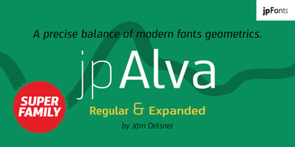 jpAlva is a technical and functional sans-serif that consists of 40 typefaces, divided in 2 font families jpAlva and jpAlva Extended. A universal family of typefaces that fits pretty much any purpose. It illustrates a precise balance of modern geometrics, with a functional yet sparing style that effectively communicates without distraction. A straightforward, unadorned appearance with efficient construction. Simple, clean with a technical note and a wide range of styles it is perfectly suitable for a wide range of applications, from identity systems to editorial design, from signage systems to software applications. Designed with powerful OpenType features (e.g. figure sets, fractions, ligatures, case sensitive forms) and extended language support, it is easy and enjoyable to use.
 - Distory Script by Letterfreshstudio,
$15.00 Distory Script Is a calligraphy Vintage script font that comes with beautiful alternate characters. copper plate mix calligraphy with handlettering style. Designed to convey stylish elegance. Pagoda attracts like a typeface that is smooth, clean, feminine, sensual, glamorous, simple and very easy to read. Distory Script comes with a Clean and Aged version, beautiful upper and lower case, binding and loved by many finishes. It has Multilingual support (Western European characters) and works with the following languages: English, Danish, Dutch, Estonian, Finnish, French, German, Hungarian, Icelandic, Italian, Norwegian, Polish, Portuguese, Spanish, Swedish. In my example I show how this script can be used. It's perfect for logos, wedding invitations, alcohol labels, romantic cards, and more. Thanks You.


