10,000 search results
(0.035 seconds)
- Orphiel Demo - Unknown license

- Lido STF by Storm Type Foundry,
$39.00Times with a Human Face: In my article of the same name which appeared in the magazine Font, volume 2000 I described the long and trying story of an order for a typeface for the Czech periodical Lidové noviny (People’s Newspaper). My task was to design a modification of the existing Times. The work, however, finally resulted in the complete re-drawing of the typeface. The assignment, which was on the whole wisely formulated, was to design a typeface which would enable “a smooth flow of information in the reader’s eye”, therefore a typeface without any artistic ambitions, from which everything which obstructs legibility would be eliminated. A year later Lidové noviny had a different manager who in the spring of 2001 decided to resume the cooperation. The typeface itself definitely profited from this; I simplified everything which could be simplified, but it still was not “it”, because the other, and obviously more important, requirement of the investor held: “the typeface must look like Times”. And that is why the above-mentioned daily will continue to be printed by a system version of Times, negligently adjusted to local conditions, which is unfortunately a far cry from the original Times New Roman of Stanley Morison. When I was designing Lido, the cooperation with the head of production of Lidové noviny was of great use to me. Many tests were carried out directly on the newspaper rotary press during which numerous weak points of the earliest versions were revealed. The printing tests have proved that the basic design of this typeface is even more legible and economical than that of Times. The final appearance of Lido STF was, however, tuned up without regard to the original assignment – the merrier-looking italics and the more daring modelling of bold lower case letters have been retained. The typeface is suitable for all periodicals wishing to abandon inconspicuously the hideous system typefaces with their even more hideous accents and to change over to the contemporary level of graphic design. It is also most convenient for everyday work in text editors and office applications. It has a fairly large x-height of lower case letters, shortened serifs and simplified endings of rounded strokes. This is typical of the typefaces designed for use in small sizes. Our typeface, however, can sustain enlargement even to the size appropriate for a poster, an information table or a billboard, as it is not trite and at the same time is moderate in expression. Its three supplementary condensed designs correspond to approximately 80% compression and have been, of course, drawn quite separately. The intention to create condensed italics was abandoned; in the case of serif typefaces they always seem to be slightly strained. I named the typeface dutifully "Lido" (after the name of the newspaper) and included it in the retail catalog of my type foundry. In order to prevent being suspected of additionally turning a rejected work into cash, Lido STF in six designs is available free of charge. I should not like it if the issuing of this typeface were understood as an “act out of spite” aimed against the venerable Times. It is rather meant as a reminder that there really are now alternatives to all fonts in all price categories. - Huxley Vertical by Bitstream,
$29.99 The PARATYPE library is our latest major addition, consisting of more than 370 typefaces. In the spirit of the perestroika changes and following the collapse of the Soviet Union, a group of Russian type designers quit the state-owned Polygraphmash foundry to establish ParaType, the first, and now largest Russian digital type foundry. The ParaType team under the supervision of Vladimir Yefimov creates new typefaces and explores the Russian typographic heritage by making digital versions of existing Russian designs: these include the hits of Soviet typography such as Literaturnaya and Journal Sans. Most ParaType fonts are available in Western/Roman, Central European, Turkish and Cyrillic encodings. The Russian constructivist and avant garde movements of the early 20th century inspired many ParaType typefaces, including Rodchenko, Quadrat Grotesk, Ariergard, Unovis, Tauern, Dublon and Stroganov. The ParaType library also includes many excellent book and newspaper typefaces such as Octava, Lazurski, Bannikova, Neva or Petersburg. On the other hand, if you need a pretty face to knock your clients dead, meet the ParaType girls: Tatiana, Betina, Hortensia, Irina, Liana, Nataliscript, Nina, Olga and Vesna (also check Zhikharev who is not a girl but still very pretty). ParaType excels in adding Cyrillic characters to existing Latin typefaces — if your company is ever going to do business with Eastern Europe, we recommend you make them part of your corporate identity! ParaType created CE and Cyrillic versions of popular typefaces licensed from other foundries, including Bell Gothic, Caslon, English 157, Futura, Original Garamond, Gothic 725, Humanist 531, Kis, Raleigh, or Zapf Elliptical 711.
 - Amica Pro by Eclectotype,
$40.00 Welcome Amica Pro, a workhorse sans designed to give your branding a friendly, approachable look. What is it that makes a typeface friendly? Eclectotype undertook extensive research* in this and the results are in! To cut a long story short, friendliness in sans serif fonts can be summed up in two words – short and fat. Basically, think Danny DeVito in letter form. The shortness in Amica Pro is achieved (somewhat counterintuitively) by pushing up the x-height. This, coupled with short ascenders and descenders, gives the text a squat appearance. For the fatness, that's easy in the bolder weights, but how to carry this through to the lights? Here, the fatness equates to roundness, so the letterforms, even if the stroke weight is light, have a rotund appearance from the wideness and roundness of the circular glyphs. When thinking about friendliness, we think about inclusiveness. To this end, Amica Pro supports a super wide range of latin-based languages, as it uses Underware's Latin Plus character set, as well as extra support for Vietnamese. Amica Pro is best used for branding, logos, infographics etc. It will give your UI a friendlier feel, but that doesn't mean it's not serious. There are many useful typographic features, including alternates, numerous figure styles, automatic fractions and case-sensitive forms. The italics are carefully optically corrected "sloped romans" and as such they are the same width as their upright equivalent, so changing your copy to italics will not mess around with the spacing. *I looked at a few fonts and drew some lazy conclusions.
 - Keratine by Zetafonts,
$39.00 The letterforms that we now accept as the historical standard for printing latin alphabets were developed in Italy around the end of 1400. Deriving from Roman capitals and from italic handwriting, they soon replaced the blackletter letterforms that were used a few years before by Gutenberg for his first moveable types. Between these two typographical traditions there's an interesting and obscure middle ground of historical oddballs, like the Pannartz-Sweynheym Subiaco types, cut in Italy in 1462. Keratine is the result of Cosimo Lorenzo Pancini's exploration of that territory. Like our Kitsch by Francesco Canovaro it explores the impossible territory between antiqua and blackletter, not as a mere historical research, but rather as a way to re-discover and empower an unexpected and contemporary dynamism. Using contemporary digital aesthetics to combine the proportions of humanistic type with the gestural energy of Fraktur letterforms, Keratine develops a "digitally carved", quasi-pixelated appearance (clearly stressed in Keratine's italics) that allows an unexpected balance between small-size readability and display-size personality. Keratine also relies heavily on a variable identity as the letterforms change dynamically with weight, developing from a contrasted, text-oriented light range to more expressive and darker display range, for a total of 8 weights with italics. Open type features and glyph alternates further enrich the usage possibility of this typeface that embodies our contemporary swap culture by embracing the contradictory complexity at the crossroads between Gothic and Humanist styles, while playfully empathising with a digital, brutalist spirit.
 - BD Megalona by Balibilly Design,
$25.00 The fundamental in creating this typeface is the implementation of our interest in typography over the past year. Inspired by the elegance, consistency, and hard work of Times New Roman pull up our minds to a daunting blank canvas and began to think about what we had to do to take this idea even further. Whatever comes to our mind and when it is poured out, it will certainly remain within the rules of the letterforms. This typeface is created by a careful approach, consisting of 28 fonts 13 weights with matching true italics forms. Feature an extended charset of over 1800 glyphs, covering 219 languages using Latin, Cyrillic (basic to extended), and Greek alphabets. Included advanced open type features like stylistic alternates, terminal form, swash, discretionary ligatures, ordinals, small caps, positional numbers, fractions, and case-sensitive forms. BD Megalona provides a range of choices that will give luxury vibes in symmetrical layouts with selective deviations, and work well in a stylish look for your typographic project. This is a complete package of problem solvers perfectly suited for body text and high-impact headlines. Advance open-type features definitely stunning on logos, branding, magazines, website, etc. BD Megalona is our ego in expression that aims to supply the necessity of design nowadays while still in the corridors of the glory of past traditions as a source of our inspiration. We would like to show you a SHORT FILM about the process of designing BD Megalona Font Family, Click Here!!!
 - Acorde by Willerstorfer,
$95.00 Please note: Acorde webfonts are exclusively available at willerstorfer.com Acorde is a reliable workhorse for large, demanding design projects. It was designed to be perfectly suited to all different sizes, from small continuous text to large headlines and big signage. The typeface’s name is derived from ‘a’ ‘cor’porate ‘de’sign typeface, however Acorde is not only suitable for corporate design programmes but for information design and editorial design purposes as well. Acorde’s inception was in early 2005 as Stefan Willerstorfer’s final project in the Type and Media course at the Royal Academy of Art in The Hague (NL). It is a humanist sans serif with noticeable diagonal contrast and shows clear influences of the broad nib pen, especially in the Italics. Acorde’s characterful details give it a distinctive appearance in large sizes and contribute to its high legibility in small sizes. It comes in 14 styles – seven weights in Roman and Italic each. While the proportions of the Regular style were chosen to guarantee optimal legibility without being too space consuming, the heavier the weight gets the more suitable it is for headline purposes. The heavy weights are relatively narrower than the lighter ones, which gives them a strong appearance. The huge character set contains 925 glyphs per font and covers a vast range of latin-based languages. Various accented letters, small caps, eleven figure-sets, superscript and subscript are all included. OpenType features allow for a comfortable use of the large set. Acorde was honored with the 2010 Joseph Binder Bronze award for type design by DesignAustria.
 - Technical SCRIPTURE by MMC-TypEngine,
$19.00 ‘Technical Scripture’ 2015-2021 A manuscript look, Pixel labyrinthine Display Type System… Plus, an Optical “Layered Game”, Retro Futuristic Sci-Fi Digital interface evolving placeholder… Now with 3D Styles! It was designed as a pair to its brother font ‘Technical Signature’ a Small Caps Font, both inspired by antique Greek, mosaics zig-zag ornaments “ancient times computer” intentionally as a Romanic variation with same metrics... Searching for Technical Solutions, it resulted in many combined styles by matching the primary ones so there’s plenty variations for multi-purpose texting like layered typesetting or simply monochromatic designs… Plus got accurate streaming resolution, therefore some sub-families like Stamp and Texture implicates greater points for minimum size as Regular and Light is appropriated to Small Optical Text reductions. *The New 3’s Upgraded Edition Improvements consisted of Correct ‘Font Info’ (verified data-debugging) rescaled glyphs, quick design review, better style linking with correspondent renamed fonts, addition of automatic OT features encoding, 3D Styles and Italics. Ps. This actual Typeface was quickly re-edited for technical reasons and hasn’t yet reached the intended design, it will soon receive a more tangible redesign upgrade, mainly in lowercases to enhance cursive style. Due to other priorities. Tip: Give preference to THE LYSERGIC UPPERCASES! Multilanguage Support: Western & Eastern European, Baltic, Turkish, Greek, and Cyrillic. This Type is pleasant to Technician Compositions, Such as Briefs layouts manuscript, Old Engineering & Crafts Logos or Support Text, Op-Art Posters, Stamps, Labels, movies and Cartoons Ludic Scripts, sites and of course Video Games! Try ‘Technical Scripture’ & Have some Power to the Pixel! Padang!
 - Aure Nox by Aure Font Design,
$23.00 Aure Nox inspires the chill whimsy of a haunted forest. The roughhewn forms of this decorative, sans-serif font engage the reader with a subtext of rakish charm. Surprisingly legible, Nox adds a bit of rebelious sass to text and titles, and a daring stance to astrological expressions and chartwheels. Nox is an original design developed by Aurora Isaac. After more than a decade in development, 2018 marks the first release of the CJ and KB glyphsets in regular, italic, bold, and bold-italic. The CJ glyphset is a full text font supporting a variety of European languages. A matching set of small-caps complements the extended lowercase and uppercase glyphsets. Supporting glyphs include standard ligatures, four variations of the ampersand, and check-mark and happy-face with their companions x-mark and grumpy-face. Numbers are available in lining, oldstyle, and small versions with numerators and denominators for forming fractions. Companion glyphs include Roman numerals, specialized glyphs for indicating ordinals, and a variety of mathematical symbols and operators. The CJ glyphset also includes an extended set of glyphs for typesetting Western Astrology. These glyphs are also available separately in the KB glyphset: a symbol font re-coded to allow easy keyboard access for the most commonly used glyphs. Though Nox stands well on its own as a text font, the more traditional sans-serif forms of Aure Jane pair well as an innocuous foil to Nox's brazen presence. Give Aure Nox a trial run! You may discover a permanent place for this font family in your typographic palette. AureFontDesign.com
 - Tenez by Plau,
$30.00 Big News! Tenez has been selected for the Tipos Latinos Biennial 2016 and Typographica’s Favorite Typefaces of 2015! Tenez is a Grand Slam display didone typeface from Plau. We designed it for a branding project, further developing the resulting logotype into a typeface we felt could solve many designers’ needs. Its origins are rooted in pointed nib calligraphy which can be seen in contemporary Didot and Bodoni inspired typefaces. But Tenez’s shapes are organic (these modern typefaces were originally cut by hand after all) – in fact that was the challenge we set from the start: to make a typeface as organic in construction as possible. This echoes some of late 19th century typefaces and advertising, yet we thought of it for contemporary uses. One of the several unique features of Tenez is its unusual Thin weight, in which the contrast between thin strokes and the black area left by the serifs makes for a typewriter-like personality. The italics provide a perfect counterpoint to the roman weights. Tenez was unapologetically conceived as a display typeface meant to be used large as in magazine openings, drop caps or everywhere there’s a need for elegant impact. The family includes support for almost all Latin languages available, figure sets for almost every conceivable occasion (tables, text, you name it), alternates for the quirky beautiful R (sometimes simpler is better, but not always!) and Q (with a nice big tail for that article opener). Tenez pairs really well with our no-frills sans-serif Motiva Sans and our cute vertical connected script Primot.
 - Haarlemmer by Monotype,
$29.00 Haarlemmer is a recreation of a never-produced Jan Van Krimpen typeface that goes one step beyond authentic: it shows how he wanted it to be designed in the first place. The original, drawn in the late 1930s, was created for the Dutch Society for the Art of Printing and Books and was to be used to set a new edition of the Bible, using Monotype typesetting. Hence the problem: fonts for metal typesetting machines like the Linotype and Monotype had to be created within a crude system of predetermined character width values. Every letter had to fit within and have its spacing determined by a grid of only 18 units. Often, the italic characters had to share the same widths as those in the roman design. Van Krimpen believed this severely impaired the design process. The invasion of Holland in World War II halted all work on the Bible project, and the original Haarlemmer never went into production. Flash forward about sixty years. Frank E. Blokland, of The Dutch Type Library, wanted to revive the original Haarlemmer, but this time as Van Krimpen would have intended. Blokland reinterpreted the original drawings and created a typeface that matched, as much as possible, Van Krimpen's initial concept. While Van Krimpen's hand could no longer be on the tiller, a thorough study of his work made up for his absence. The result is an exceptional text family of three weights, with complementary italic designs and a full suite of small caps and old style figures. Van Krimpen would be proud.
 - Span by Jamie Clarke Type,
$25.00 Span is a modern chiseled style family that flaunts its engraved heritage with sweeping serifs and sculptural forms. Bridging the contemporary and traditional, Span appears exuberant yet dignified. Designed primarily for luxurious headlines and titles, Span’s strong vertical stress is softened by elegant organic curves while its compact height accentuates the deep serifs. The family offers five weights, each with three widths and italics. The condensed styles provide an invaluable advantage when designing within narrow spaces. Span’s italics strike a balance between true italics and oblique letterforms to create a change in rhythm while preserving its chiselled style. A variety of additional features enhance Span's typographic capabilities including restrained swashes and flourishes are available in both roman and italic styles. Span also introduces an additional set of capitals for exceptional typographic control over uppercase settings. ‘Mid Caps’ sit midway between full-height capitals and lowercase letters and extend Span's title setting options to All Capitals, Capitals with Mid Caps and Capitals with Small Caps. Choose Span and take full control over your title settings and produce classic typography with statuesque poise. Overview: 30 styles comprised of 5 weights, 3 widths and accompanying italics Additional features include alternate characters, swashes, Small Caps and Mid Caps 987 glyphs per style See the Specimen Supported Languages: Albanian, Asturian, Basque, Breton, Bosnian, Catalan, Croatian, Czech, Danish, Dutch, English, Estonian, Faroese, Finnish, Filipino, French, Galician, German, Hungarian, Icelandic, Indonesian, Irish, Italian, Kurdish, Latin, Latvian, Lithuanian, Malay, Maltese, Moldavian, Norwegian, Occitan, Polish, Portuguese, Romanian, Samoan, Serbian (Latin), Slovak, Slovenian, Spanish, Swahili, Swedish, Tagalog, Turkish, Walloon, Welsh, Wolof, Zulu
 - Arabetics Harfi by Arabetics,
$59.00 Arabetics Harfi is a Latin Serif typeface with a comprehensive support for the Arabetic scripts, including Quranic texts. Careful spacing and kerning was used to enhance resulting text legibility both scripts. Arabetics Harfi fully supports MS 1252 Western and 1256 Arabic code pages, in addition to all transliteration characters required by the ALA-LC Romanization tables. Users can either select an accented character directly or form it by keying the desired combining diacritic mark following an unaccented character. For Arabic, it fully supports Unicode 6.1, and the latest Arabic Supplement and Extended-A Unicode blocks. The Arabic design of this font family follows the Mutamathil Taqlidi type style with connected glyphs, but it emphasizes a horizontal look and feel rather than verticalone, utilizing slightly varying x-heights. The Mutamathil Taqlidi type style uses one glyph per every basic Arabic Unicode character or letter, as defined by the Unicode Standards, and one additional final form glyph, for each freely-connecting letter of the Arabic cursive text. Arabetics Harfi includes the required Lam-Alif ligatures in addition to all vowel diacritic ligatures. Soft-vowel diacritic marks (harakat) are selectively positioned with most of them appearing on similar high and low levels—top left corner—, to clearly distinguish them from the letters. Tatweel is a zero-width glyph. Arabetics Harfi includes both Arabic and Arabic-Indic numerals, in addition to generous number of punctuation and mathematical symbols. It includes two weights, regular and bold, each of which has normal, right slanted Italic, and left-slanted styles.
 - Cocomat Pro by Zetafonts,
$39.00 Cocomat has been designed by Francesco Canovaro and Debora Manetti as a development of the Coco Gothic typeface system created by Cosimo Lorenzo Pancini. It shares with all the other subfamilies in the Coco Gothic system a geometric skeleton with open, more humanistic proportions, a sans serif design with slightly rounded corners and low contrast proportions, without optical compensation on the horizontal lines, resulting in a quasi-inverted contrast look in the boldest weights. What differentiates Cocomat from the other subfamilies in Coco Gothic are some slight design touches in the uppercase letters, with a vertical unbalancing reminiscent of art deco design, notably evident in uppercase "E", "A","F","P" and "R" - while lowercase letters have been given some optical compensation on the stems, like in "n","m", "p" and "q". These design choices, evoking the second and third decade of the last century (Cocomat is also referred as Coco 1920 in the Coco Gothic Family) all give Cocomat a slight vintage feeling, making it a perfect choice every time you need to add a period vibe or an historical flair to your design, like in food or luxury branding. The typeface, first published in 2014, has been completely redesigned by the original authors in 2019 as Cocomat PRO to include eight extra weights (thin, medium, black and heavy in both roman and italic form), extra open type features (including alternate forms, positional numerals), and extra glyphs making Cocomat cover over two hundred languages using latin, cyrillic and greek alphabets.
 - Hanna by Wilton Foundry,
$29.00Hanna has its roots in the Plato and Cilantro fonts published earlier by Wilton Foundry. It is an informal roman and very legible at any size - a rare combination for many applications. Hanna was specifically designed to generate additional income for an orphanage in Ethiopia. Hanna Teshome runs an orphanage of roughly 140 children in Addis Ababa, Ethiopia. She is an amazing lady with a deep passion for orphan kids as well as innocent kids that find themselves in jail because their mothers have been imprisoned - they are treated as prisoners and are typically sexually abused - it is not uncommon for them to commit suicide when they are released from jail at age 18. Most of the orphans end up with Hanna because one or both of their parents have died from AIDS. Hanna relies entirely on donations to keep her orphanage running and this font is a small but tangible way for you to help make a difference in the lives of the orphan kids. I am committed to helping Hanna after visiting the orphanage several times and seeing the jails from where the kids have been rescued. Hanna is my hero because she stepped out of her comfort zone, with no financial support, to take care of the kids. My hope is that you will use this font as a messenger of good. All of Wilton Foundry royalties for this font will go to the support of Hanna’s orphanage in Ethiopia. Thank you in advance for your support on behalf of Hanna and the kids! - Aure Westra by Aure Font Design,
$23.00 Aure Westra embodies the liquid look of a broad-nibbed ink pen. These bold forms engage the reader with a subtext of exotic wisdom. Westra’s entrancing flow brings a dramatic intrigue to text and titles and an esoteric savor to astrological expressions and chartwheels. Westra is an original design developed by Aurora Isaac, first released in the LP glyphset in 2011. After more than a decade in development, 2018 marks the release of the CJ and KB glyphsets. The CJ glyphset is a full text font with an extended set of lowercase and uppercase glyphs supporting a variety of European languages. Additional glyphs include standard ligatures, four variations of the ampersand, and check-mark and happy-face with their companions x-mark and grumpy-face. Numbers are available in lining and oldstyle versions, with numerators and denominators for forming fractions. Companion glyphs include Roman numerals, specialized glyphs for indicating ordinals, and a variety of mathematical symbols and operators. The CJ glyphset also includes an extended set of glyphs for typesetting Western Astrology. These glyphs are also available separately in the KB glyphset: a symbol font re-coded to allow easy keyboard access for the most commonly used glyphs. The unique look of Aure Westra stands on its own as a text font. Where needed, use the clean lines of Aure Jane to provide contrasting text that will showcase Westra’s exotic nature. Give Aure Westra a trial run! You may discover a permanent place for this font family in your typographic palette. AureFontDesign.com
 - LaFarge by Typetanic Fonts,
$39.00 LaFarge is a typeface primarily inspired by the historic mosaic titling capitals found in the New York City Subway, designed by architect Squire J. Vickers and his staff between 1915-1927. These elegant but industrial signs are characteristic of early-20th century American architectural lettering, and show an evolution of the classical Roman capitals to lower contrast, bolder serifs, and more regular character widths. The majority of this lettering still remains in subway stations today, and though elements of the style vary from sign to sign, many carry the unique features that are reflected in LaFarge: high-waisted crossbars with angled serifs, elegantly curved “R” leg, and distinctive trapezoidal serifs. LaFarge expands this style into a lower case, taking cues from contemporary typefaces like Bookman, Cheltenham, and Della Robbia. A number of typographic features are included, such as small caps, ordinal indicators / superscript letters, arrows, and a set of borders inspired by early subway tile. The result is a fashionable, architecturally-minded typeface that is just as at home on the façade of a grand public building as it is on packaging, magazines, or the web. LaFarge works well in both text and display settings, remaining readable at small sizes but showing off its elegant details in larger uses. LaFarge has received the Communication Arts Typography Award, the ADC Annual Merit Award, is included in the 2020 STA 100, and was part of designer Greg Shutters’ winning portfolio in the 2019 Type Directors Club Ascender Awards. You can download a PDF specimen of LaFarge, and also view a video of LaFarge in action.
 - Alright! Picture this. Talie by Star Plus Multiply isn't just your everyday font; it's like the unicorn in the world of typography—a blend of creativity, elegance, and uniqueness. Imagine the letters...
- Fantastic MF - Unknown license

- New Ancient by HIRO.std,
$19.00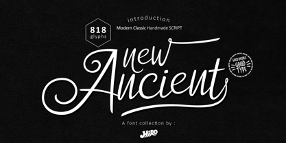 New Ancient is a Modern Classic Handmade Script. New Ancient has more than 818 Glyphs, with (82 Glyphs Uppercase), (427 Glyphs Lowercase and 65 Glyphs Ligatures. This font template contains Modern Classic, Classy, Elegant, readable, stylish, cool, catchy and easy to use. FEATURES - Ligatures - Stylistic Alternates - Stylistic Set - Uppercase and Lowercase letters - Numbering and Punctuations - Multilingual Support - Works on PC or Mac - Simple Installation Hope you like it. thanks. HIRO.std
 - Primeform Pro by Punchform,
$29.00 The most versatile geometric font ever is here. With 421 alternative characters and 19 stylistic sets, you get unlimited power to take your creativity to the next level. The first typeface of its kind, Primeform Pro is meticulously designed to adapt its personality to any project. Primeform Pro is the smartest choice for any creative project. With a single click, you can change its typographic personality and adapt it to your desired style. Choose between 3 predefined styles or create your own style by combining the hundreds of alternate characters available. OpenType Features Access All Alternates (aalt) Stylistic Alternates (salt) 19 Stylistic Sets (ss01 – ss19) Localized Forms (locl) Case-Sensitive Forms (case) Standard Ligatures (liga) & Discretionary Ligatures (dlig) Slashed Zero (zero) Proportional Figures (pnum) Tabular Figures (tnum) Subscript (subs) & Superscript (sups) Numerators (numr) & Denominators (dnom) Fractions (frac) Ordinals (ordn) Glyph Composition/Decomposition (ccmp) Language Support 317 Latin Languages 2 Greek Languages 15 Cyrillic Languages Tech Specs Glyph Count: 1185 Format: OpenType CFF
 - TT Backwards by TypeType,
$29.00 TT Backwards useful links: Specimen | Graphic presentation | Customization options About TT Backwards: TT Backwards is an experimental font project inspired by the USSR typography and fonts of the late 70s and early 80s. Shop signs, posters, and book design—this is where we drew the inspiration for our project. TT Backwards consists of two complementary font subfamilies, a Script and a Grotesque, each of them includes 5 typefaces in 5 different weights (Thin, Light, Regular, Bold, Black). TT Backwards Script is a noncontrast almost monolinear solid script inspired by shop signs, poster and book design of the USSR. TT Backwards Script features a large number of Latin and Cyrillic ligatures (more than 70 items), which allows to make the script versatile and sophisticated to the max. And thanks to the implementation of a huge number of context alternates, all lowercase letters are joined softly and without breaks, and they meet the uppercase letters beautifully and correctly. TT Backwards Script supports the following OpenType features: liga, case, ordn, frac, sups, sinf, numr, dnom, tnum, onum, pnum. TT Backwards Sans is a narrow grotesque, which takes us back to the book design of late 70s and early 80s with its ductile characters. It is created considering its use in the small text size. TT Backwards Sans has a number of pronounced peculiarities: high x-height, exaggerated extenders, and big visual compensators and ink traps. Apart from the basic visual solution, TT Backwards Sans contains two experimental stylistic sets, which markedly change the overall visual perception of the text. SS01 alters high-frequency symbols of the Cyrillic alphabet, and SS02 significantly changes the high-frequency symbols of the Latin alphabet. FOLLOW US: Instagram | Facebook | Website TT Backwards OpenType features: case, ordn, frac, sups, sinf, numr, dnom, tnum, pnum, liga, zero, salt, ss01, ss02. TT Backwards language support: Acehnese, Afar, Albanian, Alsatian, Aragonese, Arumanian, Asu, Aymara, Banjar, Basque, Belarusian (cyr), Bemba, Bena, Betawi, Bislama, Boholano, Bosnian (cyr), Bosnian (lat), Breton, Bulgarian (cyr), Cebuano, Chamorro, Chiga, Colognian, Cornish, Corsican, Cree, Croatian, Czech, Danish, Embu, English, Erzya, Estonian, Faroese, Fijian, Filipino, Finnish, French, Friulian, Gaelic, Gagauz (lat), Galician, German, Gusii, Haitian Creole, Hawaiian, Hiri Motu, Hungarian, Icelandic, Ilocano, Indonesian, Innu-aimun, Interlingua, Irish, Italian, Javanese, Judaeo-Spanish, Judaeo-Spanish, Kalenjin, Karachay-Balkar (lat), Karaim (lat), Karakalpak (lat), Kashubian, Khasi, Khvarshi, Kinyarwanda, Kirundi, Kongo, Kumyk, Kurdish (lat), Ladin, Latvian, Laz, Leonese, Lithuanian, Luganda, Luo, Luxembourgish, Luyia, Macedonian, Machame, Makhuwa-Meetto, Makonde, Malay, Manx, Maori, Mauritian Creole, Minangkabau, Moldavian (lat), Montenegrin (lat), Mordvin-moksha, Morisyen, Nahuatl, Nauruan, Ndebele, Nias, Nogai, Norwegian, Nyankole, Occitan, Oromo, Palauan, Polish, Portuguese, Quechua, Rheto-Romance, Rohingya, Romanian, Romansh, Rombo, Rundi, Russian, Rusyn, Rwa, Salar, Samburu, Samoan, Sango, Sangu, Scots, Sena, Serbian (cyr), Serbian (lat), Seychellois Creole, Shambala, Shona, Slovak, Slovenian, Soga, Somali, Sorbian, Sotho, Spanish, Sundanese, Swahili, Swazi, Swedish, Swiss German, Swiss German, Tagalog, Tahitian, Taita, Tatar, Tetum, Tok Pisin, Tongan, Tsonga, Tswana, Turkish, Turkmen (lat), Ukrainian, Uyghur, Vepsian, Volapük, Võro, Vunjo, Xhosa, Zaza, Zulu.
 - TT Jenevers by TypeType,
$35.00 TT Jenevers useful links: Specimen | Graphic presentation | Customization options Please note! If you need OTF versions of the fonts, just email us at commercial@typetype.org About TT Jenevers: TT Jenevers is a modern serif with Dutch flavor. The font family features the characteristic details peculiar to Dutch serifs—these are the asymmetrical shape of serifs and an irregular slant of ovals. For example, in the letter “o” there is no slant, but it is present in p-q. In TT Jenevers, both lowercase and uppercase characters are of a large size, which makes it a rather display typeface. At the same time, the big half-ellipse of the lowercase characters does not allow the letters to stick, which allows the implementation of TT Jenevers in text arrays. The italics of the TT Jenevers are slightly narrower as compared to upright faces—this is done to ensure a greater density of the text array. The italics of the TT Jenevers are slightly narrower as compared to upright faces—this is done to ensure a greater density of the text array. TT Jenevers font family consists of 12 fonts (6 upright and 6 true Italics), each of which has more than 830 characters. The typefaces include small capitals for Cyrillic and Latin alphabets, 33 ligatures, standard and old-style figures, stylistic alternates, arrows, hands, and card suits. We have prepared two dissimilar stylistic sets, which allow changing the nature of TT Jenevers to a more hand-written one, or adding a futuristic touch to the typeface. FOLLOW US: Instagram | Facebook | Website TT Jenevers OpenType features: ordn, case, c2sc, smcp, frac, sups, sinf, numr, dnom, onum, tnum, pnum, lnum, liga, dlig, salt, ss01, ss02, zero. TT Jenevers language support: Acehnese, Afar, Albanian, Alsatian, Aragonese, Arumanian, Asu, Aymara, Azerbaijani, Banjar, Basque, Belarusian (cyr), Belarusian (lat), Bemba, Bena, Betawi, Bislama, Boholano, Bosnian (cyr), Bosnian (lat), Breton, Bulgarian (cyr), Cebuano, Chamorro, Chichewa, Chiga, Colognian, Cornish, Corsican, Cree, Croatian, Czech, Danish, Dutch, Embu, English, Erzya, Esperanto, Estonian, Faroese, Fijian, Filipino, Finnish, French, Frisian, Friulian, Gaelic, Gagauz (lat), Galician, Ganda, German, Gusii, Haitian Creole, Hawaiian, Hiri Motu, Hungarian, Icelandic, Ilocano, Indonesian, Innu-aimun, Interlingua, Irish, Italian, Javanese, Jola-Fonyi, Judaeo-Spanish, Judaeo-Spanish, Kalenjin, Karachay-Balkar (lat), Karaim (lat), Karakalpak (lat), Kashubian, Kazakh (lat), Khasi, Khvarshi, Kinyarwanda, Kirundi, Komi-Permyak, Komi-Zyrian, Kongo, Kumyk, Kurdish (lat), Ladin, Latvian, Laz, Leonese, Lithuanian, Luba-Kasai, Luganda, Luo, Luxembourgish, Luyia, Macedonian, Machame, Makhuwa-Meetto, Makonde, Malay, Maltese, Manx, Maori, Mauritian Creole, Minangkabau, Moldavian (lat), Montenegrin (lat), Mordvin-moksha, Morisyen, Nahuatl, Nauruan, Ndebele, Nias, Nogai, Norwegian, Nyankole, Occitan, Oromo, Palauan, Polish, Portuguese, Quechua, Rheto-Romance, Rohingya, Romanian, Romansh, Rombo, Rundi, Russian, Rusyn, Rwa, Salar, Samburu, Samoan, Sango, Sangu, Sasak, Scots, Sena, Serbian (cyr), Serbian (lat), Seychellois Creole, Shambala, Shona, Silesian, Slovak, Slovenian, Soga, Somali, Sorbian, Sotho, Spanish, Sundanese, Swahili, Swazi, Swedish, Swiss German, Tagalog, Tahitian, Taita, Talysh (lat), Tatar, Teso, Tetum, Tok Pisin, Tongan, Tsakhur (Azerbaijan), Tsonga, Tswana, Turkish, Turkmen (lat), Udmurt, Ukrainian, Uyghur, Vastese, Vepsian, Volapük, Võro, Vunjo, Welsh, Wolof, Xhosa, Zaza, Zulu.
 - Geomatrix by Type Innovations,
$39.00 The font Geomatrix is an original design by Alex Kaczun. It is a dynamic stencil interpretation based on his extremely successful Contax Pro family of geometric sans typefaces. Geomatrix is a contemporary stencil typeface based on generous proportions and clean, crisp lines.The stencil treatment is balanced visually with the stem weight of the font which creates a uniformity and harmony within the design. Geomatrix makes for easy reading and is ideal for long lines of copy. It exudes a strong sense of sophistication for a true stencil design. However, this is no ordinary stencil typeface. That's putting it mildly. Geomatrix is a font on STEROIDS! This unique OpenType font incorporates hundreds of CAPITAL alternate letter forms and glyph substitutions, automatically and on the fly, within InDesign and other Open Type applications. To turn this feature on, just typeset ALL CAPS and go into InDesign's OpenType>Stylistic Sets and select Set 1 from the menu. Turn character kerning from Metrics to Optical, adjust tracking to minus 20-30, and start typing to create some visually interesting letter substitutions and unique word combinations. Geomatrix was specifically designed to take advantage of the OpenType format, allowing the Graphic Designer a unique tool to achieve the desired degree of possible visual typographic effects. And finally, the character sets in Geomatrix have been expanded to include old-style figures and all Eastern European accented glyphs. Strap in and hold on to your seats. A revolution in new font technologies has begun! GEOMATRIX IMPORTANT PLEASE READ HOW TO ACCESS "ALTERNATE" STYLISTIC "SET 1" LETTER FORMS: Geomatrix is a unique OpenType font which incorporates hundreds of CAPITAL alternate letter forms and glyph substitutions, automatically and on the fly, within InDesign and other OpenType applications. To turn this feature on, just typeset ALL CAPS and go into InDesign\'d5s OpenType>Stylistic Sets and select "Set 1" from the menu. Turn character kerning from Metrics to Optical, adjust tracking to minus 20-30, and start typing to create some visually interesting letter substitutions and unique word combinations. This feature "stylistic set 1" can be toggled "on" or "off" anytime, allowing you to go back and forth, or select only the letters that you want to change. Geomatrix was specifically designed to take advantage of the OpenType format, allowing the Graphic Designer a unique tool to achieve the desired degree of possible visual typographic effects. And finally, the character sets in Geomatrix have been expanded to include old-style figures and all Eastern European accented glyphs. Strap in and hold on to your seats. A revolution in new font technologies has begun!
 - ITC Stone Sans II by ITC,
$45.99 The ITC Stone Sans II typeface family is new from the drawing board up. Sumner Stone, who designed the original faces in 1988, recently collaborated with Delve Withrington and Jim Wasco of Monotype Imaging to update the family of faces that bears his name. Sumner was the lead designer and project director for the full-blown reworking – and his own greatest critic. The collaborative design effort began as a relatively simple upgrade to the ITC Stone Sans family. As so often happens, however, the upgrade proved to be not so simple, and grew into a major design undertaking. “My initial intent,” recalls Sumner, “was to provide ITC Stone Sans with even greater versatility. I planned to add an additional weight, maybe two, and to give the family some condensed designs.” As Sumner began to look more closely at his twenty-year-old typeface, he decided that it would benefit from more extensive design improvements. “I found myself making numerous refinements to character shapes and proportions,” says Sumner. “The project scope expanded dramatically, and I’m pleased with the final result. The redesign has improved both the legibility and the overall appearance of the face.” The original ITC Stone Sans is part of the ITC Stone super family, along with ITC Stone Serif and ITC Stone Informal. In 2005 ITC Stone Humanist joined the family. All of these designs have always offered the same three weights: Medium, Semibold, and Bold – each with an italic counterpart. Over time, Stone Sans has emerged as the godfather of the family, a powerful design used for everything from fine books, annual reports and corporate identity programs, to restaurant menus, movie credits and advertising campaigns. ITC Stone Sans, however, lacked one attribute of many sans serif families: a large range of widths and weights. “These fonts had enjoyed great popularity for many years – during which graphic designers repeatedly asked for more weights and condensed designs in the family,” says Sumner. “Their comments were the impetus.” ITC Stone Sans II includes six weights ranging from an elegant Light to a commanding Extra Bold. An italic counterpart and suite of condensed designs complements every weight. In all, the new family encompasses 24 typefaces. The ITC Stone Sans II family is also available as a suite of OpenType Pro fonts, allowing graphic communicators to pair its versatile design with the capabilities of OpenType. These fonts offer automatic insertion of ligatures, small caps and use-sensitive figure designs; their extended character set also supports most Central European and many Eastern European languages. ITC Stone® Sans II font field guide including best practices, font pairings and alternatives.
 - Lektorat by TypeTogether,
$35.00 Florian Fecher’s Lektorat font family is one for the books, and for the screens, and for the magazines. While an editorial’s main goals are to entertain, inform, and persuade, more should be considered. For example, clear divisions are necessary, not just from one article to the next, but in how each is positioned as op-ed or fact-based, infographic or table, vilifying or uplifting. From masthead to colophon, Lektorat has six concise text styles and 21 display styles to captivate, educate, and motivate within any editorial purpose. Magazines and related publications are notoriously difficult to brand and then to format accordingly. The research behind Lektorat focused on expression versus communication and what it takes for a great typeface to accomplish both tasks. In the changeover from the 19th to 20th century, German type foundry Schelter & Giesecke published several grotesque families that would become Lektorat’s partial inspiration. Experimentation with concepts from different exemplars gave birth to Lektorat’s manifest character traits: raised shoulders, deep incisions within highly contrasted junctions, and asymmetrical counters in a sans family. After thoroughly analysing magazine publishing and editorial designs, Florian discovered that a concise setup is sufficient for general paragraph text. So Lektorat’s text offering is concentrated into six total styles: regular, semibold, and bold with their obliques. Stylistic sets are equally minimal; an alternate ‘k, K’ and tail-less ‘a’ appear in text only. No fluff, no wasted “good intentions”, just a laser-like suite to focus the reader on the words. The display styles were another matter. They aim to attract attention in banners, as oversized type filling small spaces, photo knockouts, and in subsidiary headings like decks, callouts, sections, and more. For these reasons, three dialed-in widths — Narrow, Condensed, and Compressed — complete the display offerings in seven upright weights each, flaunting 21 headlining fonts in total. If being on font technology’s cutting edge is more your goal, the Lektorat type family is optionally available in three small variable font files for ultimate control and data savings. The Lektorat typeface was forged with a steel spine for pixel and print publishing. It unwaveringly informs, convincingly persuades, and aesthetically entertains when the tone calls for it. Its sans serif forms expand in methodical ways until the heaviest two weights close in, highlighting its irrepressible usefulness to the very end. Lektorat is an example of how much we relish entering into an agreed battle of persuasion — one which both sides actually enjoy.
 - As of my last update in April 2023, there isn't a widely recognized or standard font specifically known as "79." Fonts typically have names that are either descriptive of their style, such as "Times ...
- As of my last update in 2023, there isn't a widely recognized font by the name "Sanford" that's prominent in the typographic community or among mainstream font collections. However, let’s imagine wha...
- Ah, COM (sRB) by sRB-Powers, a true enigma wrapped in a digital font file. Imagine if a group of pixels woke up one day, decided to become fonts, and then went on a wild, adventurous spree guided by ...
- The Oncial font by Match Software is a modern interpretation of an ancient script style that has its roots in the early Christian and medieval periods. This typeface is designed to evoke the feeling ...
- Serif Medium is a font that gracefully bridges the gap between tradition and modernity, embodying a perfect mix of elegance and readability. Its roots are firmly planted in the serif tradition, which...
- As of my last update, Rammstein isn't widely recognized as a standard or commercially available typeface in the traditional sense, such as Helvetica or Times New Roman. Instead, Rammstein's associati...
- Picture this: "Teen Spirit" by Steven J. Lundeen is not just a font; it's the embodiment of youth rebellion, a visual shout that echoes through the halls of high school, sticking it to the man with e...
- Erotica by Lián Types,
$49.00 “A picture is worth a thousand words” and here, that’s more than true. Take a look at Erotica’s Booklet; Erotica’s Poster Design and Erotica’s User’s Guide before reading below. THE STYLES The difference between Pro and Std styles is the quantity of glyphs. Therefore, Pro styles include all the decorative alternates and ligatures while Std styles are a reduced version of Pro ones. Big and Small styles were thought for better printing results. While Big is recommended to be printed in big sizes, Small may be printed in tiny sizes and will still show its hairlines well. INTRODUCTION I have always wondered if the circle could ever be considered as an imperfect shape. Thousands of years have passed and we still consider circles as synonyms of infinite beauty. Some believe that there is something intrinsically “divine” that could be found in them. Sensuality is many times related to perfectly shaped strong curves, exuberant forms and a big contrasts. Erotica is a font created with this in mind. THE PROCESS This story begins one fine day of March in 2012. I was looking for something new. Something which would express the deep love I feel regarding calligraphy in a new way. At that time, I was practicing a lot of roundhand, testing and feeling different kinds of nibs; hearing the sometimes sharp, sometimes soft, sound of them sliding on the paper. This kind of calligraphy has some really strict rules: An even pattern of repetition is required, so you have to be absolutely aware of the pressure of the flexible pen; and of the distance between characters. Also, learning copperplate can be really useful to understand about proportion in letters and how a minimum change of it can drastically affect the look of the word and text. Many times I would forget about type-design and I would let myself go(1): Nothing like making the pen dance when adding some accolades above and below the written word. Once something is mastered, you are able to break some rules. At least, that’s my philosophy. (2) After some research, I found that the world was in need of a really sexy yet formal copperplate. (3) I started Erotica with the idea of taking some rules of this style to the extreme. Some characters were drawn with a pencil first because what I had in mind was impossible to be made with a pen. (4) Finding a graceful way to combine really thick thicks with really thin hairlines with satisfactory results demanded months of tough work: The embryo of Erotica was a lot more bolder than now and had a shorter x-height. Changing proportions of Erotica was crucial for its final look. The taller it became the sexier it looked. Like women again? The result is a font filled with tons of alternates which can make the user think he/she is the actual designer of the word/phrase due to the huge amount of possibilities when choosing glyphs. To make Erotica work well in small sizes too, I designed Erotica Small which can be printed in tiny sizes without any problems. For a more elegant purpose, I designed Erotica Inline, with exactly the same features you can find in the other styles. After finishing these styles, I needed a partner for Erotica. Inspired again in some old calligraphic books I found that Bickham used to accompany his wonderful scripts with some ornated roman caps. Erotica Capitals follows the essentials of those capitals and can be used with or without its alternates to accompany Erotica. In 2013, Erotica received a Certificate of Excellence in Type Design in the 59th TDC Type Directors Club Typeface Design Competition. Meet Erotica, beauty and elegance guaranteed. Notes (1) It is supossed that I'm a typographer rather than a calligrapher, but the truth is that I'm in the middle. Being a graphic designer makes me a little stubborn sometimes. But, I found that the more you don't think of type rules, the more graceful and lively pieces of calligraphy can be done. (2) “Know the forms well before you attempt to make them” used to say E. A. Lupfer, a master of this kind of script a century ago. And I would add “And once you know them, it’s time to fly...” (3) Some script fonts by my compatriots Sabrina Lopez, Ramiro Espinoza and Alejandro Paul deserve a mention here because of their undeniable beauty. The fact that many great copperplate fonts come from Argentina makes me feel really proud. Take a look at: Parfumerie, Medusa, Burgues, Poem and Bellisima. (4) Some calligraphers, graphic and type designer experimented in this field in the mid-to-late 20th century and made a really playful style out of it: Letters show a lot of personality and sometimes they seem drawn rather than written. I want to express my sincere admiration to the fantastic Herb Lubalin, and his friends Tony DiSpigna, Tom Carnase, and of course my fellow countryman Ricardo Rousselot. All of them, amazing.
 - Dust Mites - Unknown license

- Sunburn Central - Unknown license

- Digitalis - Unknown license

- Crakoom! - Unknown license

- Boqueta by BRtype,
$18.00 The design of Boqueta was inspired in stencil and modular forms. The project was selected for Bienal Letras Latinas 2006. The three styles include 21 discretionary ligatures.
 - Conte Script Plus by Ingo,
$61.00 A personal handwriting done in pencil. Conté Script is a computer font but has the extraordinary look of handwriting. The typeface is exceedingly lively, diversified and distinct thanks to more than 300 different ligatures, i.e. letter combinations. In addition to the letter combinations in Conté Script, there are also double letters and figures included (aa, ff, AA, MM, 22, 66…) as ligatures with stylistic alternates. Type set in Conté Script appears remarkably similar to a text actually handwritten with a pencil. The typical style of the pencil — crumbliness where pressure lessens and the deep darkness where the pressure of the graphite in it's fullest denseness smudges — is another earmark of Conté Script. The font appears to be written quickly, fleetingly, casually, as if not really to be taken seriously, and as if it would be written one minute and erased the next. Conté Script looks most ”authentic“ around the point size of 18 to 22.


